What is Absinthe Green Fairy Glow?什么是 Absinthe Green Fairy Glow?
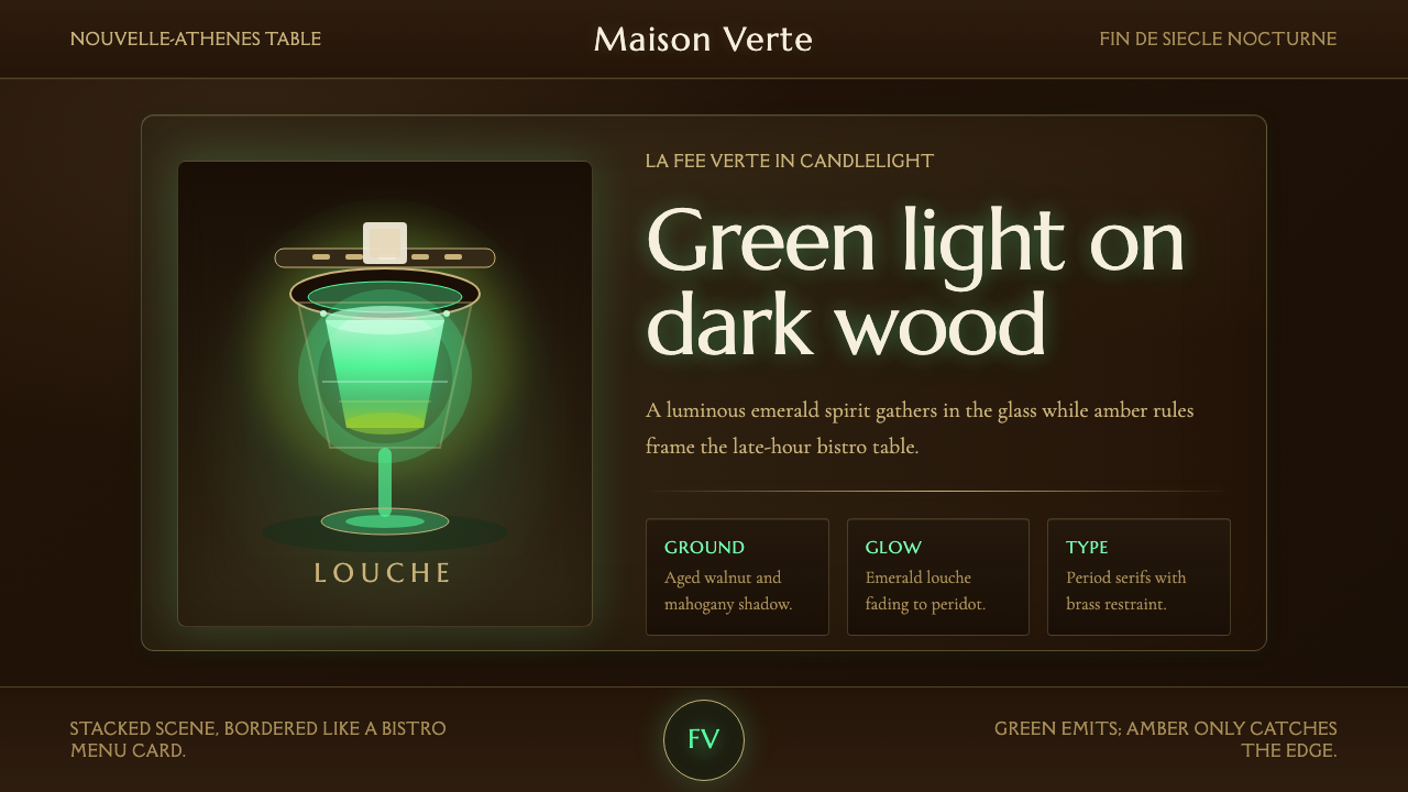
Absinthe Green Fairy Glow paints the louche moment as if it were the only light source in the room — an emerald spirit glowing against dark mahogany, the way Belle Époque Paris first saw it.苦艾酒的乳化瞬间被画成房间里唯一的光源——一抹翠绿灵魂在深色桃花心木上发亮,正如美好年代的巴黎第一次看见它的样子。
Absinthe Green Fairy Glow in briefAbsinthe Green Fairy Glow 速览
Absinthe Green Fairy Glow is a design language built around a single dramatic contrast: a luminous emerald-to-peridot green suspended in darkness. It takes its cue from the ritual of drinking absinthe in a fin-de-siècle Parisian café — the moment sugared water is dripped over a slotted spoon into the spirit, clouding it from clear green into a milky, glowing louche. That instant of chemical transformation, lit by low café gas-lamps against a backdrop of aged wood, is the entire visual thesis.「绿仙苦艾微光」围绕一组极具戏剧性的对比展开:一片翠绿到橄榄绿的光晕悬浮在黑暗之中。它取材于世纪末巴黎咖啡馆里那套苦艾酒的仪式——糖水从开槽汤匙上一滴滴淋下,酒液由清澈的绿转为乳浊发光的“乳化”状态。这一化学变化的瞬间,在低矮的煤气灯光与陈年木质背景的映衬下,构成了整套视觉体系的核心命题。
The style commits fully to darkness as a stage rather than a void. Every surface reads as aged mahogany or walnut — the wood of the bistro table, the bar rail, the frame of a mirror fogged by decades of tobacco smoke. Against that warm-dark ground, the green does not merely appear; it seems to be the only thing generating light, the way a firefly or a phosphorescent liquid pulls the eye in an otherwise unlit room.这套风格把黑暗当作舞台,而非空白。每一处表面都读作陈年的桃花心木或胡桃木——小酒馆桌面的木纹、吧台的扶手、被数十年烟草熏得雾蒙蒙的镜框。在这片温暖的深色底色上,绿色并非只是“出现”,它仿佛是唯一的发光源,如同萤火虫或磷光液体,在原本无光的房间里牢牢攫住视线。
Ornament in this system is restrained and object-specific: the curve of a slotted absinthe spoon, the cube of sugar balanced upon it, a fine amber-gold serif for labels and headings that recalls the printed menus and posters of the era. There is no confetti, no geometric abstraction — only the objects of the ritual, rendered with quiet reverence, and the glow they cast.这套系统的装饰克制而具体:一把开槽苦艾酒匙的弧线、搁在匙上的一方糖块、一款用于标签与标题的细致琥珀金衬线字体,令人想起那个时代的印刷菜单与海报。这里没有彩纸碎屑,没有几何抽象——只有仪式本身的器物,以静谧的敬意被描绘出来,以及它们投下的微光。
See the Absinthe Green Fairy Glow design system查看 Absinthe Green Fairy Glow 完整设计系统
Where does Absinthe Green Fairy Glow come from?Absinthe Green Fairy Glow 从何而来?
Absinthe rose to mass popularity in France in the second half of the nineteenth century, but it was in the Belle Époque decades before 1900 — the golden years of café society in Paris — that its cultural iconography solidified. Cheap, potent, and faintly narcotic in reputation thanks to its wormwood content, absinthe became the drink of painters, poets, and the working class alike, earning the nickname la fée verte, 'the Green Fairy,' for the way it seemed to unlock a heightened, sometimes hallucinatory state of mind.苦艾酒在十九世纪下半叶的法国风靡一时,但真正让它的文化图像固定下来的,是1900年之前的美好年代——巴黎咖啡馆社交的黄金岁月。这种酒廉价、劲道十足,又因含有苦艾成分而带着几分致幻的传言,成了画家、诗人与工人阶级共同钟爱的饮品,也因此得名“la fée verte”,绿仙子——仿佛它能开启一种更为敏锐、有时近乎幻觉的精神状态。
The ritual itself was as important as the drink: a slotted spoon rested across the rim of the glass, a sugar cube placed upon it, and cold water dripped slowly through the sugar into the spirit below. As the water diluted the alcohol, the essential oils in the liqueur — anise, fennel, and wormwood extracts — precipitated out of solution, turning the drink from a clear, almost jewel-toned green into a cloudy, opalescent pale jade. This transformation, called the louche, was itself a kind of small performance, repeated nightly at thousands of café tables.仪式本身与酒同样重要:一把开槽汤匙横搁在杯沿,一块方糖放在匙上,冷水缓缓穿过糖块滴入下方的酒液。随着水稀释酒精,酒中的茴芹、茴香与苦艾精油从溶液中析出,令原本清澈近乎宝石绿的酒液转为乳浊、乳白泛翠的“乳化”状态。这一转变被称为“louche”,本身就是一场小型表演,每晚在无数咖啡馆的桌上重复上演。
The cafés of the Nouvelle-Athènes quarter in Paris, along with countless bistros across the city, became the informal salons where this ritual played out among artists and writers. Edgar Degas's painting L'Absinthe, showing a solitary woman and her companion slumped before a glass of the pale-green liquid, became the era's most famous visual document of the drink — capturing both its allure and the social anxiety it provoked. Absinthe was eventually banned across much of Europe and the United States in the years around the First World War, blamed (with little scientific basis) for madness and violence, which only deepened its mythic, forbidden-fruit status in the decades that followed.巴黎新雅典区的咖啡馆,连同城中无数小酒馆,成了艺术家与作家们上演这场仪式的非正式沙龙。埃德加·德加的画作《苦艾酒》,描绘一名独坐的女子与她的同伴在一杯淡绿色酒液前萎靡不振,成为那个时代关于苦艾酒最著名的视觉文献——既捕捉了它的魅惑,也捕捉了它引发的社会焦虑。第一次世界大战前后,苦艾酒在欧洲大部分地区与美国相继被禁——尽管几乎没有科学依据,它仍被归咎于致人疯狂与暴力——这反而让它在此后数十年间被蒙上一层禁果般的神秘色彩。
What survives in design terms is not the chemistry but the atmosphere: dim gaslight, dark polished wood, a solitary glass glowing green on a café table. That composition — darkness as frame, emerald light as subject — is what this style extracts and rebuilds as a visual system, independent of the drink's actual history of prohibition and controversy.如今在设计层面留存下来的,不是那套化学过程,而是那种氛围:昏暗的煤气灯光、深色打磨的木料、桌上一杯独自发光的绿色酒液。黑暗作为画框,翠绿之光作为主体——这正是本风格所提炼并重建的视觉体系,与这款酒真实的禁令与争议历史无关。
What defines the Absinthe Green Fairy Glow look?Absinthe Green Fairy Glow 的视觉特征是什么?
Color色彩
The palette is anchored by a single glowing green that shifts from a deep emerald toward a lighter peridot or jade, always read against near-black or deep mahogany-brown surrounds. Amber and gold appear sparingly as accent — for type, for the suggestion of gaslight — but never compete with the green for attention. There is no secondary bright hue; the entire emotional weight rests on the darkness-to-glow relationship.整套色板以一种发光的绿为核心,从深邃的祖母绿过渡到较浅的橄榄石或翡翠色,始终衬托在近黑或深桃花心木棕色的环境之中。琥珀与金色作为点缀零星出现——用于文字,或暗示煤气灯光——但绝不与绿色争夺注意力。没有第二种鲜艳色相;全部情感重量都压在“黑暗与微光”这组关系之上。
Typography字体排印
Headline and label type draws on the elegant serif letterforms of period café menus and absinthe advertising posters — refined, slightly ornate, with enough contrast in stroke weight to read as printed rather than digital. Body text steps back into a plainer, highly legible serif or humanist form so the display type keeps its ceremonial weight.标题与标签字体取自那个时代咖啡馆菜单与苦艾酒广告海报上的优雅衬线字形——精致、略带装饰性,笔画粗细有足够的对比,读来像是印刷品而非数字产物。正文则退回到更朴素、高度易读的衬线或人文主义字形,以保留展示字体的仪式感。
Surface and Ground表面与底色
Every background surface is imagined as aged wood grain — mahogany, walnut, or a smoke-darkened café tabletop. Even where a flat digital ground is used, its value sits deep and warm rather than cool or neutral, so the eye reads it as wood and shadow rather than as a generic dark mode.每一处背景表面都被想象成陈年木纹——桃花心木、胡桃木,或是被烟熏黑的咖啡馆桌面。即便使用平面的数字底色,其明度也偏深、偏暖,而非冷调或中性,使人眼将其读作木料与阴影,而非泛泛的深色模式。
Glow and Light光晕与光感
The green functions as an internal light source rather than a flat fill — think soft haloing around key elements, a gentle luminous edge, or a radial brightening at the center of a focal shape. This glow effect is the single most important technique in the system: without it, the palette reads as generic dark-and-green rather than the specific glowing-glass motif.绿色的作用如同一处内在光源,而非平面填色——想象关键元素周围的柔和光晕、一圈轻盈发亮的边缘,或是聚焦形状中心的放射状增亮。这种发光效果是整套体系中最重要的单一技法:缺了它,色板只会读作泛泛的“深色配绿”,而非那个特定的“发光玻璃杯”母题。
Ritual Objects仪式器物
Iconography draws directly from the drinking ritual: the perforated bowl of the absinthe spoon, the cube of sugar, the tulip-shaped glass, a dripping fountain. These objects appear as line-drawn or subtly rendered motifs rather than photographic elements, keeping the system illustrative rather than literal.图像元素直接取自饮酒仪式:苦艾酒匙上带孔的匙面、一方糖块、郁金香形状的酒杯、滴水的喷泉装置。这些器物以线描或含蓄的渲染方式出现,而非照片式呈现,使整套体系保持插画感而非写实感。
Contrast Discipline对比克制
Because the whole effect depends on a small area of green reading as luminous against a large dark field, the ratio of dark ground to glowing accent must stay heavily weighted toward darkness. Overusing green anywhere in the composition collapses the glow effect into ordinary flat color.由于整体效果依赖于一小块绿色在大片暗色场域中显得发光,深色底与发光点缀之间的比例必须始终大幅偏向暗色。若在构图中过度使用绿色,发光效果就会退化成普通的平面色彩。
Period Ornament时代装饰
Where decorative flourishes appear — hairline rules, small corner motifs, a subtle vignette at the edge of a panel — they echo period printing rather than contemporary flat design: thin, precise, and slightly worn in feeling, as if printed on aged paper rather than rendered on glass.凡出现装饰性细节之处——细线规则、小巧的角饰、面板边缘的轻微暗角——都呼应那个时代的印刷品,而非当代的扁平化设计:纤细、精准,带一点微旧的质感,仿佛印在陈年纸张上,而非渲染在玻璃屏幕上。
See the Absinthe Green Fairy Glow design system查看 Absinthe Green Fairy Glow 完整设计系统
Who shaped Absinthe Green Fairy Glow?谁塑造了 Absinthe Green Fairy Glow?
Degas's 1876 painting L'Absinthe, depicting two café patrons before a glass of the pale-green liquid, remains the single most reproduced visual document of Belle Époque absinthe culture and the direct pictorial ancestor of this style's dark-cafe, glowing-glass composition.德加1876年的画作《苦艾酒》,描绘两位咖啡馆常客坐在一杯淡绿色酒液前,是美好年代苦艾酒文化中被复制最多的视觉文献,也是本风格“暗色咖啡馆、发光酒杯”构图的直接图像先祖。
This Parisian café was the informal meeting ground for painters and writers of the era, where the nightly absinthe ritual played out among figures who would go on to define Impressionist and post-Impressionist art, cementing the drink's association with bohemian creative life.这家巴黎咖啡馆是那个时代画家与作家非正式的聚集地,每晚上演的苦艾酒仪式,其参与者后来定义了印象派与后印象派艺术,也由此坐实了这款酒与波希米亚创作生活的联系。
Beyond Degas, a broader circle of painters documenting Parisian café life in the decades before 1900 shaped the enduring visual vocabulary of gaslit interiors, dark wood furnishings, and solitary drinkers — the atmospheric palette this design style draws from.除德加之外,1900年之前描绘巴黎咖啡馆生活的更大范围画家群体,共同塑造了煤气灯内景、深色木质家具与独酌者这一持久的视觉词汇——正是本设计风格所汲取的氛围色板。
How do you use Absinthe Green Fairy Glow today?今天怎么用 Absinthe Green Fairy Glow?
Absinthe Green Fairy Glow works best wherever a design needs to feel intimate, nocturnal, and a little decadent rather than bright and functional. Applying it well means treating darkness as the primary surface and green as a rationed, precious accent — not the reverse.「绿仙苦艾微光」最适合用在需要营造私密、夜色氛围、带一点颓靡美感的设计场景,而非追求明亮功能性的场合。用好这套风格,关键在于把黑暗当作主表面,把绿色当作配给制的珍贵点缀——而不是反过来。
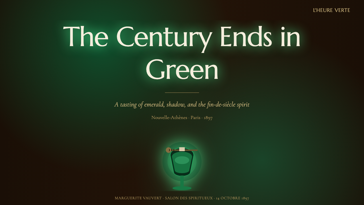
For presentation slides, this style suits a cover or divider slide beautifully: a large dark field with a single glowing green element — a shape, a numeral, a small illustrated glass — placed off-center, with the title set in the period-inspired serif nearby. Content slides should keep most of the surface dark and use the green glow only to highlight the single most important figure or heading on the page; overusing it across every bullet point flattens the drama.在演示文稿中,这套风格非常适合作为封面或分隔页:大片深色场域中放置一个发光的绿色元素——一个形状、一个数字、一只简笔描绘的酒杯——偏离中心放置,标题以带时代感的衬线字体排布在旁。内容页应保持大部分表面为暗色,仅用绿色微光突出页面上最重要的一个数字或标题;若在每个要点上都套用发光效果,戏剧性反而会被削平。
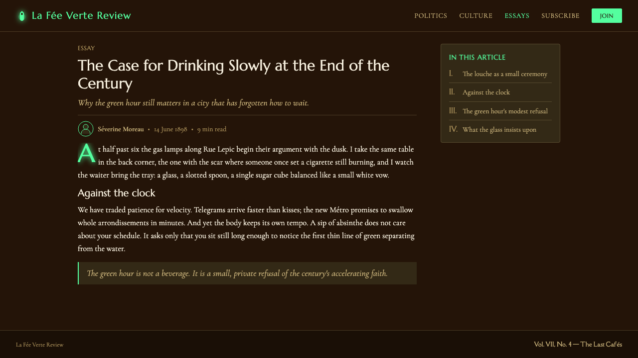
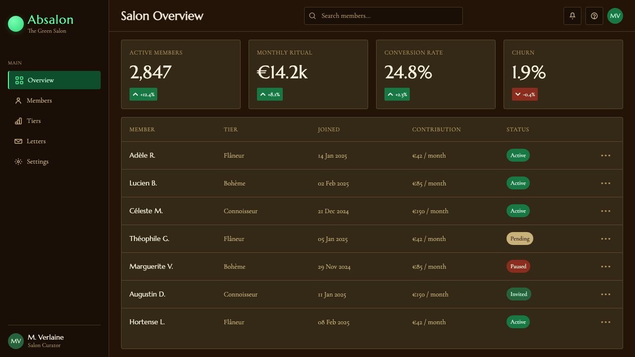
For web interfaces, the style lends itself to a moody dashboard or an evening-oriented consumer app — a cocktail or spirits brand, a late-night editorial section, a members-only lounge experience. Primary actions and key metrics can carry the glowing green treatment, while secondary UI recedes into the dark wood-toned surfaces, keeping the hierarchy clear without resorting to bright, generic accent colors.对于网页界面,这套风格适合氛围感强的仪表板,或面向夜间使用场景的消费级应用——酒类品牌、深夜编辑板块、会员制沙龙体验。主操作与关键指标可以承载发光绿色的处理,次级界面则退隐进深色木纹表面,在不诉诸明亮通用强调色的情况下保持层级清晰。
For editorial and marketing pieces — a spirits brand story, a history feature, an invitation to an evening event — the style provides an immediately recognizable mood: aged wood textures as section backgrounds, amber serif headlines, and photography or illustration treated with a warm, dim color grade so any image sits comfortably within the dark palette rather than breaking it with daylight brightness.对于编辑与营销内容——一篇酒类品牌故事、一篇历史专题、一封晚间活动的邀请函——这套风格能立刻传达出一种氛围:陈年木纹作为板块背景、琥珀色衬线标题,以及图片或插画经过暖色、低亮度调色处理,使任何影像都能自然融入深色调色板,而不会以日光般的明亮感打破它。
A common mistake is treating this as simply a 'green and black' color scheme and applying flat green broadly across a layout. Without the glow technique and the warm wood-toned ground, the specific louche-and-lamplight mood disappears and the design reads as generic horror or casino green instead of Belle Époque café ambiance.常见的错误,是把这套风格简单理解为“绿加黑”的配色方案,在版面中大范围铺开平面绿色。若缺少发光技法与暖色调的木质底色,那种“乳化时刻加灯光”的特定氛围便会消失,设计只会读作泛泛的恐怖片绿或赌场绿,而非美好年代的咖啡馆气息。
See the Absinthe Green Fairy Glow design system查看 Absinthe Green Fairy Glow 完整设计系统
Absinthe Green Fairy Glow — FAQAbsinthe Green Fairy Glow · 常见问题
What makes this different from a generic dark-mode green theme?这套风格和一般的“深色模式配绿色”主题有什么区别?
A generic dark-green theme treats green as a flat accent color on a neutral dark ground. This style instead treats the ground as warm aged wood, not neutral black, and treats the green as an internal glow rather than a flat fill — the difference between a color choice and a lighting effect. It is the glow and the wood warmth together that read as absinthe rather than as any dark UI.一般的深色配绿主题,是把绿色当作中性深色底面上的一块平面强调色。这套风格则把底色处理为温暖的陈年木料,而非中性黑,并把绿色当作内在的光晕,而非平面填色——这是“颜色选择”与“照明效果”之间的区别。正是光晕与木质的暖意共同作用,才让人读出苦艾酒的意味,而非任何一款深色界面。
Can this style work in a light interface?这套风格能用在浅色界面上吗?
Not convincingly. The entire visual logic depends on darkness making the green appear to glow — remove the dark ground and the green becomes an ordinary saturated color with no special drama. If a lighter variant is required, it is better to borrow only the amber-serif typography and wood-grain texture cues and treat the coloring as a separate, brighter palette rather than forcing the glow effect into daylight.很难令人信服。整套视觉逻辑依赖于黑暗使绿色显得发光——去掉深色底面,绿色就沦为一种普通的饱和色彩,没有任何特殊的戏剧感。如果确实需要浅色变体,更稳妥的做法是只借用琥珀衬线字体与木纹质感的线索,把配色处理为独立的、更明亮的色板,而不是强行把发光效果塞进日光场景里。
How much green should actually appear in a layout?版面中到底应该出现多少绿色?
As a rough guide, green should occupy a clear minority of the visual field — often concentrated in one or two focal elements per screen or slide, such as a hero illustration, a key metric, or a primary call to action. The majority of the composition should remain dark wood tone, with amber serif type providing the secondary layer of interest.作为一个大致的参照,绿色应当只占据视觉场域中明显的少数——通常集中在每屏或每页一到两个焦点元素上,例如一幅主视觉插画、一项关键指标,或一个主要行动按钮。构图的大部分应保持深色木质调,琥珀衬线字体则提供第二层视觉兴趣。
What kind of imagery pairs well with this style?什么样的图像素材适合搭配这套风格?
Photography or illustration with a warm, low-key color grade — deep shadows, limited highlights, and a restrained palette — sits naturally within this system. Bright, evenly lit, high-key photography clashes with the mood and should be avoided or heavily regraded before use.带有暖色调、低调光影的摄影或插画——阴影深沉、高光有限、色彩克制——能自然地融入这套体系。明亮均匀、高调布光的摄影则与整体氛围相冲突,使用前应避免,或需要经过大幅重新调色。
Is this style tied to alcohol or bar branding only?这套风格是否只适用于酒类或酒吧品牌?
The literal ritual objects are drink-specific, but the underlying mood — nocturnal, intimate, softly luminous against darkness — transfers well to any brand or product wanting an evening, members-only, or slightly mysterious feeling, from late-night editorial content to premium subscription products, as long as the ritual iconography is either omitted or replaced with subject-appropriate motifs.字面意义上的仪式器物确实与饮品相关,但其底层氛围——夜色、私密、在黑暗中柔和发光——可以很好地迁移到任何希望传达晚间感、会员制感或几分神秘气息的品牌或产品上,从深夜编辑内容到高端订阅产品皆可,只要将仪式性图像元素省略,或替换为与主题相符的其他母题。
Related design styles相关设计风格
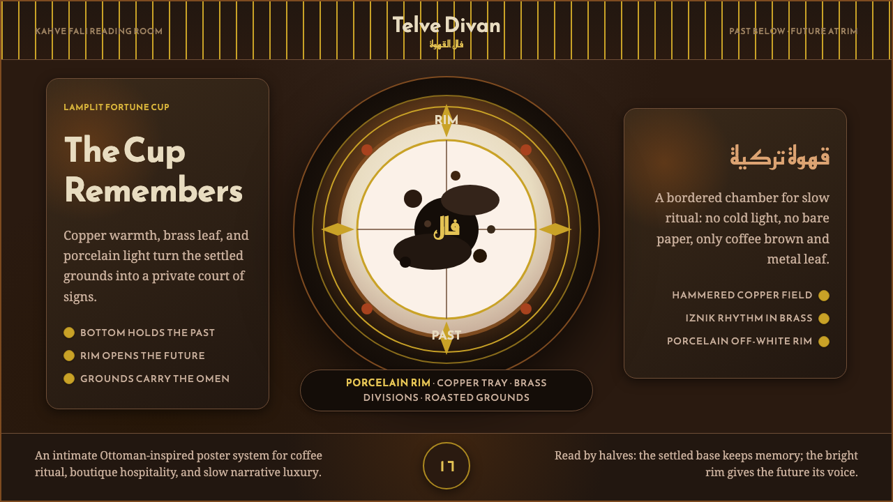 Turkish Coffee FortuneLamplit ritual, richly framed. Copper, brass, and Reem Kufi orbit a porcelain…油灯下的仪式感。铜、黄铜与Reem Kufi环绕瓷杯。
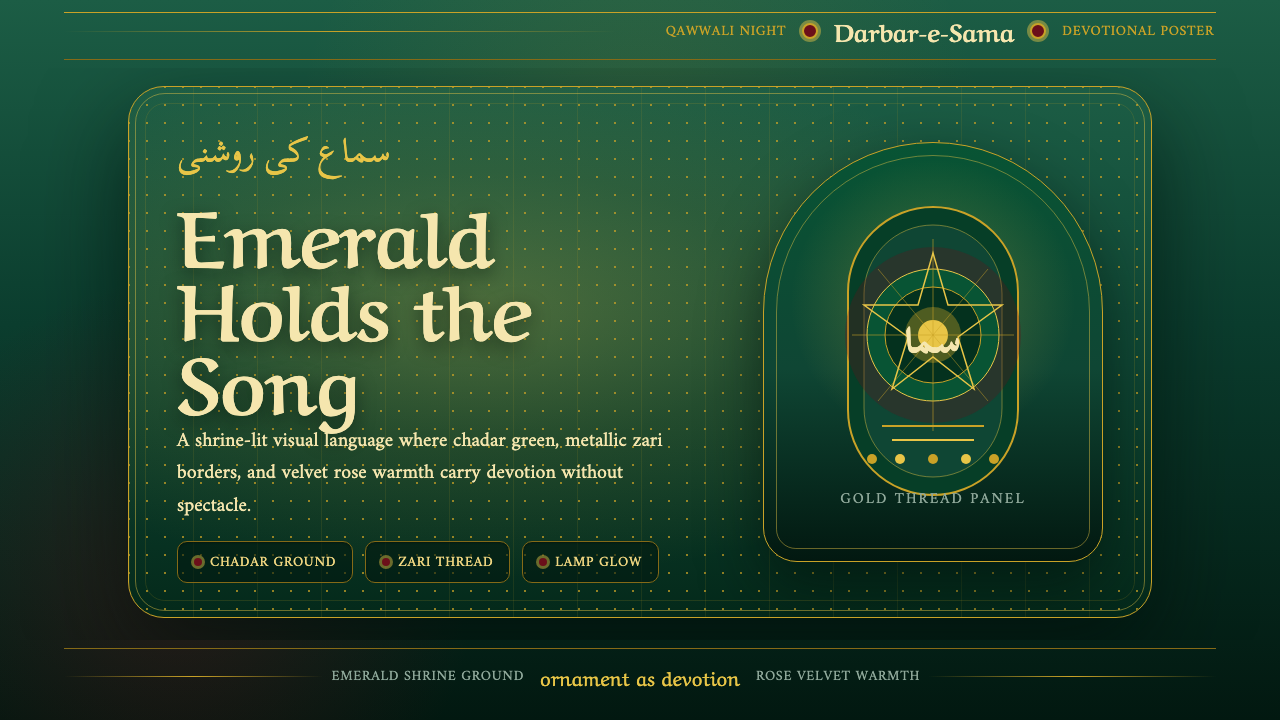 Qawwali DevotionalSacred warmth glows. Emerald cloth, zari gold borders, and Nastaliq rhythm ho…虔敬暖意发光。翠绿陵布、金线边框与纳斯塔利克节奏托起画面。
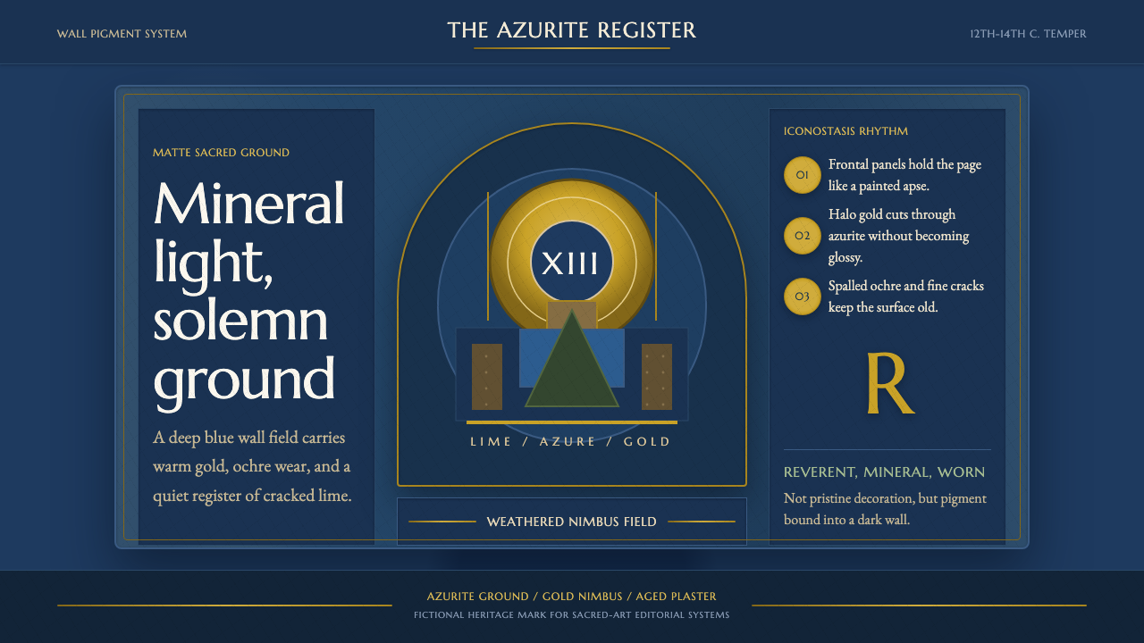 Serbian Medieval FrescoSacred wear becomes structure. Azurite fields, gold halos, and cracked plaste…神圣磨损成为结构。蓝铜矿底、金色光环与龟裂灰泥撑起画框。
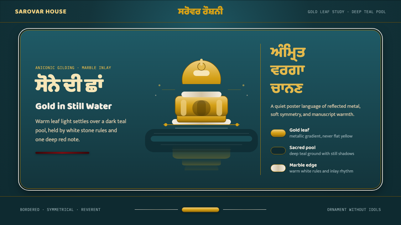 Sikh Golden TempleReverent gold in dark water. Teal ground, Gurmukhi type, marble rules hold th…暗水映金,庄重无像。深青底、古木基字体与白石线托住暖光。
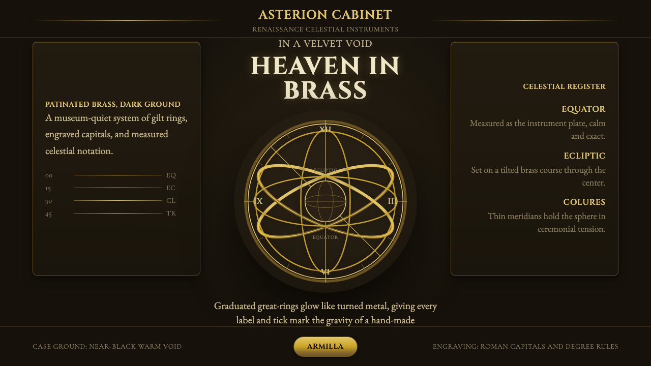 Armillary SphereMuseum darkness makes brass celestial. Cinzel capitals and concentric gold ri…博物馆暗场托起黄铜天象。Cinzel 大写字与金色同心环发光。
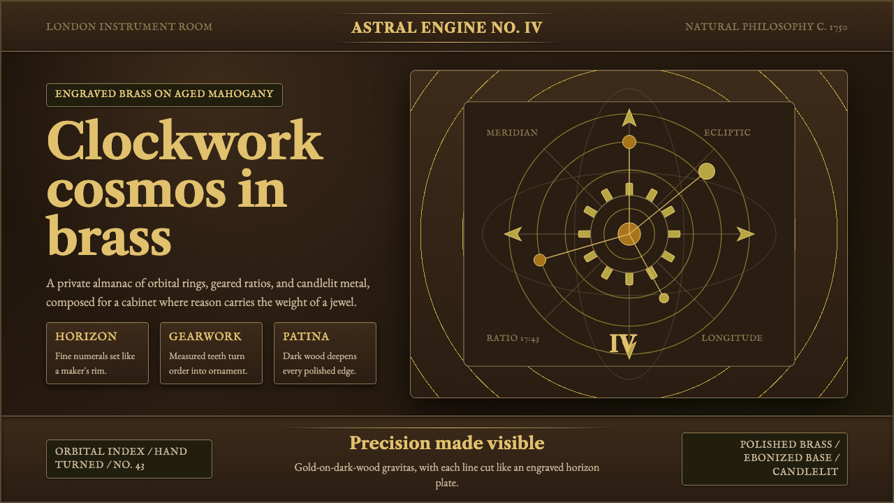 Brass OrreryTurns reason into gold. Brass rings and Caslon type glow over near-black maho…理性化作金色宇宙。黄铜轨环与卡斯隆字体在深桃花心木上发光。