What is Turkish Coffee Fortune?什么是 Turkish Coffee Fortune?
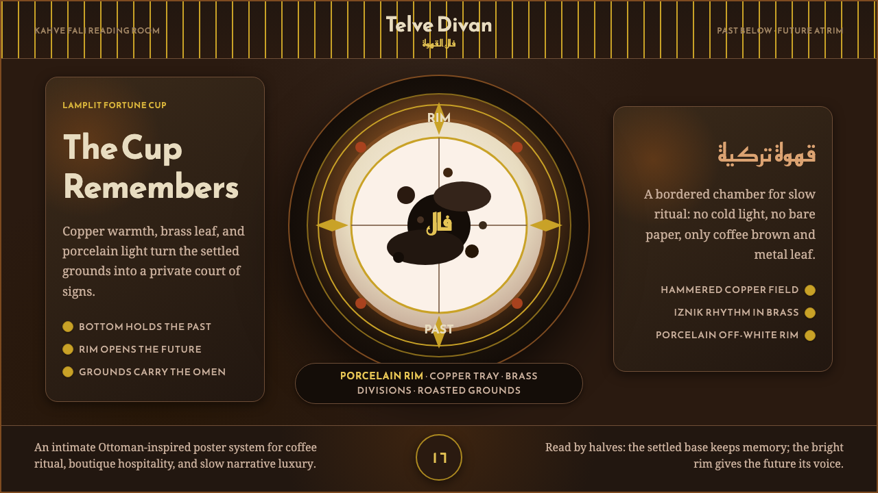
Turkish Coffee Fortune stages a centuries-old divination ritual as lamplit interior design — copper, brass, and porcelain gathered around the promise of a cup about to be read.「土耳其咖啡占卜」把一场数百年历史的占卜仪式,化作油灯下的室内设计——铜、黄铜与瓷器,环绕着一只即将被读出未来的杯子。
Turkish Coffee Fortune in briefTurkish Coffee Fortune 速览
Turkish Coffee Fortune style draws on kahve falı, Ottoman tasseography — a coffee-ground divination ritual born in the sixteenth-century Ottoman court and harem and still widely practiced across Turkey today. The ritual itself follows a precise sequence: coffee is brewed in a hammered copper cezve, poured into a small white porcelain fincan, and once the coffee is drunk, the cup is inverted onto its saucer; after the grounds have cooled and settled, the cup is turned upright again and the future is read from the pattern of kahve telvesi, the grounds left clinging to the interior glaze.「土耳其咖啡占卜」风格取材自kahve falı,即奥斯曼咖啡渣占卜术——一种诞生于十六世纪奥斯曼宫廷与后宫、至今仍在土耳其各地广泛流传的占卜仪式。仪式本身遵循一套精确的流程:咖啡在锤纹紫铜小壶cezve中煮沸,倒入小巧的白瓷杯fincan;饮尽之后,将杯子倒扣于杯碟之上;待咖啡渣冷却沉淀后,再将杯子翻正,从留在釉面内壁上的咖啡渣kahve telvesi的形状中读出未来。
As a visual system, this style stages the ritual as a lamplit interior rather than a literal illustration of tea-leaf reading or generic fortune-telling. The palette centers on a deep, roasted-coffee brown ground, lifted by copper and brass-leaf highlights and warmed further by Anatolian terracotta red, with a porcelain off-white reserved specifically for the cup's rim and interior.作为一套视觉系统,这种风格把这场仪式呈现为一间被油灯照亮的室内空间,而非对茶叶占卜或泛泛算命场景的直白描绘。色板以深焙咖啡棕为底色,由紫铜与黄铜箔高光提亮,并以安纳托利亚陶红进一步增添暖意,瓷杯般的米白色则专门保留给杯口与杯内壁。
Framing and structure carry as much narrative weight as color. Iznik-style arabesque patterning borders key content, and a radial division of the cup's interior — traditionally read as past on one side and future on the other — becomes a compositional device in its own right. Display type draws on Arabic-script letterforms such as Reem Kufi and Amiri, giving headlines a calligraphic, ceremonial quality distinct from Latin display faces.边框与结构承载着与色彩同等重要的叙事分量。伊兹尼克式的卷草纹样为关键内容镶边,而杯内壁那种放射状的分区——传统上一侧读作"过去"、另一侧读作"未来"——本身就成为一种构图手法。标题字体取自阿拉伯文字形,例如Reem Kufi与Amiri,赋予标题一种书法般、仪式感十足的质地,与拉丁展示字体截然不同。
See the Turkish Coffee Fortune design system查看 Turkish Coffee Fortune 完整设计系统
Where does Turkish Coffee Fortune come from?Turkish Coffee Fortune 从何而来?
Coffee arrived in the Ottoman court in the sixteenth century, and the ritual of reading the grounds left in a drained cup, known as kahve falı, developed alongside it within the specific social space of the court and harem, where the ceremony of brewing, serving, and drinking coffee was itself a matter of etiquette and social performance. The reading of fortunes from coffee grounds became an extension of that ceremony, practiced primarily among women in domestic and social settings, a tradition that has persisted largely unbroken into the present day across Turkey.咖啡于十六世纪传入奥斯曼宫廷,而从饮尽后的杯中读出咖啡渣形状的仪式kahve falı,也在宫廷与后宫这一特定的社交空间中随之发展起来——煮咖啡、奉茶、饮用本身就是一整套礼仪与社交表演。从咖啡渣中读取命运,成为这套仪式的延伸,主要在女性之间的家庭与社交场合中进行,这一传统几乎不曾中断地延续至今,遍及土耳其各地。
The ritual's structure depends on specific material culture: the cezve, a small long-handled copper pot traditionally hammered by hand, in which the coffee is brewed unfiltered so that fine grounds remain suspended in the liquid; and the fincan, a small porcelain cup with no handle, sized specifically for the small, strong serving that Turkish coffee culture favors. Both objects carry aesthetic as well as functional weight — the cezve's hammered copper surface and the fincan's white glaze are as central to the visual identity of the ritual as the coffee itself.这一仪式的结构依赖于特定的物质文化:cezve,一种传统上以手工锤打而成的带长柄小铜壶,咖啡在其中不经过滤地煮制,使细密的咖啡渣悬浮在液体之中;以及fincan,一种没有把手的小瓷杯,尺寸专为土耳其咖啡文化偏好的那种小而浓的份量而设计。这两件器物都兼具美学与功能上的分量——cezve锤打出的铜面质感与fincan的白釉,与咖啡本身一样,是这套仪式视觉身份的核心。
In 2013, Turkish coffee culture was formally inscribed on UNESCO's Intangible Cultural Heritage list, an acknowledgment of both the brewing and social ritual and the divinatory practice that grew from it. This recognition reflects the ritual's continued vitality rather than treating it as a historical curiosity — kahve falı remains an active social practice today, most often performed casually among friends and family rather than as formal professional fortune-telling.2013年,土耳其咖啡文化被正式列入联合国教科文组织非物质文化遗产名录,这一认定既承认了煮制与社交仪式本身,也承认了由此发展出的占卜实践。这一认定反映的是这项仪式持续的生命力,而非将其视为一件历史猎奇之物——kahve falı至今仍是一项活跃的社交实践,最常在朋友与家人之间以轻松随意的方式进行,而非作为正式的职业占卜。
The Iznik ceramic tradition, itself a distinct Ottoman decorative art centered on the town of Iznik and known for its elaborate floral and arabesque tile and pottery patterning, supplies much of the ornamental framing vocabulary associated with this style, alongside a broader Anatolian visual culture of Arabic-script calligraphy and warm, lamplit interior color that this design system draws together into a single cohesive register.伊兹尼克陶瓷传统——一种独特的奥斯曼装饰艺术,以伊兹尼克镇为中心,以精致繁复的花卉与卷草纹瓷砖及陶器图案闻名——为这种风格提供了大量装饰性的边框词汇,加之更广泛的安纳托利亚阿拉伯文字书法与油灯般温暖的室内色彩文化,这套设计系统把这些元素汇聚成一种连贯统一的调性。
What defines the Turkish Coffee Fortune look?Turkish Coffee Fortune 的视觉特征是什么?
Roasted-Coffee Brown Ground深焙咖啡棕底色
A deep, warm brown, evoking freshly brewed coffee, functions as the system's foundational field. This ground should feel rich and slightly dark rather than light or neutral, establishing the lamplit, interior mood the rest of the palette builds upon.一种深邃、温暖的棕色,唤起现煮咖啡的意象,是这套系统的基础底色。这种底色应显得浓郁而略暗,而非明亮或中性,为色板其余部分建立起的那种油灯下、室内般的氛围奠定基础。
Copper and Brass-Leaf Highlights紫铜与黄铜箔高光
Metallic copper and brass tones appear as highlights and framing details, referencing the hammered cezve and lending the system a warm, lamplit glow. These metallics should read as reflective accents against the brown ground rather than as flat, uniform fills.金属质感的紫铜与黄铜色调作为高光与镶边细节出现,呼应锤纹紫铜壶,为整套系统增添一层油灯般的暖光。这些金属色应在棕色底色之上读作反光的强调,而非平面、均匀的填色。
Anatolian Terracotta Red安纳托利亚陶红
A warm, earthy red-orange, drawn from Anatolian ceramic tradition, adds a secondary warm accent alongside the metallics. It should be used to punctuate rather than dominate, keeping the coffee-brown ground as the visual foundation.一种温暖、质朴的红橙色,取材自安纳托利亚陶瓷传统,与金属色一同构成第二层暖色强调。它应用于点睛,而非主导画面,让咖啡棕底色始终作为视觉基础。
Porcelain Off-White Rim瓷白杯口
A soft, slightly warm off-white, reserved specifically for elements referencing the fincan's rim and interior glaze, provides the system's only light-value note against the otherwise dark, warm palette. It should appear sparingly, functioning as a focal accent rather than a broad background.一种柔和、略带暖意的米白色,专门用于指涉fincan杯口与内壁釉面的元素,是整套色板中唯一的浅色调音符,映衬着其余深沉温暖的色彩。它应审慎地出现,充当一处焦点强调,而非大片背景。
Iznik Arabesque Framing伊兹尼克卷草纹边框
Ornamental borders drawn from Iznik ceramic patterning frame key content areas, using flowing floral and geometric arabesque lines. This framing should feel dense and intricate at the edges while leaving the central content area calm and legible.取材自伊兹尼克陶瓷图案的装饰性边框,用流畅的花卉与几何卷草线条,为关键内容区域镶边。这种边框应在边缘处显得繁密精致,同时让中央内容区域保持沉静易读。
Radial Past-Future Division放射状过去-未来分区
Borrowing from how the cup itself is traditionally read, compositions can use a radial or circular division of space, with one region implying past and another future. This device gives layouts a narrative, ritual structure beyond simple grid organization.借鉴杯子本身传统上的读法,构图可以采用放射状或圆形的空间分区,一个区域暗示过去,另一个暗示未来。这种手法为版面赋予了一种超越简单网格组织的、叙事性的仪式结构。
Arabic-Script Display Type阿拉伯文字体展示
Headlines and display type draw on Arabic calligraphic letterforms such as Reem Kufi and Amiri, giving titles a ceremonial, hand-lettered quality distinct from Latin sans or serif display faces. Body text can remain in a plain, legible Latin or Latin-adjacent face to preserve readability.标题与展示字体取材自阿拉伯书法字形,例如Reem Kufi与Amiri,赋予标题一种书法手写般、仪式感十足的质地,与拉丁无衬线或衬线展示字体截然不同。正文则可以保持朴素易读的拉丁或近拉丁字体,以确保可读性。
See the Turkish Coffee Fortune design system查看 Turkish Coffee Fortune 完整设计系统
Who shaped Turkish Coffee Fortune?谁塑造了 Turkish Coffee Fortune?
The sixteenth-century Ottoman court and harem provided the original social setting in which coffee brewing, serving, and the subsequent reading of grounds developed as an interconnected ceremony, establishing the ritual structure this style stages visually.十六世纪的奥斯曼宫廷与后宫,提供了咖啡的煮制、奉茶及随后的咖啡渣占卜作为一套相互关联的仪式而发展起来的最初社交场景,确立了这种风格在视觉上所呈现的仪式结构。
The practitioners of Turkish coffee-ground reading, historically and today most often women reading for friends and family in domestic settings, keep the ritual's specific sequence — brewing, drinking, inverting, waiting, reading — alive as a living social practice rather than a historical artifact.土耳其咖啡渣占卜的实践者——无论过去还是今天,大多是在家庭场合为朋友与亲人占卜的女性——让这套仪式的特定流程——煮制、饮用、倒扣、等待、解读——作为一项鲜活的社交实践延续下来,而非仅仅是一件历史文物。
How do you use Turkish Coffee Fortune today?今天怎么用 Turkish Coffee Fortune?
Turkish Coffee Fortune style suits any product or communication that wants to feel warm, ritualistic, and steeped in ceremony rather than clinical or fast-paced. Applying it well means treating the deep coffee-brown ground as foundational and letting the copper, brass, and terracotta accents earn their place through restraint rather than saturation everywhere.「土耳其咖啡占卜」风格适合任何想要显得温暖、仪式感十足、浸润在庄重感之中,而非冷峻或快节奏的产品或传播物料。用好它的关键,是把深咖啡棕底色当作根基,让铜、黄铜与陶红强调色靠克制、而非无处不在的饱和度来赢得自己的位置。
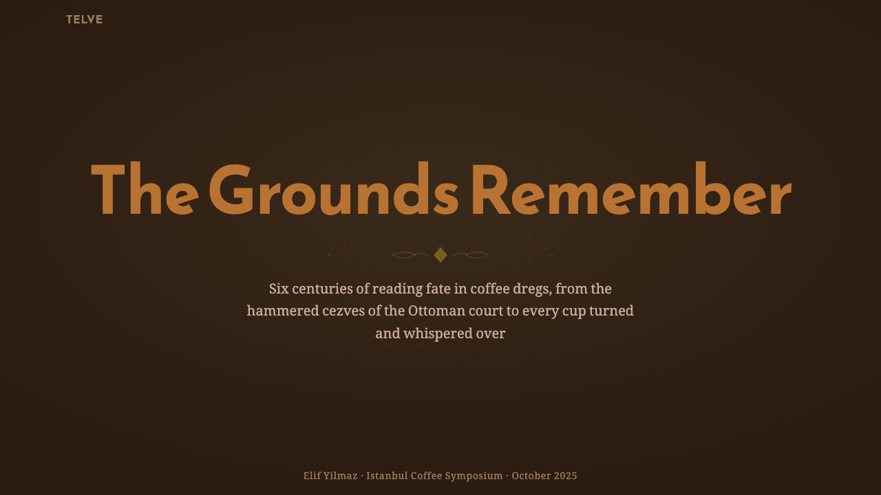
For presentation slides, a cover slide can use the coffee-brown ground with an Iznik-style arabesque border framing the title, set in Arabic-inspired calligraphic display type. Content slides should keep the radial division idea available as an occasional structural device — a circular content layout suggesting the read cup — rather than a rule applied to every slide, while data slides benefit from copper and terracotta as data-category colors against the dark ground.在演示文稿中,封面页可以用咖啡棕底色,配上伊兹尼克式卷草纹边框为标题镶边,标题以受阿拉伯书法启发的展示字体呈现。内容页应把放射状分区的理念保留为一种偶尔使用的结构手法——一种暗示占卜杯的圆形内容版面——而非套用于每一页的规则;数据页则适合用铜色与陶红作为深色底面上的数据类别颜色。
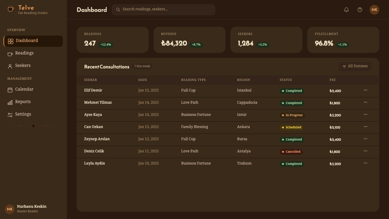
For web interfaces, the style is well-suited to hospitality, tea and coffee culture, heritage tourism, and any brand wanting a warm, ceremonial, evening-lit register rather than a bright, daytime one. Dashboards should reserve the porcelain off-white for focal elements against the dark ground, and card borders can carry a subtle arabesque motif without overwhelming content legibility.对于网页界面,这种风格适合酒店服务业、茶与咖啡文化、遗产旅游,以及任何希望呈现温暖、仪式感、夜晚灯光调性、而非明亮日间感的品牌。仪表板应把瓷白色专门保留给深色底面上的焦点元素,卡片边框可以带有一丝细微的卷草纹母题,但不应压倒内容的可读性。
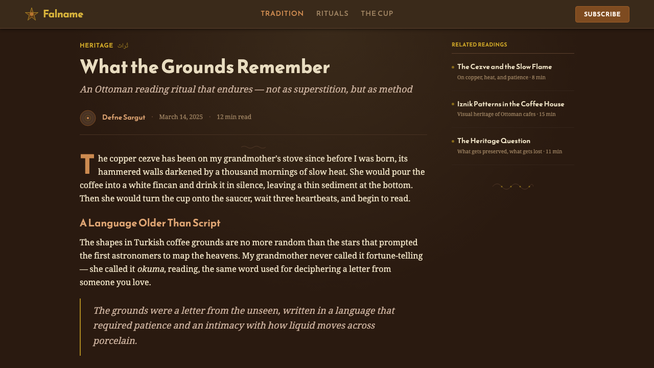
For editorial and marketing work, the register suits travel, cultural heritage, and lifestyle content genuinely engaged with Ottoman or Turkish material culture. Full-bleed dark coffee-brown sections with copper framing work well as chapter breaks, and marketing hero sections benefit from committing to the lamplit warmth throughout rather than mixing in bright, cool tones that would break the ritual mood.对于编辑与营销内容,这种调性适合真正与奥斯曼或土耳其物质文化相关联的旅行、文化遗产与生活方式类内容。整版铺满、以铜色镶边的深咖啡棕区块,适合作为章节分隔;营销主视觉区适合从头到尾坚持这种油灯般的暖意,而非混入明亮、冷冽的色调打破这种仪式氛围。
The most common mistake is treating this as generic "Middle Eastern" or "exotic fortune-telling" decoration without the specificity of the actual ritual — the cezve, the fincan, the past-future division of the cup. A second frequent error is overusing the arabesque framing so densely that it competes with content rather than framing it, losing the calm, legible center the original ceramic tradition always preserved.最常见的错误,是把这种风格当作泛泛的"中东风情"或"异域占卜"装饰,而不具备真实仪式的具体性——cezve小铜壶、fincan瓷杯、杯内过去-未来的分区。第二个常见错误,是过度使用卷草纹边框,密到与内容相互争夺注意力,而非为其镶边,丢失了原本陶瓷传统始终保留的、沉静易读的中心区域。
See the Turkish Coffee Fortune design system查看 Turkish Coffee Fortune 完整设计系统
Turkish Coffee Fortune — FAQTurkish Coffee Fortune · 常见问题
What is kahve falı and how literally should it be represented visually?什么是kahve falı,视觉上应在多大程度上直白地呈现它?
Kahve falı is the Ottoman tradition of reading a person's future from the pattern of coffee grounds left in an inverted, drained cup. The style does not require literal illustration of a cup or grounds in every application — its essence is better carried through the palette, the framing, and the radial past-future compositional device than through a repeated literal cup icon, which would quickly feel decorative rather than ritualistic.kahve falı是奥斯曼传统中,从倒扣、饮尽的杯中留下的咖啡渣形状读出一个人未来的仪式。这种风格并不要求在每一次应用中都直白地描绘一只杯子或咖啡渣——它的精髓更适合通过色板、边框以及放射状的过去-未来构图手法来承载,而非反复使用一个直白的杯子图标,那样很快会显得像装饰,而非仪式。
Why does the palette center on brown rather than a brighter, more "Middle Eastern bazaar" color scheme?为什么色板以棕色为中心,而非更明亮的"中东集市"式配色?
Because the ritual this style stages happens in a specific, intimate setting — a lamplit interior where coffee is brewed and a fortune is quietly read among a small group — rather than a public, daytime marketplace. A bazaar-bright palette would misrepresent that intimate, ceremonial mood, while the deep coffee-brown ground keeps the focus on the ritual's quiet, personal register.因为这种风格所呈现的仪式,发生在一个特定的、私密的场景之中——一间油灯照亮的室内空间,咖啡在其中被煮制,命运在一小群人之间被安静地解读——而非公开的、白日的集市。集市般明亮的色板会误呈这种私密、庄重的氛围,而深咖啡棕底色则让焦点始终停留在这场仪式安静、私人化的调性上。
How should Arabic-script display type be handled if the surrounding content is in another language?如果周围内容使用其他语言,阿拉伯文字体应如何处理?
The Arabic-inspired calligraphic display type is best reserved for headline or title moments where its ceremonial quality can stand alone, rather than applied to body text in a language it was not designed to render. Body copy should use a plain, highly legible typeface in whatever language the content requires, keeping the calligraphic reference as an accent rather than a functional text system.受阿拉伯文启发的书法展示字体,最适合保留给标题这类场合,让其仪式感得以独立呈现,而不应用于并非为其设计渲染的语言的正文文字。正文应使用朴素、高度易读的字体,配合内容所需的任何语言,把书法字体的引用保留为一种强调,而非一套功能性的文本系统。
Is this style specific to fortune-telling products, or can it be used more broadly?这种风格是否只适用于占卜类产品,还是可以更广泛地使用?
While the ritual origin is specific, the visual system — lamplit brown ground, copper and brass warmth, Iznik framing, Arabic-script display type — transfers well to any context wanting a warm, ceremonial, evening register: hospitality, cultural storytelling, or premium beverage branding, provided the connection to actual Ottoman or Turkish material culture is genuine rather than decorative shorthand.尽管这一仪式的起源是特定的,但这套视觉系统——油灯般的棕色底色、铜与黄铜的暖意、伊兹尼克式镶边、阿拉伯文展示字体——可以很好地移植到任何希望呈现温暖、庄重、夜晚调性的语境中:酒店服务业、文化叙事,或高端饮品品牌,前提是与真实的奥斯曼或土耳其物质文化的关联是真诚的,而非泛泛的装饰性简写。
Where does this style struggle or feel out of place?这种风格在哪些场景中会显得格格不入?
It struggles in bright, fast-paced, or purely functional contexts — utility software, logistics tools, or brands built on speed and efficiency rather than ritual and warmth. Its dense ornamental framing can also feel excessive in minimal, information-dense interfaces. It performs best when the product genuinely values ceremony, hospitality, or cultural heritage over pure functional speed.在明亮、快节奏或纯功能性的语境中,它会显得格格不入——实用型软件、物流工具,或建立在速度与效率、而非仪式感与温暖之上的品牌。它那繁密的装饰性边框在极简、信息密集的界面中,也可能显得过度。当产品真正看重仪式感、待客之道或文化传承、而非纯粹的功能速度时,它表现最好。
Related design styles相关设计风格
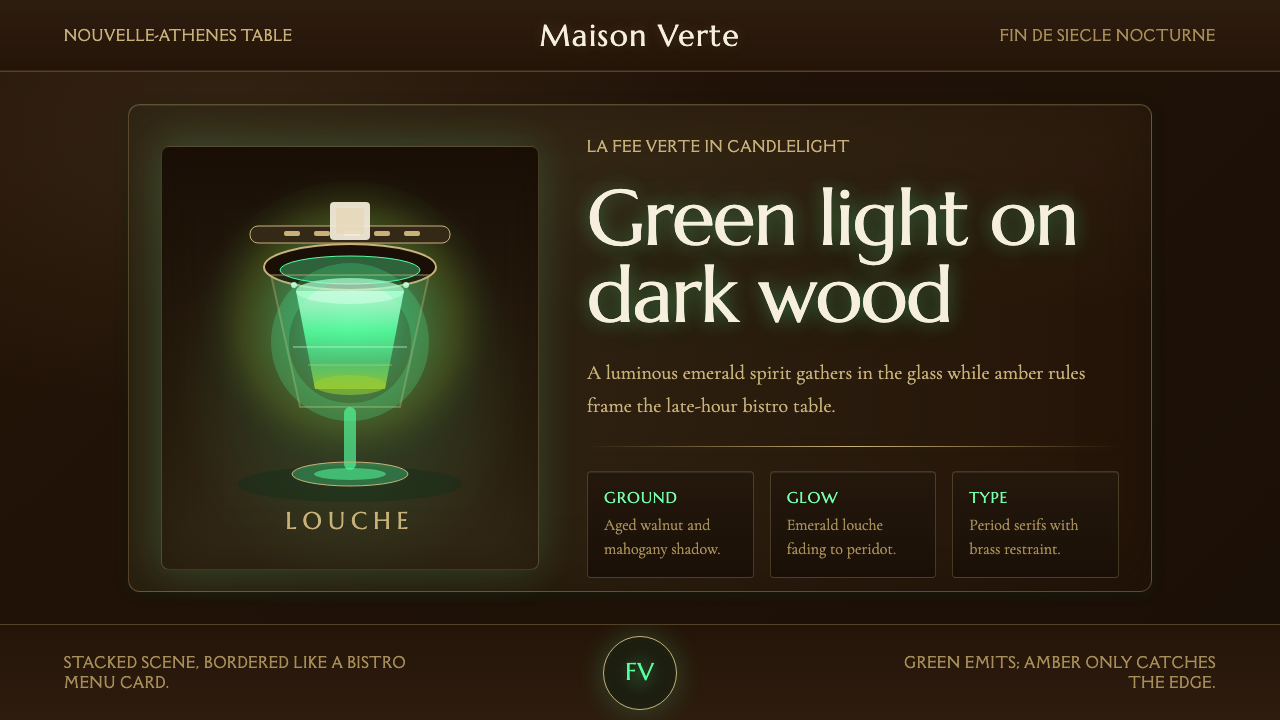 Absinthe Green Fairy GlowDarkness makes the fairy glow. Emerald louche on mahogany, framed by amber se…黑暗托起绿仙微光。桃花心木上翠绿乳浊,琥珀衬线收边。
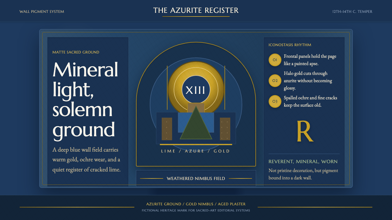 Serbian Medieval FrescoSacred wear becomes structure. Azurite fields, gold halos, and cracked plaste…神圣磨损成为结构。蓝铜矿底、金色光环与龟裂灰泥撑起画框。
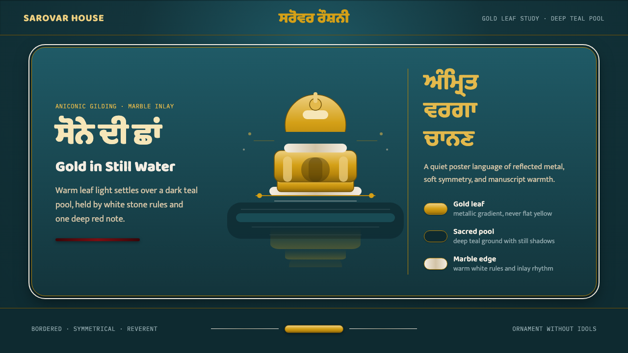 Sikh Golden TempleReverent gold in dark water. Teal ground, Gurmukhi type, marble rules hold th…暗水映金,庄重无像。深青底、古木基字体与白石线托住暖光。
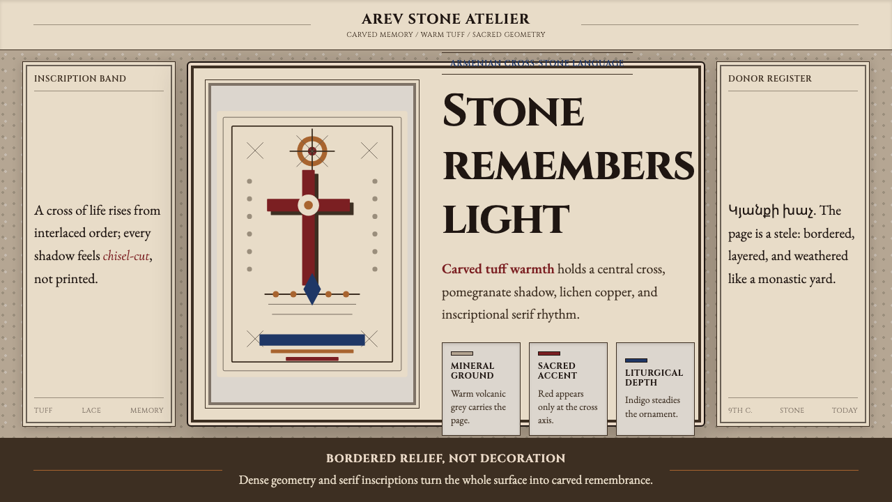 Armenian Khachkar Cross-StoneStone becomes memory. Tuff grey, pomegranate red, and carved borders hold the…石头成为记忆:凝灰岩灰、石榴红与刻痕边框托住十字中轴。
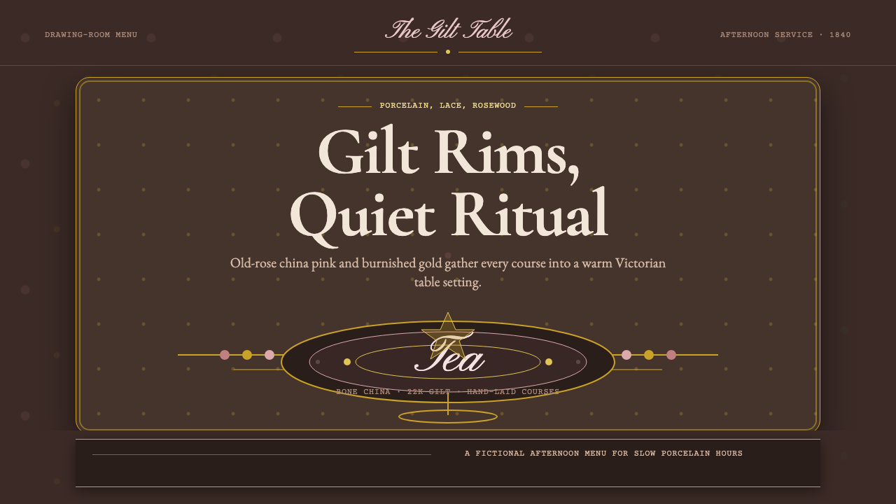 English Afternoon TeaOrnament is the ritual. Old-rose porcelain, gilt rims, and script rest on ros…装饰即仪式。旧玫瑰瓷粉、鎏金边与花体字落在玫瑰木暗底。
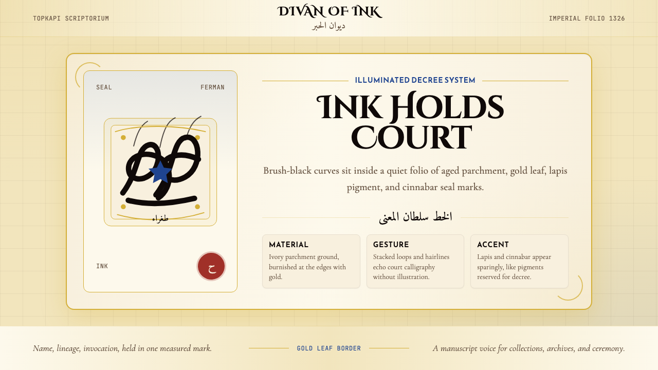 Ottoman Tughra CalligraphyImperial ink holds court. Gold borders, lapis panels, and Cinzel tughra-like…御墨自带威仪:金箔边框、青金石蓝与 Cinzel 花押式排版。