What is Silver Gelatin Darkroom?什么是 Silver Gelatin Darkroom?
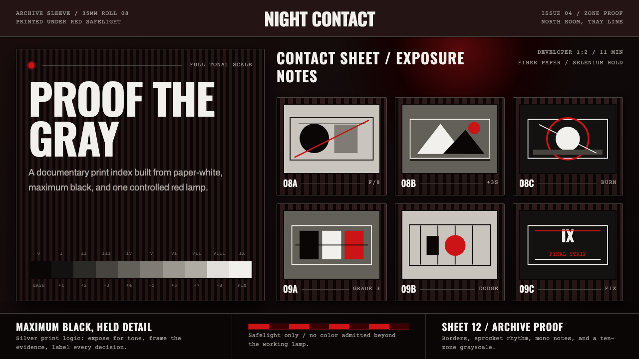
In the darkroom, tonality is the entire craft — a single red safelight, a full scale of grays, and nothing else competing for the eye.在暗房里,影调就是全部手艺——一盏红色安全灯、一整套灰阶,此外别无他物能与之争夺视线。
Silver Gelatin Darkroom in briefSilver Gelatin Darkroom 速览
Silver Gelatin Darkroom is a design language drawn from the working conditions and printed output of black-and-white documentary photography during the medium's mid-twentieth-century peak, roughly 1950 to 1990. The darkroom itself is the source: a room kept in near-total darkness except for a single deep-red safelight, under which the photographer processes prints without exposing the light-sensitive paper. Every gray value the viewer eventually sees is produced entirely by the print — there is no color in the process, only the calibrated relationship between black, white, and the tones between them.暗房银盐是一套设计语言,取材自黑白纪实摄影在二十世纪中叶鼎盛期(大致1950到1990年)的工作环境与印制成果。暗房本身就是这套语言的源头:一间几乎全黑的房间,唯一的光源是一盏深红色安全灯,摄影师在这盏灯下冲印相片,而不会曝光那些对光线敏感的相纸。观者最终看到的每一级灰阶,全部由相片本身产生——整个流程中没有颜色,只有黑、白与其间层层灰阶之间那种被精确校准的关系。
The style borrows its rigor from two overlapping traditions: the Zone System, a method for previsualizing and controlling exposure and development to produce a full, controlled tonal range, most closely associated with Ansel Adams; and the fast, unposed reportage tradition of agencies like Magnum, where photographers worked in the field rather than a studio and let contact sheets — small same-size proofs of an entire roll of film — record every frame shot, not just the chosen ones. Both traditions converge on the same visual vocabulary: film-frame borders, contact-sheet grids, and condensed, technical, uppercase typography that reads like a label on a developer tray or a note scrawled on an archival print sleeve.这种风格的严谨性来自两条相互交织的传统:区域曝光法(Zone System)——一种通过预先构想并控制曝光与显影来产出完整、可控影调范围的方法,最紧密地与安塞尔·亚当斯联系在一起;以及像马格南这样的通讯社所代表的快速、不摆拍的报道传统,在那里摄影师是在现场而非影棚工作,让小样(contact sheet,即一整卷胶卷的同尺寸小样接触印相)记录下拍摄的每一帧,而不只是最终选定的那些。两种传统最终汇聚于同一套视觉词汇:胶片边框、小样网格,以及窄体、技术感十足的全大写字体——读起来就像显影盘上的标签,或是档案相纸袋上潦草写下的批注。
Visually, the system commits entirely to grayscale — a full ten-zone range from true black to true white — with the single exception of the safelight's deep red, which appears only as an accent signaling the darkroom environment itself rather than as a decorative color. Everything else in the system, from borders to labels to grid lines, behaves as if it were printed on photographic paper: matte, high-contrast, and technical rather than painterly.在视觉上,这套系统完全投身于灰阶——从真正的黑到真正的白,一整套十区影调——唯一的例外是安全灯那种深红色,它只作为一处点缀出现,用以标示暗房环境本身,而非作为装饰性色彩。系统中其余的一切,从边框到标签到网格线,其表现方式都仿佛被印在相纸上:哑光、高对比、技术感十足,而非绘画感。
See the Silver Gelatin Darkroom design system查看 Silver Gelatin Darkroom 完整设计系统
Where does Silver Gelatin Darkroom come from?Silver Gelatin Darkroom 从何而来?
Silver gelatin printing — the technical process of exposing light-sensitive silver halide crystals suspended in a gelatin emulsion coated on paper — became the dominant photographic printing method from the late nineteenth century onward and remained the standard for black-and-white fine-art and documentary photography well into the digital era's arrival in the 1990s. The 1950 to 1990 window represents the medium's most concentrated period of institutional and artistic maturity: photography schools, agency wire services, and museum collecting departments all matured around the black-and-white silver print as the presumed final form of serious photographic work.银盐印相——即让悬浮于明胶乳剂中的感光卤化银颗粒(涂布于相纸之上)曝光显影的技术工艺——自十九世纪末起成为主导性的摄影印制方法,并在黑白美术摄影与纪实摄影领域一直保持标准地位,直到二十世纪九十年代数码时代真正到来。1950至1990年这段时期,代表着这一媒介在制度与艺术层面最为集中的成熟期:摄影学校、通讯社的电传图片业务,以及博物馆收藏部门,都是围绕着黑白银盐照片作为严肃摄影作品的既定终极形式而共同成熟起来的。
Ansel Adams, working primarily in the American West from the 1930s onward, developed and popularized the Zone System together with Fred Archer — a method of dividing the tonal range from pure black to pure white into ten discrete zones, allowing a photographer to previsualize a final print's exact tonal relationships before ever making the exposure. This system elevated darkroom printing from a mechanical finishing step to an act of deliberate artistic control, and it is the reason the style treats a full, evenly graduated gray scale as a core compositional value rather than an incidental technical fact.安塞尔·亚当斯自1930年代起主要在美国西部工作,他与弗雷德·阿彻共同发展并推广了区域曝光法——一种将从纯黑到纯白的影调范围划分为十个离散区域的方法,使摄影师能够在按下快门之前,就预先构想出最终成片精确的影调关系。这套系统把暗房印相从一道机械性的收尾工序,提升为一种刻意的艺术性掌控行为,这也正是这种风格把完整、均匀渐变的灰阶当作核心构图价值、而非附带技术细节的原因。
In parallel, agencies like Magnum Photos — founded in 1947 by photographers including Henri Cartier-Bresson and Robert Capa — built a documentary tradition oriented around speed, proximity, and unposed observation of real events, from Cartier-Bresson's concept of the 'decisive moment' to Dorothea Lange's Depression-era social documentary work for the Farm Security Administration and Robert Frank's unflinching survey of American life in 'The Americans.' These photographers worked with contact sheets as working documents — every frame from a roll printed small and uncropped on a single sheet, annotated with grease pencil to mark the frame worth enlarging — and that annotated, technical, un-precious object became as much a part of the visual culture as the finished prints themselves.与此同时,像玛格南图片社这样的机构——由亨利·卡蒂埃-布列松、罗伯特·卡帕等摄影师于1947年创立——建立起一种以速度、贴近与不摆拍地观察真实事件为导向的纪实传统:从卡蒂埃-布列松“决定性瞬间”的概念,到多罗西娅·兰格为农业安全局所做的大萧条时期社会纪实作品,再到罗伯特·弗兰克在《美国人》一书中对美国生活毫不留情的巡视。这些摄影师把小样当作工作文件来使用——一整卷胶卷的每一帧都以小尺寸、不裁切的形式印在同一张相纸上,再用油性铅笔在值得放大的画面上做标注——而这份被批注过的、技术性的、毫不珍贵化的物件,与最终成片一样,同样成为了这一视觉文化的一部分。
The style synthesizes both lineages: the controlled, previsualized tonal mastery of the Zone System and the raw, in-the-field urgency of documentary reportage, unified by the shared physical conditions of the darkroom — red safelight, chemical trays, drying lines of prints — where every image in this era was ultimately made real.这种风格综合了这两条谱系:区域曝光法那种受控的、预先构想的影调掌控,以及纪实报道那种在现场、原始而急迫的气质,二者由这个时代所有影像最终得以成真的共同物理条件——红色安全灯、化学药盘、晾晒相片的线——统一在一起。
What defines the Silver Gelatin Darkroom look?Silver Gelatin Darkroom 的视觉特征是什么?
Tonal Range影调范围
A full, deliberately graduated scale from true black to true white is the style's central discipline, directly inheriting the Zone System's insistence on controlled tonal separation. Flat gray fields lacking real black anchors or clean white highlights read as unfinished or muddy by this style's standards — the full range must be present and legible for the tonal logic to hold.从真正的黑到真正的白、经过刻意分级的完整影调,是这种风格的核心纪律,直接继承了区域曝光法对可控影调分离的坚持。缺乏真正黑色锚点或干净白色高光的平灰色域,按这种风格的标准会显得未完成或浑浊——完整的影调范围必须存在且清晰可辨,这套影调逻辑才能成立。
The Safelight Red安全灯红
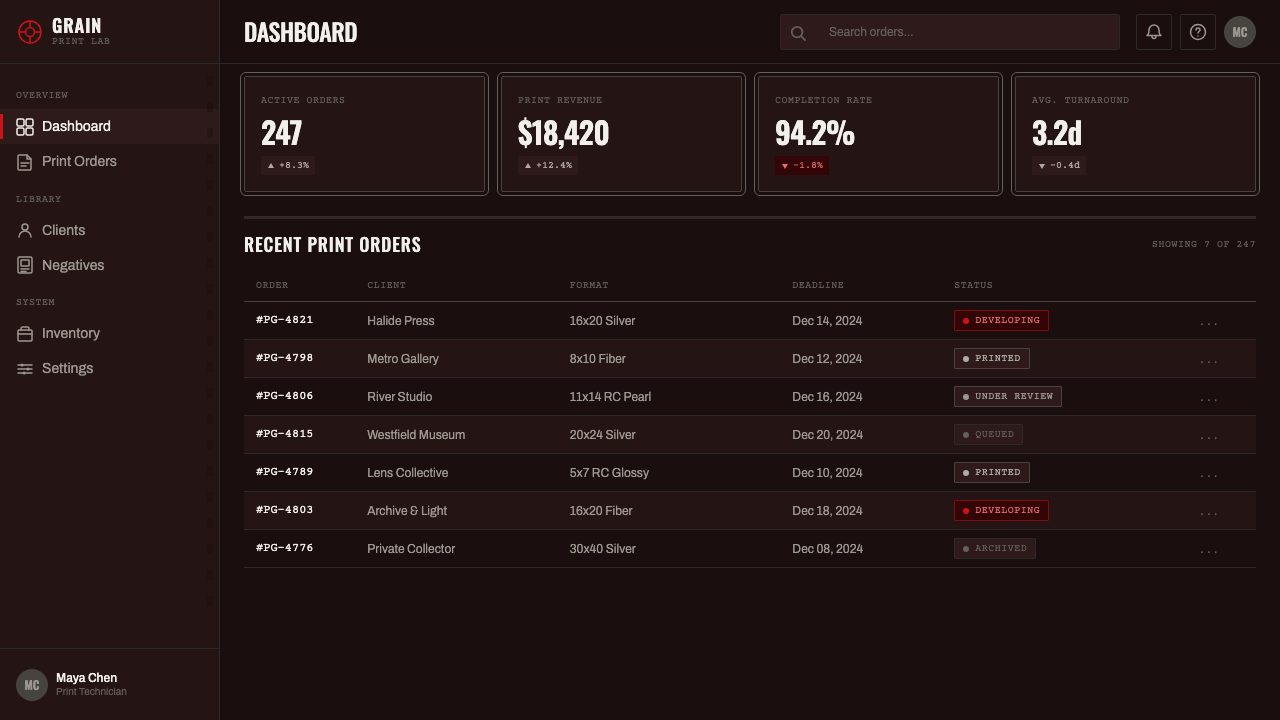
A single deep, muted red is the only non-grayscale color permitted, used sparingly to signal the darkroom environment itself — a warning label, a small indicator light, an edge marking. It should never spread into a decorative field or compete with the tonal composition; its role is atmospheric and functional, echoing the one light source by which the entire process is conducted.唯一允许出现的非灰阶颜色,是一种深沉、内敛的红色,用量克制,用来标示暗房环境本身——一张警示标签、一枚小小的指示灯、一道边缘标记。它绝不应蔓延成一片装饰性色域,也不应与影调构图相互竞争;它的作用是氛围性与功能性的,呼应着整个流程赖以进行的那唯一一处光源。
Film-Frame Borders胶片边框
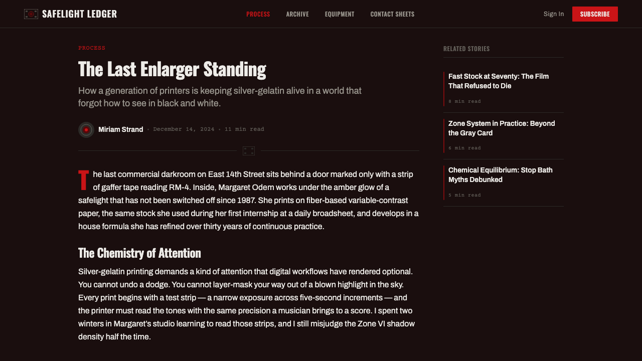
Images and content blocks are framed with the visible sprocket-hole and rebate-edge markings of 35mm or medium-format film, treating the frame border as a legible technical artifact rather than hiding it. This borrowed convention signals that the content is unretouched, direct documentary evidence rather than a polished composed graphic.图像与内容区块的边框,带着35毫米或中画幅胶片可见的齿孔与片边标记,把边框当作一份清晰可辨的技术性证物来呈现,而非将其隐藏。这一借用的惯例传达出一种信息:内容是未经修饰的直接纪实证据,而非精心构图的美化图形。
Contact-Sheet Grids小样网格
Multiple images or content items are arranged in the small, evenly spaced, uncropped grid of a contact sheet — every item shown at equal size regardless of its eventual importance, mimicking the working document a photographer used to survey an entire roll before selecting frames worth enlarging.多张图像或内容条目按照小样那种小尺寸、间距均匀、不裁切的网格排列——无论内容最终的重要程度如何,每个条目都以同等尺寸呈现,模拟摄影师用来审视整卷胶卷、从中挑选值得放大画面的那份工作文件。
Technical Typography技术感字体排印
Condensed grotesque sans-serif and typewriter-style monospace fonts, set in uppercase for labels, replicate the appearance of stamped or typed technical annotations — exposure notes, frame numbers, archival cataloguing stamps. Type should read as functional documentation rather than expressive branding.窄体的怪诞无衬线字体与打字机风格的等宽字体,以全大写形式用于标签,复现出盖印或打字式技术批注的外观——曝光记录、帧号、档案编目印章。字体应当读起来像功能性文档记录,而非表达性的品牌字体。
Grease-Pencil Marks油性铅笔标记
Circles, crop marks, and crossed-out frames — the marks an editor made directly on a contact sheet to indicate a selected or rejected image — function as an authentic accent motif, signaling a working, in-progress document rather than a finished, presented one.圆圈、裁切标记,以及被划掉的画面——编辑直接在小样上留下的、用以标示选中或淘汰画面的标记——充当着一种真实可信的点缀母题,暗示这是一份正在进行中的工作文件,而非一份已经完成、被展示出来的成品。
Matte, Non-Reflective Surface哑光不反光表面
The style rejects glossy sheen and specular highlight in favor of matte, absorbent surface qualities, consistent with the fiber-based matte photographic papers commonly used in fine-art printing of this era. Nothing should read as glassy or high-gloss; the tonal richness comes from the gray scale itself, not from surface reflectivity.这种风格拒绝光泽感与镜面高光,偏爱哑光、吸光的表面质感,与那个时代美术摄影常用的纤维基哑光相纸相符。任何地方都不应读起来像玻璃质感或高光泽面;影调的丰富感来自灰阶本身,而非表面的反光度。
See the Silver Gelatin Darkroom design system查看 Silver Gelatin Darkroom 完整设计系统
Who shaped Silver Gelatin Darkroom?谁塑造了 Silver Gelatin Darkroom?
Adams co-developed the Zone System with Fred Archer, a method for previsualizing and controlling the full tonal range of a photograph from exposure through printing. His large-format landscape work of the American West became the technical and artistic benchmark for controlled black-and-white tonality, and his influence is the direct reason this style treats a full, graduated gray scale as its central discipline.亚当斯与弗雷德·阿彻共同发展出区域曝光法,一种从曝光到印相全程预先构想并控制影像完整影调范围的方法。他在美国西部拍摄的大画幅风光作品,成为受控黑白影调的技术与艺术标杆,他的影响力正是这种风格把完整、渐变的灰阶当作核心纪律的直接原因。
A co-founder of Magnum Photos and originator of the concept of the 'decisive moment,' Cartier-Bresson worked in fast-moving, unposed street and reportage contexts, relying on contact sheets to review entire rolls of unedited film. His practice is central to the style's contact-sheet grid and film-frame border motifs.作为玛格南图片社的联合创始人以及“决定性瞬间”概念的提出者,卡蒂埃-布列松在节奏迅疾、不摆拍的街头与报道语境中工作,依靠小样来审视整卷未经剪辑的胶卷。他的实践是这种风格中小样网格与胶片边框母题的核心来源。
Working for the Farm Security Administration during the Great Depression, Lange produced some of the era's most influential social documentary photography, including 'Migrant Mother.' Her work exemplifies the style's documentary register — unposed, tonally rich, and made under real working conditions rather than studio control.兰格在大萧条时期为农业安全局工作,创作出那个时代最具影响力的社会纪实摄影作品之一,包括《移民母亲》。她的作品体现了这种风格的纪实基调——不摆拍、影调丰富,是在真实的工作条件下拍摄完成,而非在影棚的掌控之下。
Frank's 1958 photobook 'The Americans' presented an unvarnished, tonally stark survey of American life shot across the country, breaking from the more polished photojournalism conventions of his time. His raw, high-contrast approach to black-and-white printing is a key reference point for the style's commitment to unretouched documentary tonality.弗兰克1958年出版的摄影集《美国人》,以一种不加修饰、影调强烈的方式,呈现了他穿越全国拍摄的美国生活图景,突破了当时更为精致光鲜的摄影新闻惯例。他那种原始、高对比的黑白印相方式,是这种风格坚持未经修饰的纪实影调的一个关键参照点。
How do you use Silver Gelatin Darkroom today?今天怎么用 Silver Gelatin Darkroom?
Silver Gelatin Darkroom transfers well to any digital product wanting to signal editorial seriousness, documentary authenticity, or archival credibility — photojournalism outlets, museum and archive interfaces, film and photography education platforms, or brands positioning themselves around unretouched authenticity rather than polish. Because the style's core discipline is tonal rigor, applying it correctly means resisting the temptation to introduce color for warmth or vibrancy; nearly everything must survive translation into grayscale.暗房银盐这套风格,很适合任何想要传达编辑严肃性、纪实真实感或档案可信度的数字产品——新闻摄影机构、博物馆与档案界面、电影与摄影教育平台,或是那些围绕着未经修饰的真实感而非光鲜精致来定位自己的品牌。由于这种风格的核心纪律是影调的严谨性,正确应用它意味着要抵制为了温暖感或鲜艳度而引入色彩的诱惑;几乎所有内容都必须能经受住转译为灰阶的考验。
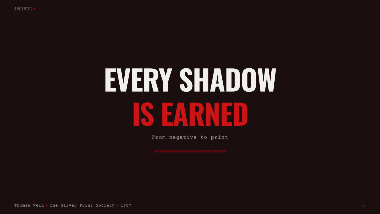
For presentation slides, a cover works well as a full-bleed high-contrast black-and-white image with a film-frame border and a small, technical, uppercase caption in one corner — echoing an archival print sleeve. Content slides should adopt the discipline of a contact sheet: a grid of equally weighted panels, condensed sans-serif or monospace labels, and grease-pencil-style circle or crop marks used sparingly to draw attention to a single selected item. Data visualization suits this style unusually well, since bar charts, tonal gradients, and step charts translate naturally into a full grayscale range — a chart rendered entirely in the ten-zone gray scale, with the safelight red reserved for a single highlighted data point, reads as authoritative rather than flat.在演示文稿中,封面适合做成一张出血满版的高对比度黑白图像,配上胶片边框,以及角落里一行小小的、技术感十足的全大写说明文字——呼应档案相纸袋的样子。内容页应当采用小样的纪律:一个各面板分量相当的网格、窄体无衬线或等宽字体的标签,以及节制使用的油性铅笔式圆圈或裁切标记,用来把注意力引向某一个被选中的条目。数据可视化与这种风格出奇地契合,因为柱状图、影调渐变与阶梯图都能自然地转译为完整的灰阶范围——一张完全以十区灰阶渲染的图表,把安全灯红保留给某个被高亮的数据点,会显得权威而不平淡。
For web interfaces, the style suits photography portfolios, editorial archives, and documentation-heavy tools where a technical, unfussy register builds credibility. A gallery interface benefits from a contact-sheet-style grid view as the default browsing mode, with film-frame borders around each thumbnail and uppercase technical labels (frame number, date, location) rather than decorative captions. Interactive states can use the safelight red sparingly — a selected state, an active filter — rather than scattering accent color throughout the interface.对于网页界面,这种风格适合摄影作品集、编辑档案,以及以文档为重的工具类产品,那种技术性、不做作的基调能够建立可信度。一个画廊界面得益于把小样式的网格视图作为默认浏览模式,每个缩略图周围带着胶片边框,用全大写的技术标签(帧号、日期、地点)而非装饰性说明文字。交互状态可以克制地使用安全灯红——一个选中状态、一个激活的筛选项——而不是把强调色散布在整个界面中。
For editorial and marketing work, the style favors long-form photo essays, archival retrospectives, and behind-the-scenes documentary storytelling. Pull quotes and captions read well set in the condensed technical typeface, and section dividers can borrow the film-frame border motif to separate chapters the way a contact sheet separates rolls of film.对于编辑与营销内容,这种风格偏爱长篇图片专题、档案回顾,以及幕后纪实叙事。引言与说明文字用窄体的技术字体排版效果很好,章节分隔可以借用胶片边框母题来分隔篇章,就像小样用来分隔不同卷胶卷一样。
A common mistake is introducing color photography or bright accent colors beyond the single safelight red, which immediately breaks the tonal discipline the entire style depends on. A second common mistake is over-polishing the surface — adding glossy sheen, soft gradients, or rounded corners that read as contemporary UI convention rather than the matte, hard-edged, technical object the darkroom tradition produced.一个常见的错误是引入彩色摄影或超出安全灯红这唯一一色之外的鲜亮点缀色,这会立即破坏整个风格所依赖的影调纪律。第二个常见的错误是把表面处理得过于光鲜——添加光泽感、柔和渐变或圆角,这些读起来像是当代UI惯例,而非暗房传统所产出的那种哑光、硬边、技术性的物件。
See the Silver Gelatin Darkroom design system查看 Silver Gelatin Darkroom 完整设计系统
Silver Gelatin Darkroom — FAQSilver Gelatin Darkroom · 常见问题
Why is only one color — a deep red — allowed in this style?为什么这种风格只允许一种颜色——深红色——存在?
Because that red is not a decorative choice but a direct reference to the safelight, the single light source under which darkroom printing was physically conducted. Every other element in the source environment — the print, the contact sheet, the developer trays — existed in grayscale under that red light. Allowing any other color into the system would break the direct link between the visual language and the physical darkroom it represents.因为那种红色并非装饰性选择,而是对安全灯的直接指涉——暗房印相在物理上正是依靠这唯一一处光源进行的。源环境中的一切其他元素——相片、小样、显影盘——在那盏红灯下都以灰阶存在。让系统中出现任何其他颜色,都会切断这套视觉语言与它所代表的实体暗房之间的直接联系。
How does this style differ from a generic 'black and white' design theme?这种风格与泛泛的“黑白”设计主题有什么不同?
A generic black-and-white theme simply desaturates color; this style specifically encodes the Zone System's full, deliberately graduated ten-value tonal scale, the physical artifacts of film photography (frame borders, contact-sheet grids), and the technical, documentary typography of darkroom labeling. It is a specific historical craft practice rendered as a design language, not merely an absence of hue.泛泛的黑白主题只是简单地去除色彩饱和度;而这种风格特别编码了区域曝光法那套完整、刻意分级的十级影调,胶片摄影的实体物件(胶片边框、小样网格),以及暗房标签那种技术性、纪实性的字体排印。它是一种被转化为设计语言的具体历史手艺实践,而不仅仅是色相的缺席。
Can this style be used for consumer-facing lifestyle brands?这种风格能用于面向消费者的生活方式品牌吗?
It can, but it works best when the brand genuinely values technical craft and unretouched authenticity rather than warmth or approachability. Its cool, austere, documentary tone can feel clinical or severe in a context that wants to feel inviting, so it suits editorial, archival, and craft-focused brands more naturally than casual consumer lifestyle products.可以,但它在品牌真正看重技术手艺与未经修饰的真实感、而非温暖或亲和力的语境中效果最好。它那种冷静、朴素的纪实基调,在需要给人邀请感的语境中可能显得冷峻甚至严苛,因此它更自然地适合编辑类、档案类,以及以手艺为重的品牌,而非休闲的消费生活方式产品。
Does data visualization work well in this style?这种风格适合用来做数据可视化吗?
Unusually well, in fact. Because the style already commits to a full, controlled grayscale range, bar charts, step charts, and tonal gradients translate naturally into it — the ten-zone scale gives charts a legible, evenly graduated value range to work with. The single safelight red can be reserved to highlight one specific data point or state, giving charts a clear focal hierarchy without breaking the grayscale discipline.事实上出人意料地契合。由于这种风格本身就致力于一套完整、受控的灰阶范围,柱状图、阶梯图与影调渐变都能自然地转译进去——十区灰阶为图表提供了一套清晰、均匀分级的数值区间可用。唯一的安全灯红可以保留下来,专门用于高亮某一个特定的数据点或状态,让图表拥有清晰的焦点层级,同时不破坏灰阶的纪律。
What kind of imagery best fits this style?什么样的图像最适合这种风格?
High-contrast, unposed black-and-white photography — street reportage, portraiture with visible grain, architectural or landscape work with a full tonal range from deep black to bright highlight — fits naturally. Heavily retouched, softly lit, or color-graded imagery works against the style, since it introduces a polish the darkroom tradition specifically did not aim for.高对比度、不摆拍的黑白摄影——街头报道、带有明显颗粒感的肖像、拥有从深黑到明亮高光完整影调范围的建筑或风光作品——都能自然契合。经过大量修饰、柔光处理或做过色彩分级的图像,则与这种风格背道而驰,因为它们引入了暗房传统特意不去追求的那种光鲜精致。
Related design styles相关设计风格
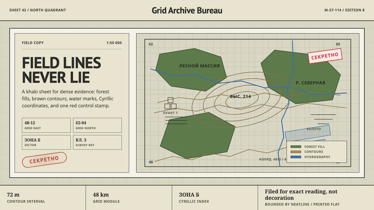 Soviet Classified MapAustere field intelligence. Khaki grid, forest green fills, brown contours, r…冷峻的野外情报感:卡其网格、森林绿块、棕色等高线与红印。
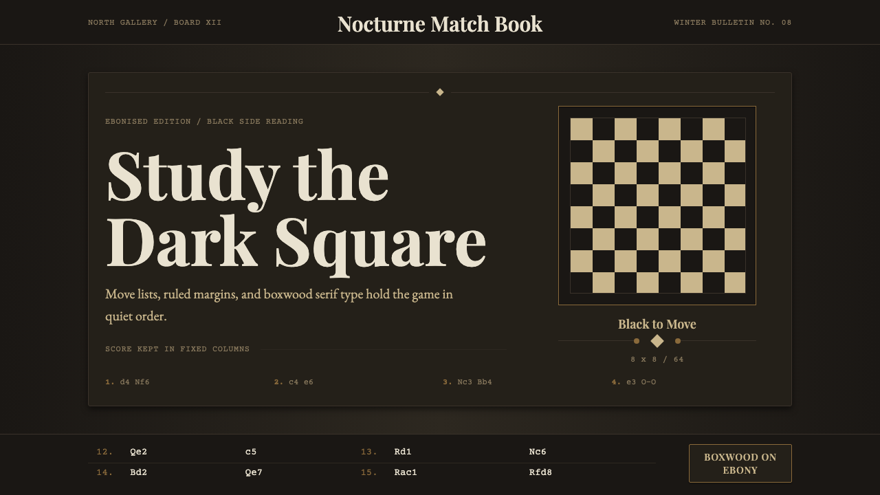 Chess TournamentQuiet intellect. Cream Playfair type, walnut rules, and notation glow on ebon…安静的智性:乌木底上乳白衬线、胡桃细线与记谱发光。
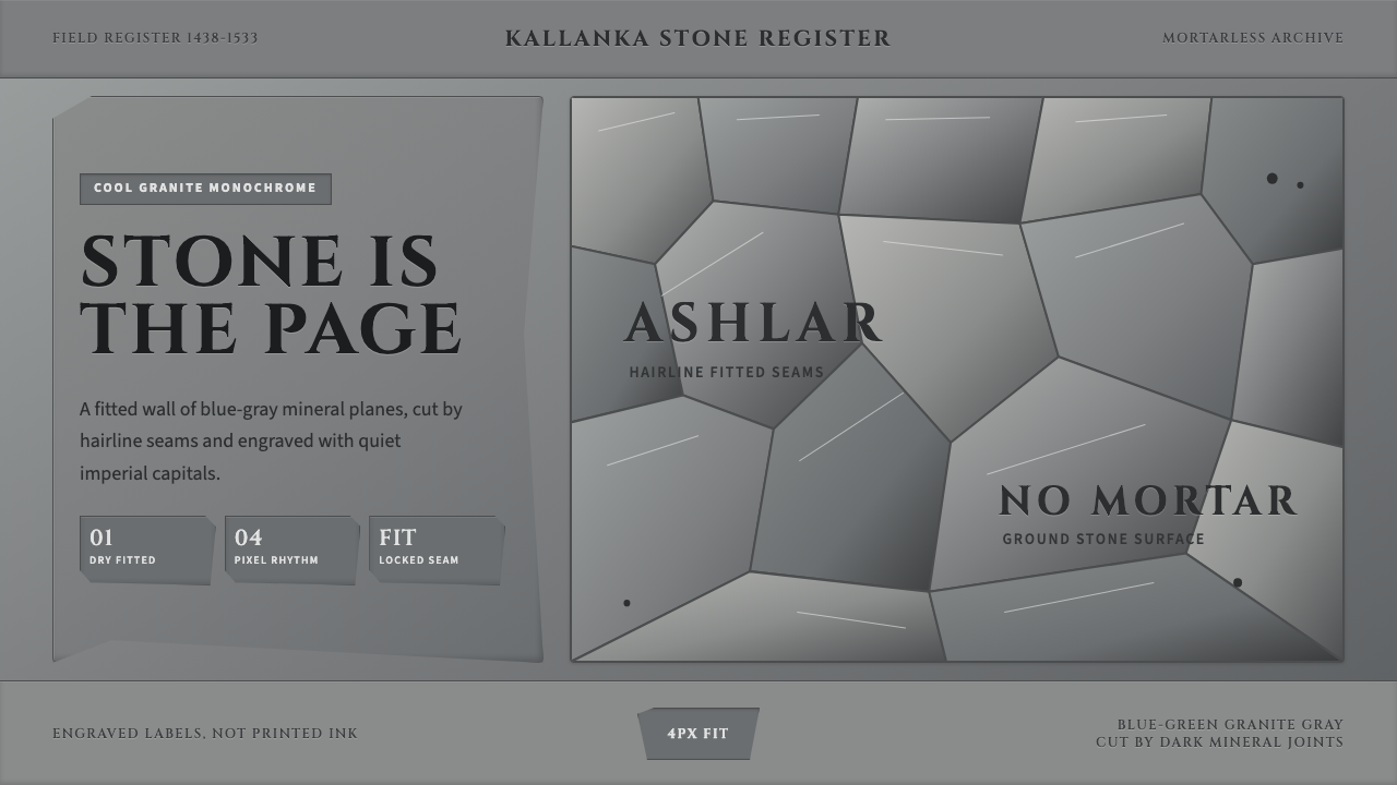 Inca Ashlar StoneworkStone becomes the page. Granite-gray planes lock into hairline ashlar seams.石墙即页面。花岗岩灰块面以发丝石缝咬合。
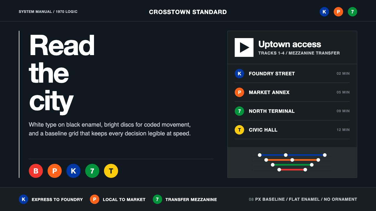 NYC Transit HelveticaOrder made visible. White type, black enamel, route discs, and a grid that ne…秩序一眼可见:黑底白字、线路圆盘与永不弯折的网格。
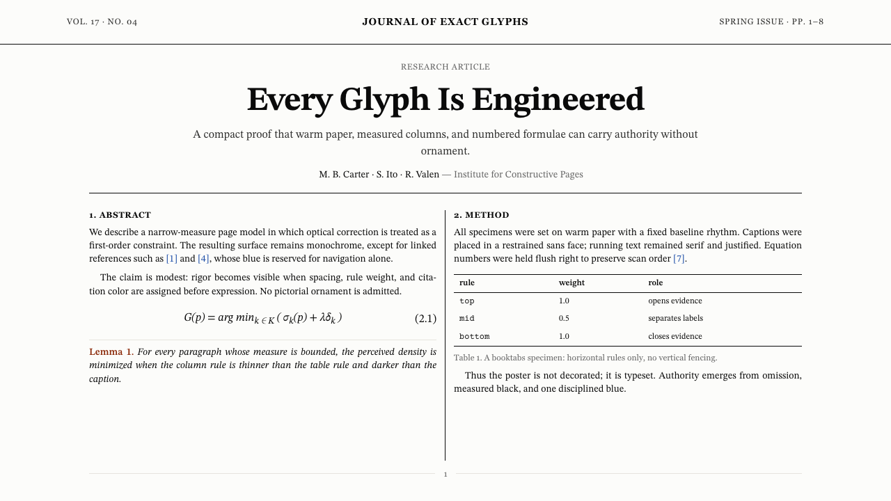 TeX Academic PaperRigor without ornament. Warm paper, Computer Modern text, hairline columns, o…无装饰的严谨:暖纸、Computer Modern、发丝栏线与唯一蓝色链接。
 Ansel Adams Zone SystemOnly light remains. Deep shadow, serif captions, and one white moon mark the…只剩光:深暗底、衬线标注与一枚白月排出灰阶。