What is Soviet Classified Map?什么是 Soviet Classified Map?
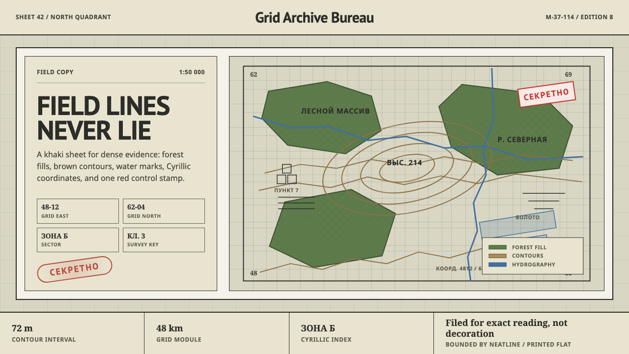
The Soviet General Staff mapped the entire planet in secret to one rigid standard — a design system built for coverage and precision, never for beauty.苏军总参谋部秘密地把整个地球测绘成图,用的是同一套严苛的标准——一套只为覆盖与精确而生、从不为美观而生的设计体系。
Soviet Classified Map in briefSoviet Classified Map 速览
Soviet Classified Map is a design system drawn from the Genshtab maps — the vast cartographic project undertaken by the Soviet General Staff between 1950 and 1990, which mapped the entire planet, not just Soviet territory, to a single rigorous and highly standardized visual code. This was one of the largest mapping efforts in human history, and every sheet, whether depicting Moscow or a foreign city the USSR had never officially surveyed, followed identical conventions.「苏联绝密地图」这套设计体系,取材自根什塔布(Genshtab)地图——苏军总参谋部在1950至1990年间开展的浩大制图工程,其测绘范围涵盖整个地球,而不仅仅是苏联境内领土,全部依照单一严谨、高度标准化的视觉规范绘制。这是人类历史上规模最大的制图工程之一,无论描绘的是莫斯科,还是一座苏联从未正式勘测过的外国城市,每一幅图纸都遵循完全相同的惯例。
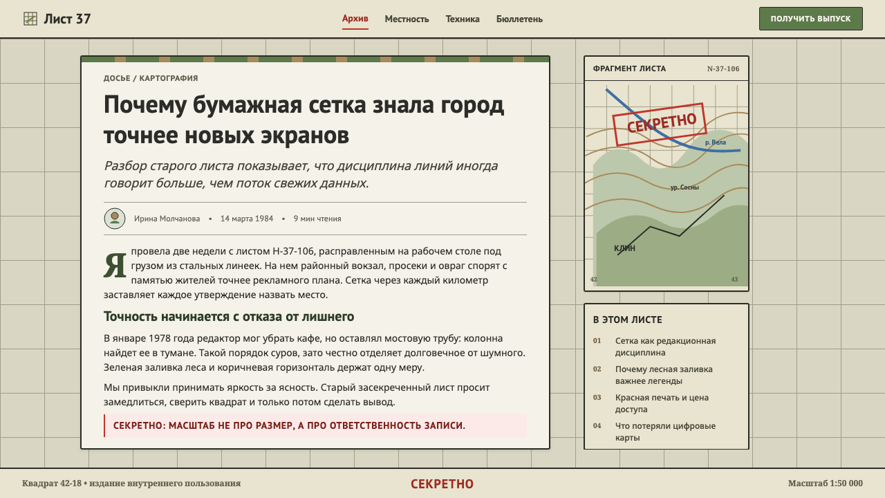
The visual language is built for density and legibility rather than decoration: khaki-gray base sheets carry forest-green polygons marking wooded areas, brown contour lines tracing elevation, and a precise kilometer grid annotated in Cyrillic labels. Every sheet also carried a red СЕКРЕТНО ("secret") stamp, marking its classified status — a detail that makes the maps read simultaneously as technical documents and as artifacts of state surveillance.这套视觉语言是为密度与可辨识度而生,而非为装饰而生:卡其灰的底图承载着标示林地的森林绿多边形、勾勒海拔的棕色等高线,以及标注西里尔字母的精确公里网格。每一幅图纸都盖有一枚红色的「СЕКРЕТНО」(绝密)印章,标示其保密级别——这一细节让这些地图同时读起来既是技术文件,又是国家监控的实物证据。
What distinguishes this system from ordinary cartography is its deliberate refusal of ornament. Nothing on a Genshtab sheet exists to please the eye — flat tinted fills replace illustrative shading, fine line-work replaces decorative borders, and condensed labels pack maximum information into minimum space. The single red stamp is the only element in the entire system that carries emotional weight rather than pure information; everything else exists purely to locate.让这套体系区别于普通制图学的,是它对装饰的刻意拒绝。根什塔布图纸上的任何元素都不是为了赏心悦目而存在——扁平的着色填充取代了写景式的晕渲,纤细的线条取代了装饰性的边框,紧缩的标注文字把最大量的信息塞进最小的空间。整套体系中唯一带有情感分量、而非纯粹信息的元素,只有那一枚红色印章;其余的一切,存在的目的只有一个:定位。
See the Soviet Classified Map design system查看 Soviet Classified Map 完整设计系统
Where does Soviet Classified Map come from?Soviet Classified Map 从何而来?
The Genshtab mapping program was conducted by the Soviet Military Topographic Directorate (Военно-топографическое управление ГШ), the cartographic arm of the Soviet General Staff, working in coordination with the Main Directorate of Geodesy and Cartography (ГУГК). Beginning in earnest in the 1950s and continuing through 1990, the program set out to produce topographic maps not merely of Soviet territory but of the entire globe, at a level of detail that in many cases exceeded what was publicly available even within the countries being mapped.根什塔布制图项目由苏军总参谋部下属的军事测绘局(Военно-топографическое управление ГШ)执行,并与国家大地测量与制图总局(ГУГК)协同合作。这一项目自1950年代正式全面展开,一直延续到1990年,目标不仅是测绘苏联境内领土,而是整个地球,其详细程度在许多情况下甚至超过了被测绘国家自己所公开的资料。
The scale of the ambition reflected Cold War military doctrine: Soviet strategic planning assumed the possibility of conflict anywhere on Earth, and commanders needed reliable topographic intelligence for any theater, regardless of whether the USSR had ever formally surveyed that ground. Soviet cartographers combined captured foreign maps, satellite and aerial reconnaissance, agent-gathered ground intelligence, and existing published geography to assemble sheets often more accurate and more current than the host nation's own public maps.这种雄心的规模,反映了冷战时期的军事教条:苏联的战略规划设想冲突可能发生在地球上任何地方,指挥官需要可靠的地形情报来应对任何战场,无论苏联是否曾正式勘测过那片土地。苏联制图人员综合了缴获的外国地图、卫星与航空侦察资料、特工搜集的地面情报,以及已出版的地理资料,绘制出的图纸往往比东道国自己的公开地图更精确、更及时。
Every sheet followed an identical, tightly disciplined visual standard regardless of subject: the same khaki-gray base tone, the same forest-green convention for wooded terrain, the same brown contour interval logic, and the same kilometer grid system tied to a unified Soviet coordinate reference. This standardization was not an aesthetic choice so much as an operational necessity — a Soviet officer trained to read one sheet from Siberia needed to be able to read a captured or reproduced sheet of a foreign city without retraining, which meant the visual code had to be absolutely uniform across the entire multi-decade, planet-spanning project.无论描绘的是什么主题,每一幅图纸都遵循完全相同、高度严谨的视觉标准:同样的卡其灰底色调,同样标示林地的森林绿惯例,同样的棕色等高线间距逻辑,以及同样与统一的苏联坐标基准相连的公里网格系统。这种标准化与其说是一种美学选择,不如说是一种作战上的必要——一名受训于阅读西伯利亚图纸的苏军军官,需要无需重新培训就能读懂一幅缴获或复制的外国城市图纸,这意味着这套视觉规范必须在这个跨越数十年、覆盖全球的项目中绝对统一。
Because the maps were produced for military intelligence purposes and frequently depicted foreign territory the Soviet government had no legal right to survey, nearly every sheet carried a classification stamp — most commonly the red SECRET (СЕКРЕТНО) marking. After the collapse of the Soviet Union in 1991, large quantities of these maps entered private and commercial circulation, and cartographers and historians worldwide discovered that in many cases they represented some of the most detailed and accurate topographic surveys of certain regions that existed anywhere at the time, occasionally surpassing locally produced civilian maps.由于这些地图是为军事情报目的制作、且常常描绘苏联政府无权测绘的外国领土,几乎每一幅图纸都盖有保密印章——最常见的是红色的「绝密」(СЕКРЕТНО)标记。1991年苏联解体后,大量这类地图流入私人与商业渠道,全球的制图学者与历史学家发现,在许多情况下,这些图纸代表了当时某些地区存在过的最详尽、最精确的地形测绘,有时甚至超过了当地制作的民用地图。
What defines the Soviet Classified Map look?Soviet Classified Map 的视觉特征是什么?
Color色彩
A restrained, muted palette of khaki-gray base tone, forest-green area fills, and brown contour lines governs the entire system, with red reserved exclusively for the classification stamp and any critical annotation. The overall effect is deliberately unglamorous — designed for a functional working document read under field conditions, not for display.一套克制、含蓄的色板——卡其灰底色调、森林绿的区域填充与棕色等高线——统摄整个体系,红色则专门保留给保密印章与任何关键批注。整体效果是刻意去魅的——为一份在野外条件下阅读的实用工作文件而设计,而非为展示而设计。
Contour Lines等高线
Brown contour lines trace elevation at regular, precise intervals, rendered as fine, consistent linework rather than artistic shading. These lines are functional first — every curve corresponds to an exact measured elevation value — and their visual rhythm across a sheet comes entirely from terrain data rather than any decorative intent.棕色等高线以固定、精确的间距勾勒海拔,呈现为纤细、粗细一致的线条,而非艺术化的晕渲。这些线条首先是功能性的——每一道曲线都对应着一个精确测量的海拔数值——它们在图纸上呈现出的视觉韵律,完全来自地形数据本身,而非任何装饰意图。
Area Fills面积填充
Forest-green polygons mark wooded terrain as flat, uniform color blocks rather than illustrated tree textures. This flat-fill convention extends to other terrain types as well — the system prioritizes instant categorical recognition over naturalistic representation, so a forest reads as a solid green shape rather than a picture of trees.森林绿多边形以扁平、均匀的色块标示林地,而非绘制树木的插图纹理。这种扁平填充的惯例同样延伸到其它地形类型——这套体系优先考虑瞬时可辨识的类别归属,而非自然主义的写实呈现,所以一片森林读起来是一块实心的绿色形状,而非一幅树木的图画。
Grid System网格系统
A precise kilometer grid overlays every sheet, rendered as thin, evenly spaced lines with small numeric labels at intersections. The grid exists purely to locate — it never doubles as a decorative border or framing device, and its lines are kept visually subordinate to the terrain data they sit above.一套精确的公里网格覆盖在每一幅图纸之上,呈现为细密、等距的线条,交叉点处标有小号数字标签。这套网格纯粹是为了定位而存在——它从不兼作装饰性边框或取景装置,其线条在视觉上始终从属于它所覆盖的地形数据。
Cyrillic Labeling西里尔字母标注
Text labels are set in condensed Cyrillic type, packed tightly to maximize the information density a single sheet can carry. Even foreign place names were transliterated into Cyrillic to maintain the reading system's internal consistency, regardless of the map's actual geographic subject.文字标注以紧缩的西里尔字体排列,紧密排布,以最大化单张图纸所能承载的信息密度。即便是外国地名,也被转写为西里尔字母,以维持这套阅读体系内部的一致性,无论地图实际描绘的是哪个地理主题。
The Classification Stamp保密印章
A red СЕКРЕТНО ("secret") stamp appears on most sheets, the single element in the entire system that carries emotional or narrative weight beyond pure cartographic function. It functions almost like a signature of the map's origin and purpose, marking it as a state intelligence document rather than a public reference tool.一枚红色的「СЕКРЕТНО」(绝密)印章出现在大多数图纸上,是整套体系中唯一一个承载着超越纯粹制图功能的情感或叙事分量的元素。它几乎如同这份地图来源与用途的一枚签名,标示着它是一份国家情报文件,而非一份公共参考工具。
Density Without Ornament密而不饰
Every square centimeter of a Genshtab sheet is put to informational use — there is no wasted margin, no decorative title cartouche, no illustrative flourish. This density is disciplined rather than cluttered: information is packed tightly but organized with absolute visual consistency, so a trained reader can navigate any sheet at speed.根什塔布图纸的每一平方厘米都被用于承载信息——没有浪费的留白,没有装饰性的标题花饰框,没有插图式的点缀。这种密度是有纪律的,而非杂乱无章的:信息被紧密地压缩,但以绝对一致的视觉规范加以组织,使受过训练的读图者能够快速在任何一幅图纸上导航。
See the Soviet Classified Map design system查看 Soviet Classified Map 完整设计系统
Who shaped Soviet Classified Map?谁塑造了 Soviet Classified Map?
The cartographic arm of the Soviet General Staff responsible for producing the Genshtab maps. This institution set and enforced the rigid visual standard applied across every sheet the program produced, regardless of the subject territory, ensuring consistency across a project spanning four decades and the entire globe.苏军总参谋部下属的制图机构,负责制作根什塔布地图。该机构制定并执行了这一贯穿项目所产出全部图纸的严格视觉标准,无论所测绘的领土是哪里,都确保了这项跨越四十年、覆盖全球的工程之一致性。
The broader Soviet state body overseeing geodesy and cartography, working in coordination with the military topographic directorate to supply the surveying data, reference systems, and production infrastructure the mapping program required. Its involvement placed the Genshtab project within the wider Soviet scientific-cartographic apparatus rather than purely military channels.苏联负责大地测量与制图的更广泛国家机构,与军事测绘局协同工作,为制图项目提供所需的测量数据、参照系统与生产基础设施。它的参与,将根什塔布项目置于更广泛的苏联科学-制图体系之中,而非仅限于纯粹的军事渠道。
How do you use Soviet Classified Map today?今天怎么用 Soviet Classified Map?
Soviet Classified Map is a restrained, information-dense style, and applying it well means resisting the urge to add color or ornament for visual interest — the system's entire appeal comes from its disciplined austerity and its implication of hidden, systematic knowledge. Every added flourish weakens that effect.「苏联绝密地图」是一种克制、信息密集的风格,要用好它,需要抵抗住为了视觉趣味而添加色彩或装饰的冲动——这套体系的全部魅力,来自它有纪律的朴素感,以及它所暗示的那种隐秘、系统化的知识。每一处添加的花饰,都会削弱这种效果。
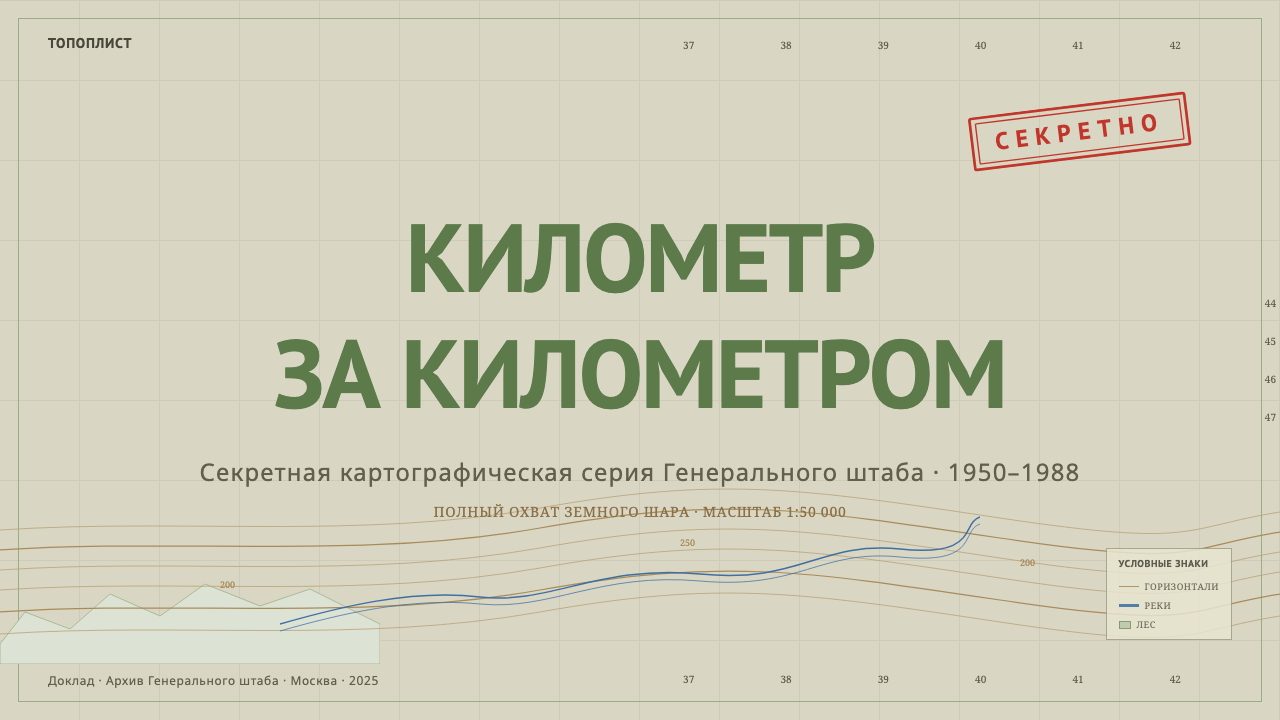
For presentation slides, a cover page benefits from the khaki-gray ground with a subtle grid pattern and a single red classification-style stamp element positioned in a corner, evoking the sense of a real intelligence document. Content slides should keep to the muted three-tone palette and use condensed, tightly-set labels rather than generous whitespace typography — density itself is part of the visual signature. Data visualizations translate unusually well into this system: charts rendered as if they were terrain contours or grid overlays reinforce the cartographic conceit directly.在演示文稿中,封面页适合以卡其灰底面搭配细微的网格图案,并在角落放置一个类似红色保密印章的元素,唤起真实情报文件的感觉。内容页应保持这套含蓄的三色色板,并采用紧缩、排布紧密的标签,而非宽松留白的字体排印——密度本身就是这种视觉签名的一部分。数据可视化格外适合转译进这套体系:把图表渲染得仿佛是地形等高线或网格叠层,能直接强化这种制图学的构想。
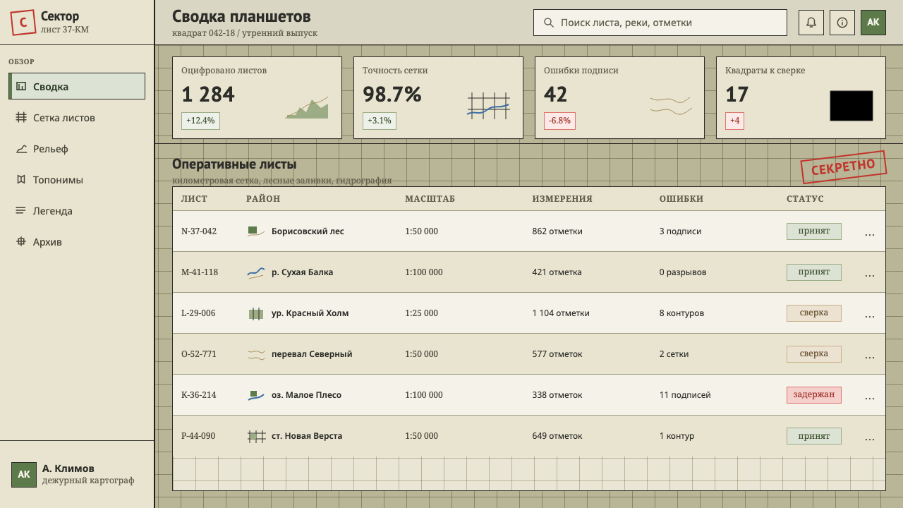
For web interfaces, the style suits products dealing with intelligence, logistics, geospatial data, or any brand wanting to evoke rigor and hidden systematic knowledge — mapping tools, security products, research platforms. Dashboards are a natural fit given the style's origin in dense informational documents; interactive elements can use the grid-line convention for structural dividers rather than modern flat borders.在网页界面中,这种风格适合处理情报、物流、地理空间数据的产品,或任何想要传达严谨感与隐秘系统化知识的品牌——制图工具、安全产品、研究平台。鉴于这种风格源自密集的信息类文件,仪表板天然与之契合;交互元素可以采用网格线的惯例作为结构性分隔,而非现代的扁平边框。
For editorial and marketing work, the style suits long-form writing on Cold War history, intelligence and espionage, or cartography itself. Section breaks can use a stamp-like graphic device sparingly, reserved for genuinely significant transitions rather than every heading, echoing the way the original maps reserved the red stamp for classification rather than decoration.在编辑与营销内容中,这种风格适合关于冷战历史、情报与谍报活动、或制图学本身的长文。段落分隔可以节制地使用类似印章的图形装置,仅保留给真正重要的转折,而非每个标题都用,呼应原始地图把红色印章保留给保密标记、而非装饰的做法。
A common mistake is treating this style as simply "a map texture" and adding decorative compass roses, illustrated legends, or antique-map flourishes borrowed from an entirely different cartographic tradition. Genshtab maps are aggressively modern and functional, not antique or ornamental — mixing in old-world map decoration undermines the cold, systematic precision that defines the style.一个常见的错误,是把这种风格简单理解为「一种地图纹理」,再加入装饰性的罗盘玫瑰、插图式图例,或借自完全不同制图传统的古董地图花饰。根什塔布地图是极度现代且功能性的,而非古董或装饰性的——混入旧世界的地图装饰,会瓦解定义这种风格的那种冷峻、系统化的精确感。
See the Soviet Classified Map design system查看 Soviet Classified Map 完整设计系统
Soviet Classified Map — FAQSoviet Classified Map · 常见问题
Why did the Soviet Union map foreign territory it had no legal right to survey?苏联为什么会测绘它无权勘测的外国领土?
Soviet Cold War military doctrine assumed conflict could occur anywhere on Earth, so the General Staff needed reliable topographic intelligence for any potential theater regardless of formal survey rights. Cartographers combined captured foreign maps, aerial and satellite reconnaissance, and ground intelligence to produce sheets for locations the USSR had never been officially permitted to survey, treating global topographic coverage as a strategic military necessity rather than a diplomatic courtesy.苏联冷战时期的军事教条设想冲突可能发生在地球上任何地方,因此总参谋部需要为任何潜在战场准备可靠的地形情报,无论是否拥有正式的勘测权。制图人员综合缴获的外国地图、航空与卫星侦察资料以及地面情报,为苏联从未被正式允许测绘的地点制作图纸,将全球地形覆盖视为一种战略军事必需,而非外交礼节。
Why is the red stamp the only saturated color in an otherwise muted system?为什么在这套克制的体系中,红色印章是唯一饱和的颜色?
The rest of the palette exists purely to represent physical terrain data — elevation, vegetation, water — and stays muted because that is a faithful, functional representation of the landscape. The red stamp is not terrain data at all; it is an institutional marking of classification status, and its saturated color exists specifically to stand out from the informational palette and demand attention as an administrative, rather than geographic, fact.色板中其余部分的存在,纯粹是为了呈现实际的地形数据——海拔、植被、水系——因而保持含蓄,这才是对地貌忠实、功能性的呈现。红色印章根本不是地形数据;它是一种关于保密等级的机构标记,其饱和的颜色正是为了从这套信息性色板中脱颖而出,作为一项行政性的、而非地理性的事实来引人注意。
How does this style differ from ordinary topographic map design used elsewhere?这种风格与其它地方通行的普通地形图设计有什么不同?
Most national topographic map traditions vary their symbology and color conventions somewhat across regions and eras. The Genshtab system is distinctive for its absolute uniformity — the exact same khaki-gray, forest-green, brown-contour, and Cyrillic-grid convention was applied identically whether the sheet depicted Siberia or a foreign capital city, because operational consistency across a global military mapping project mattered more than tailoring the visual code to local conventions.大多数国家的地形图传统,在不同地区与年代之间,符号体系与色彩惯例会有所变化。根什塔布体系的独特之处,在于它绝对的统一性——无论图纸描绘的是西伯利亚还是某座外国首都,同样的卡其灰、森林绿、棕色等高线与西里尔网格惯例都被完全一致地应用,因为在一个覆盖全球的军事制图项目中,作战上的一致性比根据当地惯例定制视觉规范更为重要。
Can this style be used for anything other than literal maps?这种风格能用在字面意义上的地图之外的场景吗?
Yes — its core value is the visual language of dense, disciplined, classified information, which transfers well to any product dealing with data, security, or systematic knowledge even without a literal geographic subject. Grid systems, muted terrain-style color fills, and a sparing use of a single stamp-like accent color can structure dashboards, reports, or intelligence-themed products just as effectively as an actual map.可以——它的核心价值在于一种密集、有纪律的保密信息视觉语言,这种语言即便脱离字面意义上的地理主题,也能很好地移植到任何处理数据、安全或系统化知识的产品上。网格系统、含蓄的地形风格色块填充,以及对单一印章式强调色的节制使用,同样能够有效地组织仪表板、报告或情报主题产品的结构,效果不亚于一幅真实的地图。
Related design styles相关设计风格
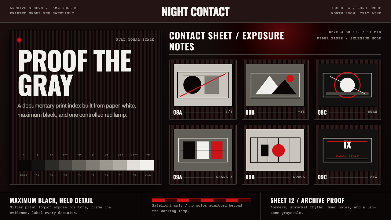 Silver Gelatin DarkroomTonality is the craft. Safelight red, contact grids, and ten-zone grays hold…影调即工艺。红色安全灯、接触网格与十区灰阶撑起暗房。
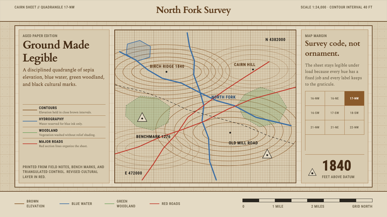 Topographic Survey MapMeasurement becomes beauty. Sepia contours and blue hydrography sit on aged m…测量即美:旧纸上的赭褐等高线与蓝色水系。
 IBM Punchcard 029 (1928)Constraint becomes authority. Manila stock, hairline grid, industrial blue.约束即权威。米黄色卡纸、发丝网格与工业蓝。
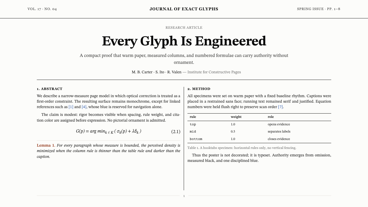 TeX Academic PaperRigor without ornament. Warm paper, Computer Modern text, hairline columns, o…无装饰的严谨:暖纸、Computer Modern、发丝栏线与唯一蓝色链接。
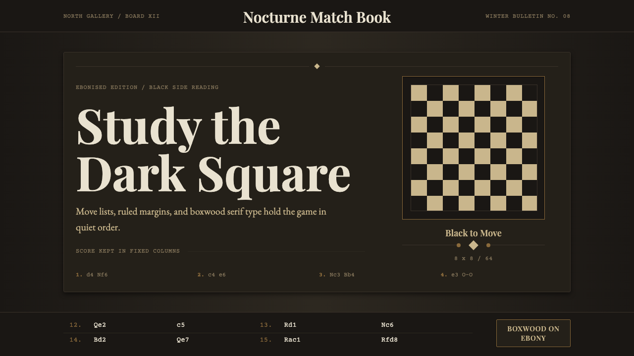 Chess TournamentQuiet intellect. Cream Playfair type, walnut rules, and notation glow on ebon…安静的智性:乌木底上乳白衬线、胡桃细线与记谱发光。
 Dieter Rams / BraunQuiet by design. Warm gray, white panels, hairline grids, and one earned gree…安静即设计:暖灰、白面板、细网格,只留一枚绿色指示点。