What is VW Kombi Bus?什么是 VW Kombi Bus?
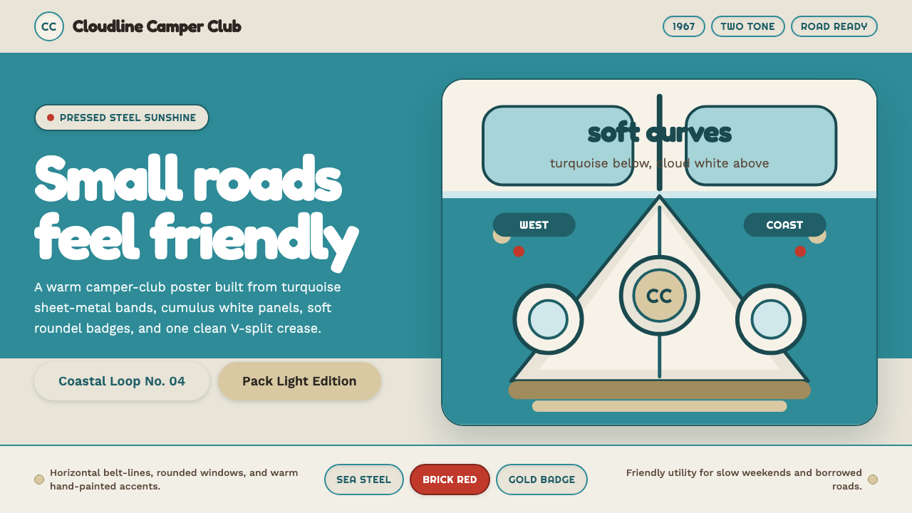
The Volkswagen Kombi turned a humble delivery van into the rolling emblem of an entire generation's optimism, and its two-tone steel body is still one of the most recognizable silhouettes in design history.大众Kombi把一辆朴素的货运厢式车变成了整整一代人乐观精神的移动象征,它的双色钢板车身至今仍是设计史上最容易辨认的轮廓之一。
VW Kombi Bus in briefVW Kombi Bus 速览
VW Kombi Bus is a design system drawn from the Volkswagen Type 2, the rounded, twin-cab van whose two-tone steel bodywork — a band of turquoise beneath a belt-line of cumulus white — became one of the most beloved shapes in twentieth-century vehicle design. Unlike styles rooted in a single decade of aggressive reinvention, the Kombi's visual language is defined by gentle, confident simplicity: soft pressed-steel curves, a V-split front panel, round headlamp circles, and a body built almost entirely from large, friendly, rounded forms.大众Kombi巴士风格是一套取材于大众Type 2的设计系统——这款圆润的双驾驶舱厢式车,以其标志性的双色钢板车身(一道青绿色色带托举着一条积云般的白色腰线)成为二十世纪最受喜爱的汽车造型之一。与那些扎根于某个激进求新年代的风格不同,Kombi的视觉语言由一种温和而自信的简洁定义:柔软的冲压钢曲线、V形分体前脸、圆形大灯,以及几乎完全由宽大、亲切、圆润的形态构成的车身。
The palette is optimistic without being loud. Turquoise and white carry the structure of any composition, doing the work that a corporate brand color would do elsewhere, while gold, brick-red, and earth-brown are held back as accent notes — badges, trim details, a single painted flourish — rather than competing fields of color. This restraint is what separates an authentic Kombi-derived palette from a generic retro-van pastiche: the two-tone base must remain clean and dominant, with warmer colors appearing only in small, deliberate doses.这套色板乐观而不喧闹。青绿与白色承载着任何构图的结构,扮演着其他场景中企业主色调的角色,而金色、砖红与土棕则被克制地保留为点缀色——徽章、装饰细节、一处手绘的花朵——而非与主色竞争的大片色块。正是这种克制,把一套真正源自Kombi的色板与一套泛泛的复古货车仿制品区分开来:双色基调必须保持干净且占主导,暖色只能以小而刻意的分量出现。
Typographically and texturally, the style leans toward rounded, friendly letterforms and soft, slightly bouncy curves that echo the van's own pressed-steel panels — nothing sharp, nothing severe. The overall effect should read as sunny, sturdy, and a little nostalgic: a design language built for road trips, community, and the specific brand of postwar optimism that believed technology and travel could make ordinary life better.在字体与质感上,这种风格倾向于圆润、亲切的字形与柔软、略带弹性的曲线,呼应车身自身的冲压钢板——没有锐角,没有严肃感。整体效果应读作阳光、结实,又带一点怀旧:一种为公路旅行、社群感,以及战后那种相信技术与旅行能让平凡生活变得更好的特定乐观精神而生的设计语言。
Where does VW Kombi Bus come from?VW Kombi Bus 从何而来?
The story begins in 1947, when Dutch Volkswagen importer Ben Pon sketched a rough idea on a napkin during a visit to Volkswagen's Wolfsburg factory: a flat-fronted delivery van built on the mechanical platform of the existing Beetle, using its rear-mounted engine and simple chassis to create a boxy cargo space with maximum interior volume. Pon's sketch — a simple rectangle with wheels tucked to the corners and a driver's cab pushed forward — captured the essential logic that would define the Type 2 for decades: build the smallest possible mechanical footprint and let the body maximize everything else.故事始于1947年,荷兰大众进口商本·彭在参观大众沃尔夫斯堡工厂时,在一张餐巾纸上随手画下了一个粗略构想:一辆平头货运厢式车,建立在现有甲壳虫的机械平台之上,利用其后置发动机与简单底盘,打造出一个内部空间最大化的方盒形货舱。彭的草图——一个简单的矩形,轮子塞在四个角落,驾驶室尽量前置——捕捉到了此后数十年定义Type 2的核心逻辑:把机械部分的占地尽量做到最小,让车身把其余一切空间都最大化。
Volkswagen's postwar leadership under director Heinz Nordhoff, who took charge of the devastated Wolfsburg plant in 1948 under British military occupation oversight, saw commercial vehicles as essential to rebuilding both the company and West German industry more broadly. The Type 2 entered production in 1950, initially as a straightforward panel van and pickup for trades and small businesses. Its rounded nose, split windshield, and rear engine cover became instantly recognizable, and the two-tone paint schemes — turquoise, red, or blue paired with white — served a practical purpose as much as an aesthetic one: they helped delivery fleets and small business owners distinguish trim levels and configurations at a glance.1948年,海因茨·诺德霍夫在英国军事占领当局的监督下接掌了满目疮痍的沃尔夫斯堡工厂,他领导下的大众战后管理层认为,商用车对于重建公司自身乃至更广泛的西德工业都至关重要。Type 2于1950年投入生产,最初只是面向商贩与小企业的普通厢式货车与皮卡。它圆润的车头、分体式挡风玻璃与后置发动机盖立刻成为标志性特征,而双色喷漆方案——青绿、红或蓝搭配白色——既有美学考量,也有实用目的:帮助车队与小企业主一眼分辨不同配置与车型等级。
The Westfalia camping conversion, developed by the German coachbuilder Westfalia-Werke starting in the early 1950s, transformed the humble delivery van into something else entirely: a self-contained camper with a pop-top roof, built-in cabinetry, and a fold-out bed, aimed squarely at families and young travelers seeking affordable mobility. This version — sold widely across West Germany and exported in large numbers to the United States — is what fixed the Kombi in the popular imagination as a vehicle of leisure and freedom rather than commerce.德国车体改装商威斯法利亚工厂从1950年代初开始开发的露营改装版本,把这辆朴素的货运车彻底转变成了另一种东西:一辆配有可弹起车顶、内置橱柜与可折叠床铺的自给自足式房车,直接瞄准了追求经济实惠出行方式的家庭与年轻旅行者。这一版本——在西德广泛销售,并大量出口至美国——正是让Kombi在大众想象中定格为一辆休闲与自由之车、而非商用车的关键。
By the mid-1960s, the Type 2 had crossed the Atlantic in enormous numbers and been fully absorbed into American counterculture. Its low cost, simple mechanicals, spacious interior, and inherently friendly, rounded silhouette made it the default vehicle for surfers, musicians, and the emerging hippie and flower-power movements of the era. Owners frequently painted hand-drawn flowers, peace symbols, and psychedelic patterns directly over the factory two-tone paint, layering countercultural expression on top of Volkswagen's clean industrial design — a combination that, by 1967, had made the Kombi as much a symbol of the era's social movements as of German engineering.到1960年代中期,Type 2已大批量跨越大西洋,被彻底吸纳进美国反主流文化之中。它低廉的成本、简单的机械结构、宽敞的内部空间,以及天然亲切、圆润的车身轮廓,使它成为冲浪者、音乐人,以及当时新兴的嬉皮与花朵力量运动的默认座驾。车主们经常直接在出厂的双色漆面上手绘花朵、和平符号与迷幻图案,把反主流文化的表达层层叠加在大众清爽的工业设计之上——到1967年,这种结合已经让Kombi既成为那个时代社会运动的象征,也同样代表着德国工程的成就。
What defines the VW Kombi Bus look?VW Kombi Bus 的视觉特征是什么?
Two-Tone Belt Line双色腰线
The defining structural feature is a horizontal division between a lower band of turquoise steel and an upper band of cumulus white, meeting at a clean belt-line. This division should always run horizontally and hold its position roughly at the midpoint of any composition, echoing where the actual bodywork split occurred on the vehicle.最核心的结构特征,是下方一道青绿色钢板色带与上方一道积云般白色色带之间的水平分界,交汇于一条干净的腰线。这道分界线应始终保持水平,并大致停留在构图中点位置,呼应车身实际漆面分割的位置。
V-Split FrontV形分体前脸
The front-facing composition should reference the Type 2's characteristic V-shaped panel split running down the nose, flanked by two round headlamp circles. This creates a friendly, symmetrical, almost face-like quality that is central to the vehicle's approachable character.正面构图应参照Type 2标志性的V形分体前脸——一道V形分割线沿车头向下延伸,两侧各有一个圆形大灯。这营造出一种亲切、对称、近乎拟人化的品质,是这辆车平易近人性格的核心所在。
Rounded Curves圆润曲线
Every structural line in the system favors gentle curvature over sharp angles, echoing the soft, rounded pressed-steel panels of the original vehicle. Corners are rounded rather than mitred, and any framing element should feel soft-edged rather than crisp and geometric.这套系统中的每一条结构线都偏好柔和的曲率而非锐角,呼应原车柔软圆润的冲压钢板。转角应是圆角而非直角拼接,任何框架元素都应显得柔边而非棱角分明。
Accent Colors点缀色彩
Gold, brick-red, and earth-brown appear only in small doses — badges, trim lines, a single painted detail — never as competing large fields of color. Their role is to add warmth and craft-like character without disturbing the clean dominance of the turquoise-and-white structure.金色、砖红与土棕只应以小分量出现——徽章、装饰线条、一处手绘细节——绝不能作为与主色竞争的大片色块。它们的作用是增添温暖感与手工质感,而不干扰青绿与白色结构的干净主导地位。
Rounded Typography圆润字体
Type should feel friendly and slightly bouncy rather than technical or severe — soft rounded letterforms that echo the vehicle's own curves. Headlines can be generously sized, but should never feel aggressive; the tone is welcoming, not commanding.字体应显得亲切、略带弹性,而非技术感或严肃感——柔软圆润的字形呼应车身自身的曲线。标题可以放得比较大,但绝不应显得咄咄逼人;整体基调是欢迎而非命令。
Chrome and Trim Details镀铬与装饰细节
Small metallic or gold-toned details — a badge, a bumper line, a hinge — provide moments of craftsmanship and material honesty against the flat painted panels, echoing the actual chrome trim of the original vehicle without overwhelming the composition.小型金属或金色调细节——一枚徽章、一道保险杠线、一处铰链——在平面喷漆板面之上提供一些工艺感与材料真实感的瞬间,呼应原车真实的镀铬装饰,但不应压过整体构图。
Hand-Painted Warmth手绘的温度
Occasional organic, hand-drawn motifs — a small painted flower, an informal flourish — can appear against the clean industrial base, referencing the countercultural custom paint jobs of the late 1960s, but they must remain the exception, not the rule, sitting lightly against the vehicle's essentially clean factory finish.偶尔出现的有机、手绘母题——一朵小小的手绘花朵、一处随性的花饰——可以出现在干净的工业化底面上,呼应1960年代末反主流文化的定制喷漆传统,但这必须是例外而非常态,轻轻落在车辆本质上干净的出厂漆面之上。
Who shaped VW Kombi Bus?谁塑造了 VW Kombi Bus?
The Dutch Volkswagen importer whose 1947 napkin sketch during a Wolfsburg factory visit proposed a flat-fronted delivery van built on the Beetle's mechanical platform. His simple, functional concept — maximize cargo space by pushing the wheels to the corners and the cab forward — became the essential layout of the Type 2 that followed.这位荷兰籍大众进口商在1947年一次沃尔夫斯堡工厂参观中,用一张餐巾纸草绘出了一辆建立在甲壳虫机械平台之上的平头货运车构想。他这个简单而实用的概念——把轮子推向四角、驾驶室前置以最大化货舱空间——成了此后Type 2最基本的布局逻辑。
As director of Volkswagen from 1948, Nordhoff oversaw the company's transformation from a war-damaged factory under British oversight into a major postwar industrial success. His decision to invest seriously in commercial vehicles, including the Type 2, positioned Volkswagen as central to West Germany's broader economic recovery.诺德霍夫自1948年起担任大众公司总裁,主导了公司从一座在英国监管下饱受战争摧残的工厂,转变为战后重要工业成功典范的过程。他决心认真投入商用车领域(包括Type 2),使大众成为西德整体经济复苏的核心力量之一。
The German coachbuilder that developed the camping conversion for the Type 2 starting in the early 1950s, adding a pop-top roof, built-in cabinetry, and a fold-out bed. Westfalia's conversions turned a commercial delivery van into the self-contained camper that fixed the Kombi in popular culture as a symbol of affordable travel and freedom.这家德国车体改装商自1950年代初开始为Type 2开发露营改装版本,加装了可弹起车顶、内置橱柜与可折叠床铺。威斯法利亚的改装把一辆商用货运车,转变为让Kombi在大众文化中定格为经济实惠出行与自由象征的自给自足式房车。
How do you use VW Kombi Bus today?今天怎么用 VW Kombi Bus?
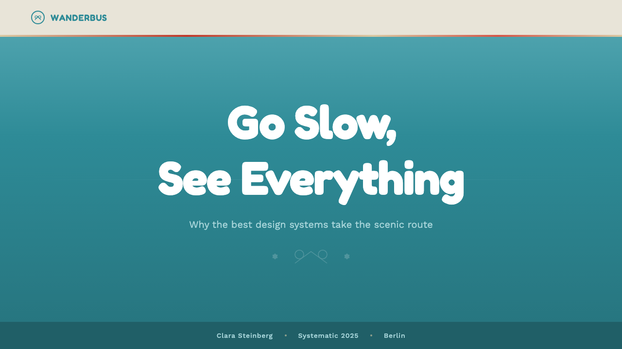
On presentation slide covers, the Kombi style delivers warmth without effort: a clean turquoise-and-white split fills the frame, a single gold badge or accent sits at a corner, and the title rides on the white upper band in friendly, rounded type. Content slides should carry the two-tone structure through consistently — a turquoise sidebar or footer band against a white body — while charts and data use the warmer accent colors sparingly to highlight a single key figure rather than color-coding every category.在演示文稿封面上,Kombi风格能毫不费力地传递温暖感:一道干净的青绿与白色分割铺满画面,一个金色徽章或点缀落在角落,标题以亲切圆润的字体骑在白色上半区域。内容页应始终贯彻这套双色结构——一道青绿色侧边栏或页脚色带映衬白色主体——图表与数据应节制地使用较暖的点缀色来突出单一关键数字,而非给每个类别都上色区分。
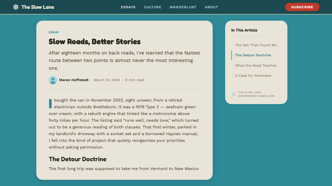
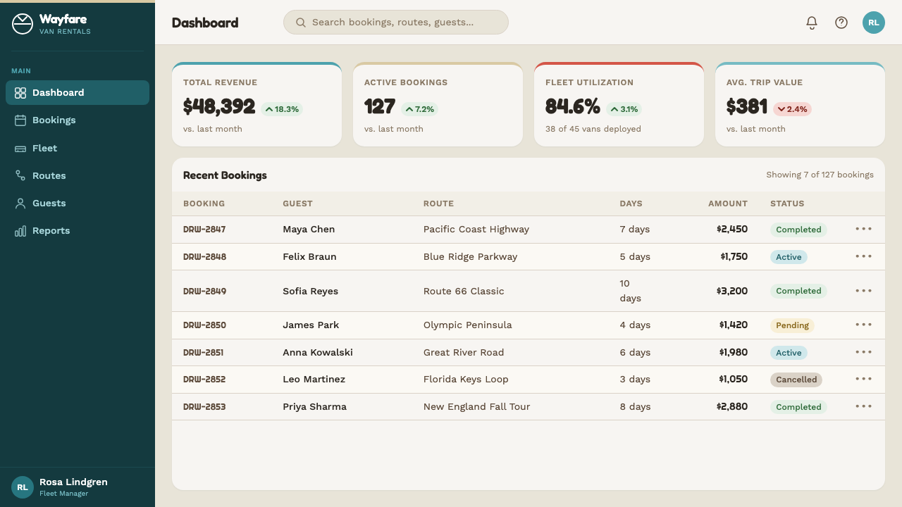
For web interfaces, the style suits products built around community, travel, leisure, or small-scale craft businesses — think booking platforms, travel blogs, or maker marketplaces. Dashboards should keep primary chrome in turquoise and white, using gold or brick-red only for a small number of interactive states, so the palette reads as sunny rather than busy. Pricing pages benefit from the same restraint: differentiate tiers with subtle shifts in the accent color rather than introducing entirely new hues.对于网页界面,这种风格适合围绕社群、旅行、休闲或小型手工业务打造的产品——比如预订平台、旅行博客或手作市集。仪表板应把主色调保持在青绿与白色上,金色或砖红只用于少数几种交互状态,这样整套色板才能读作阳光而非繁忙。定价页面同样受益于这种克制:用点缀色的细微变化来区分等级,而非引入全新的色相。
In editorial and marketing contexts, the style is well suited to storytelling about journeys, nostalgia, or community — a magazine feature on road trips, a brand campaign about accessible travel, or a retrospective piece on postwar design. Full-bleed hero sections work well with a large expanse of turquoise-and-white split, a single rounded headline, and a small hand-drawn accent motif tucked into a corner rather than spread across the page.在编辑与营销语境中,这种风格特别适合讲述关于旅程、怀旧或社群的故事——一篇关于公路旅行的杂志专题、一场关于平价旅行的品牌campaign,或一篇关于战后设计的回顾文章。通栏主视觉区块适合用大面积的青绿与白色分割、一个圆润的大标题,以及一处小小的手绘点缀母题塞在角落,而非铺满整个页面。
Marketing materials aimed at a younger, adventure-oriented audience can lean slightly more into the hand-painted, countercultural side of the reference — a single flower motif, an informal flourish — but this should remain a minor accent against the otherwise clean, confident two-tone base, echoing how actual custom paint jobs sat on top of, rather than replaced, the factory finish.面向更年轻、更热衷冒险的受众的营销材料,可以稍微偏向参照素材中手绘、反主流文化的一面——一处花朵母题、一道随性的花饰——但这应始终只是干净自信的双色基调之上的一处次要点缀,正如真实的定制喷漆是叠加在出厂漆面之上,而非取而代之。
The most common mistake is treating this as a generic 'retro van' palette and mixing in too many colors at once — turquoise, red, gold, and brown all fighting for attention in the same composition. Authentic Kombi-derived work always keeps the turquoise-and-white structure dominant and clean, with only one or two accent colors appearing at small scale. A second frequent error is making the curves too sharp or the typography too technical, which undercuts the friendly, approachable character that is the entire point of the style.最常见的错误,是把这种风格当作一套泛泛的「复古货车」色板,一次性混入过多颜色——青绿、红、金、棕在同一构图中相互争夺注意力。真正源自Kombi的作品,始终让青绿与白色的结构保持主导且干净,只让一到两种点缀色以小尺度出现。第二个常见错误,是把曲线画得太锋利,或把字体做得太技术化,这会削弱这种风格真正的核心——亲切平易的性格。
VW Kombi Bus — FAQVW Kombi Bus · 常见问题
Is the Kombi style the same as generic 1960s retro design?Kombi风格和泛泛的1960年代复古设计是一回事吗?
No. Generic 1960s retro design draws on a much broader visual vocabulary — psychedelic patterns, bold pop-art color blocking, mod graphics. The Kombi style is far more specific and restrained: it is anchored entirely in the vehicle's actual two-tone bodywork, rounded pressed-steel forms, and V-split front, with warmer colors held back as small accents rather than dominant fields. It borrows the era's optimism without borrowing its visual chaos.不是。泛泛的1960年代复古设计取材于一套广得多的视觉词汇——迷幻图案、大胆的波普艺术色块、摩登图形。Kombi风格要具体和克制得多:它完全扎根于这辆车真实的双色车身、圆润冲压钢形态与V形分体前脸,暖色只作为小分量的点缀而非主导色块。它借用了那个年代的乐观精神,却没有借用它的视觉混乱。
Why is turquoise-and-white the dominant palette rather than the flower-power colors it's associated with?为什么主色调是青绿与白,而不是它常被联想到的花朵力量色彩?
Because the two-tone turquoise-and-white scheme is the vehicle's actual factory bodywork — the structural, load-bearing part of the design that existed before any custom paint job. The flower-power patterns owners added later were always applied on top of this clean factory base, as a personal accent rather than a replacement. Keeping turquoise-and-white dominant preserves that historical relationship: structure first, personality second.因为青绿与白色的双色方案是这辆车真实的出厂车身漆面——是先于任何定制喷漆存在的、结构性的设计部分。车主后来添加的花朵力量图案,始终是叠加在这层干净的出厂底色之上,作为个人化的点缀而非取代。保持青绿与白色的主导地位,正是保留了这层历史关系:先有结构,后有个性。
How many accent colors should a Kombi-derived design use?一套Kombi风格的设计应该用多少种点缀色?
Generally no more than one or two at a time, applied at small scale — a gold badge, a brick-red trim line. Introducing three or more accent colors simultaneously, or letting any of them occupy a large area, dilutes the clean two-tone structure that is the style's foundation and starts to read as a generic multicolor retro palette instead.通常一次不超过一到两种,且以小尺度应用——一枚金色徽章、一道砖红色装饰线。同时引入三种或更多点缀色,或让其中任何一种占据大面积,都会稀释这种风格赖以立足的干净双色结构,转而读作一套泛泛的多彩复古色板。
Does this style work for serious, professional products, or is it only for casual/travel brands?这种风格适合严肃、专业的产品,还是只适合休闲/旅行类品牌?
It works best where warmth, approachability, and a sense of trustworthy craft are genuine product values — community platforms, small business tools, hospitality and travel products, education for younger audiences. It is a poor fit for products that need to project severity, high-stakes precision, or cutting-edge technical authority, where the friendly rounded curves and sunny palette would undercut the intended tone.在温暖感、亲和力,以及一种值得信赖的手工感是真正的产品价值所在的场景中,它表现最好——社群平台、小微企业工具、酒旅与旅行产品,面向年轻受众的教育内容。它不适合需要传达严肃感、高风险精确性或前沿技术权威感的产品,那些场景下,友好的圆润曲线与阳光色板反而会削弱预期的调性。
Can the style be adapted to a dark-mode interface?这种风格能改造成深色模式界面吗?
It is possible but requires care, since the style's essential character is sunny and light-ground. A dark variant should still keep turquoise as the dominant structural color against a dark neutral ground, with white reserved for text and key highlights, and warm accents used just as sparingly as in the light version — otherwise the result loses the specific optimistic character that defines the style.可以,但需要谨慎处理,因为这种风格的本质气质是阳光、浅色底面的。一个深色变体仍应让青绿作为主导结构色,映衬深色中性底面,白色保留给文字与关键高亮,暖色点缀的使用应和浅色版本一样节制——否则就会失去这种风格所定义的那种特定的乐观气质。
Related design styles相关设计风格
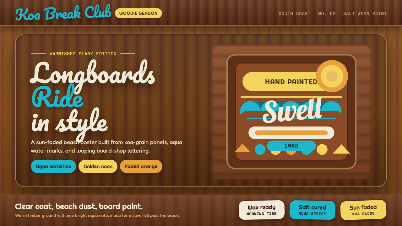 Surf Woodie CultureSalt-worn joy. Aqua script and gold badges ride over varnished koa planks.咸风里的欢快:青蓝手写字与金色徽章压在清漆木纹上。
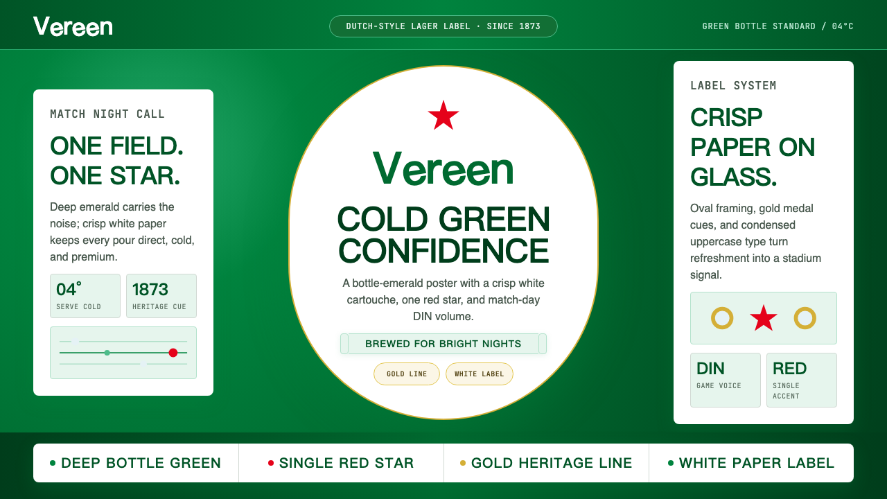 HeinekenEmerald owns the field. White label, red star, gold line, and condensed type…翠绿占满赛场。白标、红星、金线与窄体字让画面冰爽。
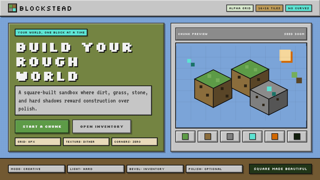 Minecraft VoxelUgly becomes buildable. Grass green, dirt brown, hard bevels, and 16×16 grids…丑也能亲手搭:草绿泥棕、硬边物品栏与16×16栅格。
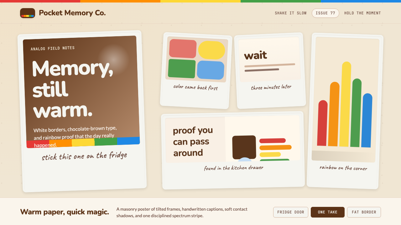 Polaroid InstantMemory made tangible. Photo-white frames tilt on aged paper with a warm rainb…记忆变得可触:相纸白边倾斜在旧纸底上,彩虹条点亮温度。
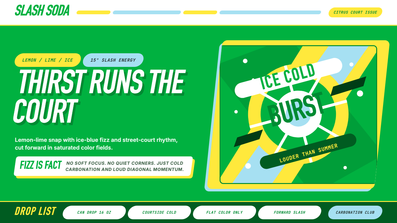 Sprite — Obey Your ThirstCitrus hits like asphalt heat. Saturated green, lemon yellow, and 15° slashes…柑橘像球场热浪般直击:饱和绿、柠檬黄与15°斜切推动海报。
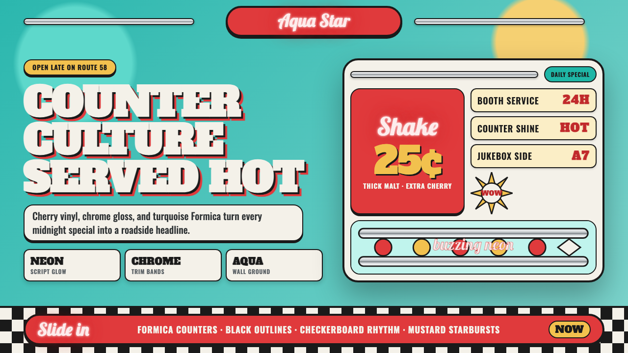 1950s Diner AquaRoadside optimism shouts. Aqua walls, cherry vinyl, chrome bands, and neon sc…公路乐观主义在叫卖:湖水蓝墙、樱桃红皮革、镀铬条与霓虹手写体发光。