What is Vintage Passport Stamps?什么是 Vintage Passport Stamps?
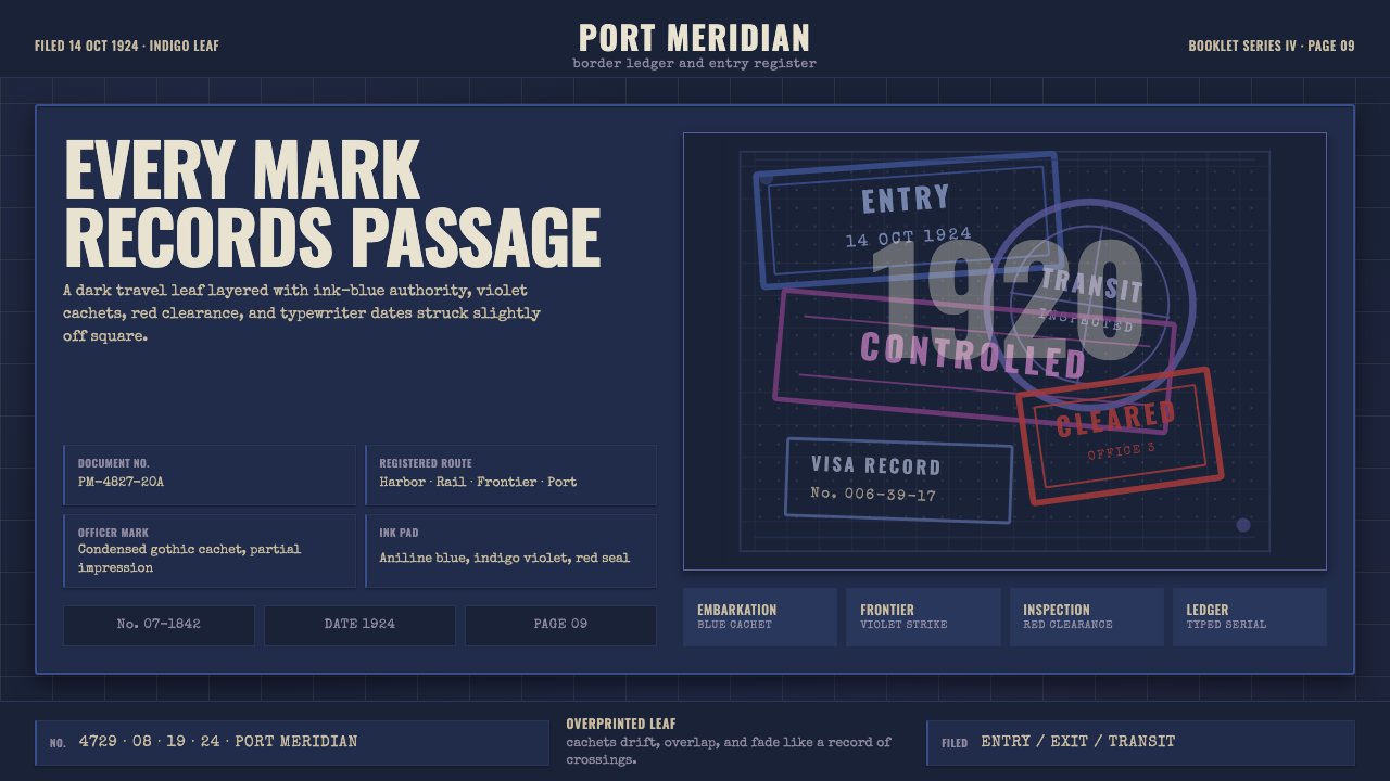
A 1920s passport page is a small archive of crossings — every overlapping stamp, every hand-dated cachet, a record that ink never fully forgets.一页1920年代的护照,是一部微型的过境档案——每一枚叠压的印戳、每一处手写日期的戳记,都是墨水从未真正遗忘的记录。
Vintage Passport Stamps in briefVintage Passport Stamps 速览
Vintage Passport Stamps is a design system drawn from the official document pages of 1920s international passports, a period shortly after the League of Nations' 1920 conference standardized the modern passport booklet format across many countries. Its defining trait is treating a page not as a clean blank surface but as a document that accumulates marks over time — layers of overlapping rubber-stamp cachets, numbered fields, engraved decorative borders, and both handwritten and typewritten annotations, all sitting on a deep, ink-stained ground rather than bright paper.复古护照印戳是一套取材于1920年代国际护照官方内页的设计系统,其历史背景正值国际联盟1920年会议将现代护照小册子格式在许多国家实现标准化之后不久。它的核心特征,是把一页纸张不当作干净的空白表面,而是当作一份随时间累积痕迹的文档——层层叠压的橡皮章戳记、编号栏位、雕版装饰边框,以及手写与打字机敲出的双重批注,全部落在一张被墨水浸染的深色底面上,而非明亮的纸张之上。
The visual logic is archival and bureaucratic rather than decorative for its own sake. Every element on the page has an official function: a guilloche border authenticates the document against forgery, a numbered field records a specific piece of information, and a cachet marks a specific border crossing at a specific date. The style translates this functional density into a visual language where accumulation itself becomes the aesthetic — nothing sits in isolation, and the overlapping of marks over time is treated as a feature rather than a flaw to be cleaned up.这套视觉逻辑是档案性与官僚性的,而非为装饰而装饰。页面上的每一个元素都有其官方功能:雕版花纹边框用以防伪认证这份文件,编号栏位记录某项具体信息,而一枚戳记则标记着某个具体日期的某次具体过境。这种风格把这种功能性的密度转化为一种视觉语言——积累本身成为一种美学,没有任何东西孤立存在,而随着时间推移形成的痕迹叠压,被当作一种特征来对待,而非需要被清理掉的瑕疵。
Color plays a specific, historically grounded role: aniline violet and ink-blue dominate as the colors most associated with early twentieth-century rubber cachet inks, joined by a formal red seal marking the most significant or official stamps. Typewriter-style serial numbers and condensed gothic capital lettering complete the bureaucratic character. Nothing in the composition sits perfectly square or aligned — every mark carries the slight imprecision of a hand-operated rubber stamp pressed by a border official, which is central to the style's sense of authenticity.色彩扮演着一个特定的、扎根于历史的角色:苯胺紫与靛蓝作为二十世纪初橡皮章油墨最常见的颜色而占据主导,再配上一枚标示最重要或最正式印戳的正式红色印章。打字机风格的流水号与窄体哥特大写字母,完善了这种官僚性的气质。构图中没有任何东西是绝对方正或对齐的——每一处痕迹都带有边境官员手动盖印时留下的些微不精确感,而这正是这种风格真实感的核心所在。
See the Vintage Passport Stamps design system查看 Vintage Passport Stamps 完整设计系统
Where does Vintage Passport Stamps come from?Vintage Passport Stamps 从何而来?
The modern passport as a standardized travel document took shape in the aftermath of the First World War, when the League of Nations convened a passport conference in 1920 that established shared conventions for the booklet format many countries would adopt — a move driven by the practical need to manage cross-border movement and identity verification at a scale and level of formality that the postwar international system now required.现代护照作为一种标准化的旅行证件,其形态是在第一次世界大战结束后逐渐成型的,1920年国际联盟召开的一次护照会议,确立了许多国家将会采用的通用小册子格式惯例——这一举措的驱动力,是战后国际体系此时所需要的、以某种规模与正式程度来管理跨境流动与身份核实的实际需求。
Before this standardization, travel documents varied considerably in format and rigor from country to country. The 1920s booklet introduced consistent features that this design style draws directly from: engraved guilloche border patterns (the fine, interwoven decorative line-work historically used on currency and official documents to deter forgery), numbered fields for recording specific identifying information, and dedicated pages meant to accumulate entry and exit stamps from each border crossing over the life of the document.在这次标准化之前,各国旅行证件的格式与严谨程度差异相当大。1920年代的小册子引入了这种设计风格所直接取材的一致性特征:雕版花纹边框(一种历史上用于货币与官方文件、精细交织的装饰性线条,用以防止伪造)、用于记录特定身份信息的编号栏位,以及专门用于在证件使用期间累积每次过境所留印戳的页面。
Border officials of this era typically used rubber cachets — hand-stamped ink marks — to record entry and exit, often supplemented by handwritten dates or typewritten serial numbers where a rubber stamp alone was insufficient. Aniline dyes, a class of synthetic dye developed in the nineteenth century, were commonly used in these ink pads, producing the characteristic violet and blue-violet tones that mark so many surviving documents from this period; a formal red ink was often reserved for especially significant or official markings.那个时代的边境官员通常使用橡皮章——手工盖印的墨水痕迹——来记录出入境,常常辅以手写日期或打字机流水号,用于仅凭橡皮章不足以记录的信息。苯胺染料——一类十九世纪研发的合成染料——常被用于这些印油之中,产生了标记着这一时期众多存世文件的标志性紫色与蓝紫色调;一种正式的红色墨水则常常保留给特别重要或官方性质的标记使用。
Because passports were carried and used repeatedly over months or years of travel, a single page would accumulate numerous overlapping stamps from many different countries and border posts, each pressed at a slightly different angle, with varying ink saturation, and often only partially legible where marks crossed over one another. This physical reality of repeated, imperfect, hand-applied stamping over time is the direct source of the style's dense, overlapping, imprecisely aligned visual character — an accumulation the style treats as a travel ledger rather than a defect.由于护照会在数月乃至数年的旅行中被反复携带使用,一页纸上会累积来自许多不同国家与边境哨所的层层叠压印戳,每一枚都以略微不同的角度盖印、墨水饱和度也各不相同,且常常因彼此交叠而只能部分辨认。这种反复、不精确、手工盖印随时间累积的物理现实,正是这种风格密集、叠压、不精确对齐的视觉性格的直接来源——这种风格把这种积累当作一本旅行账册,而非缺陷。
What defines the Vintage Passport Stamps look?Vintage Passport Stamps 的视觉特征是什么?
Deep Indigo Leaf幽深靛青纸页
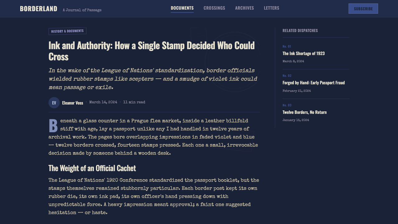
The page ground is a deep, ink-stained indigo rather than bright white paper, evoking a document darkened by years of handling and repeated ink contact. This dark ground is essential to the style's archival mood, distinguishing it from a clean, pristine document aesthetic.页面底色是一种被墨水浸染的深邃靛青,而非明亮的白纸,唤起一份历经多年经手、反复接触墨水而变暗的文件意象。这种深色底面对于这种风格的档案氛围而言至关重要,将其与一种干净、崭新的文件美学区分开来。
Overlapping Aniline Cachets叠压的苯胺印戳
Multiple rubber-stamp marks in violet and ink-blue overlap one another at varying angles and opacities, some fully legible and others only partially so where a later stamp crosses an earlier one. This overlapping is a core compositional principle, not an error to be avoided — density and layering over time is the entire point.多枚紫色与靛蓝色的橡皮章印记以不同的角度与不透明度相互叠压,有些完全可辨,有些则因后盖的印戳压过早先的印记而只能部分辨认。这种叠压是一种核心的构图原则,而非需要避免的错误——随时间推移形成的密度与层次,正是整个要点所在。
Formal Red Seal正式红色印章
A single red-inked seal or stamp typically anchors the composition as the most significant or official mark, standing apart from the more numerous violet and blue cachets. Its relative rarity within the composition is what gives it authority — if red appeared as frequently as the other ink colors, it would lose its function as a marker of particular official significance.一枚单独的红色印油印章,通常作为最重要或最正式的标记锚定整个构图,与更为频繁出现的紫色与蓝色印戳区别开来。它在构图中的相对稀少性,正是赋予它权威感的原因——如果红色像其他印油颜色一样频繁出现,它就会丧失作为特定官方重要性标记的功能。
Engraved Guilloche Borders雕版花纹边框
Fine, interwoven decorative line-work — the same anti-forgery technique historically used on currency — frames the page's structural fields. This border pattern is delicate and dense, contrasting with the bolder, heavier cachet stamps layered on top of it, and signals the document's official, security-conscious origin.精细、交织的装饰性线条——与历史上用于货币的同一种防伪技术——为页面的结构性栏位勾勒边框。这种边框图案精致而密实,与叠加其上更为大胆、厚重的印戳形成对比,标示着这份文件官方的、注重安防的出身。
Condensed Gothic Capitals窄体哥特大写字母
Field labels and headers use a narrow, upright gothic capital letterform, the bureaucratic lettering style associated with official document design of the period. This typography is functional and legible rather than decorative, matching the document's administrative purpose.栏位标签与标题使用一种窄体、直立的哥特大写字形,这是与那个时代官方文件设计相关联的官僚字体风格。这种字体排印是功能性、可辨识的,而非装饰性的,与文件的行政用途相匹配。
Imperfect Alignment不精确的对齐
Nothing in the composition sits perfectly square — stamps are pressed at slight angles, handwritten dates drift from a straight baseline, and typewriter serial numbers sit slightly askew. This imprecision is deliberate and essential: perfect alignment would contradict the hand-operated, real-world origin of every mark on the page.构图中没有任何东西是绝对方正的——印戳以轻微的角度盖下,手写日期偏离笔直的基线,打字机流水号也略微歪斜。这种不精确是刻意为之、也是至关重要的:完美的对齐会与页面上每一处痕迹那种手工操作、来自真实世界的出身相矛盾。

See the Vintage Passport Stamps design system查看 Vintage Passport Stamps 完整设计系统
Who shaped Vintage Passport Stamps?谁塑造了 Vintage Passport Stamps?
The delegates who convened in 1920 to standardize the modern passport booklet format established the shared structural conventions — numbered fields, decorative security borders, dedicated stamp pages — that this design style draws its formal vocabulary from. Their decisions were bureaucratic and international-relations-driven rather than aesthetic, yet they directly shaped the visual template underlying the style.1920年召开会议、将现代护照小册子格式标准化的与会代表们,确立了共通的结构性惯例——编号栏位、装饰性防伪边框、专用印戳页面——而这种设计风格正是从中汲取其形式词汇。他们的决定是官僚性与国际关系驱动的,而非美学性的,但正是这些决定,直接塑造了这种风格所依托的视觉模板。
The officials who hand-stamped passport pages at border crossings throughout the 1920s were the actual, unnamed authors of the dense, overlapping, imperfectly aligned mark-making that defines this style visually. Their routine, repeated administrative act — pressing a rubber cachet, noting a date — is the direct physical origin of the aesthetic's entire compositional logic.1920年代在边境口岸手工为护照页面盖章的官员们,才是塑造这种风格视觉特征的、密集叠压、不精确对齐的印记的真正无名作者。他们例行的、反复的行政动作——按下一枚橡皮章、记下一个日期——正是这种美学整套构图逻辑的直接物理来源。
How do you use Vintage Passport Stamps today?今天怎么用 Vintage Passport Stamps?
Vintage Passport Stamps suits products and brands built around travel, international mobility, or the romance of crossing borders — travel booking platforms, loyalty and frequent-traveler programs, luggage or travel-gear brands, or editorial projects documenting journeys and border histories.复古护照印戳适合那些围绕旅行、国际流动性,或跨越边境的浪漫感构建的产品与品牌——旅行预订平台、忠诚度或常旅客计划、行李箱或旅行装备品牌,或是记录旅程与边境历史的编辑类项目。
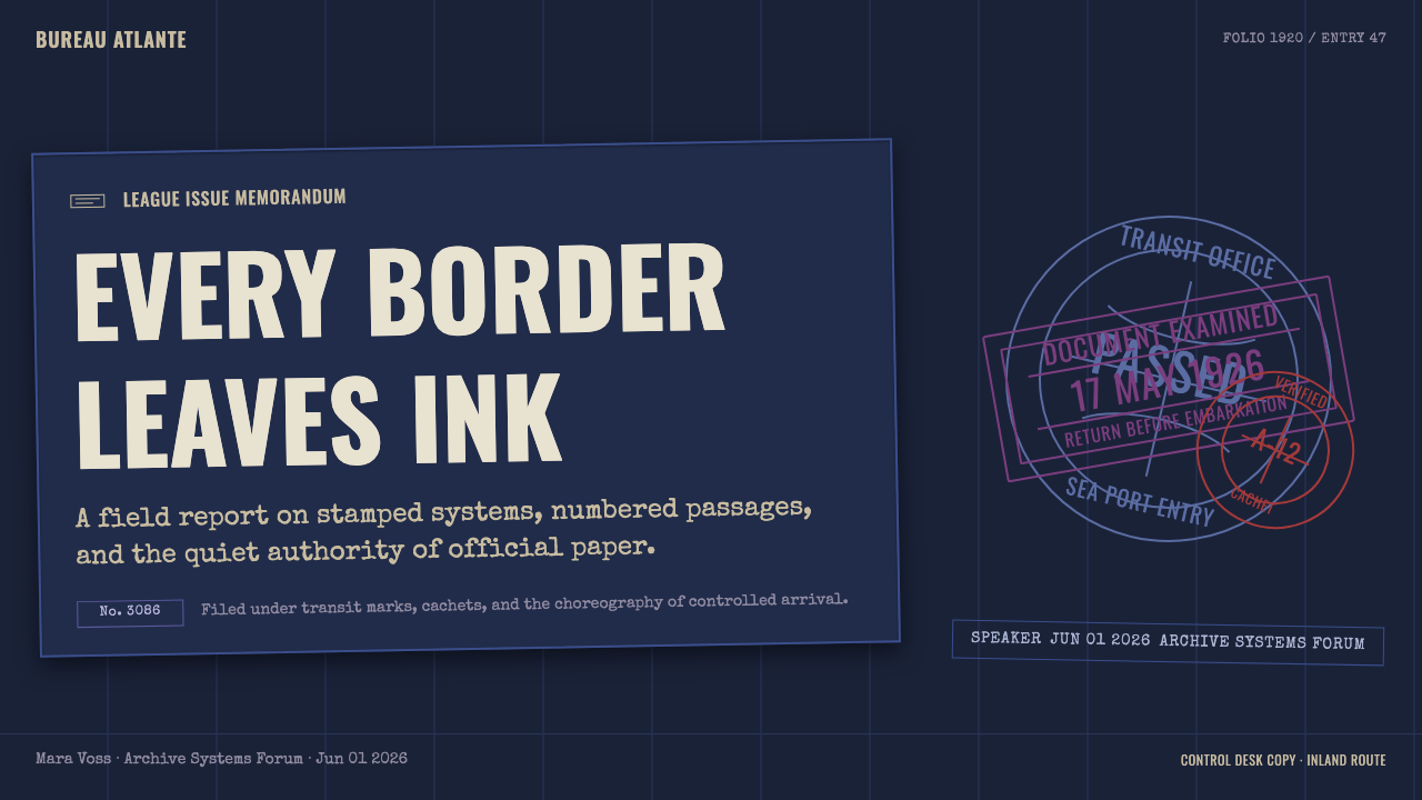
For presentation slides, a cover slide can carry the full deep-indigo ground with a dense cluster of overlapping cachets and the red seal as a focal anchor, mimicking a well-traveled passport page's accumulated history. Content slides should reduce the cachet density considerably and keep the ink-stained ground calmer, reserving the fullest overlapping-stamp treatment for a single feature moment per deck rather than every slide.在演示文稿中,封面页可以铺满完整的深靛青底色,配上一簇密集叠压的印戳,以红色印章作为焦点锚定,模拟一页历经风霜的护照所积累的历史感。内容页应大幅降低印戳密度,让墨渍底色保持更平静,把最完整的叠压印戳处理留给整套课件中的单一亮点时刻,而非每一页都套用。
For web interfaces, the style fits travel platforms particularly well — a trip-history page or loyalty-tier dashboard can use individual cachet-style stamps as visual markers for completed journeys or achieved status levels, echoing how an actual passport records a traveler's accumulated crossings. Core functional UI like search forms or checkout flows should stay considerably calmer, since dense overlapping ink marks would hurt legibility in transactional contexts.在网页界面中,这种风格尤其适合旅行类平台——一个行程历史页面或忠诚度等级仪表板,可以用单独的印戳样式标记来表示已完成的旅程或已达成的等级,呼应真实护照记录旅行者累积过境经历的方式。搜索表单或结账流程这类核心功能界面,应保持相当平静,因为密集叠压的墨迹标记会在交易场景中损害可读性。
For editorial and marketing work, the aesthetic supports travel writing, border and migration history features, or campaign moments celebrating a milestone number of destinations or journeys. A feature opener can use the full ink-stained, stamp-dense treatment; body copy should sit on a calmer, lighter version of the indigo ground to preserve readability across longer passages.在编辑与营销内容中,这种美学支持旅行写作、边境与移民历史专题,或庆祝达成某个里程碑目的地数量或旅程数的活动时刻。专题开篇可以运用完整的墨渍、密集印戳处理;正文文字应置于更平静、更浅淡的靛青底色版本之上,以在较长篇幅中保持可读性。
A common mistake is using clean, single, perfectly aligned stamp graphics rather than the dense, overlapping, imprecisely angled layering that defines the style's authenticity. Another frequent error is using bright, saturated ink colors rather than the specific muted aniline violet and ink-blue palette, which loses the historically grounded color logic in favor of a generic 'stamp' graphic.一个常见的错误,是使用干净、单一、完全对齐的印戳图形,而非定义这种风格真实感所需的那种密集、叠压、角度不精确的层次。另一个常见的错误,是使用明亮饱和的印油颜色,而非那种特定的柔和苯胺紫与靛蓝色板,这会丧失扎根于历史的色彩逻辑,沦为一种泛泛的“印戳”图形。
See the Vintage Passport Stamps design system查看 Vintage Passport Stamps 完整设计系统
Vintage Passport Stamps — FAQVintage Passport Stamps · 常见问题
Why is the page background dark and ink-stained rather than bright white?为什么页面背景是深色且被墨水浸染的,而非明亮的白色?
A bright white background would evoke a fresh, unused document, which contradicts the style's core idea: a passport page's value and character come from accumulated evidence of travel over time. The dark, ink-stained ground signals a document that has been used repeatedly across years of border crossings, which is central to the archival, well-traveled mood the aesthetic aims for.明亮的白色背景会让人联想到一份崭新、未曾使用的文件,这与这种风格的核心理念相悖:一页护照的价值与性格,正来自其随时间积累的旅行证据。深色、被墨水浸染的底面,标示着一份历经多年边境穿越、反复使用的文件,这正是这种美学所追求的档案感与风尘仆仆感的核心所在。
Why do the stamps overlap and sit at imperfect angles instead of being neatly arranged?为什么这些印戳彼此叠压、角度不精确,而非整齐排列?
This directly reflects how a real passport accumulates stamps over time: a border official hand-presses a rubber cachet quickly, without concern for perfect alignment with previous marks, and later stamps naturally land on top of or near earlier ones as the page fills up across multiple trips. Neatly arranged stamps would look staged and artificial; the overlapping imprecision is what makes the composition read as an authentic travel record.这直接反映了真实护照随时间积累印戳的方式:边境官员迅速手工按下橡皮章,并不关心与先前印记的完美对齐,而随着页面在多次旅行中被填满,后来的印戳自然会落在早先印记之上或附近。整齐排列的印戳看起来会显得刻意而人工;正是这种叠压的不精确感,让构图读起来像一份真实的旅行记录。
Why is violet, rather than black or blue alone, the most prominent ink color in this style?为什么这种风格中最突出的印油颜色是紫色,而非单纯的黑色或蓝色?
Violet and blue-violet tones were characteristic of aniline dye-based rubber-stamp inks widely used by border officials in the early twentieth century, making them the historically accurate color for this specific document tradition. Using plain black or a generic blue instead would lose the period-specific chemistry and appearance that ties the style to its 1920s source material.紫色与蓝紫色调,是二十世纪初边境官员广泛使用的苯胺染料基橡皮章油墨的特征色,因此对于这一特定文件传统而言,它们是符合历史真实的颜色。若改用纯黑色或泛泛的蓝色,就会丧失将这种风格与其1920年代源头材料联系在一起的、特定时代的化学成分与外观特征。
What distinguishes the red seal from the other stamps in a composition?红色印章与构图中的其他印戳有何不同?
The red seal is used sparingly and functions as a marker of particular official or ceremonial significance, distinct from the more routine violet and blue entry-exit cachets. Its rarity within a composition is what preserves its authority — if applied as frequently as the other stamps, it would lose its function as a signal of special importance.红色印章的使用是节制的,其功能是标示某种特别的官方或礼仪性重要意涵,区别于更为常规的紫色与蓝色出入境印戳。它在构图中的稀少性,正是维系其权威感的原因——如果它像其他印戳一样频繁出现,就会丧失作为特殊重要性信号的功能。
Does this style work well for modern, digital-first travel products?这种风格适合现代的、数字优先的旅行产品吗?
Yes, particularly for products that want to evoke the romance, history, and tangible record-keeping of physical travel rather than a purely frictionless, dematerialized booking experience. It works less well for products emphasizing speed, efficiency, or minimal visual noise, since the style's entire identity depends on density, accumulation, and a sense of documented history rather than clean simplicity.可以,尤其适合那些想要唤起实体旅行那种浪漫感、历史感与切实的记录留存感、而非一种纯粹无摩擦、去物质化预订体验的产品。对于强调速度、效率或极简视觉噪音的产品,这种风格就不太适合了,因为它的整个身份认同,依赖于密度、积累与一种被记录下来的历史感,而非清爽的简洁。
Related design styles相关设计风格
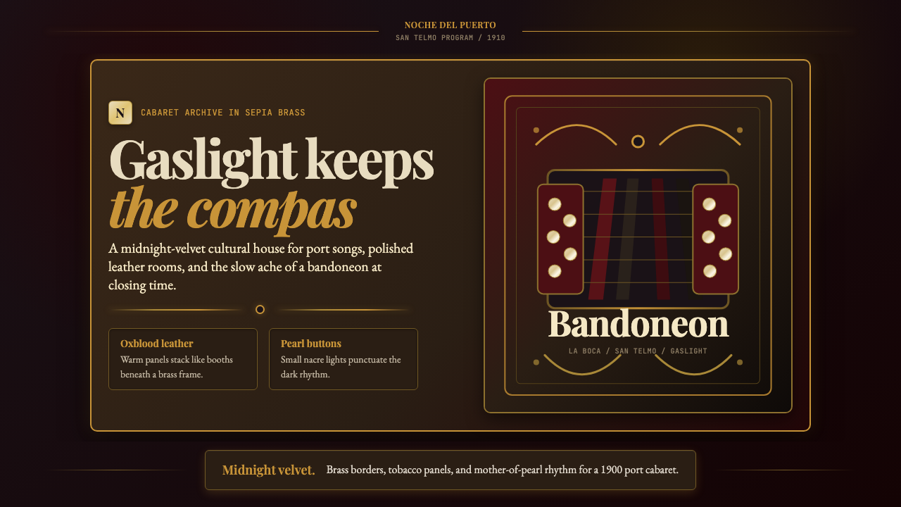 Argentine Bandoneón 1900 (Tango)Gaslit tango luxury. Midnight velvet, brass fileteado, and pearl-button geome…煤气灯下的探戈奢华:午夜绒底、黄铜卷草与珍珠琴键。
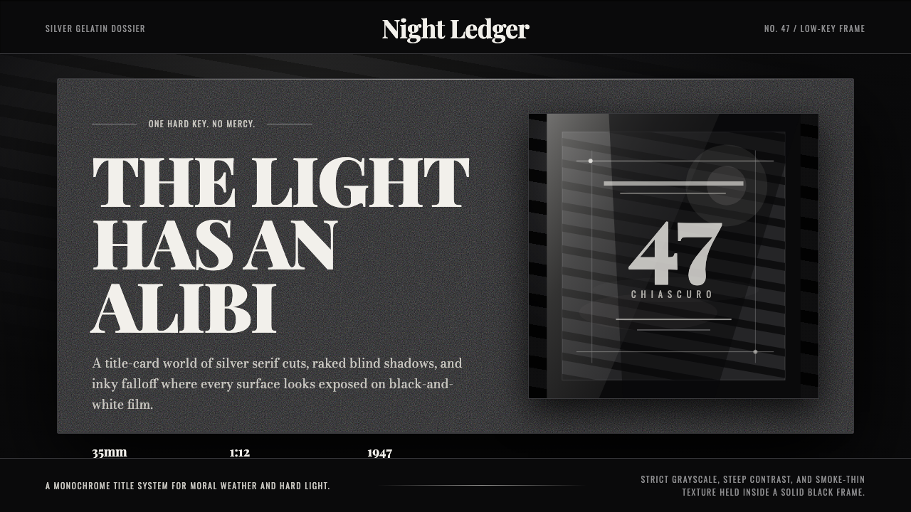 Film Noir ChiaroscuroLight is the crime. Silver serif cards, blind stripes, and grain carve drama…光就是罪证。银色衬线、百叶窗斜影与胶片颗粒从黑场刻出戏剧。
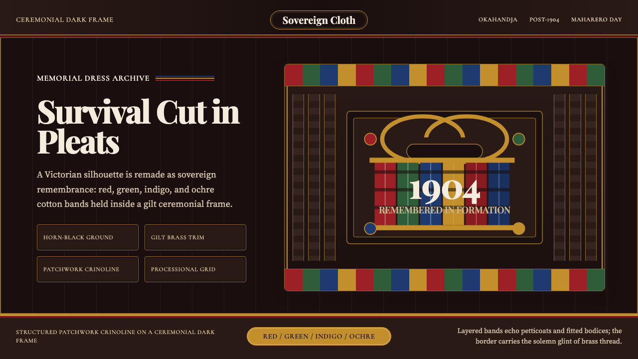 Herero Victorian Dress (Namibia)Memorial wears structure. Red, indigo, green pleats frame gilt brass on dark…纪念有了结构:暗布上红、靛、绿褶柱由黄铜线框起。
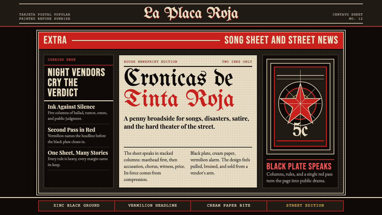 Mexican Tarjeta Postal (Posada Engraving 1900)Tabloid drama in two inks. Fraktur mastheads, vermilion rules, and cream news…双色小报式戏剧:哥特报头、朱红分隔线与粗粝新闻纸。
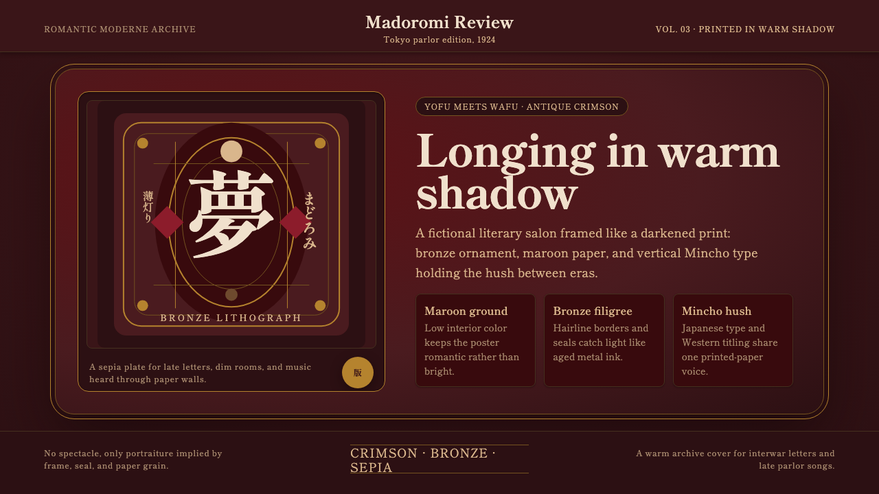 Taishō RomanLonging framed in bronze. Maroon ground, Mincho type, and sepia ornament hush…眷恋被青铜裱起:绛红底、明朝体与旧纸纹样让画面静下来。
 Uruguayan Tango Rioplatense 1900Cabaret melancholy. Oxblood velvet, candle silver, and framed type hold the d…歌厅式忧郁。牛血红天鹅绒、烛银细框与排版托住暗夜。