What is Taishō Roman?什么是 Taishō Roman?
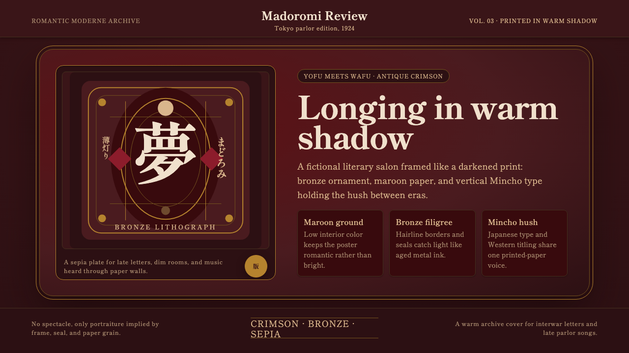
Between two world wars, Japan fell briefly and beautifully in love with a hybrid nostalgia — Western dress worn like a Japanese print, lit like a dim interior at dusk.在两次世界大战之间,日本短暂而深情地爱上了一种混血式的乡愁——洋装穿出和风韵味,又被点亮在一室黄昏般的微暗之中。
Taishō Roman in briefTaishō Roman 速览
Taishō Roman describes the visual culture of interwar Japan, roughly spanning the years 1900 to 1950 with its aesthetic peak during the Taishō period, 1912 to 1926. The name combines the era's own designation with 'Roman,' a Japanese transliteration borrowing the sound of the English word 'romance' — signaling that this style is, at its core, about a wistful, sentimental mood rather than any single technical school of design. It emerged as Japan absorbed Western clothing, music, architecture, and print culture, and rather than replacing existing Japanese visual traditions, that Western influence (yōfū) fused with them (wafū) into a single hybrid sensibility.大正浪漫(Taishō Roman)描述的是两次世界大战之间日本的视觉文化,大致跨越1900至1950年,其美学巅峰出现在大正年间(1912—1926年)。这个名字融合了年号本身与“ロマン”——这是日语对英文“romance”一词的音译,暗示着这种风格的核心,与其说是某一套具体的技法体系,不如说是一种怅惘、多愁善感的情绪。它诞生于日本吸收西方服饰、音乐、建筑与印刷文化的过程中,而这种西方影响(洋风)并没有取代既有的日本视觉传统,反而与之(和风)融合,形成了一种独特的混血感性。
Visually, the style is best understood through the bijin-ga lithograph — a genre of printed portraiture depicting idealized beautiful women, often in a hybrid of Western-style dress and Japanese sensibility, rendered in muted, antique color. The palette leans toward deep crimson, bronze sheen, and a moody, warm maroon ground that recalls the low, warm lighting of an early-twentieth-century interior lit by gas or early electric lamps rather than daylight. Nothing in this style is bright or high-contrast; everything is filtered through a sepia-toned, slightly hushed atmosphere.在视觉上,理解这种风格最好的切入点是“美人画”石版画——一种描绘理想化美人肖像的版画类型,人物常常身着西式与和式混搭的服装,以柔和、陈旧的色调呈现。色板偏向深沉的绛红、青铜般的光泽,以及一种情绪化的暖褐底色,令人联想起二十世纪初由煤气灯或早期电灯(而非日光)照亮的、低而暖的室内光线。这种风格中没有任何明亮或高对比度的元素;一切都透过一层棕褐色调、略带静谧感的氛围被过滤过。
What separates Taishō Roman from either pure Japanese traditional aesthetics or pure Western Art Deco is precisely this fusion quality, and the emotional register it carries. The style frames longing rather than spectacle: portraiture over grand scenes, quiet ornament over bold geometry, a printed-paper hush rather than a declarative modernist statement. It is nostalgic even in its own moment — a visual culture that knew, even as it was being made, that it was documenting something fragile and temporary.把大正浪漫与纯粹的日本传统美学、或纯粹的西方装饰艺术区分开来的,正是这种融合的品质,以及它所承载的情感基调。这种风格所定格的是眷恋,而非奇观:是肖像而非宏大场景,是静谧的纹样而非大胆的几何,是一种印纸般的静谧,而非一句宣言式的现代主义陈述。它甚至在自己诞生的当下就已经是怀旧的——一种在被创造出来的那一刻,就已经知道自己正在记录某种脆弱而短暂之物的视觉文化。
Where does Taishō Roman come from?Taishō Roman 从何而来?
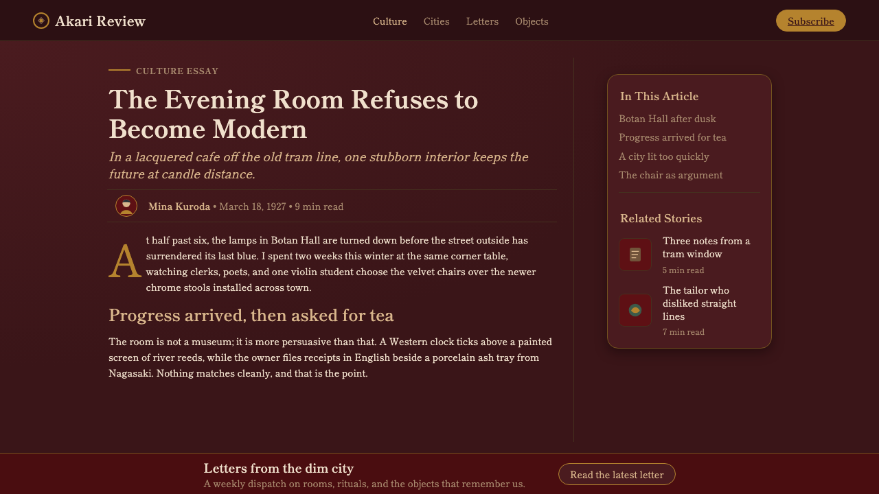
The Taishō period takes its name from Emperor Taishō, whose reign from 1912 to 1926 followed the intensely reformist Meiji era and preceded the militarist Shōwa years. Politically and culturally, Taishō Japan is often remembered as a relatively liberal, cosmopolitan interlude — a period of expanding urban middle-class culture, greater personal freedoms, jazz, cinema, department stores, and cafés, sandwiched between two much harsher eras. This social loosening is what allowed Western fashion, music, and visual culture to enter everyday Japanese life not as a foreign imposition but as something genuinely, popularly embraced.“大正”这一年号取自大正天皇,其在位期间(1912—1926年)承接了锐意改革的明治时代,又先于军国主义色彩浓厚的昭和年代。在政治与文化上,大正时期的日本常被追忆为一段相对自由、国际化的插曲——一个城市中产文化不断扩张、个人自由日渐扩大、爵士乐、电影院、百货公司与咖啡馆兴起的年代,被夹在两个更为严酷的时代之间。正是这种社会氛围的松动,使得西方的时尚、音乐与视觉文化得以进入日本人的日常生活,不是作为一种外来强加物,而是作为某种被真心、广泛拥抱的东西。
The visual hallmark of the period — the fusion of yōfū (Western-style) and wafū (Japanese-style) dress, architecture, and print — reflected a genuine social experience: young urban Japanese women known as 'modan gāru' (modern girls) adopted Western bobbed hair, cloche hats, and Western dress while retaining kimono for other occasions, moving fluidly between both visual vocabularies rather than choosing one over the other. This lived hybridity is what the bijin-ga lithograph genre captured and idealized, rendering the modern woman as both accessible and slightly melancholic — a figure caught between two worlds.这一时期最鲜明的视觉标志——洋风与和风在服饰、建筑与印刷上的融合——反映的是一种真实的社会体验:被称为“摩登女郎”(modan gāru)的都市年轻女性,会采用西式波波头短发与钟形帽、穿着西式服装,同时在其他场合仍穿和服,在两种视觉词汇之间流畅切换,而非非此即彼地二选一。正是这种“活生生的混血感”,被美人画石版画这一类型所捕捉并理想化,把摩登女性刻画为既可亲近、又带着一丝忧郁——一个被夹在两个世界之间的形象。
Takehisa Yumeji stands as the single most consequential figure in defining this visual style. A largely self-taught illustrator, poet, and print artist working from the 1900s through the 1930s, Yumeji developed a signature style of feminine portraiture — wistful, willowy figures rendered in the era's characteristic muted crimson and bronze palette — that became so influential it effectively defined the bijin-ga genre's romantic register for the era. His work appeared not only as standalone prints but across sheet music covers, magazine illustrations, and packaging, meaning the Taishō Roman visual language reached ordinary consumers through commercial print far more than through fine art alone.在定义这种视觉风格的过程中,最具影响力的人物是竹久梦二。这位大致自学成才、活跃于1900年代至1930年代的插画家、诗人与版画艺术家,发展出一套标志性的女性肖像风格——怅惘、纤柔的人物形象,以那个时代特有的柔和绛红与青铜色板呈现——其影响力之大,几乎定义了那个年代美人画类型的浪漫基调。他的作品不仅以单幅版画的形式出现,还广泛出现在乐谱封面、杂志插画与包装设计中,这意味着大正浪漫的视觉语言,是通过商业印刷品而非仅仅精英艺术,触达了普通消费者。
The style's peak roughly coincided with the years 1915 to 1926, after which the increasingly militarized and austere atmosphere of the early Shōwa period made its wistful cosmopolitanism culturally untenable. Taishō Roman survives today primarily through printed ephemera — postcards, sheet music, magazine covers, packaging — objects that were never intended as permanent fine art but that collectively preserved a mood the era itself knew was passing even as it lived through it.这种风格的巅峰大致对应1915至1926年,此后早期昭和时代日益军事化、日趋肃杀的氛围,使得这种怅惘的国际主义在文化上难以为继。大正浪漫如今主要通过印刷品这类日常之物留存至今——明信片、乐谱、杂志封面、包装——这些从未被当作永久性精致艺术来创作的物件,却共同保存了一种情绪:一种即便身处其中的那个时代,也已经知道自己正在逝去的情绪。
What defines the Taishō Roman look?Taishō Roman 的视觉特征是什么?
Color色彩
The dominant ground is a moody, warm maroon, evoking the low light of an early-twentieth-century interior lit by gas or early electric lamps rather than daylight. Against it, deep crimson and a bronze metallic sheen carry accent and ornament, with the overall effect toned down as if seen through a sepia-tinted lithograph rather than reproduced in bright, contemporary color. No hue in this palette is high-saturation or bright; every color reads as aged and filtered.主导底色是一种情绪化的暖褐红,令人联想起二十世纪初由煤气灯或早期电灯(而非日光)照亮的、低沉的室内光线。在此之上,深沉的绛红与青铜金属光泽承担强调与纹样,整体效果被压低调性,仿佛透过一张棕褐色调的石版画来观看,而非以明亮、当代的色彩重现。这套色板中没有一种色相是高饱和或明亮的;每一种颜色读起来都带着岁月与滤镜般的质感。
Mincho Typography明朝体字体排印
Type is rendered in Mincho — the Japanese serif letterform tradition analogous to Western serif type, characterized by contrast between thick vertical and thin horizontal strokes and small triangular ornaments at stroke ends. This choice signals literary, printed, and slightly formal warmth rather than the geometric sans-serif favored by contemporaneous Western Art Deco graphic design, anchoring the style firmly in Japanese print culture even as its imagery borrows Western fashion.字体采用明朝体——日本对应西方衬线字体的传统,特征是竖粗横细的笔画对比,以及笔画末端的小三角装饰。这一选择传达出一种文学性、印刷感与略带正式感的暖意,而非同时代西方装饰艺术平面设计所偏好的几何无衬线字体,将这种风格牢牢锚定在日本印刷文化之中,即便其画面借用了西式时尚元素。
Bijin Portraiture美人画肖像
The central figurative motif is the idealized woman — wistful, willowy, often depicted in a hybrid of Western dress and Japanese posture or setting — rendered with soft linework rather than hard, geometric outline. The figure carries the style's emotional register almost entirely on her own; a Taishō Roman composition without a portrait subject relies far more heavily on ornament and color to communicate the same longing mood.核心的人物母题是理想化的女性形象——怅惘、纤柔,常常身着西式服装、却保持着日式的姿态或场景——以柔和的线条而非硬朗的几何轮廓呈现。这个人物形象几乎独自承载了整套风格的情感基调;一幅没有肖像主体的大正浪漫构图,就需要更大程度地依赖纹样与色彩,来传达同样的眷恋情绪。
Sepia Ornament旧纸纹样
Decorative motifs — floral sprays, geometric borders, printed textures resembling aged paper grain — appear muted and secondary to the central portrait, rendered in tones close to the sepia range rather than in bright contrast. Ornament here supports mood rather than asserting its own visual dominance, a quieter role than ornament plays in more maximalist historical styles.装饰性纹样——花卉枝叶、几何边框、模拟陈旧纸张纹理的印刷质感——在色调上被压低、退居于中心肖像之次,色调贴近棕褐色系,而非明亮对比。这里的纹样是为烘托情绪服务,而非主张自身的视觉主导地位——比起在更繁复的历史风格中,纹样在这里扮演着更为安静的角色。
Dim, Interior Lighting Quality室内式暗光质感
The overall lighting sensibility mimics an early-twentieth-century interior lit by gas lamp or early electric bulb — warm, low, and slightly uneven rather than the even, bright illumination of contemporary photography or design. This quality should govern not just color choice but the overall contrast level of any adaptation: high-contrast, brightly lit compositions work against the style's core mood.整体的光感模拟的是二十世纪初由煤气灯或早期电灯照亮的室内——温暖、低沉、略微不均,而非当代摄影或设计那种均匀、明亮的照度。这种质感不仅应决定色彩选择,还应决定任何改编方案的整体对比度:高对比度、明亮打光的构图,会与这种风格的核心情绪背道而驰。
Yōfū / Wafū Fusion洋风与和风的融合
Western elements — silhouettes of dress, musical instruments, architectural details — sit alongside Japanese compositional conventions, printing techniques, and figurative posture without either vocabulary dominating the other. This fusion is the style's defining structural principle: applying either a purely Western Art Deco vocabulary or a purely traditional Japanese ukiyo-e vocabulary without the hybrid quality misses what makes Taishō Roman distinct.西方元素——服装的轮廓、乐器、建筑细节——与日本的构图惯例、印刷技法及人物姿态并置,二者互不压倒对方。这种融合正是这种风格最核心的结构性原则:如果只套用纯粹的西方装饰艺术词汇、或纯粹传统的浮世绘词汇,而缺少这种混血感,就会失去大正浪漫之所以独特的关键所在。
Who shaped Taishō Roman?谁塑造了 Taishō Roman?
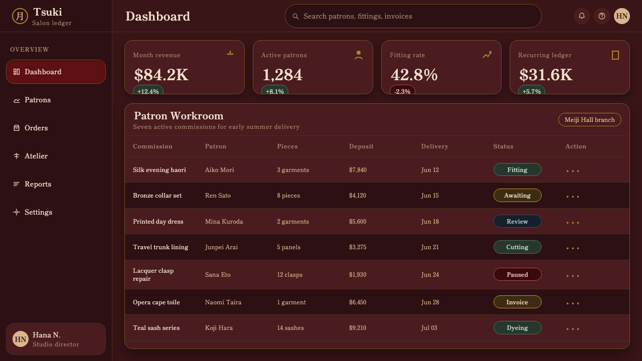
A largely self-taught illustrator, poet, and print artist active from the 1900s through the 1930s, Yumeji developed the signature wistful, willowy bijin portraiture rendered in the era's characteristic muted crimson and bronze palette that came to define Taishō Roman's romantic register. His work spread widely through sheet music covers, magazine illustration, and packaging, carrying the style's visual language into everyday commercial print rather than confining it to fine art.竹久梦二大致自学成才,是活跃于1900年代至1930年代的插画家、诗人与版画艺术家。他发展出标志性的怅惘、纤柔美人肖像风格,以那个年代特有的柔和绛红与青铜色板呈现,成为定义大正浪漫浪漫基调的代表。他的作品广泛出现在乐谱封面、杂志插画与包装设计中,把这种风格的视觉语言带入日常商业印刷,而非局限于精英艺术之中。
How do you use Taishō Roman today?今天怎么用 Taishō Roman?
For presentation slides, Taishō Roman suits content with a nostalgic, literary, or culturally reflective tone — a cover slide can commit to the full maroon ground with a single portrait-like focal image or ornamental motif rendered in bronze and crimson, with Mincho-style type carrying the title in a restrained, formal register. Content slides should keep contrast low and warm throughout, avoiding stark white backgrounds that would break the sepia-toned mood; data should be presented in muted metallic accent tones rather than bright saturated chart colors.在演示文稿中,大正浪漫适合怀旧、文学性或带有文化反思意味的内容——封面页可以整页铺满暖褐红底色,配以一个肖像式的焦点图像或以青铜与绛红呈现的纹样,标题用明朝体式字体、以克制而正式的语调呈现。内容页应通篇保持低对比度与暖色调,避免使用会打破棕褐色氛围的刺眼白色背景;数据呈现应采用低调的金属强调色,而非明亮饱和的图表配色。
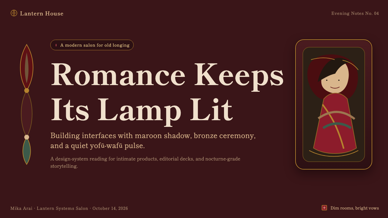
For web interfaces, the style works well for cultural, editorial, or heritage-focused brands — museums, literary publications, boutique fashion or fragrance brands referencing early-twentieth-century romanticism, or storytelling-driven products. The approach: a warm, dim ground rather than bright white, restrained bronze or crimson accents used sparingly for interactive states, and Mincho or Mincho-adjacent serif type for headings to preserve the literary register. Avoid the flat geometric sans-serif hierarchy of Western Art Deco branding, which would contradict the style's Japanese print lineage.对于网页界面,这种风格适合文化、编辑或以文化遗产为核心的品牌——博物馆、文学类出版物、致敬二十世纪初浪漫主义的精品时装或香氛品牌,或以叙事为驱动的产品。方法是:使用温暖、暗沉的底色而非明亮的白色,交互状态克制地使用青铜或绛红强调色,标题使用明朝体或类明朝体的衬线字体,以保留文学性的语调。避免使用西方装饰艺术品牌那种扁平几何无衬线字体层级,这会与这种风格的日本印刷血统相矛盾。
In editorial and marketing work, the style is particularly well suited to long-form storytelling, historical retrospectives, or products marketed around nostalgia and craft — a magazine-style layout can use a full-bleed maroon section break with a single bijin-style illustration as its emotional anchor, and pull-quotes set in Mincho against the same warm ground. Marketing pages benefit from treating imagery, not typography or geometry, as the primary emotional driver, since the style's power rests overwhelmingly in figurative portraiture and color mood.在编辑与营销内容中,这种风格尤其适合长篇叙事写作、历史回顾类内容,或围绕怀旧与工艺进行营销的产品——杂志式版面可以用整页出血的暖褐红底色作为段落分隔,以一幅美人画风格的插图作为情感锚点,引述段落以明朝体呈现在同样的暖色底面之上。营销页面应把图像、而非字体或几何,当作首要的情感驱动力,因为这种风格的力量绝大部分都寄托在具象肖像与色彩情绪之中。
The style is less suited to fast, transactional, or highly technical products, where its slow, wistful register would read as tonally mismatched against a need for speed and clarity.这种风格不太适合快节奏、事务性或高度技术性的产品,因为它缓慢、怅惘的语调,会与对速度与清晰度的需求产生调性上的错位。
The most common mistake when adapting this style is treating it as generic 'vintage Japanese' without the specific yōfū/wafū fusion quality — using only traditional ukiyo-e motifs, or only Western Art Deco geometry, misses the hybrid tension that defines Taishō Roman. A second common mistake is rendering the palette too brightly or with too much contrast; the style depends entirely on a dim, sepia-filtered, low-contrast mood, and any adaptation that brightens the palette for 'visibility' undoes the nostalgic atmosphere that is the style's entire point.移植这种风格时最常见的错误,是把它当作笼统的“复古日式”来处理,而忽略了洋风与和风融合这一具体品质——只使用传统浮世绘纹样,或只使用西方装饰艺术几何形态,都会失去定义大正浪漫的那种混血张力。第二个常见错误,是把色板渲染得过于明亮或对比过强;这种风格完全依赖一种暗沉、棕褐色滤镜般、低对比度的氛围,任何为了“可见性”而调亮色板的改编,都会瓦解这种风格全部意义所在的怀旧氛围。
Taishō Roman — FAQTaishō Roman · 常见问题
Is Taishō Roman the same as Art Deco?大正浪漫和装饰艺术风格是同一回事吗?
They are contemporaries that overlap but are not the same. Art Deco is a Western movement built on bold geometric form, high-contrast color, and streamlined modernity. Taishō Roman shares its era but is defined instead by the fusion of Western fashion and Japanese print sensibility, a wistful bijin-portraiture focus, and a muted, sepia-toned palette rather than Art Deco's bright geometric confidence. A design that uses only Art Deco geometry without the Japanese fusion quality and the nostalgic mood is not Taishō Roman.两者是同时代但并不相同的风格。装饰艺术是一场西方运动,建立在大胆的几何形态、高对比度色彩与流线型现代感之上。大正浪漫虽处于同一时代,却由西方时尚与日本印刷感性的融合、以怅惘的美人肖像为焦点、以及柔和的棕褐色调板所定义,而非装饰艺术那种明亮、几何式的自信。一个只使用装饰艺术几何形态、却缺少日式融合品质与怀旧情绪的设计,并非大正浪漫。
Does this style require a female portrait subject to work?这种风格必须要有一位女性肖像主体才能成立吗?
Not strictly, but the bijin portrait is where the style's emotional register lives most powerfully, so compositions without one need to work harder through color, ornament, and typographic mood to convey the same wistful nostalgia. A product surface without a figurative subject can still succeed by leaning heavily on the maroon-crimson-bronze palette, dim lighting quality, and Mincho typography, but the figure remains the style's most efficient emotional carrier.并非绝对必须,但美人画肖像正是这种风格情感基调最有力的载体,因此没有肖像的构图,需要更多依赖色彩、纹样与字体氛围来传达同样怅惘的怀旧感。一个没有具象人物的产品界面,依然可以借助暖褐红-绛红-青铜色板、暗光质感与明朝体字体取得成功,但人物形象仍然是这种风格最高效的情感载体。
Why is the palette so muted rather than bright and colorful?为什么这套色板如此柔和低调,而不是明亮多彩?
The muted, sepia-toned quality is inherited directly from the lithographic printing techniques used to produce the era's bijin-ga, and from the low, warm gas or early electric lighting the compositions themselves depict. A bright, high-saturation version of this style would break its connection to both its printed origin and its dim-interior subject matter, reading instead as a generic historical-Japanese theme rather than the specific interwar nostalgia Taishō Roman represents.这种柔和、棕褐色调的品质,直接继承自当年印制美人画所用的石版印刷技法,也来自构图本身所描绘的那种温暖、低沉的煤气灯或早期电灯照明。一个明亮、高饱和度的版本,会切断它与自身印刷起源、以及暗沉室内主题的联系,读起来更像一个笼统的“日本历史风”主题,而非大正浪漫所代表的那种特定于两次大战之间的怀旧感。
How does this style handle contrast and hierarchy without bright accent colors?在没有明亮强调色的情况下,这种风格如何处理对比与层级?
Hierarchy is established primarily through the bronze metallic sheen against the deep maroon and crimson ground, and through the scale and placement of the portrait figure or ornamental motif rather than through hue contrast. Typography size and the Mincho serif's own stroke-weight contrast (thick verticals, thin horizontals) provide additional hierarchy without requiring any color outside the muted palette.层级主要通过青铜金属光泽与深沉暖褐红、绛红底面之间的对比来建立,也通过肖像人物或纹样的尺度与位置来建立,而非依靠色相对比。明朝体自身笔画粗细的对比(竖粗横细)以及字号大小,提供了额外的层级感,而无需在这套柔和色板之外引入任何其他颜色。
Is this style culturally appropriate to use outside a Japanese cultural context?在非日本文化语境中使用这种风格是否合适?
The style itself emerged from a specific historical fusion of Western and Japanese visual culture, so applying it thoughtfully — understanding and crediting its origin rather than treating it as generic 'Asian vintage' decoration — matters. It is best used for content that genuinely engages with early-twentieth-century Japanese culture, history, or an explicit homage to that period, rather than applied purely decoratively to unrelated subject matter.这种风格本身诞生于西方与日本视觉文化在特定历史时期的融合,因此审慎地应用它——理解并尊重其来源,而非把它当作笼统的“东方复古”装饰来对待——很重要。它最适合用于真正涉及二十世纪初日本文化、历史,或明确向那个时代致敬的内容,而非纯粹装饰性地套用在毫不相关的主题上。
Related design styles相关设计风格
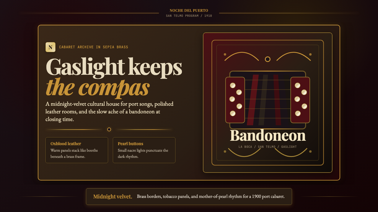 Argentine Bandoneón 1900 (Tango)Gaslit tango luxury. Midnight velvet, brass fileteado, and pearl-button geome…煤气灯下的探戈奢华:午夜绒底、黄铜卷草与珍珠琴键。
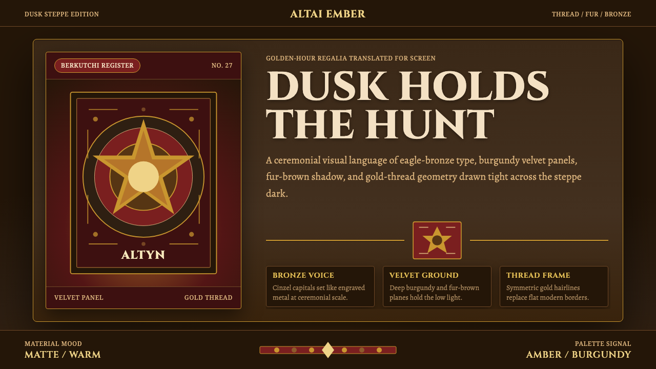 Kazakh Eagle HunterGolden hour feels handmade. Burgundy velvet, bronze type, and gold-thread bor…手作的黄金时刻。酒红丝绒、古铜字与金线边框托住暮色。
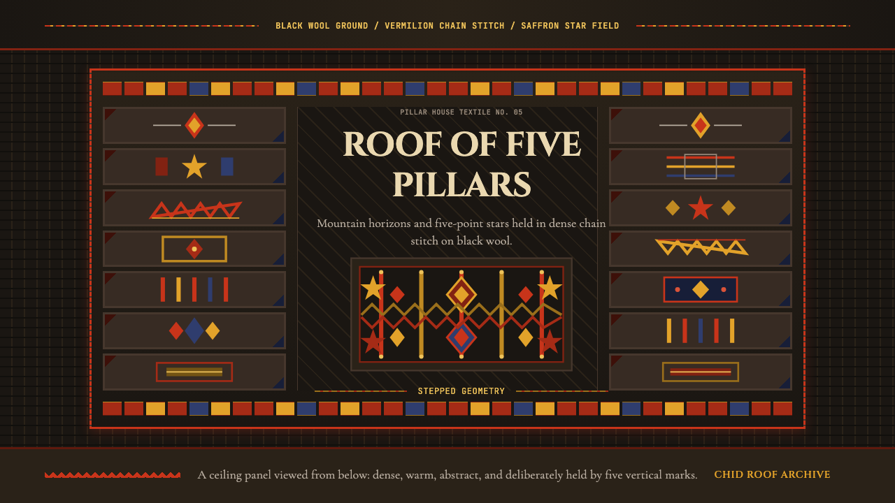 Tajik Pamir Needlework (Chid Roof)Cosmos stitched into wool. Vermilion diamonds and saffron stars hold a five-p…羊毛上的宇宙:朱砂菱形与藏红花星纹撑起五柱网格。
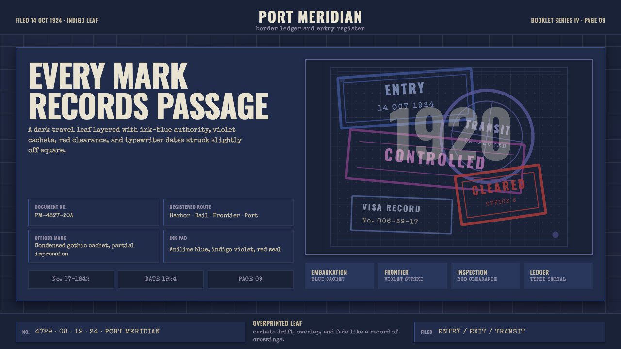 Vintage Passport StampsInk remembers passage. Indigo leaf, blue-violet cachets, red seal, typewriter…墨迹记住过境。靛青纸页、蓝紫印戳与红章叠成档案。
 Zelda Ocarina of TimeWarm-fantasy mythology as a UI. Cinzel inscriptions on cream parchment, minte…温暖奇幻的史诗感:Cinzel 碑铭字落于米色羊皮,金币般的按钮,深靛蓝的夜。
 Čiurlionis SymbolismCosmos becomes music. Midnight blue-violet washes and pale gold stars drift i…宇宙化为音乐:午夜蓝紫晕染,淡金星点与衬线字静静漂浮。