What is Pantone Ultra Violet?什么是 Pantone Ultra Violet?
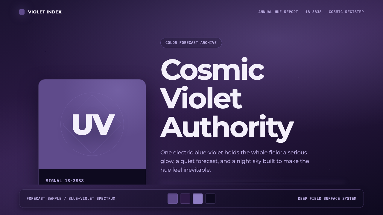
In December 2017, a color institute told the world that the coming year would feel like violet — cosmic, forward-looking, and quietly authoritative.2017年12月,一家色彩机构向世界宣布:即将到来的一年会是紫色的感觉——宇宙感、前瞻,且带着一种不动声色的权威。
Pantone Ultra Violet in briefPantone Ultra Violet 速览
Pantone Ultra Violet is a corporate color-forecasting aesthetic built around a single hue: Pantone 18-3838, an electric blue-violet that the Pantone Color Institute named its Color of the Year for 2018. Unlike a historical art movement or a subculture, this style originates from an annual marketing ritual — a color authority declaring which shade will define fashion, product design, and visual culture for the next twelve months. What makes Ultra Violet distinct from other Colors of the Year is the imagery Pantone chose to launch it: instead of a flat white swatch card, the violet was set against a deep indigo night sky rendered as a nebula gradient, explicitly framing the color as cosmic and mystical rather than merely fashionable.Pantone Ultra Violet 是一套围绕单一色相搭建的企业色彩预测美学:潘通 18-3838,一种带电感的蓝紫色,被潘通色彩研究所选为2018年度代表色。与历史悠久的艺术运动或亚文化不同,这套风格源自一项年度性的市场仪式——一家色彩权威机构宣布,未来十二个月的时尚、产品设计与视觉文化将由哪一种色调来定义。Ultra Violet 与其他年度色彩最大的不同,在于潘通选择的发布画面:他们没有用白纸印刷的平面色卡,而是把这抹紫色放进了以星云渐变呈现的深靛蓝夜空之中,明确地把这种颜色定义为宇宙感与神秘感,而非单纯的时尚感。
The resulting visual system is built entirely in service of that one hue. A confident, saturated violet anchors every composition, surrounded by clean geometric grotesque typefaces, generous negative space, and a single starlit gradient standing in for the night sky. Color blocks are treated like the swatch chips found in a professional color-matching book, and small monospaced tags echo the alphanumeric codes — PMS numbers — that the Pantone system uses to identify each shade precisely. Everything else in the composition is quiet so that the violet can glow.由此产生的视觉系统完全为这一色相服务。每一个构图都由一种笃定、饱和的紫色锚定,周围环绕着干净的几何无衬线字体、慷慨的留白,以及一道代表夜空的星光渐变。色块被处理得像专业配色手册里的色卡样片,小号等宽字体标签则呼应着潘通体系用来精确标识每种色调的字母数字编码(即 PMS 编号)。构图中的其余一切都保持安静,好让这抹紫色持续发光。
The tone this produces is deliberately different from playful neon-violet aesthetics like vaporwave. Ultra Violet is not campy or nostalgic; it aims for authority and depth. It reads as a hue chosen by an institution rather than a hue reached for by a rebellious subculture, and its restraint — one color doing almost all of the expressive work — is what separates a well-executed Ultra Violet composition from a generic purple gradient.这种气质刻意区别于波普霓虹紫这类玩味、怀旧的美学。Ultra Violet 不追求戏谑或复古感,它追求权威与深度。它读起来像是一种由机构挑选出的色相,而非某个叛逆亚文化伸手抓来的颜色;这种克制——让一种颜色几乎承担全部表达任务——正是区分一个用心制作的 Ultra Violet 构图与一个泛泛的紫色渐变的关键所在。
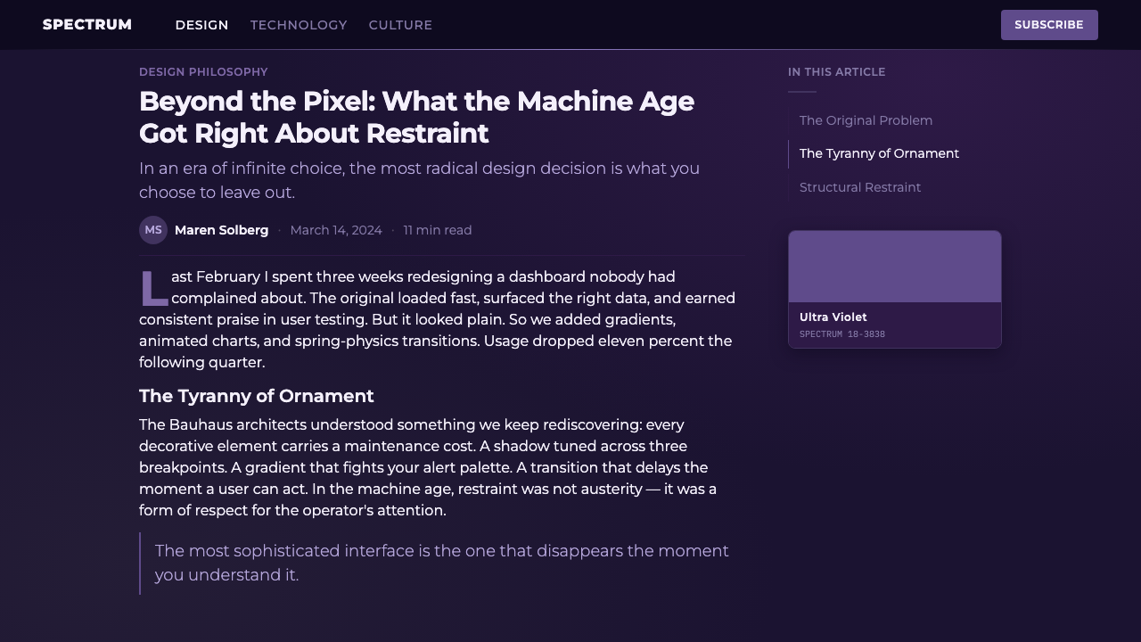
See the Pantone Ultra Violet design system查看 Pantone Ultra Violet 完整设计系统
Where does Pantone Ultra Violet come from?Pantone Ultra Violet 从何而来?
The Pantone Color Institute is a division of Pantone LLC, the company headquartered in Carlstadt, New Jersey, that created the Pantone Matching System — the numbered color-reference standard used across printing, fashion, product design, and manufacturing since the 1960s to guarantee that a color specified in one factory looks identical when produced in another. Since 2000, the Institute has issued an annual Color of the Year, a forecast built from trend research across runway shows, entertainment, art, and travel, intended to give brands and designers a shared color to anchor collections and campaigns around.潘通色彩研究所是潘通公司(Pantone LLC)旗下的一个部门,总部位于美国新泽西州卡尔施塔特。这家公司创建了潘通配色系统——一套自1960年代起被印刷、时尚、产品设计与制造业广泛采用的编号色彩参照标准,用来保证某个工厂指定的颜色,在另一个工厂生产出来时依然完全一致。自2000年起,该研究所每年发布一个年度代表色,这一预测基于对时装秀、娱乐、艺术与旅行等领域趋势的研究,旨在给品牌与设计师提供一个共同的色彩基准,用来统筹系列产品与营销活动。
Leatrice Eiseman, the Institute's longtime executive director, led the selection of Ultra Violet for 2018. The Institute's public reasoning tied the color to space exploration culture — a period marked by renewed public fascination with the cosmos, private spaceflight ventures, and stargazing imagery circulating widely on social media — as well as to the color's long association with spirituality, mysticism, and unconventional creativity. Violet has historically carried these connotations in Western color theory: it sits at the far end of the visible spectrum, is comparatively rare in nature, and has been linked to royalty, ritual, and altered states of consciousness across many cultures.研究所的长期执行总监莱特丽斯·艾斯曼主导了2018年度代表色 Ultra Violet 的评选。研究所对外给出的理由,将这种颜色与太空探索文化联系在一起——彼时公众对宇宙重新燃起兴趣,私人航天事业兴起,社交媒体上广泛流传着星空影像;同时也与紫色长久以来所承载的灵性、神秘主义与非常规创造力的联想相关。在西方色彩理论中,紫色历来带有这些内涵:它位于可见光谱的极远端,在自然界中相对罕见,在许多文化中都与王权、仪式和意识变化状态相关联。
The choice landed in a specific cultural moment. Late 2017 into 2018 saw a wave of gradient-driven digital design — often described informally as a 'holographic' or 'cosmic' aesthetic — spreading across app interfaces, album covers, and social media branding. Ultra Violet's launch imagery, with its night-sky gradient rather than a conventional flat swatch, was itself part of this trend rather than separate from it; Pantone's marketing visibly borrowed the visual language of digital gradient culture to sell a physical color standard.这一选择恰逢一个特定的文化时刻。2017年末到2018年,一波以渐变为核心的数字设计浪潮——常被非正式地称为“全息感”或“宇宙感”美学——正蔓延至各类应用界面、专辑封面与社交媒体品牌形象之中。Ultra Violet 的发布画面以星空渐变取代了传统的平面色卡,这本身就是这股潮流的一部分,而非独立于它:潘通的营销团队明显借用了数字渐变文化的视觉语言,来推销一种实体的色彩标准。
Because Pantone's Color of the Year is fundamentally a piece of corporate color forecasting rather than an art or design movement with named practitioners, its 'origin story' is institutional: a single company's annual announcement, amplified through licensing deals, retail tie-ins, and media coverage, that briefly becomes a shared visual reference point across unrelated industries — fashion houses, tech branding, home goods, and eventually, web and app interface design.由于潘通的年度代表色本质上是一种企业色彩预测行为,而非一场有具名实践者的艺术或设计运动,它的“起源故事”是机构性的:一家公司每年一度的宣布,经由授权合作、零售联名与媒体报道层层放大,短暂地成为跨越时尚、科技品牌、家居用品乃至网页与应用界面设计等不相关行业的共同视觉参照点。
What defines the Pantone Ultra Violet look?Pantone Ultra Violet 的视觉特征是什么?
Color色彩
A single saturated blue-violet dominates every composition, almost always paired with a deep, near-black indigo ground rather than white. Secondary hues are kept minimal — a muted lavender or a pale starlight tone at most — so that the eye reads violet as the subject of the page, not a background accent among many. Color is never spread thin across many elements; it is concentrated into a small number of confident blocks and gradients.一种饱和的蓝紫色主导着每一个构图,几乎总是与深邃近黑的靛蓝底色搭配,而非白色。辅助色调被压到最低——最多是一种柔和的薰衣草紫或浅淡的星光色——好让紫色本身被读作页面的主体,而非众多背景点缀之一。色彩从不被稀薄地铺陈在许多元素上,而是被浓缩进少数几个笃定的色块与渐变之中。
Gradient as Sky渐变即星空
The system's single most identifying feature is a gradient that reads as a night sky rather than a decorative flourish — deep indigo darkening toward the edges of a composition, sometimes with faint speckled points standing in for distant stars. This gradient is used sparingly, typically as a full-bleed background or a large hero panel, never as a texture applied to small UI elements. It exists to evoke depth and distance, echoing the cosmic framing Pantone itself used to launch the color.这套系统最具辨识度的单一特征,是一道读起来像夜空而非装饰花样的渐变——深靛蓝色向构图边缘逐渐加深,有时点缀着细微的斑点,代表遥远的星辰。这道渐变被节制地使用,通常作为通栏背景或一块大型主视觉面板,而绝不作为施加于小型界面元素上的纹理。它的存在是为了唤起深度与距离感,呼应潘通本身用来发布这种颜色时所采用的宇宙框架。
Typography字体排印
Type is a clean geometric grotesque — the kind of sans-serif associated with corporate branding and trend reports, chosen for its neutrality rather than any expressive flourish. This restraint is deliberate: the typeface should never compete with the color for attention. Headlines are set with generous letter spacing and moderate weight, avoiding both the extreme heaviness of poster type and the delicacy of a display serif, so the composition reads as authoritative rather than playful.字体是一种干净的几何无衬线字体——与企业品牌形象及趋势报告相关联的那种无衬线字体,之所以被选中是因为它的中性感,而非任何表现性的花哨笔触。这种克制是刻意为之的:字体绝不能与色彩争夺注意力。标题排版通常字距宽松、字重适中,既不采用海报字体的极端厚重,也不采用展示衬线体的纤细感,从而使整体构图读起来权威而非玩味。
Swatch-Chip Logic色卡逻辑
Rectangular color blocks are treated like the physical chips found in a professional color-reference fan deck — clean-edged, flat, and unadorned, often labeled with a small monospaced code reminiscent of a PMS number. This gives the system a subtle institutional undertone: even a purely digital interface can feel like it is referencing a physical, authoritative color standard rather than an arbitrary palette choice.矩形色块被处理得像专业配色扇形卡里的实体色卡——边缘干净、平面、不加修饰,常常标注一个类似 PMS 编号的小号等宽字体代码。这为整套系统注入了一种微妙的机构气息:即便是一个纯数字化的界面,也能让人感觉它在引用一套实体的、权威的色彩标准,而非随意挑选的配色方案。
Negative Space留白
Compositions are generously spaced, with large areas of the dark ground left entirely empty around the violet elements. This is not incidental breathing room but a structural choice — space signals confidence, allowing the single hue and the gradient to command attention without competing visual noise. Cluttered layouts undermine the aesthetic's entire premise of quiet authority.构图留白慷慨,紫色元素周围大片的深色底面被完全留空。这并非偶然的呼吸空间,而是一个结构性的选择——留白传递出自信,让单一色相与渐变能够统领视线,而不必与繁杂的视觉噪音争夺注意力。杂乱的版面会瓦解这种美学“安静权威感”的整个前提。
Restraint over Ornament克制胜于装饰
Unlike ornamental or maximalist styles, Ultra Violet avoids pattern, texture, and decorative borders almost entirely. The gradient and the swatch blocks are the only permitted visual embellishments; everything else is flat, unshaded color or clean typography. This restraint is what keeps the aesthetic feeling corporate and forward-looking rather than tipping into the kitsch of generic 'cosmic' or 'galaxy' design trends that layer stars, sparkles, and glow effects indiscriminately.与装饰性或极繁主义风格不同,Ultra Violet 几乎完全避免图案、纹理与装饰性边框。渐变与色卡块是仅有的两种被允许的视觉点缀;其余一切都是平涂、无阴影的色彩或干净的字体排印。正是这种克制,让这种美学保持企业感与前瞻感,而不至于滑向那种把星星、闪光与光晕效果不加节制地层层堆叠的“宇宙风”俗套。
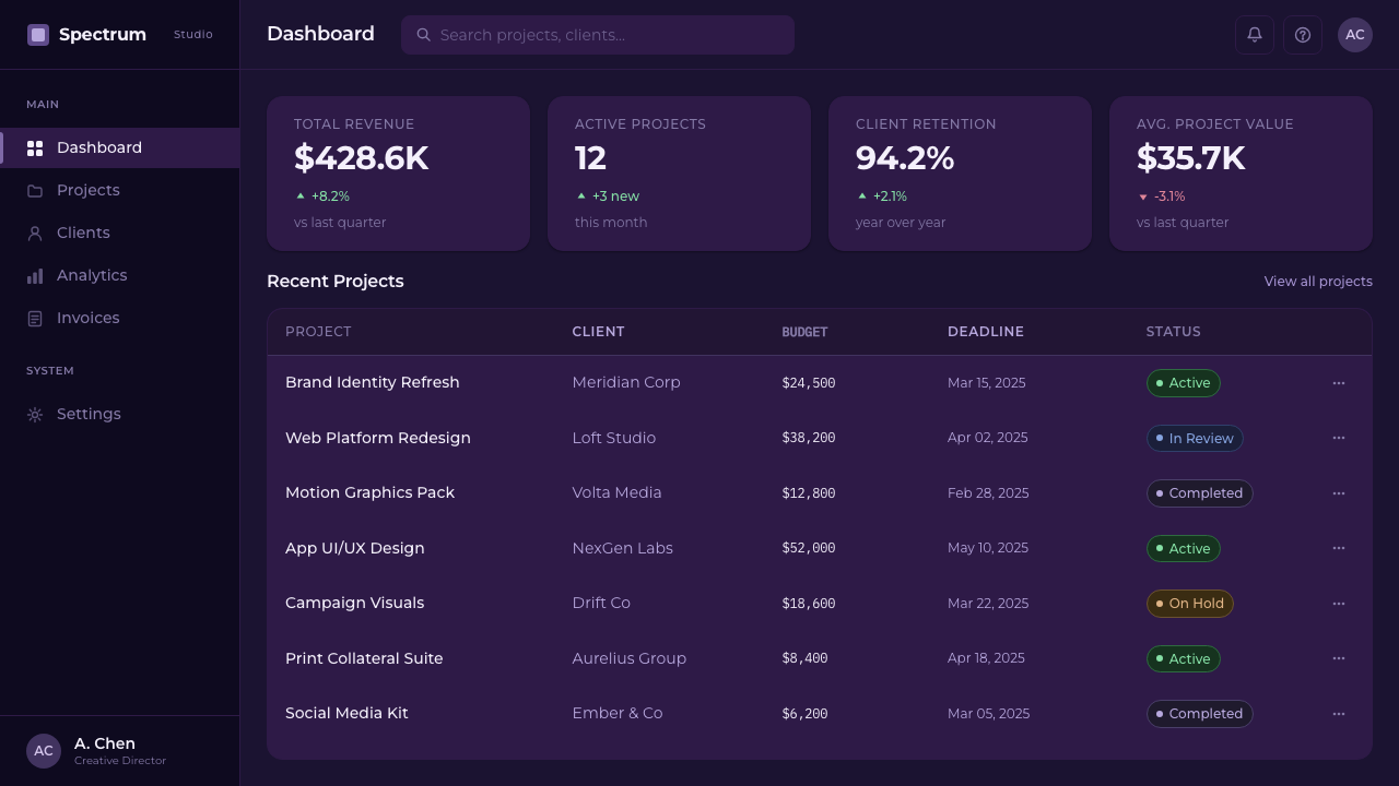
See the Pantone Ultra Violet design system查看 Pantone Ultra Violet 完整设计系统
Who shaped Pantone Ultra Violet?谁塑造了 Pantone Ultra Violet?
Eiseman served for decades as the executive director of the Pantone Color Institute and was the public face of its annual Color of the Year announcements, including Ultra Violet in 2017. Her role combined color psychology research with trend forecasting, and her public commentary consistently framed color choices in terms of broader cultural mood rather than pure fashion trend-chasing — a framing that gave Ultra Violet its cosmic, contemplative positioning rather than a purely decorative one.艾斯曼数十年来担任潘通色彩研究所执行总监,是该机构每年发布年度代表色(包括2017年宣布的 Ultra Violet)时的公众代言人。她的工作将色彩心理学研究与趋势预测结合在一起,其公开评论也一贯将色彩选择置于更广阔的文化情绪之中,而非单纯追逐时尚潮流——正是这种视角,赋予了 Ultra Violet 宇宙感与沉思气质的定位,而非纯粹的装饰性定位。
Founded as a commercial printing company before pivoting to color standardization in the 1960s, Pantone LLC created the Pantone Matching System that underlies the swatch-chip visual logic this style borrows. The company's business model — licensing its color codes and authority to manufacturers and brands worldwide — is itself part of what makes an aesthetic built around 'Pantone 18-3838' feel institutional rather than merely artistic.潘通公司最初是一家商业印刷企业,1960年代转向色彩标准化业务,创立了潘通配色系统,而这套体系正是本风格所借用的色卡视觉逻辑的根基。该公司的商业模式——向全球制造商与品牌授权其色彩编码与权威地位——本身就是这种围绕“潘通18-3838”打造的美学之所以显得机构化、而非单纯艺术化的原因之一。
As the forecasting arm of Pantone LLC, the Institute conducts the annual research process that produces each year's Color of the Year, drawing on runway collections, entertainment releases, art exhibitions, and travel trends. Its announcements are covered by fashion, design, and lifestyle media each December, giving each year's color — including Ultra Violet — an outsized, temporary influence across unrelated creative industries.作为潘通公司的预测部门,该研究所每年进行一轮研究,从时装秀系列、娱乐作品、艺术展览与旅行趋势中提炼出当年的代表色。每年12月,时尚、设计与生活方式媒体都会报道这一发布,使得包括 Ultra Violet 在内的每一年度代表色,在毫不相关的创意行业中获得一种规模超常但短暂的影响力。
How do you use Pantone Ultra Violet today?今天怎么用 Pantone Ultra Violet?
Ultra Violet works especially well anywhere a product wants to project forward-looking authority without appearing playful or juvenile — think fintech dashboards, premium subscription tiers, or launch pages for tools positioned as cutting-edge rather than approachable. The key to applying it correctly is committing fully to the dark indigo ground; a light-background version of this aesthetic loses the cosmic framing entirely and reads as generic purple branding instead.Ultra Violet 特别适合那些想要传达前瞻性权威感、又不希望显得玩味或幼稚的产品场景——比如金融科技仪表板、高级订阅套餐,或是定位为前沿而非亲民的工具类产品的发布页面。正确应用这种风格的关键,在于完全投入深靛蓝底色;如果把这种美学套用在浅色背景上,宇宙感的框架就会彻底丧失,变成一种泛泛的紫色品牌形象。
For presentation slides, the style suits a cover or section-divider treatment better than dense content slides. A title slide can use the full night-sky gradient as a hero background with a single confident headline in light type; content slides should pull back to a near-black or deep indigo ground with violet used sparingly for emphasis — a highlighted statistic, a key term, a single accent bar — rather than saturating every slide in violet, which quickly becomes fatiguing.在演示文稿中,这种风格更适合用作封面或章节分隔页,而非密集的内容页。标题页可以用完整的星空渐变作为主视觉背景,配上一句用浅色字体书写的笃定标题;内容页则应回归到近黑或深靛蓝底色,紫色只做点睛之用——一个被强调的数据、一个关键术语、一条强调色的分隔线——而不是让每一页都被紫色填满,那样很快会让人视觉疲劳。
For web interfaces, Ultra Violet is a strong fit for dashboard hero sections, pricing-page premium tiers, and onboarding flows for products in spatial, scientific, or forward-looking categories. Swatch-chip blocks work well as feature-comparison cards or plan-tier indicators, echoing the sense of a curated, authoritative selection. Buttons and interactive states should use the violet as the single accent color against the dark ground, keeping all body text in a soft off-white rather than pure white to preserve the muted, night-sky mood.在网页界面中,Ultra Violet 非常适合仪表板的主视觉区域、定价页面的高级套餐,以及面向航天、科学或前沿科技类产品的引导流程。色卡式的色块非常适合用作功能对比卡片或套餐等级指示器,呼应出一种经过精心甄选、具有权威性的感觉。按钮与交互状态应把紫色作为深色底面上唯一的强调色,正文文字则应保持柔和的米白色而非纯白色,以维持这种克制的、夜空般的氛围。
For editorial and marketing pages, the aesthetic supports long-form storytelling about trends, forecasts, or futures — articles about emerging technology, culture pieces, or annual 'state of the industry' reports. A full-bleed gradient hero image paired with a short, confident headline mirrors exactly how Pantone itself launched the color, and this self-referential quality is part of the aesthetic's appeal when used knowingly.在编辑与营销内容中,这种美学适合承载关于趋势、预测或未来议题的长文——探讨新兴科技的文章、文化专栏,或年度“行业状态”报告。通栏渐变主图配上简短而笃定的标题,恰恰复刻了潘通当初发布这种颜色的方式;当被有意识地使用时,这种自我指涉的特质正是这种美学吸引力的一部分。
A common mistake is treating Ultra Violet as simply 'purple mode' — swapping an existing light-themed design's accent color to violet without darkening the ground or introducing the gradient. Without the deep indigo backdrop and the restrained, swatch-like treatment of color blocks, the result loses the cosmic authority that defines the style and becomes an ordinary violet color scheme instead.一个常见的错误,是把 Ultra Violet 简单理解为“紫色模式”——只是把一套现有浅色主题设计的强调色换成紫色,而不加深底色、不引入渐变。如果没有深邃的靛蓝背景,也没有对色块进行克制的、类似色卡的处理,最终结果就会丧失这种风格所定义的宇宙感权威,沦为一套普通的紫色配色方案。
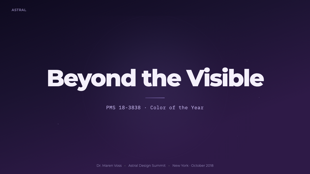
See the Pantone Ultra Violet design system查看 Pantone Ultra Violet 完整设计系统
Pantone Ultra Violet — FAQPantone Ultra Violet · 常见问题
Is Ultra Violet the same as the general 'holographic' or 'vaporwave' aesthetic?Ultra Violet 和一般的“全息感”或“蒸汽波”美学是一回事吗?
No, though they overlap in timing and color range. Vaporwave draws on 1980s-90s nostalgia, neon pink-and-cyan gradients, and a knowingly ironic or dreamy tone. Ultra Violet is narrower and more serious: it is built around a single institutionally-declared hue, favors a night-sky gradient over a synthetic neon one, and aims for corporate authority rather than retro playfulness. Ultra Violet can be thought of as a more restrained, single-color cousin that emerged from a color-forecasting announcement rather than a music or internet subculture.不是,虽然两者在出现时间与色彩范围上有所重叠。蒸汽波取材于1980到90年代的怀旧情绪,采用霓虹粉与青色的渐变,带有一种心照不宣的反讽或梦幻基调。Ultra Violet 则更为狭窄和严肃:它围绕一种由机构宣布的单一色相构建,偏爱夜空渐变而非合成霓虹渐变,追求的是企业级的权威感而非复古的玩味感。可以把 Ultra Violet 理解为一个更克制、更单色调的“表亲”,它诞生于一次色彩预测宣布,而非某种音乐或网络亚文化。
Why is the background almost always dark rather than the traditional white swatch-book background?为什么背景几乎总是深色的,而不是传统色卡册那种白色背景?
Because the style is built to imitate Pantone's own 2018 launch imagery, which deliberately broke from the flat white background of a conventional color-reference fan deck in order to frame Ultra Violet as cosmic rather than merely commercial. A white background would evoke a print shop or a paint store; the dark indigo ground evokes a night sky, which is the whole point — the color is being sold as mystical and forward-looking, not just accurate and reproducible.因为这种风格本就是在模仿潘通2018年官方发布画面的做法——它刻意打破了传统配色扇形卡那种平面白色背景,为的是把 Ultra Violet 定义为宇宙感的,而非单纯的商业感。白色背景会让人联想到印刷厂或油漆店;而深靛蓝底色唤起的是夜空,这正是整个风格的立意所在——这种颜色被包装成神秘而前瞻的,而不只是精准可复制的。
Can this style work with a color other than violet?这种风格能否用在紫色以外的其他颜色上?
The structural logic — a single confident hue against a dark, gradient-lit ground, treated with swatch-chip blocks and restrained typography — could technically be adapted to another Pantone Color of the Year, since Pantone repeats this forecasting ritual annually with different hues. But doing so changes the aesthetic's identity: Ultra Violet specifically trades on violet's cultural associations with mysticism and the cosmos. A different hue would need its own justification for the dark, night-sky treatment rather than simply swapping the color value.这套结构逻辑——一种笃定的色相配上深色、被渐变点亮的底面,辅以色卡式色块与克制的字体排印——理论上可以套用到潘通其他年份的年度代表色上,因为潘通每年都会用不同的色相重复这一预测仪式。但这样做会改变这种美学的身份认同:Ultra Violet 特别依赖紫色所承载的神秘主义与宇宙感的文化联想。换成另一种色相,就需要为深色夜空式处理找到属于它自己的理由,而不能只是简单替换色值。
How is Ultra Violet different from purely applying a purple-blue gradient in modern UI design?Ultra Violet 与现代 UI 设计中单纯使用紫蓝渐变有什么区别?
Generic purple-blue gradients in modern app design are typically used as a texture or accent applied broadly across a light-background interface — buttons, icons, hero banners — without any deeper conceptual framing. Ultra Violet as a system is more disciplined: the gradient specifically represents a night sky, the color blocks specifically reference physical color-swatch chips, and the overall palette is restricted almost entirely to one hue plus near-black. It is a curated, institutional aesthetic rather than a loosely applied color trend.现代应用设计中常见的紫蓝渐变,通常只是作为一种纹理或点缀,被大面积应用在浅色背景界面的按钮、图标或主视觉横幅上,并没有更深层的概念框架。而作为一套体系,Ultra Violet 更加自律:渐变特指夜空,色块特指实体色卡样片,整体色板几乎完全被限制在一种色相加近黑色之内。这是一种经过精心策划的机构化美学,而非一种随意套用的色彩潮流。
Does Ultra Violet suit playful or consumer-facing products?Ultra Violet 适合玩味或面向普通消费者的产品吗?
It can, but it requires care. The style's core appeal is authority, seriousness, and cosmic depth — qualities that fit premium tools, forecasting products, science or astronomy content, and forward-looking brand positioning well. Applied to a playful consumer product like a children's app or a casual game, the restrained, institutional tone can read as mismatched or overly serious. It fits best where the product itself wants to feel a step ahead of the moment rather than immediately fun.可以,但需要谨慎处理。这种风格的核心魅力在于权威感、严肃性与宇宙般的深度——这些特质非常适合高端工具、预测类产品、科学或天文内容,以及追求前瞻定位的品牌。如果把它用在儿童应用或休闲游戏这类玩味十足的消费产品上,那种克制、机构化的基调可能显得不搭调或过于严肃。它最适合那些希望自己显得走在时代前面、而非追求即时趣味性的产品。
Related design styles相关设计风格
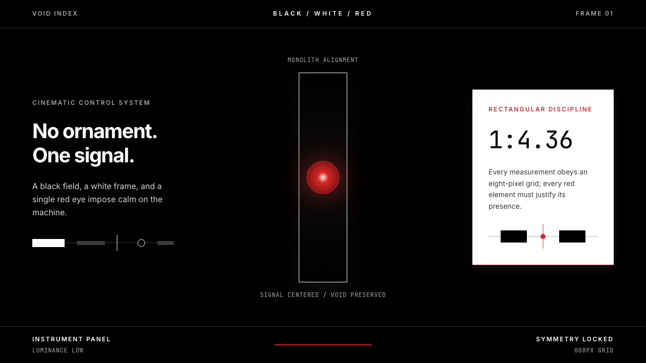 2001 — A Space OdysseyAbsolute restraint. Black void, white monolith geometry, one HAL-red signal.绝对克制:黑色虚空、白色巨石几何、唯一的 HAL 红信号。
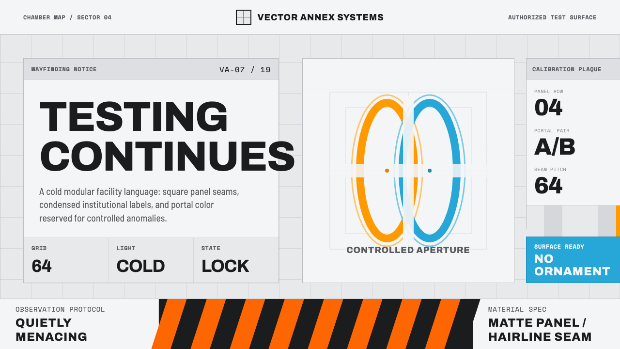 Aperture ScienceSterile authority. Cool panel seams, Archivo signage, and sparse orange-blue…冷峻权威:冷灰板缝、Archivo 标识与稀疏橙蓝光环。
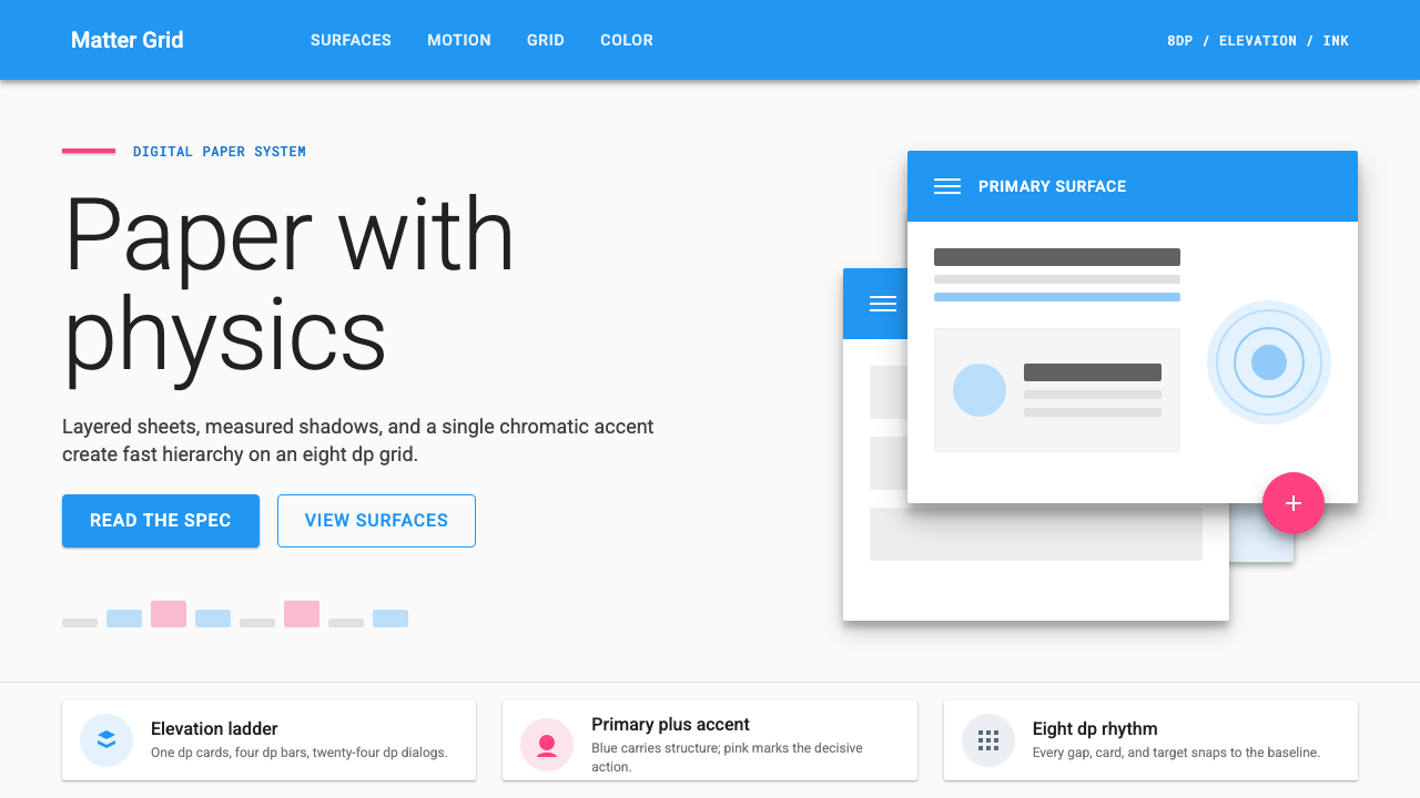 Material Design 1.0Depth made flat usable. Blue app bars, pink FABs, 8dp grids, and crisp paper…让扁平拥有深度:蓝色应用栏、粉色FAB、8dp网格与纸张投影。
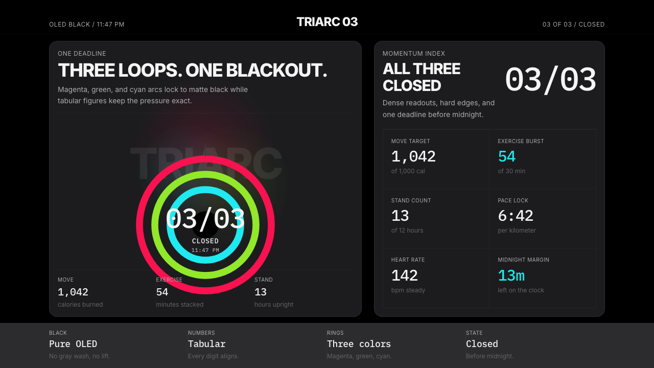 Apple Fitness Rings Closed (2024)Midnight feels exact. Magenta, green, and cyan rings lock onto OLED black.午夜像被校准。洋红、绿、青三环锁在黑底上。
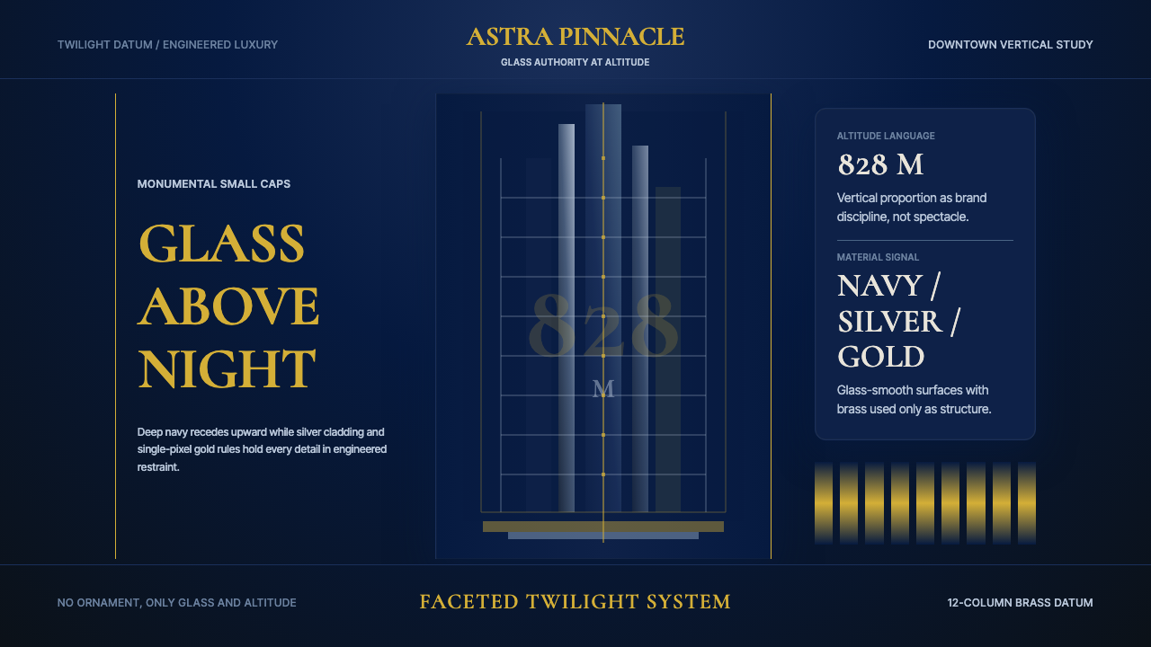 Burj Khalifa TowerAltitude becomes authority. Navy glass, silver facets, and hairline gold rule…高度即权威。夜蓝玻璃、银色切面与发丝金线向上攀升。
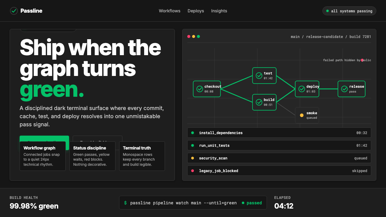 CircleCI Pipeline-GreenConfidence goes green. Emerald status lines cut through terminal-black pipeli…信心变绿。翠绿状态线切过终端黑流水线网格。