What is Turkmen Bukhara Rug?什么是 Turkmen Bukhara Rug?
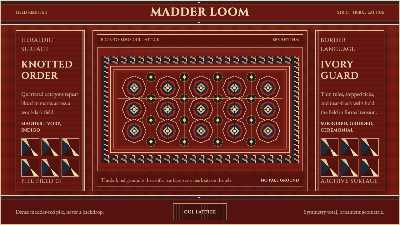
The Turkmen Bukhara rug is heraldic and earthbound — madder red wool, ivory hairline outlines, and octagonal gül medallions locked into an unyielding grid.土库曼布哈拉地毯庄重而扎根大地——茜红羊毛绒面、象牙细线轮廓,以及锁进不容动摇网格之中的八角古尔纹章。
Turkmen Bukhara Rug in briefTurkmen Bukhara Rug 速览
Turkmen Bukhara Rug style is drawn from the Turkmen Tekke rug — commonly sold in Western markets under the name Bukhara, after the Central Asian trading city through which it historically passed rather than the place it was woven. This is a pre-1900 tribal weaving tradition built on a lustrous, madder-dyed red wool field, its surface organized by rows of quartered octagonal medallions known as gül, most famously the pattern called fil pai, or elephant's foot, repeating in a strict, unbroken lattice.「土库曼布哈拉地毯」风格取材自土库曼特克地毯——在西方市场通常以"布哈拉"之名流通,这一名称源自这种地毯历史上流经交易的中亚城市,而非其编织产地本身。这是一项1900年之前的部落织造传统,以茜草根染出的、光泽饱满的红色羊毛绒面为基底,表面由一排排被称为古尔(gül)的四分八角纹章所组织,其中最著名的图案是被称作"象脚"(fil pai)的纹样,在严整、不间断的网格中反复出现。
The palette is monochrome-warm rather than multicolored: deep madder reds dominate the field, lifted by ivory outlines that trace each motif's edge, with dark indigo and near-black brown appearing as structural accents within the pattern rather than as competing hues. Multi-band geometric borders frame the entire field, and latch-hook edging finishes the composition, both devices reinforcing the sense of total, deliberate containment.色板是暖调的单色系,而非多彩缤纷:深沉的茜红主导整个绒面,被勾勒每个纹样边缘的象牙白轮廓所提亮,深靛蓝与近黑的棕色则作为图案内部的结构性点缀出现,而非相互争夺的色调。多道几何边带环绕整个绒面,钩齿镶边收束整幅构图,两者都强化了那种彻底、刻意的收束感。
This is a heraldic, knotted-grid surface — formal, dense, and earthbound rather than airy or decorative in the ornamental sense. Symmetry across the field is total and non-negotiable; ornament throughout is strictly geometric rather than curvilinear or floral. Crucially, the dark red ground is treated as the authentic material of the artifact itself, never as a backdrop meant to be lightened or softened — everything in the composition sits directly on the pile, with no illusion of depth or atmosphere behind it.这是一面纹章式的手工打结网格表面——庄重、密实、扎根大地,而非轻盈或装饰意义上的花哨。整个绒面上的对称是绝对的、不容协商的;纹饰始终是几何式的,而非曲线或花卉式的。至关重要的是,深红色底色被当作织物本身真实的材料来对待,绝非意图被冲淡或柔化的背景——构图中的一切都直接坐落在绒面之上,其背后没有任何深度或氛围感的幻觉。
See the Turkmen Bukhara Rug design system查看 Turkmen Bukhara Rug 完整设计系统
Where does Turkmen Bukhara Rug come from?Turkmen Bukhara Rug 从何而来?
The rug tradition this style draws from predates 1900 and belongs to the Turkmen tribal weaving cultures of Central Asia, particularly the Tekke, Yomut, and Saryk tribes, who each maintained distinct but related gül motif traditions within a shared nomadic weaving practice. These rugs were woven for use within the tribal household and encampment — as floor coverings, tent decoration, and storage bags — rather than produced initially for external commercial markets.这种风格所取材的地毯传统早于1900年,隶属于中亚的土库曼部落织造文化,尤以特克、约穆德与萨雷克三个部落为代表——它们各自保持着独特却又相关联的古尔纹传统,共存于一套共享的游牧织造实践之中。这些地毯最初是为部落家庭与营地内部使用而织造——作为地面铺垫、帐篷装饰与储物袋——而非最初就为外部商业市场生产。
The name Bukhara itself is a historical misnomer that stuck: the Central Asian city of Bukhara served as a major trading and market center through which Turkmen tribal rugs passed on their way to buyers, and Western traders and collectors came to associate the name of the trading hub with the rugs themselves, rather than using the tribal names that would have more accurately identified their origin. The rugs sold as Bukhara in Western markets are, in the majority of cases, the product of Tekke weavers specifically."布哈拉"这一名称本身是一个沿用至今的历史性误称:中亚城市布哈拉是一个主要的交易与市场中心,土库曼部落地毯在运往买家的途中往往途经此地,西方商人与收藏家便把这个贸易枢纽的名字与地毯本身联系了起来,而非使用本可以更准确标示其产地的部落名称。在西方市场以"布哈拉"之名流通的地毯,绝大多数实际上出自特克部落织工之手。
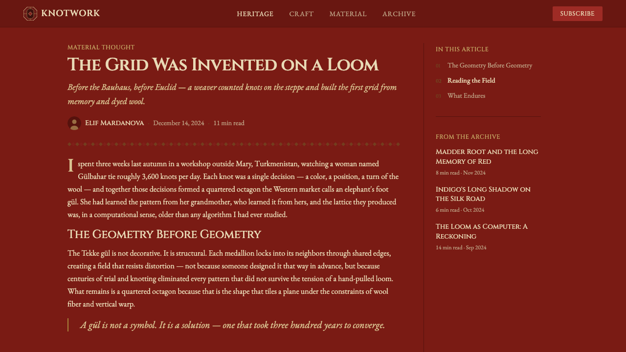
The gül motif itself — a quartered octagonal medallion repeated in strict rows — functions within Turkmen weaving culture as something close to tribal heraldry, with different tribes maintaining recognizably distinct gül variations that could historically signal tribal identity and lineage in much the way a coat of arms would. The elephant's foot pattern, or fil pai, is among the most widely recognized and widely reproduced of these gül variations.古尔纹样本身——一种在严整排列中反复出现的四分八角纹章——在土库曼织造文化中的功能,近似于部落纹章,不同部落各自保持着可辨识的、独特的古尔变体,历史上足以标示部落身份与血脉,其作用近似于家族徽章。"象脚"纹样,即fil pai,是这些古尔变体中最广为人知、也最被广泛复制的一种。
Turkmen tribal weaving as a whole belongs to a broader nomadic geometric textile craft tradition across Central Asia, in which the rug served practical, ceremonial, and social functions simultaneously — a dowry item, a marker of household wealth, and a portable, durable surface suited to a mobile way of life. The strict symmetry, dense knotting, and geometric-only ornament that define the style are direct consequences of this practical weaving tradition rather than purely decorative choices made independent of function.土库曼部落织造整体上隶属于中亚更广泛的游牧几何纺织工艺传统,在这一传统中,地毯同时承担着实用、仪式与社会功能——既是嫁妆物品,也是家庭财富的标志,还是一种适合游牧生活方式的、便携耐用的表面。定义这种风格的严格对称、密实打结与纯几何纹饰,都是这一实用织造传统的直接结果,而非独立于功能之外的纯装饰性选择。
What defines the Turkmen Bukhara Rug look?Turkmen Bukhara Rug 的视觉特征是什么?
Madder Red Field茜红绒面
The dominant field color is a deep, lustrous red derived historically from madder root dye, functioning as the authentic material ground of the piece rather than a backdrop. This red should feel saturated and warm without leaning orange, and it is never lightened or treated as a neutral surface for other elements to float above.主导的绒面颜色是一种历史上取自茜草根染料的、深沉光泽的红色,充当织物真实的材料底色,而非一层背景。这种红色应显得饱和而温暖,不偏橙调,也绝不被冲淡或当作供其他元素悬浮其上的中性表面来处理。
Octagonal Gül Medallions八角古尔纹章
Quartered octagonal medallions, most iconically the elephant's-foot fil pai pattern, repeat in strict, evenly spaced rows across the field. Each medallion is a self-contained geometric unit, never overlapping or blending into its neighbors, reinforcing the heraldic, emblematic quality of the pattern.四分八角纹章——最具代表性的是"象脚"fil pai纹样——在绒面上以严整、均匀间隔的排列反复出现。每一个纹章都是一个独立自足的几何单元,从不与相邻纹章重叠或融合,强化了这种图案纹章式的、徽章般的品质。
Ivory Hairline Outlines象牙细线轮廓
Fine ivory or off-white lines trace the edges of each gül and border motif, providing the only high-contrast relief against the dominant red. These outlines should remain thin and precise, functioning as structural definition rather than as a broad secondary color field.细密的象牙白或米白线条勾勒着每个古尔纹与边框纹样的轮廓,是映衬主导红色的唯一高对比浮雕感元素。这些轮廓线应保持纤细而精确,起到结构性界定的作用,而非成为一片宽阔的次要色域。
Indigo and Near-Black Accents靛蓝与近黑点缀
Dark indigo and near-black brown appear only as small structural accents within the gül pattern and border work, never as a competing dominant hue. These darker tones deepen the overall warmth of the composition rather than cooling it.深靛蓝与近黑的棕色仅作为古尔纹样与边框内部的小型结构性点缀出现,从不作为与主色竞争的主导色调。这些较深的色调加深了整体构图的暖意,而非使其转冷。
Multi-Band Geometric Borders多道几何边带
Several concentric bands of smaller repeating geometric motifs frame the central field, each band distinct in pattern but consistent in palette. This layered bordering is what gives the composition its sense of total, deliberate containment rather than an open or bleeding edge.数道同心的几何小纹样重复带环绕着中央绒面,每一道边带图案各异,但色板保持一致。这种分层的镶边手法,正是让整个构图显得彻底、刻意收束、而非开放或出血边缘的原因。
Total Symmetry绝对对称
Every element of the composition is mirrored across both the horizontal and vertical axis without exception. This is not a loose or approximate symmetry — it is exact, and any deviation from it would immediately read as a flaw rather than an intentional variation.整个构图中的每一个元素都毫无例外地在水平轴与垂直轴上镜像对称。这不是一种松散或近似的对称——它是精确的,任何偏差都会立刻读作瑕疵,而非有意的变化。
Geometric-Only Ornament纯几何纹饰
Every ornamental element is built from straight lines, angles, and stepped diagonal edges rather than curves or floral forms. This geometric-only discipline distinguishes the Turkmen tradition from other Central Asian and Persian textile styles that favor curvilinear, botanical ornament.每一处装饰元素都由直线、角度与阶梯状斜边构成,而非曲线或花卉形态。这种纯几何的纪律,将土库曼传统与其他偏好曲线花卉纹饰的中亚及波斯纺织风格区分开来。

See the Turkmen Bukhara Rug design system查看 Turkmen Bukhara Rug 完整设计系统
Who shaped Turkmen Bukhara Rug?谁塑造了 Turkmen Bukhara Rug?
The Tekke tribe's weavers produced the majority of rugs that Western markets came to know as Bukhara, developing a specific gül variation and dense knotting technique that became the most widely recognized version of this style.特克部落的织工织造了绝大多数被西方市场称为"布哈拉"的地毯,发展出一种特定的古尔纹变体与密实的打结技法,成为这种风格最广为人知的版本。
The Yomut tribe maintained a related but distinct weaving tradition within the broader Turkmen textile culture, contributing gül motif variations that scholars and collectors use to distinguish tribal origin within the larger Bukhara-labeled category.约穆德部落在更广泛的土库曼纺织文化中,保持着一种相关但独特的织造传统,贡献了古尔纹样的变体,学者与收藏家借此在"布哈拉"这一更宽泛的标签类别中区分部落产地。
The Saryk tribe represents a third distinct thread within Turkmen weaving culture, their gül variations and border conventions forming part of the broader tribal heraldic vocabulary that this style's octagonal medallion system draws from.萨雷克部落代表着土库曼织造文化中第三条独特的脉络,他们的古尔纹变体与边框惯例,构成了这种风格八角纹章系统所借鉴的、更广泛的部落纹章词汇的一部分。
How do you use Turkmen Bukhara Rug today?今天怎么用 Turkmen Bukhara Rug?
Turkmen Bukhara Rug style suits any product or communication that wants to feel formal, heraldic, and deeply grounded rather than light or casual. Applying it well means preserving the total symmetry and geometric-only ornament discipline, resisting any temptation to soften the red ground or introduce curvilinear decoration.「土库曼布哈拉地毯」风格适合任何想要显得庄重、纹章感十足、深深扎根,而非轻盈或随意的产品或传播物料。用好它的关键,是保留绝对对称与纯几何纹饰的纪律,抵住任何想要软化红色底色或引入曲线装饰的诱惑。
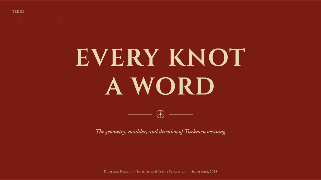
For presentation slides, a cover slide can use the madder red field as a full-bleed ground with a single centered gül medallion, framed by a multi-band border echoing the rug's structure. Content slides should maintain strict symmetry in layout — mirrored columns or centered compositions — while data slides can use the ivory-outline convention to define chart elements against the red field, keeping indigo and near-black reserved for secondary data categories.在演示文稿中,封面页可以将茜红绒面用作整版铺满的底色,配上一个居中的古尔纹章,由呼应地毯结构的多道边带镶边。内容页应在版面中保持严格的对称——镜像的分栏或居中的构图——数据页则可以运用象牙轮廓线的惯例,在红色底面上界定图表元素,靛蓝与近黑色留给次要数据类别。
For web interfaces, the style is well-suited to heritage brands, premium textile and home-goods products, and any platform wanting to signal craft authority and tribal or ancestral lineage. Card and section borders should use the multi-band geometric framing device rather than a simple single-line border, and the red field should be used generously rather than diluted into a lighter accent tone.对于网页界面,这种风格适合传承类品牌、高端纺织与家居用品,以及任何希望传达工艺权威感与部落或祖传血脉的平台。卡片与区块边框应使用多道几何镶边手法,而非简单的单线边框,红色底色应大方使用,而非被稀释成一种更浅的强调色调。
For editorial and marketing work, the register suits craft, textile history, and heritage storytelling with genuine cultural grounding. Full-bleed red sections with a centered gül motif work well as chapter breaks, and marketing hero sections benefit from committing to the dense, formal symmetry throughout rather than loosening the composition for a more casual feel.对于编辑与营销内容,这种调性适合带有真实文化根基的工艺、纺织历史与传承类叙事。整版铺满红色、配以居中古尔纹样的区块,适合作为章节分隔;营销主视觉区适合从头到尾坚持这种密实、庄重的对称感,而非为了更轻松的感觉而松散构图。
The most common mistake is lightening the red ground into a pastel or diluted tone to make the design feel more approachable, which strips away the earthbound, authentic-material quality that defines the style. A second frequent error is introducing curvilinear or floral ornament alongside the geometric gül pattern, which breaks the strict geometric-only discipline that separates Turkmen weaving from other Central Asian and Persian textile traditions.最常见的错误,是把红色底色调淡成一种粉彩或稀释的色调,以让设计显得更平易近人,这会剥离掉定义这种风格的、扎根大地般的真实材料质感。第二个常见错误,是在几何古尔纹样之外引入曲线或花卉装饰,这会打破区分土库曼织造与其他中亚及波斯纺织传统的、那种严格纯几何的纪律。
See the Turkmen Bukhara Rug design system查看 Turkmen Bukhara Rug 完整设计系统
Turkmen Bukhara Rug — FAQTurkmen Bukhara Rug · 常见问题
Why is the rug called "Bukhara" if it was not woven in Bukhara?如果这种地毯并非在布哈拉织造,为何被称作"布哈拉"地毯?
Bukhara was a major Central Asian trading city through which Turkmen tribal rugs, particularly those woven by the Tekke tribe, passed on their way to external buyers. Western traders and collectors came to associate the trading hub's name with the rugs themselves rather than adopting the more accurate tribal names, and the misnomer stuck widely enough that it remains the common Western market term today.布哈拉是中亚的一个主要贸易城市,土库曼部落地毯——尤其是特克部落织造的地毯——在运往外部买家的途中,往往会途经此地。西方商人与收藏家逐渐把这个贸易枢纽的名字与地毯本身联系起来,而没有采用更准确的部落名称,这一误称流传得如此广泛,以至于至今仍是西方市场的通用称谓。
Why is the red ground never lightened or softened in authentic applications of this style?为什么在这种风格的真实应用中,红色底色从不被调淡或柔化?
Because the deep madder red is treated as the actual material of the artifact — the dyed wool itself — rather than a stylistic backdrop applied for atmosphere. Lightening it would be equivalent to claiming the rug is made of a different material than it is; the style's authenticity depends on the red being presented as substantive and physical, something the composition sits on rather than in front of.因为深沉的茜红被当作织物真实的材料——染色的羊毛本身——而非为了氛围而叠加的风格化背景。将其调淡,等于是在暗示这块地毯所用的材料并非其本来的材料;这种风格的真实性依赖于把红色呈现为实在的、物质性的存在——构图坐落于其上,而非置于其前方。
Can this style incorporate curved or floral decoration for visual variety?这种风格能否加入曲线或花卉装饰以增加视觉变化?
Not without breaking its core discipline. The Turkmen weaving tradition is defined specifically by its exclusive use of geometric ornament — straight lines, angles, stepped diagonals — in contrast to the curvilinear, floral ornament common in other Central Asian and Persian carpet traditions. Introducing curves or florals would blur this style into a different, related but distinct textile tradition.很难做到,除非打破其核心纪律。土库曼织造传统的独特之处,正在于它专门使用几何纹饰——直线、角度、阶梯状斜边——与其他中亚及波斯地毯传统中常见的曲线花卉纹饰形成对比。引入曲线或花卉,会把这种风格模糊成另一种相关却截然不同的纺织传统。
How strict does the symmetry need to be in a digital application?在数字应用中,对称需要严格到什么程度?
It should be exact rather than approximate. Traditional Turkmen weaving achieves precise mirrored symmetry despite being entirely hand-knotted, and that precision is central to the style's heraldic, formal character. A digital layout that only loosely approximates symmetry loses the sense of rigor and control that defines the original craft.应当是精确的,而非近似的。传统的土库曼织造尽管完全依靠手工打结,却依然实现了精确的镜像对称,而这种精确性正是这种风格纹章式、庄重气质的核心。若数字版面只是松散地近似对称,就会丢失定义原始工艺的那种严谨与控制感。
Where does this style struggle or feel out of place?这种风格在哪些场景中会显得格格不入?
It struggles in playful, casual, or minimalist contexts where dense pattern and heavy symmetry would feel overwrought — children's products, casual social apps, or brands built on lightness and simplicity. Its dense, formal quality can overwhelm interfaces that need to prioritize open space and quick scanning. It performs best when the product genuinely values heritage, craft authority, or a formal, established character.在轻松、随意或极简的语境中,它会显得格格不入——那些密集的图案与厚重的对称感会显得用力过猛,例如儿童产品、休闲社交类应用,或建立在轻盈与简约之上的品牌。它那密实、庄重的品质,可能会压垮那些需要优先考虑留白与快速扫读的界面。当产品真正看重传承、工艺权威感或一种正式、确立已久的气质时,它表现最好。
Related design styles相关设计风格
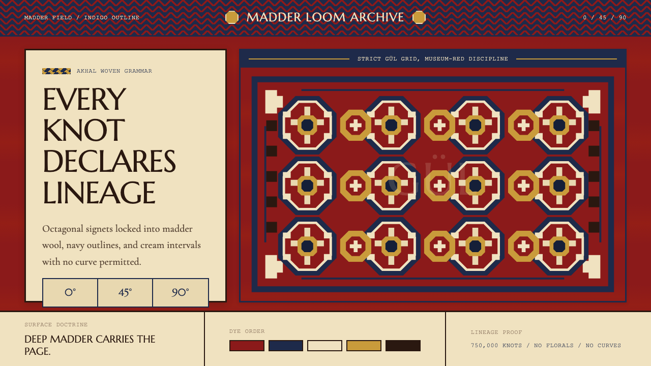 Turkmen Tekke Carpet (Gül Medallion)Disciplined red geometry. Madder field, indigo outlines, cream gül grid.红色几何有纪律。茜草红底、靛蓝线、奶白格尔阵列。
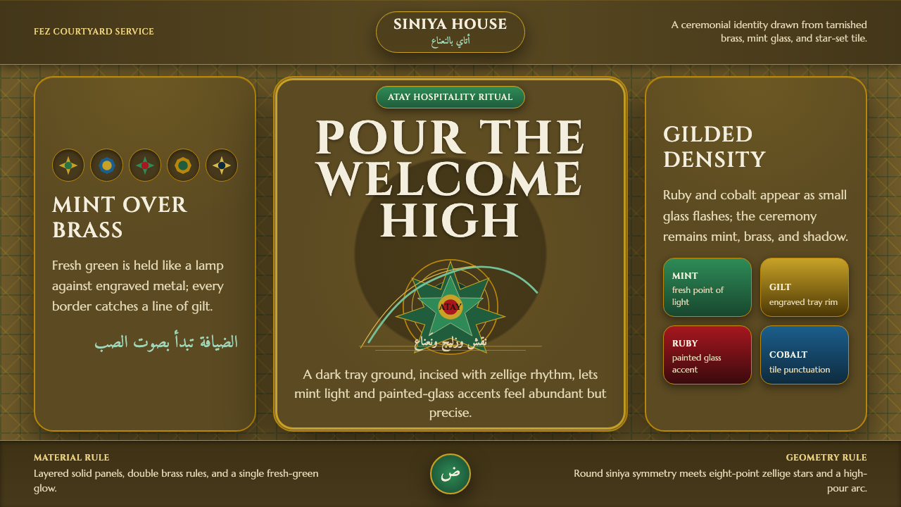 Moroccan Mint TeaCeremony glows in brass. Mint green, Cinzel type, and zellige geometry frame…黄铜中发光的仪式:薄荷绿、Cinzel字形与泽里吉几何围合全场。
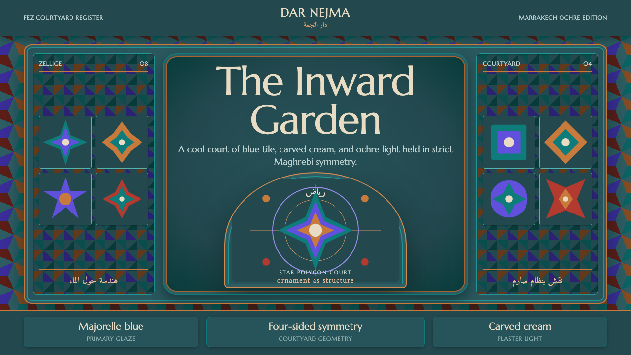 Moroccan RiadOrnament is structure. Majorelle blue and teal zellige frame a symmetrical ar…纹样即结构。马若雷勒蓝与青绿瓷砖围合对称拱庭。
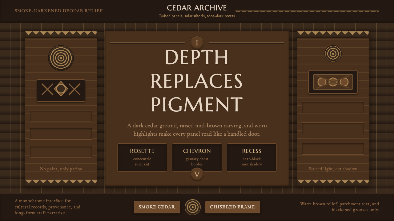 Nuristani Carved CedarDepth replaces pigment. Smoke cedar, chevrons, and rosettes carve light from…以深度取代颜料:烟熏雪松底、折纹与玫瑰花结从暗槽中凿出光。
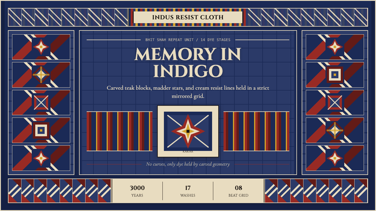 Sindh Ajrak Block PrintAncient cloth feels exact. Indigo fields, madder stars, and cream grids repea…古老棉布也精准。靛蓝底、茜红星、米白格反复如雕版。
 Uyghur Xinjiang Suzani EmbroiderySilk glows like memory. Cochineal and lapis medallions orbit brass on indigo…丝线像记忆发光。靛蓝羊毛上,胭脂红与青金石纹章环绕黄铜。