What is Tamil Grantha Inscription?什么是 Tamil Grantha Inscription?
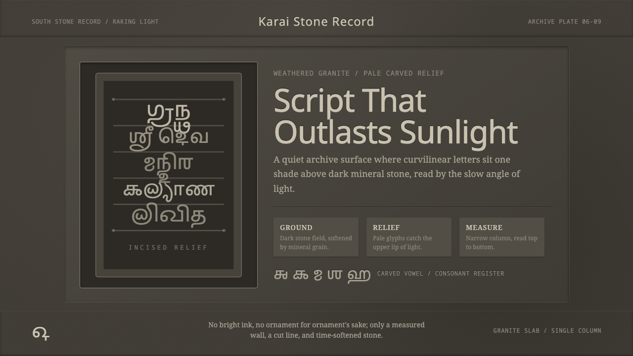
Chiseled a shade lighter than the weathered granite around it, Grantha script turned sacred language into stone that was built to outlast empires.比周围风化石面浅上一度的凿痕,让格兰塔文字把神圣的语言,凿刻成了一种为长存王朝更迭而生的石头。
Tamil Grantha Inscription in briefTamil Grantha Inscription 速览
Grantha is a script developed in South India specifically to write Sanskrit, a language that arrived in the Tamil-speaking south without its own native writing system suited to the region's stone-carving and manuscript traditions. Its letterforms are deeply curved, with rounded, almost calligraphic strokes that curl and loop in a way visibly distinct from the more angular scripts used to write Tamil itself. For centuries, Grantha was carved directly into the gray granite walls of South Indian temples, recording royal decrees, religious dedications, and land grants in a form meant to be permanent.格兰塔文(Grantha)是南印度专门为书写梵语而发展出的一种文字。梵语传入泰米尔语通行的南方地区时,并没有一套自身适合当地石刻与抄本传统的文字系统,格兰塔文由此而生。它的字形深深弯曲,笔画圆润,近乎书法般卷曲盘绕,与用于书写泰米尔语本身的更为方正棱角的字体明显不同。数个世纪以来,格兰塔文被直接凿刻进南印度寺庙灰色花岗岩的墙面上,记录王室诏令、宗教供奉与土地赠予——以一种意在永久留存的形式。
The defining visual quality of this style is not the letterforms in isolation but the specific material relationship between carved stone and ambient light. Temple inscriptions in Grantha were incised — carved as a recessed relief — into granite surfaces that have, over centuries, weathered and darkened unevenly. Under raking, angled light — the kind sunlight naturally produces as it moves across a temple wall through the day — the carved relief itself sits a shade lighter than the surrounding weathered stone, because the incised surface has been exposed to less oxidation and staining than the broader, older face around it.这种风格最本质的视觉特质,并不在于字形本身,而在于凿刻石面与周遭光线之间那种特定的物质关系。以格兰塔文书写的寺庙铭文,是以凹陷浮雕的形式凿刻进花岗岩表面的,而这些表面历经数百年,已经不均匀地风化、变暗。在斜射的角度光——正如阳光在一天之中自然掠过寺庙墙面时所产生的那种光线——之下,凿出的浮雕本身会比周围风化的石面浅上一度,因为被凿出的表面所经历的氧化与染色,要少于其周边更为古老的大面积石面。
This produces a visual language built on subtlety rather than contrast: pale, incised characters floating on a dark, mineral, time-softened ground, legible not through stark black-and-white opposition but through a quiet difference in tone that rewards careful looking. The overall effect is calm, monumental, and inherently sacred — a script whose visual character comes directly from having been built to physically endure rather than to simply communicate.这造就了一种建立在微妙差异之上、而非强烈对比之上的视觉语言:浅色的凿刻字符浮在深沉、矿物质感、被岁月磨柔的底面之上,其可读性不是靠黑白分明的强烈对立,而是靠一种回报仔细端详的、安静的色调差异。整体效果肃穆、如纪念碑般恒久,且天然带有神圣感——这种文字的视觉性格,直接来自它被建造出来是为了物理意义上的长存,而非仅仅为了传达信息。
See the Tamil Grantha Inscription design system查看 Tamil Grantha Inscription 完整设计系统
Where does Tamil Grantha Inscription come from?Tamil Grantha Inscription 从何而来?
Grantha script developed in South India to solve a specific problem: Sanskrit, the liturgical and scholarly language shared across much of the Indian subcontinent, needed a writing system suited to the Tamil-speaking south, where the existing Tamil script's letterforms and conventions were not well matched to Sanskrit's more extensive consonant clusters and phonetic range. Grantha filled that role, becoming the primary vehicle through which Sanskrit texts — religious, philosophical, and courtly — were recorded and transmitted throughout the Tamil region for well over a millennium.格兰塔文诞生于南印度,是为了解决一个具体问题:梵语作为印度次大陆大部分地区共享的礼仪与学术语言,需要一套适合泰米尔语通行的南方地区的书写系统,而当地既有的泰米尔文字形与惯例,与梵语更为繁复的辅音丛与音位范围并不十分匹配。格兰塔文填补了这一空缺,成为长达一千多年间,泰米尔地区记录与传播宗教、哲学与宫廷梵语文本的主要载体。
The script's most enduring visual legacy comes from its use in monumental temple architecture during the Pallava dynasty, which ruled significant portions of South India from roughly the sixth through ninth centuries CE. Pallava kings, several of whom were themselves accomplished scholars and patrons of the arts, commissioned extensive stone temple complexes whose walls carried Grantha inscriptions recording genealogies, religious dedications, and royal accomplishments. King Mahendravarman I, a Pallava ruler known for his own literary and architectural patronage, and his successor Rajasimha Pallava, who commissioned some of the era's most architecturally significant temple work, are both associated with major inscriptional commissions from this period.这种文字最持久的视觉遗产,来自它在帕拉瓦王朝(大致于公元六世纪至九世纪统治南印度大部分地区)纪念性寺庙建筑中的运用。帕拉瓦诸王中,有几位本身就是造诣深厚的学者与艺术赞助人,他们委托修建了规模宏大的石造寺庙群,墙面上刻满记录世系谱牒、宗教供奉与王室功绩的格兰塔铭文。以自身文学与建筑造诣著称的帕拉瓦国王摩亨德拉瓦尔曼一世,以及其继任者、委托修建了那个时代最具建筑意义的寺庙工程之一的拉贾辛哈·帕拉瓦,都与这一时期的重要铭文工程相关联。
The Chola dynasty, which succeeded Pallava dominance in the region and expanded South Indian temple architecture to an even grander scale, continued and extended the Grantha inscriptional tradition, carving royal records and temple endowments into the granite walls of increasingly massive temple complexes through roughly the ninth century and beyond. The scholar and poet Dandin, associated with the broader Sanskrit literary culture that Grantha served, represents the kind of learned tradition the script existed to support — Grantha was never simply an administrative tool but the vehicle for an entire register of religious and literary Sanskrit thought circulating in the Tamil south.继帕拉瓦王朝之后在该地区崛起、并将南印度寺庙建筑扩展到更为宏大规模的朱罗王朝,延续并进一步发展了格兰塔铭文传统,在规模日益庞大的寺庙群花岗岩墙面上,持续凿刻王室记录与寺庙供养文书,大致从九世纪延续至更晚。与格兰塔文所服务的更广阔梵语文学文化相关联的学者与诗人檀丁(Dandin),代表着这种文字存在意义所支撑的那种博学传统——格兰塔文从来不只是一件行政工具,而是承载着整个泰米尔南方地区流通的宗教与文学梵语思想体系的载体。
Grantha remained in continuous, living use for writing Sanskrit texts in South India for an unusually long span, persisting in manuscript and inscriptional use into roughly the eighteenth century before its role was gradually absorbed by other regional scripts and, eventually, the widespread adoption of Devanagari for printed Sanskrit. Its epigraphic legacy — the carved temple inscriptions themselves — remains one of the most extensive bodies of stone-carved script surviving from the classical and medieval South Indian world.格兰塔文在南印度作为书写梵语的活文字,持续使用了异常漫长的时间,在抄本与铭刻中一直延续到大致十八世纪,此后其角色才逐渐被其他地区文字取代,并最终随着天城文(Devanagari)在印刷梵语中的广泛采用而式微。它的碑铭遗产——那些被凿刻的寺庙铭文本身——至今仍是留存自古典与中世纪南印度世界规模最大的石刻文字体系之一。
What defines the Tamil Grantha Inscription look?Tamil Grantha Inscription 的视觉特征是什么?
Color色彩
The palette is built entirely around tonal proximity rather than hue contrast: pale, incised glyph forms sit only a shade lighter than the dark, mineral granite ground surrounding them, mimicking the way carved relief catches raking light against weathered stone. There is no bright accent color anywhere in this style — its entire visual identity depends on subtlety of value rather than variety of hue.这套色板完全建立在色调邻近性、而非色相对比之上:浅色的凿刻字形,只比周围深沉、矿物质感的花岗岩底面浅一度,模拟凿刻浮雕在风化石面上捕捉斜射光线的方式。这种风格中没有任何明亮的强调色——它全部的视觉身份,都依赖明度上的微妙差异,而非色相的多样性。
Deeply Curved Letterforms深弧字形
Grantha's letters are built from rounded, looping strokes distinct from more angular regional scripts, giving lines of text a flowing, almost calligraphic rhythm even when carved into hard stone. This curvature is a defining structural feature of the script itself, not a stylistic overlay, and any adaptation should preserve the sense of continuous, rounded line rather than reducing the forms to geometric simplification.格兰塔文的字母由圆润、盘绕的笔画构成,有别于当地更为棱角分明的文字,即便被凿刻进坚硬的石头,字行也呈现出流畅、近乎书法般的韵律。这种弧度是这种文字本身的结构性特征,而非风格化的表层处理,任何改编都应保留这种连续、圆润的线条感,而不应把字形简化为几何形态。
Incised Relief Texture凹刻浮雕质感
The characters are rendered as carved-in relief rather than flat printed marks, meaning any visual adaptation should suggest depth and physical incision — a subtle inset or engraved quality — rather than presenting glyphs as flush, flat surface marks. This carved quality is what allows the pale-on-dark tonal relationship to register as physical rather than purely graphic.字符是以凹刻浮雕的形式呈现,而非平面印刷的标记,这意味着任何视觉改编都应暗示深度与实际的凿刻感——一种微妙的凹陷或雕刻质感——而非把字形处理成贴合表面的扁平标记。正是这种雕刻质感,让“浅色浮于深色之上”的色调关系,能够被感知为一种实体,而非纯粹的图形效果。
Weathered Granite Ground风化花岗岩底面
The background is a dark, mineral gray-brown tone that reads as naturally aged stone rather than a neutral flat color — variation and subtle unevenness in the ground tone is authentic to the source material and should not be smoothed into perfect flatness. This ground carries as much of the style's identity as the glyphs themselves.背景是一种深沉、矿物质感的灰褐色调,读起来像是自然风化的石材,而非中性的平面色彩——底色中的变化与细微的不均匀,正是源材料的真实特质,不应被磨平成完美的平面。这层底色所承载的风格身份,与字符本身同样重要。
Narrow Vertical Stacking窄列纵向排布
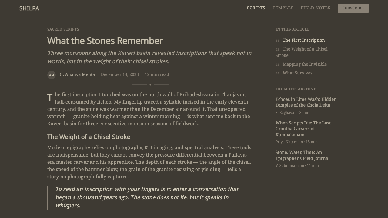
Temple inscriptions are commonly organized as narrow, dense stacked columns rather than wide horizontal blocks, a layout convention suited to the vertical proportions of temple wall surfaces. This narrow-column discipline gives compositions a tall, quiet reading rhythm distinct from wide, horizontally scanned text blocks.寺庙铭文通常被组织成窄而密集的纵向堆叠栏,而非宽阔的横向文本块——这一版式惯例与寺庙墙面本身的竖向比例相适配。这种窄列的秩序,赋予构图一种高瘦、静谧的阅读节奏,有别于宽阔、横向扫读的文本块。
Monumental Stillness纪念碑式的静止感
Beyond individual visual elements, the style carries an overriding quality of stillness and permanence — nothing about the composition suggests motion, urgency, or temporariness. This should inform any interface adaptation's pacing and interaction design: the style is fundamentally at odds with fast, ephemeral, or highly animated interaction patterns.除了单个视觉元素之外,这种风格还带有一种统摄全局的静止与恒久感——构图中没有任何一处暗示运动、紧迫或短暂。这一点应当指导任何界面改编的节奏与交互设计:这种风格从根本上,与快速、短暂或高度动态的交互模式相悖。
See the Tamil Grantha Inscription design system查看 Tamil Grantha Inscription 完整设计系统
Who shaped Tamil Grantha Inscription?谁塑造了 Tamil Grantha Inscription?
A Pallava king known for his own scholarly and literary accomplishments as well as his patronage of temple architecture, Mahendravarman I commissioned significant early stone temple work carrying Grantha inscriptions, helping establish the tradition of royal genealogy and religious dedication carved directly into temple granite.摩亨德拉瓦尔曼一世是一位以自身学术与文学成就、以及对寺庙建筑的赞助而著称的帕拉瓦国王,他委托修建了早期重要的石造寺庙,其上刻有格兰塔铭文,帮助确立了将王室世系与宗教供奉直接凿刻进寺庙花岗岩的传统。
A later Pallava ruler who commissioned some of the dynasty's most architecturally ambitious temple complexes, Rajasimha's inscriptional legacy in Grantha script represents the tradition at its most mature and monumentally scaled, reflecting the dynasty's peak architectural and cultural confidence.拉贾辛哈·帕拉瓦是帕拉瓦王朝后期的一位君主,委托修建了该王朝一些建筑抱负最为宏大的寺庙群,他留下的格兰塔铭文遗产,代表着这一传统最为成熟、规模最为纪念碑式的阶段,反映出王朝在建筑与文化上的巅峰自信。
A Sanskrit scholar and poet associated with the broader literary culture that Grantha script served, Dandin represents the register of learned Sanskrit thought and composition that circulated through the Tamil south and that the script existed to record and transmit beyond purely administrative use.檀丁是一位与格兰塔文所服务的更广阔梵语文学文化相关联的学者与诗人,他代表着那种在泰米尔南方地区流通的博学梵语思想与创作体系——而格兰塔文的存在,正是为了记录与传播这一体系,其意义远超纯粹的行政用途。
How do you use Tamil Grantha Inscription today?今天怎么用 Tamil Grantha Inscription?
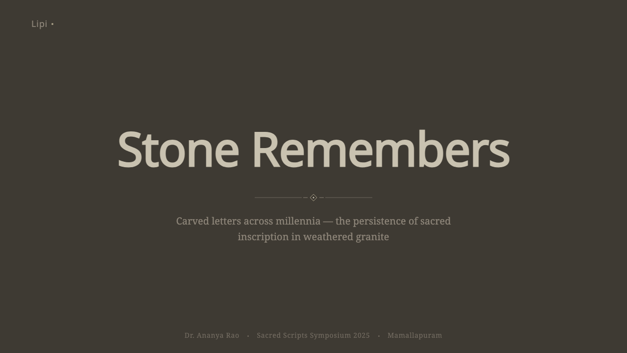
For presentation slides, this style suits content about heritage, spirituality, ancient history, or archaeology — a cover slide can use the dark granite-toned ground as a full-bleed field, with title type rendered as a subtly incised or embossed effect in a pale gray-tan tone rather than flat white, echoing the carved relief's characteristic tonal restraint. Content slides work best with narrow, tall text columns rather than wide horizontal blocks, and any data visualization should stay within the muted gray-brown tonal range rather than introducing bright chart colors.在演示文稿中,这种风格适合关于文化遗产、灵性、古代历史或考古学的内容——封面页可以用深沉的花岗岩色调底面铺满整页,标题字体呈现出微妙的凹刻或浮雕效果,用浅灰棕色调而非纯白呈现,呼应凿刻浮雕特有的克制色调关系。内容页最适合使用窄而高的文本栏,而非宽阔的横向文本块,任何数据可视化都应停留在柔和的灰褐色调范围内,而不应引入明亮的图表色彩。
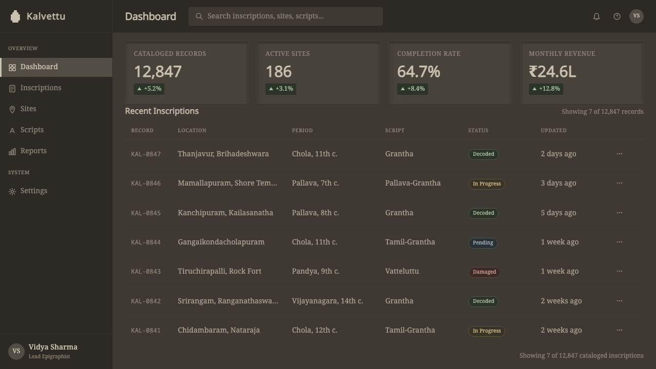
For web interfaces, the style is well suited to museum, archaeological, heritage-preservation, or scholarly platforms where the brand identity depends on projecting permanence, gravity, and reverence rather than speed or vibrancy. The approach: a dark mineral-toned background rather than bright white, pale gray-tan text with a subtle inset or engraved quality on key headings, and narrow column layouts for body content that echo the temple inscription's stacked verticality.对于网页界面,这种风格适合博物馆、考古学、文化遗产保护或学术类平台,这些品牌身份依赖传达恒久、庄重与敬畏感,而非速度或活力。方法是:使用深沉的矿物色调背景而非明亮的白色,关键标题用浅灰棕色文字呈现微妙的凹陷或雕刻质感,正文采用窄栏布局,呼应寺庙铭文那种纵向堆叠的排布。
In editorial and marketing work, the style supports long-form writing about ancient history, epigraphy, religious architecture, or South Indian cultural heritage. A magazine-style layout can treat section openings the way a temple wall treats an inscription — a carved-relief-style heading against the dark granite ground, narrow columns of body text beneath. Marketing pages for heritage tourism, museum exhibitions, or cultural preservation initiatives benefit from the style's inherent gravitas.在编辑与营销内容中,这种风格支持关于古代历史、碑铭学、宗教建筑,或南印度文化遗产的长文写作。杂志式版面可以像寺庙墙面处理铭文那样处理段落开篇——在深色花岗岩底面上,以凿刻浮雕式的标题,下接窄栏正文。文化遗产旅游、博物馆展览或文化保护项目的营销页面,能从这种风格与生俱来的庄重感中获益。
The style is poorly suited to fast-paced consumer products, playful branding, or any context where energy and vibrancy are the primary desired qualities, since its entire visual logic communicates stillness and permanence rather than motion or excitement.这种风格不太适合快节奏的消费类产品、俏皮的品牌形象,或任何以活力与生机为首要诉求的语境,因为它整套视觉逻辑传达的是静止与恒久,而非运动或兴奋感。
The most common mistake when adapting this style is increasing the contrast between glyph and ground far beyond the subtle tonal difference of the original — rendering the text bright white against black, for instance, replaces the quiet, weathered quality that defines the style with a harsh, generic dark-mode aesthetic. A second common mistake is using wide, sans-serif Latin type in place of the deeply curved, calligraphic letterform quality that gives Grantha its rhythm; a faithful adaptation should carry that rounded, flowing character into whatever typography is used.移植这种风格时最常见的错误,是把字符与底面之间的对比拉得远远超出原作那种微妙的色调差异——比如把文字渲染成黑底纯白,就会用一种生硬、通用的深色模式美学,取代定义这种风格的那种安静、风化的质感。第二个常见错误,是用宽阔的无衬线拉丁字体,取代赋予格兰塔文韵律感的深弧、书法般的字形品质;一次忠实的改编,应当把这种圆润、流畅的character,延续到任何被选用的字体之中。
See the Tamil Grantha Inscription design system查看 Tamil Grantha Inscription 完整设计系统
Tamil Grantha Inscription — FAQTamil Grantha Inscription · 常见问题
Why does the text appear only slightly lighter than the background instead of in high contrast?为什么文字只是比背景略浅一点,而不是高对比度呈现?
This subtle tonal relationship comes directly from how the original inscriptions physically exist: carved recessed relief on weathered granite catches raking light in a way that makes the incised surface read as slightly lighter than the surrounding, more oxidized stone. It was never meant to be read in stark black-and-white terms — the inscriptions were designed to be legible under natural, angled sunlight moving across a temple wall throughout the day, which produces exactly this kind of quiet, tonal difference rather than sharp contrast.这种微妙的色调关系,直接来自原始铭文的物理存在方式:凿刻进风化花岗岩的凹陷浮雕,在斜射光线下会呈现出比周围氧化程度更深的石面略浅的效果。它从来就不是为了以黑白分明的方式被阅读——这些铭文的设计初衷,是要在一天之中自然移动、以角度照射寺庙墙面的阳光下保持可读,而这恰恰产生的正是这种安静的色调差异,而非鲜明的对比。
Is Grantha the same as Tamil script?格兰塔文和泰米尔文是同一种文字吗?
No. Grantha was developed specifically to write Sanskrit in the Tamil-speaking south, because the existing Tamil script's letterforms were not well suited to Sanskrit's broader consonant range. The two scripts coexisted for centuries, serving different linguistic purposes within the same region, and Grantha's deeply curved letterforms are visibly distinct from Tamil's own more angular character shapes.不是。格兰塔文是专门为在泰米尔语通行的南方地区书写梵语而开发的,因为既有的泰米尔文字字形,并不太适合梵语更为广泛的辅音范围。这两种文字在同一地区并存了数个世纪,服务于不同的语言用途,格兰塔文深弧的字形,与泰米尔文本身更为棱角分明的字符形状有着明显区别。
Can this style work with digital, screen-based color rather than physical stone texture?这种风格能用数字化、基于屏幕的色彩来呈现,而不依赖实体石材质感吗?
Yes, but the digital adaptation should still evoke the physical incision and tonal subtlety even without literal stone texture — using a dark, slightly uneven mineral-toned background and a pale, not-quite-white text tone with a subtle inset shadow effect can suggest the carved-relief quality convincingly on a flat screen. What matters most is preserving the tonal proximity and the sense of physical depth, not necessarily reproducing granite grain literally.可以,但数字化改编仍应唤起那种凿刻的实体感与色调上的微妙,即便没有字面意义上的石材纹理——使用深沉、带轻微不均匀感的矿物色调背景,配以并非纯白、带有微妙内嵌阴影效果的浅色文字,就能在扁平屏幕上令人信服地暗示出凿刻浮雕的质感。最重要的是保留色调上的邻近性与实体的深度感,而不必字面意义上还原花岗岩的纹理。
Does this style suit modern, brightly-colored consumer branding?这种风格适合现代、色彩明亮的消费类品牌吗?
Generally not. The style's entire identity depends on tonal restraint, weathered stillness, and a sacred, monumental register — qualities that are undermined by bright, high-saturation color or playful branding. It is far better suited to contexts where gravity, permanence, and cultural reverence are the desired qualities.一般来说不适合。这种风格的整套身份都依赖色调上的克制、风化般的静止感,以及一种神圣、纪念碑式的调性——而明亮、高饱和度的色彩或俏皮的品牌形象,会削弱这些品质。它更适合那些以庄重、恒久与文化敬畏感为诉求的语境。
How narrow should text columns be when adapting this style?改编这种风格时,文本栏应该窄到什么程度?
There is no fixed measurement, but the guiding principle is proportion: temple inscriptions were carved into tall, narrow wall surfaces, producing dense, vertically stacked columns rather than wide horizontal blocks. An adaptation should favor a noticeably narrower text measure than a typical wide-format layout, giving the composition a tall, quiet reading rhythm that echoes the original architectural context rather than a broad, horizontally scanned page.没有固定的量化标准,但指导原则是比例关系:寺庙铭文被凿刻在高而窄的墙面上,形成密集、纵向堆叠的栏,而非宽阔的横向文本块。改编时应选用明显比典型宽版式更窄的行宽,让构图呈现出一种高瘦、静谧的阅读节奏,呼应原始的建筑语境,而非一页宽阔、横向扫读的版面。
Related design styles相关设计风格
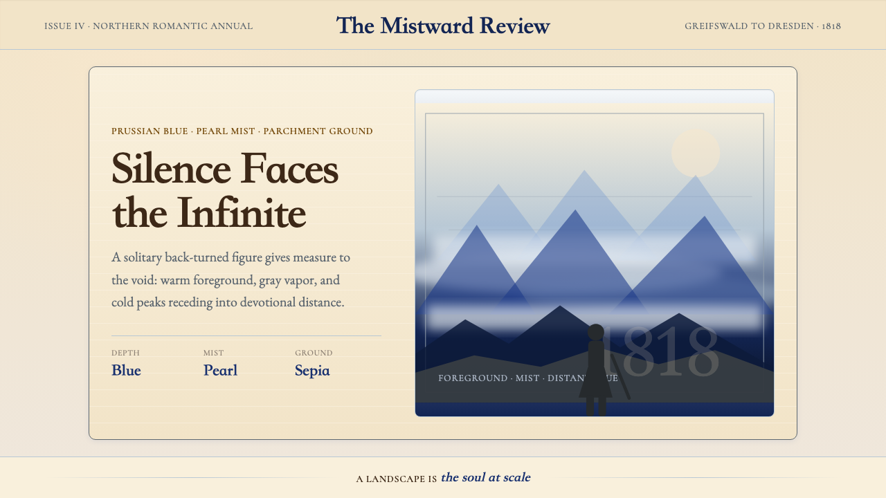 Caspar David FriedrichSilence becomes vast. Prussian blue depth, pearl mist, and parchment framing…寂静变得辽阔:普鲁士蓝纵深、珍珠雾与羊皮纸框层层后退。
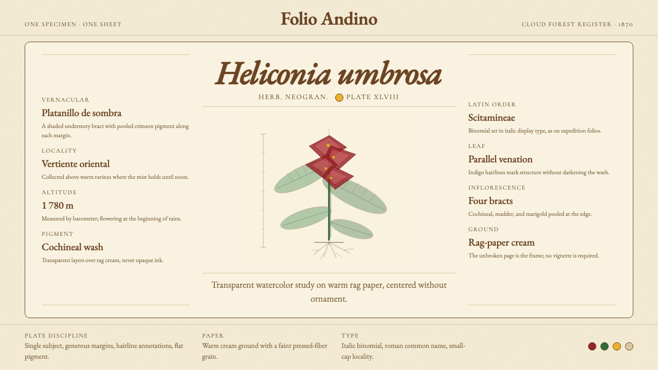 Colombian Botanical (Triana)Observation becomes ornament. Crimson watercolor specimen breathes on cream r…观察即装饰。绯红水彩标本静置于奶油破布纸。
 Degas Ballet PastelsBackstage glamour is labor. Jade walls, rose footlights, cropped serifs on cr…后台华丽即劳动。玉墙、玫瑰脚灯与裁切衬线落在奶油纸上。
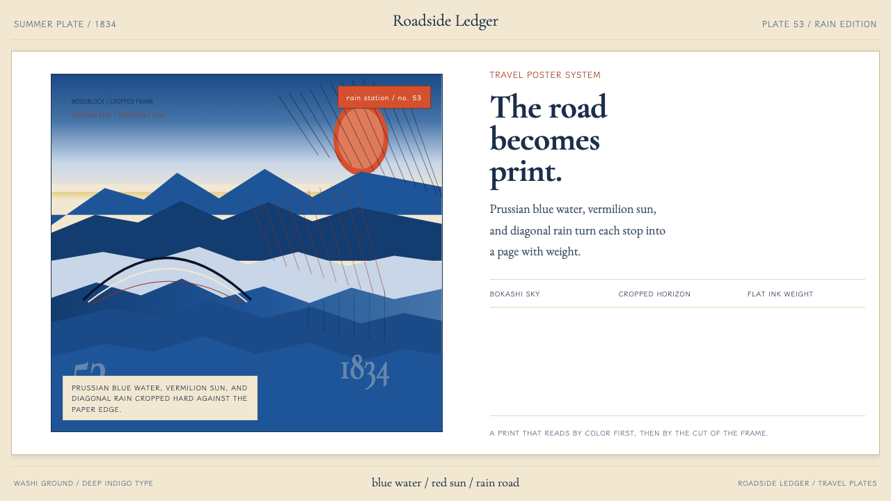 Hiroshige — Tokaido RoadA road print in motion. Prussian blue blocks, vermilion cartouches, diagonal…会行进的路途海报。普鲁士蓝色块、朱红题签与斜雨。
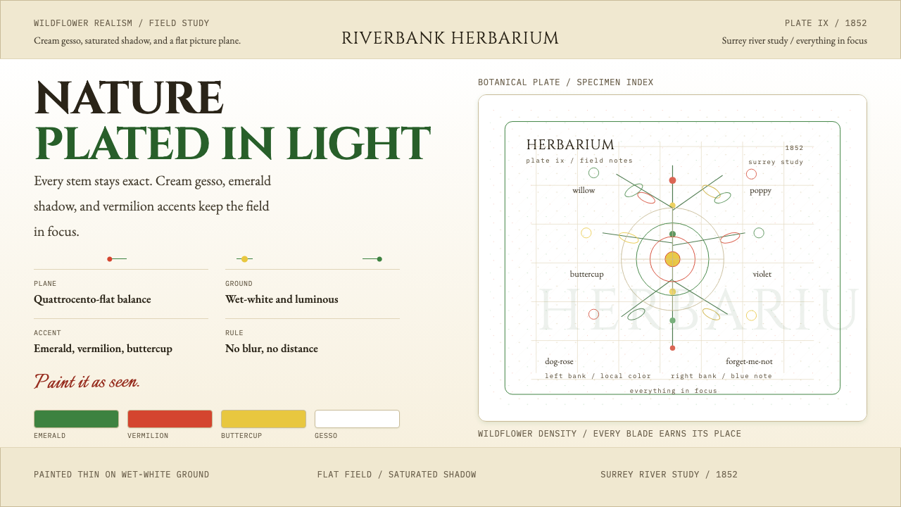 Millais — Ophelia / Wildflower Pre-RaphBotany, rendered with conviction. Cream gesso, emerald, and vermilion stay in…植物画得极其笃定。奶油底、祖母绿、朱红始终清晰。
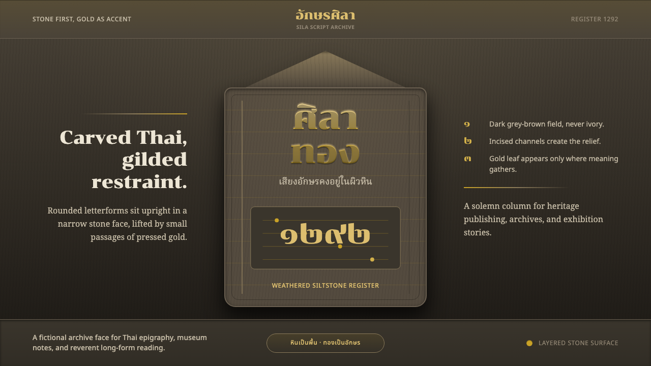 Sukhothai Thai ScriptStone carries the script. Chonburi Thai letters glint gold on dark siltstone.石承文字。深砂岩上金色泰文字闪光。