What is Swiss Franc Note?什么是 Swiss Franc Note?
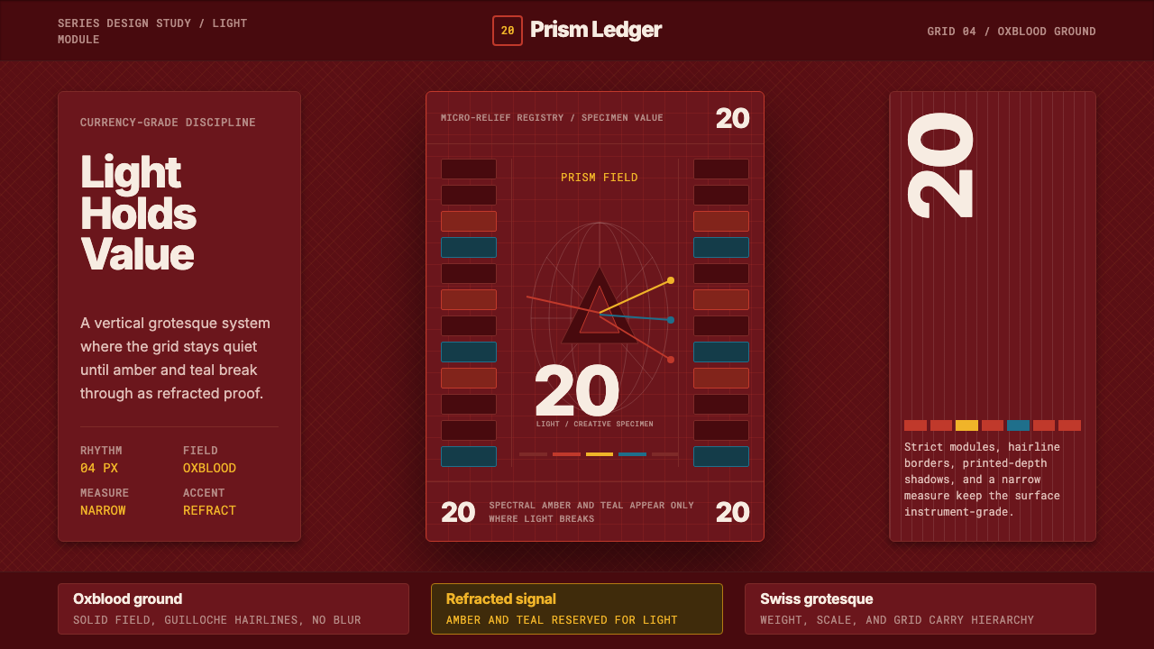
Switzerland rebuilt its banknotes around a single idea per bill, then hid a spectrum of hidden physics inside a field of disciplined red.瑞士把纸币设计重建为“一面一主题”,又在一片克制的红色底面之下,藏进一整道看不见的光谱物理。
Swiss Franc Note in briefSwiss Franc Note 速览
Swiss Franc Modern describes the visual language of the Swiss National Bank's ninth banknote series, released beginning in 2016 and completed in 2019 — the world's most awarded currency redesign of its decade. Each denomination is organized around one abstract theme rendered through a Swiss hand performing an action: touch, motion, light, and so on. The 20-franc note, themed light and creativity, shows a hand holding a triangular prism that splits a beam into a visible spectrum, paired with a star-map globe and a field of micro-relief security patterning.“瑞士法郎现代”描述的是瑞士国家银行第九版钞票的视觉语言——该系列自2016年起陆续发行,2019年全部完成,是当年全球获奖最多的货币再设计项目。每一面额都围绕一个抽象主题展开,由一只瑞士人的手完成一个动作来呈现:触摸、运动、光线,等等。20法郎钞票的主题是“光与创造力”,画面是一只手握着一枚三棱镜,将一束光分解为可见光谱,旁边配有星图地球与一片微浮雕防伪纹理。
The system is built on a paradox that makes it unusually interesting as a design reference: it is simultaneously one of the most restrained and one of the most technically dense objects a person handles daily. The dominant field is a single deep, saturated color per denomination — oxblood red for the 20-franc note — printed with almost no competing hue. Within that restraint sits an enormous amount of engineered complexity: guilloché line work, latent images, and color-shifting inks that only resolve under specific light or tilt angles.这套体系建立在一个颇具设计参考价值的悖论之上:它同时是人们日常接触到的物件中,克制感最强、也是技术密度最高的一种。每一面额的主导底色都是单一、饱和的颜色——20法郎是暗酒红——几乎不与任何其他色相竞争。而在这份克制之内,藏着庞大的工程复杂度:扭索纹线条、潜影,以及只有在特定光线或倾斜角度下才会显现的变色油墨。
What makes this style transferable to screens is the tension it holds between calm and precision. The red field reads as confident and singular from a distance; step closer and a disciplined grid of numerals, a Swiss grotesque type hierarchy, and hairline security patterning reward attention. Nothing about the composition is loud. The prism motif — the one moment of color outside the dominant field — earns its presence by carrying the note's entire conceptual argument: light entering a solid object and leaving transformed.让这种风格能够移植到屏幕上的,正是它在“冷静”与“精密”之间保持的张力。远看,红色底面自信而纯粹;靠近细看,一套严谨的数字网格、瑞士无衬线体的层级体系,以及细如发丝的防伪纹理才会浮现,回报你的专注。整个构图没有一处喧哗。棱镜这个唯一跳出主导底色的色彩瞬间,之所以有资格存在,是因为它承载了整张钞票的核心概念:光进入一个实体、又以变化的姿态离开。
See the Swiss Franc Note design system查看 Swiss Franc Note 完整设计系统
Where does Swiss Franc Note come from?Swiss Franc Note 从何而来?
Swiss banknotes have carried an unusual cultural burden since the country's currency law was overhauled in the twentieth century: they are required to project neutrality, precision, and technical credibility to a public that treats forgery-resistance as a point of national pride. The eighth series, introduced in the 1990s, had leaned toward portraiture of historical Swiss figures. When the Swiss National Bank began planning its ninth series in the 2000s, it deliberately broke from that convention, choosing instead to organize each denomination around a universal human capacity rather than a named individual — a decision that removed the risk of any single figure's reputation compromising the currency's neutrality.自二十世纪瑞士货币法完成修订以来,瑞士纸币就背负着一种不寻常的文化使命:它必须向一个把“防伪能力”视为国家荣誉的公众,传达中立、精密与技术可信度。上一版(第八版)纸币在1990年代推出,倾向于印制瑞士历史人物肖像。而当瑞士国家银行在2000年代开始筹划第九版时,刻意与这一惯例决裂,转而围绕一种人类普遍的能力(而非某个具名人物)来组织每一面额——这个决定同时消除了“某个历史人物的声誉可能损害货币中立性”的风险。
The ninth series went through an unusually long development and security-testing cycle, roughly a decade from initial concept to first release, because Swiss currency design carries a mandate that ordinary graphic design does not: every visual element must double as a verifiable security feature. The design brief called for a note that a sighted person could authenticate in seconds by eye, that a visually impaired person could distinguish by touch and size, and that would defeat increasingly capable color-reproduction technology for years after release. The 20-franc note's prism and light-beam motif was chosen specifically because it let designers embed genuine optical phenomena — a shifting color gradient, layered under raking light — as the note's core anti-counterfeiting device, rather than bolting security features onto an otherwise unrelated illustration.第九版经历了异常漫长的研发与防伪测试周期——从最初构想到首张发行,历时近十年——因为瑞士货币设计肩负着普通平面设计所没有的使命:每一个视觉元素都必须同时是一项可验证的防伪特征。设计任务书要求:视力正常者能在数秒内凭肉眼辨真伪;视障者能凭触感与尺寸区分面额;且在发行后的多年里,能持续抵御日益精进的色彩复制技术。20法郎钞票的棱镜与光束母题之所以被选中,正是因为它让设计师能把真实的光学现象——在斜射光下呈现的渐变色彩——直接嵌入成为核心防伪装置,而不是在一幅无关的插画上外挂防伪元素。
The production technique itself is inseparable from the visual result. Intaglio engraving — ink pressed under enormous pressure into recessed plate lines — produces the raised, tactile ridges that give the printed numerals and portrait lines their crisp edge; offset and letterpress layers beneath it carry the flat color fields; and a final layer of optically variable ink and embedded security thread completes the object. The guilloché micro-relief patterning that borders the star-map globe is generated by mathematical curve algorithms rather than drawn by hand, a practice inherited directly from nineteenth-century engine-turning machines used on the earliest engraved banknotes and still considered nearly impossible to forge convincingly at scale.生产工艺本身与最终视觉效果密不可分。凹版雕刻——在巨大压力下把油墨压进凹陷的版线——造就了印刷数字与肖像线条那种凸起、可触摸的清晰边缘;其下的胶印与凸版层承载平涂色域;最后一层光学变色油墨与嵌入式防伪线完成整个物件。星图地球周边那圈扭索纹微浮雕,是由数学曲线算法生成,而非手绘——这一做法直接继承自十九世纪最早雕版纸币所用的车花机(engine-turning machine),至今仍被认为几乎无法被大规模仿造。
The ninth series was released denomination by denomination between 2016 and 2019, with the 20-franc note — the single most circulated denomination in Swiss daily commerce — released in 2017. Its immediate public reception centered on the boldness of committing an entire national currency to abstract, non-representational themes, a decision that was initially controversial and is now broadly credited with making Swiss currency the most frequently cited reference in international discussions of contemporary security-printing design.第九版纸币在2016至2019年间分面额陆续发行,其中20法郎——瑞士日常商业流通中最常用的面额——于2017年发行。它最初的公众反响集中于一个大胆的决定:让整套国家货币围绕抽象、非具象的主题展开——这一决定起初颇具争议,如今则被广泛认为让瑞士货币成为当代防伪印刷设计领域被引用最多的国际范例。
What defines the Swiss Franc Note look?Swiss Franc Note 的视觉特征是什么?
Color色彩
Each denomination commits to one dominant, deeply saturated field color — the 20-franc note's is a dark oxblood red — used with almost no competing hue across the majority of the surface. Against that field, a narrow spectral range of amber and teal appears only where the prism motif's light-beam logic justifies it: the moment light splits, and nowhere else. This creates a palette that reads as confident and singular from a distance, with a single, earned moment of chromatic complexity at its conceptual center.每一面额都以单一、深度饱和的底色为主导——20法郎是暗酒红——几乎覆盖整个版面而不与其他色相竞争。在这片底色之上,只有在“棱镜折光”这一逻辑成立之处,才会出现一段窄幅的琥珀与青蓝光谱色——光线分裂的那一瞬间,别无他处。这造就了一种远看自信而纯粹、却在概念核心处拥有唯一一次色彩复杂性的色板。
Typography字体排印
Numerals and labels follow a disciplined Swiss grotesque hierarchy — the same lineage of type discipline that produced Swiss International Style — set with tabular alignment so that figures line up with mechanical precision regardless of digit count. Type size and weight are used to signal denomination value and security-relevant information rather than for decorative emphasis; nothing is set for visual flourish. The numerals carry raised, tactile edges in the physical object, a reminder that every typographic choice on a banknote must also perform a verification function.数字与标签遵循严谨的瑞士无衬线体层级——正是这一脉字体传统孕育了瑞士国际主义风格——并以表格式对齐排布,使数字无论位数多少都能保持机械般的精确对位。字号与字重被用来标示面额与防伪相关信息,而非用于装饰性强调;没有一处是为视觉花哨而设置。在实体钞票上,这些数字带有凸起的可触摸边缘,提醒人们:纸币上的每一个排版选择,同时也必须承担验证功能。
Figure and Motion人物与动态
The hand-holding-a-prism illustration is rendered with engraved, linear precision rather than photographic or painterly rendering — every contour is a line, consistent with intaglio printmaking's fundamental technique. The composition captures a single frozen instant of transformation: light entering the prism as a plain beam and leaving as a spectrum. This economy of gesture — one hand, one object, one moment — replaces any broader illustrative scene, keeping the figure legible at both banknote scale and, by extension, at interface scale.手持棱镜的插画以凹版雕刻式的线性精度呈现,而非摄影式或绘画式的渲染——每一处轮廓都是一条线,这与凹版印刷的基本工艺一脉相承。构图捕捉的是转化过程中被定格的一瞬:光以一束平直的光线进入棱镜,又以光谱的形态离开。这种极简的姿态经济——一只手、一件物、一个瞬间——取代了任何更宏大的叙事场景,使人物无论在钞票尺度还是延伸到界面尺度上,都保持清晰可读。
Security Micro-Pattern防伪微纹理
A field of guilloché line work — mathematically generated curves rather than hand-drawn ornament — borders the star-map globe motif at a scale fine enough to require close inspection. This pattern is not decorative filler; it exists because algorithmically generated curves are nearly impossible to reproduce convincingly through casual copying. As a design reference, the lesson transfers directly: dense, precise micro-detail earns its place when it rewards close attention rather than existing purely as texture.一圈扭索纹线条——由数学算法生成,而非手绘装饰——环绕在星图地球母题周围,其精细程度需要凑近细看才能分辨。这种纹理并非装饰性的填充;它之所以存在,是因为算法生成的曲线几乎不可能被随意复制得以假乱真。作为设计参考,这一点可以直接迁移:只有当密集、精确的微观细节真正回报专注的目光,而非仅仅充当质感填充时,它才配得上被使用。
Layout Discipline版面秩序
The note's format is strictly vertical and gridded, a departure from the traditionally horizontal orientation of most world currencies. Every element — the portrait figure, the globe, the denomination numerals, the security thread — occupies a fixed, non-negotiable position dictated by both aesthetic hierarchy and verification function. There is no loose or exploratory placement anywhere on the surface; the grid is total.钞票的版式严格竖向、依附网格,这与世界上大多数货币传统的横向布局形成对比。每一个元素——人物图像、地球图案、面额数字、防伪线——都占据一个由美学层级与验证功能共同决定的固定位置,绝无商榷余地。整个版面上没有任何一处是松散或试探性的放置;网格是全面而彻底的。
Restraint as Trust Signal以克制传达信任
Because the note must be trusted at a glance by an entire population, every visual decision leans toward calm rather than spectacle. A single dominant color, one figure, and one moment of chromatic complexity communicate authority far more effectively than a busier composition would. This is the style's central lesson for interface work: restraint, applied to a surface people must trust instantly, reads as more credible than richness.因为这张钞票必须让全体公众一眼便能信任,所以每一个视觉决定都倾向于冷静而非张扬。单一的主导色、一个人物形象、一次色彩复杂性的瞬间,远比一个更繁复的构图更能有效传达权威感。这正是这种风格给界面设计留下的核心启示:在一个人们必须瞬间信任的界面上,克制比丰富更显可信。
See the Swiss Franc Note design system查看 Swiss Franc Note 完整设计系统
Who shaped Swiss Franc Note?谁塑造了 Swiss Franc Note?
The Swiss National Bank oversaw the ninth series as commissioning body, setting the brief that required every denomination to embody a universal human capacity rather than a historical individual, and that every visual element double as a security feature verifiable by sight, touch, or instrument.瑞士国家银行作为委托方主导了第九版纸币的整体研发,制定了任务书:要求每一面额都体现一种人类普遍的能力,而非某个历史人物;并要求每一个视觉元素都同时具备可凭肉眼、触摸或仪器验证的防伪功能。
Pfrunder led the design studio responsible for the ninth series' visual concept, developing the hand-performing-an-action motif that unifies all denominations and translating an abstract theme brief into a coherent, technically feasible security-printing system.普鲁恩德(Manuela Pfrunder)主持了负责第九版视觉概念的设计工作室,开发出“手完成一个动作”这一贯穿全系列面额的统一母题,把抽象的主题任务书转化为一套连贯、技术上可行的防伪印刷体系。
The security printer responsible for realizing the ninth series in production, translating the design concept into intaglio, offset, and optically variable ink layers, and generating the mathematically derived guilloché patterning that underlies the note's anti-counterfeiting architecture.Orell Füssli 防伪印刷公司负责将第九版设计概念付诸生产实现,把设计转化为凹版、胶印与光学变色油墨等多层工艺,并生成支撑整套防伪架构的数学扭索纹图案。
How do you use Swiss Franc Note today?今天怎么用 Swiss Franc Note?
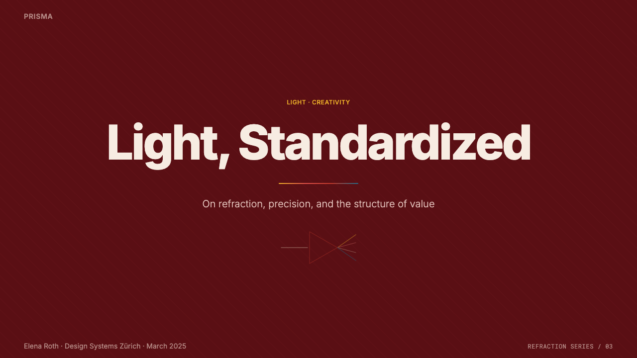
Applying Swiss Franc Modern to a slide deck cover works best when the designer treats the dominant color field as the entire canvas rather than a background accent. A cover slide should commit to one deep, saturated color across nearly the full frame, with title type set in a disciplined grotesque hierarchy and a single small motif — an icon, a mark, a data point — occupying the role the prism plays on the real note: one earned moment of visual interest against total restraint. Content slides should carry that same discipline into tabular data: numerals aligned with mechanical precision, no decorative dividers, and color reserved strictly for the rare moment something needs to stand apart.把“瑞士法郎现代”用于演示文稿封面时,最有效的做法是把主导色域当作整张画布,而非仅仅是背景点缀。封面页应当让一种深沉、饱和的颜色几乎铺满整个画面,标题字体遵循严谨的无衬线层级,再配一个小小的母题——一个图标、一个标记、一个数据点——扮演真实钞票上棱镜所扮演的角色:在全面克制中,唯一一处值得驻足的视觉焦点。内容页应把同样的秩序延续到表格数据上:数字以机械般的精度对齐,无装饰性分割线,色彩只留给极少数真正需要脱颖而出的瞬间。
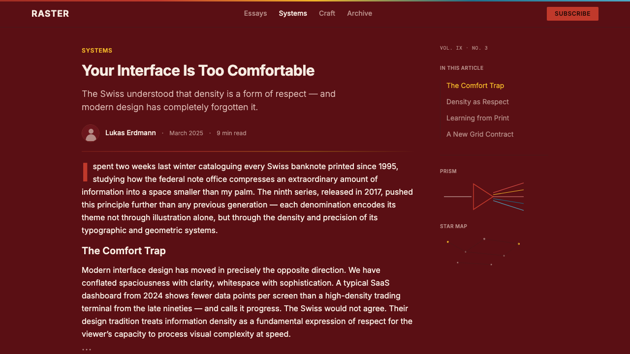
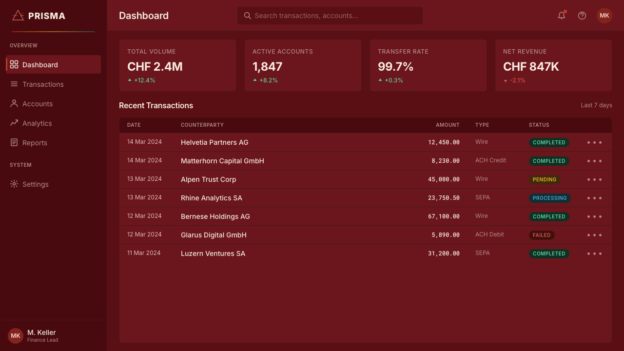
For web interfaces, this style suits products where trust and verification are the primary user need — financial dashboards, security or compliance tools, identity verification flows, or premium account settings. The approach: a single deep accent color for structural chrome, near-monochrome numeral-heavy data tables, and a narrow spectral accent range reserved exclusively for states that genuinely need to draw the eye, such as an active security indicator or a verified badge. Avoid using the accent spectrum decoratively; on the source note it exists only because light is physically transforming, and using it without that justification dilutes the device's authority.对于网页界面,这种风格适合以“信任”与“验证”为核心用户需求的产品——金融仪表板、安全或合规工具、身份验证流程,或高端账户设置页。方法是:结构性框架使用单一的深色强调色,数据表格以近乎单色的数字为主,窄幅光谱强调色则严格保留给真正需要吸引目光的状态,例如一个激活中的安全指示器或一枚已验证徽章。避免把这段光谱色用作纯装饰——在原型钞票上,它之所以存在,只因为光正在物理意义上发生转化;脱离这一理由使用它,会稀释这个装置本应具有的权威感。
In editorial and marketing contexts, the style supports work about precision, craftsmanship, or Swiss-adjacent themes — watchmaking, security technology, premium manufacturing. A magazine-style layout can use the deep field color as a full-bleed section break, with body text set in a narrow measure against generous margin, echoing the note's vertical, gridded discipline. Marketing pages benefit from treating the accent spectral color as a signature moment reserved for a single hero visual rather than spreading it across multiple elements.在编辑与营销语境中,这种风格适合与精密、工艺或瑞士相关主题相关的内容——制表业、安全科技、高端制造。杂志式版面可以把深色底面用作整页出血的段落分隔,正文以窄行宽配宽阔留白排布,呼应钞票竖向、依附网格的秩序感。营销页面适合把光谱强调色当作一个签名式的高光时刻,只保留给单一的主视觉,而不是分散在多个元素上。
The style also transfers cleanly to premium packaging or credential design — certificates, verified badges, membership cards — anywhere an object needs to project both restraint and technical sophistication simultaneously.这种风格同样可以干净利落地移植到高端包装或凭证设计——证书、认证徽章、会员卡——任何需要同时传达克制感与技术精密感的物件。
The most common mistake is treating the spectral amber-teal accent as a general-purpose secondary color palette and applying it broadly across buttons, links, and decorative elements. On the source note, that color range appears in exactly one place for exactly one conceptual reason. Diluting it across a full interface strips away the very quality — earned rarity — that makes the accent meaningful. A second common mistake is loosening the grid: this style depends on numerals and structural elements sitting at fixed, mechanically precise positions, and any looseness in alignment reads as a break in the currency's implicit promise of exactness.最常见的错误,是把琥珀-青蓝光谱强调色当作一套通用的次级色板,广泛用在按钮、链接与装饰性元素上。在原型钞票上,这段色域只在唯一一处、因唯一一个概念理由而出现。若把它稀释到整个界面中,就会抹去让它有意义的那种“来之不易的稀有感”。第二个常见错误是放松网格:这种风格依赖数字与结构性元素坐落在固定、机械般精确的位置上,任何对齐上的松散,读起来都像是背叛了货币本应承诺的精确性。
See the Swiss Franc Note design system查看 Swiss Franc Note 完整设计系统
Swiss Franc Note — FAQSwiss Franc Note · 常见问题
Why does this style use only one accent color range instead of a broader palette?为什么这种风格只用一段强调色,而不是更宽的色板?
The restriction is inherited directly from the source object's logic. On the real banknote, the spectral amber-teal range exists only because it depicts an actual physical phenomenon — light splitting through a prism — and appears in exactly the place that phenomenon occurs. A broader palette would break that internal logic and dilute the moment's significance. When adapting the style, keeping the accent narrow and rare preserves the sense that its appearance means something, rather than reading as arbitrary decoration.这种限制直接继承自原型对象的内在逻辑。在真实钞票上,琥珀-青蓝光谱色之所以存在,只是因为它描绘了一个真实的物理现象——光穿过棱镜发生折射——并且只出现在这一现象发生的确切位置。更宽的色板会破坏这种内在逻辑,稀释这一瞬间的意义。移植这种风格时,保持强调色的窄幅与稀有,才能让它的出现显得有意义,而不是显得随意装饰。
Is this style suitable for playful or casual consumer products?这种风格适合轻松、休闲的消费类产品吗?
Generally not. The style's entire visual grammar is built around projecting trust, precision, and authority — qualities suited to financial products, security tools, credential systems, and premium or technical brands. Applying it to a playful consumer app risks reading as cold or overly formal, since the restraint that signals credibility in a banking context can signal a lack of warmth in a casual one.一般来说不适合。这种风格的整套视觉语法都是为了传达信任、精密与权威——这些品质适合金融产品、安全工具、凭证系统,以及高端或技术类品牌。把它用在轻松的消费类应用上,可能会显得冷漠或过于正式,因为在银行语境中传达可信度的那种克制,在休闲语境中反而可能显得缺乏温度。
How does the security micro-pattern (guilloché) translate to digital interfaces?防伪微纹理(扭索纹)如何转化到数字界面中?
On the note, guilloché patterning is mathematically generated line work fine enough to require close inspection, existing specifically to resist casual reproduction. In interface work, the equivalent gesture is a fine, precise micro-detail — a subtle textured border, a delicate line pattern around a badge or seal — used sparingly at a scale that rewards attention rather than existing as generic decorative texture. It should never be applied as a blanket background pattern; its value depends on scarcity and precision.在钞票上,扭索纹是由数学算法生成的、精细到需要凑近细看的线条,其存在的目的正是抵御随意的复制。在界面设计中,与之对应的手法是精细、精确的微观细节——一道细腻的纹理边框,一圈围绕徽章或印章的细密线条图案——以奖励专注为目的、克制地使用,而非作为通用的装饰性底纹泛滥铺开。它绝不应被当作大面积背景图案使用;它的价值取决于稀缺性与精确度。
What is the relationship between this style and Swiss International Style (Swiss grotesque)?这种风格与瑞士国际主义风格(瑞士无衬线体系)是什么关系?
They share a typographic lineage — both rely on disciplined Swiss grotesque type set with mathematical grid precision — but they diverge in purpose. Swiss International Style was developed for corporate identity and information design broadly, favoring wide color ranges including photography. Swiss Franc Modern narrows that same typographic discipline into a single-color-field, security-printing context, where every element must also verify authenticity. Think of it as Swiss Style's typographic rigor redirected toward a narrower, higher-stakes purpose.两者共享同一脉字体传统——都依赖遵循数学网格精度设置的严谨瑞士无衬线体——但用途不同。瑞士国际主义风格是为广泛的企业识别与信息设计而发展的,偏好包括摄影图像在内的宽阔色彩范围。而“瑞士法郎现代”把同一套字体纪律收窄进单一色域、防伪印刷的语境中,其中每一个元素还必须承担验证真伪的功能。可以把它理解为:瑞士风格的字体严谨性,被重新导向了一个更窄、也风险更高的用途。
Does this style work well in a light-background, non-dark layout?这种风格能用在浅色背景、非深色版面上吗?
The style's canonical form is dark-ground — the deep oxblood field is central to how it communicates authority and restraint. A light-background adaptation is possible but requires care: the dominant color should still be treated as a single confident field rather than diluted into a light tint, and the spectral accent should remain equally rare. Without the depth of a saturated dark ground, the style risks losing the gravitas that makes it distinctive, so a light variant works best when the dominant color is still applied at strong, undiluted saturation somewhere prominent on the page.这种风格的经典形态是深色底面——那片深沉的暗酒红底色,正是它传达权威与克制感的核心。浅色背景的改编是可行的,但需要谨慎处理:主导色仍应被当作一整片自信的色域来使用,而不是被稀释成浅色调;光谱强调色也应保持同样的稀有度。如果失去饱和深色底面所带来的分量感,这种风格就有可能失去让它与众不同的庄重感,因此浅色变体最好在页面某个显著位置仍保留强烈、未经稀释的高饱和主导色。
Related design styles相关设计风格
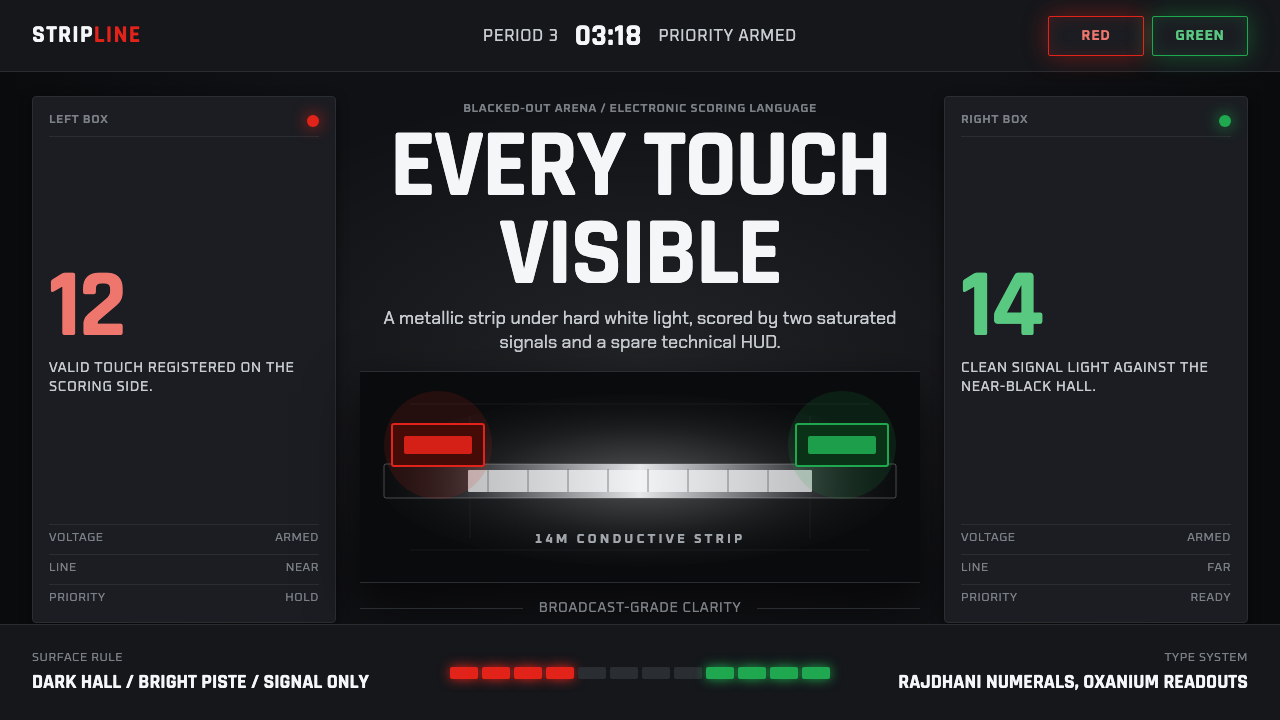 Fencing PisteTurns darkness into signal. Rajdhani HUD type frames a white piste and red-gr…黑场化为信号:Rajdhani HUD、白色剑道与红绿计分灯。
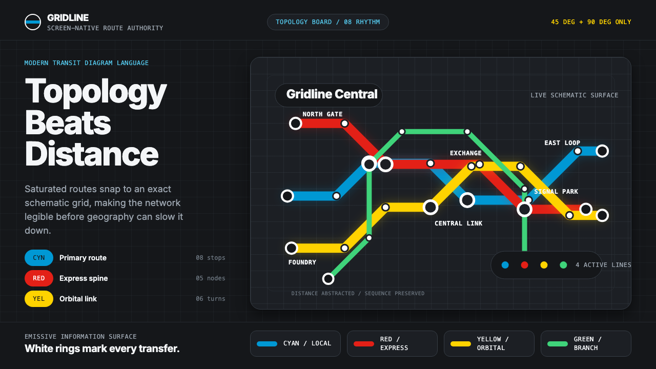 Transit Diagram (modern)Topology over geography. Cyan, red and yellow routes lock to 45-degree angles…拓扑胜过地理:黑底上青红黄线路锁定45度角。
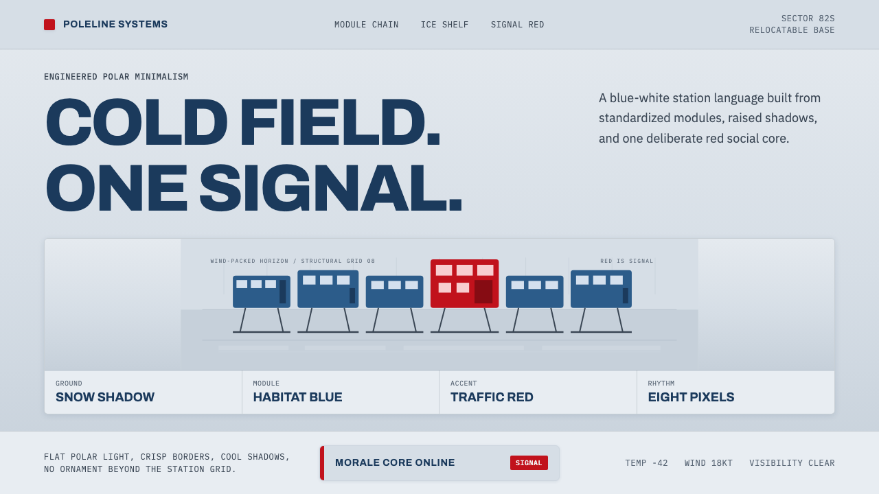 Antarctic StationCold precision, one red signal. Archivo modules ride a blue-white horizon gri…冷峻精准,一点红色信号。Archivo 模块排在蓝白地平线上。
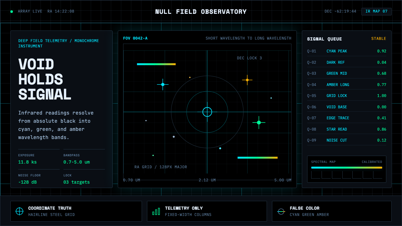 Deep Space ObservatoryTrust the void. Cyan telemetry and amber wavelength bars lock to a steel grid.信任虚空:青色遥测与琥珀波段锁定钢性网格。
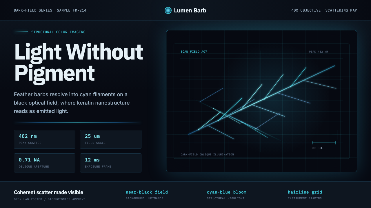 Feather MicroscopyPhysics glows in the dark. Cyan filaments and mono scale bars cut a black ima…黑暗中显出物理之光。青蓝羽丝与等宽比例尺切开暗场。
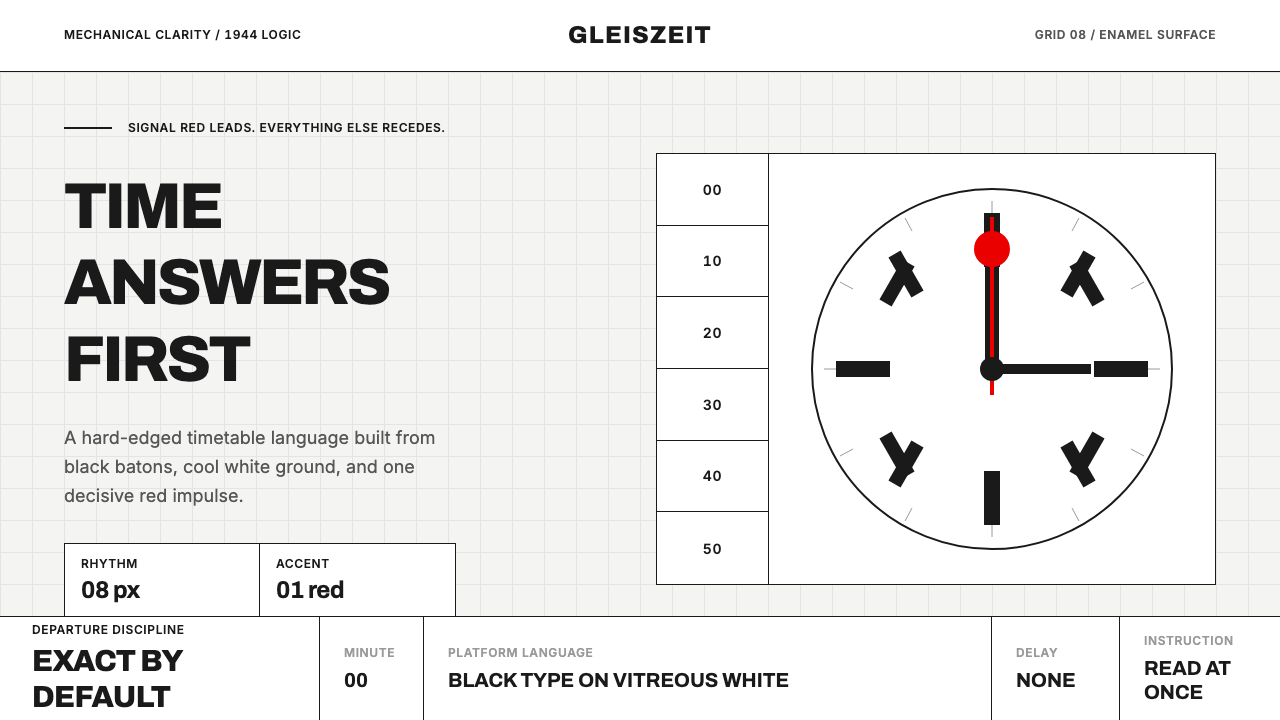 Swiss Railway ClockPrecision refuses decoration. Black batons and one red hand cut through ename…精准拒绝装饰:白珐琅底、黑色刻度,一根红秒针定向。