What is Antarctic Station?什么是 Antarctic Station?
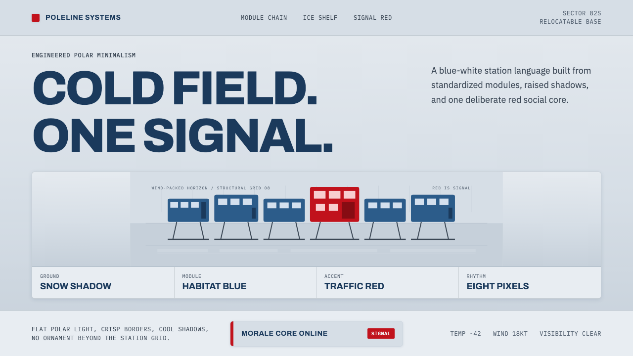
A row of blue modules stands on hydraulic legs above a wind-packed ice shelf, and one red module breaks the cold to remind everyone inside that they are still human.一排蓝色模块架在液压支腿之上,凌驾于被风压实的冰架,唯有一座红色模块打破了这份寒冷,提醒着里面的人:他们仍是有血有肉的人。
Antarctic Station in briefAntarctic Station 速览
Antarctic Station distills the design language of Halley VI, the world's first fully relocatable polar research base, into a digital system. The real station is a string of standardized blue habitat and laboratory modules mounted on hydraulic skis, raised above the accumulating snow of a moving ice shelf, with a single two-storey red social module breaking the line as a deliberate accent for morale rather than function.「南极科考站」将哈雷六号——世界上第一座完全可移动的极地研究基地——的设计语言转化为一套数字系统。真实的科考站是一连串标准化的蓝色起居与实验模块,架设在液压雪橇支腿之上,凌驾于一片移动冰架上不断堆积的积雪之中,唯有一座两层高的红色社交模块打破了这条线,作为提振士气而非功能性用途的刻意点缀。
The system speaks in cold, engineered precision: a blue-white snow ground, a clean signal-red used sparingly as a point accent rather than a field color, and disciplined geometric grotesque typefaces built for signage-grade legibility rather than warmth. Every choice reads as functional first — nothing exists purely for decoration, because in the real station nothing could.该系统以冷峻、工程化的精准发声:蓝白雪原底色、克制地作为点状强调色而非大面积铺色使用的干净信号红,以及为标识级可读性而非温暖感而设计的严谨几何无衬线字体。每一个选择都首先读作功能性的——没有任何东西纯粹为装饰而存在,因为在真实的科考站里,也确实不能有。
Red in this system behaves exactly as it does at Halley VI: it marks the one place designed for human connection amid an otherwise utilitarian, life-supporting structure. It is never the dominant color and never spread across large fields — it is a signal, a single warm interruption in an otherwise cold and precise environment.在这套系统中,红色的行为方式与哈雷六号一模一样:它标记着在一个功能主义、维持生命的结构中,唯一为人类联结而设计的场所。它从不是主导色,也从不铺满大面积——它是一个信号,是在一个原本冷峻精确的环境中唯一一次温暖的打断。
See the Antarctic Station design system查看 Antarctic Station 完整设计系统
Where does Antarctic Station come from?Antarctic Station 从何而来?
Halley VI, opened in stages during 2012 and 2013, is operated by the British Antarctic Survey and represents the sixth iteration of a research station on the Brunt Ice Shelf, a floating platform of ice in the Weddell Sea. Every previous version of the Halley station had eventually been crushed or buried by accumulating snow and shifting ice, since a floating ice shelf moves gradually toward the sea and can calve into icebergs. Halley VI was designed specifically to solve this recurring problem by being fully relocatable.哈雷六号科考站于2012至2013年间分阶段建成开放,由英国南极调查局运营,是布伦特冰架——威德尔海中一片漂浮冰体平台——上第六代科考站。此前每一代哈雷站最终都被不断堆积的积雪或移动的冰体压垮或掩埋,因为一片漂浮的冰架会逐渐向海洋方向移动,并可能崩解出冰山。哈雷六号的设计正是为了从根本上解决这一反复出现的问题,将整座科考站设计成完全可移动的。
The design, led by Hugh Broughton Architects with engineering by AECOM, mounts each module on hydraulic legs fitted with skis, allowing the entire station to be periodically jacked up above rising snow accumulation and, when necessary, towed to a new location entirely — an unprecedented capability for a permanent research facility. In 2017, this exact capability was tested for real when the British Antarctic Survey towed the station roughly 23 kilometers inland after a massive crack in the ice shelf threatened to calve the section the station stood on.该设计由休·布劳顿建筑事务所主持,AECOM 提供工程支持,将每个模块架设在配备雪橇的液压支腿之上,使整座科考站能够定期被顶升至不断堆积的积雪之上,必要时还能被整体拖曳至全新的地点——这是一座永久性研究设施前所未有的能力。2017年,这项能力真的被投入实战:当冰架上一道巨大裂缝威胁到科考站所在区域即将崩解成冰山时,英国南极调查局将整座科考站向内陆拖曳了约23公里。
The station's blue modules house the standardized science and living functions — laboratories, sleeping quarters, technical systems — chosen in a cold, engineered blue that reads as calm and functional under the harsh, high-contrast light of the polar environment. The single red module, elevated on two storeys and containing communal social space, was a deliberate architectural decision to counter the psychological toll of prolonged isolation in one of the most extreme environments humans inhabit; its color and its unique scale within the otherwise uniform module line make it unmistakably the place built for human contact rather than research output.科考站的蓝色模块容纳着标准化的科研与生活功能——实验室、卧室、技术系统——之所以选用一种冷峻、工程化的蓝色,是因为它在极地环境严苛、高对比度的光线下读起来沉着而具功能性。唯一的红色模块高出两层,容纳着公共社交空间,这是一项刻意的建筑决策,用以对抗长期身处人类所居住的最极端环境之一所带来的心理代价;它的色彩以及在原本统一的模块序列中独树一帜的尺度,让它毫无疑问地成为那个为人际联结、而非科研产出所建造的场所。
Halley VI's design also had to account for near-total darkness through the Antarctic winter, hurricane-force winds, and temperatures that regularly drop far below freezing, all of which shaped the station's commitment to clear, high-contrast wayfinding signage in engineered sans-serif type — a life-safety necessity in an environment where confusion during an emergency could be genuinely fatal. The result is a design language born entirely of engineering necessity that happens to read, aesthetically, as clean, cold, and quietly confident.哈雷六号的设计还必须应对南极冬季近乎全暗的极夜、飓风级强风,以及经常远低于冰点的气温,这一切共同塑造了科考站对清晰、高对比度工程化无衬线体标识指引的坚持——在一个紧急情况下发生混乱可能真正致命的环境中,这是一项攸关生命安全的必需品。最终呈现出的这套设计语言,完全诞生于工程上的必要性,却恰好在美学上读起来干净、冷峻,且带着一种安静的自信。
What defines the Antarctic Station look?Antarctic Station 的视觉特征是什么?
Blue-White Snow Ground蓝白雪原底色
The base surface reads as cold, wind-packed snow under polar light — a blue-white that never warms toward beige or cream. This ground stays flat and unadorned, mirroring the vast, featureless expanse of an ice shelf, and provides the neutral field against which the red social-module accent gains its full impact.基底表面读起来像极地光线下被风压实的寒冷积雪——一种绝不偏向米色或奶油色暖调的蓝白色。这层底色保持平坦、不加修饰,映照着冰架广袤、毫无特征的延展,也为红色社交模块强调色获得其全部冲击力提供了中性的场域。
Signal Red as Point Accent作为点状强调的信号红
Red appears only at single, deliberate points — never as a field fill — echoing the one red module among an otherwise all-blue line of habitat units. Its rarity is what makes it function as a signal: in this system, red always marks the one place, action, or piece of information meant for human attention above all else.红色只出现在单一、刻意的点位——从不作为大面积色块填充——呼应着在一列全蓝起居单元中唯一的那座红色模块。正是这种稀有性,让它发挥信号的作用:在这套系统中,红色总是标记着那唯一需要人类首要关注的地点、操作或信息。
Engineered Grotesque Typography工程化无衬线字体
Type draws on clean, geometric grotesque letterforms built for signage-grade legibility in harsh conditions rather than editorial warmth. Letterforms are simple, evenly weighted, and designed to remain readable at a glance, echoing the life-safety wayfinding signage a real polar station depends on.字体借鉴了为在恶劣条件下达到标识级可读性、而非编辑感温度而设计的干净几何无衬线字形。字形简洁、字重均匀,设计目标是让人一眼就能读懂,呼应着真实极地科考站所依赖的、攸关生命安全的寻路标识。
Modular Repetition模块化重复
Interface elements are treated as standardized, repeatable modules — consistent card shapes, uniform spacing, identical component treatment — mirroring the identical blue habitat units strung together at Halley VI. Uniformity is a feature, not a limitation; it signals engineering discipline and reliability.界面元素被当作标准化、可重复的模块处理——一致的卡片形状、统一的间距、相同的组件处理方式——映照着哈雷六号中一连串完全相同的蓝色起居单元。这种统一性是一项特性,而非局限;它传达着工程纪律与可靠性。
Raised, Structural Framing抬升的结构性框架
Panels and cards read as though raised on legs above their ground, echoing the hydraulic ski legs that lift the real station's modules above accumulating snow. This creates a subtle sense of engineered elevation rather than flat, page-bound placement.面板与卡片读起来仿佛被支腿架高于其底面之上,呼应着真实科考站中把模块架高、使其凌驾于不断堆积的积雪之上的液压雪橇支腿。这营造出一种工程化的抬升感,而非扁平、贴附于页面的摆放方式。
High Contrast for Legibility为可读性而生的高对比度
Contrast between text and ground stays deliberately high, reflecting the extreme lighting conditions of polar day and night that make clear wayfinding a genuine safety requirement rather than a design preference. Low-contrast, softly blended elements have no place in this system.文字与底色之间的对比度刻意保持很高,反映出极地昼夜极端光照条件下,清晰的寻路指引是一项真正的安全需求,而非设计偏好。低对比度、柔和融合的元素在这套系统中没有立足之地。
Function Over Ornament功能优先于装饰
Every visual element traces back to a functional origin — no decorative flourishes exist purely for visual interest, because in the real station's extreme environment, nothing could exist without earning its place. This discipline gives the system a quiet, confident restraint.每一个视觉元素都可追溯到某种功能性起源——没有任何装饰性花饰纯粹为了视觉趣味而存在,因为在真实科考站那极端的环境中,任何东西的存在都必须有其存在的理由。这份纪律赋予这套系统一种安静、自信的克制感。
See the Antarctic Station design system查看 Antarctic Station 完整设计系统
Who shaped Antarctic Station?谁塑造了 Antarctic Station?
The architecture firm led the design of Halley VI, conceiving the relocatable module-on-legs concept and the deliberate choice of a single red social module to counter the psychological isolation of extreme polar duty — a decision that became the visual and emotional anchor of the entire station.这家建筑事务所主持了哈雷六号的设计,构思出以支腿架高的可移动模块概念,以及刻意设置单一红色社交模块以对抗极地驻站极端隔离感的决定——这一决定成为整座科考站的视觉与情感锚点。
The operating body behind Halley VI, the British Antarctic Survey defined the operational requirements that shaped the station's design, including the 2017 relocation of the entire base roughly 23 kilometers inland when a crack in the ice shelf threatened to calve the section it stood on.作为哈雷六号的运营机构,英国南极调查局确立了塑造科考站设计的运营需求,包括2017年在冰架裂缝威胁崩解科考站所在区域时,将整座基地向内陆迁移约23公里的行动。
AECOM provided the structural and mechanical engineering that made the hydraulic-ski relocation system physically viable, translating the architects' concept into a working solution capable of surviving hurricane-force winds and extreme cold.AECOM 提供了使液压雪橇迁移系统在结构与机械层面切实可行的工程支持,将建筑师的构思转化为一套能够在飓风级强风与极端严寒中运行的可行方案。
How do you use Antarctic Station today?今天怎么用 Antarctic Station?
This style suits products that want to communicate cold precision, engineering rigor, and reliability under extreme conditions — a register well suited to infrastructure, monitoring, safety, or scientific tools, where trustworthiness matters more than warmth.这种风格适合那些希望传达冷峻精准、工程严谨性与极端条件下可靠性的产品——这种语域非常适合基础设施、监控、安全或科学工具类产品,在这些场景中,可信度比温暖感更重要。
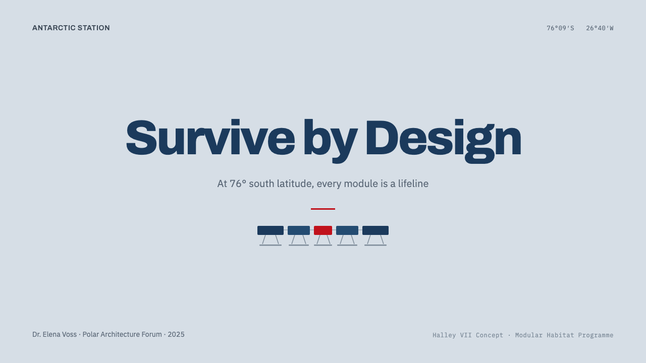
For presentation slides, the blue-white ground and single red accent work well on a cover slide that wants to feel disciplined and authoritative: a modular geometric arrangement in cold blue tones, with a single red element marking the one most important point on the slide. Content slides should maintain strict modular repetition — identical card or block treatments for parallel information — reserving red exclusively for the single most critical data point or call to action per slide.在演示文稿中,蓝白底色与单一红色强调色在封面页上表现出色:一种冷调蓝色的模块化几何排布,配以一个标记出页面上最重要那一点的红色元素。内容页应保持严格的模块化重复——为并列信息使用相同的卡片或区块处理方式——将红色严格保留给每页最关键的数据点或行动号召。
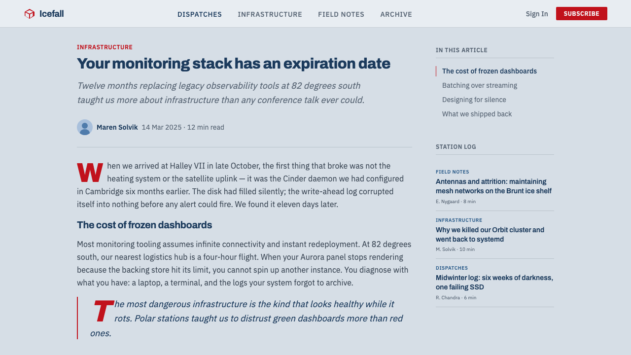
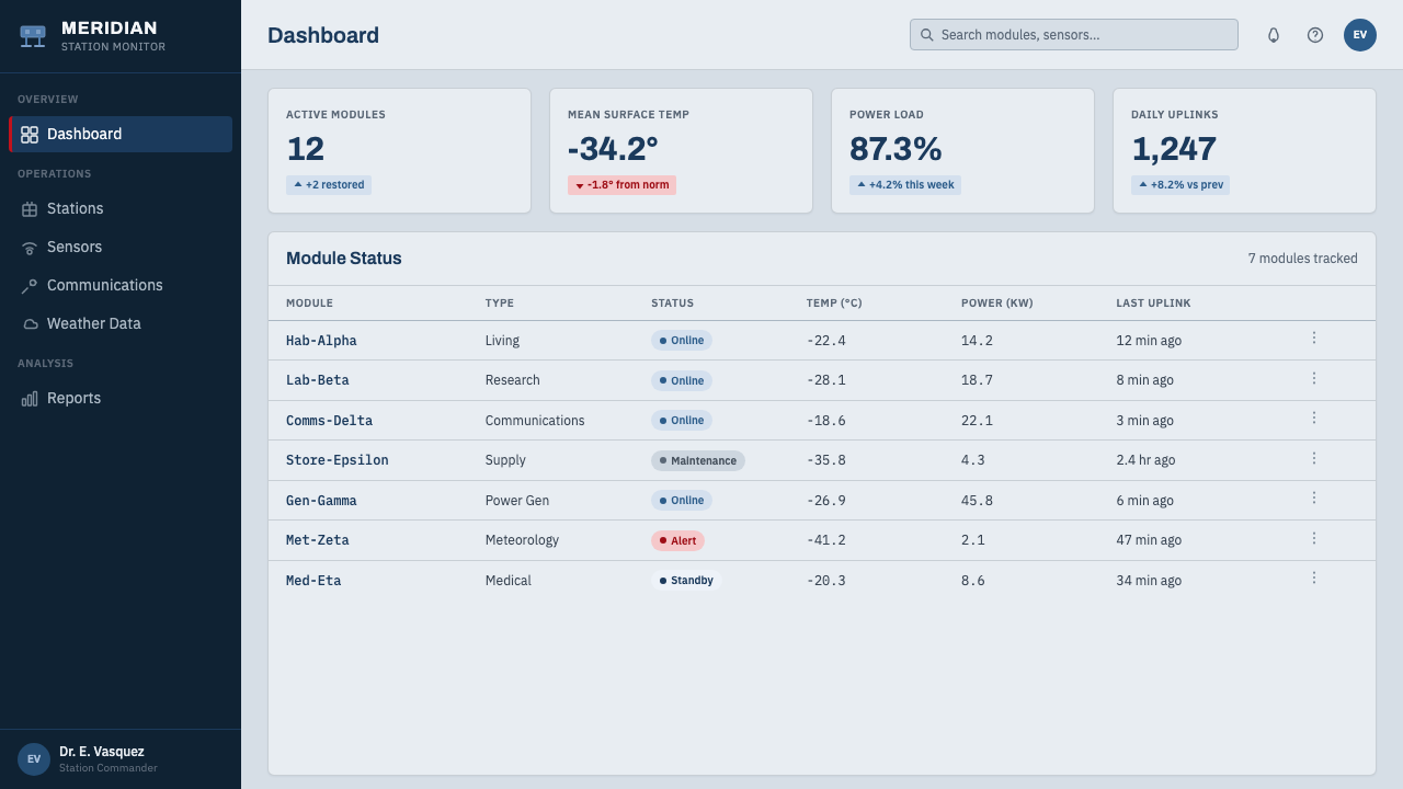
For web interfaces, the system suits infrastructure dashboards, scientific or research platforms, safety-critical monitoring tools, and any product operating in a technical or high-stakes context. Navigation and structural elements should stay in cold blue and neutral tones, with red used only for primary calls to action, critical alerts, or the single most important interactive element on a screen — never as a general brand accent spread across multiple UI elements.对于网页界面,这套系统适合基础设施仪表板、科学或研究平台、安全关键型监控工具,以及任何在技术性或高风险语境中运行的产品。导航与结构性元素应保持冷调蓝色与中性色调,红色仅用于主要行动号召、关键警报,或屏幕上唯一最重要的交互元素——绝不作为泛泛铺开在多个界面元素上的品牌强调色。
For editorial and marketing content, the style suits stories about engineering achievement, extreme environments, or scientific research, where a cold, precise visual language reinforces credibility. A single red pull-quote or callout within an otherwise blue-and-white layout can carry significant emphasis precisely because of its rarity.对于编辑与营销内容,这种风格适合关于工程成就、极端环境或科学研究的报道,冷峻精准的视觉语言能强化其可信度。在整体蓝白版面中,单独一处红色引言或要点框,正因其稀有性,能承载相当分量的强调。
A common mistake is treating red as a general accent color used throughout a layout rather than a single, rare signal — doing so erases the exact discipline that gives Halley VI's red module its meaning. Another mistake is warming the blue-white ground toward a friendlier beige or cream, which undermines the cold, engineered precision that is the entire point of this style.一个常见的错误,是把红色当作贯穿整个版面的通用强调色使用,而非单一、稀有的信号——这样做会抹去让哈雷六号红色模块具有意义的确切纪律。另一个错误,是把蓝白底色朝更友好的米色或奶油色暖化,这会削弱这种风格全部要义所在的冷峻工程精准感。
See the Antarctic Station design system查看 Antarctic Station 完整设计系统
Antarctic Station — FAQAntarctic Station · 常见问题
Why is red used so sparingly instead of as a general brand color?为什么红色使用得如此克制,而非作为通用品牌色?
Because in the real Halley VI station, the single red module is deliberately singular — it is the one place among an otherwise uniform blue line built specifically for human social contact. Spreading red across many elements would erase that meaning entirely and turn a deliberate architectural signal into generic decoration.因为在真实的哈雷六号科考站中,那座唯一的红色模块本就是刻意做成独一无二的——它是在原本统一的蓝色模块序列中,专门为人际社交联结而建造的那一处。若把红色铺洒到许多元素上,会彻底抹去这层含义,把一项刻意的建筑信号变成泛泛的装饰。
Does this style require literal snow or ice imagery to work?这种风格需要字面意义上的雪或冰图像才能奏效吗?
No. The style works through its tonal palette (blue-white ground, signal red), typographic choice (engineered grotesque), and modular repetition rather than literal photographic imagery. A dashboard or pricing page can read as authentically 'Antarctic Station' without a single photograph of snow, purely through color relationships and structural discipline.不需要。这种风格通过其色调色板(蓝白底色、信号红)、字体选择(工程化无衬线体)与模块化重复来发挥作用,而非依赖字面意义上的摄影图像。一个仪表板或定价页面完全可以纯粹通过色彩关系与结构性纪律,就读起来真实地具有“南极科考站”的气质,无需一张雪景照片。
Is this style suitable for a warm, consumer-friendly product?这种风格适合温暖、亲近消费者的产品吗?
Generally not. The palette and typography are built around cold precision and function-first discipline, which reads as trustworthy and engineered rather than warm or inviting. It suits infrastructure, scientific, and safety-critical products far better than consumer products aiming for approachability.通常不适合。色板与字体建立在冷峻精准与功能优先的纪律之上,读起来是可信赖、工程化的,而非温暖或亲近的。它更适合基础设施、科学与安全关键型产品,而非追求亲和力的消费者产品。
How should modular repetition be handled if content varies significantly in importance?如果内容在重要性上差异很大,模块化重复应该如何处理?
Keep the module shape and structural treatment uniform even when content importance varies — differentiate importance through the presence or absence of the red accent, not through breaking the modular consistency. This mirrors the real station, where every habitat module is physically identical except for the one singled out by color and scale for a different purpose.即便内容重要性存在差异,也应保持模块形状与结构性处理的统一——通过红色强调色的有无来区分重要性,而非打破模块化的一致性。这映照着真实科考站的做法:每座起居模块在物理上都完全相同,唯有那一座因用途不同而以色彩与尺度加以区别。
Related design styles相关设计风格
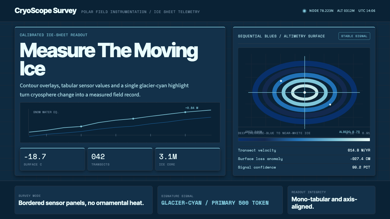 Glacier Arctic SurveyCold precision. Crevasse-blue panels, cyan readouts and contour grids calibra…冷峻精准:冰裂蓝面板、冰川青读数与等高网格校准每个数值。
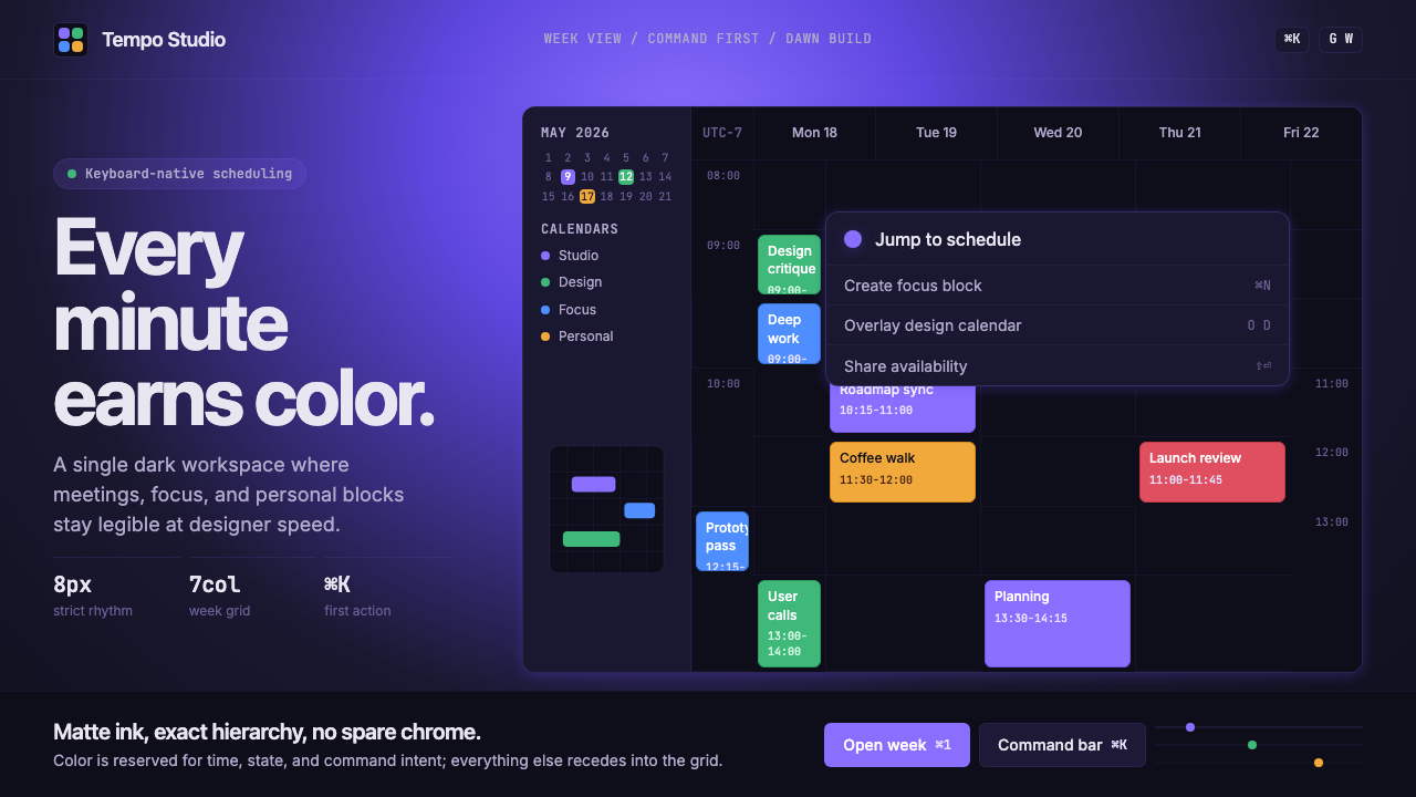 Cron CalendarDesigner-tech restraint. Purple wash, ink grid, mono shortcuts, surgical even…设计师科技的克制:紫色光晕、墨色网格、等宽快捷键与精准色块。
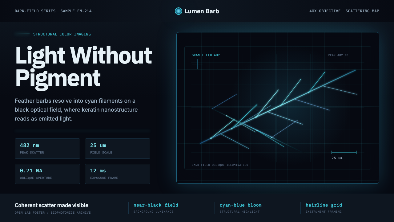 Feather MicroscopyPhysics glows in the dark. Cyan filaments and mono scale bars cut a black ima…黑暗中显出物理之光。青蓝羽丝与等宽比例尺切开暗场。
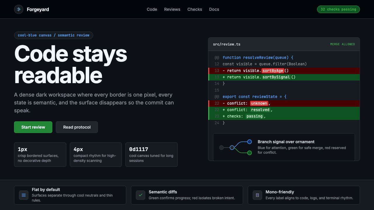 GitHub DarkCode-first darkness. Cool-blue canvas, 1px borders, green/red diff lines.代码优先的暗色:冷蓝画布、1px边框、绿红diff线。
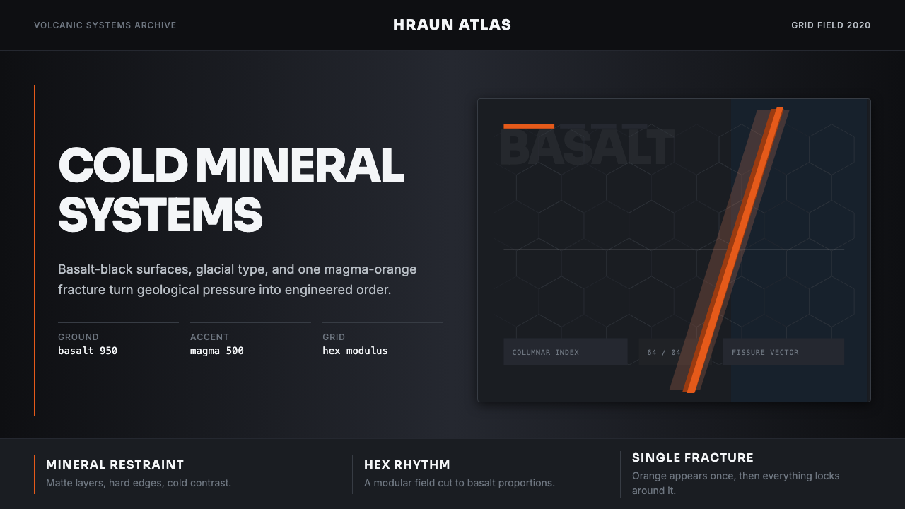 Icelandic Basalt VolcanoCold geology, engineered. Basalt black, Sora type, and one magma fissure hold…冷硬地质感:玄武黑、Sora 字体与岩浆裂缝锁定网格。
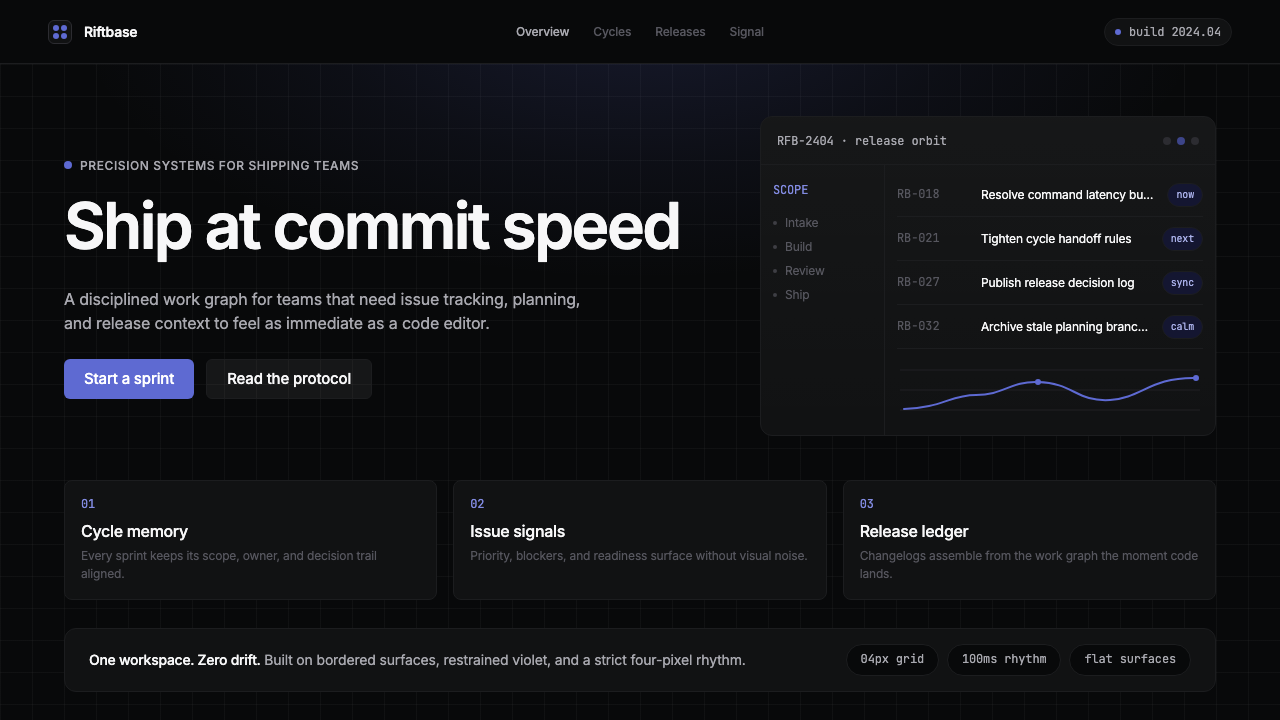 Linear 2024Precision down to the millisecond. Near-black, indigo-violet accents, Inter D…开发者工具美学的标杆:近乎纯黑、克制靛紫点缀、Inter Display 字体…