What is Song Ru Ware 宋汝窑?什么是 Song Ru Ware 宋汝窑?
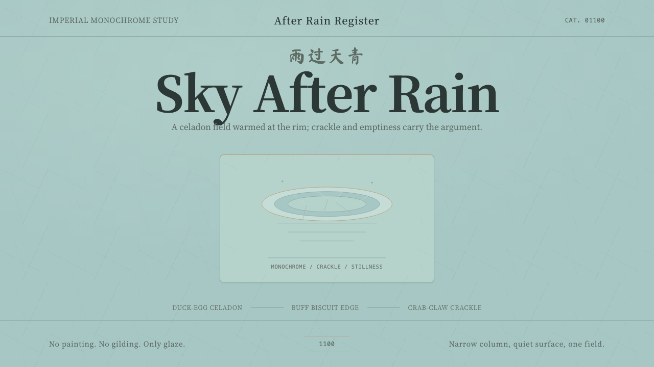
Ru ware turned a glaze color into an entire philosophy of restraint — the rarest ceramic in Chinese history, fired for barely two decades and prized for everything it refused to add.汝窑把一种釉色变成了一整套克制的哲学——中国陶瓷史上最稀有的品类,只烧造了不到二十年,其珍贵之处,恰恰在于它拒绝添加的一切。
Song Ru Ware 宋汝窑 in briefSong Ru Ware 宋汝窑 速览
Song Ru Ware is a design system built from the rarest and most revered ceramic tradition in Chinese history. Ru ware was produced for the Northern Song imperial court for barely two decades around 1100 CE, and fewer than a hundred complete pieces are known to survive today — a scarcity that has made each surviving vessel a national treasure and the glaze color itself a byword for refined taste.「宋汝窑」这套设计体系,取材自中国陶瓷史上最稀有、最受尊崇的传统。汝窑只为北宋宫廷烧造了大约二十年,时间约在公元1100年前后,如今已知完整传世的器物不足百件——这种稀缺让每一件存世之器都成为国之重器,也让这种釉色本身成为了雅致品味的代名词。
The defining feature is a glaze color the Song court called "sky after rain" (雨过天青) — a muted blue-green, neither fully blue nor fully green, closer to the color of duck-egg shell, laid over a pale buff clay body that warms through wherever the glaze runs thin, particularly at rims and edges. This is not a bright, assertive hue; it is quiet, slightly grey, and changes subtly depending on the light that falls on it.最具决定性的特征,是宋人称之为“雨过天青”的釉色——一种介于蓝与绿之间、说不清是蓝还是绿的含蓄色调,更接近鸭蛋壳的颜色,覆盖在浅淡的香灰色胎体之上,釉薄之处(尤其是口沿边缘)会透出胎骨的暖意。这不是一种明亮张扬的色彩;它是安静的、略带灰调的,并会随落在其上的光线不同而微妙变化。
What makes Ru ware historically remarkable is what it does not do. Chinese ceramics of other periods layered on painted decoration, gilding, and figurative motifs. Ru ware refused all of it — no painting, no gilding, no dragons, no narrative scenes. What remained was the glaze itself, a fine web of "crab-claw" crackle where the glaze cooled and contracted unevenly, and the shape of a single vessel held in near-total isolation. Restraint was not a limitation of the technology; it was the entire aesthetic argument.汝窑在历史上最令人惊叹之处,在于它「不做什么」。中国其它时期的陶瓷层层叠加着彩绘装饰、描金与具象纹样。汝窑将这一切全部拒绝——不绘彩、不描金、无龙无凤。所剩下的,唯有釉面本身、一张因釉料冷却收缩不均而形成的、细密如蟹爪的开片纹网络,以及近乎孤立地凝视一件单一器形。克制并非技术局限所致;克制本身,就是它全部的美学主张。
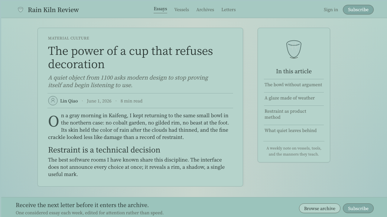
See the Song Ru Ware 宋汝窑 design system查看 Song Ru Ware 宋汝窑 完整设计系统
Where does Song Ru Ware 宋汝窑 come from?Song Ru Ware 宋汝窑 从何而来?
Ru ware takes its name from Ruzhou, a city in Henan province where the imperial kiln operated during the Northern Song dynasty. The kiln was active for a remarkably short window — most scholarship places its operation somewhere between 1086 and 1125, a span of perhaps twenty years — before the Jurchen invasions that ended the Northern Song and drove the court south disrupted production permanently. This brevity, combined with the fact that the ware was produced exclusively for court use rather than trade, is why so few pieces survive: it was never made in volume to begin with.汝窑得名于汝州——北宋时期御用窑场所在的河南一座城市。这座窑场活跃的时间窗口极短——多数学者认为其烧造年代大致在1086至1125年之间,前后不过约二十年——此后,女真人的入侵终结了北宋,朝廷南迁,生产就此永久中断。这种短暂性,加上汝瓷完全为宫廷所用、从未用于贸易的事实,正是它存世如此稀少的原因:从一开始,它就没有被大量烧造过。
The kiln's patron was Emperor Huizong, a ruler remembered less for his political competence — his reign ended in catastrophe with the Jurchen conquest — than for his connoisseurship. Huizong was himself a painter and calligrapher of real accomplishment, and court records describe him personally specifying the glaze color he wanted: the blue-green of sky glimpsed through clearing rain clouds. This is an unusual origin story for a design tradition — not an anonymous craft guild refining a technique over generations, but a single patron's exacting aesthetic vision imposed on a workshop.这座窑场的主人是宋徽宗——这位帝王更多因其政治上的无能而被后人记住(他的统治以女真征服的灾难收场),但他同时也是一位真正意义上有造诣的鉴赏家。徽宗本人便是一位有相当成就的画家与书法家,宫廷记载描述他亲自指定所欲求的釉色:那种雨过云开、天空初露时所见的青绿色。对于一种设计传统而言,这是一个不寻常的起源故事——它不是某个匿名工匠行会历经数代打磨出的技艺,而是一位帝王苛刻的审美意志,被强加于一座作坊之上。
Ru ware belongs to a broader current in Song-dynasty taste often described as literati aesthetics — a set of values held by the educated scholar-official class that prized understatement, natural imperfection, and quiet sophistication over ostentatious display. This was a deliberate reaction against the more elaborate, brightly colored ceramics and metalwork of earlier dynasties. Song monochrome wares generally, and Ru ware most extremely, treated a single unbroken glaze surface as sufficient — even superior — to painted ornament.汝窑属于宋代品味中更广泛的一股潮流,常被称为「文人美学」——一套由受过教育的士大夫阶层所持有的价值观,推崇含蓄、天然的不完美与安静的精致,而非张扬的炫示。这是对更早朝代那种更繁复、色彩更鲜明的陶瓷与金属器的一种刻意反动。宋代的单色釉瓷普遍如此,而汝窑将其推向极致:一整片不间断的釉面本身,就已足够——甚至优于——任何彩绘装饰。
Because the kiln operated for such a short time and the surviving corpus is so small, Ru ware occupies a unique position in ceramic history: it is simultaneously the most studied and the most mysterious of the Five Great Kilns of the Song dynasty. Modern potters and scholars have spent decades attempting to reconstruct the exact glaze recipe and firing conditions, and while close approximations exist, nobody claims to have fully replicated the original. Each surviving Song-dynasty piece remains, in a real sense, an irreproducible historical artifact rather than a formula waiting to be re-run.由于这座窑场活跃时间如此短暂、存世器物如此稀少,汝窑在陶瓷史上占据着独特的位置:它同时是宋代五大名窑中被研究得最多、也最神秘的一种。现代陶艺家与学者花费数十年试图复原其确切的釉料配方与烧造条件,虽已有接近原作的仿制,但没有人敢宣称已完全复现原作。每一件传世的宋代汝瓷,在真正意义上,依然是一件无法再造的历史遗物,而非一条等待重新运行的配方。
What defines the Song Ru Ware 宋汝窑 look?Song Ru Ware 宋汝窑 的视觉特征是什么?
Glaze Color釉色
The signature blue-green — described historically as "sky after rain" — is muted and slightly grey rather than saturated. It sits between blue and green without committing fully to either, and its apparent hue shifts subtly with the angle and quality of ambient light, the way real overcast sky does. This color functions as the ground of the entire system, not an accent within it.标志性的青绿色——历史上被称为“雨过天青”——是含蓄而略带灰调的,而非高饱和的。它介于蓝与绿之间,却不完全偏向任何一方,并会随周边光线的角度与质地不同而微妙变化,就像真实的阴天天空那样。这种颜色是整套体系的底色,而非其中的点缀。
Crackle (Crazing)开片
A fine web of surface cracks, called "crab-claw" crackle for its irregular, branching pattern, forms naturally where the glaze and clay body cool at different rates. Rather than being a flaw to conceal, this crazing is the single most prized surface texture in the tradition — an unplanned, irregular network that gives an otherwise flawless glaze surface visible history and depth.一张细密的表面裂纹网络,因其不规则的分叉形态而被称为“蟹爪”开片,是釉料与胎体以不同速率冷却时自然形成的。这种开片并非需要掩饰的瑕疵,恰恰相反,它是这一传统中最受珍视的表面肌理——一张未经规划、不规则的网络,为一片本无瑕疵的釉面增添了可见的历史感与深度。
Body and Edge胎体与边缘
Beneath the glaze sits a pale buff, slightly warm-toned clay body. Where the glaze is thickest, the cool blue-green dominates completely; where it thins — typically at rims, edges, and raised details — the warm body color glows through, creating a soft gradient effect achieved entirely through material thickness rather than applied color.釉层之下是浅淡、略带暖调的香灰色胎体。釉层最厚之处,冷调的青绿色完全占主导;而釉层变薄之处——通常在口沿、边缘与凸起细节处——暖色调的胎体便透出光来,形成一种完全通过材料厚度、而非施加色彩来实现的柔和渐变效果。
Negative Space留白
Vast quiet negative space surrounds the single focal vessel in any Ru-ware-derived composition. This is not empty space in the sense of unused area — it is an active compositional choice that gives the vessel room to be looked at without competition, mirroring the way a scholar's studio would display a single treasured object rather than a crowded cabinet.在任何源自汝窑的构图中,大片安静的留白环绕着那唯一的聚焦器物。这并非未加利用的空白,而是一种主动的构图选择,让器物获得被凝视的空间、而无需与其它元素争夺注意力,如同一间文人书斋只陈设一件珍爱之物,而非塞满橱柜。
Composition构图
A single vessel is held in narrow, centered focus rather than arranged among a group of objects. This isolation is itself a statement of value — in a tradition where abundance of decoration signaled importance, holding back to a single form signaled a more confident, understated kind of authority.单一器物被置于狭窄、居中的焦点之中,而非与一组物件并陈排列。这种孤立本身就是一种价值宣言——在一个以装饰之丰富来标示重要性的传统中,克制到只剩一种形制,反而传递出一种更自信、更含蓄的权威感。
Absence of Ornament无装饰
No painted motifs, no gilding, no figurative or narrative imagery appear anywhere in an authentic Ru-ware-derived system. This absence is not a stylistic minimalism borrowed from modern design vocabulary — it is a specifically Song-dynasty literati value, in which the highest sophistication is demonstrated by what one chooses not to add.在一套地道的汝窑衍生体系中,任何地方都不会出现彩绘纹样、描金或具象叙事图像。这种缺席并非借用自现代设计词汇的极简主义——它是一种特属于宋代文人的价值观,其中,最高的品味恰恰体现在一个人选择不去添加什么。
Surface Quality釉面质感
The glaze has a soft, slightly opaque, jade-like quality rather than the hard glassy shine of later porcelain glazes. It absorbs light rather than sharply reflecting it, giving the surface a gentle, almost matte luminosity that photographs and digital renderings must work to preserve rather than flatten into a glossy highlight.釉面具有一种柔和、略带乳浊、近乎玉石的质感,而非后世瓷釉那种坚硬的玻璃光泽。它吸收光线,而非尖锐地反射光线,赋予表面一种柔和、近乎哑光的光泽,摄影与数字渲染都需要用心保留这种质感,而非把它压平成一处光亮的高光。

See the Song Ru Ware 宋汝窑 design system查看 Song Ru Ware 宋汝窑 完整设计系统
Who shaped Song Ru Ware 宋汝窑?谁塑造了 Song Ru Ware 宋汝窑?
The Northern Song emperor whose personal connoisseurship is credited with directing the Ru kiln toward its signature glaze color. An accomplished painter and calligrapher in his own right, Huizong's reign ended in political catastrophe with the Jurchen conquest of 1127, but his aesthetic patronage left behind a ceramic tradition still considered the pinnacle of Chinese monochrome glaze work nearly a millennium later.北宋皇帝,其个人的鉴赏眼光被认为直接主导了汝窑走向其标志性釉色。徽宗本人是一位有真正造诣的画家与书法家,他的统治以1127年女真人的征服而告终,但他在审美上的赞助,留下了一种近千年后依然被视为中国单色釉瓷巅峰的陶瓷传统。
The broader circle of scholar-officials and court aesthetes around Huizong who shaped and consumed Ru ware. Their shared taste — favoring understatement, natural texture, and monochrome restraint over painted ornament — reflects the literati values that also shaped Song-dynasty painting, poetry, and garden design during the same period.围绕在徽宗周围、塑造并消费汝窑的更广泛的士大夫与宫廷雅士群体。他们共同的品味——推崇含蓄、天然肌理与单色的克制,而非彩绘装饰——反映了同一时期也塑造了宋代绘画、诗歌与园林设计的文人价值观。
How do you use Song Ru Ware 宋汝窑 today?今天怎么用 Song Ru Ware 宋汝窑?
Song Ru Ware is a system built on scarcity and restraint, and applying it well means resisting the urge to fill space or add color simply because empty space feels unfinished. The style rewards patience: a single well-placed element surrounded by generous quiet almost always reads as more sophisticated than a busier arrangement in this palette.「宋汝窑」这套体系建立在稀缺与克制之上,要用好它,就要抵抗住那种因为空白看起来「没做完」而想去填满空间或添加色彩的冲动。这种风格奖励耐心:在这套色板里,一个安置得当的单一元素,周围环绕着慷慨的静谧,几乎总是比更繁密的排布读起来更为高级。
For presentation slides, a cover page works best with the muted celadon tone as the entire ground and a single centered graphic element — a simple shape, a logo mark, a title — held in isolation rather than paired with supporting imagery. Content slides should keep text blocks narrow and left a large margin of quiet space; data visualizations should use the warm undertone sparingly, as a single highlight color against the dominant blue-green, echoing the way the clay body glows through thin glaze.在演示文稿中,封面页最适合以那种含蓄的天青色调作为整个底色,配一个居中、孤立的图形元素——一个简单的形状、一个标志、一个标题——而不与配图并置。内容页应保持文本区块窄小,留出大片安静的边距;数据可视化应节制地使用暖调,作为衬在主导青绿色上的单一强调色,呼应胎体透过薄釉发光的方式。
For web interfaces, the palette suits premium, quiet product categories — home goods, tea and craft brands, wellness services, high-end hospitality — where restraint itself signals quality. Dashboards should avoid dense data-table treatments in this palette; it works better for a small number of key metrics given generous surrounding space than for information-dense grids. Buttons and interactive elements can use a very subtle crackle-inspired texture rather than a flat fill, echoed at low opacity so it never competes with content.在网页界面中,这套色板适合高端、安静的产品类别——家居用品、茶与手工艺品牌、健康服务、高端酒店业——克制本身就是品质的信号。仪表板应避免在这套色板中采用密集的数据表格处理;它更适合用来呈现少量关键指标、周围留出慷慨的空间,而非信息密集的网格。按钮与交互元素可以用一种极其微妙的、受开片启发的低透明度纹理,而非平涂填充,让它永远不与内容争夺注意力。
For editorial and marketing work, the style suits long-form writing about craft, heritage, or quiet luxury. Pull quotes benefit from being set alone on a page with the celadon tone as background rather than boxed in with borders; a single image of an object, isolated against negative space, communicates the aesthetic more effectively than a busy photo grid.在编辑与营销内容中,这种风格适合关于工艺、传统或安静奢华的长文。引语段落适合单独置于以天青色为背景的页面上,而非用边框框起来;一张孤立于留白之中的单件器物图片,比繁杂的图片网格更能传达这种美学。
A common mistake is treating the celadon color as simply "a green" and pairing it with saturated accent colors or heavy ornament — this collapses the restraint that defines the whole system. Another mistake is over-cluttering the crackle texture so it reads as a busy pattern rather than a quiet, incidental network; authentic crackle should feel discovered, not designed.一个常见的错误,是把这种天青色简单理解为「一种绿色」,再搭配高饱和的强调色或繁复的装饰——这会瓦解定义整套体系的那种克制。另一个常见错误,是把开片纹理做得过于繁密,读起来像一种忙乱的图案,而非一张安静、偶然形成的网络;地道的开片应当让人感觉是被发现的,而非被设计出来的。
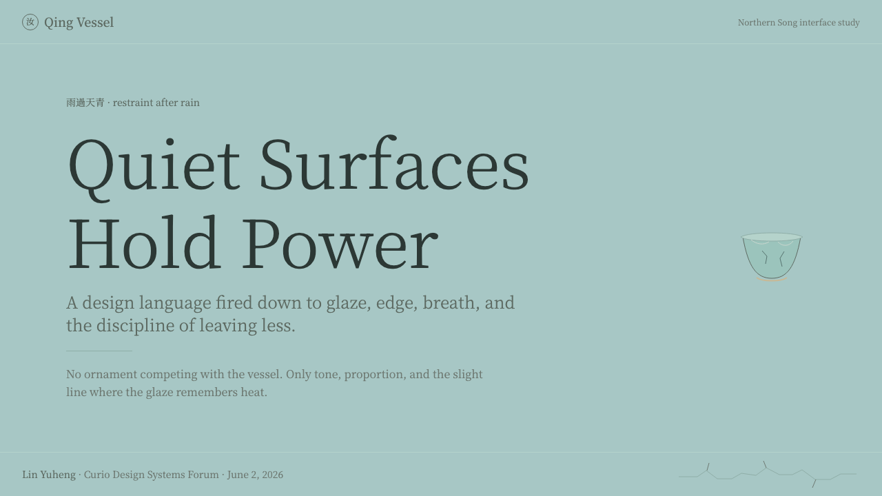
See the Song Ru Ware 宋汝窑 design system查看 Song Ru Ware 宋汝窑 完整设计系统
Song Ru Ware 宋汝窑 — FAQSong Ru Ware 宋汝窑 · 常见问题
Why is Ru ware considered more valuable than other Song-dynasty ceramics?为什么汝窑被认为比其它宋代瓷器更珍贵?
Scarcity is the primary reason — the kiln operated for only about two decades, produced exclusively for the imperial court rather than trade, and fewer than a hundred complete pieces survive worldwide. Beyond rarity, Ru ware is also considered the purest expression of Song monochrome taste: its refusal of any painted or gilded decoration made the glaze color and surface quality the entire aesthetic statement, which later connoisseurs came to regard as the most sophisticated possible position a ceramic tradition could take.稀缺性是首要原因——这座窑场只运作了约二十年,且专供宫廷,从未用于贸易,如今全球存世的完整器物不足百件。除了稀有之外,汝窑也被视为宋代单色釉品味最纯粹的表达:它拒绝任何彩绘或描金装饰,使釉色与釉面质感成为了全部的美学陈述,后世的鉴赏家逐渐将这视为一种陶瓷传统所能采取的最高级的立场。
What exactly is "crab-claw" crackle, and is it a flaw?「蟹爪」开片究竟是什么?它是一种瑕疵吗?
It is a fine network of surface cracks that forms naturally during cooling, when the glaze and the clay body contract at slightly different rates. Far from being a flaw, it became one of the most prized qualities in the tradition — an unrepeatable, organic pattern unique to each piece, admired for adding visible history and texture to an otherwise perfectly smooth surface.这是一张在冷却过程中自然形成的细密表面裂纹网络,因釉料与胎体收缩速率略有差异而产生。它远非瑕疵,反而成为这一传统中最受珍视的品质之一——一种不可重复、每件器物独一无二的有机纹样,因其为原本完美光滑的表面增添了可见的历史感与肌理而备受推崇。
How is Ru ware different from other celadon or blue-green ceramics?汝窑和其它青瓷或青绿色陶瓷有什么不同?
Many ceramic traditions across East Asia produced celadon-family glazes, but Ru ware is distinguished by the specificity of its "sky after rain" color — a particular muted, slightly grey blue-green tied to a documented aesthetic directive from the imperial court — and by its near-total absence of any decoration beyond the glaze and its natural crackle. Other celadon traditions often incorporated carved relief patterns or brighter, more saturated green tones; Ru ware's restraint is more extreme.东亚的许多陶瓷传统都烧造过青瓷家族的釉色,但汝窑的独特之处在于其“雨过天青”色的具体性——一种特定的、略带灰调的青绿色,与宫廷有记载的美学指令相关联——以及它除釉面本身与自然开片之外,几乎完全不施任何装饰。其它青瓷传统常常会加入雕刻的浮雕纹样或更明亮、更饱和的绿色调;汝窑的克制程度更为极致。
Can this style work with any color other than the celadon blue-green?这种风格能用青绿色以外的其它颜色吗?
The celadon tone is the load-bearing element of the entire system — swapping it for another hue removes the specific historical and aesthetic reference the style depends on. What can vary is the warm undertone showing through at thin edges, which can shift slightly warmer or cooler depending on the application, as long as the dominant field stays within the muted blue-green family the tradition is named for.天青色调是整套体系承重的核心元素——换成其它色相,就抽离了这种风格所依赖的具体历史与美学指涉。可以调整的是薄釉处透出的暖调,视应用场景可以略偏暖或偏冷,只要主导色场仍保持在这一传统命名所依据的含蓄青绿色系之内。
Related design styles相关设计风格
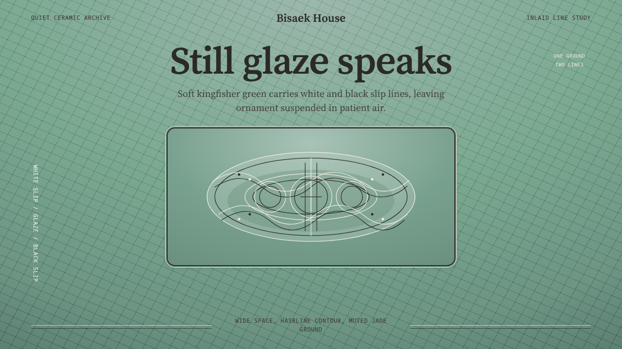 Goryeo Celadon 高麗青瓷Stillness carries ornament. Bisaek jade ground holds white and black hairline…静中见纹:翡色釉底承托黑白发丝镶嵌线。
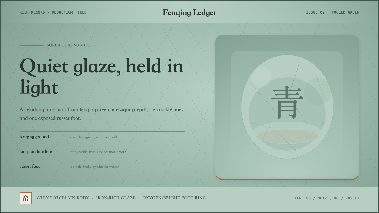 Longquan CeladonQuiet glaze carries the page. Fenqing green, crackle hairlines, and one russe…静釉成页。粉青底、冰裂细线与一抹赭红圈足。
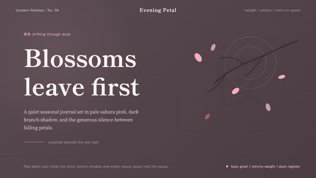 Cherry Blossom HanamiTenderness arrives in dusk. Sakura pink, branch-shadow, and Mincho type leave…暮色里的温柔:樱粉、枝影与明朝体,在大片留白中生出物哀。
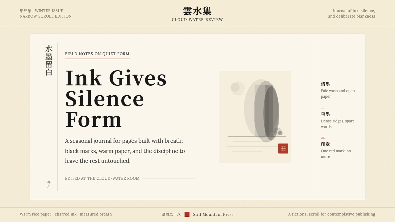 Chinese Ink Wash 水墨A thousand years of restraint. Six tones of ink on rice-paper warmth, a singl…千年单色绘画的精髓:墨分六彩、宣纸暖白底色、一抹印泥红作落款——留白即意。
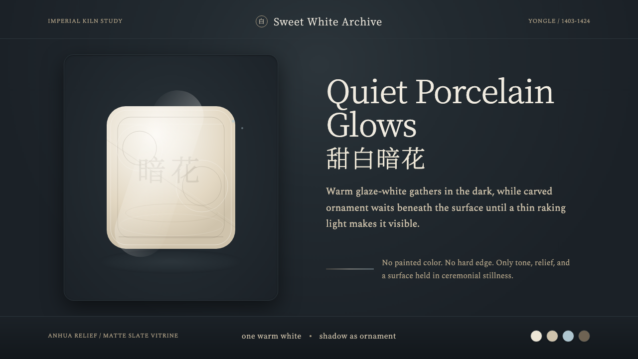 Jingdezhen BlancQuiet porcelain glows. Warm glaze-white on slate reveals hidden anhua incisio…静默瓷光:深板岩底上的温润甜白,暗花随斜光浮现。
 Plum Blossom Ink (宋)Silence carries the ink. Tea-tan ground, reserved blossoms, and one diagonal…静处见墨:茶褐绢底、留白梅花与一枝斜干。