What is Kīlauea Lava Flow?什么是 Kīlauea Lava Flow?
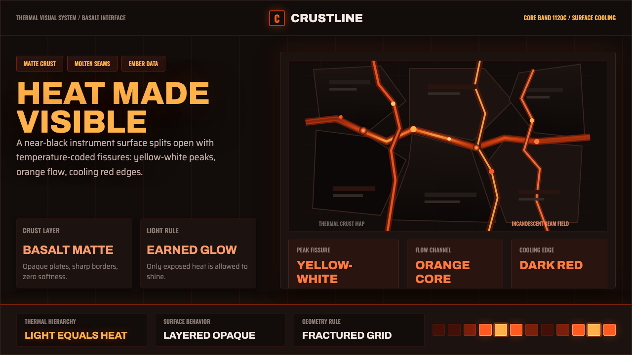
Kīlauea turns molten rock into a color code — heat measured not in degrees but in the shift from a dying red to a blinding yellow-white, and that code becomes an interface language.基拉韦厄把熔岩变成了一套色彩编码——热度不用温度计量,而用从将熄的暗红到刺目的黄白之间的过渡来读取,这套编码后来成了一种界面语言。
Kīlauea Lava Flow in briefKīlauea Lava Flow 速览
Kīlauea Lava Flow is a design system built from the visual physics of an active Hawaiian shield volcano: a near-black cooled basalt crust, split by glowing fissures whose color runs from dark cooling red through orange to yellow-white at the hottest point. It is a thermal-gradient palette pulled directly from geology rather than invented at a color wheel.基拉韦厄熔岩流是一套直接取材于夏威夷活跃盾状火山视觉物理学的设计系统:近乎全黑的冷却玄武岩硬壳,被一道道发光裂缝劈开,裂缝的颜色从冷却中的暗红,经过橙色,一直到温度最高处的黄白。这是一套直接从地质现象中提炼出的热力梯度色板,而不是在色轮上凭空发明的。
The defining discipline of the style is scarcity. Because the surrounding basalt is almost totally dark and matte, any warm glow reads as intensely bright by contrast — the same way a single ember looks blinding in a pitch-black room but unremarkable in daylight. The system enforces this relationship deliberately: glowing color only ever appears in thin seams, cracks, or isolated points, never as a broad wash. If warmth were spread evenly across a layout, the whole thermal metaphor would collapse into a generic sunset gradient.这种风格最核心的自律是稀缺。由于周围的玄武岩几乎完全深色且哑光,任何暖色的光在对比之下都显得极其明亮——就像一粒余烬在漆黑房间里显得刺眼,但在白天却毫不起眼。这套系统刻意强化了这种关系:发光色彩只允许出现在细窄的缝线、裂纹或孤立的点上,绝不铺成大面积的色块。如果暖色均匀地铺满整个版面,整个热力隐喻就会崩塌成一个普通的日落渐变。
The result is an interface language suited to anything that wants to communicate urgency, live data, or barely-contained energy without resorting to loud color everywhere. Structure stays dark and quiet; only the things that matter — an active state, a live metric, a critical alert — earn a glow, exactly the way lava earns its light by cracking through a cooled crust rather than radiating freely across the surface.由此产生的这套界面语言,特别适合那些想要传达紧迫感、实时数据或一种蓄势待发的能量、却又不想满屏堆砌鲜艳色彩的场景。结构始终保持深沉安静;只有真正重要的东西——一个激活状态、一条实时指标、一条严重警报——才配得到那道光,就像熔岩只有挣破冷却的硬壳才能发光,而不是在表面自由地放射热量。
See the Kīlauea Lava Flow design system查看 Kīlauea Lava Flow 完整设计系统
Where does Kīlauea Lava Flow come from?Kīlauea Lava Flow 从何而来?
Kīlauea is one of five volcanoes that together make up the Island of Hawaiʻi, and among the most continuously active volcanoes on Earth. Unlike the steep, explosive stratovolcanoes found in much of the Pacific Ring of Fire, Kīlauea is a shield volcano — a broad, gently sloping dome built up over hundreds of thousands of years by countless thin, fluid lava flows rather than violent eruptions. Its magma is basaltic, meaning it is comparatively low in silica and therefore flows with unusually low viscosity, more like thick syrup than the sludgy, gas-charged magma that produces explosive eruptions elsewhere.基拉韦厄是共同构成夏威夷岛的五座火山之一,也是地球上持续活跃程度最高的火山之一。与环太平洋火山带常见的陡峭、易爆发的层状火山不同,基拉韦厄是一座盾状火山——一座宽阔而坡度平缓的穹丘,历经数十万年由无数次稀薄流动的熔岩流层层堆积而成,而非剧烈的爆发式喷发。它的岩浆属于玄武质,二氧化硅含量相对较低,因此流动性异常好,粘度低,更像浓稠的糖浆,而不是其他地方那种造成爆炸性喷发的黏稠含气岩浆。
This fluidity produces the two classic Hawaiian lava textures that geologists borrowed their names for directly from Hawaiian: pāhoehoe, a smooth, ropy, almost fabric-like surface formed when a thin skin of cooling lava is dragged and folded by the still-moving molten rock beneath it, and ʻaʻā, a rough, clinkery, spiny surface formed by faster-moving, more viscous flows that shatter their own cooling crust as they advance. Both textures cool from the outside in, which is precisely why a lava flow's surface can look almost fully solid and black while brilliant orange still glows through cracks — the crust is often only a thin skin over a molten interior.这种流动性造就了两种经典的夏威夷熔岩质地,地质学家干脆直接借用了夏威夷语来命名:绳状熔岩「pāhoehoe」,光滑如布、呈绳索状盘绕,是冷却中的薄壳被底下仍在流动的熔融岩体拖拽折叠而成;渣状熔岩「ʻaʻā」,则是表面粗糙、多刺、嶙峋不平,由流速更快、粘度更高的熔岩流在推进过程中不断撕裂自身冷却外壳而形成。两种质地都是由外向内冷却的,这正是为什么一股熔岩流的表面可以看起来几乎完全凝固发黑,同时明亮的橙色仍从裂缝中透出——那层硬壳往往只是覆盖在熔融内部之上的一层薄膜。
The near-continuous eruptive activity at Kīlauea through the early 2010s and beyond, including the dramatic Puʻu ʻŌʻō vent and the massive 2018 lower East Rift Zone eruption that destroyed hundreds of homes, made the volcano one of the most heavily photographed and scientifically monitored volcanic systems in the world. The U.S. Geological Survey's Hawaiian Volcano Observatory, established in 1912, maintains a continuous record of thermal imaging, seismic monitoring, and gas measurement that has produced an enormous public archive of high-contrast night photography — glowing fissures against black rock — which has become the dominant visual reference for how the general public imagines active lava.从2010年代初至今,基拉韦厄近乎持续不断的喷发活动——包括戏剧性的普乌欧欧火口,以及2018年摧毁数百座房屋的东裂谷带下段大规模喷发——使这座火山成为全世界被拍摄和科学监测最密集的火山系统之一。美国地质调查局成立于1912年的夏威夷火山观测所,持续保存着热成像、地震监测与气体测量的完整记录,由此产生了一个庞大的公开影像档案:高对比度的夜间摄影,发光裂缝映衬着黑色岩石,成为公众想象「活跃熔岩」的主流视觉参照。
That photographic tradition is itself a design lineage. Thermal-color visualization — the convention of mapping temperature to a fixed hue sequence, dark and cool through red, orange, yellow, to white-hot — long predates volcano photography and appears in infrared imaging, industrial furnace monitoring, and scientific heat-mapping generally. What Kīlauea contributes uniquely is the emotional and cultural register: an association not just with heat as data, but with heat as living, moving, ancient force, tied in Hawaiian tradition to Pele, the deity of fire and volcanoes, whose presence in the landscape gives the raw physical phenomenon a sense of intention and consequence that a purely scientific thermal map does not carry.这一摄影传统本身就是一条设计谱系。热力色彩可视化——把温度映射到固定色相序列(冷暗、经红、橙、黄,直到炽白)的惯例——远早于火山摄影,广泛出现在红外成像、工业熔炉监测与一般性科学热力图中。基拉韦厄独有的贡献,是它带来的情感与文化维度:热不只是数据,更是一种活着的、移动的、古老的力量,在夏威夷传统中与火与火山之神佩蕾相连——她在这片风景中的存在,赋予了这一纯粹物理现象一种意图感与后果感,是纯科学热力图所不具备的。
What defines the Kīlauea Lava Flow look?Kīlauea Lava Flow 的视觉特征是什么?
Ground Color底色
The base is a near-black, matte basalt tone — never a pure neutral black, but one carrying a faint warm undertone as if the rock retains a memory of heat even while appearing cooled and solid. This ground occupies the overwhelming majority of any composition; it is the crust, and everything else is what breaks through it.底色是一种近乎全黑的哑光玄武岩色调——绝非纯粹的中性黑,而是带着一丝隐约暖调,仿佛岩石即便看起来已冷却凝固,仍残留着热的记忆。这种底色占据构图的绝大部分;它就是那层硬壳,其余一切都是从中挣破而出的东西。
Thermal Gradient热力梯度
Color functions as a temperature reading, not a decorative accent. A dark cooling red marks the coolest active glow; it warms through orange as intensity rises, and reaches yellow-white only at the single hottest point of a composition. This sequence must always run in the correct order — skipping straight from dark red to yellow-white without the orange transition breaks the thermal logic entirely.色彩的作用是读取温度,而非装饰点缀。冷却中的暗红标记最低的活跃热度;随强度上升过渡为橙色,只有在构图中温度最高的单一焦点处才达到黄白。这个序列必须始终按正确顺序推进——从暗红直接跳到黄白、省略橙色过渡,会彻底破坏热力逻辑。
Fissure Geometry裂缝几何
Glowing elements take the form of thin, irregular, branching seams rather than blocks, circles, or clean geometric shapes. A fissure narrows and widens along its length, forks unpredictably, and never runs perfectly straight — it should read as a crack propagating through rock, not a drawn line.发光元素应呈现为纤细、不规则、带分支的缝线,而非色块、圆形或规整的几何形状。一道裂缝沿其走向会时窄时宽,会不可预测地分岔,绝不会笔直贯穿——它应读作在岩石中蔓延的裂纹,而非一条画出来的直线。
Ember Scatter余烬散布
Beyond the main fissures, small isolated points of glow — embers, sparks, cooling droplets — scatter irregularly across the dark ground at low density. These are never uniform or grid-aligned; their randomness is what makes the surface feel alive and still cooling rather than static and printed.在主裂缝之外,一些孤立的微小发光点——余烬、火星、冷却中的熔滴——以低密度不规则地散布在深色底面上。它们绝不应均匀分布或对齐网格;正是这种随机性,让画面显得仍在冷却、仍然鲜活,而非静止的印刷图案。
Texture and Crust质感与硬壳
Surfaces should suggest the two Hawaiian lava textures: a smooth, folded, almost fabric-like quality for calmer areas (echoing pāhoehoe) and a rougher, more broken, jagged quality where activity is more intense (echoing ʻaʻā). This textural contrast gives the dark ground variation without introducing extra color.画面质感应暗示两种经典夏威夷熔岩肌理:较平静的区域呈现光滑、褶皱、近乎织物般的质感(呼应绳状熔岩),活动更剧烈的区域呈现更粗糙、破碎、嶙峋的质感(呼应渣状熔岩)。这种质感对比让深色底面产生变化,而无需引入额外色彩。
Restraint and Contrast克制与对比
The single governing rule is that glow must remain rare relative to darkness. A composition where warm color occupies more than a small fraction of the surface loses the sense of heat breaking through containment and instead reads as an ordinary warm color scheme. Contrast, not coverage, is what communicates temperature.唯一的支配性规则是:发光相对于黑暗必须保持稀有。如果暖色占据了画面相当一部分面积,就会失去「热从束缚中挣破而出」的意味,沦为一套普通的暖色配色方案。传达温度的是对比,而非覆盖面积。
Data and Telemetry Framing数据与遥测框架
Because the reference material is scientific monitoring imagery as much as raw eruption photography, numerical readouts, coordinates, and status labels sit comfortably within this system — rendered in a plain, legible, technical register rather than an ornamental one, as if displayed on a monitoring instrument beside the glow itself.由于这套系统的参照材料既包括原始喷发影像,也包括科学监测图像,数值读数、坐标与状态标签在这一系统中显得自然贴切——应以朴素、清晰、技术性的方式呈现,而非装饰性的方式,仿佛就显示在发光体旁边的监测仪器上。
See the Kīlauea Lava Flow design system查看 Kīlauea Lava Flow 完整设计系统
Who shaped Kīlauea Lava Flow?谁塑造了 Kīlauea Lava Flow?
In Hawaiian tradition, Pele is the deity associated with fire, lightning, wind, and volcanoes, said to reside within Kīlauea's summit crater. Her presence in local belief gives eruptive activity a narrative of will and consequence rather than pure geophysics, and continues to shape how Hawaiian communities and visitors alike interpret the volcano's ongoing activity.在夏威夷传统中,佩蕾是掌管火、闪电、风与火山的神祇,传说居于基拉韦厄的顶部火口之中。她在当地信仰中的存在,为喷发活动赋予了意志与后果的叙事,而不只是纯粹的地球物理现象,也持续影响着夏威夷社区与游客对这座火山持续活动的理解方式。
Founded in 1912, HVO is one of the oldest continuously operating volcano observatories in the world. Its decades of thermal imaging, seismic monitoring, and eruption documentation produced the visual and scientific archive from which the modern popular image of glowing lava against dark rock largely derives.夏威夷火山观测所成立于1912年,是世界上持续运作时间最长的火山观测机构之一。它数十年积累的热成像、地震监测与喷发记录,构成了如今大众对「深色岩石映衬发光熔岩」这一视觉印象的主要科学与影像来源。
Jaggar, a geologist, founded the Hawaiian Volcano Observatory in 1912 after witnessing the devastation of the 1902 Mount Pelée eruption in Martinique and concluding that continuous scientific monitoring could save lives. His insistence on systematic, ongoing observation established the monitoring tradition that still generates the thermal and photographic record the style draws from.地质学家托马斯·贾格尔在目睹1902年马提尼克岛培雷火山喷发造成的巨大破坏后,于1912年创立了夏威夷火山观测所,他确信持续的科学监测能够挽救生命。他坚持系统性、持续性观测的理念,建立起至今仍在产出热成像与影像记录的监测传统,也是这一风格素材的来源。
How do you use Kīlauea Lava Flow today?今天怎么用 Kīlauea Lava Flow?
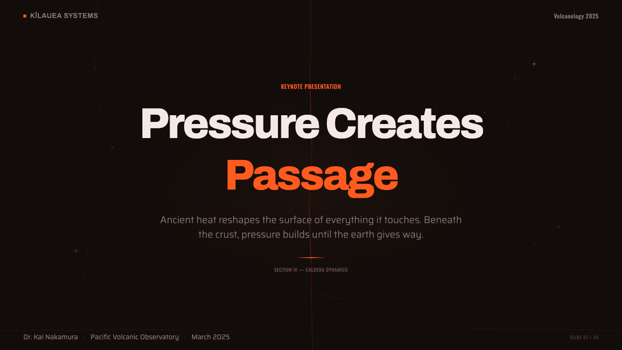
Applied to presentation slides, this style gives cover pages an immediate sense of contained energy: a dark, matte field with a single glowing fissure motif cutting across a corner, title text set in a clean, high-contrast light color that reads as if lit by the glow rather than printed over it. Content slides should keep body text and structural elements on the dark, matte register, reserving any warm glow strictly for callouts, key numbers, or a single highlighted data point — never for section headers generally, which would dilute the effect.应用在演示文稿中,这种风格能立刻给封面页带来一种被克制住的能量感:深色哑光底面上,一道发光裂缝母题划过某个角落,标题文字采用干净、高对比度的浅色,读起来像是被那道光照亮,而非印在上面。内容页应让正文与结构元素保持在深色哑光的基调上,把任何暖色的光严格保留给重点标注、关键数字或单一的高亮数据点——绝不用于一般性的章节标题,否则会稀释效果。
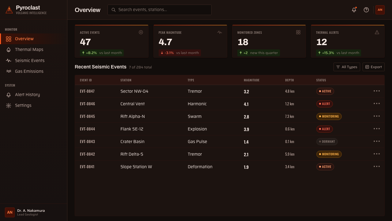
For dashboards and monitoring interfaces, the style is a natural fit for anything genuinely about live status, alerts, or system health, precisely because its visual logic already means something: dark and quiet is normal, a warm glow means something is active and worth attention. A status indicator, an alert badge, or a live metric earns the ember treatment; the surrounding chrome, navigation, and static content should stay in the dark basalt register so the glowing elements retain their meaning as signals rather than becoming generic accent color.对于仪表板与监控类界面,这种风格天然适合任何真正关乎实时状态、警报或系统健康度的场景,正因为它的视觉逻辑本身已经承载了含义:深沉安静是常态,一道暖光意味着有什么正在活跃、值得关注。一个状态指示器、一枚警报徽标或一条实时指标,配得上这种余烬处理;周围的导航与静态内容应保持在深色玄武岩基调上,这样发光元素才能保留其作为信号的意义,而不会沦为普通的强调色。
In pricing pages, the thermal gradient can be used to differentiate tiers without needing separate color families — a lower tier rendered in the cooler, darker end of the gradient and a premium tier rendered closer to the yellow-white hot end, communicating escalation through the same physical logic that governs a real lava flow's temperature.在定价页面中,这套热力梯度可以用来区分不同等级,而无需额外的独立色系——较低等级渲染在梯度中较冷、较暗的一端,高级等级渲染得更接近黄白炽热的一端,用统摄真实熔岩流温度的同一套物理逻辑传达出等级的升级感。
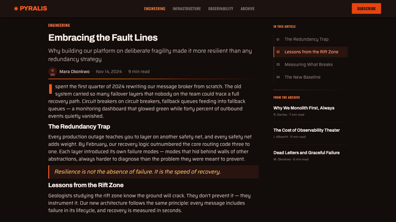
For editorial or marketing pages themed around energy, urgency, or transformation, full-bleed sections can use a large-scale fissure motif as a hero background, with call-to-action buttons rendered in the hottest point of the gradient so they read as the visual and thematic focal point of the page, exactly as the brightest point of an active flow draws the eye first.对于以能量、紧迫感或蜕变为主题的编辑或营销页面,通栏区块可以用大尺度的裂缝母题作为主视觉背景,行动号召按钮渲染在梯度中最炽热的一点,使其成为页面视觉与主题上的焦点,正如真实熔岩流中最明亮的一点总是最先攫住目光。
The most common mistake is treating this as simply an orange-on-black color scheme and applying warm color broadly — filling large background areas with orange or using it for body text and general UI chrome. This inverts the entire logic: real thermal drama depends on warmth being scarce and hard-won against overwhelming darkness. A second frequent error is skipping the mid-gradient orange and jumping straight from dark red to yellow-white, which breaks the sense of a continuous, physically plausible heat scale.最常见的错误,是把这套系统简单理解为「黑底配橙色」的配色方案,从而大面积铺开暖色——用橙色填充大片背景,或用于正文与一般性界面元素。这彻底颠覆了整套逻辑:真正的热力戏剧性依赖于暖色在压倒性的黑暗面前显得稀有而来之不易。第二个常见错误是跳过梯度中段的橙色,直接从暗红跳到黄白,这会破坏一种连续、物理上可信的热度尺度感。
See the Kīlauea Lava Flow design system查看 Kīlauea Lava Flow 完整设计系统
Kīlauea Lava Flow — FAQKīlauea Lava Flow · 常见问题
Why is the base color almost black instead of gray or brown?为什么底色几乎是纯黑,而不是灰色或棕色?
Cooled basalt genuinely reads as near-black in photographs and in person, especially in the low, high-contrast light typical of night eruption photography — the reference material the style draws from. A lighter gray or brown ground would flatten the contrast that makes glowing fissures feel intensely bright, undermining the entire visual premise. The near-black ground is not a stylistic exaggeration; it is close to how the actual rock looks when it has cooled enough to hold its shape.冷却后的玄武岩在照片与实景中确实近乎全黑,尤其是在夜间喷发摄影常见的那种低光、高对比度光线下——而这正是这种风格所依据的参照素材。如果底色改为较浅的灰色或棕色,会削弱让发光裂缝显得极其明亮的那种对比,从根本上瓦解整套视觉前提。近黑的底色并非风格化的夸张,而是接近岩石冷却到足以定型时的真实样貌。
Can this style work with a light or white background?这种风格能用在浅色或白色背景上吗?
Not without losing its core logic. The style depends on the relationship between a dark, matte, mostly-inert ground and rare points of intense contrasting glow; on a white or light background, warm colors simply read as warm colors, with none of the sense of heat breaking through containment. If a lighter variant is genuinely needed, it should borrow only the palette's hue sequence for accents, not attempt to preserve the full thermal metaphor.很难保留其核心逻辑。这种风格依赖于深色、哑光、大体静止的底面,与罕见的、强烈对比的发光点之间的关系;在白色或浅色背景上,暖色就只是暖色,不再有热从束缚中挣破而出的意味。如果确实需要更浅的变体,应只借用这套色板的色相序列作为点缀色,而不必强行保留完整的热力隐喻。
How much of a layout should actually glow?一个版面里究竟应该有多少比例发光?
As a rule of thumb, glowing or warm-colored elements should occupy a small minority of any composition's total area — think of thin fissures and scattered embers against a dominant dark field, not competing color blocks. If warm color starts to feel like it is balancing the dark ground rather than breaking through it, it has likely gone too far.作为经验法则,发光或暖色元素应只占整个构图总面积的一小部分——想象的是细窄的裂缝与散落的余烬映衬着占主导地位的深色地基,而不是相互竞争的色块。如果暖色开始给人「与深色底面势均力敌」而非「从中挣破而出」的感觉,很可能就已经用得过头了。
Is this style only suitable for volcano or nature-themed content?这种风格是否只适用于火山或自然主题的内容?
No — its underlying logic (rare, high-contrast signals against a quiet dark field) transfers well to any product context built around live status, urgency, or energy, such as monitoring dashboards, real-time data products, or gaming and entertainment interfaces that want to feel charged without being visually chaotic. The volcanic reference gives it a distinctive texture and color story, but the structural principle is broadly applicable.不是——它底层的逻辑(在安静的深色场域上出现罕见、高对比度的信号)可以很好地移植到任何围绕实时状态、紧迫感或能量感构建的产品场景,比如监控仪表板、实时数据产品,或是希望显得充满张力却不显视觉混乱的游戏与娱乐类界面。火山这一参照给了它独特的质感与色彩叙事,但其结构性原则的适用范围要广泛得多。
What is the difference between the pāhoehoe and ʻaʻā textures in practical design terms?从实际设计角度看,绳状熔岩与渣状熔岩这两种质感有什么区别?
Pāhoehoe suggests calmer, more continuous surfaces — smooth folds and gentle undulation, appropriate for background textures or areas meant to feel settled. ʻAʻā suggests higher-intensity, more chaotic zones — jagged, broken, spiny textures suited to areas signaling active alerts or peak intensity. Using both within a single composition, reserving ʻaʻā for the most active or urgent zones, reinforces the sense of a gradient not just in color but in energy state.绳状熔岩暗示更平静、更连续的表面——光滑的褶皱与柔和的起伏,适合用于背景质感或希望显得安定的区域。渣状熔岩暗示强度更高、更混乱的区域——嶙峋、破碎、多刺的质感,适合用于标示活跃警报或峰值强度的区域。在同一构图中同时使用这两种质感,将渣状熔岩保留给最活跃或最紧迫的区域,能强化一种不仅体现在色彩、也体现在能量状态上的梯度感。
Related design styles相关设计风格
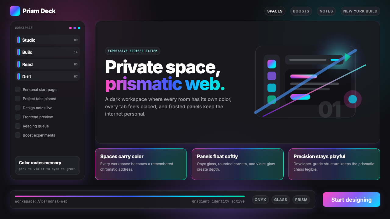 Arc Browser Prismatic (2023)Color is architecture. Pink-violet-cyan ribbons glow over onyx glass and roun…颜色即架构:粉紫青光带浮在黑曜石玻璃面板上。
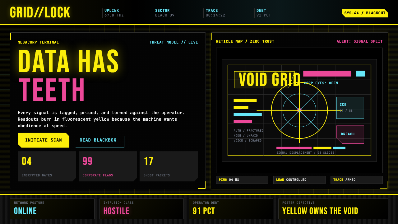 Cyberpunk 2077 (Screen UI)Weaponized terminals. Fluorescent yellow on black, scanlines and bracketed HU…被武器化的终端:黑底荧光黄、扫描线与HUD方括号网格。
 Cyberpunk 2077 Night City YellowCombat HUD on black. Sun-yellow chrome splits into magenta-cyan coordinate gr…黑底战斗HUD:太阳黄框架裂出品红与青色坐标网。
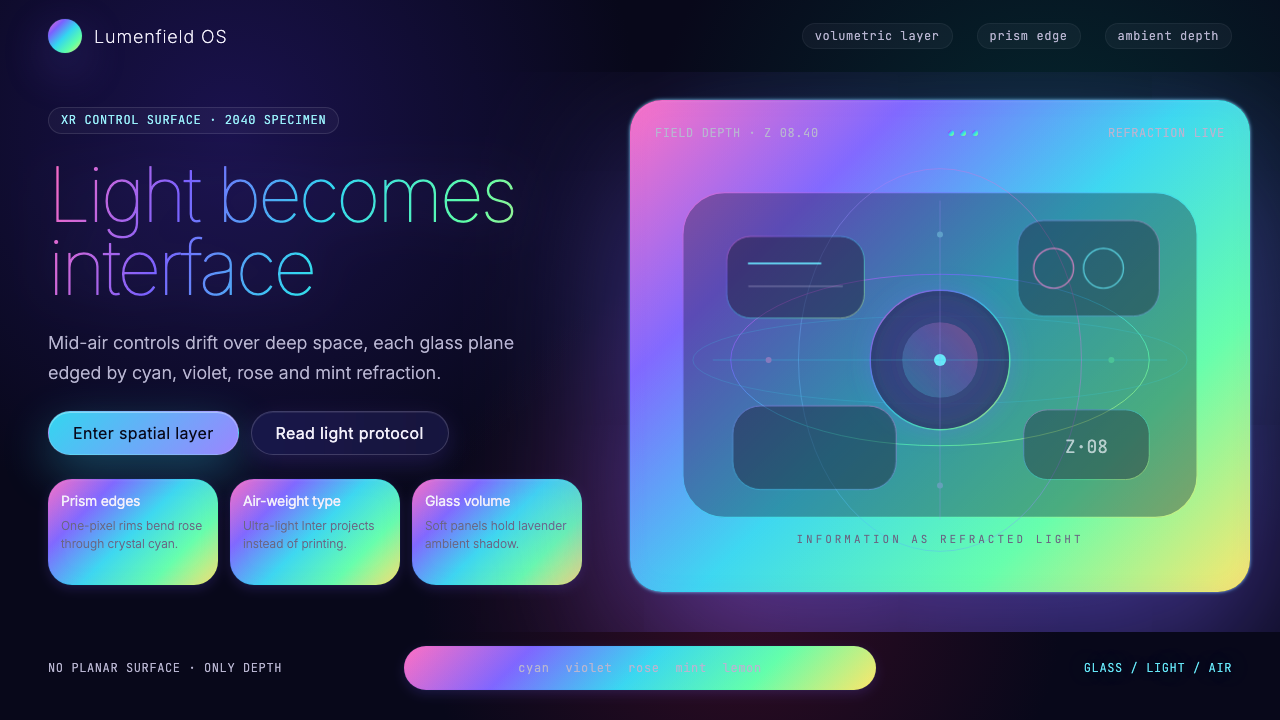 Holographic UI 2040Information made of light. Deep-space black, ultra-light Inter and prismatic…信息由光构成:深空黑、极细 Inter 与棱镜玻璃边缘。
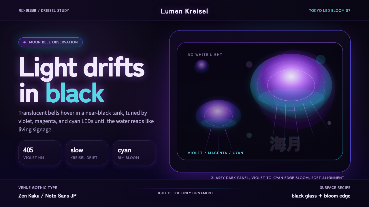 Jellyfish Aquarium StudyLight is the ornament. Violet-cyan glow floats in black glass with venue-goth…光是唯一装饰。紫青冷光漂浮于黑色玻璃,配日式哥特字。
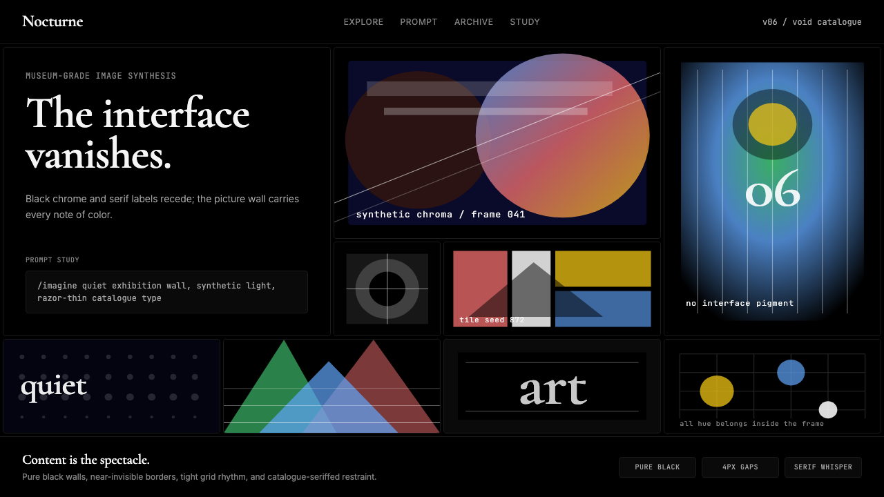 MidjourneyInvisible chrome, visible art. Pure black grid and Cormorant serif give color…界面隐身,图像发声。纯黑网格与细衬线让色彩只属于作品。