What is Vietnamese Propaganda?什么是 Vietnamese Propaganda?
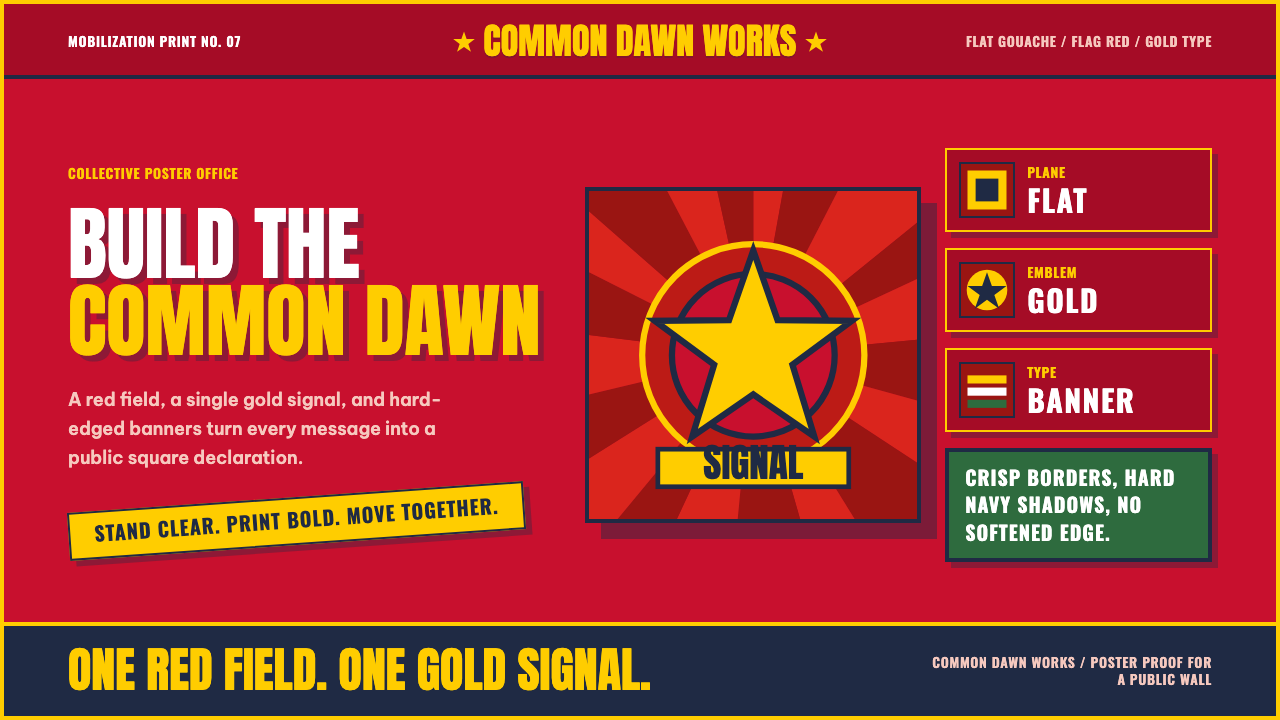
Hand-painted in flat, unshaded fields of flag-red and gold, Vietnamese mobilization posters commanded attention through simplicity rather than detail.越南动员海报以平涂、无渐变的旗红与金色绘制而成,靠的是简洁而非细节来赢得注意力。
Vietnamese Propaganda in briefVietnamese Propaganda 速览
Vietnamese Propaganda is a design system drawn from tranh cổ động — literally 'mobilization art' — the tradition of hand-painted poster propaganda produced in Vietnam during its era of socialist mobilization, roughly the mid-twentieth century. The style is defined by flat, unmodulated gouache color fields, with flag-red as the dominant ground and a bold gold star or gold lettering as the primary accent, arranged into compositions that read instantly and forcefully even from a distance.越南宣传画是一套取材于“tranh cổ động”——字面意思是“动员艺术”——的设计系统,这是越南在其社会主义动员年代(大致为二十世纪中叶)所产生的手绘海报宣传传统。这种风格的定义特征,是平涂、无渐变的广告颜料色域,以旗红为主导底色,以大胆的金星或金色字体作为主要点缀,构图排布得即便远观也能瞬间、有力地被读取。
The graphic language draws heavily on socialist-realist artistic conventions but renders them in a way that is visually flat rather than illustrative or painterly in the academic sense. Figures — workers, soldiers, peasants — are simplified into heroic, confident poses and rendered in solid, unshaded blocks of color rather than modeled with light and shadow. This flattening is deliberate: it makes the imagery reproducible at poster scale, legible from a distance, and unambiguous in its message, all qualities essential to propaganda art meant to be seen quickly by large crowds.这套图形语言大量借鉴了社会主义现实主义的艺术惯例,但呈现方式在视觉上是扁平的,而非学院意义上的写实或绘画性的。人物形象——工人、战士、农民——被简化为英雄气概十足、姿态自信的造型,以实心、无阴影的色块呈现,而非用光影塑造体积。这种扁平化是刻意为之的:它让图像能够在海报尺度上被复制、能够远距离可辨识、能够毫无歧义地传达信息——这些都是旨在让大批人群迅速看懂的宣传艺术所必需的品质。
Typography is thick, uppercase, and direct — slogans dominate the composition with heavy weight and confident scale, functioning as a graphic element in their own right rather than as a secondary caption to an image. A five-pointed gold star, often with rays bursting outward, serves as a recurring symbolic anchor. The overall tone is emphatic and collective rather than personal or nuanced: every visual choice serves clarity and immediate impact.字体排印粗壮、全大写、直白——标语以厚重的字重与自信的尺度主导着构图,其自身就是一个图形元素,而非依附于图像的次要文字说明。一枚五角金星,常常伴随着向外迸射的光芒,充当着反复出现的象征性锚点。整体基调是激昂而集体主义的,而非个人化或含蓄的:每一个视觉选择都服务于清晰度与即时的冲击力。
See the Vietnamese Propaganda design system查看 Vietnamese Propaganda 完整设计系统
Where does Vietnamese Propaganda come from?Vietnamese Propaganda 从何而来?
Tranh cổ động emerged as a distinct artistic tradition in Vietnam during the mid-twentieth century, a period defined by anti-colonial struggle, national division, and eventual reunification under socialist governance. Mobilization art served an explicit political function during this period: rallying public support for military campaigns, agricultural and industrial production goals, and broader socialist nation-building efforts, in a context where mass literacy could not be assumed and visual communication needed to work instantly and unambiguously.“动员艺术”(tranh cổ động)作为一种独特的艺术传统,在二十世纪中叶的越南兴起,那是一个由反殖民斗争、国家分裂与最终在社会主义治理下实现统一所定义的时期。在这一时期,动员艺术承担着明确的政治功能:为军事行动、农业与工业生产目标,以及更广泛的社会主义国家建设动员公众支持——在一个不能假定普遍识字的语境中,视觉传达必须能够即时、毫无歧义地发挥作用。
The visual approach drew on the broader international tradition of socialist realism — the officially sanctioned artistic style across many socialist states that idealized workers, soldiers, and peasants as heroic, purposeful figures serving the collective good — but Vietnamese poster artists adapted this framework into a distinctly flat, graphic idiom suited to the practical constraints of hand-painted gouache poster production, often made quickly and in large quantities rather than as singular fine-art objects.这套视觉手法借鉴了社会主义现实主义这一更广泛的国际传统——这是许多社会主义国家官方认可的艺术风格,把工人、战士与农民理想化为服务于集体福祉的英雄气概人物——但越南的海报艺术家将这一框架改造成一种鲜明扁平的图形语汇,以适应手绘广告颜料海报生产的实际约束,这些海报往往是快速、大批量制作的,而非作为单件美术品创作出来的。
Because these posters were typically produced anonymously or collectively — by state poster artists and collective propaganda studios rather than individually celebrated fine artists working in a gallery tradition — the tranh cổ động tradition does not center on named auteurs in the way many Western art movements do. The art form's authorship is institutional and collective, reflecting the broader socialist emphasis on collective effort over individual genius, which is itself part of what the visual style communicates.由于这些海报通常是匿名或集体创作的——由国家海报艺术家与集体宣传工作室创作,而非在画廊传统中受个人推崇的美术家——tranh cổ động传统并不像许多西方艺术运动那样,以具名的作者为中心。这门艺术形式的作者身份是机构性与集体性的,反映了社会主义更广泛地强调集体努力、而非个人天才的价值观,而这本身也是这种视觉风格所传达内容的一部分。
The five-pointed gold star at the center of much of this imagery draws directly from Vietnam's national flag, adopted in its modern form during the mid-twentieth-century independence and reunification struggles. Its recurring presence in mobilization posters ties the visual tradition directly to national symbolism, reinforcing the connection between individual mobilization campaigns — for production, for military effort, for social reform — and the broader project of the nation itself.这类图像中反复出现的五角金星,直接取材于越南国旗——它以现代形式,在二十世纪中叶的独立与统一斗争期间被确立下来。它在动员海报中反复出现,将这一视觉传统与国家象征直接联系在一起,强化了个别动员运动——为了生产、为了军事努力、为了社会改革——与国家这一更宏大工程本身之间的联系。
What defines the Vietnamese Propaganda look?Vietnamese Propaganda 的视觉特征是什么?
Flat Gouache Fields平涂广告颜料色域
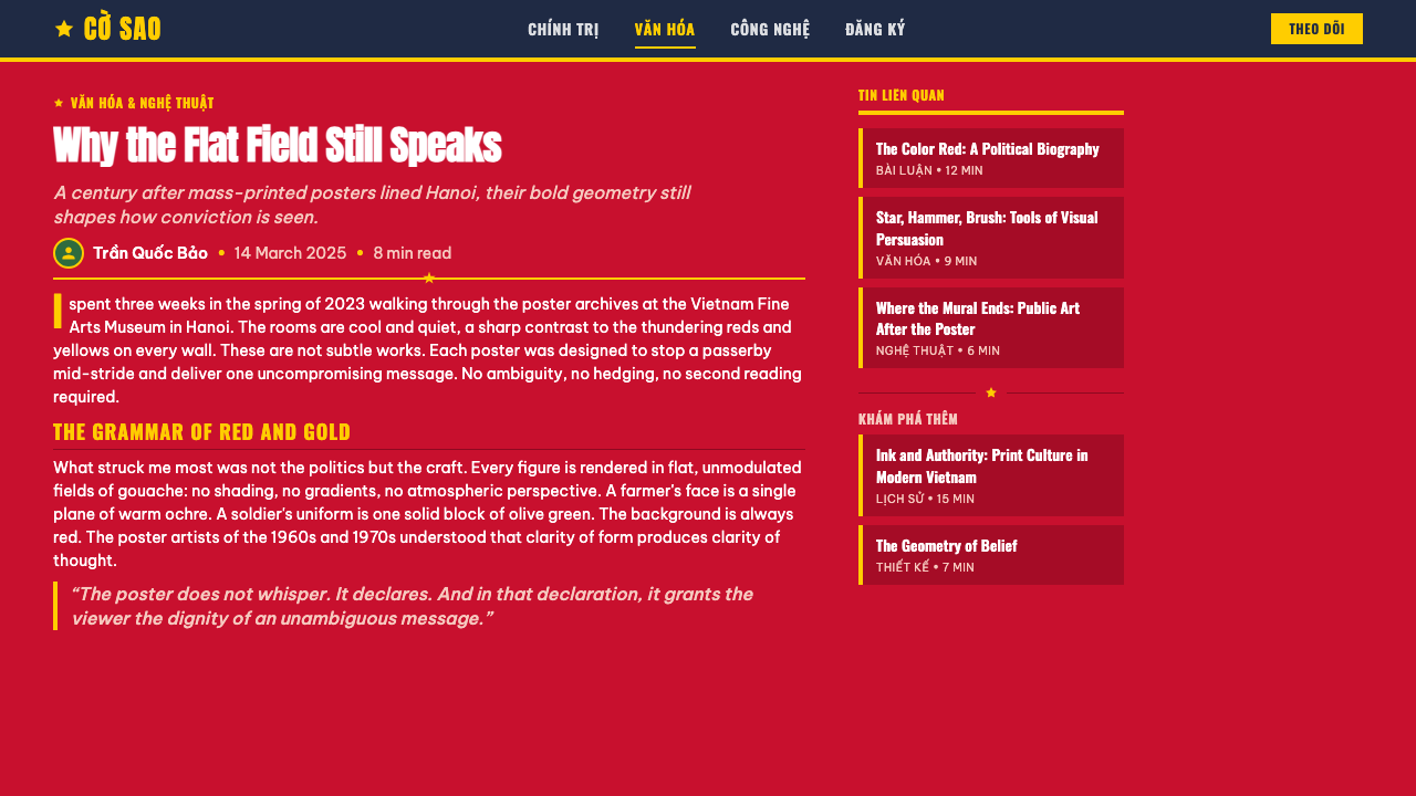
Color is applied as solid, unmodulated flat fields rather than blended or shaded tones, a direct consequence of the hand-painted gouache technique used to produce these posters quickly and legibly. This flatness is central to the style: every color area has a clear, hard-edged boundary, and there is no attempt to simulate light, shadow, or three-dimensional volume.色彩以实心、无渐变的平涂色域呈现,而非混合或渲染出的色调,这直接源于用来快速、清晰地制作这些海报的手绘广告颜料技法。这种扁平感是这种风格的核心:每一个色域都有清晰、硬边的边界,也没有试图模拟光线、阴影或三维体积。
Flag-Red Ground旗红底色
A strong, saturated red — drawn from national flag symbolism — dominates as the primary ground color across most compositions, occupying large areas rather than being used sparingly. This red is warm and confident rather than muted, and its scale within a composition signals the seriousness and urgency of the message being communicated.一种浓烈、饱和的红色——取材于国旗的象征意义——在大多数构图中占据主导地位,作为主要底色大面积铺陈,而非节制使用。这种红色温暖而笃定,而非柔和黯淡,它在构图中所占的比例,标示着所传达信息的严肃性与紧迫感。
Gold Star and Rays金星与光芒
A five-pointed gold star, frequently shown with rays bursting outward, serves as a recurring symbolic anchor point in compositions. The star and its rays are rendered as flat gold shapes rather than with any metallic shading effect, keeping it consistent with the overall unmodulated color logic of the system.一枚五角金星,常伴随着向外迸射的光芒,充当构图中反复出现的象征性锚点。这枚星星及其光芒被呈现为扁平的金色形状,而非带有任何金属渐变效果,从而与系统整体无渐变的色彩逻辑保持一致。
Simplified Heroic Figures简化的英雄人物
Human figures — workers, soldiers, peasants — are rendered in confident, purposeful poses using minimal internal detail, built from a small number of flat color shapes rather than modeled surfaces. Faces and bodies are simplified to their most legible, iconic form, prioritizing instant recognition and emotional directness over individualized likeness.人物形象——工人、战士、农民——以自信、坚定的姿态呈现,内部细节极为精简,由少数几个扁平色形构建而成,而非塑造出立体表面。面部与身体被简化到最易辨识、最具符号性的形态,优先考虑即时的辨识度与情感上的直接性,而非个体化的肖似。
Thick Uppercase Slogans粗体全大写标语
Text is set in heavy, confident, uppercase lettering that functions as a primary graphic element rather than a secondary caption, often taking up substantial visual weight within the composition. The slogans are direct and declarative in tone, and their scale within the page reflects their importance to the overall message rather than being subordinated to the illustrated figure.文字以厚重、自信的全大写字体排列,其功能是一个主要的图形元素,而非次要的文字说明,常常在构图中占据相当可观的视觉分量。标语的语气直接而宣示性,它们在页面中的尺度,反映的是其对整体信息的重要性,而非从属于插画人物。
Emphatic Poster Scale海报级的强调感
Every element in a composition is scaled and simplified for legibility from a distance — large shapes, minimal fine detail, and high color contrast between adjacent fields. This poster-scale discipline distinguishes the style from more intimate or detailed illustration traditions; nothing is designed to reward close inspection, and everything is designed to communicate instantly.构图中的每一个元素,其尺度与简化程度都是为了远距离可辨识而设计的——大面积的形状、极少的精细细节,以及相邻色域之间高对比度的色彩关系。这种海报级的规范,将这种风格与更为亲密或细致的插画传统区分开来;没有任何东西是为了让人近距离细看而设计的,一切都是为了瞬间传达信息。
See the Vietnamese Propaganda design system查看 Vietnamese Propaganda 完整设计系统
Who shaped Vietnamese Propaganda?谁塑造了 Vietnamese Propaganda?
The artists who produced tranh cổ động worked largely within state-sponsored institutions rather than as independent gallery artists, trained to produce mobilization imagery efficiently and consistently across large volumes of poster work. Their collective, often anonymous authorship reflects the socialist emphasis on service to the collective rather than individual artistic celebrity.创作“动员艺术”的艺术家们,大多在国家支持的机构内工作,而非作为独立的画廊艺术家,他们受训以高效、一致的方式,大批量地制作动员图像。他们集体的、往往匿名的创作身份,反映了社会主义对服务集体、而非个人艺术名望的强调。
These studios functioned as the institutional production centers for mobilization posters, coordinating artists, standardizing visual conventions, and distributing finished work for public display at scale. Their organizational role is central to understanding why the style shares such consistent visual grammar across many individual posters despite lacking a single named creative author.这些工作室充当着动员海报的机构性生产中心,协调艺术家、统一视觉惯例,并大规模分发成品供公开展示。理解它们的组织角色,是理解为何这种风格在众多单独的海报之间,尽管缺乏单一具名的创作者,却依然共享如此一致的视觉语法的关键。
How do you use Vietnamese Propaganda today?今天怎么用 Vietnamese Propaganda?
Vietnamese Propaganda suits products and brands that want bold, immediate, high-conviction visual communication — campaign or advocacy platforms, cultural and historical storytelling projects, or brands that want to project confidence and directness rather than subtlety or ambiguity. It is a poor fit for anything wanting to feel quiet, understated, or neutral.越南宣传画适合那些想要传达大胆、即时、高度笃定视觉传达的产品与品牌——倡议或宣传类平台、文化与历史叙事项目,或是任何想要展现自信与直接、而非含蓄或模糊气质的品牌。对于任何想要显得安静、含蓄或中性的场景,这种风格并不合适。
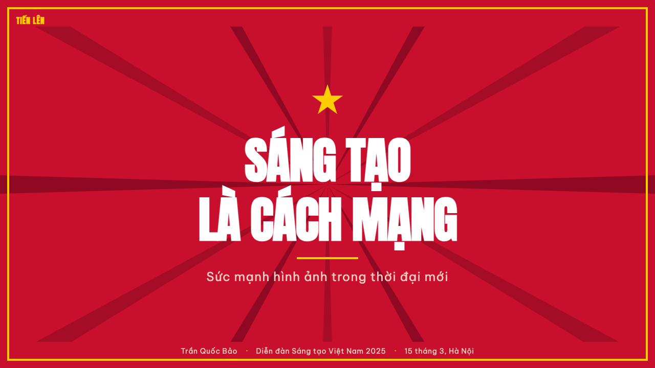
For presentation slides, a cover slide can use the full red ground with the gold star as a central anchoring shape and a short, declarative headline in thick uppercase type — this mirrors exactly how the original posters were composed for maximum impact from a distance. Content slides should reduce the red field considerably to avoid visual fatigue, using it as a strong accent band rather than the entire background, while keeping key statements in the same confident uppercase treatment.在演示文稿中,封面页可以运用完整的红色底色,将金星作为中心锚定形状,配上一句以粗体全大写字体书写的简短宣示性标题——这恰恰复刻了原始海报为了在远距离达到最大冲击力而进行的构图方式。内容页应大幅缩减红色色域的比例,以避免视觉疲劳,将其用作强调色带,而非整个背景,同时让关键陈述保持同样自信的全大写处理。
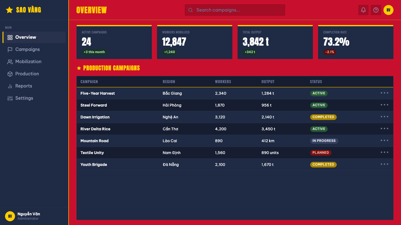
For web interfaces, the style is a strong fit for campaign landing pages, advocacy or activism platforms, or bold marketing moments — a hero section or call-to-action banner can carry the full red-and-gold treatment, but dense functional UI like dashboards or settings screens should avoid it entirely, since the flat, high-contrast, poster-scale logic does not translate well to small, information-dense interface components.在网页界面中,这种风格非常适合活动落地页、倡议或行动主义平台,或大胆的营销时刻——一个主视觉区域或行动号召横幅可以完整运用红金配色的处理,但仪表板或设置界面这类功能密集的界面,应当完全避免使用这种风格,因为其扁平、高对比、海报级的逻辑并不能很好地转化到小型、信息密集的界面组件上。
For editorial and marketing work, the aesthetic works well for feature openers, historical or cultural retrospectives, and campaign-style announcements where a strong, unambiguous visual statement is desired. Pull-quotes and section breaks can borrow the thick uppercase slogan treatment to maintain the poster's declarative energy even within a longer article.在编辑与营销内容中,这种美学非常适合专题开篇、历史或文化回顾,以及需要强烈、毫不含糊视觉宣示的活动式公告。引言段落与分区隔断可以借用粗体全大写标语的处理方式,以在较长的文章中依然保持海报式的宣示能量。
A common mistake is softening the red or adding gradients and shading to the figures, which directly contradicts the flat, unmodulated color logic that gives the style its poster-scale legibility and confidence. Another frequent error is using the gold star purely as decoration without any accompanying declarative typography, which loses the style's essential pairing of bold symbol and bold text working together.一个常见的错误,是柔化红色,或为人物形象添加渐变与阴影,这直接违背了赋予这种风格海报级可辨识度与自信感的扁平、无渐变色彩逻辑。另一个常见的错误,是把金星纯粹当作装饰使用,而没有配上任何宣示性的字体排印,这会丧失这种风格中大胆符号与大胆文字协同运作这一本质性的搭配。
See the Vietnamese Propaganda design system查看 Vietnamese Propaganda 完整设计系统
Vietnamese Propaganda — FAQVietnamese Propaganda · 常见问题
Why is the color always applied flat, with no shading or gradient?为什么色彩总是平涂呈现,没有阴影或渐变?
This flatness comes directly from the hand-painted gouache technique used to produce these posters quickly and in volume, and it also serves the practical need for the imagery to be legible instantly from a distance to large crowds. Shading and gradient would slow production, reduce reproducibility, and soften the visual impact — all qualities at odds with the propaganda poster's core function as an immediate, unambiguous call to action.这种扁平感直接源自用来快速、大批量制作这些海报的手绘广告颜料技法,它也服务于图像必须能够被大批人群远距离即时辨识这一实际需求。阴影与渐变会拖慢制作速度、降低可复制性、削弱视觉冲击力——这些特质都与宣传海报作为即时、毫不含糊行动号召的核心功能相悖。
Is this style the same as generic Soviet or Chinese propaganda poster aesthetics?这种风格与泛泛的苏联或中国宣传海报美学是一回事吗?
They share a family resemblance through socialist realism as a broader international artistic framework, but each national tradition developed its own specific visual character. The Vietnamese tradition documented here is defined by its particular flag-red-and-gold palette, its specific star iconography, and a distinctly Vietnamese approach to figure simplification — it should be treated as its own specific tradition rather than interchangeable with Soviet or Chinese propaganda art, which have their own distinct color palettes and compositional conventions.它们通过社会主义现实主义这一更广泛的国际艺术框架,共享着一种家族相似性,但每个国家的传统都发展出了自己特定的视觉性格。本文所记录的越南传统,其特征是特定的旗红与金色配色、特定的星形图腾,以及一种鲜明越南式的人物简化手法——应当将其视为自成一体的具体传统,而非可与苏联或中国宣传艺术互换,后两者各自拥有独特的色彩配置与构图惯例。
Why does the style avoid detailed, individualized human figures?为什么这种风格避免细致、个体化的人物形象?
Mobilization art's purpose was to rally collective action rather than portray specific individuals, so figures were simplified into heroic archetypes — the worker, the soldier, the peasant — that any viewer could recognize as representing themselves or their community. Individualized detail would work against this collective, representative function, shifting attention toward a specific person rather than a shared cause.动员艺术的目的是号召集体行动,而非刻画特定个人,因此人物形象被简化为英雄原型——工人、战士、农民——任何观者都能将其识别为自己或自己社群的代表。个体化的细节会削弱这种集体的、代表性的功能,把注意力转移到某个特定的人身上,而非一项共同的事业上。
Does the gold star always have to appear in a composition using this style?运用这种风格的构图中,是否必须始终出现金星?
It is not strictly mandatory, but the star is one of the style's most recognizable and symbolically loaded elements, tying any composition directly to the national iconography the tradition draws on. Compositions built around thick uppercase slogans and flat red-gold color logic can still read as belonging to this style without the star, but including it strengthens the reference considerably.并非严格必须,但这枚星星是这种风格中最具辨识度、也最富象征意涵的元素之一,能将任何构图直接与这一传统所取材的国家图腾联系起来。围绕粗体全大写标语与扁平红金色彩逻辑构建的构图,即便没有这枚星星,依然能被读作属于这种风格,但加入它会大大强化这一指涉。
Is this style appropriate for casual or lighthearted product contexts?这种风格适合休闲或轻松的产品语境吗?
Generally, no. The aesthetic's entire visual grammar — heavy red fields, declarative uppercase slogans, heroic figures — is built for conviction, urgency, and collective seriousness. Applying it to a casual, playful, or purely commercial context risks feeling tonally mismatched or even trivializing a visual tradition tied to a specific and significant historical and political moment; it fits best where the product itself calls for bold, serious conviction.通常不适合。这种美学的整套视觉语法——浓重的红色色域、宣示性的全大写标语、英雄气概的人物——都是为了传达坚定信念、紧迫感与集体的严肃性而构建的。把它应用于休闲、玩味或纯商业的语境,可能会显得基调不搭,甚至有轻慢一段与特定重大历史政治时刻相连的视觉传统之嫌;它最适合那些产品本身确实需要大胆、严肃信念感的场景。
Related design styles相关设计风格
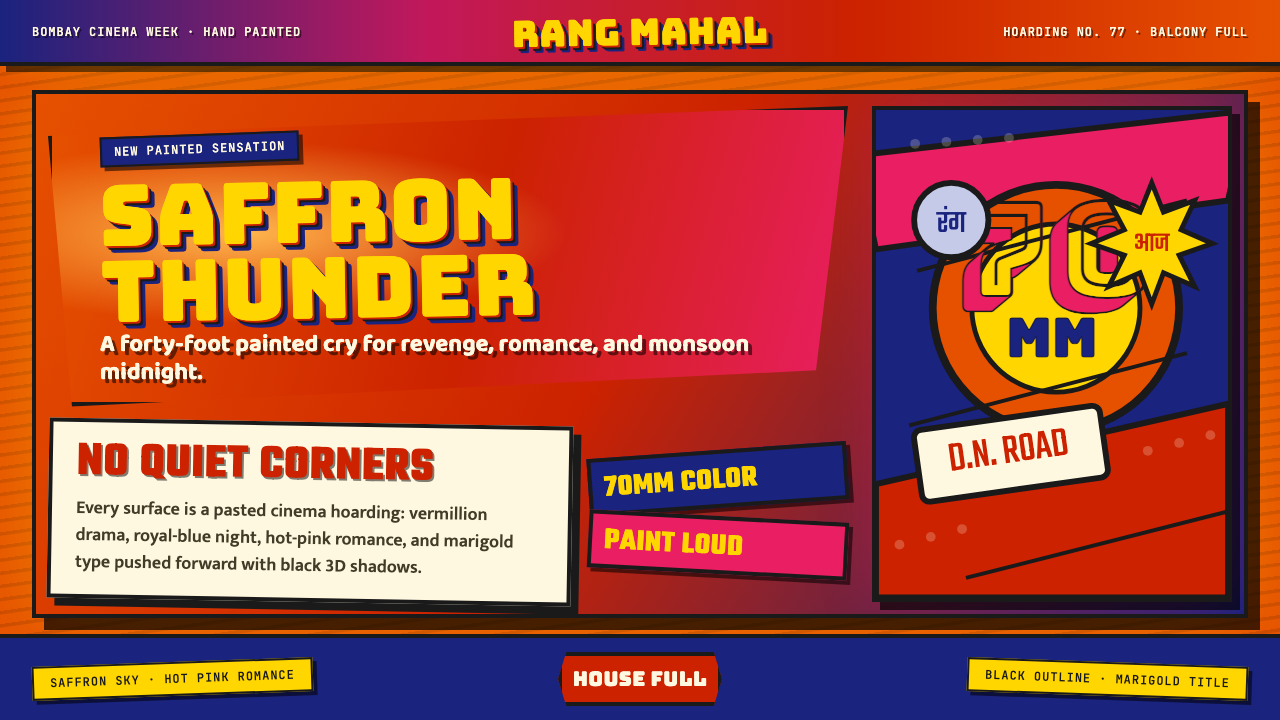 Bollywood Poster Art (1970s)Subtlety is unaffordable. Saffron fields, Bungee shadows, diagonal hoarding d…节制太便宜:藏红花底、Bungee黑影与斜向招贴制造十米戏剧。
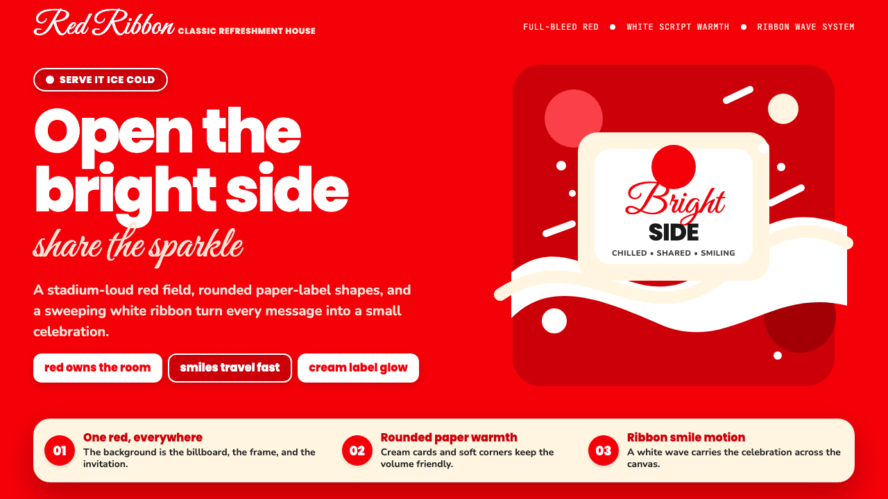 Coca-Cola ClassicHappiness goes full-bleed. Signature red, white ribbon waves, and warm rounde…快乐铺满全屏:标志性红、白色缎带波浪与圆润字体。
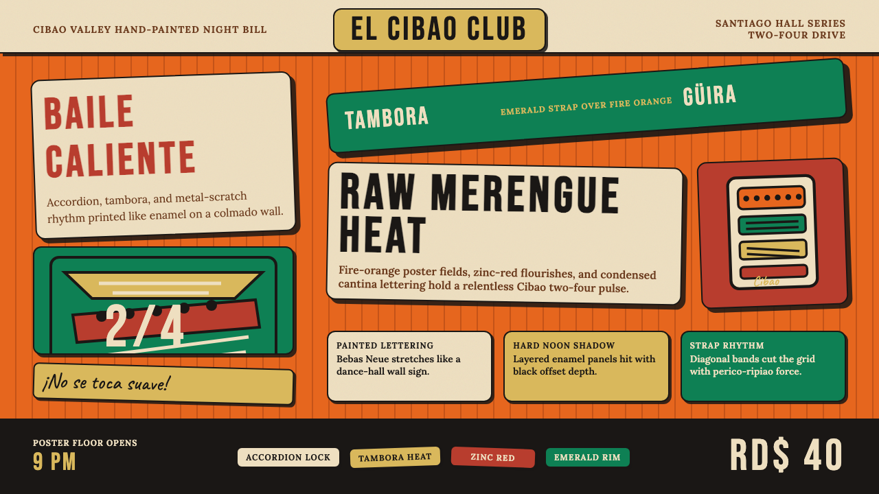 Dominican Merengue Perico RipiaoMaximalism keeps time. Fire-orange fields, Bebas Neue, and diagonal emerald s…极繁主义踩准节拍:火橙底、Bebas Neue 与翡翠斜带。
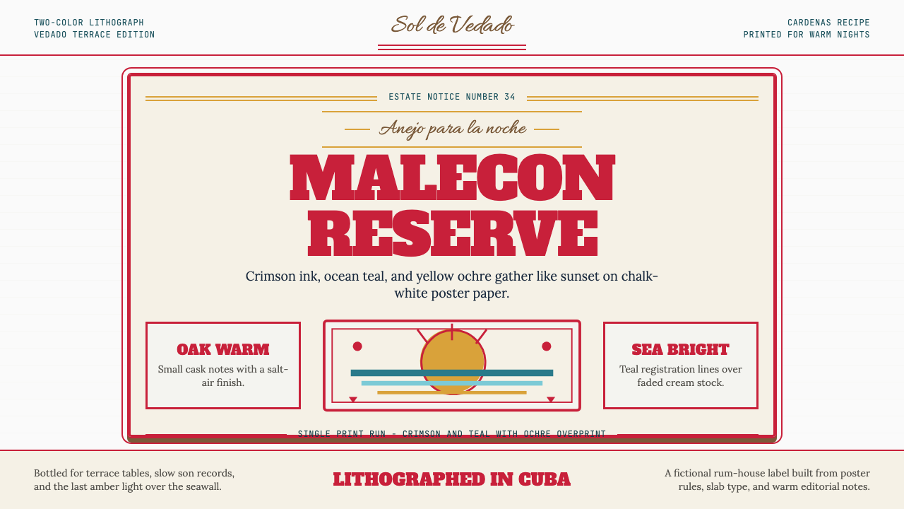 Havana Club Cuban RumSunset in print. Crimson slab type and ocean teal rules age on chalk-white pa…印刷里的日落。深红粗衬线与海洋青绿线框落在白垩纸上。
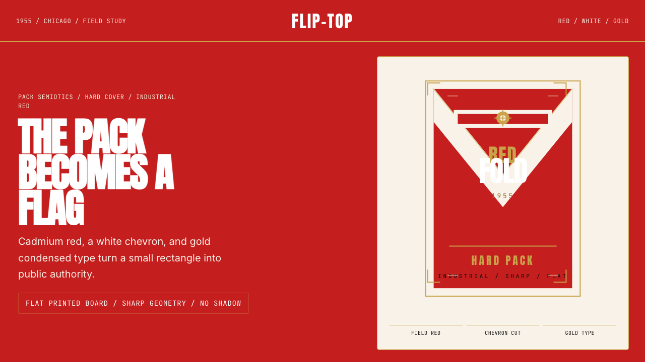 Marlboro Red Flip-Top (1955)Authority in one fold. Cadmium red, white chevron, and gold type read like a…一折成旗。镉红、白人字与金字排出强硬权威。
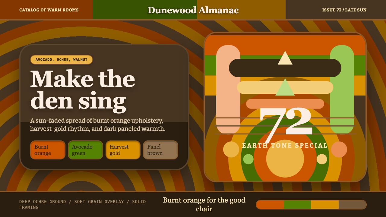 1970s Earth TonesWarm maximalism stays muddy. Bulbous slabs, avocado bands, and harvest-gold r…暖色极繁不怕浑厚:圆胖字、牛油果绿块与丰收金同心环。