What is Mod Scooter Chrome?什么是 Mod Scooter Chrome?
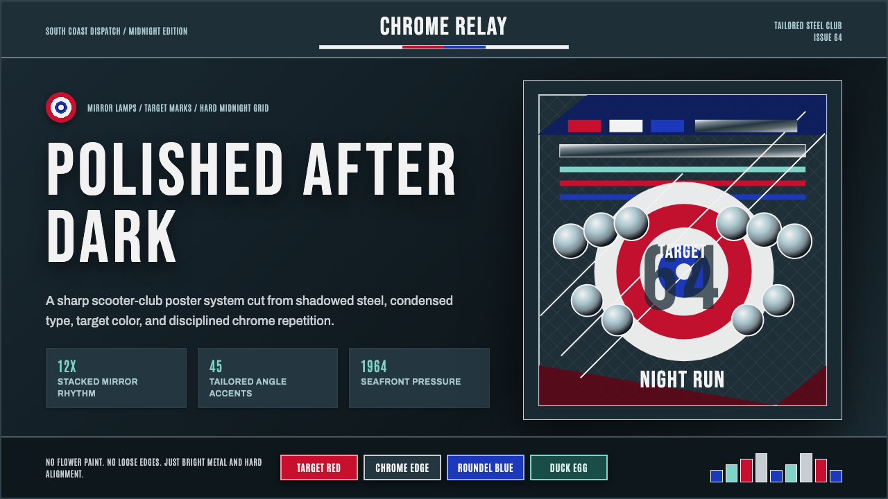
In mid-1960s Britain, sharp-dressed teenagers armored their Italian scooters with stacks of mirrors and chrome spotlamps and turned a mode of transport into a uniform of style.1960年代中期的英国,衣着锐利的少年们把意大利踏板车装点上层层镜面与铬制射灯,把一种代步工具变成了一套风格制服。
Mod Scooter Chrome in briefMod Scooter Chrome 速览
Mod Scooter Chrome is a design system drawn from the visual culture of the British Mod subculture at its mid-1960s peak, expressed most vividly through the customized Italian scooters — Vespa GS and Lambretta models — that Mods rode and modified as an extension of their meticulous personal style. Where the earlier Vespa Mint Scooter aesthetic captures a manufacturer's original, quiet postwar optimism, this style captures what a youth subculture did to that same object roughly two decades later: armoring it with banks of mirror-mounted spotlamps and layers of gleaming chrome until the scooter itself became a display object as considered as its rider's tailored clothing.摩德镀铬是一套取材于1960年代中期英国摩德亚文化鼎盛时期视觉文化的设计系统,其最鲜明的表达,是摩德青年骑乘并改装的意大利踏板车——韦士柏GS与兰美达车型——这些改装是他们精心打磨个人风格的延伸。如果说更早的Vespa薄荷绿踏板车美学捕捉的是制造商原始、安静的战后乐观主义,那么这种风格捕捉的,则是大约二十年后一场青年亚文化对同一件物品所做的事情:用成排的镜面射灯与层层锃亮的镀铬把它武装起来,直到这辆踏板车本身,变成一件与骑手剪裁考究的衣着同样经过深思熟虑的展示品。
The visual character is crisp, tailored, and modernist rather than playful or nostalgic. A deep chrome-steel ground — dark, reflective, and cool in temperature — forms the base, lit by specific accent colors: a strong blue associated with Royal Air Force roundel insignia, a target red, and faded, slightly desaturated pastel tones like duck-egg blue. These colors appear as precise geometric accents against the metallic dark ground rather than as broad fields, mirroring how badges, roundels, and paint accents sat against a scooter's mirror-polished bodywork.这套视觉性格利落、剪裁讲究、带有现代主义气息,而非玩味或怀旧。深邃的铬钢底色——深沉、反光、色温偏冷——构成了基础,被特定的强调色所点亮:一种与皇家空军徽章相关联的浓烈蓝色、一种靶心红,以及褪色、略微去饱和的粉彩色调,比如鸭蛋青。这些颜色以精准的几何点缀形式出现在金属质感的深色底面上,而非大面积的色域,映照着徽章、圆形徽标与漆面点缀落在镜面抛光车身上的方式。
Typography in this system is bold, condensed, and poster-like — the kind of confident, tightly-set grotesque lettering associated with 1960s British youth-culture graphics and music posters. The overall mood is disciplined and sharp rather than loose or spontaneous: Mod culture prized precision in dress, grooming, and scooter customization alike, and the aesthetic aims to carry that same disciplined sharpness into any composition it is applied to.这套系统的字体排印大胆、紧缩、带有海报感——那种与1960年代英国青年文化图形及音乐海报相关联的、笃定而紧凑排布的无衬线字体。整体气质是纪律严明、锐利的,而非松散随性的:摩德文化在衣着、仪容与踏板车改装上都推崇精准,这种美学试图把同样这种纪律严明的锐利感,带入它被应用的任何构图之中。
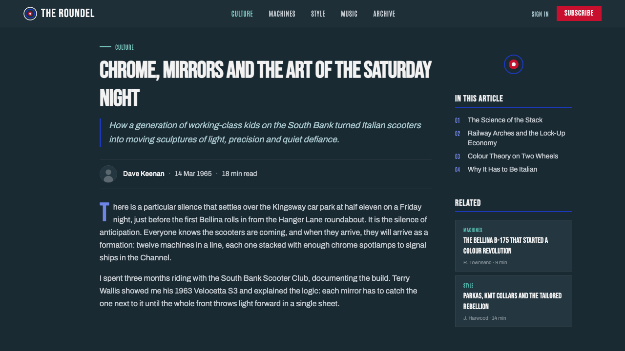
See the Mod Scooter Chrome design system查看 Mod Scooter Chrome 完整设计系统
Where does Mod Scooter Chrome come from?Mod Scooter Chrome 从何而来?
The Mod subculture emerged in Britain in the late 1950s and reached its cultural peak in the mid-1960s, centered on young, working- and lower-middle-class Britons who defined themselves through obsessive attention to fashion, music, and personal style — tailored Italian suits, soul and R&B records, and a self-presentation that prized sharpness and modernity over the leather-and-motorcycle aesthetic of their rival subculture, the Rockers. Choosing an Italian scooter over a British motorcycle was itself a statement: it signaled continental sophistication and a rejection of the rougher, more traditionally masculine biker image.摩德亚文化于1950年代末在英国兴起,并在1960年代中期达到文化巅峰,其核心是那些通过对时尚、音乐与个人风格的极致关注来定义自我的年轻工人阶层与中下层英国人——剪裁考究的意大利西装、灵魂乐与节奏布鲁斯唱片,以及一种推崇锐利感与现代感、而非其竞争对手亚文化“摇滚客”那种皮衣摩托美学的自我呈现方式。选择一辆意大利踏板车而非英国摩托车,本身就是一种宣言:它标志着大陆式的精致感,以及对更粗犷、更传统阳刚的摩托骑士形象的拒绝。
Piaggio's Vespa and Innocenti's Lambretta — both Italian manufacturers — became the vehicles of choice, but Mods rarely left them in factory condition. Customization was central to the culture: riders added banks of auxiliary mirrors and spotlamps, sometimes a dozen or more mounted across the front of the scooter, alongside chrome crash bars, luggage racks, and other accessories, transforming a practical commuter vehicle into an elaborately accessorized personal statement piece that also served a practical function, since Mods often used their scooters for long-distance trips to seaside towns.比亚乔的韦士柏与伊诺森提的兰美达——两家均为意大利制造商——成为首选载具,但摩德青年很少让它们保持出厂原状。改装是这种文化的核心:车手会加装成排的辅助后视镜与射灯,有时车头会安装十几个甚至更多,再配上镀铬防撞杆、行李架及其他配件,把一辆实用的通勤车辆变成一件精心装点的个人宣言之物,同时它也具有实用功能,因为摩德青年常常骑车长途前往海滨小镇。
The most famous flashpoint of Mod scooter culture came at British seaside resorts, particularly Brighton, where clashes between Mods and Rockers during bank holiday weekends in the mid-1960s drew significant media attention and cemented the association between scooter convoys, sharp dress, and youth rebellion in the wider British public imagination. This seaside, convoy-riding context is part of why the aesthetic favors a disciplined, almost military presentation — roundel-inspired blue and red accents echo actual Royal Air Force insignia, a visual reference some Mods incorporated directly into their clothing and scooter decoration.摩德踏板车文化最著名的爆发点,出现在英国海滨度假胜地,尤以布莱顿为甚,1960年代中期银行假日周末摩德与摇滚客之间的冲突引发了广泛的媒体关注,将踏板车车队、锐利的着装与青年反叛这三者的联系,深深植入了更广泛的英国公众想象之中。这种海滨、车队骑行的语境,正是这种美学偏爱一种纪律严明、近乎军事化呈现方式的部分原因——受徽标启发的蓝色与红色点缀,呼应着真实的皇家空军徽记,一些摩德青年甚至将这一视觉参照直接融入自己的衣着与踏板车装饰之中。
The band The Who became closely associated with Mod culture and its scooter iconography during this period, helping cement the subculture's visual identity in wider British popular culture. The style's legacy persisted well beyond its mid-1960s peak, with periodic Mod revivals through the late 1970s, 1980s, and beyond keeping the chrome-and-mirror scooter aesthetic recognizable to audiences well outside its original historical moment.乐队The Who在这一时期与摩德文化及其踏板车图腾紧密联系在一起,帮助将这场亚文化的视觉身份,深深植入了更广泛的英国流行文化之中。这种风格的影响力远远延续到1960年代中期的鼎盛期之后,1970年代末、1980年代及以后周期性出现的摩德复兴运动,让这种镀铬与镜面踏板车美学,对远远超出其原始历史时刻的观众而言,依然辨识度十足。
What defines the Mod Scooter Chrome look?Mod Scooter Chrome 的视觉特征是什么?
Chrome-Steel Ground铬钢底色
The dominant background tone is a deep, cool, reflective steel-grey rather than a warm or matte color, evoking the mirror-polished bodywork of a customized scooter seen in shadow. This ground should feel metallic and light-catching even in a flat, two-dimensional application, distinguishing it from an ordinary dark neutral background.主导的背景色调是一种深沉、冷峻、反光的钢灰色,而非暖调或哑光色,唤起阴影中所见改装踏板车镜面抛光车身的意象。即便在扁平的二维应用中,这种底色也应感觉具有金属感与迎光效果,从而区别于一种普通的深色中性背景。
Roundel Blue and Target Red徽标蓝与靶心红
Two specific accent colors dominate: a strong, saturated blue associated with Royal Air Force roundel insignia, and a target red used in bold, geometric shapes. Both colors appear as precise, bounded accents — a circular badge, a stripe, a small block — rather than broad washes, echoing how insignia and paint accents sit against a scooter's polished surface.两种特定的强调色占据主导:一种与皇家空军徽章相关联的浓烈饱和蓝色,以及一种用于大胆几何形状的靶心红。两种颜色都以精准、有界的点缀形式出现——一枚圆形徽章、一道条纹、一小块色块——而非大面积的色域铺陈,映照着徽章与漆面点缀落在踏板车抛光表面上的方式。
Faded Duck-Egg Pastels褪色鸭蛋青粉彩
Alongside the sharper primary accents, a muted, slightly desaturated pastel like duck-egg blue appears as a softening counterpoint — a nod to weathered paint or fabric rather than a fresh, saturated pastel. This faded quality keeps the system from feeling like a bright, contemporary sports palette and instead grounds it in a specific mid-1960s material reality.在更为锐利的主色点缀之外,一种柔和、略带去饱和的粉彩色(如鸭蛋青)作为柔化的对位出现——它致意的是风化的漆面或织物,而非鲜亮饱和的粉彩色。这种褪色的质感,让整套系统不至于显得像一套明快的当代运动配色,而是将其扎根于一个特定的1960年代中期材料现实之中。
Condensed Poster Grotesques紧缩海报无衬线体
Headline type is bold, tightly condensed, and confident, styled after 1960s British youth-culture poster and music graphics. Letters sit close together with minimal spacing, producing a dense, high-impact block of type that reads as disciplined and sharp rather than loose or casual.标题字体大胆、紧密压缩、笃定十足,其风格取材于1960年代英国青年文化的海报与音乐图形设计。字母紧密相邻、字距极小,形成一整块密实、冲击力强的字体,读起来纪律严明而锐利,而非松散随意。
Mirror-Disc Rhythm镜面圆盘节奏
A repeating rhythm of small circular or disc shapes — echoing the stacked auxiliary mirrors and spotlamps mounted across a customized scooter's front — appears as a recurring compositional motif, arranged in rows or clusters rather than singly. This rhythmic repetition is what most directly signals the specific scooter-customization culture this style is drawn from.一种重复出现的小型圆形或圆盘形节奏——呼应着改装踏板车车头堆叠安装的辅助后视镜与射灯——作为一种反复出现的构图母题出现,成排或成簇排列,而非单独出现。这种有节奏的重复,是最直接地标示出这种风格所取材的具体踏板车改装文化的特征。
Tailored Precision剪裁般的精准
Every element in the system — spacing, alignment, the crispness of geometric shapes — should feel deliberately precise rather than loose or hand-drawn, mirroring the meticulous personal grooming and tailoring that defined Mod culture. Imprecise or organic linework undermines the disciplined, sharp-dressed mood the style depends on.系统中的每一个元素——间距、对齐、几何形状的干脆利落——都应感觉是刻意精确的,而非松散或手绘的,映照着定义摩德文化的那种一丝不苟的个人仪容与剪裁。不够精准或有机随性的线条处理,会瓦解这种风格所依赖的纪律严明、衣着讲究的气质。
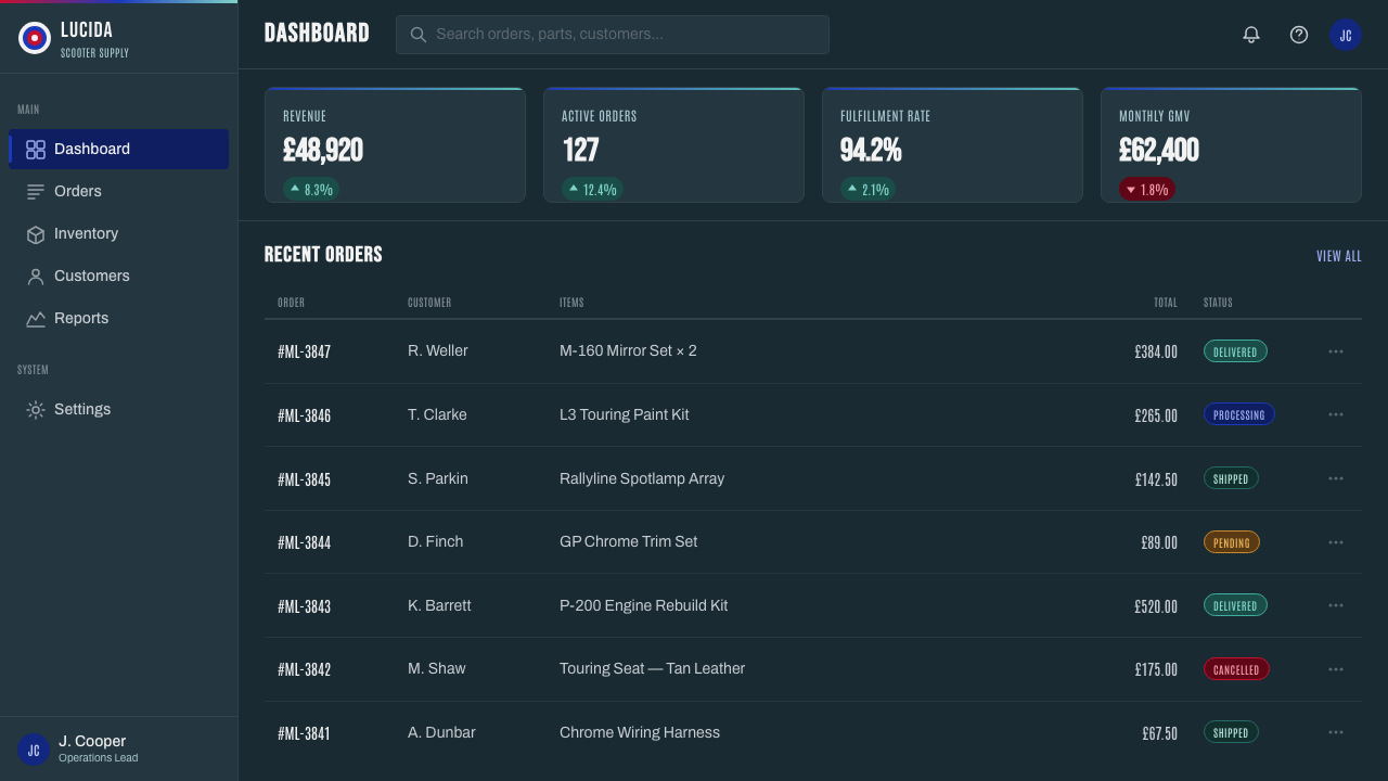
See the Mod Scooter Chrome design system查看 Mod Scooter Chrome 完整设计系统
Who shaped Mod Scooter Chrome?谁塑造了 Mod Scooter Chrome?
The Italian manufacturer of the Vespa scooter, particularly the GS model, was one of the two primary scooter brands adopted and customized by Mods. Piaggio's own design and engineering — inherited from the earlier postwar Vespa lineage — provided the base object onto which Mod customization culture layered its distinctive mirrors and chrome.韦士柏踏板车的意大利制造商——尤其是GS车型——是摩德青年采用并改装的两大主要踏板车品牌之一。比亚乔自身的设计与工程——继承自更早的战后韦士柏血统——提供了这个基础物件,摩德改装文化正是在其上叠加了它标志性的镜面与镀铬。
The Italian manufacturer of the Lambretta scooter, Innocenti's product was the other primary vehicle of choice within Mod culture, competing directly with Piaggio's Vespa for the loyalty of British scooter riders. The rivalry between Vespa and Lambretta owners within Mod culture itself added another layer of tribal identity to an already highly stylized subculture.兰美达踏板车的意大利制造商伊诺森提,其产品是摩德文化中另一款主要的首选载具,与比亚乔的韦士柏直接争夺英国骑手的忠诚度。摩德文化内部韦士柏与兰美达车主之间的竞争,为这个本已高度风格化的亚文化,又增添了一层部落式的身份认同。
The band became closely associated with Mod culture during the mid-1960s, and their imagery and music helped cement the subculture's visual identity — sharp suits, target and roundel iconography, and customized scooters — in the wider British popular consciousness, extending the aesthetic's reach beyond the subculture's original participants.The Who乐队在1960年代中期与摩德文化紧密联系在一起,他们的形象与音乐帮助将这场亚文化的视觉身份——考究的西装、靶心与徽标图腾、改装踏板车——深深植入了更广泛的英国大众意识之中,让这种美学的影响力延伸到了亚文化原本参与者之外的范围。
How do you use Mod Scooter Chrome today?今天怎么用 Mod Scooter Chrome?
Mod Scooter Chrome suits products and brands that want to project sharp, disciplined, youthful modernism with a subcultural edge — music and fashion brands, mobility and lifestyle products with a British or European sensibility, or any brand wanting a cooler, more tailored register than either loud pop-color youth branding or generic corporate minimalism.摩德镀铬适合那些想要传达锐利、纪律严明、带有亚文化棱角的青年现代主义的产品与品牌——音乐与时尚品牌、带有英伦或欧陆气质的出行与生活方式产品,或是任何希望比张扬波普色青年品牌或泛泛的企业极简主义更为冷峻、更为讲究的品牌。
For presentation slides, a cover slide can use the full chrome-steel ground with a cluster of the mirror-disc motif arranged like a bank of scooter spotlamps, paired with bold condensed type for the title. Content slides should keep the steel ground but use the roundel blue and target red sparingly as accent colors for key data points or callouts, since spreading either color broadly would overwhelm the disciplined, metallic mood.在演示文稿中,封面页可以运用完整的铬钢底色,配上一簇排列成射灯阵列般的镜面圆盘母题,再搭配大胆紧缩的标题字体。内容页应保留钢色底色,但把徽标蓝与靶心红节制地用作强调色,用于关键数据点或引述框,因为大面积铺陈其中任何一种颜色都会压过这种纪律严明、金属质感的气质。
For web interfaces, the style fits music, fashion, and mobility platforms particularly well, with the mirror-disc rhythm translating naturally into icon clusters, avatar groupings, or decorative dividers. Buttons and interactive states should draw on the roundel blue as the primary accent, reserving target red for higher-priority actions or alerts, keeping the overall interface disciplined rather than colorful throughout.在网页界面中,这种风格尤其适合音乐、时尚与出行类平台,镜面圆盘节奏能自然地转化为图标簇、头像群组,或装饰性分隔线。按钮与交互状态应以徽标蓝作为主要强调色,把靶心红留给更高优先级的操作或警示使用,让整体界面保持纪律感,而非通篇色彩斑斓。
For editorial and marketing work, the aesthetic supports storytelling about music subcultures, British youth culture history, or scooter and mobility heritage. A full-bleed chrome-steel hero section with condensed poster-style typography captures the same sharp confidence as a 1960s Mod gig poster; body copy should sit on a calmer, lighter steel tone to preserve legibility across longer passages.在编辑与营销内容中,这种美学支持关于音乐亚文化、英国青年文化历史,或踏板车与出行传承的叙事。铺满铬钢色的通栏主视觉区域,配上紧缩海报风格的字体,捕捉的正是1960年代摩德演出海报那种锐利的自信感;正文文字应置于更平静、更浅淡的钢色调之上,以在较长篇幅中保持可读性。
A common mistake is using the roundel-inspired colors without the disciplined, condensed typography and precise geometric treatment that keeps the style feeling tailored rather than merely 'retro British.' Another frequent error is treating the mirror-disc motif as a single decorative circle rather than a repeated cluster, which loses the specific reference to stacked scooter spotlamps that gives the style its subcultural specificity.一个常见的错误,是使用受徽标启发的颜色,却没有搭配那种让这种风格显得讲究、而非泛泛“英伦复古”的纪律严明的字体与精准的几何处理。另一个常见的错误,是把镜面圆盘母题当作单一的装饰性圆形,而非成簇重复出现,这会丧失对堆叠踏板车射灯的具体指涉,而正是这一指涉赋予了这种风格其亚文化的特殊性。
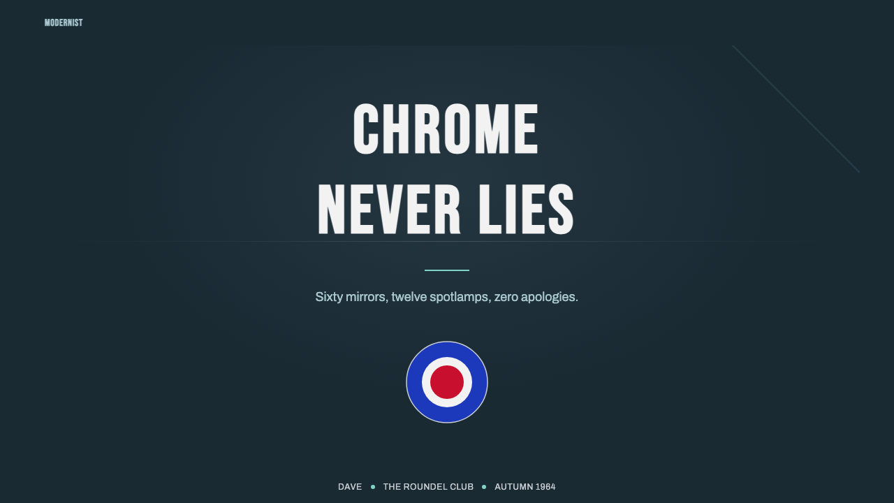
See the Mod Scooter Chrome design system查看 Mod Scooter Chrome 完整设计系统
Mod Scooter Chrome — FAQMod Scooter Chrome · 常见问题
Why do Mods specifically use Royal Air Force roundel colors rather than a generic red-white-blue palette?为什么摩德青年特意使用皇家空军徽标的配色,而非泛泛的红白蓝配色?
The roundel — the circular target-like insignia painted on RAF aircraft — was a specific visual reference some Mods adopted directly, painting it onto clothing, scooters, and accessories. This was a distinctly British military reference rather than a generic patriotic palette, and it carried connotations of precision, discipline, and modern machinery that aligned with the subculture's broader aesthetic values, distinguishing it from a more casual or purely decorative use of national colors.徽标——涂在皇家空军战机上、状如靶心的圆形徽记——是一些摩德青年直接采用的一种具体视觉参照,他们把它绘制在衣物、踏板车与配件上。这是一种明确的英国军事参照,而非泛泛的爱国配色,它承载着精准、纪律与现代机械的意涵,与这场亚文化更广泛的美学价值观相契合,使其区别于更随意或纯粹装饰性地使用国旗色彩。
How does this style differ from the original Vespa Mint Scooter aesthetic in the same library?这种风格与库中同样以踏板车为原型的Vespa薄荷绿踏板车美学有何不同?
Vespa Mint Scooter captures Piaggio's original 1946 factory design — restrained sage-green steel and quiet postwar optimism. Mod Scooter Chrome captures what a youth subculture did to that same class of Italian scooter nearly two decades later — stacking on mirrors, spotlamps, and chrome as a form of personal display. One is a manufacturer's calm original vision; the other is a subculture's loud, tailored customization of it.Vespa薄荷绿踏板车捕捉的是比亚乔1946年最初的出厂设计——克制的灰绿钢材与安静的战后乐观主义。摩德镀铬捕捉的则是近二十年后,一场青年亚文化对同一类意大利踏板车所做的事情——层层堆叠镜面、射灯与镀铬,作为一种个人展示的形式。一个是制造商平静的原始愿景,另一个则是亚文化对其张扬而讲究的改装。
Why is the typography condensed and bold rather than light or airy?为什么字体是紧缩且大胆的,而非轻盈或疏朗的?
Condensed, bold poster typography was the visual language of 1960s British youth-culture graphics — gig posters, record sleeves, and subculture flyers — that Mod culture was steeped in. A light or airy typeface would clash with the disciplined, sharp-edged confidence that defines both the subculture's dress sense and its scooter customization, undermining the style's core mood.紧缩、大胆的海报字体,正是1960年代英国青年文化图形——演出海报、唱片封套与亚文化传单——的视觉语言,而摩德文化正深深浸润其中。一种轻盈或疏朗的字体,会与定义这场亚文化衣着品味及踏板车改装的那种纪律严明、棱角分明的自信感相冲突,从而瓦解这种风格的核心气质。
Is the mirror-disc motif purely decorative, or does it reference something specific?镜面圆盘母题纯粹是装饰性的,还是有具体的指涉?
It references something specific: Mod scooter customization frequently involved mounting a dozen or more auxiliary rearview mirrors and spotlamps across the front of a Vespa or Lambretta, turning a functional vehicle component into an elaborate display feature. Using the motif as a single isolated circle loses this reference; the repeated, clustered arrangement is what makes it legible as a nod to actual scooter customization.它有具体的指涉:摩德式的踏板车改装常常会在韦士柏或兰美达车头安装十几个甚至更多的辅助后视镜与射灯,把一个实用的车辆部件变成一个精心设计的展示特征。把这个母题用作单一孤立的圆形会丧失这一指涉;重复、成簇的排布方式,才是让它能被辨识为对真实踏板车改装致意的关键。
Does this style suit calm, low-energy product contexts?这种风格适合平静、低能量的产品语境吗?
Not especially well. The aesthetic's core identity is sharp, disciplined energy — precise geometry, confident condensed type, and a cool metallic ground lit by punchy accent colors. It fits products and brands that want to feel modern, youthful, and a little rebellious far better than those aiming for softness, warmth, or quiet calm, where a gentler style in the library would likely be a better match.并不太适合。这种美学的核心身份,是一种锐利、纪律严明的能量——精准的几何形态、笃定紧缩的字体,以及被冲击力十足的强调色点亮的冷峻金属底色。它更适合那些想要显得现代、年轻、带点叛逆气质的产品与品牌,而非那些追求柔软、温暖或安静平和的场景——对于后者,库中其他更为柔和的风格可能是更好的选择。
Related design styles相关设计风格
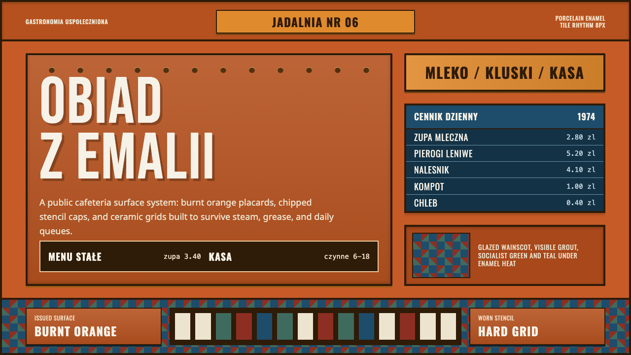 Polish Milk Bar (PRL)State-issued warmth. Burnt orange enamel, stencil caps, and hard tile grids.国营日常有热度。焦橙搪瓷、镂空大字与硬瓷砖网格。
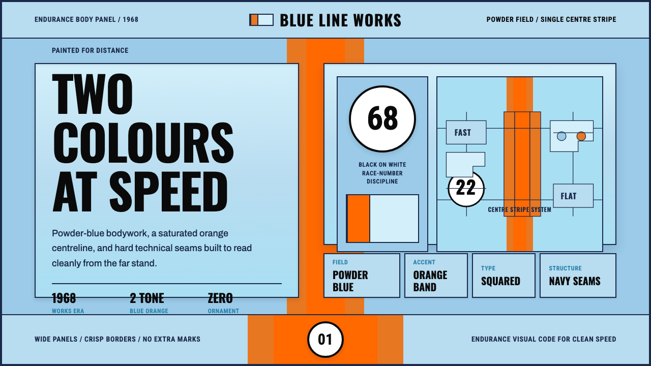 Gulf Racing LiverySpeed made disciplined. Powder blue, orange stripe, black roundel, strict gri…速度被纪律化:粉蓝车身、橙色中线、黑白圆号与硬网格。
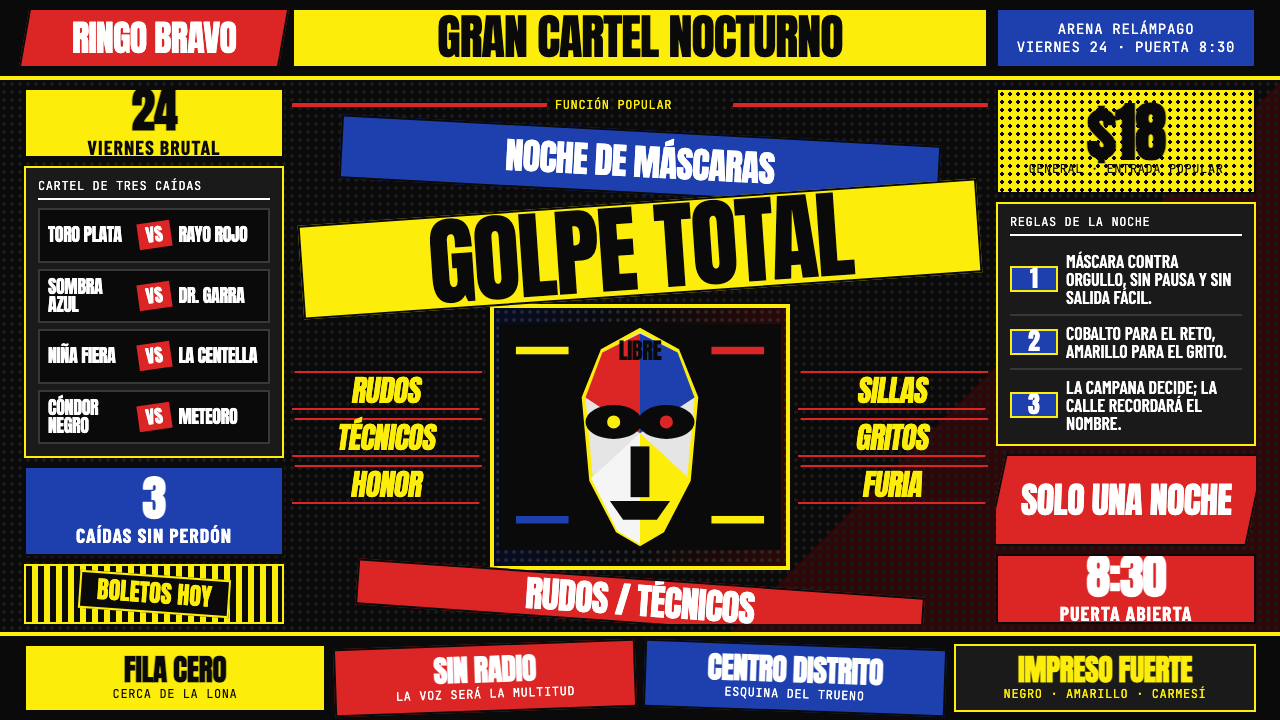 Lucha Libre PosterStreet-poster voltage. Yellow Anton banners, crimson diagonals, cobalt grids…街头高压海报:黑底上的荧光黄Anton、猩红斜线与钴蓝网格。
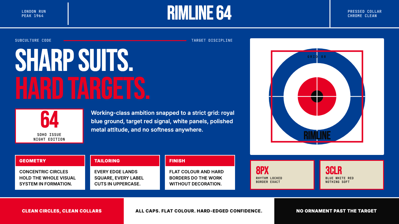 Mod Vespa London (1964)Precision rides hard. Royal blue, target red, Bebas caps, and roundel geometr…精确即锋芒。皇家蓝、靶心红与高窄大写锁住版面。
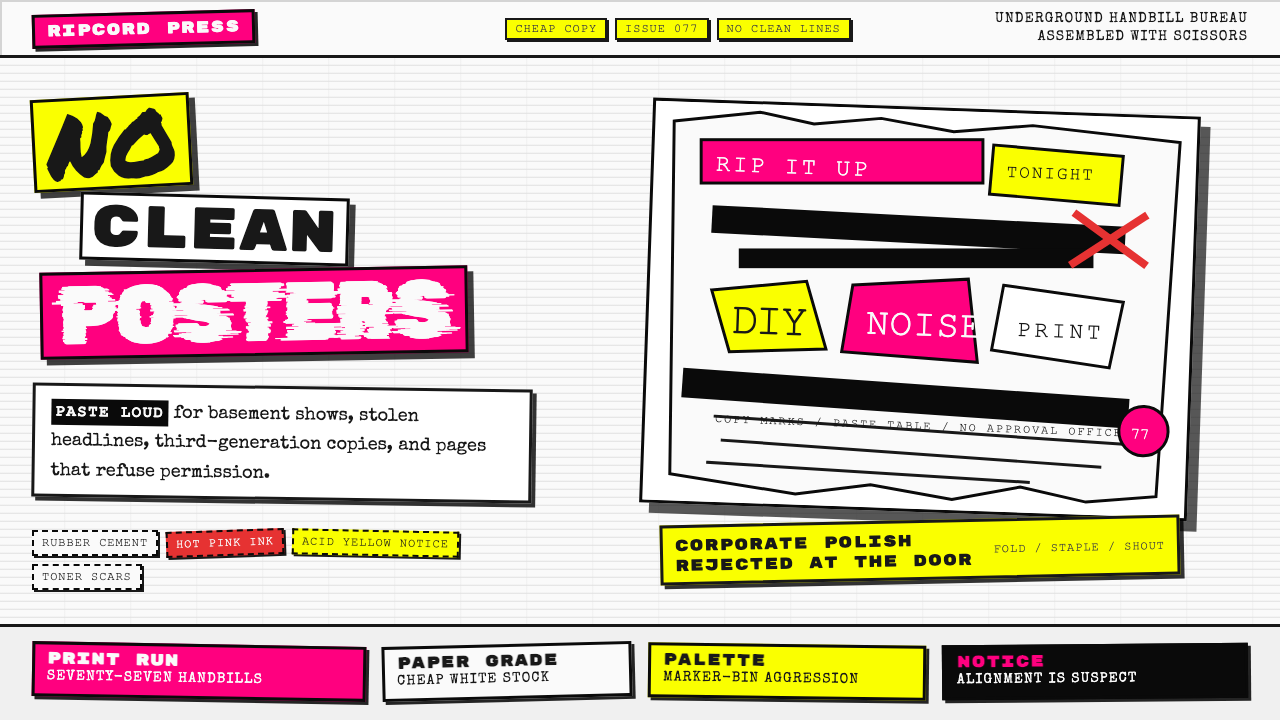 Punk Xerox 1977Anti-design shouts. Hot pink and acid yellow collide with ransom type on Xero…反设计在尖叫:荧光粉与酸黄撞上复印纸勒索字。
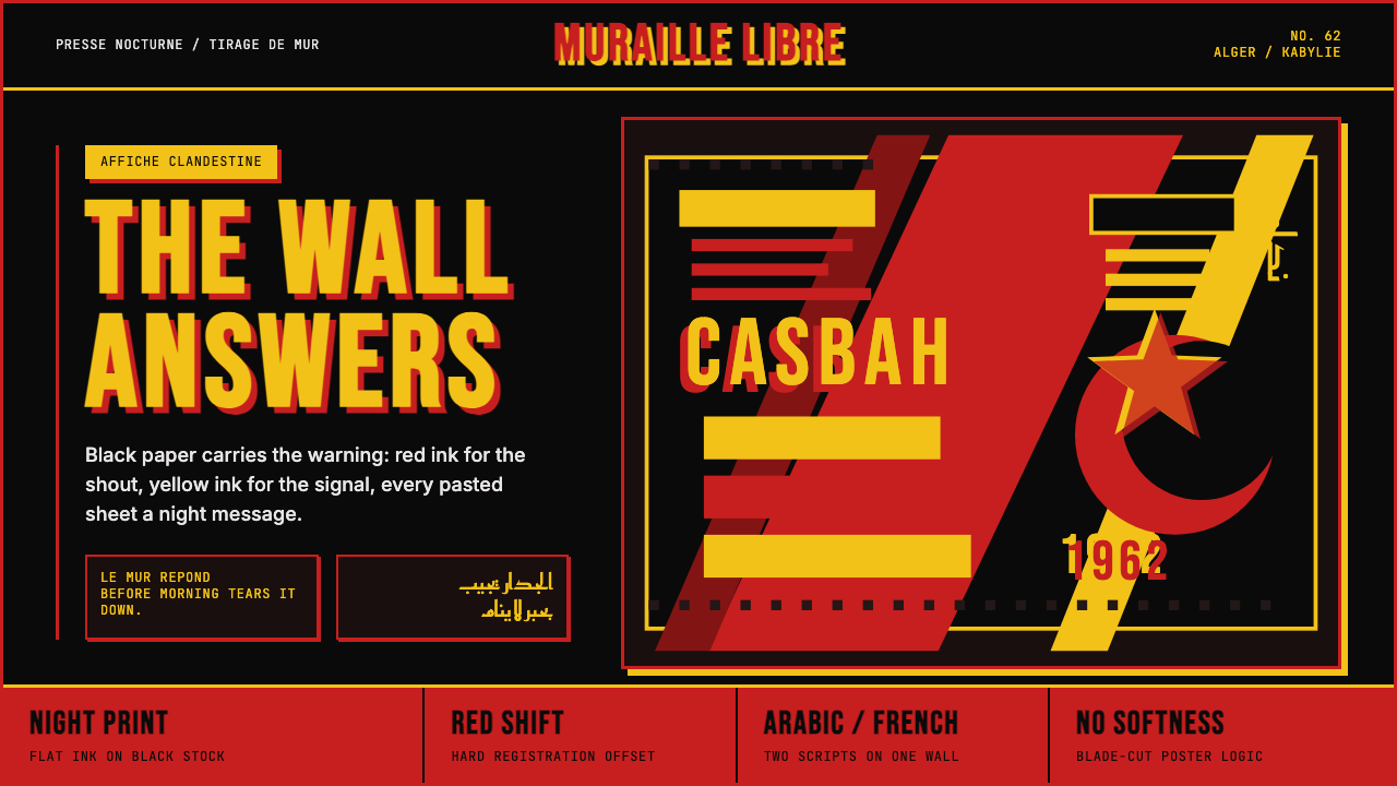 Algerian Casbah Poster (1954–1962)Every surface is a manifesto. Blood red, warning yellow, and stencil type hit…每个表面都是宣言:血红、警示黄与模板字撞上黑色新闻纸。