What is 2 Tone Ska?什么是 2 Tone Ska?
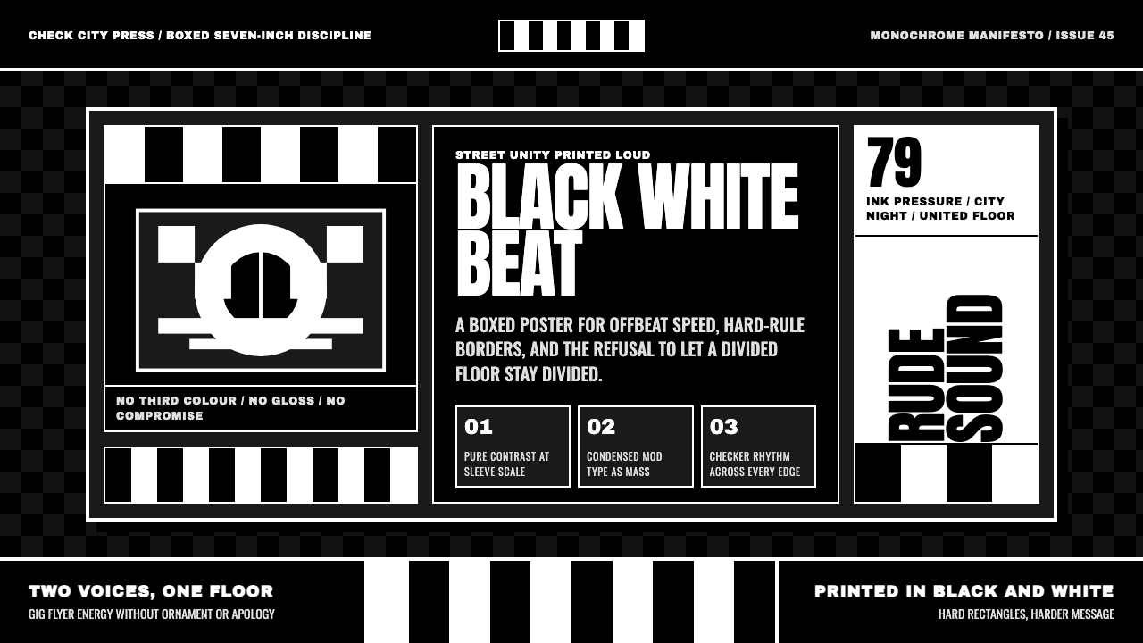
2 Tone Ska treats contrast as a manifesto — pure-white display type locked into a near-black checkerboard sleeve, with no third color and no compromise.「2 Tone Ska」把对比本身当作一份宣言——纯白展示字体压进近黑棋盘唱片封套,没有第三种颜色,没有妥协。
2 Tone Ska in brief2 Tone Ska 速览
2 Tone Ska style is drawn from the record sleeves, logo, and visual identity of 2 Tone Records, the Coventry label that gave a divided late-1970s Britain a sound and a look that refused to stay divided. Jamaican ska rhythm was welded to punk's speed and urgency, and every sleeve associated with the label was printed in nothing but black and white — no third color was ever introduced, and none was needed.「2 Tone Ska」风格取材自2 Tone Records唱片厂牌的唱片封套、标识与视觉身份——这个来自考文垂的厂牌,为1970年代末一个分裂的英国,带来了一种拒绝维持分裂的声音与外观。牙买加ska的律动被焊进朋克的速度与急迫感,而与该厂牌相关的每一张唱片封套,只印黑与白两色——从未引入第三种颜色,也从不需要。
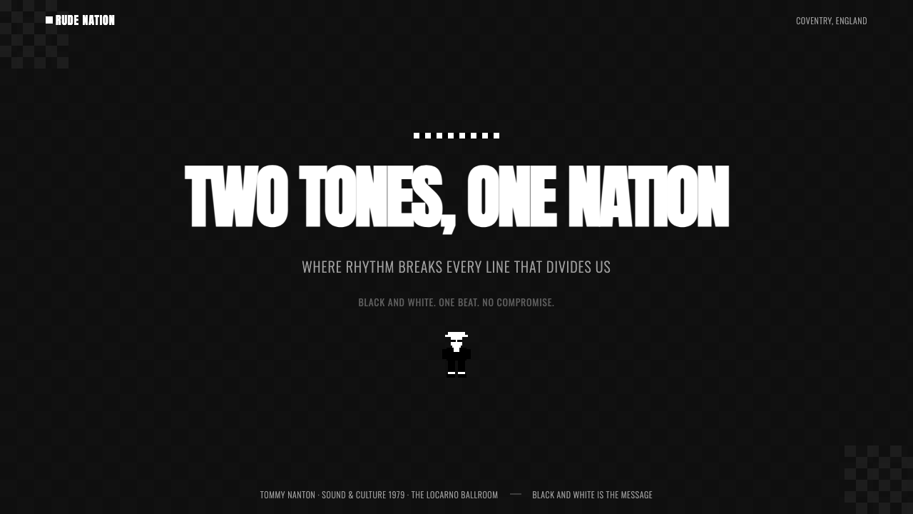
The checkerboard pattern and Walt Jabsco, the label's rude-boy silhouette mascot, were never merely decorative devices. The strict duotone itself carried the movement's message: black and white, sitting directly adjacent with no gradient or blending between them, stood in for the label's explicit commitment to racial unity between Black and white musicians and audiences during a period of significant racial tension in Britain.棋盘格图案与厂牌的"rude boy"剪影吉祥物Walt Jabsco,从来都不只是装饰性的手法。严格的双色本身就承载着这场运动的信息:黑与白直接相邻,中间没有渐变或过渡,代表着厂牌在英国种族关系紧张的年代,对黑人与白人音乐人与听众之间种族团结的明确承诺。
This system keeps that discipline absolute. A near-black checkerboard ground anchors most compositions, pure-white display type is set in condensed, angular mod-influenced lettering, and hard-edged rectangular blocks frame content the way a 7-inch single sleeve frames its artwork. There is no third color, no gloss, and no softened edge anywhere in the system — contrast alone does all the communicative work.这套设计把那份纪律贯彻到底。近黑的棋盘格底面锚定着大多数构图,纯白的展示字体以紧缩、棱角分明、带有摩德风影响的字形排布,硬边的矩形色块像七寸单曲唱片封套框定其画面那样框定内容。整套系统中没有第三种颜色,没有光泽,没有任何柔化的边缘——一切交由对比来完成全部传达工作。
Where does 2 Tone Ska come from?2 Tone Ska 从何而来?
2 Tone Records was founded in 1979 in Coventry by Jerry Dammers, keyboardist and driving creative force of The Specials, at a moment when Britain was experiencing significant economic decline, unemployment, and racial tension, particularly in industrial Midlands cities like Coventry. Dammers conceived the label explicitly as a platform for racially integrated ska-revival bands, and its roster, most prominently The Specials themselves alongside The Selecter and, in the wider scene, Madness, embodied that integration directly in their lineups.2 Tone Records于1979年由杰里·达默斯——The Specials的键盘手兼创作核心——在考文垂创立,彼时的英国正经历显著的经济衰退、失业与种族紧张局势,尤其是在考文垂这样的中部工业城市。达默斯将这个厂牌明确构想为一个种族融合的ska复兴乐队的平台,其旗下艺人——最突出的是The Specials本身,加上The Selecter,以及更广泛场景中的Madness——都在阵容本身中直接体现了这种融合。
The music itself fused the rhythmic foundation of 1950s Jamaican ska, brought to Britain by Caribbean immigrants in the postwar decades, with the tempo and aggression of contemporary punk, producing a sound that was danceable but also carried an unmistakable edge. This musical fusion had a direct visual counterpart: the label's branding took the most stripped-down possible palette, pure black and white, and used it as an emblem of the exact fusion the music itself represented.音乐本身把1950年代牙买加ska的节奏根基——由战后数十年间移民英国的加勒比移民带来——与当代朋克的速度感与攻击性熔于一炉,产生了一种既适合跳舞、又带着一股不容忽视的锋芒的声音。这种音乐上的融合有着直接的视觉对应:厂牌的视觉识别采用了最彻底精简的色板——纯黑与纯白——将其用作音乐本身所代表的那种融合的象征。
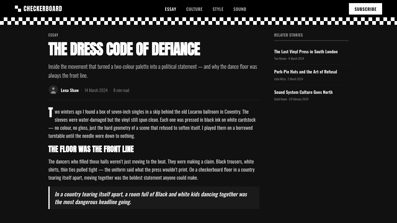
The label's visual identity was inseparable from the broader Rock Against Racism movement active in Britain during the same period, which used music and design as an explicit organizing tool against the rise of far-right political movements. 2 Tone's checkerboard and duotone sleeve design functioned within this context not as neutral branding but as a visible, repeated political statement — every record sleeve was, in effect, a small poster for racial unity.这个厂牌的视觉身份,与同一时期在英国活跃的"反种族主义摇滚"(Rock Against Racism)运动密不可分——后者把音乐与设计当作明确的组织工具,用以对抗当时正在崛起的极右翼政治运动。2 Tone的棋盘格与双色封套设计,在这一语境中,并非中性的品牌标识,而是一种可见的、反复出现的政治宣言——每一张唱片封套,实质上都是一张关于种族团结的小型海报。
The 2 Tone era proper ran from 1979 to roughly 1985, a compressed but intensely influential period, after which the label's specific roster dispersed, though the checkerboard-and-black-and-white visual language it established continued to be referenced by subsequent ska revival scenes internationally, cementing it as a recognizable design idiom well beyond its original five-year run.严格意义上的2 Tone时代大致从1979年持续到1985年前后,一段短暂却影响深远的时期,此后厂牌的原班艺人阵容各自离散,但它所确立的棋盘格与黑白视觉语言,持续被后来国际上的ska复兴场景所引用,使其成为一种远超其最初五年运行期的、可辨识的设计惯用语。
What defines the 2 Tone Ska look?2 Tone Ska 的视觉特征是什么?
Near-Black Checkerboard近黑棋盘格
A checkerboard of alternating near-black and white squares functions as the system's signature ground pattern, appearing at a scale confident enough to read clearly at a glance. The checkerboard should never be tinted or softened into gray — the tension between the two extremes is the entire point.由交替的近黑与白色方格组成的棋盘格,是这套系统的标志性底纹图案,其尺度应足够自信,让人一眼就能清晰辨认。棋盘格绝不应被染上色调或柔化成灰色——两个极端之间的张力,正是其全部意义所在。
Pure White Display Type纯白展示字体
Headline and title type is set in pure white against the dark ground, with no off-white softening or tinting. The whiteness should be as absolute as the blackness it sits against, preserving the hard, immediate contrast the style depends on.标题与展示字体以纯白色呈现在深色底面之上,不带任何米白色的软化或染色。这种白必须与其映衬的黑一样绝对,保留这种风格所依赖的那种硬朗、直接的对比。
Condensed Mod Lettering紧缩摩德风字体
Type draws on condensed, angular letterforms associated with the British mod subculture, favoring compact, upright characters over anything rounded or soft. This lettering should feel urgent and compact, matching the tempo of the music the style references.字体取材自与英国摩德亚文化相关联的紧缩、棱角分明的字形,偏好紧凑、竖直的字符,而非任何圆润或柔和的形态。这种字体应给人一种急迫而紧凑的感觉,与这种风格所指涉的音乐节奏相匹配。
Hard-Edged Blocks硬边色块
Content is framed within sharp, rectangular blocks with no rounded corners or soft shadows. These blocks should feel printed rather than rendered, echoing the flat, mechanical reproduction quality of an actual record sleeve.内容被框定在锐利的矩形色块之中,没有圆角,也没有柔和阴影。这些色块应给人一种印刷出来、而非渲染出来的感觉,呼应实际唱片封套那种扁平、机械复制的质感。
7-Inch Sleeve Framing七寸唱片封套式取景
Compositions are treated as though bounded by the fixed, square-ish proportions of a 7-inch single sleeve, with a clear, contained edge rather than a bleeding or open layout. This framing gives every composition a sense of physical, object-like containment.构图被处理得仿佛受限于七寸单曲唱片封套那种固定的、近乎方形的比例,有着清晰、封闭的边界,而非出血或开放式的版面。这种取景方式,让每一幅构图都带有一种实体物件般的收束感。
Zero Third Color零第三色
No hue beyond black and white ever appears in an authentic application of this style. This absolute restriction is the style's defining rule; introducing even a single accent color, however small, breaks the exact duotone discipline that carries the movement's original meaning.在这种风格的真实应用中,除黑白之外从不出现任何色调。这条绝对的限制是这种风格的核心规则;哪怕引入一处极小的强调色,也会打破那种承载着这场运动原初意义的、精确的双色纪律。
No Gloss, No Gradient无光泽、无渐变
Surfaces are treated as flat matte print rather than glossy or gradient-shaded digital renderings. This flatness reinforces the printed, physical, record-sleeve origin of the style and keeps the contrast between black and white absolute rather than softened by simulated lighting.表面被处理为平面哑光印刷品,而非光泽或渐变明暗处理的数字渲染。这种扁平感强化了这种风格印刷、实体、唱片封套式的出身,也让黑白之间的对比保持绝对,而非被模拟光照所柔化。
Who shaped 2 Tone Ska?谁塑造了 2 Tone Ska?
Founder of 2 Tone Records and keyboardist for The Specials, Dammers conceived the label explicitly as a platform for racially integrated ska-revival music, and the stark black-and-white checkerboard identity he oversaw became the visual embodiment of that founding commitment to unity.作为2 Tone Records的创始人以及The Specials的键盘手,达默斯明确将这个厂牌构想为种族融合的ska复兴音乐平台,他所主导的那套鲜明黑白棋盘格视觉身份,成为这份团结创始承诺的视觉化身。
The label's flagship band, The Specials embodied the racially mixed lineup and ska-punk fusion sound that 2 Tone's visual identity was built to represent, and their sleeve artwork remains the most widely recognized expression of the style.作为厂牌的旗舰乐队,The Specials体现了2 Tone视觉身份所要代表的、种族混合的阵容与ska-朋克融合的声音,其唱片封套艺术至今仍是这种风格最广为人知的呈现。
A core 2 Tone-era band alongside The Specials, The Selecter's association with the label's roster reinforced the checkerboard-and-duotone visual identity as a shared genre signature rather than a single band's individual branding.作为与The Specials同属2 Tone时代的核心乐队,The Selecter与该厂牌旗下艺人的关联,强化了棋盘格与双色视觉身份作为一种共享的流派签名,而非某支乐队个体品牌形象的地位。
Though not signed directly to 2 Tone Records, Madness was closely associated with the wider ska-revival scene the label anchored, and their popularity helped carry the checkerboard visual language to a broader international audience.尽管Madness并未直接签约2 Tone Records,但他们与该厂牌所锚定的更广泛ska复兴场景关系密切,其人气帮助把棋盘格视觉语言带给了更广泛的国际听众。
How do you use 2 Tone Ska today?今天怎么用 2 Tone Ska?
2 Tone Ska style suits any product or communication that wants to feel bold, urgent, and unambiguous rather than nuanced or soft. Applying it well means preserving the absolute two-color rule; the moment a third color is introduced, the design stops referencing this specific movement and becomes generic high-contrast branding.「2 Tone Ska」风格适合任何想要显得大胆、急迫、毫不含糊,而非细腻或柔和的产品或传播物料。用好它的关键,是保留绝对的双色规则;一旦引入第三种颜色,设计就不再指涉这场特定的运动,而沦为泛泛的高对比品牌设计。
For presentation slides, a cover slide can use the checkerboard as a full-bleed ground with the title set in pure white condensed type inside a hard-edged block, echoing a record sleeve's framing. Content slides should keep to strict black-and-white throughout, using the checkerboard sparingly as an accent element rather than covering every slide, while data slides can use black-filled versus white-outlined shapes to distinguish categories without introducing color.在演示文稿中,封面页可以将棋盘格用作整版铺满的底色,标题以纯白紧缩字体呈现,置于一个硬边色块之中,呼应唱片封套的取景方式。内容页应始终坚持严格的黑白配色,把棋盘格作为一种审慎使用的强调元素,而非铺满每一页;数据页则可以用黑色填充与白色描边的形状来区分类别,而不引入颜色。
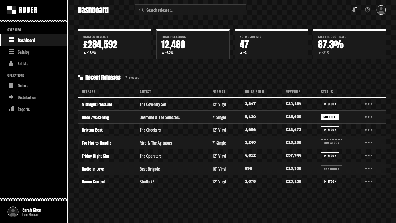
For web interfaces, the style is well-suited to music, streetwear, and youth culture brands that want to signal boldness and unambiguous identity. Buttons and interactive elements should use hard black-and-white states rather than gray or tinted intermediate states, and navigation can borrow the checkerboard motif sparingly as a background texture for headers or dividers rather than filling entire pages with it.对于网页界面,这种风格适合音乐、街头潮流与青年文化类品牌,它们希望传达大胆感与毫不含糊的身份认同。按钮与交互元素应使用硬朗的黑白状态,而非灰色或染色的中间状态;导航可以审慎地借用棋盘格母题,作为页眉或分隔线的背景质感,而非用它铺满整个页面。
For editorial and marketing work, the register suits music journalism, subculture history, and youth-culture brand storytelling. Full-bleed checkerboard sections work well as chapter breaks or section dividers, and marketing hero sections benefit from committing fully to the stark contrast rather than softening it with gray tones for readability.对于编辑与营销内容,这种调性适合音乐评论、亚文化历史,以及青年文化类品牌叙事。整版铺满的棋盘格区块,适合作为章节分隔或分节标记;营销主视觉区适合完全坚持这种鲜明的对比,而非为了可读性而用灰色调加以软化。
The most common mistake is introducing a single accent color, often assuming it will simply add visual interest, which immediately breaks the style's defining discipline and its historical meaning. A second frequent error is softening the checkerboard into gray-and-white or adding gradients and shadows, which strips away the flat, printed, confrontational quality that gives the original sleeve design its force.最常见的错误,是引入一处强调色,往往只是想增加视觉趣味,这会立刻打破这种风格的核心纪律及其历史意义。第二个常见错误,是把棋盘格软化成灰白色,或添加渐变与阴影,这会剥离掉原版封套设计那种扁平、印刷感、直面冲突般的力量所依赖的品质。
2 Tone Ska — FAQ2 Tone Ska · 常见问题
Why is a single accent color forbidden, even a subtle one?为什么连一处细微的强调色都不被允许?
Because the strict black-and-white duotone was never a neutral aesthetic choice — it was the label's explicit visual statement about racial unity, black and white sitting directly adjacent with no blending or third element between them. Adding any additional color, however subtle, dilutes that specific historical and political meaning and turns the design into generic high-contrast branding rather than a reference to 2 Tone's actual visual language.因为严格的黑白双色从来都不是一个中性的美学选择——它是厂牌就种族团结所作出的明确视觉宣言:黑与白直接相邻,中间没有过渡或第三种元素。添加任何额外的颜色,无论多么细微,都会稀释这一特定的历史与政治意涵,把设计变成泛泛的高对比品牌形象,而非对2 Tone真实视觉语言的引用。
Is this the same as generic "checkerboard pattern" or 1990s skate/punk graphic design?这和泛泛的"棋盘格图案"或1990年代滑板/朋克平面设计是一回事吗?
Related but distinct. Checkerboard patterns appear widely across skate and punk visual culture from later decades, often mixed with additional colors and looser composition. 2 Tone Ska style specifically references the 1979–1985 Coventry label's stark, disciplined black-and-white-only application, tied to its explicit anti-racist political context — a narrower and more historically specific reference than the broader checkerboard motif alone.相关但不同。棋盘格图案在后来数十年的滑板与朋克视觉文化中广泛出现,往往混入额外的颜色,构图也更为松散。「2 Tone Ska」风格特指1979至1985年考文垂厂牌那种鲜明、克制的纯黑白应用,与其明确的反种族主义政治语境紧密相连——这是一个比泛泛的棋盘格母题本身更狭窄、更具历史特定性的引用。
Can this style work with rounded corners or soft shadows for a friendlier feel?这种风格能否使用圆角或柔和阴影,以显得更友好一些?
Softening the hard edges undermines the style's core identity. The sharp, unrounded blocks and flat, shadow-free surfaces echo the mechanical, printed quality of an actual record sleeve and reinforce the confrontational directness the movement intended. Rounding corners or adding soft shadows shifts the mood toward friendly and approachable, which contradicts the bold, urgent character the style is built to project.柔化硬边会削弱这种风格的核心身份。锐利、不带圆角的色块与扁平、无阴影的表面,呼应着实际唱片封套那种机械、印刷的质感,也强化了这场运动所意图传达的、直面冲突般的直接感。加圆角或添加柔和阴影,会把整体氛围转向友好亲切,这与这种风格本应传递的大胆、急迫气质相矛盾。
How should the checkerboard be scaled — large squares or small ones?棋盘格应如何设定尺度——大方格还是小方格?
The scale should be confident enough to read clearly as a checkerboard at a glance rather than dissolving into a fine texture or moiré pattern. Historical sleeve designs favored a bold, clearly countable grid over a busy, small-scale pattern, keeping the pattern legible as an intentional graphic device rather than an incidental background texture.尺度应足够自信,让人一眼就能清晰辨认这是一个棋盘格,而非溶解成一种细密的纹理或摩尔纹图案。历史上的封套设计偏好大胆、清晰可数的网格,而非繁密的小尺度图案,让这一图案作为一种有意为之的图形手法保持可辨识,而非一种偶然的背景质感。
Where does this style struggle or feel out of place?这种风格在哪些场景中会显得格格不入?
It struggles in contexts that need to feel gentle, warm, or reassuring — wellness, children's products, or brands built on comfort rather than boldness. Its stark, high-contrast confrontation can also feel excessive in enterprise or clinical software where restraint and neutrality are valued over visual urgency. It performs best when the product genuinely wants to project boldness, subcultural authenticity, or unambiguous energy.在需要显得温和、温暖或令人安心的语境中,它会显得格格不入——健康养生、儿童产品,或建立在舒适感、而非大胆感之上的品牌。在重视克制与中性、而非视觉急迫感的企业或临床软件中,它那鲜明、高对比的冲突感也可能显得过度。当产品真正想要传达大胆感、亚文化的真实感或毫不含糊的能量时,它表现最好。
Related design styles相关设计风格
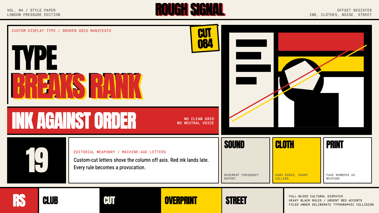 Neville Brody The FaceType mutinies on paper. Cream stock, black rules, urgent red overprint, broke…文字在纸上叛变:奶油纸、黑粗线、急促红色套印和破碎网格。
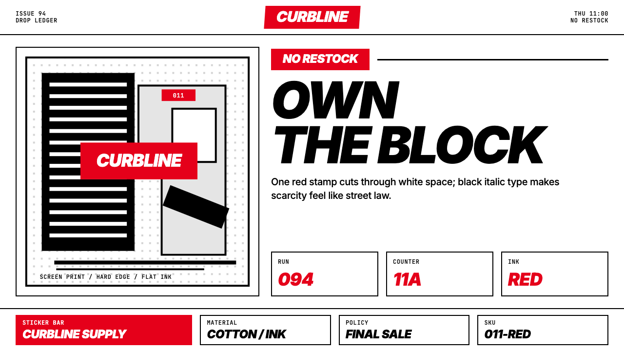 Streetwear (Supreme red)Militant minimalism. A single red box, white field, and black italic grid do…极端克制:红色方块、白底与黑色斜体网格完成一切。
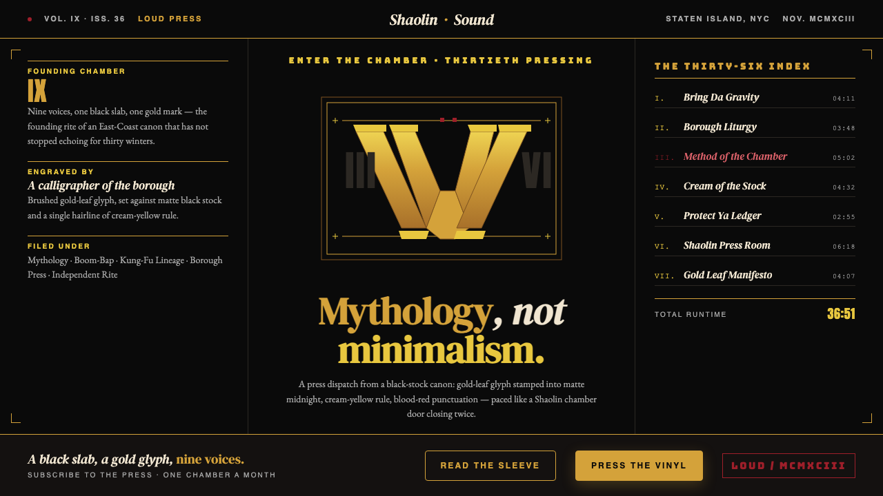 Wu-Tang Clan — 36 ChambersMythology, not minimalism. Gold-leaf glyph on matte black, cream-yellow rule,…神话感而非极简:纯黑底色压上金箔字徽,奶油黄细线,血红点睛,少林功夫片的重量。
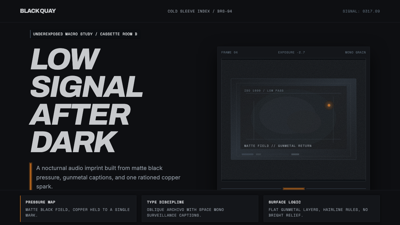 Bristol Trip-HopMenace through minimalism. Near-black grain, gunmetal type, one copper spark.以极简制造威胁感:近黑颗粒、枪金属字体、一点铜火。
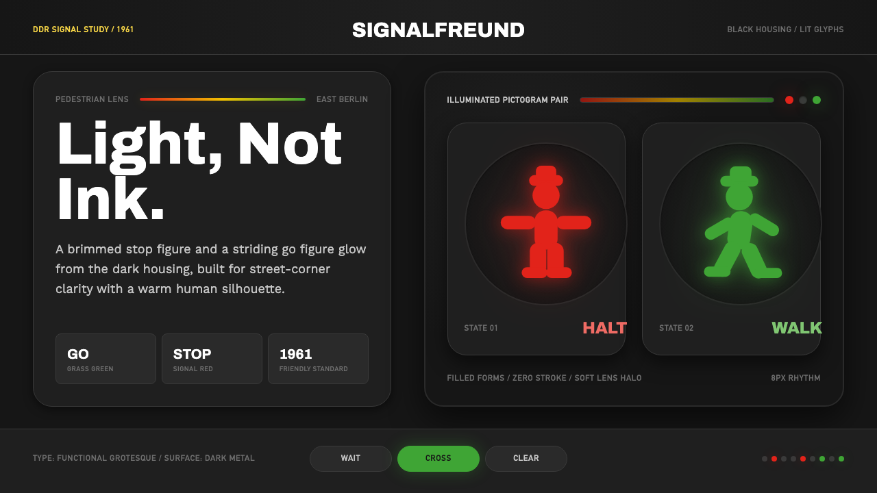 East German AmpelmännchenLight, not ink. Grass-green and signal-red silhouettes glow inside black lens…光不是墨。黑色灯罩中,草绿与信号红剪影发亮。
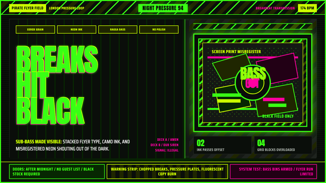 Jungle / Drum & BassRaw rave voltage. Neon green Anton, camo strips, and xerox grain hit black.粗粝锐舞电压。霓虹绿窄体字、迷彩警示条与复印颗粒压上黑底。