What is Tokyo Metro Signage?什么是 Tokyo Metro Signage?
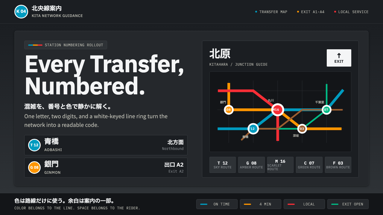
Tokyo Metro Signage turns transit chaos into code — charcoal panels, white-keyed color rings, and calm bilingual grids for the world's busiest subway.东京地铁导视系统把交通的混乱化为编码——炭灰面板、白边色环与冷静的双语网格,为全球最繁忙的地铁而生。
Tokyo Metro Signage in briefTokyo Metro Signage 速览
Tokyo Metro Signage is the wayfinding grammar of Tokyo's subway network, unified system-wide by the 2004 station-numbering rollout that gave every line a color and every station along it a letter-and-number code. The style captures the specific visual world of that system: a dark charcoal illuminated sign panel carrying white-keyed colored rings, each holding one Latin letter and one number, alongside crisp bilingual type stacking kanji above romaji.东京地铁导视系统是东京地铁网络的指路语言,由 2004 年推行的全网车站编号体系统一起来——每条线路被赋予一种颜色,沿线每个车站都获得一个字母加数字的编码。这种风格捕捉的正是这套体系特有的视觉世界:一块深炭灰色的灯箱指示牌,承载着白边彩色圆环,每个环里嵌着一个拉丁字母与一个数字,配以汉字压罗马字的清晰双语排版。
The overall mood is systematic, dense, and calm rather than decorative. A strict modular grid governs every sign, generous negative space keeps individual elements legible even at a glance from a moving train or a crowded platform, and signal-clear pictograms handle wayfinding tasks that text alone would make too slow to parse in a network of this scale and speed.整体气质是系统的、密集的,却是冷静的,而非装饰性的。严格的模数网格支配着每一块指示牌,充裕的留白让每个元素即便在飞驰的列车上或拥挤的站台上一瞥即能辨读,信号般清晰的象形图承担着若单靠文字就会因这一规模与速度而变得难以解析的指路任务。
Crucially, there is no ornament anywhere in this system — every visual form exists because it encodes information. Color belongs exclusively to the subway lines themselves (Tozai blue, Ginza orange, Marunouchi scarlet, and so on), never applied simply because it looks appealing. This is a style built entirely around the discipline of taming genuine urban complexity into something a first-time visitor can navigate at speed.关键在于,这套系统中没有任何一处装饰——每一种视觉形态之所以存在,都是因为它承载着信息。颜色只属于地铁线路本身(东西线的天蓝、银座线的橙、丸之内线的猩红等等),绝不会仅仅因为好看而被使用。这是一种完全围绕着「把真实的城市复杂性驯服成初来乍到者也能快速导航之物」这一自律而建立的风格。
See the Tokyo Metro Signage design system查看 Tokyo Metro Signage 完整设计系统
Where does Tokyo Metro Signage come from?Tokyo Metro Signage 从何而来?
The style emerged from a specific, dated intervention: Tokyo Metro's 2004 station-numbering rollout, introduced to make an increasingly complex, multi-operator subway network navigable for the growing number of international visitors and residents unfamiliar with kanji-only station names. Before this rollout, wayfinding relied far more heavily on written Japanese station names alone, which created real barriers for non-Japanese-literate riders navigating one of the densest urban rail networks in the world.这种风格源自一次具体的、有明确年代的改革:东京地铁 2004 年推行的车站编号体系,其目的是让一个日益复杂、由多家运营商共同运营的地铁网络,对于越来越多不熟悉纯汉字站名的国际访客与居民而言变得可以导航。在这次改革之前,指路很大程度上依赖单纯的日文站名书写,这为不识日文的乘客在这个全球最密集的城市轨道网络之一中导航造成了真实的障碍。
Tokyo Metro's in-house design office developed the codified system of line colors, station numbering, and panel layout that defines the style, working within the broader context of Japan's postwar public design tradition — a tradition that treats infrastructure signage as a serious design discipline rather than an afterthought bolted onto architecture.东京地铁的内部设计部门开发出了定义这种风格的线路颜色、车站编号与面板布局的成文体系,其工作置于日本战后公共设计传统的更广阔背景之下——这一传统把基础设施导视当作一门严肃的设计学科,而非附加在建筑上的事后补丁。
The typographic backbone of the system draws on the legacy of Adrian Frutiger, the Swiss type designer whose transit and wayfinding typefaces (developed for contexts like the Paris Charles de Gaulle Airport and other transit systems) established international conventions for legible, humanist sans-serif letterforms under difficult reading conditions — distance, motion, low light. Japan's own Shin Go type team developed the specific bilingual type pairing, coordinating a Japanese gothic typeface with Latin lettering so that kanji and romaji could sit together in one coherent visual rhythm rather than reading as two unrelated systems forced onto the same sign.这套系统的字体骨架,承袭自瑞士字体设计师阿德里安·弗鲁提格的遗产——他为巴黎戴高乐机场等交通场景开发的交通与导视字体,确立了在距离、运动、低照度等困难阅读条件下保持清晰易读的人文主义无衬线字形的国际惯例。日本自己的「新黑体」字体团队则开发出这套特定的双语字体搭配,将日文黑体与拉丁字母协调统一,使汉字与罗马字能够并置在同一套连贯的视觉节奏中,而非读来像是被强行拼凑在同一块指示牌上的两套无关系统。
This body of work sits within the broader lineage of the International Typographic Style — the mid-century Swiss tradition of grid-based, systematic graphic design — applied specifically to the discipline of systematic transit wayfinding, a field where Tokyo Metro's 2004 system is now widely studied as a benchmark for how a genuinely complex network can be made legible through color-coding and modular consistency rather than more signage volume.这批作品置身于国际主义字体风格——二十世纪中叶瑞士那套基于网格的系统化平面设计传统——的更广泛脉络之中,并被具体应用于系统化交通导视这一领域,东京地铁 2004 年的体系如今被广泛研究,视为如何通过色彩编码与模数一致性、而非增加更多指示牌数量,让一个真正复杂的网络变得清晰易读的标杆。
What defines the Tokyo Metro Signage look?Tokyo Metro Signage 的视觉特征是什么?
Color色彩
Color belongs exclusively to subway lines — Tozai blue, Ginza orange, Marunouchi scarlet, and each other line's assigned hue — applied consistently across every sign, map, and train indicator for that line. No color is ever used decoratively; every hue on a sign carries specific navigational meaning.颜色只属于地铁线路——东西线的天蓝、银座线的橙、丸之内线的猩红,以及其他各线各自被赋予的色相——在该线路的每一块指示牌、地图与列车标识上都保持一致运用。颜色从不作装饰性使用;指示牌上的每一种色相都承载着特定的导航含义。
Charcoal Panel Ground炭灰面板底色
The illuminated sign panel itself is a dark charcoal rather than bright white, chosen so that colored elements and white type stand out with strong contrast under the sign's internal lighting, especially in the low ambient light of underground platforms.灯箱指示牌本身的底色是深炭灰,而非明亮的白色,这样选择是为了让色彩元素与白色文字在指示牌的内部照明下、尤其是在地下站台低环境光线中,能以强烈对比凸显出来。
White-Keyed Rings白边色环
Station and line codes are held inside circular rings outlined in white, each ring filled with the line's assigned color and containing one Latin letter and one number. This ring form is the system's single most recognizable unit, repeated with total consistency across the network.车站与线路编码被置于以白色勾边的圆环之中,每个圆环填充该线路专属的颜色,内含一个拉丁字母与一个数字。这个圆环造型是整套系统中最具辨识度的单元,在全网以完全一致的方式反复出现。
Bilingual Type Stacking双语叠排字体
Kanji station names sit stacked directly above romaji transliterations, both set in complementary, carefully paired typefaces so the two scripts read as one coordinated unit rather than a translation awkwardly appended below the 'real' text.汉字站名直接叠排在罗马字音译之上,两者都采用相互搭配、经过精心配对的字体,使两种文字读来像是一套协调统一的单元,而非附加在「真正」文字下方、显得别扭的翻译。
Modular Grid Discipline模数网格纪律
Every sign, regardless of how much information it must carry, is built on a strict underlying grid that governs spacing, alignment, and proportion. This consistency is what allows a rider to parse a new, unfamiliar sign instantly, because its structure matches every other sign in the network.无论一块指示牌需要承载多少信息,都建立在一套严格的底层网格之上,支配着间距、对齐与比例。正是这种一致性,让乘客能够瞬间读懂一块从未见过的新指示牌,因为它的结构与网络中的每一块指示牌都相同。
Signal-Clear Pictograms信号般清晰的象形图
Pictograms for exits, transfers, and facilities are reduced to their simplest legible form, avoiding any illustrative detail that would slow recognition. Their role is purely functional signaling, read in the fraction of a second a passing rider has to register them.出口、换乘与设施的象形图被简化至最简洁可辨读的形态,避免任何会拖慢识别速度的插画式细节。它们的作用纯粹是功能性的信号传递,要在匆匆而过的乘客能够辨认的那一瞬间被读懂。
Generous Negative Space充裕的留白
Despite carrying dense information, each sign leaves deliberate breathing room around its elements rather than crowding them together. This space is what keeps a system carrying this much data from tipping into visual noise.尽管承载着密集的信息,每一块指示牌仍在其元素周围刻意留出呼吸空间,而非把它们挤在一起。正是这份留白,让承载如此大量数据的系统不至于沦为视觉噪音。
See the Tokyo Metro Signage design system查看 Tokyo Metro Signage 完整设计系统
Who shaped Tokyo Metro Signage?谁塑造了 Tokyo Metro Signage?
The in-house design team responsible for developing and maintaining the 2004 station-numbering and signage system, working within Japan's broader tradition of treating public infrastructure design as a serious, systematized discipline rather than an incidental afterthought.负责开发并维护2004年车站编号与导视系统的内部设计团队,其工作置身于日本更广泛的传统之中——把公共基础设施设计当作一门严肃、系统化的学科,而非顺带的事后考虑。
The Swiss type designer whose transit and wayfinding typefaces established international conventions for legible humanist sans-serif letterforms under difficult reading conditions — distance, motion, low light — providing the typographic lineage that Tokyo Metro's signage system draws on.这位瑞士字体设计师所设计的交通与导视字体,确立了在距离、运动、低照度等困难阅读条件下保持清晰易读的人文主义无衬线字形的国际惯例,为东京地铁导视系统提供了字体传承的血脉。
The team responsible for developing the specific bilingual type pairing used across the network, coordinating a Japanese gothic typeface with Latin lettering so kanji and romaji share a single coherent visual rhythm on every sign.负责开发全网所用这套特定双语字体搭配的团队,将日文黑体与拉丁字母协调统一,使汉字与罗马字在每一块指示牌上都共享同一套连贯的视觉节奏。
How do you use Tokyo Metro Signage today?今天怎么用 Tokyo Metro Signage?
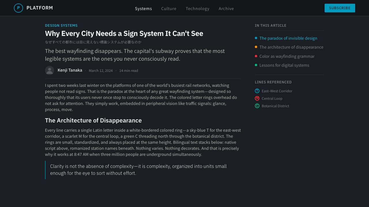
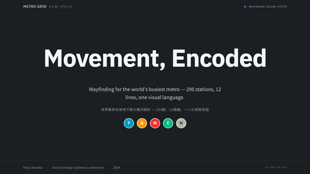
This style rewards content that needs to communicate dense, structured information quickly and calmly rather than persuasively. On a presentation cover slide, a charcoal field with a single white-keyed color ring holding a title initial signals the system's identity immediately — resist adding gradient or texture, which would contradict the flat, signal-clear logic. Content slides work well as strict modular grids, using color rings purely to categorize sections rather than to decorate them.这种风格适合那些需要快速、冷静地传递密集、结构化信息,而非诉诸说服力的内容。在演示文稿封面上,一整块炭灰底面,配一个白边色环承载标题首字母,能立刻传递出这套系统的身份认同——抵住添加渐变或纹理的冲动,那会与这种平面、信号般清晰的逻辑相矛盾。内容页适合以严格的模数网格呈现,用色环纯粹为板块分类,而非装饰它们。
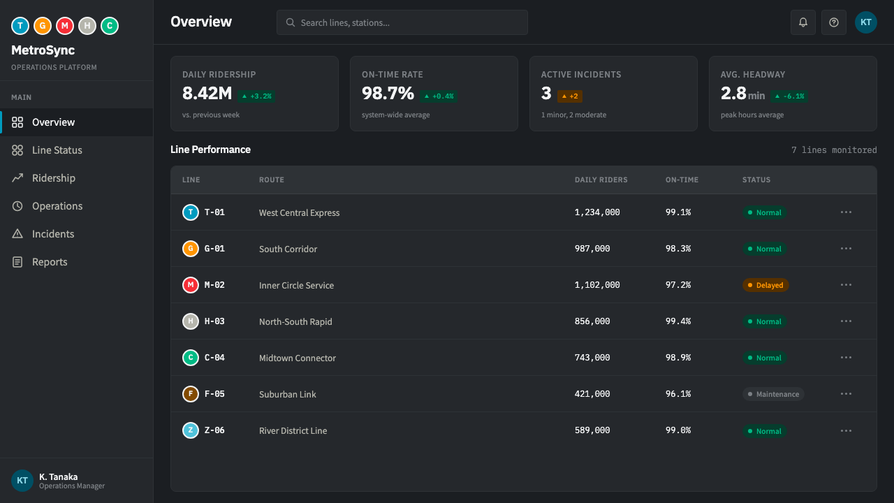
For web interfaces, the style suits navigation-heavy products — transit apps, airport wayfinding tools, large multi-section dashboards, or any product where users need to parse their location within a complex system at a glance. Interactive elements can borrow the white-keyed ring convention for status indicators or category tags, always pairing a color with a specific, consistent meaning rather than using color decoratively.对于网页界面,这种风格适合导航密集型产品——交通应用、机场导视工具、大型多板块仪表板,或任何用户需要一瞥即知自己在复杂系统中所处位置的产品。交互元素可以借用白边色环的惯例来做状态指示或分类标签,始终让一种颜色对应一个具体、一致的含义,而非装饰性地使用颜色。
In editorial and marketing contexts, the style suits infographic-style content, transit or urban-planning journalism, and any feature that benefits from a systematic, trustworthy tone. A pull-quote or key-figure callout can be set inside a ring-and-panel treatment echoing the station-code convention, giving the number a sense of official, verified weight.在编辑与营销语境中,这种风格适合信息图式的内容、交通或城市规划类新闻报道,以及任何受益于系统化、可信赖语气的专题内容。引言段落或关键数据可以放进呼应车站编码惯例的圆环加面板处理之中,赋予这个数字一种官方、经过核实的分量感。
The style struggles in contexts that want to feel warm, playful, or emotionally expressive — its entire visual argument is built on systematic restraint, and adding decorative color or looser typography undermines the sense of engineered calm that makes it legible under pressure. Content with a single dominant hero image should keep that imagery secondary to the grid structure, since the style's strength lies in organizing many small elements, not showcasing one large one.这种风格在需要显得温暖、顽皮或情感外露的场景中会力不从心——它的整套视觉论证都建立在系统化的克制之上,加入装饰性色彩或更松散的字体,会削弱这种让它在压力之下仍能保持可读性的、被工程化的冷静感。若内容有一张主导性的主视觉图片,应让它在网格结构面前居于次要地位,因为这种风格的优势在于组织大量细小元素,而非展示单一的大幅图像。
A common mistake is using the colored rings as generic decorative badges without assigning each color a consistent, specific meaning. The entire system depends on color being a reliable code — Tozai is always blue, Ginza is always orange — and breaking that consistency, even for visual variety, undermines the trust the style depends on.一个常见的误区,是把彩色圆环当作泛泛的装饰性徽标使用,而不为每种颜色赋予一致、具体的含义。整套系统都依赖于颜色是一种可靠的编码——东西线永远是天蓝色,银座线永远是橙色——即便是为了追求视觉变化而打破这种一致性,也会削弱这种风格所依赖的那份信任感。
See the Tokyo Metro Signage design system查看 Tokyo Metro Signage 完整设计系统
Tokyo Metro Signage — FAQTokyo Metro Signage · 常见问题
Why does the signage use a dark charcoal panel instead of a bright white background?为什么这套导视系统用深炭灰面板,而非明亮的白色背景?
The dark ground maximizes contrast for the internally illuminated sign panels typical of underground stations, where ambient light is low and signs must be read at a glance by riders in motion. A white ground would reduce the contrast of the colored rings and reflect more glare under platform lighting, making the sign harder rather than easier to read quickly.深色底面为地下车站常见的内部照明指示牌最大化了对比度,在环境光线较暗、乘客需要在移动中一瞥辨读指示牌的场景下尤为关键。白色底面会降低彩色圆环的对比度,在站台照明下反射更多眩光,反而让指示牌变得更难而非更容易被快速读取。
Does every line's color have to be historically accurate, or can it be adapted?每条线路的颜色是否必须与历史准确对应,还是可以自行调整?
For content directly referencing the real Tokyo Metro network, matching the actual assigned line colors preserves authenticity and recognizability. For a more general application of the style's principles to an unrelated product, the specific hues can be adapted, but the underlying rule should be preserved: once a color is assigned to a category, it must be used consistently for that category everywhere it appears, never varied for decorative reasons.对于直接引用真实东京地铁网络的内容而言,采用实际指定的线路颜色能保持真实性与可辨识度。对于将这种风格的原则更泛化地应用于一个无关产品的场景,具体色相可以调整,但底层规则应当保留:一旦一种颜色被赋予某个类别,就必须在其出现的每一处都保持一致使用,绝不因装饰目的而变化。
How does this style differ from generic Swiss International Typographic Style?这种风格与泛泛的瑞士国际主义字体风格有何不同?
Both share a grid-based, systematic foundation, but Tokyo Metro Signage adds two specific layers Swiss Style does not inherently require: a bilingual typographic pairing coordinating two entirely different writing systems, and a strict color-to-category coding system tied to a real, navigable transit network rather than an abstract compositional device. The style is Swiss discipline applied to a very specific, high-stakes wayfinding problem.两者都共享基于网格的系统化基础,但东京地铁导视在此之上增加了瑞士风格本身并不必然要求的两个具体层面:一套协调两种完全不同书写系统的双语字体搭配,以及一套与真实、可导航的交通网络绑定、而非抽象构图手法的严格颜色对类别编码体系。这种风格是瑞士式的自律,被应用于一个非常具体、事关重大的导视问题。
Can this style work for a product with only a small amount of content, or does it need real density to succeed?这种风格能否用于内容量很少的产品,还是必须有真正的密集内容才能奏效?
The style's grid and ring conventions can scale down to a small amount of content without losing coherence, since the underlying logic — consistent color coding, modular alignment — works at any density. What matters is preserving the systematic rules even at small scale; a single page using the ring convention just once should still follow the same proportion and spacing logic a dense transit map would use.即便内容量很少,这种风格的网格与圆环惯例也能相应缩小规模而不失连贯性,因为其底层逻辑——一致的颜色编码、模数化对齐——在任何密度下都适用。关键在于即便在小规模下也要保留这套系统性规则;一个只用了一次色环惯例的单页面,仍应遵循与一张密集交通地图相同的比例与间距逻辑。
Related design styles相关设计风格
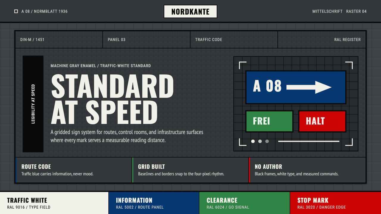 DIN 1451 SignageAuthorless and exact. Enamel gray grid, traffic-white DIN type, and RAL signa…无作者的精确感:珐琅灰网格、交通白字与RAL色条。
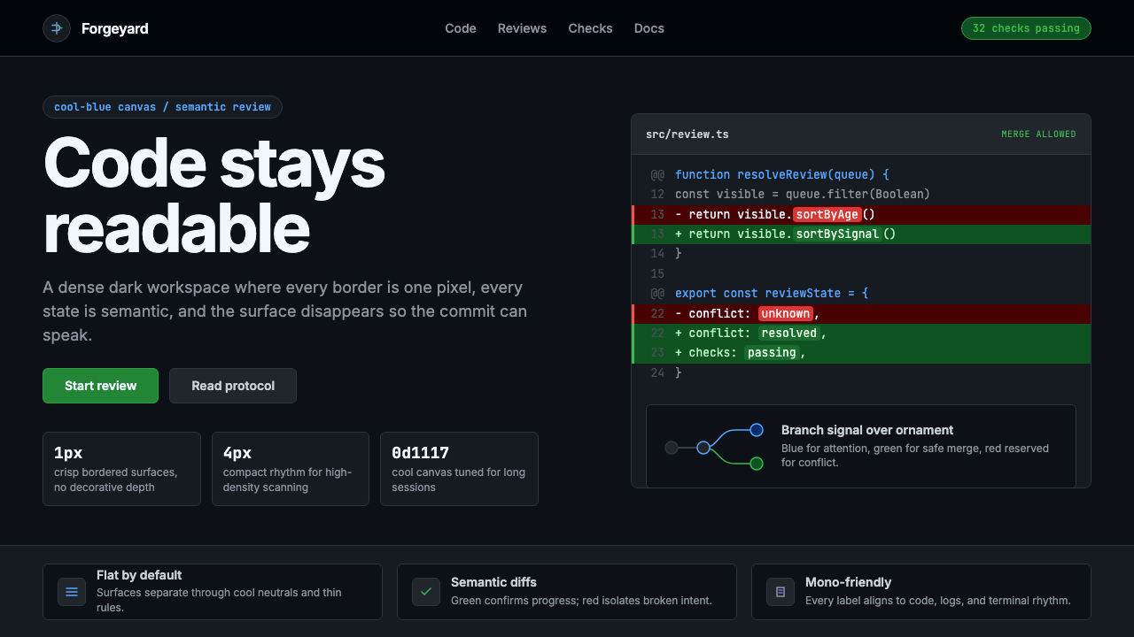 GitHub DarkCode-first darkness. Cool-blue canvas, 1px borders, green/red diff lines.代码优先的暗色:冷蓝画布、1px边框、绿红diff线。
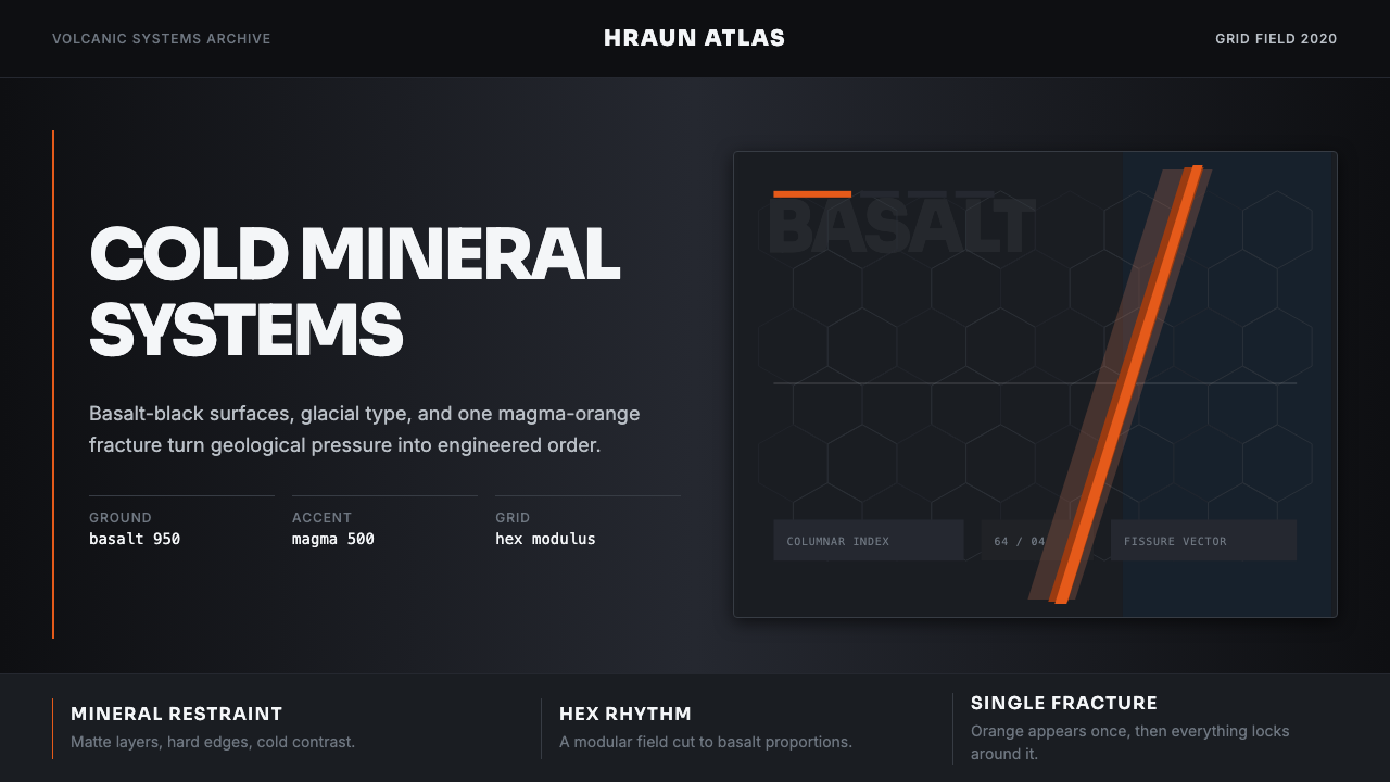 Icelandic Basalt VolcanoCold geology, engineered. Basalt black, Sora type, and one magma fissure hold…冷硬地质感:玄武黑、Sora 字体与岩浆裂缝锁定网格。
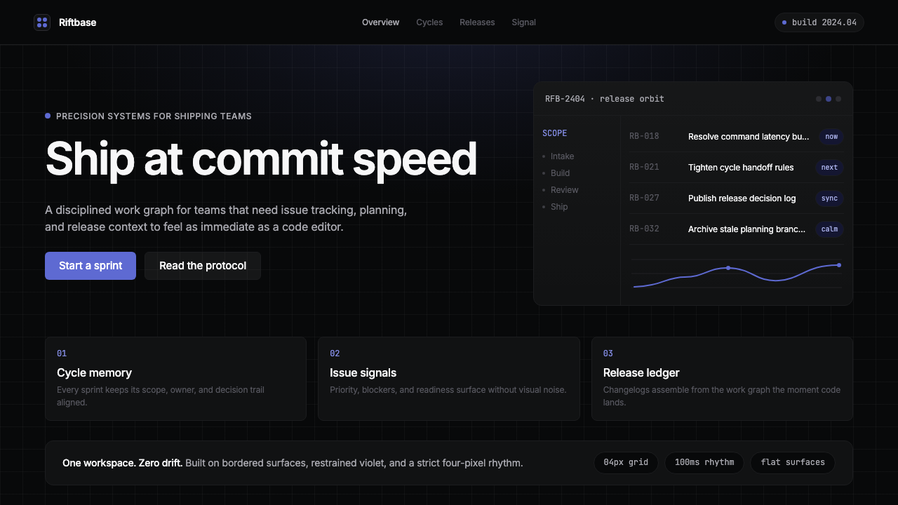 Linear 2024Precision down to the millisecond. Near-black, indigo-violet accents, Inter D…开发者工具美学的标杆:近乎纯黑、克制靛紫点缀、Inter Display 字体…
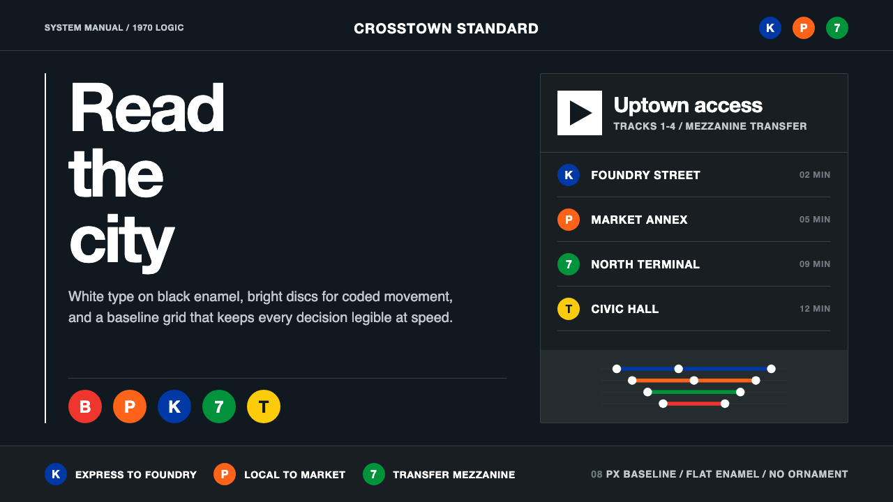 NYC Transit HelveticaOrder made visible. White type, black enamel, route discs, and a grid that ne…秩序一眼可见:黑底白字、线路圆盘与永不弯折的网格。
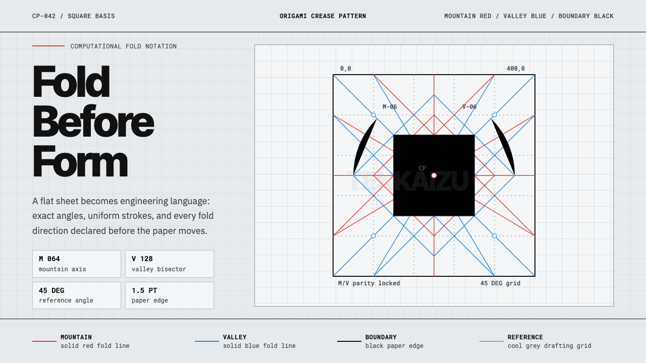 Origami Crease PatternPrecision is the brand. Red and blue fold lines map a cool grey drafting latt…精密就是品牌。红蓝折线铺成冷灰制图网格。