What is Kanjōzoku Loop Racer?什么是 Kanjōzoku Loop Racer?
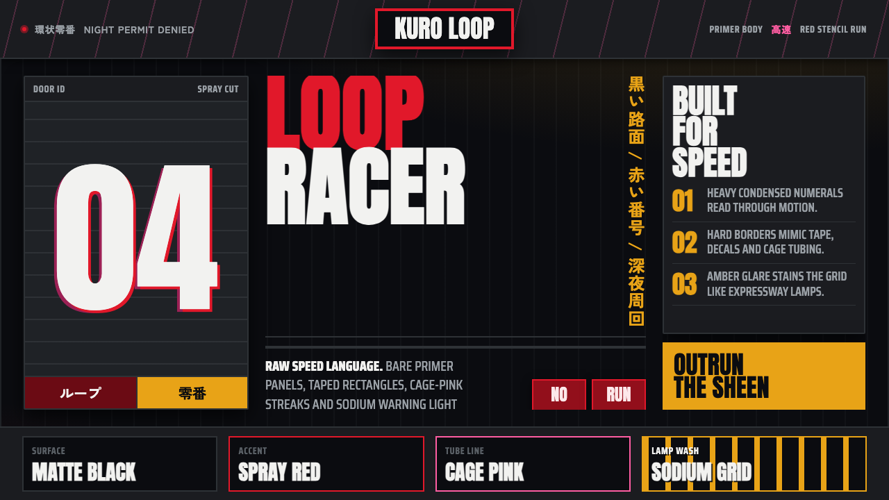
Kanjōzoku Loop Racer treats speed as contraband — hot spray-red numbers slicing black tarmac under the amber glare of expressway sodium lamps.環状族竞速者把速度当作违禁品——火红的喷漆数字划破黑色沥青,在高速路钠灯的琥珀光晕下疾驰。
Kanjōzoku Loop Racer in briefKanjōzoku Loop Racer 速览
Kanjōzoku Loop Racer is the design language of Osaka's outlaw loop racers — anonymous crews who run stripped-down Honda Civics around the Hanshin Expressway's ring road at night, chasing lap times rather than any officially sanctioned motorsport recognition. The style translates that illicit nighttime world directly: its ground is black tarmac lit by sodium glare rather than any conventional page background, and its texture is built from hand-sprayed door numbers, taped-off body panels, and powder-coated roll cages rather than factory-clean automotive graphics.環状族竞速者是大阪飙车手的设计语言——一群匿名的车队,深夜驾着裸车身改装的本田 Civic,在阪神高速的环状线上一圈圈追逐圈速,而非追求任何官方认可的赛车荣誉。这种风格直接转译了这个违禁的夜间世界:它的底色是被钠灯照亮的黑色沥青,而非任何常规的页面背景;它的肌理由手喷的车门号码、贴胶遮挡的车身板件与粉末涂装的防滚架构成,而非原厂洁净的汽车涂装图形。
Everything in this system reads as condensed and shouted rather than composed and calm. Heavy, grotesque Latin numerals — the kind hand-painted or stenciled onto a car door — collide with Japanese gothic lettering used for crew tags, producing a bilingual density that mirrors the actual visual clutter of a tuner car's bodywork. Hot spray-red cuts across a near-black ground, while amber warning-light tones bleed in at the edges, echoing the actual sodium lighting of an expressway at night.这套系统中的一切读来都是被压缩、被吼出来的,而非从容构图。厚重、粗犷的拉丁数字——那种手绘或用模板喷涂在车门上的字体——与用于车队名的日文黑体撞在一起,产生出一种呼应着改装车车身实际视觉杂乱感的双语密度。火红的喷漆划过近乎全黑的底色,琥珀色的警示光调在边缘渗入画面,呼应着夜间高速公路真实的钠灯照明。
Crucially, this is a style built on the absence of polish. There is no factory sheen, no glossy paint rendering, no clean corporate motorsport branding — just primer texture, overspray edges, and a sense of motion blur, because the source culture itself was defined by improvised, garage-level modification rather than manufacturer-sanctioned racing.关键在于,这是一种建立在「无光泽」之上的风格。没有原厂的光泽,没有光滑的涂装渲染,没有整洁的官方赛车品牌形象——只有底漆的质感、过喷的边缘,以及一种动态模糊感,因为这一源文化本身就是由即兴的、车库级别的改装所定义的,而非厂商认可的正式赛车运动。
See the Kanjōzoku Loop Racer design system查看 Kanjōzoku Loop Racer 完整设计系统
Where does Kanjōzoku Loop Racer come from?Kanjōzoku Loop Racer 从何而来?
The style emerges from a specific street-racing subculture centered on the Hanshin Expressway in Osaka, active roughly from the 1990s through the 2010s. Kanjōzoku, literally 'loop tribe,' refers to crews who circled the expressway's ring road — the 'kanjō' loop — through the night, developing a distinct driving and modification culture separate from both legal circuit racing and the more widely known mountain-pass drift scene.这种风格源自以大阪阪神高速为中心的一支特定街头竞速亚文化,大致活跃于1990年代至2010年代。「環状族」,字面意为「环状部落」,指的是那些深夜绕着高速公路环状线——即「環状」(kanjō)环线——一圈圈行驶的车队,发展出一套与合法赛道竞速、以及更为人知的山路飘移文化都截然不同的驾驶与改装文化。
The vehicles at the center of this culture were overwhelmingly Honda's EF, EG, and EK-generation Civics, chosen for their light weight and tunability rather than raw factory power. Crews stripped interiors, added powder-coated roll cages for structural rigidity, and applied bodywork modifications — extended fender flares, aggressive front lips — using techniques closer to garage fabrication than professional bodyshop finishing, which is why taped-off panels and hand-sprayed numbers became part of the aesthetic rather than a flaw to be hidden.这一文化核心的车辆几乎清一色是本田 EF、EG、EK 世代的 Civic,之所以被选中,是因为其轻量化与可改装性,而非原厂的蛮力输出。车队拆除内饰,加装粉末涂装的防滚架以增强车身刚性,并施加车身改装——外扩的轮拱、激进的前唇——所用的手法更接近车库自行加工,而非专业车身厂的精修,这也是为何贴胶遮挡的板件与手喷号码成为了这种美学的一部分,而非需要被掩饰的瑕疵。
One of the most recognized names associated with the scene is No Good Racing, a crew whose cars and visual identity became emblematic of the broader kanjōzoku look — bold hand-applied numerals, deliberately anonymous or coded crew tags, and a general resistance to the glossy sponsor-branding conventions of professional motorsport.与这一场景关联最广为人知的名号之一是 No Good Racing,这支车队的车辆与视觉识别成为了更广泛的環状族形象的代表——大胆手绘的数字、刻意匿名或带密码性质的车队标记,以及对职业赛车运动那种光鲜赞助商品牌惯例的普遍抵触。
This subculture sits within the broader lineage of Japanese street-racing culture and the Honda tuner scene specifically — a movement built on modifying affordable, mass-produced cars into highly specific, community-legible machines, operating largely outside official sanction and documented mostly through amateur photography and word of mouth rather than official media coverage.这一亚文化置身于日本街头竞速文化、尤其是本田改装车场景的更广泛脉络之中——这是一场建立在把平价量产车改装成高度特定化、社群内部可辨识的机器之上的运动,大体游离于官方认可之外,主要通过业余摄影与口耳相传记录,而非官方媒体报道。
What defines the Kanjōzoku Loop Racer look?Kanjōzoku Loop Racer 的视觉特征是什么?
Color色彩
The ground is a near-black tarmac tone, punctuated by hot spray-red for numerals and accents, with amber warning-light tones bleeding in from the edges. Colors are used at high contrast and in flat, unblended fields, mimicking spray paint rather than printed or digital gradients.底色是近乎全黑的沥青色调,以火红喷漆点缀数字与强调元素,琥珀色的警示光调从边缘渗入。色彩以高对比、平涂的方式使用,不做混合,模拟喷漆质感,而非印刷或数字渐变。
Hand-Sprayed Numerals手喷数字
Door numbers and identifying marks are rendered as if hand-sprayed or stencil-applied rather than precision-cut vinyl, carrying slightly irregular edges and overspray texture. This roughness is central to the style's illicit, garage-level character.车门号码与识别标记呈现出仿佛手工喷涂或模板喷印的质感,而非精密切割的贴纸,边缘略带不规则,带着过喷的肌理。这种粗糙感是这种风格违禁、车库级别气质的核心。
Bilingual Typography Collision双语字体碰撞
Heavy grotesque Latin numerals collide directly with Japanese gothic crew-tag lettering, with no attempt to harmonize the two systems into a single unified type family. This deliberate clash mirrors the actual layered, improvised graphics found on a real tuner car's bodywork.厚重粗犷的拉丁数字直接与日文黑体的车队标记文字相碰撞,不试图将两套文字系统调和成统一的字体家族。这种刻意的冲撞感,呼应着真实改装车车身上层层叠叠、即兴而成的图形。
Taped-Off Panels贴胶遮挡板件
Masked-off sections with visible tape-edge lines reference the actual process of hand-painting or hand-spraying a car panel, where masking tape protects adjacent surfaces. This visible process trace is treated as texture rather than something to be cleaned up.带有可见胶带边缘线的遮挡区域,呼应着手工喷涂车身板件时的实际工序——遮蔽胶带用于保护相邻表面。这种可见的工序痕迹被当作一种肌理来处理,而非需要清理干净的瑕疵。
Powder-Coated Cage Texture粉末涂装防滚架肌理
Structural elements like roll cages carry a matte, slightly textured powder-coat finish rather than glossy paint, referencing the actual protective coating applied to safety equipment inside a stripped-down tuner car.防滚架等结构元素带有哑光、略带质感的粉末涂装饰面,而非光滑涂料,呼应着裸车身改装车内部安全设备实际所用的防护涂层。
Sodium Glare Lighting钠灯光晕
An amber-orange glow, evoking the sodium-vapor lamps used on expressway lighting, bleeds into edges and corners of the composition rather than being distributed evenly. This uneven, source-specific lighting is what gives the near-black ground its sense of a real nighttime environment.一种令人联想到高速公路钠气灯照明的琥珀橙色光晕,从构图的边缘与角落渗入,而非均匀分布。这种不均匀、有具体光源指向的照明,正是让近黑底色具备真实夜间环境感的关键。
Anti-Polish Texture反光泽肌理
Surfaces deliberately carry primer texture, overspray edges, and motion-blur suggestion rather than the clean, reflective rendering typical of professional automotive branding. The absence of gloss is a core value statement, not an omission.表面刻意带着底漆质感、过喷边缘,以及动态模糊的暗示,而非职业汽车品牌形象常见的那种干净、反光的渲染。光泽的缺席是一种核心的价值宣言,而非疏漏。
See the Kanjōzoku Loop Racer design system查看 Kanjōzoku Loop Racer 完整设计系统
Who shaped Kanjōzoku Loop Racer?谁塑造了 Kanjōzoku Loop Racer?
One of the most recognized crews associated with the kanjōzoku scene, No Good Racing's cars and visual identity — bold hand-applied numerals, coded crew tags, resistance to glossy sponsor branding — became emblematic of the broader loop-racing look documented in amateur photography and enthusiast media.No Good Racing 是与環状族场景关联最广为人知的车队之一,其车辆与视觉识别——大胆手绘的数字、带密码性质的车队标记、对光鲜赞助商品牌的抵触——成为了业余摄影与爱好者媒体所记录的更广泛環状竞速形象的代表。
How do you use Kanjōzoku Loop Racer today?今天怎么用 Kanjōzoku Loop Racer?
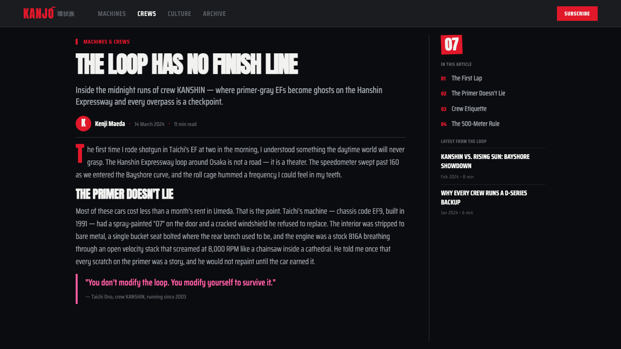
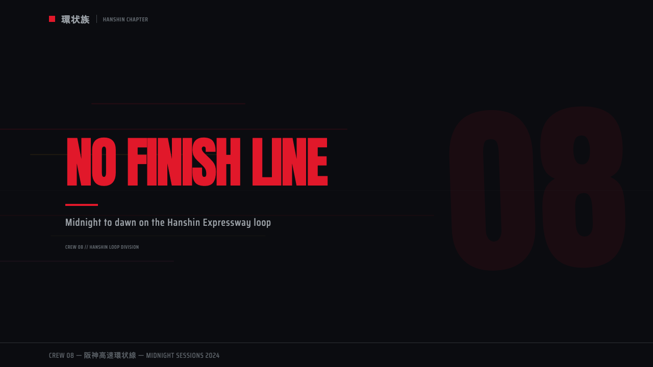
This style rewards content that wants to feel raw, illicit, and built for speed rather than polished or corporate. On a presentation cover slide, a near-black tarmac field with a single hot-red hand-sprayed-style numeral or crew tag communicates the mood immediately — resist adding gloss, gradients, or clean vector precision, which would contradict the garage-built logic. Content slides should use the bilingual type collision sparingly, reserving the boldest numerals for section markers rather than body text.这种风格适合那些希望显得生猛、违禁、为速度而生,而非光鲜或官方的内容。在演示文稿封面上,一整块近乎全黑的沥青底面,配一个火红、手喷风格的数字或车队标记,能立刻传递出这份气质——抵住添加光泽、渐变或精准矢量图形的冲动,那会与车库改装的逻辑相矛盾。内容页应节制地使用双语字体碰撞,把最厚重的数字留给板块标记,而非正文文字。
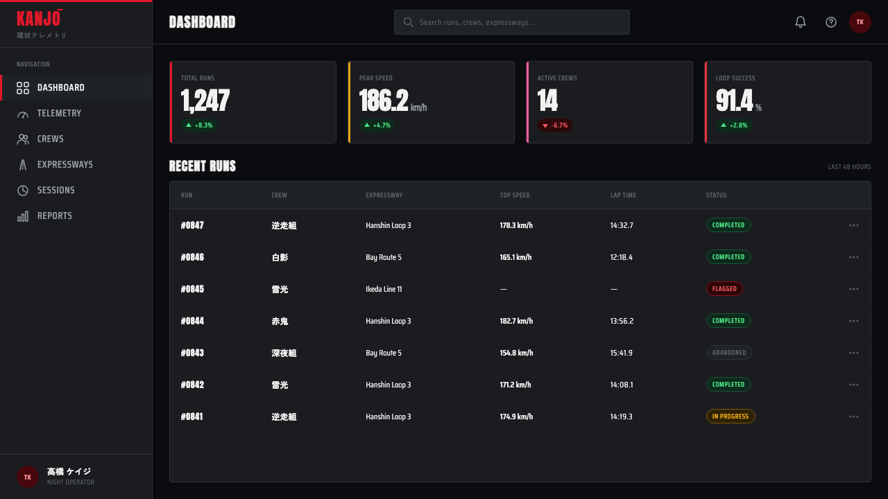
For web interfaces, the style suits automotive enthusiast platforms, night-life or event ticketing products, and any brand aiming for an edgy, underground energy rather than mainstream polish. Buttons and interactive elements can borrow the taped-off panel look — a masked rectangular field with a hard edge — while keeping the overall palette anchored in near-black with red and amber used only for the most important actions.对于网页界面,这种风格适合汽车爱好者平台、夜生活或活动票务类产品,以及任何追求边缘、地下能量而非主流光鲜感的品牌。按钮与交互元素可以借用贴胶遮挡的观感——一块带硬边的遮蔽矩形区域——同时让整体色板锚定在近黑色,红色与琥珀色只用于最重要的操作。
In editorial and marketing contexts, the style suits features on car culture, underground subcultures, or nighttime urban photography. A pull-quote can be rendered in the heavy grotesque numeral style against the black ground, echoing a stenciled door number rather than a conventional typographic callout.在编辑与营销语境中,这种风格适合汽车文化、地下亚文化或夜间城市摄影相关的专题内容。引言段落可以用厚重粗犷的数字风格呈现在黑色底面上,呼应着模板喷涂的车门号码,而非常规的字体引用框。
The style struggles in contexts that need to feel safe, official, or broadly welcoming — its entire visual argument depends on an outlaw, unsanctioned energy, and softening it into a clean, corporate motorsport look erases the specific illicit charge that makes it recognizable. Content-dense interfaces should use the style's texture sparingly, since heavy overspray and taped-edge effects can reduce legibility if applied to large blocks of text.这种风格在需要显得安全、官方或普遍亲和的场景中会力不从心——它的整套视觉论证都依赖于一种不法、未经认可的能量,若把它软化成干净、官方的赛车品牌形象,就会抹去让它得以被辨认的那份特有的违禁张力。信息密集的界面应节制使用这种风格的肌理,因为厚重的过喷与贴胶边缘效果若应用在大段文字上,可能降低可读性。
A common mistake is treating this as simply 'red and black racing stripes.' The style's identity comes specifically from the sense of improvised, hand-applied graphics and nighttime sodium lighting — a clean, symmetrical racing-stripe motif without that rough, illicit texture reads as generic motorsport branding rather than kanjōzoku specifically.一个常见的误区,是把这种风格简单理解为「红黑相间的赛车条纹」。这种风格的辨识度恰恰来自那种即兴、手工喷涂的图形感与夜间钠灯照明——一个干净、对称的赛车条纹母题若没有这种粗糙、违禁的肌理,读来只是泛泛的赛车品牌形象,而非確切意义上的環状族。
See the Kanjōzoku Loop Racer design system查看 Kanjōzoku Loop Racer 完整设计系统
Kanjōzoku Loop Racer — FAQKanjōzoku Loop Racer · 常见问题
What does 'kanjōzoku' mean, and why does it matter to the style's identity?「環状族」是什么意思?它对这种风格的身份认同为何重要?
Kanjōzoku translates roughly as 'loop tribe' or 'ring-road tribe,' referring to the crews who circled the Hanshin Expressway's ring road at night. The name matters because it grounds the style in a specific, real place and activity rather than a generic 'street racing' theme — the visual references (sodium lighting, expressway tarmac, ring-road geography) are tied to that one location and its actual nighttime conditions.「環状族」大致可译为「环线部落」或「环状道路部落」,指的是那些深夜绕着阪神高速环状线行驶的车队。这个名字之所以重要,是因为它把这种风格扎根于一个具体、真实的地点与活动,而非泛泛的「街头竞速」主题——其视觉参照(钠灯照明、高速公路沥青、环线地理)都紧扣着这一特定地点及其真实的夜间条件。
Why does the style deliberately include rough, imperfect elements like overspray and taped edges?为什么这种风格刻意包含过喷、贴胶边缘这类粗糙、不完美的元素?
Because the actual cars this style references were modified by amateur crews working in garages, not professional bodyshops — the roughness is historically accurate, not a stylistic affectation. Removing that texture in favor of clean, precision-cut graphics would misrepresent the culture's actual visual reality and shift the style toward generic professional motorsport branding instead.因为这种风格所参照的真实车辆,是由在车库里工作的业余车队改装的,而非专业车身厂——这种粗糙感是历史真实的,而非一种风格化的矫饰。若为了追求干净、精密切割的图形而去掉这种肌理,就会歪曲这一文化的真实视觉面貌,反而让这种风格滑向泛泛的职业赛车品牌形象。
How does this style differ from generic motorsport or racing-stripe design?这种风格与泛泛的赛车运动或赛车条纹设计有何不同?
Generic motorsport branding tends toward clean vector graphics, symmetrical racing stripes, and glossy sponsor-logo placement associated with sanctioned professional racing. Kanjōzoku Loop Racer instead centers on hand-applied, asymmetrical, improvised graphics tied to a specific illicit night-racing subculture, with a nighttime sodium-lit palette rather than a bright daytime track environment.泛泛的赛车运动品牌形象往往偏向干净的矢量图形、对称的赛车条纹,以及与认可的职业赛事相关联的光鲜赞助商标位置。而環状族竞速者则聚焦于手工制作、不对称、即兴而成的图形,与一个特定的违禁夜间竞速亚文化紧密相连,色板是夜间钠灯照明,而非明亮的白日赛道环境。
Is this style appropriate for mainstream commercial products?这种风格适合用于主流商业产品吗?
It works best for products that want to signal an edgy, underground, enthusiast-driven identity — automotive culture platforms, night-event branding, subculture media — rather than broadly welcoming consumer products. Applying its rough, illicit texture to a mainstream retail or financial product would likely undercut trust rather than build appeal, since the style's entire value proposition depends on an outlaw energy that most mainstream contexts specifically want to avoid.它最适合那些希望传递边缘、地下、爱好者驱动身份的产品——汽车文化平台、夜间活动品牌、亚文化媒体——而非普遍亲和的消费产品。将这种粗糙、违禁的肌理套用在主流零售或金融产品上,很可能会削弱而非建立信任感,因为这种风格的整套价值主张都依赖于一种大多数主流场景恰恰想要避免的不法能量。
Related design styles相关设计风格
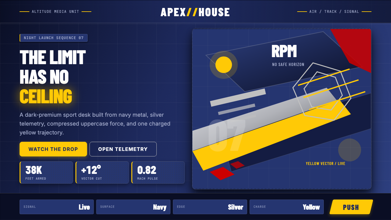 Red Bull Extreme SportsAdrenaline goes corporate. Navy chrome, condensed uppercase, yellow slashes a…肾上腺素也很企业。海军蓝金属面、压缩大写与黄色斜切加速。
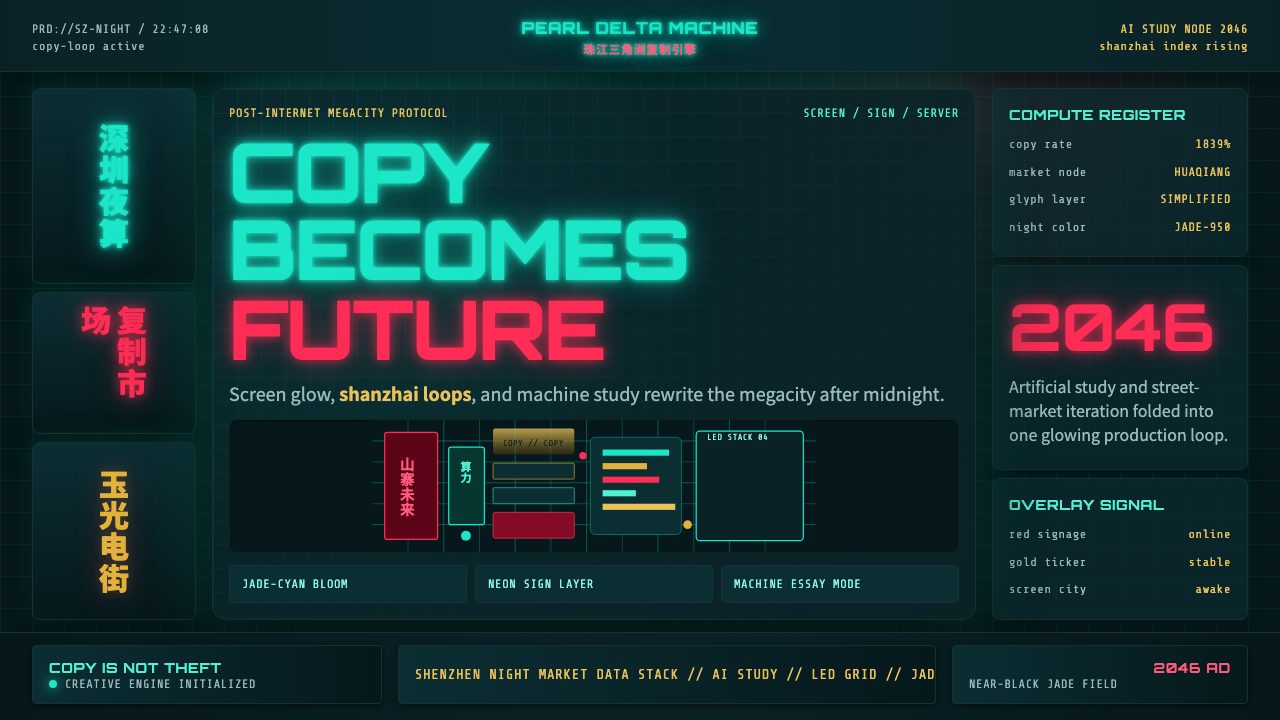 SinofuturismCopy becomes future. Jade-cyan grids, red signage, and Orbitron data stack th…复制成为未来。玉青网格、红色招牌与数据字叠起夜城。
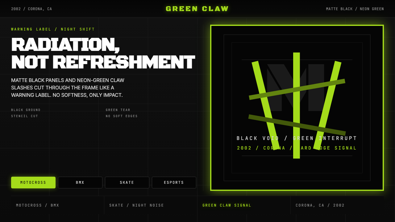 Monster Energy Claw (2002)Aggression, not refreshment. Matte black and neon-green claw slashes cut the…不是清爽,是冲击。哑黑底与霓绿爪痕撕裂画面。
 SHAFT Monogatari TypographyType becomes cinema. Red cuts, black flats, and monumental kanji steer the fr…文字变成电影。红黑平涂与巨字闪切主导画面。
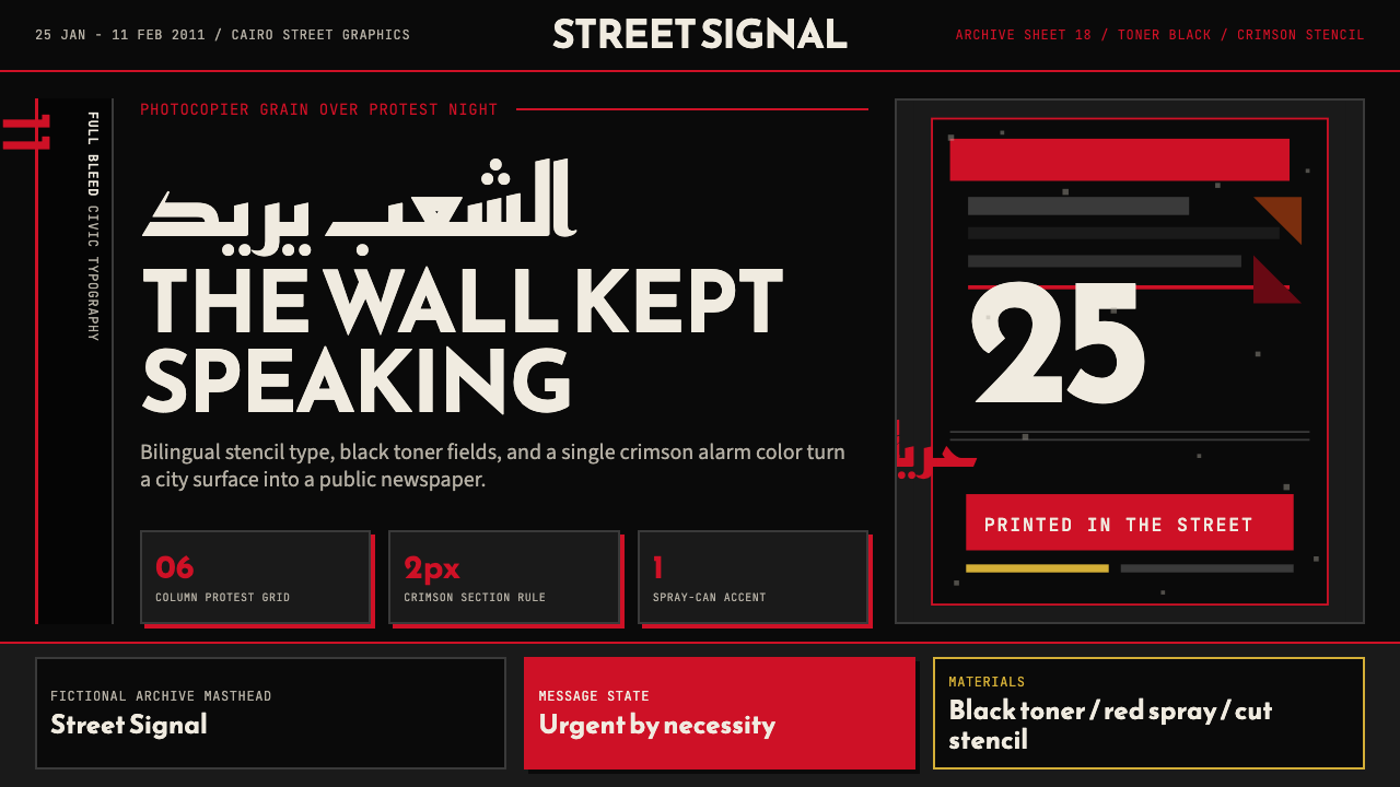 Tahrir Square 2011Civic signal, not polish. Photocopier black and crimson stencils on a hard gr…公民信号,不加修饰。复印黑与猩红模板压进硬网格。
 Banksy Stencil GraffitiProtest is reduced to a cut mark. Anton black on brick cream, one scarlet red…抗议被压成剪影。砖墙奶油底、Anton黑字,一点猩红打断。