What is Briar Pipe & Tobacco?什么是 Briar Pipe & Tobacco?
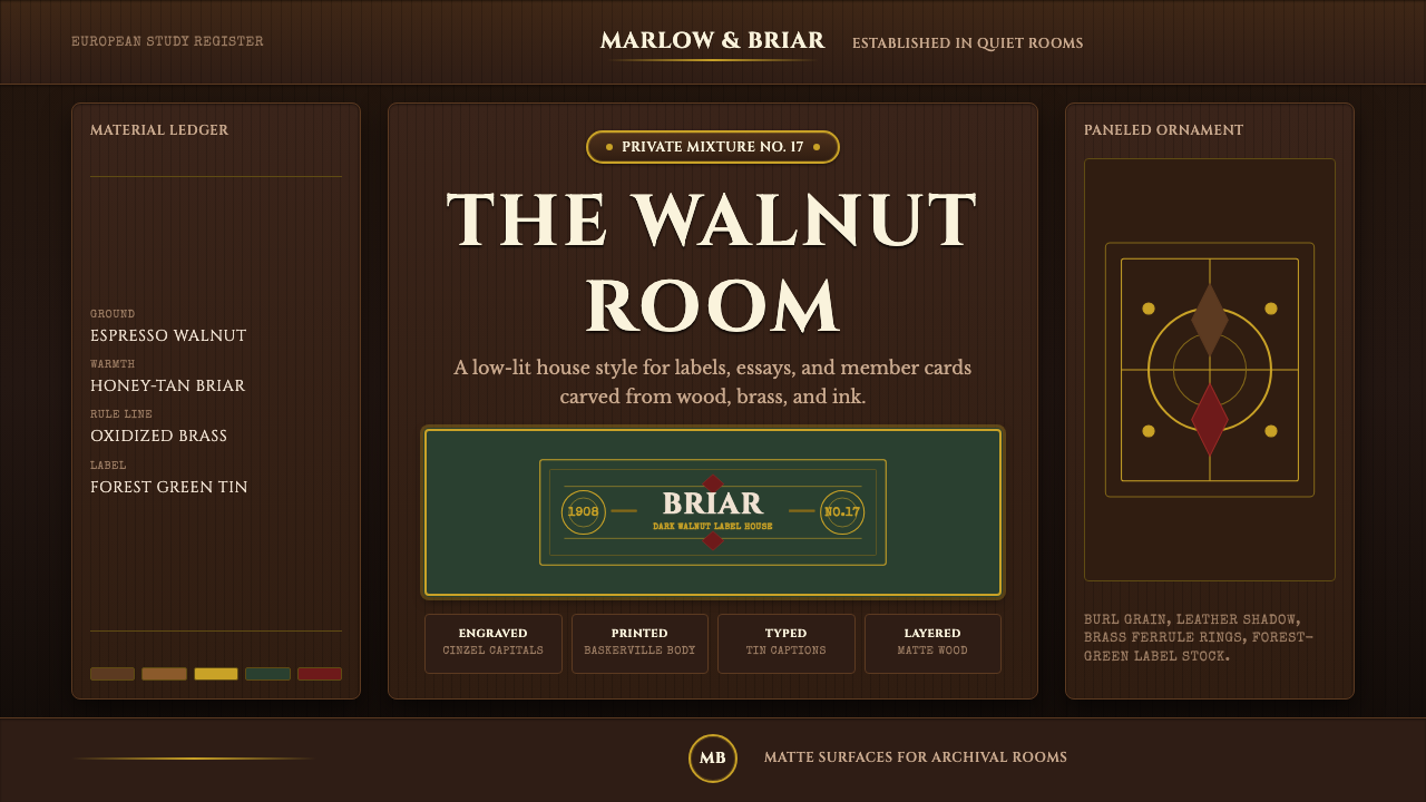
Briar Pipe & Tobacco recreates a gentleman's study in warm gloom — espresso walnut, brass rules, and engraved capitals precisely aged rather than merely dark.石楠烟斗与烟草重现了一间绅士书房的温暖幽暗——浓咖胡桃木、黄铜细线与考究入微的雕刻大写字体。
Briar Pipe & Tobacco in briefBriar Pipe & Tobacco 速览
Briar Pipe & Tobacco is the visual world of an early-twentieth-century gentleman's study — a low-lit room built from dark walnut paneling, an oxblood-stained briar pipe bowl resting on a leather-topped desk, and a shelf lined with lithographed tobacco tins. Unlike styles that use black or near-black as a neutral backdrop, this system builds its entire ground from espresso-brown wood tones, never pale label stock or bright neutral surfaces.石楠烟斗与烟草描绘的是二十世纪初一间绅士书房的视觉世界——低垂灯光下,一间由深胡桃木护墙板构成的房间,一只血石楠染色的烟斗碗搁在皮面书桌上,架上排列着印着石版画标签的烟草锡罐。与那些把黑色或近黑色当作中性背景使用的风格不同,这套系统把整个底色都建立在浓咖色木质之上,绝不使用浅色标签纸或明亮的中性表面。
That wood-based ground is warmed by a small, carefully chosen set of accent materials: honey-tan briar wood, brass ferrules (the metal bands that reinforce a pipe's stem), burgundy leather, and the muted forest-green typical of a vintage tobacco-tin label. Each of these accents references an actual material from the physical object world the style depicts, rather than an arbitrary decorative color choice.这片木质底色由一组经过精心挑选、数量有限的点缀材质来温暖:蜂蜜色的石楠木、黄铜箍环(加固烟斗烟嘴的金属环)、酒红皮革,以及复古烟草锡罐标签上那种沉静的森林绿。每一种点缀都对应着这种风格所描绘的实体物件世界中真实存在的材质,而非随意选定的装饰色。
The overall effect is precision aged rather than simply dark — every surface reads as matte wood or oxidized metal instead of glossy glass, and every typographic choice favors the engraved, hand-finished quality of old tobacco packaging over the bright neutrality of a modern digital interface. This is a system built for content that wants to feel considered, tactile, and unhurried.整体效果是精心考究的陈旧感,而非单纯的昏暗。每一处表面读来都是哑光木头或氧化金属,而非光亮玻璃;每一处字体排印的选择都偏向老式烟草包装那种雕刻感、手工完成的质感,而非现代数字界面那种明亮的中性感。这是一套为「陈旧、考究、可触」的内容而生的体系。
See the Briar Pipe & Tobacco design system查看 Briar Pipe & Tobacco 完整设计系统
Where does Briar Pipe & Tobacco come from?Briar Pipe & Tobacco 从何而来?
The style draws on the material culture of European briar pipe-making and tobacco packaging between roughly 1900 and 1950, a period when smoking a pipe was a widespread, respectable domestic and social ritual across Britain, France, and the Mediterranean briar-growing regions. Briar wood itself — a burl harvested from the tree heath, a shrub native to the Mediterranean — became the dominant material for quality pipe bowls during this era because of its heat resistance and grain, largely replacing earlier materials like clay and meerschaum for everyday use.这种风格取材于大约1900年至1950年间欧洲石楠烟斗制作与烟草包装的物质文化,那一时期,抽烟斗在英国、法国以及地中海石楠产区都是一种普遍而体面的家庭与社交仪式。石楠木本身——采自欧石南这种地中海原生灌木的树瘤——因其耐热性与纹理,在这一时期成为优质烟斗碗的主导材质,很大程度上取代了陶土与海泡石等早期日常用材。
European briar pipe-makers refined the craft of shaping, staining, and fitting pipes with brass or silver ferrules over generations of small workshops, often family-run, concentrated in briar-growing regions of the Mediterranean and pipe-carving centers elsewhere in Europe. Their aesthetic choices — the oxblood stain, the polished bowl, the fitted metal band — were driven by both function and a quiet display of craftsmanship.欧洲的石楠烟斗匠人历经数代小型工坊——往往是家族经营,集中在地中海的石楠产区以及欧洲其他的雕刻中心——打磨出塑形、染色、以及为烟斗装配黄铜或白银箍环的手艺。他们的美学选择——血石楠染色、抛光的烟斗碗、贴合的金属环——既出于功能考量,也是一种低调的匠艺展示。
Alongside the pipes themselves, tobacco-tin lithographers produced the packaging that completed the ritual: printed tins in muted greens, tans, and burgundies, often set with engraved-style serif lettering that echoed the formality of contemporary print advertising. Tobacco blenders, who developed and marketed specific tobacco mixtures, relied on this packaging to communicate a sense of quality and tradition on the shelf.与烟斗本身并行的,是烟草锡罐石版画印刷匠人,他们制作出完成这一仪式所需的包装:以沉静的绿、棕褐与酒红印制的锡罐,常配以雕刻感的衬线字体,呼应着当时印刷广告的那份正式感。研制并营销特定烟草配方的烟草调配师,依赖这些包装在货架上传递品质感与传统感。
Together, these trades produced the broader cultural environment this style distills: the gentleman's study or smoking-room interior as a recognized domestic archetype, and a vintage tobacciana label craft that shaped how consumer goods of the era were expected to look — restrained, engraved, and built to suggest permanence rather than disposability.这些行当共同营造了这种风格所提炼的更广阔的文化环境:绅士书房或吸烟室内景作为一种被公认的家居原型,以及一门塑造了那个时代消费品应有面貌——克制、雕刻感、意在暗示恒久而非一次性——的复古烟草物件工艺。
What defines the Briar Pipe & Tobacco look?Briar Pipe & Tobacco 的视觉特征是什么?
Color色彩
The ground is built entirely from espresso-brown wood tones, never pale or neutral stock. Honey-tan briar, brass, burgundy leather, and muted forest green appear as accents drawn directly from the physical materials of pipes, tins, and study furnishings.底色完全建立在浓咖色木质之上,从不使用浅色或中性色底。蜂蜜色石楠、黄铜、酒红皮革与沉静的森林绿作为点缀出现,直接取自烟斗、锡罐与书房陈设的实体材质。
Typography字体排印
Engraved-style serif capitals, in the tradition of Cinzel, carry headings and labels, echoing the formal, hand-cut lettering used on period tobacco tins and pipe boxes. Body text stays restrained and legible, never competing with the engraved quality of display type.Cinzel传统中那种雕刻感的衬线大写字体承载标题与标签,呼应着当年烟草锡罐与烟斗盒上那种正式、手刻的字样。正文文字保持克制且清晰,绝不与展示性字体的雕刻质感相争。
Brass Rules and Ferrules黄铜细线与箍环
Fine brass-toned rules divide sections the way a pipe's brass ferrule reinforces its stem — thin, functional, and metallic rather than decorative filigree. This detail is one of the style's most direct material references.细致的黄铜色分隔线划分着各个板块,就像烟斗上的黄铜箍环加固着烟嘴——纤细、实用、带着金属质感,而非繁复的镂空花纹。这一细节是这种风格中最直接的材质呼应之一。
Matte Wood Surfaces哑光木质表面
Every surface is treated as if it were matte-finished walnut or briar rather than glossy or reflective material. This choice keeps the mood grounded and tactile, avoiding the bright, glassy quality typical of modern digital interfaces.每一处表面都被处理得仿佛是哑光饰面的胡桃木或石楠木,而非光亮或反光的材质。这一选择让整体气质保持沉稳而可触,避免了现代数字界面常见的那种明亮、玻璃般的质感。
Tobacco-Tin Label Accents烟草锡罐标签点缀
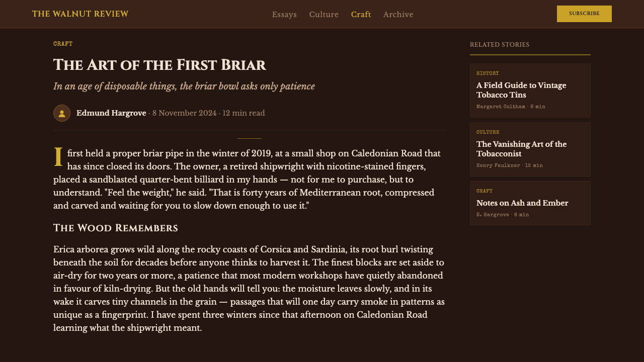
Small typewritten or letterpress-style label elements — a product name in a tight border, a muted-green accent field — recall the printed tobacco tins that lined a period shop shelf, used sparingly rather than throughout the composition.小巧的打字机式或活版印刷风格的标签元素——紧凑边框内的产品名,一块沉静绿色的点缀区域——令人想起当年陈列在店铺货架上的印刷烟草锡罐,这类元素被节制地使用,而非铺满整个构图。
Warm Gloom温暖幽暗
The lighting mood is consistently low and warm rather than bright and neutral, evoking a room lit by a single desk lamp against dark paneling. This warmth distinguishes the style from generic 'dark mode' interfaces, which typically favor cooler, flatter neutrals.整体光照气氛始终是低沉而温暖的,而非明亮而中性的,令人联想到一间由单盏台灯照亮、背景是深色护墙板的房间。这份暖意将这种风格与泛泛的「深色模式」界面区分开来,后者通常偏好更冷、更平的中性色。
Restraint over Ornament克制胜过繁饰
Decoration is limited to functional details drawn from the actual objects — a ferrule, a label border, a rule line — rather than applied for visual richness alone. The style earns its sense of quality through material fidelity rather than surface decoration.装饰局限于取自实体物件本身的功能性细节——一圈箍环、一个标签边框、一条分隔线——而非单纯为了视觉丰富度而添加。这种风格的品质感,是通过对材质的忠实还原、而非表面装饰来赢得的。
See the Briar Pipe & Tobacco design system查看 Briar Pipe & Tobacco 完整设计系统
Who shaped Briar Pipe & Tobacco?谁塑造了 Briar Pipe & Tobacco?
Small, often family-run workshops concentrated in Mediterranean briar-growing regions refined the craft of shaping and staining briar bowls and fitting them with metal ferrules across the early twentieth century. Their material choices — oxblood stain, polished honey-tan wood, brass fittings — form the direct visual reference points this style draws from.集中在地中海石楠产区的小型、往往由家族经营的工坊,在二十世纪初打磨出塑形、染色石楠烟斗碗并为其装配金属箍环的手艺。他们的材质选择——血石楠染色、抛光的蜂蜜色木质、黄铜配件——构成了这种风格所直接借鉴的视觉参照点。
Printers who specialized in producing the lithographed metal tins that held loose tobacco developed a house visual language of muted greens, tans, and engraved-style lettering that communicated quality on a crowded shop shelf. Their packaging conventions are the direct source of this style's label-accent characteristic.专门制作盛装散装烟草的石版印刷金属锡罐的印刷商,形成了一套沉静绿、棕褐色调与雕刻感字体的机构视觉语言,用以在拥挤的店铺货架上传递品质感。他们的包装惯例,正是这种风格中标签点缀特征的直接源头。
The merchants who developed and marketed specific tobacco mixtures relied on packaging and in-store presentation to signal the quality and character of their product, contributing to the broader visual culture of the smoking-room shelf that this style evokes.研制并营销特定烟草配方的商人,依赖包装与店内陈列来传递其产品的品质与个性,为这种风格所唤起的吸烟室货架视觉文化贡献了一份力量。
How do you use Briar Pipe & Tobacco today?今天怎么用 Briar Pipe & Tobacco?
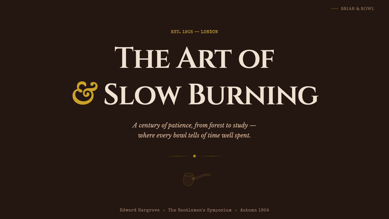
This style rewards content that wants to feel considered, aged, and tactile — the opposite of bright, disposable modern UI. On a presentation cover slide, an espresso-brown field with a single brass rule beneath a title set in engraved-style capitals communicates the mood immediately, without needing any literal pipe or tobacco imagery. Content slides should keep the warm wood ground consistent, using brass rules to separate sections the way a ferrule separates parts of a pipe.这种风格适合那些希望显得考究、陈旧、可触摸的内容——是明亮、一次性现代界面的反面。在演示文稿封面上,一整块浓咖色底面,配一条黄铜细线,标题以雕刻感大写字体呈现,无需任何字面上的烟斗或烟草图像,就能立刻传递出这份气质。内容页应保持温暖木质底色的一致性,用黄铜细线分隔各个板块,就像箍环分隔着烟斗的各个部件。
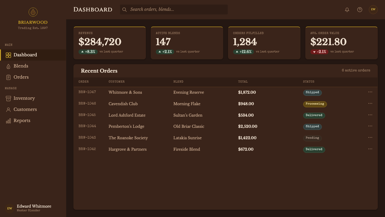
For web interfaces, the palette suits premium, heritage, or craft-oriented brands — a bespoke goods retailer, a whiskey or cigar-adjacent lifestyle brand, a men's grooming or accessories platform — more than everyday consumer software, where the low-light mood could slow task completion. Buttons and interactive elements can borrow the brass-rule and label-border details, keeping icon use minimal and letting typography carry most of the visual weight.对于网页界面,这种色板适合高端、传承感或手艺导向的品牌——一家定制商品零售商、一个与威士忌或雪茄相关的生活方式品牌、一个男士美容或配饰平台——而不太适合日常消费软件,那里的低照度氛围可能拖慢任务完成速度。按钮与交互元素可以借用黄铜细线与标签边框的细节,图标使用应尽量精简,让字体排印承担大部分视觉分量。
In editorial and marketing contexts, the style suits long-form storytelling about craft, tradition, or vintage material culture. A pull-quote can be framed with a thin brass rule above and below, set in the engraved capital style, echoing a label on a tin rather than a generic modern callout box. Feature imagery should favor close, textural photography — wood grain, leather, brass — over bright, high-key product shots.在编辑与营销语境中,这种风格适合围绕手艺、传统或复古物质文化展开的长篇叙事内容。引言段落可以在上下各配一条黄铜细线来框住,采用雕刻感的大写字体,呼应着锡罐上的标签,而非通用的现代引用框。特写图像应偏好近距离、质感丰富的摄影——木纹、皮革、黄铜——而非明亮高调的产品直拍。
The style struggles in contexts that need to feel light, fast, or youthful — its low-light, wood-toned mood works against energy and urgency. Content-dense interfaces, such as data dashboards, should borrow only the typographic restraint and brass-rule dividers rather than the full warm-gloom lighting mood, which can reduce legibility at small sizes if overused.这种风格在需要显得轻盈、快节奏或年轻化的场景中会力不从心——它那种低照度、木质色调的氛围与活力感和急迫感相悖。信息密集的界面,比如数据仪表板,应当只借鉴其字体排印上的克制与黄铜细线分隔,而非整套温暖幽暗的光照氛围,后者若过度使用,在小字号下可能降低可读性。
A common mistake is treating this as simply 'brown and gold' without the material specificity that makes it work. The style depends on distinguishing between matte wood, oxidized brass, and leather surfaces rather than using a single flat brown tone throughout — losing that material distinction flattens the style into generic vintage brown rather than the considered smoking-room world it references.一个常见的误区,是把这种风格简单理解为「棕色加金色」,而没有让它奏效的材质特定性。这种风格依赖于区分哑光木质、氧化黄铜与皮革表面,而不是通篇使用单一的平面棕色——丢掉这种材质区分,会把这种风格拍扁成泛泛的复古棕色,而非它所参照的那个考究的吸烟室世界。
See the Briar Pipe & Tobacco design system查看 Briar Pipe & Tobacco 完整设计系统
Briar Pipe & Tobacco — FAQBriar Pipe & Tobacco · 常见问题
Why does this style avoid pale or cream backgrounds common to other vintage styles?为什么这种风格回避了其他复古风格常见的浅色或米白背景?
Because its reference point is a specific interior — a low-lit study with dark walnut paneling — rather than paper or print media, which is where pale, cream-toned vintage styles typically originate. Using a pale ground here would shift the reference away from the physical room this style depicts and toward a generic 'old paper' aesthetic that belongs to a different design lineage.因为它的参照对象是一个特定的室内空间——一间深胡桃木护墙板环绕、灯光低垂的书房——而非纸张或印刷媒介,浅色米白调的复古风格通常正是源自后者。若在此处使用浅色底面,会让参照对象偏离这种风格所描绘的那间实体房间,转而滑向属于另一条设计脉络的泛泛「旧纸张」美学。
Is brass the only metal accent this style allows?黄铜是这种风格唯一允许的金属点缀吗?
Brass is the primary and most historically accurate metal reference, since it was the common material for pipe ferrules and hardware in this era, but a muted, oxidized silver is also historically plausible for higher-end pieces. What should be avoided is a bright, polished chrome or overly reflective metal finish, which belongs to a more modern or industrial visual language and breaks the warm, aged mood.黄铜是主要且历史上最为准确的金属参照,因为它是那个时代烟斗箍环与配件常用的材质,但一种沉静、氧化的银色对于更高端的物件而言也符合历史事实。应当避免的是明亮、抛光的铬色或过于反光的金属饰面,那属于更现代或工业化的视觉语言,会打破这种温暖、陈旧的氛围。
Can this style be adapted for a lighter, daytime-feeling product without losing its identity?能否为一个更明亮、白天感的产品调整这种风格,同时不丢掉其辨识度?
The low-light, wood-toned ground is central to the style's identity, so shifting toward a bright, daylight mood risks losing what makes it recognizable. A better path is to keep the espresso-wood ground as the dominant surface while increasing the proportion of honey-tan briar and brass accents slightly, which lightens the overall feel without abandoning the warm-gloom foundation entirely.低照度、木质色调的底色是这种风格辨识度的核心,因此转向明亮的白日感氛围,有可能丢失它的辨识特征。更好的做法是保持浓咖木质底色作为主导表面,同时略微提高蜂蜜色石楠与黄铜点缀的比例,这样能在不彻底放弃温暖幽暗基调的前提下,让整体感觉更明亮一些。
Does this style require literal pipe or tobacco imagery to be recognizable?这种风格是否必须配有字面意义上的烟斗或烟草图像才能被辨认?
No — the color, material, and typographic conventions can carry the identity on their own, without any literal pipe or tin illustration. In fact, relying too heavily on literal imagery rather than the underlying material and color logic risks making the style feel like a costume theme rather than a genuinely considered visual system.不需要——色彩、材质与字体排印的惯例本身就足以承载这种识别感,无需任何字面意义上的烟斗或锡罐插图。事实上,过度依赖字面图像、而非底层的材质与色彩逻辑,反而有可能让这种风格显得像一套主题戏服,而非一套真正经过深思熟虑的视觉系统。
Related design styles相关设计风格
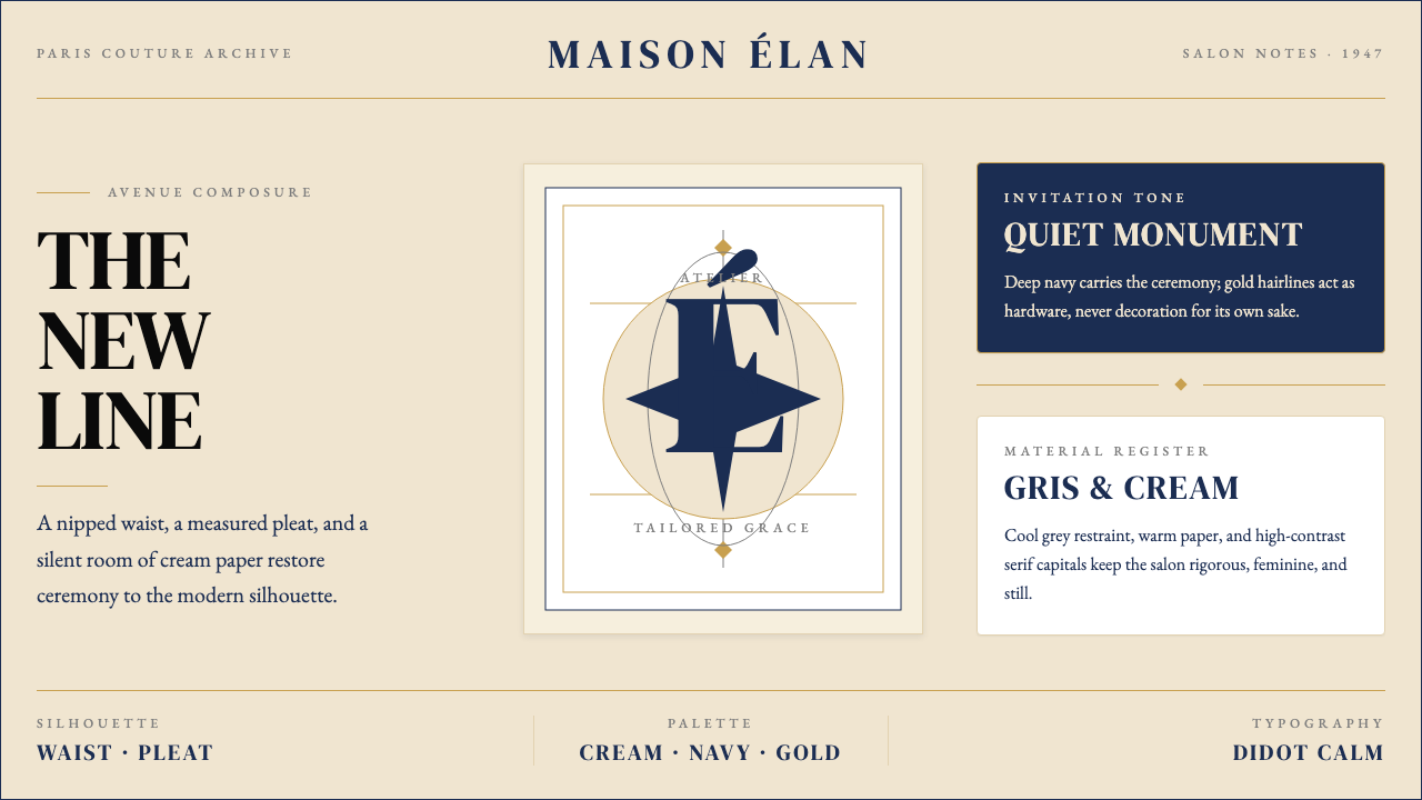 Dior New Look (1947)Couture speaks softly. Cream ground, navy Didot capitals, and gold hairlines…高级订制低声发言:米白底、海军蓝Didot大写与金色发丝线稳住全场。
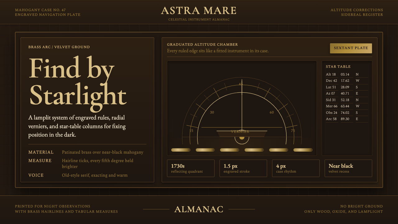 Sextant NavigationPrecision feels ceremonial. Brass ticks and mahogany grids chart the dark by…精密如仪式。黄铜刻线与红木格架在暗处定星位。
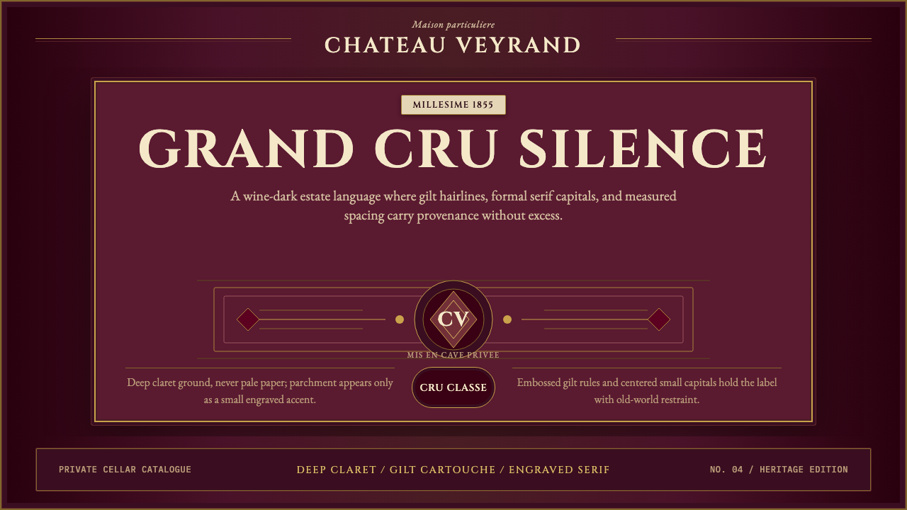 Bordeaux Wine ChâteauAged claret authority. Cinzel capitals, gilt rules, and label symmetry on win…沉静的酒红权威:Cinzel大写、金色细线与酒标式对称。
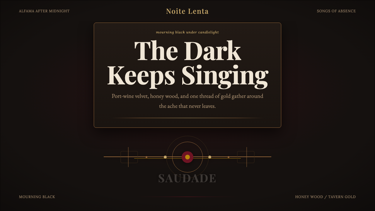 Fado SaudadeSaudade in shadow. Mourning black holds wine red, honey wood, and one gold li…阴影里的思念:哀黑托住酒红、蜜木与一线烛金。
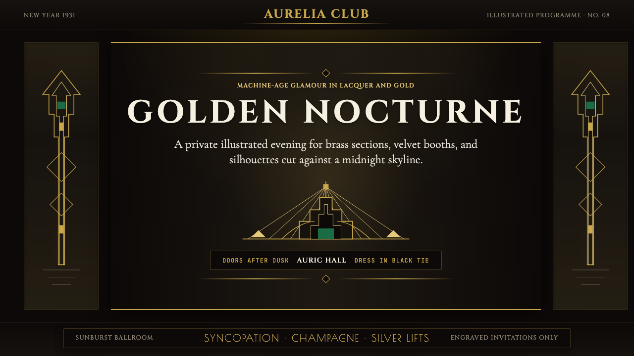 Art Deco Jazz AgeJazz Age glamour. Sunburst rays, stepped ziggurats, gold on black — Chrysler…爵士时代的流光奢华:太阳光芒、阶梯几何、金色撞黑底——克莱斯勒大厦门厅的 CS…
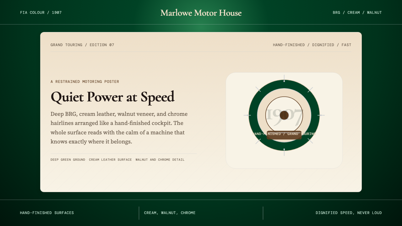 British Racing Green (Motorsport, 1907)Quiet authority at speed. Deep BRG, cream leather, walnut, and chrome hairlin…安静却有速度感。深赛车绿配奶油皮革、胡桃木和铬银细线。