What is Tin Toy Robot?什么是 Tin Toy Robot?
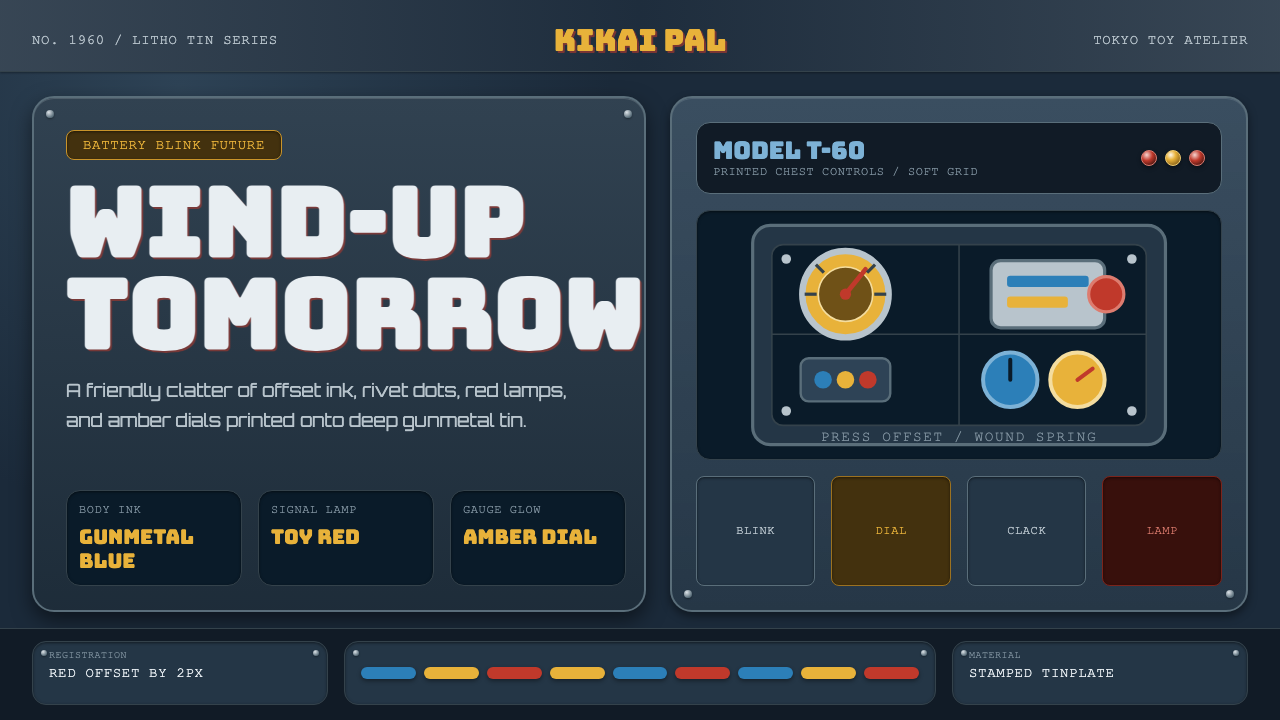
Tin Toy Robot is wind-up optimism rendered in litho ink — gunmetal-blue tin panels, brushed-silver chest plates, and the friendly clatter of a mid-century future.锡皮机器人是用油墨印出来的发条式乐观——枪铁蓝锡板、拉丁银胸甲,以及中世纪未来那份亲切的咔哒声。
Tin Toy Robot in briefTin Toy Robot 速览
Tin Toy Robot is the visual language of Japan's post-war toy ateliers, workshops that lithographed entire imagined space-age worlds onto flat sheet tin rather than molding them in plastic or casting them in metal detail. The style captures the specific look of that manufacturing method: bodies in deep gunmetal blue, chest plates that flash brushed silver, lamps that glow a toy red, and gauges that burn amber, all printed in flat offset color rather than rendered with shading or gradient.锡皮机器人是日本战后玩具工坊的视觉语言——这些工坊用平版胶印,把整个想象中的太空时代世界印在平整的薄锡板上,而非用塑料模塑或金属精工铸造。这种风格捕捉的正是这种制造方式所带来的特有观感:机身是深枪铁蓝,胸甲闪着拉丝银光,信号灯亮着玩具红,仪表盘燃着琥珀黄,一切都以平版胶印的平涂色彩呈现,而非通过明暗或渐变来表现。
What distinguishes this from generic 'retro robot' imagery is its fidelity to the actual production constraints of tin lithography. Forms are rounded and boxy because that shape was easy to stamp and fold from flat sheet metal; dials and rivets are printed rather than sculpted, appearing as flat graphic elements rather than three-dimensional detail; and a faint registration offset — a slight misalignment between color layers — betrays the mechanical press that produced the toy.让这种风格区别于泛泛的「复古机器人」图像的,是它对锡皮胶印实际生产条件的忠实还原。造型圆润方正,是因为这种形状便于从平整锡板上冲压、折叠而成;刻度盘与铆钉是印刷上去的,而非雕刻出来的,呈现为平面的图形元素,而非立体的细节;而套色间那一丝轻微的错位,则泄露了印制这个玩具的那台机械印刷机的手感。
The mood this produces is optimism without gloss. Unlike sleek, chrome-heavy science-fiction imagery, this style trades polish for the friendly clatter of a hand-cranked, battery-blinking wind-up toy — mid-century in every detail, and unmistakably a product of its manufacturing process rather than a rendering of an idealized machine.由此产生的气质是一种没有光泽的乐观主义。与那些光滑、大量使用铬亮质感的科幻图像不同,这种风格用光泽换来了手摇上发条、电池闪灯的玩具那份亲切的咔哒声——每一处细节都是不折不扣的昭和味道,明确无误地是其制造工艺的产物,而非某种理想化机械的渲染图。
Where does Tin Toy Robot come from?Tin Toy Robot 从何而来?
The style emerges from a specific window in Japanese manufacturing history: the post-war toy industry of the 1950s and 1960s, when Japan's export economy was rebuilding and tin lithography offered an affordable, mass-producible way to make colorful, detailed toys without the tooling cost of injection-molded plastic. Space-themed and robot toys were especially popular exports during this period, riding the wave of global fascination with the Space Race and atomic-age futurism.这种风格源自日本制造业历史上一个特定的时间窗口:1950至60年代的战后玩具产业,当时日本的出口经济正在重建,而锡皮胶印提供了一种低成本、可大规模生产的方式,能在不需要注塑塑料那种昂贵模具成本的情况下,做出色彩丰富、细节精致的玩具。太空主题与机器人玩具在这一时期尤其是热门的出口商品,乘着全球对太空竞赛与原子时代未来主义的痴迷浪潮。
Three workshops in particular are credited with defining the genre: Nomura Toys, known by the mark T.N., produced some of the most celebrated tin robots of the era; Masudaya, one of the oldest toy manufacturers in Japan, produced landmark battery-operated robot lines; and Horikawa, marked S.H., continued producing tin robots even as the industry began shifting toward plastic, helping preserve the aesthetic into later decades.有三家工坊尤其被认为定义了这一门类:野村玩具,以T.N.标记闻名,制作了那个时代一些最负盛名的锡皮机器人;增田屋,日本最古老的玩具制造商之一,出品了具有里程碑意义的电池驱动机器人系列;堀川,标记为S.H.,在整个行业开始转向塑料之际仍持续制作锡皮机器人,帮助这种美学延续到了后来的年代。
The tin lithography process itself shaped the visual outcome directly. Sheet tin was printed with flat offset color before being stamped, cut, and folded into three-dimensional form — meaning every visual detail, from rivets to warning labels to control panels, had to be conceived as a flat printed graphic first and a physical shape second. This production logic is what produced the characteristic printed-dial, flat-color look rather than sculpted or painted detail.锡皮胶印工艺本身直接塑造了视觉结果。薄锡板先以平版胶印印上平涂色彩,再经冲压、裁切、折叠成立体造型——这意味着从铆钉到警示标签再到控制面板,每一处视觉细节都必须先被构思为一幅平面印刷图形,其次才是一个实体形状。正是这种生产逻辑,造就了那种印刷刻度盘、平涂色彩的特有观感,而非雕刻或手绘的细节。
This body of work belongs to the broader post-war Japanese toy industry and the specific craft of tin lithography, and it has since become closely associated with retro-futurism as a genre — the specific flavor of imagined future produced by a mid-century culture looking forward from a pre-digital manufacturing base, now viewed with nostalgic affection rather than as a serious prediction of what machines would become.这批作品属于更广泛的战后日本玩具产业与锡皮胶印这门具体手艺,此后它也与「复古未来主义」这一门类紧密相连——这是一种由前数字时代制造基础上、面向未来展望的中世纪文化所产生的特定风味的想象未来,如今被人们以怀旧的喜爱而非严肃的机械预言来看待。
What defines the Tin Toy Robot look?Tin Toy Robot 的视觉特征是什么?
Color色彩
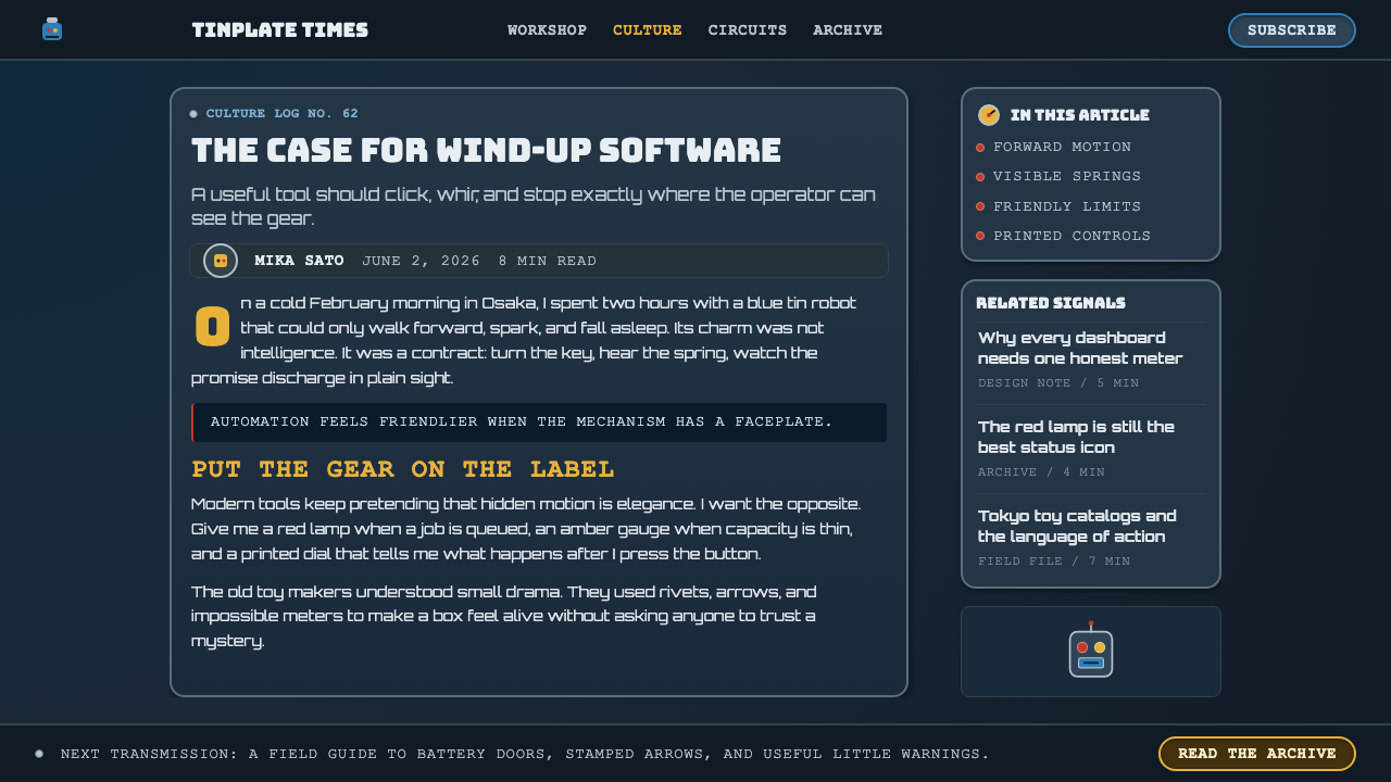
Bodies are rendered in a deep gunmetal blue, a color chosen for its association with industrial machinery. Brushed-silver chest plates, toy-red lamps, and amber gauge accents punctuate the blue in flat, unshaded fields — every color printed as a solid area rather than gradated.机身以深枪铁蓝呈现,这一颜色的选用与工业机械的联想相关。拉丝银胸甲、玩具红信号灯与琥珀色仪表点缀在这片蓝色之中,皆以平涂、不渲染明暗的方式呈现——每种颜色都是一整块实色,而非渐变。
Boxy Rounded Forms圆润方正的造型
Silhouettes are built from rounded rectangular blocks — head, torso, limbs — a shape dictated by what was easy to stamp and fold from flat sheet tin rather than an aesthetic choice made independently of manufacturing. The result reads as friendly and toy-like rather than mechanically threatening.轮廓由圆润的矩形块面构成——头部、躯干、四肢——这种形状是由从平整锡板上冲压、折叠的便利性所决定的,而非脱离制造工艺独立做出的美学选择。由此产生的效果读来是亲切、玩具般的,而非机械上的威胁感。
Printed Dials and Rivets印刷刻度盘与铆钉
Control panels, gauges, and fastener details are rendered as flat printed graphics rather than sculpted or applied hardware. A dial is a circle of ink, not a raised knob — this flatness is a direct signature of the lithographic process rather than an attempt at realism.控制面板、仪表与紧固件细节都以平面印刷图形呈现,而非雕刻或加装的硬件。一个刻度盘是一圈油墨,而非凸起的旋钮——这种平面感是胶印工艺的直接印记,而非追求写实的尝试。
Registration Offset套色偏移
A faint, deliberate misalignment between color layers — a hallmark of period offset printing — is preserved as a texture rather than corrected into crisp digital precision. This slight offset is what gives the style its handmade, era-specific authenticity.色层之间一丝刻意保留的轻微错位——这是当年胶版印刷的标志性特征——被保留为一种肌理,而非被校正成精准无误的数字精度。正是这份轻微的偏移,赋予了这种风格手工制作、时代特有的真实感。
Toy-Scale Detail玩具尺度的细节
Details are sized and simplified for a small physical toy rather than an imagined life-size machine — warning labels, control panels, and rivets appear at a scale and simplicity consistent with a hand-held object, not an industrial installation.细节的尺寸与简化程度,是按照一个手持小玩具而非某种想象中的实体大小机械来设计的——警示标签、控制面板与铆钉,其比例与简洁程度都与一件手持物品相符,而非一套工业装置。
Wind-Up Optimism发条式乐观
Every visual choice in this style avoids menace or coldness in favor of a friendly, approachable machine — rounded edges, bright toy-red accents, and a general absence of sharp or aggressive forms. The mood is playful curiosity about the future rather than anxiety about it.这种风格的每一个视觉选择都避免了威慑感或冷峻感,转而营造出一台友善、平易近人的机器——圆润的边缘、明亮的玩具红点缀,以及整体上对尖锐或具攻击性造型的回避。这里的气质是对未来的一份顽皮好奇,而非对它的焦虑。
Litho-Ink Flatness胶印油墨的平面感
There is no attempt to simulate metallic reflection, depth, or shading beyond what flat printed color naturally provides. Any sense of dimensionality comes from the folded physical form of the toy, not from rendered lighting effects.除了平涂印刷色彩本身自然带来的效果之外,这种风格不刻意模拟金属反光、深度或明暗。任何立体感都来自玩具折叠而成的实体造型,而非渲染出来的光照效果。

Who shaped Tin Toy Robot?谁塑造了 Tin Toy Robot?
Marked with the T.N. logo, Nomura Toys produced some of the most celebrated tin robots of the mid-century era, exporting widely and helping establish the visual conventions — boxy bodies, printed control panels, bright accent colors — that later collectors and designers associate with the genre.以T.N.标记闻名的野村玩具,制作了中世纪年代一些最负盛名的锡皮机器人,广泛出口,帮助确立了后来收藏者与设计师所联想到的这一门类的视觉惯例——方正的机身、印刷的控制面板、明亮的点缀色。
One of the oldest toy manufacturers in Japan, Masudaya produced landmark battery-operated tin robot lines that combined lithographed detail with mechanical action — blinking lights, walking motion — setting a technical and visual benchmark for the industry.增田屋是日本最古老的玩具制造商之一,出品了具有里程碑意义的电池驱动锡皮机器人系列,将胶印细节与机械动作——闪烁的灯光、行走的动作——结合在一起,为整个行业树立了技术与视觉上的标杆。
Marked S.H., Horikawa continued producing tin robots even as the broader toy industry shifted toward plastic manufacturing, helping extend the tin-lithography aesthetic into later decades and ensuring its conventions survived into the collector market that keeps the style visible today.标记为S.H.的堀川,在整个玩具行业逐渐转向塑料制造之际,依然持续制作锡皮机器人,帮助将锡皮胶印的美学延续到了后来的年代,也让其惯例得以保存进如今让这种风格持续可见的收藏品市场。
How do you use Tin Toy Robot today?今天怎么用 Tin Toy Robot?
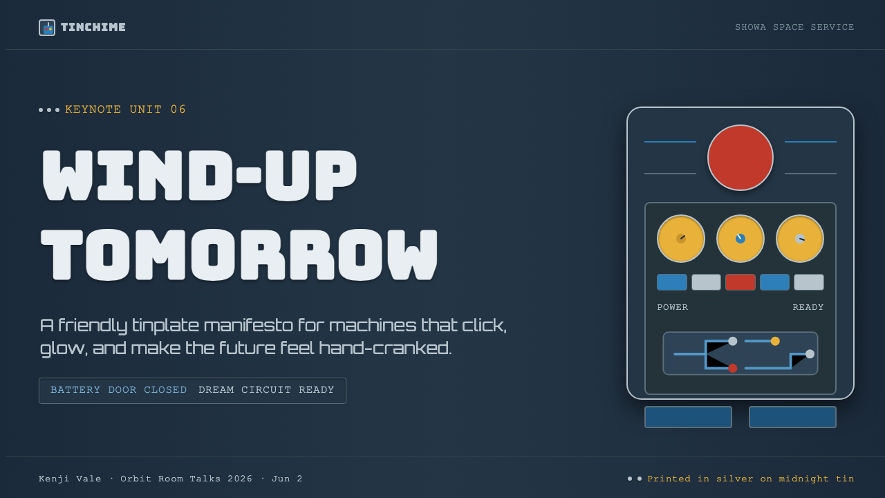
This style rewards content that wants to feel playful, nostalgic, and hand-crafted rather than sleek or futuristic in a cold sense. On a presentation cover slide, a gunmetal-blue field with a single toy-red accent shape and a hint of printed-dial texture signals the mood before any text appears — resist the urge to add gradients or glossy highlights, which would contradict the flat litho-ink logic. Content slides work well when treated like labeled toy panels: bordered blocks with printed-style headers, using amber or red sparingly for emphasis.这种风格适合那些希望显得顽皮、怀旧、手工感十足,而非冷峻未来感的内容。在演示文稿封面上,一整块枪铁蓝底面,配一个玩具红的点缀形状与一丝印刷刻度盘的质感,在任何文字出现之前就已传递出这份气质——抵住添加渐变或光泽高光的冲动,那会与平涂油墨的逻辑相矛盾。内容页适合被当作贴着标签的玩具面板来处理:带边框的区块配印刷风格的标题,琥珀色或红色作节制的强调。
For web interfaces, the style suits children's products, hobbyist or collector platforms, and any brand aiming for warm nostalgia rather than cutting-edge polish — think a kids' educational app, a vintage-toy marketplace, or a maker-community tool. Buttons and interactive elements can borrow the printed-dial look — flat circles with a simple ring rather than a modern soft-shadow button — while keeping the overall palette anchored in gunmetal blue with red and amber accents.对于网页界面,这种风格适合儿童产品、爱好者或收藏类平台,以及任何追求温暖怀旧感、而非前沿光泽感的品牌——比如一款儿童教育应用、一个复古玩具交易市场,或是一个创客社区工具。按钮与交互元素可以借用印刷刻度盘的观感——一个带简单圆环的平面圆形,而非现代柔和阴影按钮——同时让整体色板锚定在枪铁蓝,配红色与琥珀色点缀。
In editorial and marketing contexts, the style suits retro-futurism features, toy history pieces, or nostalgia-driven campaigns. A pull-quote can be framed like a printed warning label — bordered rectangle, condensed type, amber or red accent — echoing the toy's own printed graphics rather than a generic modern callout box.在编辑与营销语境中,这种风格适合复古未来主义专题、玩具历史文章或怀旧主题活动。引言段落可以像一张印刷警示标签那样被框住——带边框的矩形、窄体字、琥珀色或红色点缀——呼应玩具本身的印刷图形,而非通用的现代引用框。
The style struggles in contexts demanding a sense of cutting-edge technology or seriousness — its entire visual argument depends on the friendly imperfection of period lithography, and polishing it into glossy, gradient-heavy modern sci-fi imagery erases the specific charm that makes it recognizable. Content with large photographic imagery should keep photography secondary to the flat-color graphic elements, or the mid-century printed quality gets diluted.这种风格在需要传递前沿科技感或严肃感的场景中会力不从心——它的整套视觉论证都依赖于那个时代胶印那份亲切的不完美,若把它打磨成光泽渐变的现代科幻图像,就会抹去让它得以被辨认的那份特有魅力。若内容包含大量摄影图像,应让摄影退居次要位置,把平涂图形元素放在主位,否则那种中世纪印刷质感会被稀释。
A common mistake is over-cleaning the aesthetic — removing the slight registration offset and printed-dial flatness in favor of crisp vector precision. That polish, however well-intentioned, removes the manufacturing fingerprint that makes this style read as authentically mid-century rather than a generic 'robot' theme.一个常见的误区,是把这种美学「洗」得过于干净——去掉那一丝套色偏移与印刷刻度盘的平面感,换成精准无误的矢量图形。这种打磨无论出发点多好,都会抹去让这种风格读来真正具有中世纪质感、而非泛泛「机器人」主题的那份制造工艺印记。
Tin Toy Robot — FAQTin Toy Robot · 常见问题
Why does this style avoid smooth gradients and metallic shine typical of modern robot imagery?为什么这种风格回避了现代机器人图像常见的平滑渐变与金属光泽?
Because the source material — tin lithography — could only print flat offset colors; there was no mechanism in the manufacturing process to simulate reflection or depth. Preserving that flatness is what keeps the style historically honest. Adding gradients or gloss would import a modern rendering technique that never existed in the original toys, breaking the connection to the specific manufacturing era the style represents.因为源头材料——锡皮胶印——只能印出平涂的胶印色彩;生产工艺中根本没有模拟反光或深度的机制。保留这种平面感,正是让这种风格保持历史真实性的关键。加入渐变或光泽会引入一种在原始玩具中从未存在过的现代渲染技法,从而割裂与这种风格所代表的特定制造时代之间的联系。
Is the registration offset a flaw that should be corrected in digital design?套色偏移是一种应该在数字设计中被修正的瑕疵吗?
In the original manufacturing context it was an unavoidable imperfection of mechanical printing, but within this design system it functions as a deliberate signature texture rather than a flaw. Removing it entirely produces a cleaner but less authentic result; the offset is one of the clearest visual cues that separates this style from a generic flat-color robot illustration.在原始制造语境中,它是机械印刷不可避免的一种瑕疵,但在这套设计系统里,它发挥着一种刻意的标志性肌理的作用,而非瑕疵。彻底去除它会得到更干净、但也更缺乏真实感的结果;这种偏移正是将这种风格与泛泛的平色机器人插图区分开来的最清晰的视觉线索之一。
How does this style differ from Art Deco or streamline-moderne robot imagery?这种风格与装饰艺术风格或流线型现代主义的机器人图像有何不同?
Streamline-moderne and Art Deco robot imagery tends to emphasize smooth, aerodynamic curves and a sense of chrome-heavy futurist glamour, often rendered with careful shading. Tin Toy Robot, by contrast, is boxier, flatter in color, and rooted specifically in the constraints of sheet-metal stamping and offset printing rather than an idealized aerodynamic form — its charm comes from visible manufacturing limitation, not aspirational sleekness.流线型现代主义与装饰艺术风格的机器人图像,往往强调光滑、符合空气动力学的曲线,以及一种大量使用铬亮质感、带着未来主义光辉的气质,通常经过细致的明暗渲染。相比之下,锡皮机器人更为方正、色彩更平,其根源特别扎根于薄板冲压与胶版印刷的工艺限制,而非某种理想化的空气动力学造型——它的魅力来自可见的制造局限,而非令人向往的光滑感。
Can this style work for adult-facing or professional products, or is it strictly for playful contexts?这种风格能否用于面向成年人的专业产品,还是只适合顽皮的场景?
It can work for adult audiences when the context itself carries a nostalgic or hobbyist framing — a collector's marketplace, a design history publication, a maker or engineering community that appreciates mid-century manufacturing craft. It struggles in contexts demanding institutional seriousness, such as financial or medical software, where the playful, toy-like mood would undercut trust rather than build it.当语境本身带有怀旧或爱好者的框架时——比如一个收藏品交易市场、一份设计历史出版物,或是一个欣赏中世纪制造工艺的创客或工程社区——它也能面向成年受众发挥作用。但在需要机构严肃感的场景中,比如金融或医疗软件,它会力不从心,因为那份顽皮的、玩具般的气质会削弱而非建立信任感。
Related design styles相关设计风格
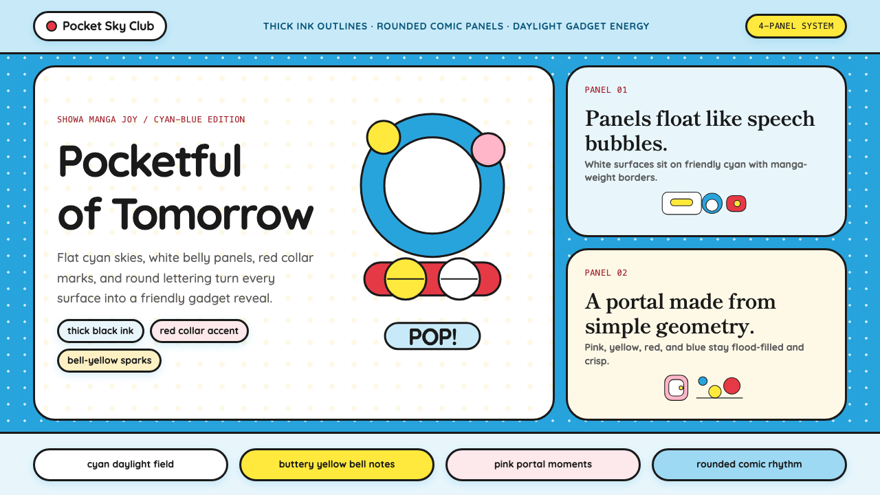 DoraemonChildhood joy, inked bold. Cyan fields, white panels, red collars, and rounde…童年快乐被粗线描出:青蓝底、白面板、红项圈与圆润漫画字。
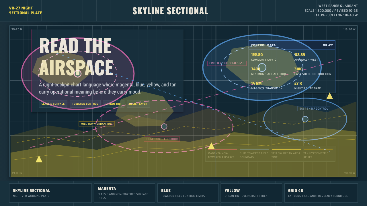 Aeronautical ChartReads like cockpit data. Magenta-blue airspace rings cut through dense dark-c…像座舱数据般可读:品红与蓝色空域环切入深色密集网格。
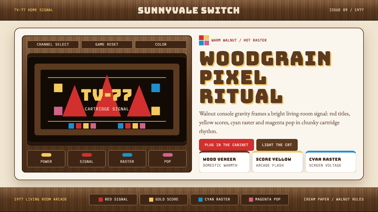 Atari 2600 (Woodgrain)Woodgrain meets raw pixels. Walnut panels frame Bungee type and CMYK raster b…木纹遇上生猛像素:胡桃木面板包裹Bungee字与CMYK色块。
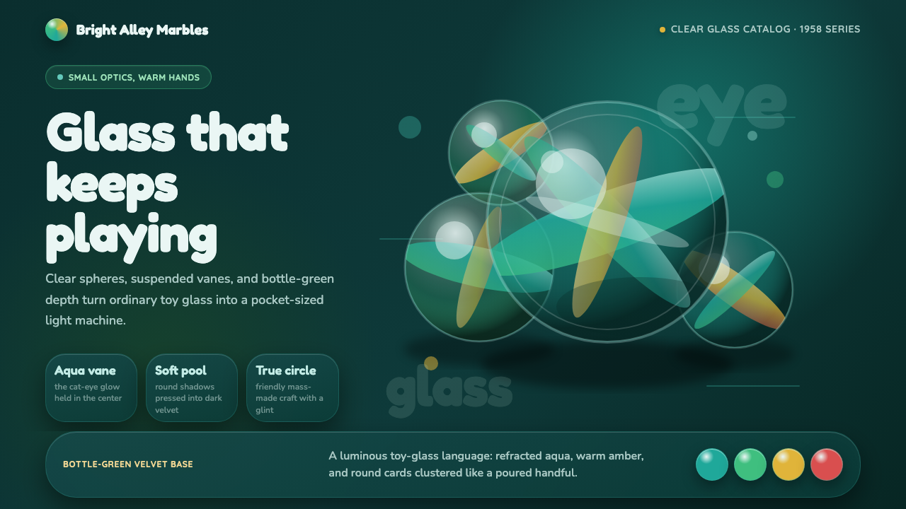 Cat's Eye MarblesMass-made glass feels magical. Aqua vanes glow inside round forms on bottle-g…量产玻璃也有魔法:水绿叶片在圆形玻璃与墨绿绒面里发光。
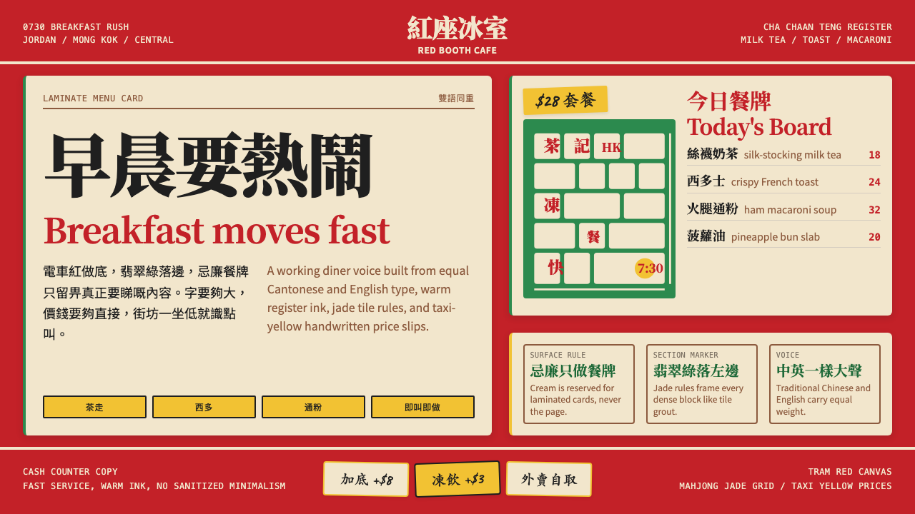 Hong Kong Cha Chaan TengDemocratic diner warmth. Tram red, jade rules, cream menu cards, equal Canton…街坊飯堂的熱度:電車紅、翡翠綠線、忌廉餐牌,中英並重。
 LEGO ClassicCheerful engineering. Primary bricks snap across a warm gray stud grid.快乐工程学:原色砖块咔哒扣入暖灰凸点网格。