What is Syriac Estrangela?什么是 Syriac Estrangela?
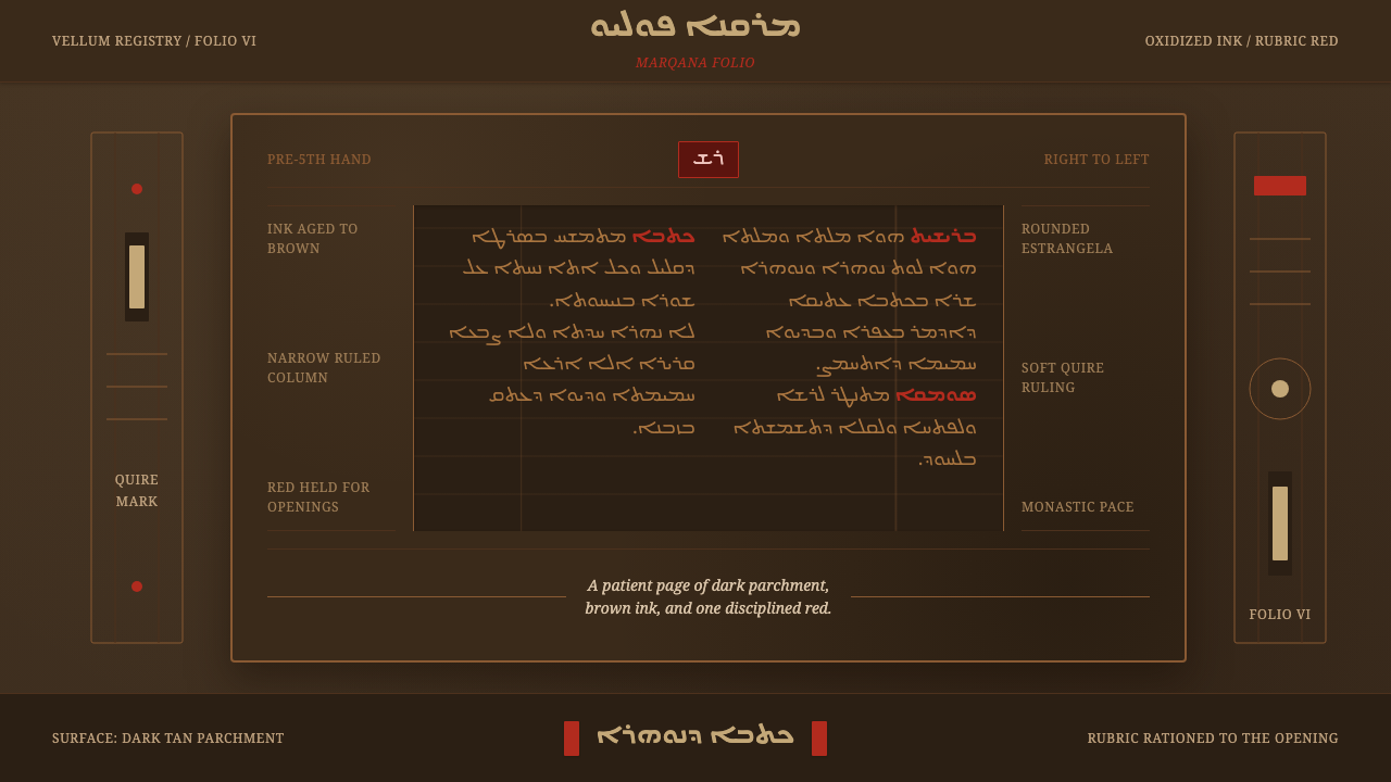
The oldest Syriac script survives not as black ink on white paper but as oxidized brown on darkened vellum, with red rationed like a scribe's most precious pigment.最古老的叙利亚文字留存至今的样子,不是白纸黑字,而是深褐羊皮纸上氧化后的褐色墨迹,红色则被抄写员像珍稀颜料一样吝惜地使用。
Syriac Estrangela in briefSyriac Estrangela 速览
Estrangela is the oldest of the three historical Syriac scripts, a twenty-two letter right-to-left abjad — a consonant-based writing system — used across Eastern Christianity from before the fifth century onward. Its name is thought to derive from a Greek term related to rounded lettering, and its physical form is unmistakable: broad, rounded strokes with minimal diacritical marking, connected in flowing horizontal lines that read right to left across the page.Estrangela(意为“圆体”)是三种历史悠久的叙利亚字体中最古老的一种,是一套二十二字母、自右向左书写的辅音文字(abjad),自公元五世纪之前起便在东方基督教世界广泛使用。它的名字据信源自希腊语中与“圆形字母”相关的词汇,其字形也确实一望而知:笔画宽厚圆润,附加符号极少,以流畅的横向连笔自右向左排布成行。
What makes Estrangela distinctive as a visual style is not the letterforms alone but the material reality of how they survive. Manuscripts written in Estrangela were produced with iron-gall and carbon inks on vellum, and centuries of oxidation have transformed what was once black ink into a warm, russet brown. The parchment itself has darkened toward tan and umber. The result is a page that reads as fundamentally warm rather than stark — a monastic, candlelit palette rather than a printed one.让Estrangela在视觉上独树一帜的,并非仅仅是字形本身,而是它得以留存至今的物质现实。以Estrangela书写的抄本使用铁胆墨与碳墨写在羊皮纸上,历经数百年的氧化,曾经的黑色墨迹已经转变为一种温润的赭褐色。羊皮纸本身也已泛黄发暗,趋向棕黄与土褐。最终呈现的这一页,读起来根本上是温暖的,而非冷峻的——是一种修道院式、烛光般的色调,而非印刷品的色调。
Rubrication — the use of red ink, from which the English word 'rubric' derives — marks titles, section openings, and liturgical instructions throughout Estrangela manuscripts, but always sparingly. Red never competes with the brown body text for dominance; it appears at structural moments only, guiding a reader through a text the way a header guides a reader through a document today. This combination of aged warmth and rationed red gives the style a patient, devotional character that is immediately legible even to viewers unfamiliar with the script itself.朱批(rubrication,英语“rubric”一词正源于此)——即使用红墨——在Estrangela抄本中用于标记标题、分节起始与礼仪指示,但始终是克制而少量的。红色从不与褐色正文争夺主导地位;它只出现在结构性的关键节点,引导读者穿行文本,正如今天的标题引导读者阅读文档。这种“历经岁月的温暖”与“被严格配给的红色”的组合,赋予这种风格一种耐心、虔敬的气质,即便对不熟悉这种文字本身的观者,也能一眼辨识。
See the Syriac Estrangela design system查看 Syriac Estrangela 完整设计系统
Where does Syriac Estrangela come from?Syriac Estrangela 从何而来?
Estrangela emerged as the primary script of Syriac Christianity, a distinct branch of Eastern Christianity that developed its own literary and liturgical tradition centered on the city of Edessa (in present-day southeastern Turkey) and spreading through Mesopotamia and the broader Levant. Syriac itself is a dialect of Aramaic, the language tradition associated with the region around the time of early Christianity, and Estrangela was current as its primary written form from before the fifth century CE, with surviving codices dating predominantly from the fifth through ninth centuries.Estrangela作为叙利亚基督教(东方基督教的一个独立分支)的主要文字兴起,该传统以埃德萨城(今土耳其东南部)为中心发展出自己的文学与礼仪体系,并向美索不达米亚与更广阔的黎凡特地区扩散。叙利亚语本身是阿拉姆语的一种方言——阿拉姆语正是早期基督教时期这一地区的语言传统——而Estrangela作为其主要书写形式,早在公元五世纪之前就已通行,现存抄本主要集中在五至九世纪。
The script's development was inseparable from its liturgical and scholarly purpose. Syriac Christian communities produced an enormous body of theological writing, biblical translation, and monastic literature, much of it copied and recopied by hand in scriptoria across Mesopotamia and the Levant over centuries. The most consequential of these efforts was the Peshitta, the standard Syriac translation of the Bible, whose repeated hand-copying across generations of monastic scribes is responsible for much of the surviving Estrangela manuscript corpus that defines the style today.这套文字的发展与其礼仪、学术功能密不可分。叙利亚基督教社群产出了浩瀚的神学著作、圣经译本与修道院文学,其中大部分在美索不达米亚与黎凡特各地的抄写所中,历经数个世纪被一代代手工誊抄、复抄。其中影响最深远的成果是《别西大译本》(Peshitta)——标准的叙利亚语圣经译本,正是历代修道院抄写员对它的反复誊抄,构成了如今定义这一风格的绝大部分现存Estrangela抄本。
Ephrem the Syrian, a fourth-century theologian, poet, and hymn writer, stands as the most significant figure associated with the broader literary tradition that Estrangela manuscripts carried forward — his hymns and theological writings were copied and recopied across the Syriac Christian world for centuries, and the physical manuscripts preserving his work exemplify the script at its most mature. The monastic copyists who produced these manuscripts worked within a tradition that treated the act of copying itself as a devotional practice, which helps explain the discipline and rationed use of red ink: every color choice on the page carried liturgical weight, not merely aesthetic intent.四世纪的神学家、诗人与圣歌作者“叙利亚人以法莲”(Ephrem the Syrian),是与Estrangela抄本所承载的更广阔文学传统相关联的最重要人物——他的圣歌与神学著作在叙利亚基督教世界中被誊抄、复抄了数个世纪,而保存其作品的实体抄本,正是这种文字最成熟形态的典范。制作这些抄本的修道院抄写员,工作于一种把誊抄行为本身视为虔修实践的传统之中——这也有助于解释为何红墨的使用如此克制而讲究:页面上的每一次色彩选择,都承载着礼仪上的分量,而非仅仅是审美意图。
As Syriac Christianity diversified over subsequent centuries into distinct traditions, two descendant scripts — Serto in the West and Madnhaya in the East — gradually developed more angular, cursive forms suited to faster everyday writing, while Estrangela itself became increasingly reserved for formal, ceremonial, and monumental use. This preserved Estrangela's association with gravity and permanence even as it receded from daily use, a status that persists in the script's ceremonial and liturgical use in Syriac Christian communities today.随着叙利亚基督教在此后数世纪中分化为不同的传统,两种衍生字体——西方的Serto与东方的Madnhaya——逐渐发展出更棱角分明、更适合日常快速书写的连笔形态,而Estrangela本身则愈发被保留用于正式、庄严与纪念性的场合。这使得Estrangela即便退出日常使用,也依然保留着与庄重、恒久相联系的身份地位——这一地位延续至今,体现在当代叙利亚基督教社群对这种文字的礼仪性、庆典性使用之中。
What defines the Syriac Estrangela look?Syriac Estrangela 的视觉特征是什么?
Color色彩
The dominant palette is a warm, oxidized brown for body text against a darkened tan or umber ground, the result of centuries of ink and vellum aging together. Red is present only as rubrication, reserved for titles and section openings, and never approaches the visual weight of the brown body text. There is no black, no bright white, and no cool tone anywhere in the palette — every hue reads as earthen and time-worn.主导色板是用于正文的温暖、氧化褐色,铺陈于深棕黄或土褐色底面之上——这是墨迹与羊皮纸历经数百年共同老化的结果。红色只以朱批的形式出现,专供标题与分节起始使用,视觉分量绝不逼近褐色正文。整个色板中没有黑色、没有明亮的白色,也没有任何冷色调——每一种色相读起来都带着泥土般、经年累月的质感。
Right-to-Left Column Structure右向栏文结构
Text runs in disciplined right-to-left horizontal lines, organized into ruled column blocks that structure the page much as a modern grid does, but oriented in the opposite direction from Latin-script conventions. This directional discipline is not a stylistic affectation but a functional necessity of the abjad script itself, and any adaptation of this style must respect the underlying reading direction rather than treating it as a purely decorative flourish.文字以严谨的右向横行排布,组织成有栏线的栏块,其结构功能类似现代网格,但方向与拉丁字母的排版惯例相反。这种方向性的秩序并非风格上的矫饰,而是这套辅音文字本身的功能性必然;任何对这种风格的移植,都必须尊重其底层的阅读方向,而不能只当作纯粹的装饰花样对待。
Rounded, Minimal-Diacritic Letterforms圆润、少附加符号的字形
Estrangela's letterforms are broad and rounded, with far fewer diacritical marks than the later Serto or Madnhaya scripts, giving the script a clean, uncluttered rhythm across a line of text. Letters connect in flowing strokes rather than sitting as isolated, boxy characters, producing a horizontal visual cadence distinct from more angular later Syriac scripts.Estrangela的字形宽厚圆润,附加符号远少于后来的Serto或Madnhaya字体,使整行文字呈现出干净、不杂乱的节奏。字母以流畅的连笔相接,而非各自孤立、方正地排列,形成一种有别于后期更棱角分明的叙利亚字体的横向视觉韵律。
Rationed Rubric Red克制的朱批红
Red ink is deployed with strict discipline — titles, liturgical section markers, and occasional emphasis words, never body text. This rationing means red retains its signaling power precisely because it is rare; a page might carry a single red heading among many lines of brown text, and that scarcity is what gives the color its authority.红墨的使用极为严格克制——只用于标题、礼仪性分节标记,以及偶尔的强调词汇,绝不用于正文。这种配给制恰恰是红色能保持其信号功能的原因:一页之中,可能在满篇褐色文字里只有一处红色标题,正是这种稀有性赋予了红色权威。
Aged Vellum Ground陈旧羊皮纸底面
The background is never paper-white; it is a warm, mottled tan or umber that reads as physically aged material rather than a neutral digital canvas. This ground color is as central to the style's identity as the ink color itself — a bright white background would break the style's entire visual logic of patient, centuries-old warmth.背景绝不是纸张般的白色,而是一种温暖、带斑驳感的棕黄或土褐色,读起来像是一件历经岁月的实体材料,而非中性的数字画布。这种底色对这种风格的身份认同,与墨色本身同样重要——若换成明亮的白色背景,就会瓦解这种风格整套“耐心、历经数百年”的视觉逻辑。
Restrained, Devotional Pacing克制、虔敬的节奏
Beyond individual visual elements, the style carries an overall pacing quality: dense, unhurried columns of text with minimal ornament, giving the impression of a slow, careful, devotional act of transcription rather than a mass-produced or rapidly generated document. This pacing quality should inform layout density and whitespace decisions when the style is adapted, favoring measured density over sparse, airy minimalism.除了单个视觉元素之外,这种风格还带有一种整体的节奏感:密集而不急促的文字栏块,装饰极少,给人一种缓慢、审慎、虔敬誊抄的印象,而非批量生产或急速生成的文档。移植这种风格时,应当让这种节奏感来指导版面密度与留白决策——倾向于有分寸的密度,而非稀疏、通透的极简主义。
See the Syriac Estrangela design system查看 Syriac Estrangela 完整设计系统
Who shaped Syriac Estrangela?谁塑造了 Syriac Estrangela?
A fourth-century theologian, poet, and prolific hymn writer whose work formed the core of the Syriac Christian literary tradition. His hymns and theological writings were copied and recopied by generations of Estrangela scribes across the Syriac Christian world, and manuscripts preserving his work stand among the most mature examples of the script's devotional application.四世纪的神学家、诗人与多产的圣歌作者,他的作品构成了叙利亚基督教文学传统的核心。他的圣歌与神学著作被叙利亚基督教世界一代代的Estrangela抄写员反复誊抄,保存其作品的抄本,是这种文字虔修性应用最成熟的范例之一。
The largely anonymous monastic scribes across Mesopotamia and the Levant who produced the surviving body of Estrangela manuscripts, including the repeated hand-copying of the Peshitta. Their disciplined, devotional approach to the act of transcription — treating every ink and color decision as liturgically meaningful — is directly responsible for the rationed, purposeful use of rubric red that defines the style.分布在美索不达米亚与黎凡特各地、大多不具名的修道院抄写员,是他们制作了现存的Estrangela抄本,包括对《别西大译本》的反复誊抄。他们对誊抄这一行为所秉持的自律、虔修态度——把每一次墨色决定都视为具有礼仪意义——直接造就了这种风格中克制而有目的的朱批用色方式。
How do you use Syriac Estrangela today?今天怎么用 Syriac Estrangela?
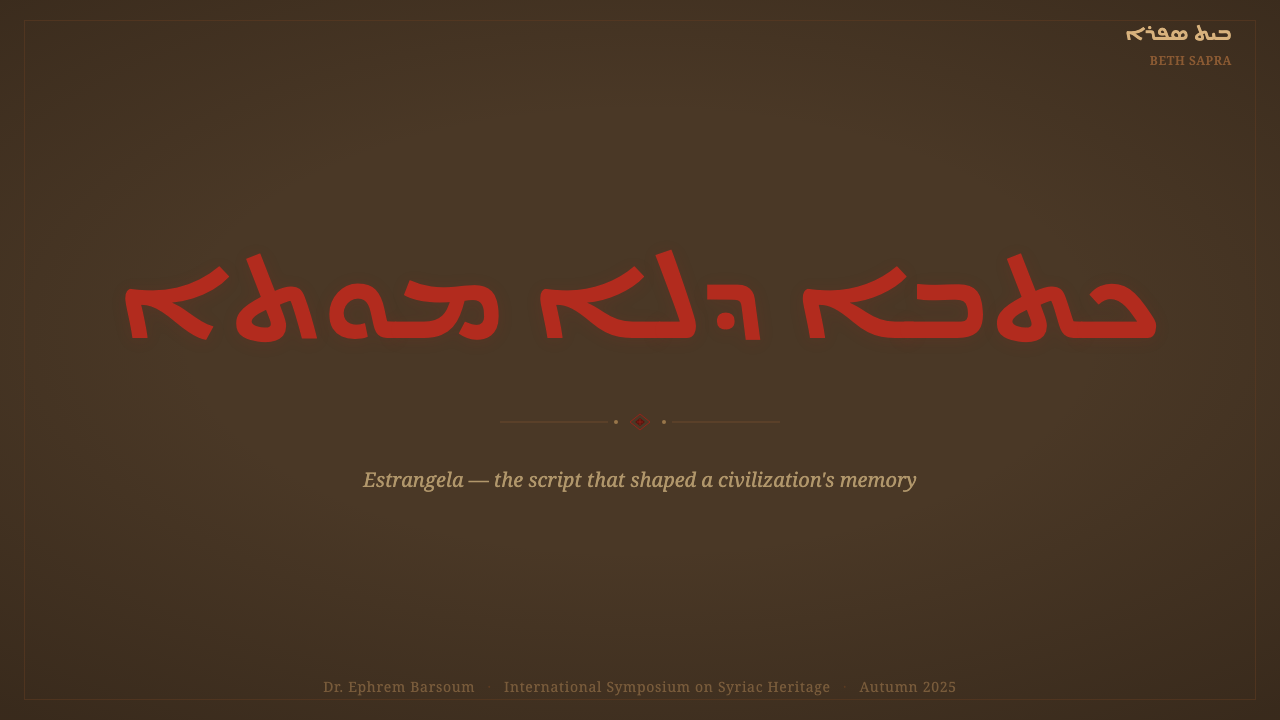
For presentation slides, this style suits content about heritage, translation, ancient texts, or slow-crafted knowledge — a cover slide can use the aged tan-brown ground as a full-bleed field with a single, restrained red accent marking the title, echoing a rubricated manuscript opening. Content slides should treat body text with generous, unhurried spacing and reserve red exclusively for section headers, mirroring the manuscript's own hierarchy of brown body copy and rare red markers. Data or quote slides benefit from framing key numbers or quotations the way a rubric heading frames a section — a moment of red amid a field of warm brown.在演示文稿中,这种风格适合关于传承、翻译、古代文本,或慢工出细活的知识类内容——封面页可以用陈旧的棕黄色底面作为整页出血的画布,配以唯一、克制的红色强调标题,呼应一页朱批抄本的开篇。内容页应给正文留出宽裕、不急促的间距,红色仅保留给分节标题,映射抄本自身“褐色正文、稀有红色标记”的层级关系。数据或引言页可以借鉴朱批标题“框住一个分节”的手法,来框住关键数字或引文——在一片温暖褐色之中,出现一瞬红色。
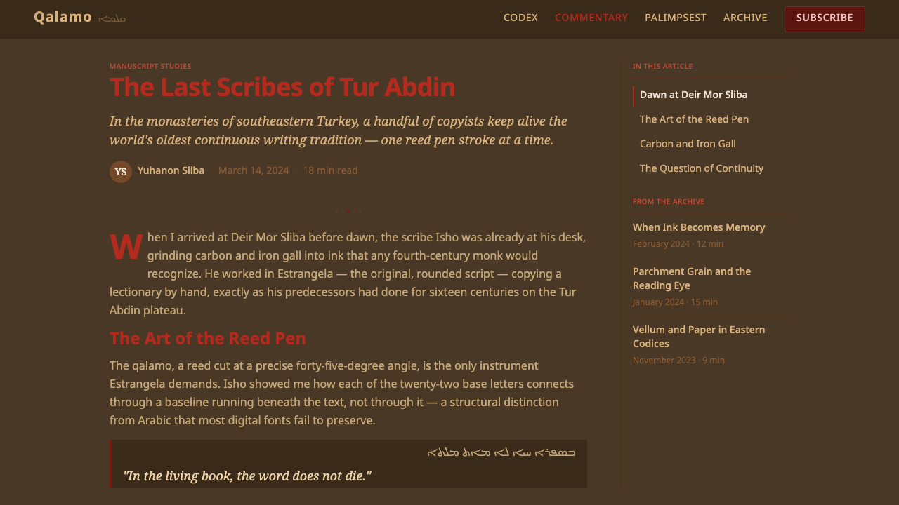
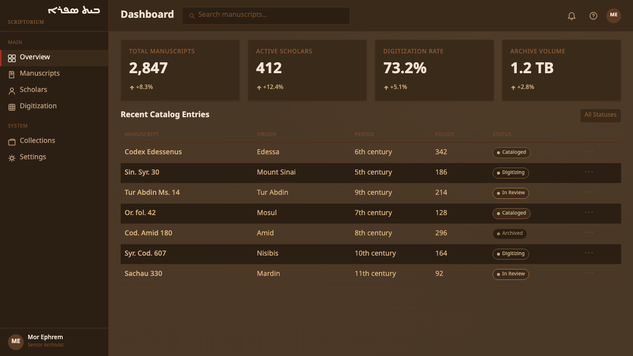
For web interfaces, the style works well for archival platforms, historical or academic research tools, translation services, or any product whose brand identity depends on projecting depth, patience, and scholarly credibility rather than speed or modernity. The approach: a warm tan or umber-toned background rather than stark white, dark brown for primary text, and red reserved strictly for the rare interface moment that functions like a rubric heading — a section label, a highlighted status, never a general-purpose button color.对于网页界面,这种风格适合档案平台、历史或学术研究工具、翻译服务,或任何品牌身份依赖传达深度、耐心与学术可信度、而非速度或现代感的产品。方法是:使用温暖的棕黄或土褐色调背景而非刺眼的白色,正文用深褐色,红色则严格保留给界面中那个功能类似朱批标题的稀有时刻——一个分节标签、一个被高亮的状态,绝不作为通用按钮颜色使用。
In editorial and marketing contexts, the style supports long-form writing about history, religion, linguistics, or craft traditions. A magazine-style layout can adopt column-block structure with generous margins and treat pull-quotes the way a manuscript treats rubricated openings — set apart in red, sparingly. Marketing pages for products related to preservation, archives, or cultural heritage benefit from the style's implicit credibility: a design this patient and restrained signals that the underlying content has been handled with care.在编辑与营销语境中,这种风格支持关于历史、宗教、语言学或工艺传统的长文写作。杂志式版面可以采用栏块结构,配以宽裕的页边距,并像抄本处理朱批开篇那样,克制地处理引述段落——单独设色为红。与保存、档案或文化遗产相关的产品的营销页面,能从这种风格隐含的可信度中获益:一个如此耐心而克制的设计,暗示着其背后的内容曾被悉心对待。
The style transfers less naturally to fast-paced, data-dense, or highly interactive products, since its entire visual logic is built around unhurried reading rather than rapid scanning or frequent interaction.这种风格不太适合快节奏、数据密集或高频交互的产品,因为它的整套视觉逻辑都建立在从容阅读之上,而非快速扫视或频繁交互。
The most common mistake when adapting this style is treating red as a general accent color and spreading it across multiple UI elements — buttons, links, icons — which collapses the exact quality that gives rubrication its power: scarcity. A second common mistake is using a bright white or neutral gray background instead of the warm, aged tan ground; without that warmth, the style loses its connection to physical vellum and reads as a generic serif-adjacent theme rather than an authentic manuscript reference.移植这种风格时最常见的错误,是把红色当作一种通用强调色,分散使用在多个界面元素上——按钮、链接、图标——这会瓦解朱批之所以有力量的确切品质:稀有性。第二个常见错误,是使用明亮的白色或中性灰色背景,而非温暖、陈旧的棕黄色底面;失去这种暖意,这种风格就会失去与实体羊皮纸的联系,读起来更像一个泛衬线风格的通用主题,而非一次真正的抄本引用。
See the Syriac Estrangela design system查看 Syriac Estrangela 完整设计系统
Syriac Estrangela — FAQSyriac Estrangela · 常见问题
Why does this style use brown ink and a tan ground instead of black on white?为什么这种风格用褐色墨迹与棕黄色底面,而不是白纸黑字?
The brown and tan are not stylistic choices made by the original scribes — they are what iron-gall and carbon ink, and the vellum they were written on, look like after many centuries of oxidation and aging. What was written as black on cream has aged into brown on tan. Preserving that aged palette rather than reconstructing an artificial 'original' black-on-white keeps the design honest to how these manuscripts actually exist and are encountered today.褐色与棕黄色并非原始抄写员做出的风格选择——它们是铁胆墨与碳墨、以及书写其上的羊皮纸,历经数百年氧化老化之后呈现的真实样貌。曾经的白底黑字,如今已老化为棕黄底褐字。保留这种历经岁月的色板,而非重构一个人为的“原始”白底黑字版本,能让设计忠实于这些抄本如今真实存在与被观看的样子。
Is the right-to-left text direction essential, or can this style be adapted for left-to-right layouts?自右向左的文字方向是必不可少的吗,能不能改成自左向右的版面?
The right-to-left direction is a functional property of the Syriac abjad itself, not a decorative choice, so authentic Estrangela text must remain right-to-left. When adapting the broader visual style — color, texture, column structure — for a left-to-right language context, it is reasonable to keep the surrounding layout left-to-right while treating any genuine Syriac text elements (if present) with correct right-to-left orientation, rather than forcing the entire interface into an unfamiliar direction purely for aesthetic effect.自右向左的方向是叙利亚辅音文字本身的功能属性,而非装饰性选择,因此真正的Estrangela文字必须保持自右向左。若要为自左向右语言语境移植这种风格的整体视觉语言——色彩、质感、栏块结构——合理的做法是让周边版面保持自左向右,同时对任何真实存在的叙利亚文字元素(如果有)保持正确的自右向左方向,而不是纯粹为了美学效果,把整个界面强行改成一个不自然的阅读方向。
How rare should the red accent be in a screen adaptation of this style?在屏幕改编版本中,红色强调应该稀有到什么程度?
As rare as it is in the original manuscripts — reserved for structural moments such as headings, section markers, or a single highlighted status, never spread across multiple interactive elements. A useful test: if red appears in more than a small handful of places on a given screen, it has likely lost the rationed, purposeful quality that makes rubrication meaningful in the source material.应当像原始抄本中一样稀有——只保留给结构性节点,例如标题、分节标记,或某个被单独高亮的状态,绝不分散使用在多个交互元素上。一个实用的检验标准:如果某个界面上红色出现的地方超过寥寥几处,那它很可能已经失去了让朱批在原始材料中具有意义的那种“配给制、有目的”的品质。
Does this style work for products with a modern, fast-paced brand identity?这种风格适合品牌身份现代、节奏快的产品吗?
Not naturally. The style's entire visual logic communicates patience, permanence, and unhurried craftsmanship — qualities that can feel mismatched against a brand built on speed, novelty, or rapid iteration. It is far better suited to products where depth, trust, and a sense of accumulated history are core to the value proposition, such as archives, scholarly tools, translation services, or heritage-focused brands.并不自然适合。这种风格的整套视觉逻辑传达的是耐心、恒久与从容不迫的工艺感——这些品质与一个建立在速度、新奇或快速迭代之上的品牌相比,可能会显得格格不入。它更适合那些以深度、信任与历史积淀感为核心价值主张的产品,例如档案系统、学术工具、翻译服务,或以文化遗产为核心的品牌。
What is the relationship between Estrangela and later Syriac scripts like Serto?Estrangela与后来的叙利亚字体(如Serto)是什么关系?
Estrangela is the ancestor script from which Serto (in the Western Syriac tradition) and Madnhaya (in the Eastern Syriac tradition) later developed, gradually taking on more angular, cursive forms suited to faster everyday writing. As those descendant scripts took over daily use, Estrangela itself became increasingly reserved for formal, monumental, and liturgical contexts — which is precisely why it retains the gravity and permanence associated with ceremonial and devotional use today.Estrangela是母体文字,后来的Serto(西方叙利亚传统)与Madnhaya(东方叙利亚传统)都由此发展而来,逐渐演变出更棱角分明、更适合日常快速书写的连笔形态。随着这些衍生字体接管日常书写,Estrangela本身则愈发被保留用于正式、纪念性与礼仪性的场合——这正是它至今仍保留着与庆典、虔修用途相关联的庄重与恒久感的原因。
Related design styles相关设计风格
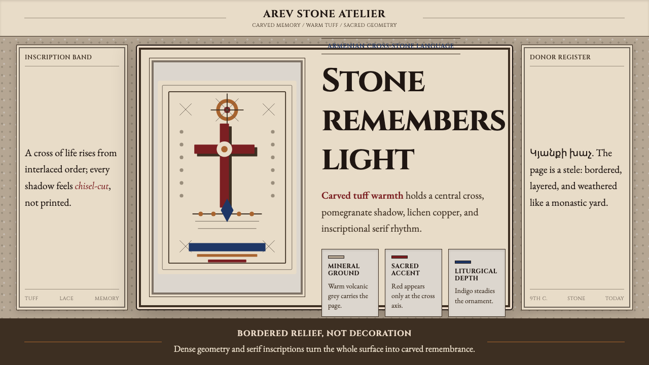 Armenian Khachkar Cross-StoneStone becomes memory. Tuff grey, pomegranate red, and carved borders hold the…石头成为记忆:凝灰岩灰、石榴红与刻痕边框托住十字中轴。
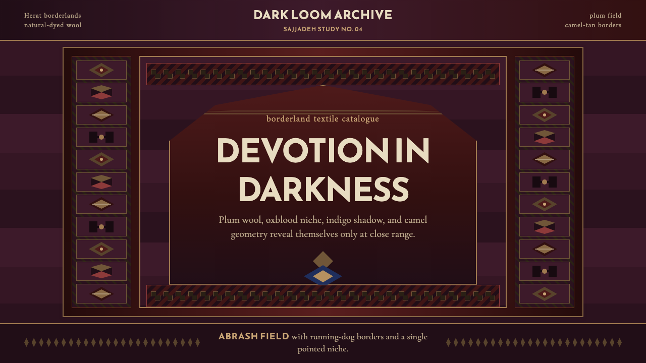 Afghan Baluchi Prayer RugDevotional darkness glows. Plum field, oxblood mihrab, and camel borders surf…虔敬暗色会发光:梅紫毯面、牛血红壁龛与骆驼棕边饰缓缓显影。
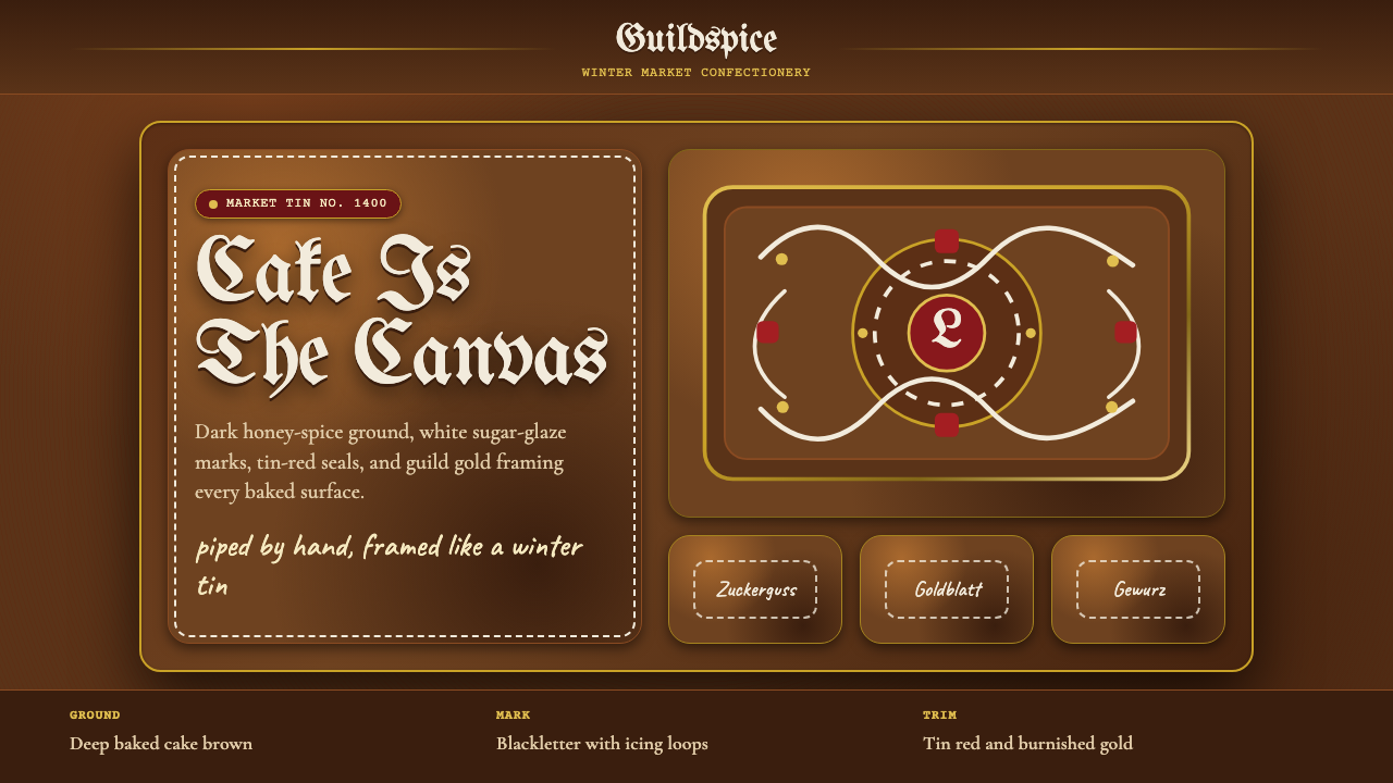 Nuremberg LebkuchenBaked dark, written in sugar. Cake-brown ground, blackletter type, white icin…深烤成底,糖霜作笔。蛋糕棕、哥特黑体与白色卷纹。
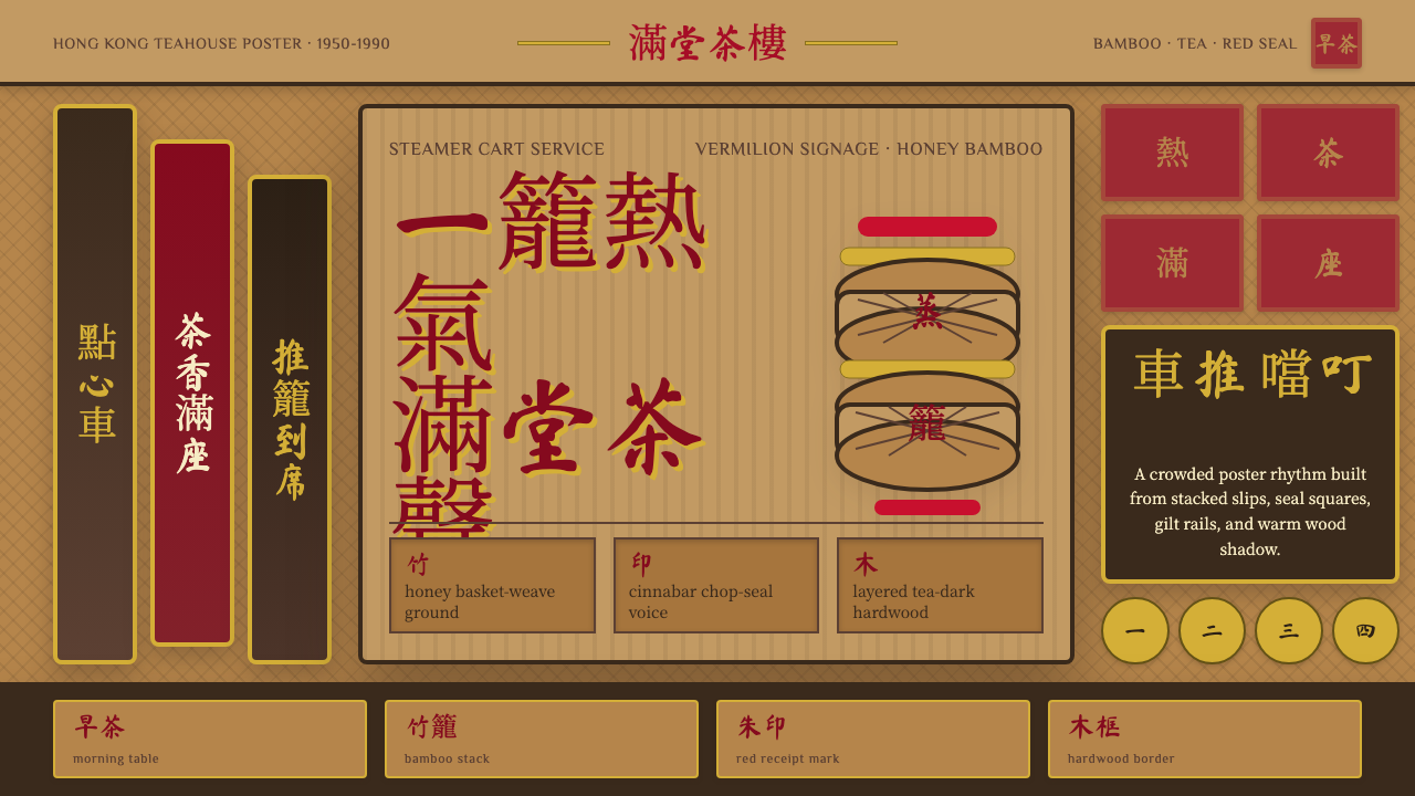 Dim Sum CartWarm clutter sings. Vermilion seals, bamboo weave, and brush type stack like…温热杂沓会唱:朱砂印、竹编纹与手写字层层堆成茶楼推车。
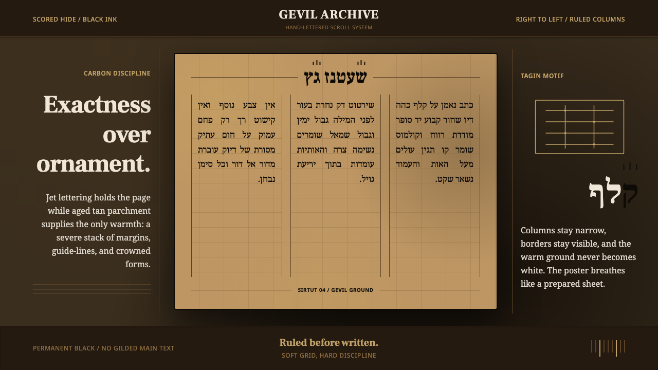 Hebrew STaM ScrollExactness over ornament. Jet ink, ruled Hebrew columns, and amber-tan parchme…精确压过装饰。黑墨、希伯来栏线与琥珀羊皮纸。
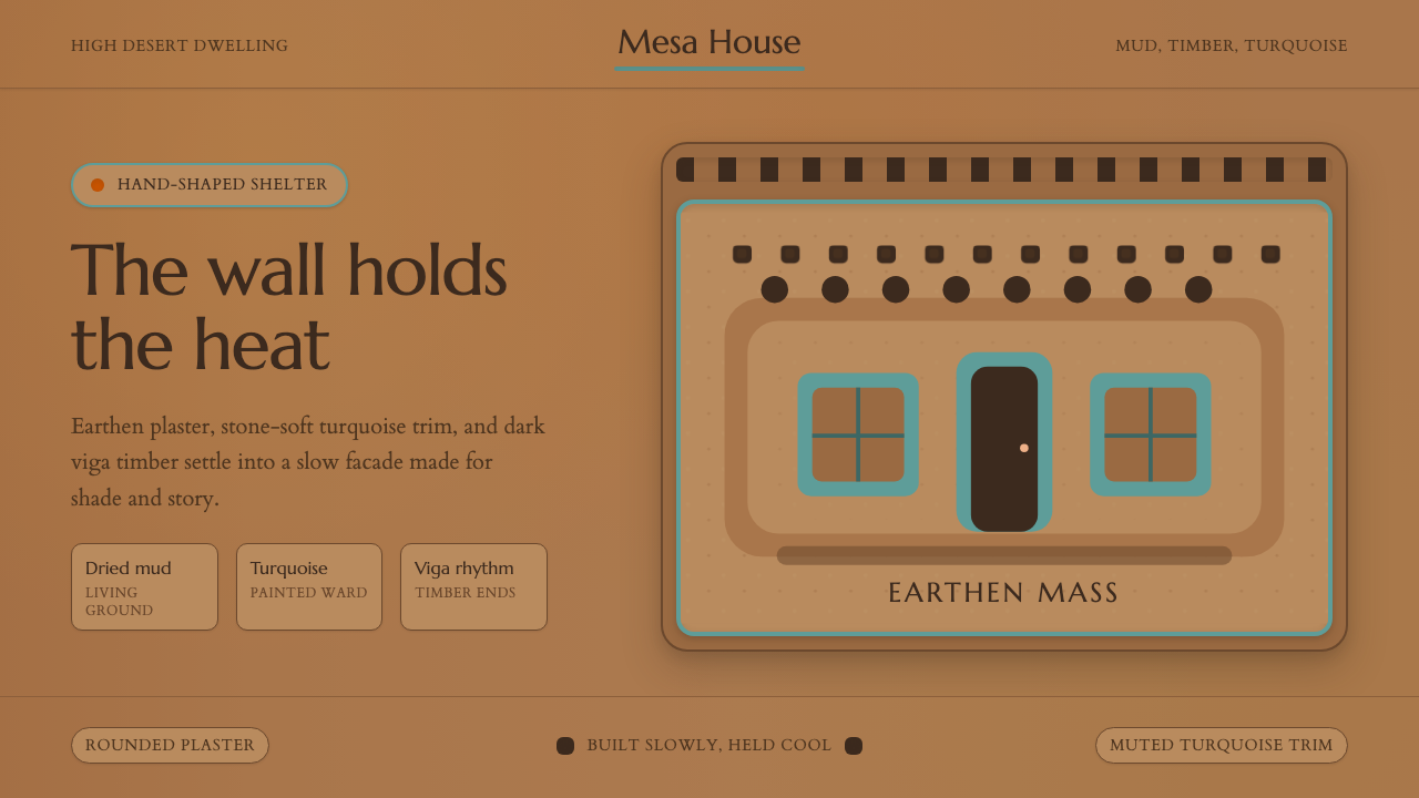 Adobe Pueblo SouthwestFeels made by hand. Earthen tan, turquoise trim, and viga rhythm shape the fr…手工泥墙的温度。土褐底、绿松石窗框与木梁节奏定调。