What is Hockney Pool Blue?什么是 Hockney Pool Blue?
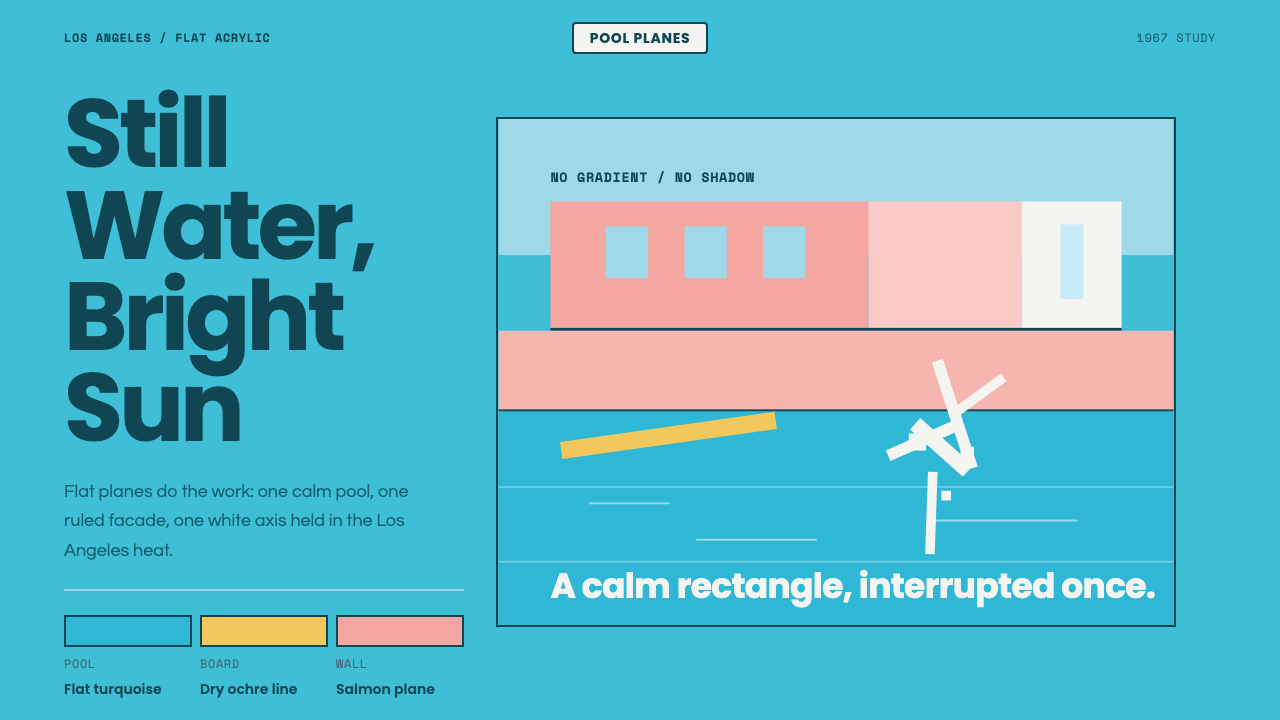
David Hockney froze a single splash against flat turquoise and hard geometric edges in 1967, and in doing so turned serenity itself into a graphic design language.1967年,大卫·霍克尼把一道水花定格在平涂的绿松石色与硬朗几何边缘之前,也由此把宁静本身变成了一门图形设计语言。
Hockney Pool Blue in briefHockney Pool Blue 速览
Hockney Pool Blue takes its visual cue from David Hockney's 1967 painting 'A Bigger Splash' — flat, smooth acrylic color fields, a calm turquoise swimming pool, a pale sky, and a single frozen white splash set against hard geometric architectural edges. It is a distilled version of California Modern: no gradients, no visible brushwork, just confident, matte planes of color composed with architectural precision.「霍克尼泳池蓝」以大卫·霍克尼1967年的画作《A Bigger Splash》为视觉线索——平涂、光滑的丙烯色域,一泓宁静的绿松石色泳池,苍白的天空,以及一道定格的白色水花,衬在硬朗的几何建筑边缘之前。这是被提炼过的加州现代主义:没有渐变,没有可见笔触,只有以建筑般的精确构成的、自信的哑光色块。
The style exists because Hockney, working in Los Angeles in the mid-1960s, was drawn to the way flat acrylic paint could render the specific quality of Southern California light and water — surfaces that in reality shimmer and ripple were rendered instead as still, clean, geometric shapes, trading the appearance of motion for a kind of frozen calm. The single splash in the source painting is the one deliberate exception: a burst of energetic white brushwork against an otherwise perfectly still, flat composition.这种风格之所以存在,是因为霍克尼在1960年代中期于洛杉矶创作时,被平涂丙烯颜料呈现南加州特有光线与水质的方式所吸引——现实中会闪烁、泛起涟漪的表面,被他转而呈现为静止、干净的几何形状,用一种冻结的宁静,替换了运动本身的外观。原作中那道水花是唯一被刻意打破的例外:在一幅其余部分完全静止、平涂的构图前,爆发出一阵充满活力的白色笔触。
Visually, the language trades depth for clarity. Generous negative space, crisp rectangular architecture, and a quiet diagonal splash motif carry most compositions, while salmon-pink architectural elements and ochre accents warm the cool turquoise ground. Every surface stays matte and airy; nothing glosses, nothing casts a soft naturalistic shadow, and the whole system reads as serene rather than dramatic.在视觉上,这门语言用清晰取代了纵深。充裕的负空间、利落的矩形建筑,以及一道安静的斜向水花母题,构成了大多数构图,而鲑鱼粉的建筑元素与赭黄的点缀,为冷调的绿松石地面注入暖意。每个表面都保持哑光与通透;没有任何东西发亮,没有任何东西投下柔和的自然主义阴影,整套系统读起来是宁静的,而非戏剧性的。
See the Hockney Pool Blue design system查看 Hockney Pool Blue 完整设计系统
Where does Hockney Pool Blue come from?Hockney Pool Blue 从何而来?
David Hockney moved from Britain to Los Angeles in the mid-1960s, drawn by the quality of Southern California light and, by his own account, by the visual appeal of the region's swimming pools — an object he found almost nowhere in the same abundance in Britain. He began a sustained series of pool paintings during this period, experimenting with how to render water, a subject with no fixed shape or texture, using the flat, quick-drying acrylic paints that had only recently become widely available to painters.大卫·霍克尼于1960年代中期从英国移居洛杉矶,被南加州光线的品质,以及据他本人所说,被这一地区泳池的视觉吸引力所打动——这种物件在英国几乎从未以同样的丰富程度出现过。他在这一时期开始了一系列持续创作的泳池画作,探索如何用当时刚刚在画家中普及开来的、平涂快干的丙烯颜料,来呈现水这样一种没有固定形状或质感的题材。
'A Bigger Splash,' completed in 1967, is the culminating work of this series and remains Hockney's most widely recognized image. The painting depicts an empty modernist house beside a pool, its diving board still swaying and a white splash frozen mid-air, with no human figure visible anywhere in the frame — the splash itself stands in for a human presence just out of view, a compositional choice that became one of the painting's most discussed features.1967年完成的《A Bigger Splash》是这一系列的集大成之作,也是霍克尼至今最广为人知的一幅画作。画中描绘的是一栋现代主义空房子旁边的泳池,跳水板还在摇晃,一道白色水花定格在半空中,画面中任何地方都看不到一个人影——水花本身代表着一个恰好在画面之外的人的存在,这一构图选择成为这幅画最受讨论的特征之一。
Hockney's technique in this period drew directly from Hard-Edge Painting, a strand of American abstraction associated with painters working in flat, sharply bounded color fields with no visible brushwork or blending, and from the broader California Modern architectural movement, which favored clean rectilinear forms, flat roofs, and glass walls suited to the region's climate and light. Hockney applied this hard-edged, architectural sensibility to a swimming pool — an inherently soft, moving subject — producing a tension between the fluid subject matter and the rigid, geometric technique that became the defining quality of the whole series.霍克尼在这一时期的技法直接借鉴自硬边绘画——美国抽象绘画的一个分支,与那些用平涂、边界锐利的色域作画、不留可见笔触或过渡的画家相关联——以及更广泛的加州现代主义建筑运动,这一运动偏爱简洁的直线形态、平屋顶与适应该地区气候与光线的玻璃墙面。霍克尼把这种硬边、建筑般的感性,运用到了泳池这样一种本质上柔软、流动的题材上,在流动的题材内容与刚硬的几何技法之间产生了张力,这成为整个系列最具决定性的品质。
The painting and the broader body of work around it became closely associated with a particular strand of mid-century Los Angeles visual culture — Pop-adjacent painting concerned with the surfaces and settings of contemporary leisure life, rendered with the same cool detachment associated with the wider Pop art movement of the period, but softened by Hockney's own warmth toward his subject matter rather than treated with pure irony.这幅画作及其周边更广泛的作品,与二十世纪中叶洛杉矶视觉文化的一个特定分支密切关联——一种与波普艺术相邻的绘画,关注当代休闲生活的表面与场景,以与那个时代更广泛的波普艺术运动相关联的同样冷静疏离的态度来呈现,但被霍克尼本人对其题材的温情所柔化,而非以纯粹的反讽来处理。
What defines the Hockney Pool Blue look?Hockney Pool Blue 的视觉特征是什么?
Color色彩
The palette centers on a calm, flat turquoise for water, a pale sky tone above it, salmon-pink for architectural elements, and ochre or warm yellow as a secondary accent. Colors are applied as flat, unmodulated fields rather than blended or gradated, keeping the palette crisp and confident throughout.色板以宁静、平涂的绿松石色作为水色为中心,其上是苍白的天空色调,建筑元素用鲑鱼粉,赭黄或暖黄作为次要强调色。色彩以平涂、无渐变的色域施加,而非混合或渐变,让整套色板始终保持干脆自信。
Flat Acrylic Planes平涂丙烯色块
Every surface is rendered as a smooth, matte, unmodulated field of color with no visible brushwork, texture, or gradient. This flatness is the technique's defining quality — it treats color as an architectural material in its own right rather than as a rendering of light and shadow.每个表面都呈现为光滑、哑光、无渐变的色域,没有可见的笔触、质感或渐变。这种平涂感是这项技法的决定性品质——它把色彩本身当作一种建筑材料,而非对光影的描绘。
Hard Geometric Edges硬朗几何边缘
Architectural elements — walls, diving boards, pool edges — are rendered as crisp rectangles and clean lines with no soft transitions, borrowing directly from Hard-Edge Painting's sharply bounded color fields. This geometric precision gives the otherwise calm composition a quiet structural confidence.建筑元素——墙面、跳水板、泳池边缘——被呈现为利落的矩形与干净的线条,没有柔和的过渡,直接借鉴自硬边绘画那种边界锐利的色域。这种几何上的精确性,为这一其余部分宁静的构图,赋予一种沉静的结构性自信。
The Frozen Splash Motif定格水花母题
A single burst of energetic, textured white brushwork — the one moment of visible motion and expressive mark-making in an otherwise perfectly still, flat composition — stands in as the system's signature accent. It is used sparingly, as one deliberate contrast rather than a repeated pattern.一阵充满活力、带质感的白色笔触——在一幅其余部分完全静止、平涂的构图中,唯一可见运动与表现性笔法的时刻——作为这套系统的标志性强调元素存在。它的使用非常克制,作为一处刻意的对比,而非重复出现的图案。
Generous Negative Space充裕的负空间
Compositions leave large areas of flat sky, water, or wall untouched by detail, treating emptiness as an active compositional choice that reinforces the sense of calm. Density is avoided; the eye is given room to rest on large, quiet fields of color.构图留下大片未加细节的天空、水面或墙面,把空白当作一种主动的构图选择,强化了宁静感。密度被刻意避免;观者的目光被给予空间,得以在大片安静的色域上休憩。
Salmon-Pink Warmth鲑鱼粉暖意
Architectural surfaces are frequently rendered in a warm salmon-pink, providing contrast and warmth against the cool turquoise of the pool water. This pairing of a cool water tone with warm architectural color is one of the system's most recognizable and repeatable formulas.建筑表面常常以温暖的鲑鱼粉呈现,与泳池水面冷调的绿松石色形成对比与暖意。这种冷调水色与暖调建筑色彩的搭配,是这套系统最具辨识度、最可重复的公式之一。
Matte, Airy Surfaces哑光、通透的表面
Nothing in the system is glossy or reflective; every surface, whether water, sky, or wall, carries the same flat matte quality. This consistency across otherwise very different materials — water versus stucco versus sky — is what unifies the composition into a single coherent visual field.系统中没有任何东西是光泽或反光的;无论是水面、天空还是墙面,每个表面都带有同样的平涂哑光品质。这种在原本迥异的材质——水、灰泥墙、天空——之间保持的一致性,正是使整个构图统一成单一连贯视觉场域的关键。
See the Hockney Pool Blue design system查看 Hockney Pool Blue 完整设计系统
Who shaped Hockney Pool Blue?谁塑造了 Hockney Pool Blue?
A British-born painter who moved to Los Angeles in the mid-1960s, Hockney produced an extended series of swimming pool paintings during this period, culminating in 'A Bigger Splash' in 1967. His technique of rendering water and architecture as flat, hard-edged color planes, applied with fast-drying acrylic paint, became one of the most recognized visual signatures of California art from this era.一位英国出生的画家,霍克尼于1960年代中期移居洛杉矶,在这一时期创作了一系列泳池画作,于1967年在《A Bigger Splash》中达到高峰。他用快干丙烯颜料,把水与建筑呈现为平涂、硬边色块的技法,成为这个时代加州艺术最具辨识度的视觉签名之一。
How do you use Hockney Pool Blue today?今天怎么用 Hockney Pool Blue?
Hockney Pool Blue transfers well to any context that wants to communicate calm, clarity, and quiet confidence rather than energy or density. Its core discipline is trading depth for flatness — every surface should read as a smooth, matte plane of color, with negative space treated as generously as any painted element.「霍克尼泳池蓝」能很好地移植到任何想要传达宁静、清晰与沉静自信、而非活力或密度的场景。它的核心自律是用平涂取代纵深——每个表面都应读作光滑、哑光的色块,负空间应被当作与任何绘制元素同等重要地对待。
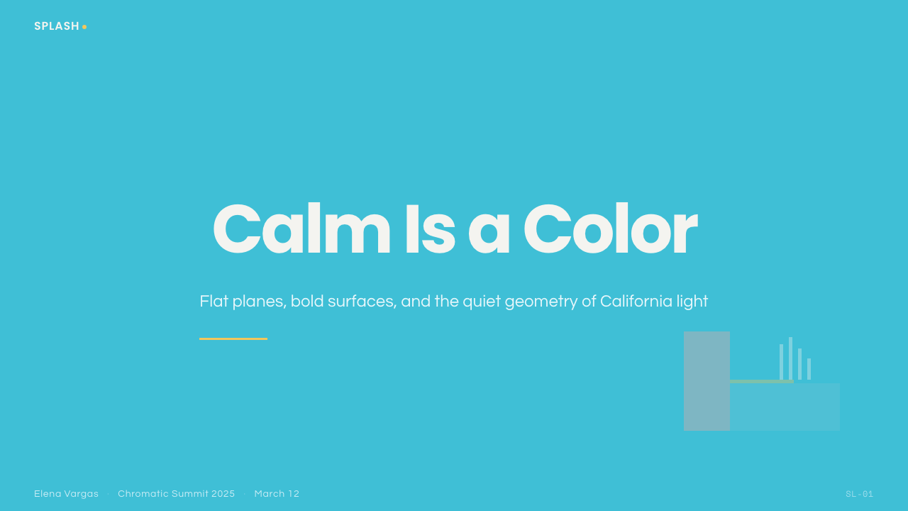
For presentation slides, a cover page benefits enormously from a large flat turquoise field with a single small white splash motif in one corner and a title set in confident, minimal type — the emptiness itself does most of the compositional work. Content slides should keep density low, using salmon-pink and ochre sparingly as accent colors against a mostly turquoise-and-white palette. Data slides work well when charts are rendered as flat, unshaded geometric shapes rather than gradients or 3D effects, echoing the source painting's hard-edged planes.在演示文稿中,封面页极大受益于一大片平涂的绿松石色域,一角有一个小小的白色水花母题,标题以自信、简约的字体设置——空白本身完成了大部分构图工作。内容页应保持低密度,鲑鱼粉与赭黄色作为强调色克制地使用,衬在以绿松石与白色为主的色板之上。数据页在图表被呈现为平涂、无阴影的几何形状而非渐变或3D效果时效果最佳,呼应原作硬边色块的特质。
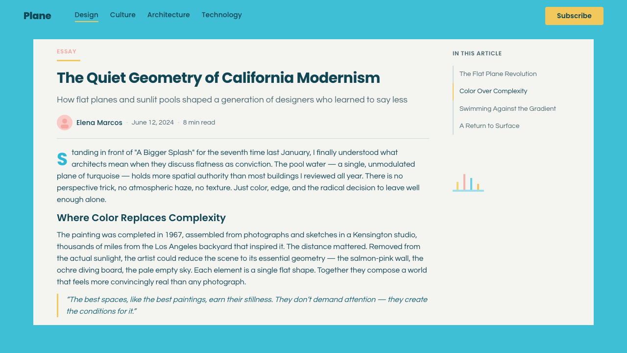
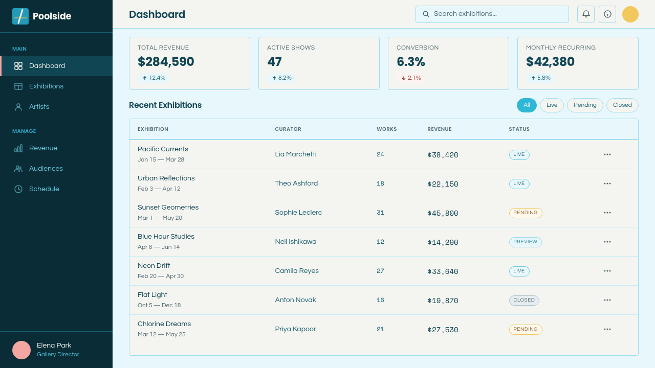
For web interfaces, the aesthetic suits hospitality, wellness, and lifestyle brands especially well — a pricing page can use a flat turquoise background with salmon-pink card surfaces and a single white-splash-inspired accent mark for the recommended tier. Dashboards are a harder fit given the style's low information density, but a calm landing or account page benefits directly from the palette and flat geometric treatment.对于网页界面,这种美学尤其适合酒店、养生与生活方式品牌——定价页面可以用平涂绿松石背景搭配鲑鱼粉卡片表面,为推荐档位配一个受白色水花启发的强调标记。仪表板由于这种风格较低的信息密度而较难适配,但一个宁静的落地页或账户页面能直接从这套色板与平涂几何处理中受益。
For editorial and marketing work, the style suits any content about leisure, architecture, or a considered, unhurried lifestyle — a pull-quote set against a flat turquoise field, with a small white splash accent in one corner, borrows the vocabulary convincingly. Marketing pages for travel, real estate, or summer products benefit from the palette's built-in sense of calm luxury.在编辑与营销内容中,这种风格适合任何关于休闲、建筑,或从容深思生活方式的内容——一段衬在平涂绿松石色域上、一角配一个小白色水花强调的引言,能令人信服地借用这套语汇。旅游、房地产或夏季产品的营销页面,都能从这套色板内置的宁静奢华感中受益。
The most common mistake is adding gradients, soft shadows, or photographic texture to what should remain flat, matte color fields — this immediately breaks the hard-edged, Pop-adjacent quality that defines the style and turns it into generic photorealistic pool imagery instead. Equally, overusing the splash motif across many elements dilutes its power; it should remain a single, deliberate accent rather than a repeated pattern.最常见的错误,是给本应保持平涂哑光的色块添加渐变、柔和阴影或摄影质感——这会立刻破坏定义这种风格的硬边、波普邻近的品质,转而变成泛泛的写实泳池图像。同样,在许多元素上过度使用水花母题会稀释它的力量;它应保持为唯一、刻意的强调,而非重复出现的图案。
See the Hockney Pool Blue design system查看 Hockney Pool Blue 完整设计系统
Hockney Pool Blue — FAQHockney Pool Blue · 常见问题
Why is the splash rendered with visible brushwork when everything else is flat and smooth?为什么水花用可见的笔触呈现,而其他一切都平涂光滑?
The contrast is deliberate and is one of the most discussed features of Hockney's original painting: the splash is the one moment of implied motion and human presence in an otherwise perfectly still composition, and rendering it with visible, energetic brushwork against the flat surrounding fields makes that contrast immediately legible. If the splash were rendered as flatly as everything else, the sense of a frozen instant would be lost entirely.这种对比是刻意为之的,也是霍克尼原作最受讨论的特征之一:水花是这幅其余部分完全静止的构图中,唯一暗示运动与人的存在的时刻,用可见、充满活力的笔触将其呈现在平涂的周围色域之前,让这种对比立刻清晰可辨。如果水花也被同样平涂地呈现,「定格瞬间」的感觉就会完全丧失。
Why does the original painting have no visible human figure?为什么原作中没有可见的人物?
The absence of a figure is a compositional choice that makes the splash itself carry the implication of a person having just jumped or dived out of frame — the water's disturbance stands in for a human presence the viewer never actually sees. This ambiguity, rather than a literal depiction of a swimmer, became one of the painting's most discussed and analyzed qualities.没有人物出现是一个构图选择,让水花本身承载起「有人刚刚跳出画面」的暗示——水面的扰动,代表着观者从未真正看见的人的存在。这种含糊性,而非对游泳者的字面描绘,成为这幅画最受讨论与分析的品质之一。
What is Hard-Edge Painting, and how does it relate to this style?什么是硬边绘画?它与这种风格有什么关系?
Hard-Edge Painting is a strand of American abstract painting characterized by flat, sharply bounded fields of color with no blending, shading, or visible brushwork at the edges between shapes. Hockney applied this technique, originally developed for pure abstraction, to a representational subject — a swimming pool and its surrounding architecture — producing a distinctive tension between a recognizable real-world scene and an abstraction-derived, geometrically precise rendering technique.硬边绘画是美国抽象绘画的一个分支,特点是平涂、边界锐利的色域,形状之间的边缘没有混合、渲染或可见笔触。霍克尼把这项最初为纯抽象而发展出的技法,应用于一个具象题材——一座泳池及其周边建筑——在一个可辨认的真实场景与源自抽象艺术、几何精确的呈现技法之间,产生了独特的张力。
Why does this style avoid gradients and soft lighting effects?为什么这种风格避开渐变与柔和的光照效果?
The original technique relies on flat acrylic paint applied in smooth, unmodulated fields, which produces color with no visible gradation or naturalistic shading. Introducing gradients or soft shadows would import a photorealistic or painterly quality that works against the deliberately flat, almost graphic-design-like precision that gives Hockney's pool paintings their distinctive calm — the technique treats color as a flat material rather than as a simulation of how light actually falls on water or architecture.原始技法依赖平涂丙烯颜料以光滑、无渐变的方式施加,产出的色彩没有可见的层次变化或写实的明暗渲染。引入渐变或柔和阴影,会带入一种写实或绘画性的品质,与那种赋予霍克尼泳池画作独特宁静感的、刻意平涂、近乎图形设计般的精确性背道而驰——这项技法把色彩当作一种平面材料,而非对光线实际如何落在水面或建筑上的模拟。
Where does this style struggle or feel out of place?这种风格在哪些场景会显得不合适?
It struggles for content that needs to feel urgent, dense, or information-heavy — data-intensive enterprise tools, news platforms, or anything competing for attention with many simultaneous elements will find the style's generous negative space and low visual density work against functional clarity. It can also feel thin or decorative when applied without any of the underlying hard-edge geometric precision, since a merely turquoise-and-pink color scheme without the flat, architectural composition misses what actually makes the style distinctive.对于需要传达紧迫感、密度或信息繁重感的内容——数据密集的企业工具、新闻平台,或任何需要用众多同时呈现的元素争夺注意力的场景——这种风格充裕的负空间与较低的视觉密度,会与功能清晰度背道而驰。当应用时缺失底层的硬边几何精确性,它也可能显得单薄或流于装饰,因为一套仅仅是绿松石加粉色的配色方案,若没有平涂、建筑般的构图,就没有抓住真正使这种风格与众不同的东西。
Related design styles相关设计风格
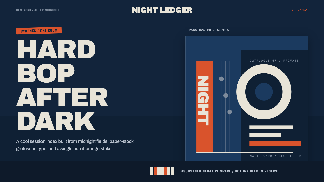 Blue Note JazzCool intelligence, printed flat. Midnight blue, paper type, and one burnt-ora…冷静而智性的平面感:午夜蓝、纸白粗体与一抹焦橙油墨。
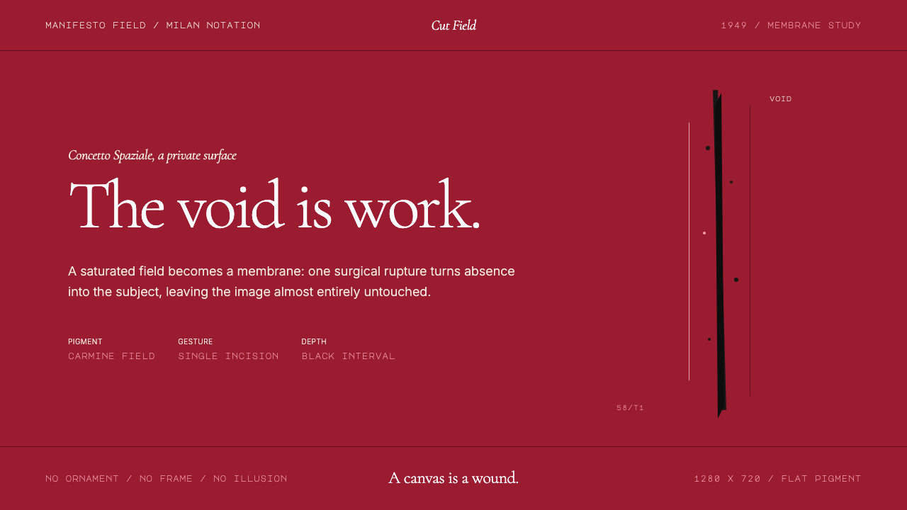 Spatialism (Fontana Cut, 1949)Absence becomes medium. Carmine field, Garamond restraint, one black incision.缺席成为媒介:胭脂红色场、Garamond克制排版、一道黑色切口。
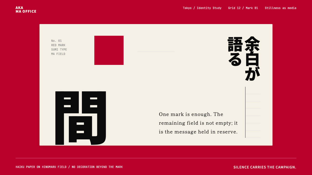 Dentsu Tokyo CreativeSilence does the selling. Hinomaru red, sumi type, and empty columns carry th…以静制胜:日之丸红、墨黑字体与空列共同承托标记。
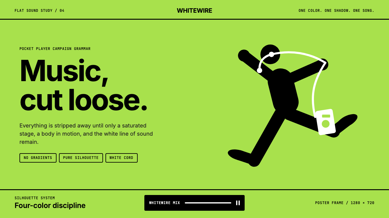 iPod Silhouette 2004Discipline dances. Lime flat-field, black silhouette, and one white cord carr…纪律在跳舞。柠檬绿纯色场、黑色剪影与白线撑起海报。
 Klein Blue (IKB)Color becomes the content. Pure ultramarine field, white italic serif, one go…色彩即内容:纯群青场域、白色斜体衬线与一线金色。
 Paul Rand / IBM Corporate IdentityCorporate modernism stays exact. Blue 8-bar stripes, high-contrast serif, har…企业现代主义保持精确:蓝色八条纹、高反差衬线与硬网格色块。