What is Succulent Cactarium?什么是 Succulent Cactarium?
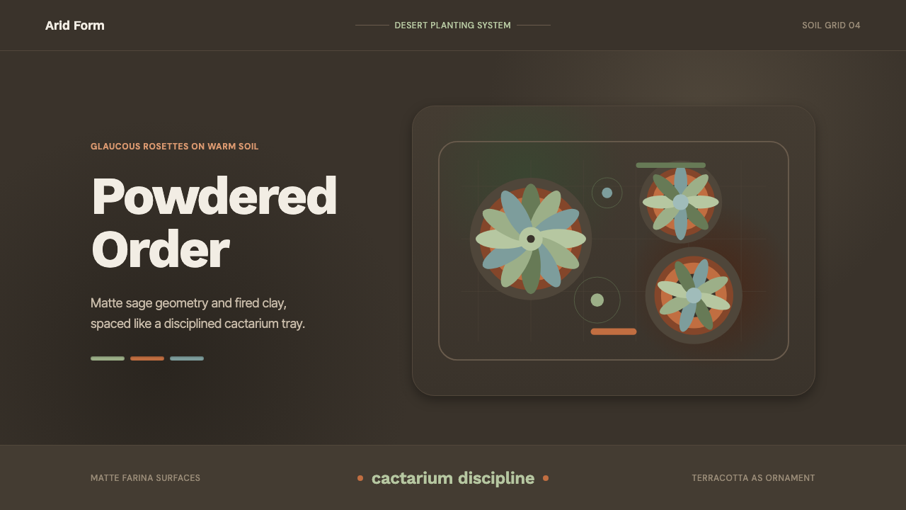
Succulent Cactarium takes the quiet discipline of arranging desert plants and turns it into a design language built entirely from restraint, geometry, and dust.「沙漠多肉栽植」把安排沙漠植物的静默自律,转化成一门完全由克制、几何与粉尘感构筑的设计语言。
Succulent Cactarium in briefSucculent Cactarium 速览
Succulent Cactarium is a design language drawn from the contemporary practice of cactarium and succulent cultivation — the careful, minimalist arrangement of echeveria, agave, and other desert plants in geometric order on dry soil. It is a system built almost entirely on texture and restraint rather than color variety: bluish-grey sage greens, the warm clay orange of terracotta, and a dark, dry, warm-toned soil ground make up nearly the entire palette.「沙漠多肉栽植」是一门取自当代多肉与仙人掌栽植实践的设计语言——把拟石莲花、龙舌兰等沙漠植物以极简的方式、按几何秩序小心排布。这是一套几乎完全建立在质感与克制之上、而非色彩多样性之上的系统:灰蓝的鼠尾草绿、陶土般温暖的橙色,以及深暖色调的干燥土壤底色,几乎构成了它的全部色板。
The style exists because succulent styling itself is a discipline of subtraction. A well-kept cactarium does not crowd its plants; it gives each rosette room to be seen individually, arranges pots with geometric intention, and lets dry soil and matte clay do the visual work that glossy ceramics or bright color would do in other plant-styling traditions. Nothing in this system is glossy, saturated, or busy — everything reads as powdery, sun-dried, and deliberately spaced.这种风格之所以存在,是因为多肉造型本身就是一门「做减法」的学问。一处打理得当的多肉栽植园不会让植物拥挤在一起;它给每一朵莲座形态足够的空间被单独看见,以几何意图安排花盆,让干燥的土壤与哑光的陶土完成本该由光泽陶瓷或鲜艳色彩在其他植物造型传统中所承担的视觉工作。这套系统中没有任何东西是光泽的、饱和的或繁忙的——一切都读作粉霜质地、日晒干燥,且刻意留有间距。
Visually, the language is defined by contrast between a dark, warm-soil ground and the cool, bluish-grey tone of the plants themselves, with terracotta orange as the system's single warm accent. Rosette geometry — the radiating, symmetrical leaf pattern of echeveria and similar succulents — recurs as a structural motif, and generous negative space is treated as essential rather than optional, echoing the way a real cactarium gives each plant breathing room rather than crowding specimens together.在视觉上,这门语言由深暖色调土壤底色与植物本身冷调灰绿色之间的对比所定义,陶土橙是这套系统唯一的暖色强调。莲座几何——拟石莲花及类似多肉植物那种放射状、对称的叶片图案——作为结构性母题反复出现,充裕的负空间被当作必要而非可选项,呼应了真实的多肉栽植园给每株植物留出呼吸空间、而非让标本相互拥挤的做法。
See the Succulent Cactarium design system查看 Succulent Cactarium 完整设计系统
Where does Succulent Cactarium come from?Succulent Cactarium 从何而来?
Succulent cultivation as an aesthetic practice has roots in desert horticulture across the arid regions of North America, particularly the American Southwest, where echeveria, agave, and related rosette-forming plants grow natively and have long been cultivated both for practical drought resistance and for their striking, sculptural form. Unlike lush tropical plant styling, desert horticulture works with scarcity as a given — water is precious, growth is slow, and the resulting aesthetic values patience and precision over abundance.作为一种审美实践的多肉栽培,其根源在于北美干旱地区——尤其是美国西南部——的沙漠园艺,拟石莲花、龙舌兰及相关的莲座状植物在那里原生生长,长期以来既因其实用的耐旱性、也因其引人注目的雕塑般形态而被栽培。与郁郁葱葱的热带植物造型不同,沙漠园艺把稀缺当作前提来对待——水是珍贵的,生长是缓慢的,由此产生的审美重视耐心与精确,胜过丰盛。
The contemporary cactarium as a design object — a curated, often small-scale arrangement of succulents displayed with the same intentionality as a bonsai collection — emerged from the broader twenty-first-century revival of minimalist plant styling, itself connected to wider minimalist design movements in interiors and lifestyle branding. Where mid-century houseplant culture often emphasized abundance and variety, contemporary succulent styling emphasizes restraint: fewer specimens, more space, and a deliberate matte, dust-toned material palette that echoes the plants' own natural bloom — the powdery, waxy coating many succulents develop as protection from sun and moisture loss.作为一种设计对象的当代多肉栽植园——像盆景收藏一样精心策划、常常小规模地展示多肉植物——脱胎于二十一世纪更广泛的极简植物造型复兴,而这场复兴本身又与室内设计及生活方式品牌中更广泛的极简主义设计运动相连。二十世纪中叶的室内盆栽文化常常强调丰盛与多样性,当代多肉造型则强调克制:更少的标本、更多的空间,以及一套刻意选择的哑光、带粉尘色调的材质色板,呼应植物自身天然的「白霜」——许多多肉植物为抵御日晒与水分流失而生成的那层粉状蜡质外皮。
Terracotta, the warm fired-clay material used for plant pots across countless horticultural traditions for centuries, became the material signature of this specific aesthetic because its unglazed, matte, faintly rough surface visually matches the powdery quality of the plants themselves — unlike glossy glazed ceramic, which would introduce a shine at odds with the desert plants' natural bloom. The pairing of terracotta with sage-toned succulents on dark soil became a recognizable, repeatable visual formula precisely because each material choice reinforces the same underlying value: nothing here should shine.陶土——数世纪以来无数园艺传统中用于花盆的暖色烧制粘土材料——之所以成为这种特定美学的材质标志,是因为它未上釉、哑光、略带粗糙的表面在视觉上与植物本身的粉霜质感相匹配——不同于光泽的上釉陶瓷,那种反光会与沙漠植物天然的白霜格格不入。陶土与鼠尾草色调多肉植物在深色土壤上的搭配,之所以成为一个可辨认、可重复的视觉公式,正是因为每一个材质选择都强化了同一个底层价值:这里没有任何东西应该发亮。
This aesthetic sits within a broader contemporary movement toward minimalist arrangement across design disciplines — an approach that treats generous negative space and restrained material palettes as markers of sophistication rather than austerity. Applied specifically to succulent styling, it produced a design vocabulary distinct enough to be recognized on sight: dry, matte, spaced, and quietly ordered, in deliberate contrast to more maximalist or colorful approaches to plant display.这种美学处于设计各领域朝向极简主义排布的更广泛当代运动之中——这一取向把充裕的负空间与克制的材质色板视为精致的标志,而非苦行的标志。将其具体应用于多肉造型,产出了一套辨识度极高、一望即知的设计词汇:干燥、哑光、留有间距、安静有序,与更为繁复或色彩缤纷的植物展示手法形成刻意的对比。
What defines the Succulent Cactarium look?Succulent Cactarium 的视觉特征是什么?
Color色彩
The palette is narrow and deliberate: bluish-grey sage green for the plants, warm terracotta orange for pots, and a dark, warm-toned soil brown as the ground. No bright saturated colors, no floral pinks or reds, and no cool blue-white lighting appear anywhere — every hue is muted, as if dusted with the same fine desert powder that coats the plants themselves.色板狭窄而克制:植物用灰蓝调的鼠尾草绿,花盆用温暖的陶土橙,底色是深暖调的土壤棕。任何地方都不出现明亮饱和的色彩、花卉般的粉红或红色,也不出现冷调的蓝白光——每一种色相都是柔和的,仿佛被同一层覆盖植物本身的细密沙漠粉尘所笼罩。
Matte, Powdery Texture哑光粉霜质感
Every surface in this system is matte — no gloss, no shine, no reflective highlight anywhere. This directly mirrors the natural bloom of many succulents, a waxy, powdery coating that protects the plant from sun and dehydration, and it extends to the unglazed terracotta and the dry, dusty soil ground, so that the entire visual field shares one consistent, non-reflective quality.这套系统中的每一个表面都是哑光的——任何地方都没有光泽、反光或高光。这直接映照了许多多肉植物天然的白霜——一层保护植物免受日晒与脱水的蜡质粉状外皮——并延伸到未上釉的陶土与干燥、带粉尘感的土壤底色,使整个视觉场共享同一种一致的、不反光的质地。
Rosette Geometry莲座几何
The radiating, symmetrical leaf pattern of echeveria and similar succulents recurs as a structural motif throughout the system, echoed in circular arrangement patterns, radial spacing, and pot placement. This geometric repetition gives the style an underlying order even though the plants themselves are organic in form.拟石莲花及类似多肉植物那种放射状、对称的叶片图案,作为结构性母题贯穿整套系统反复出现,在圆形排布图案、放射状间距与花盆摆放中得到呼应。这种几何上的重复,为这种风格赋予了一种底层的秩序感,尽管植物本身的形态是有机的。
Terracotta as the Single Warm Accent陶土作为唯一暖色强调
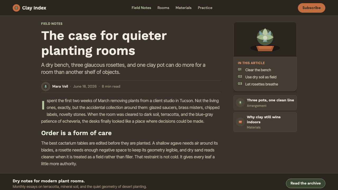
Terracotta orange is used sparingly and specifically for pots and containers, functioning as the one warm note against the otherwise cool sage-and-soil palette. It is never used decoratively or spread across large areas — its role is to anchor and contain the plants, echoing its literal horticultural function.陶土橙的使用非常克制,专门用于花盆与容器,充当着在其余冷调鼠尾草与土壤色板中唯一的暖色音符。它从不作为装饰或大面积铺陈使用——它的作用是锚定并容纳植物,呼应它在实际园艺中的真实功能。
Generous Negative Space充裕的负空间
Composition treats empty space as essential rather than wasted — plants and pots are spaced with clear visual breathing room around each specimen, mirroring the way a well-kept cactarium avoids crowding. Density is treated as a failure of restraint rather than a sign of abundance.构图把空白视为必要而非浪费——植物与花盆之间留有清晰的视觉呼吸空间,围绕每一株标本,呼应了一处打理得当的多肉栽植园避免拥挤的做法。密度被视为克制的失败,而非丰盛的标志。
Dark Warm-Soil Ground深暖调土壤底色
The background is dark and warm-toned, evoking dry desert soil rather than a neutral studio backdrop or bright white surface. This dark ground allows the cooler sage greens of the plants and the warm terracotta of the pots to register with quiet contrast rather than washing out against a bright field.背景是深色且暖调的,唤起的是干燥的沙漠土壤,而非中性的摄影棚背景或明亮的白色表面。这种深色底面让植物较冷调的鼠尾草绿与花盆温暖的陶土色能够以安静的对比呈现出来,而不是在明亮底面上被冲淡。
Restraint as Structure克制即结构
Every design choice in this system serves the same underlying discipline: fewer specimens, fewer colors, fewer textures, more space between each element. This is not minimalism for its own sake but a direct visual translation of how desert plants themselves survive — through economy rather than abundance.这套系统中的每一个设计选择都服务于同一底层自律:更少的标本、更少的颜色、更少的质感、每个元素之间更多的空间。这并非为极简而极简,而是对沙漠植物自身生存方式的直接视觉转译——依靠节制而非丰盛。

See the Succulent Cactarium design system查看 Succulent Cactarium 完整设计系统
Who shaped Succulent Cactarium?谁塑造了 Succulent Cactarium?
The horticulturalists and specialist nurseries who cultivate echeveria, agave, and related rosette succulents for aesthetic display — rather than purely for drought-resistant landscaping — established the practical conventions this style draws from: careful spacing between specimens, geometric pot arrangement, and an emphasis on each plant's individual rosette form being visible rather than obscured by crowding.那些为审美展示(而非仅仅为耐旱景观)而栽培拟石莲花、龙舌兰及相关莲座状多肉植物的园艺家与专业苗圃,确立了这种风格所借鉴的实践惯例:标本之间的细心间距、几何化的花盆排布,以及强调每株植物各自的莲座形态应当清晰可见、而非被拥挤所掩盖。
Contemporary interior and lifestyle stylists who apply broader minimalist design principles to plant display helped translate desert horticulture's natural restraint into a deliberate design vocabulary — favoring matte terracotta over glazed ceramic, dark warm-soil grounds over neutral studio backdrops, and generous spacing over dense, varied plant collections.将更广泛的极简设计原则应用于植物展示的当代室内与生活方式造型师,帮助把沙漠园艺天然的克制转化为一套刻意的设计词汇——偏爱哑光陶土胜过上釉陶瓷,偏爱深暖调土壤底色胜过中性摄影棚背景,偏爱充裕的间距胜过密集多样的植物收藏。
How do you use Succulent Cactarium today?今天怎么用 Succulent Cactarium?
Succulent Cactarium transfers well to any context that wants to communicate calm, patience, and quiet sophistication rather than energy or abundance. The style's core discipline is restraint — a narrow palette, matte surfaces, and generous space between elements — which makes it especially suited to content that benefits from a slower, more contemplative pace.「沙漠多肉栽植」能很好地移植到任何想要传达平静、耐心与安静精致感、而非活力或丰盛感的场景。这种风格的核心自律是克制——狭窄的色板、哑光的表面,以及元素之间充裕的空间——这使它尤其适合那些能从更缓慢、更沉思的节奏中受益的内容。
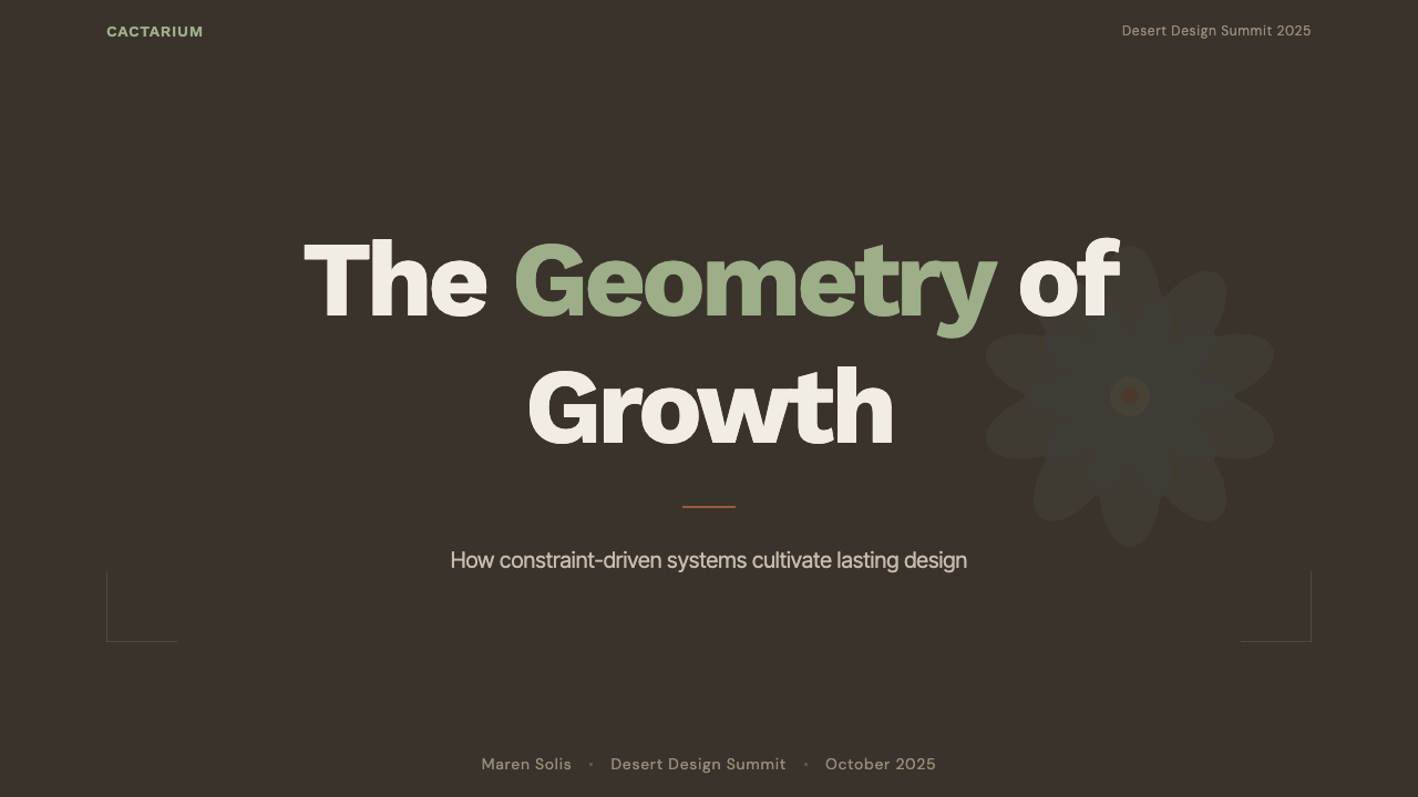
For presentation slides, a cover page works well with a single large rosette-like geometric motif set against the dark warm-soil ground, with terracotta used sparingly as an accent line or divider. Content slides should keep density low: one idea per slide, generous margins, and sage-and-terracotta color coding used only to distinguish categories rather than for visual richness. Data slides can borrow the rosette's radial geometry directly for circular or radial chart types, which feel native to the system rather than borrowed from elsewhere.在演示文稿中,封面页适合用一个巨大的莲座状几何母题衬在深暖调土壤底色上,陶土色克制地用作强调线条或分隔线。内容页应保持低密度:每页一个想法,宽裕的边距,鼠尾草绿与陶土色的编码仅用于区分类别,而非用于视觉丰富度。数据页可以直接借用莲座的放射状几何用于圆形或放射状图表类型,这在这套系统中读起来是原生的,而非从别处借来的。
For web interfaces, the style suits wellness, lifestyle, and slow-living brands particularly well — dashboards and account pages benefit from the dark warm-ground treatment paired with matte card surfaces and sage-green accent states, while pricing pages can use a single terracotta highlight for the recommended tier against an otherwise quiet, spaced layout.对于网页界面,这种风格尤其适合养生、生活方式与慢生活品牌——仪表板与账户页面能从深暖调底色搭配哑光卡片表面与鼠尾草绿强调状态中受益,而定价页面可以用一处陶土色高亮标出推荐档位,衬在其余安静、留有间距的版面之中。
For editorial and marketing work, the aesthetic suits any content about craft, patience, or mindful living — home and garden editorial, sustainability marketing, or slow-fashion branding all benefit from the style's inherent sense of unhurried care. Generous negative space around a pull-quote, framed by a thin terracotta rule, reads as considered rather than sparse.在编辑与营销内容中,这种美学适合任何关于手艺、耐心或有意识生活的内容——家居与园艺编辑内容、可持续发展营销,或慢时尚品牌,都能从这种风格内在的从容感中受益。围绕一段引言的充裕留白,由一条细陶土色线条勾勒,读起来是经过深思熟虑的,而非空洞的。
The most common mistake is treating the style as simply 'add a succulent icon' without adopting its underlying restraint — crowding a layout with many small plant motifs, using bright saturated greens instead of the muted sage tone, or introducing glossy surfaces all undermine the matte, spaced quality that gives the style its calm authority. The style rewards subtraction: fewer elements, more space, and a commitment to matte over shine throughout.最常见的错误,是把这种风格简单理解为「加一个多肉图标」,而没有采纳其底层的克制——用许多小型植物图案填满版面、使用明亮饱和的绿色而非柔和的鼠尾草色调,或引入光泽表面,都会破坏赋予这种风格沉静权威感的哑光、留白特质。这种风格奖励的是做减法:更少的元素、更多的空间,以及全程坚持哑光而非光泽。
See the Succulent Cactarium design system查看 Succulent Cactarium 完整设计系统
Succulent Cactarium — FAQSucculent Cactarium · 常见问题
Why does this style avoid bright, saturated greens in favor of muted sage tones?为什么这种风格避开明亮饱和的绿色,而偏爱柔和的鼠尾草色调?
The muted, bluish-grey sage tone directly reflects the natural bloom that many succulents develop — a powdery, waxy coating that protects the plant from intense sun exposure and water loss in arid climates. A bright, saturated green would look more like a lush tropical houseplant, which contradicts the desert plant's actual biology and undermines the quiet, dust-toned quality the whole system depends on.柔和、灰蓝调的鼠尾草色调直接反映了许多多肉植物天然生成的白霜——一层在干旱气候中保护植物免受强烈日晒与水分流失的蜡质粉状外皮。明亮饱和的绿色看起来会更像郁郁葱葱的热带室内植物,这与沙漠植物的实际生物学特性相矛盾,也会破坏整套系统所依赖的那种安静、带粉尘感的品质。
Why terracotta specifically, rather than glazed ceramic pots?为什么specifically是陶土,而非上釉陶瓷花盆?
Unglazed terracotta has a matte, slightly rough, porous surface that visually and materially matches the powdery bloom of the plants it holds, while also being practically suited to succulents because its porous clay allows excess moisture to evaporate, helping prevent root rot in plants adapted to arid conditions. Glazed ceramic would introduce a shine that breaks the system's consistent matte quality and also, practically, retains more moisture than desert plants prefer.未上釉的陶土拥有哑光、略带粗糙的多孔表面,在视觉与材质上都与它所盛放的植物那层粉霜外皮相匹配,同时也实际上适合多肉植物,因为多孔的粘土能让多余水分蒸发,有助于防止适应干旱环境的植物根部腐烂。上釉陶瓷会引入一种破坏系统一致哑光品质的光泽,实际上也会保留比沙漠植物所偏好更多的水分。
How much negative space is actually necessary for this style to read correctly?要让这种风格正确呈现,实际上需要多少负空间?
There is no fixed numeric rule, but the underlying principle is that each element should have enough surrounding space to be perceived individually rather than as part of a crowded mass. A cactarium arrangement that crowds many specimens close together loses the calm, considered quality that defines the style and starts to read as a generic dense houseplant collection instead.没有固定的数字规则,但底层原则是:每个元素都应有足够的周边空间被单独感知,而非作为拥挤整体的一部分被感知。一个把许多标本紧紧挤在一起的多肉栽植布局,会失去定义这种风格的那种平静、深思熟虑的品质,转而读起来像是一堆泛泛的密集室内盆栽收藏。
Can this style work with brighter, more colorful branding?这种风格能和更明亮、更多彩的品牌形象搭配吗?
It resists this strongly, because the entire system depends on a narrow, muted palette to communicate its sense of quiet restraint. Introducing bright, saturated brand colors alongside the sage-and-terracotta palette tends to make the succulent styling look like an afterthought rather than an integrated design language — the style works best when it is allowed to set the palette rather than being forced to accommodate an unrelated bright color scheme.它对此有较强的抗拒,因为整套系统依赖一个狭窄、柔和的色板来传达其安静克制的观感。在鼠尾草与陶土色板之外引入明亮饱和的品牌色,往往会让多肉造型看起来像是事后添加的点缀,而非一套整合的设计语言——这种风格在被允许自己设定色板、而非被迫迁就一套无关的明亮配色时,效果最好。
Where does this style struggle or feel out of place?这种风格在哪些场景会显得不合适?
It struggles for content that needs to feel energetic, urgent, or celebratory — flash sales, entertainment products, or anything competing for attention in a fast-scrolling feed will find the style's slow, spaced quality reads as passive rather than confident. It also struggles at very small scale or in information-dense contexts like complex dashboards, where the generous negative space it depends on simply isn't available without sacrificing the density of information the interface actually needs to display.对于需要传达活力、紧迫感或庆祝感的内容——限时促销、娱乐类产品,或任何在快速滚动的信息流中争夺注意力的场景——这种风格缓慢、留白的品质会被读作被动而非自信。它在非常小的尺度下,或在诸如复杂仪表板这类信息密集的场景中也会显得吃力,因为它所依赖的充裕负空间根本无法在不牺牲界面实际需要显示的信息密度的情况下获得。
Related design styles相关设计风格
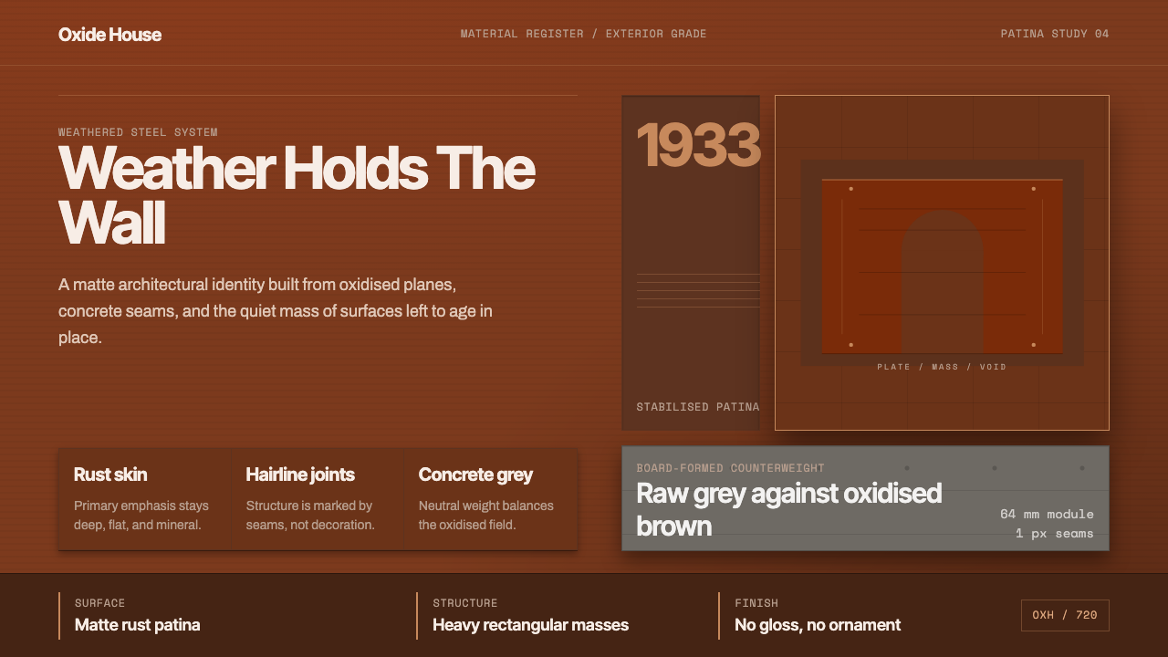 Corten Weathering SteelWeight over ornament. Rust-brown planes and concrete-grey seams make mass vis…重量胜过装饰:锈褐平面与混凝土灰细缝,让体量可见。
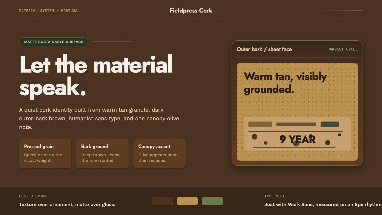 Portuguese CorkGrounded by texture. Cork tan speckles on bark brown, with one olive rule.质感踏实:软木棕斑点落在焦褐树皮底上,一道橄榄绿收束。
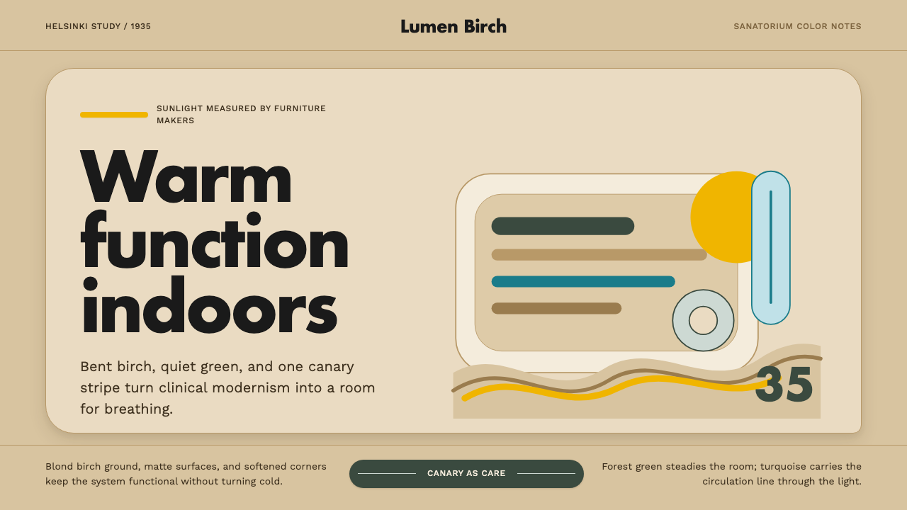 Aalto Finnish ModernModernism made humane. Birch fields, canary yellow, and soft plywood curves b…温柔的现代主义。桦木底、明黄与弯木曲线把阳光带入室内。
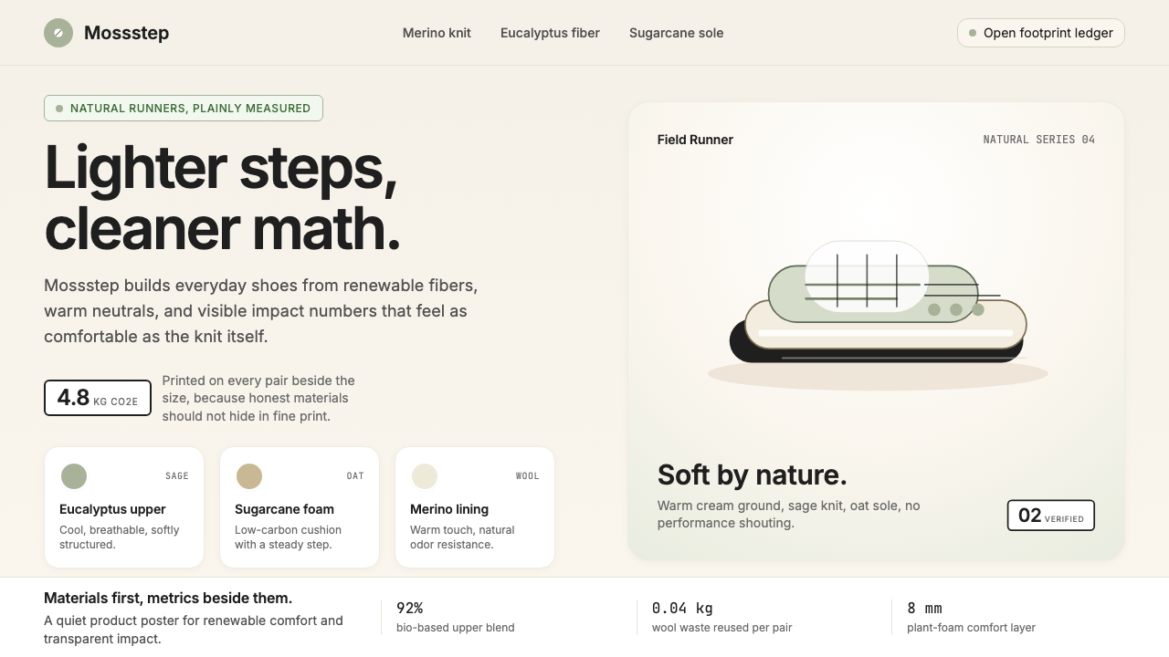 AllbirdsSustainability that breathes. Cream-and-sage tones, carbon labels next to pri…可持续,但绝不说教:奶油色与鼠尾草绿、碳足迹标签与价格并排——一种深呼吸般的诚…
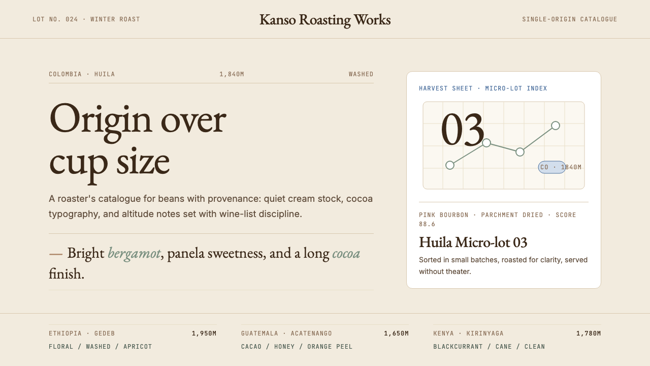 Third Wave CoffeeCoffee as catalogue. Cream paper, cocoa serif, mono origin specs, one sage no…咖啡如图录:奶油纸底、可可衬线、等宽产地规格与鼠尾草绿。
 Airbnb 2014Coral red, soft pill cards, Cereal type. The Bélo wraps strangers in warm, da…Bélo 时代的珊瑚红与圆润 Cereal 字体——把陌生人之间的房间包装成阳…