What is Star Trek LCARS?什么是 Star Trek LCARS?
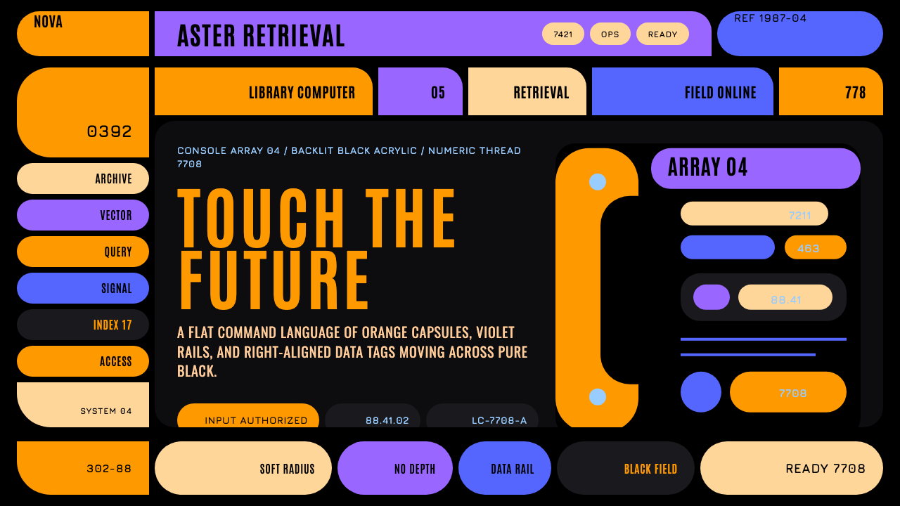
LCARS is a fictional starship computer interface that became one of the most recognizable graphic languages in television — flat color, sweeping elbows, and Okuda's disciplined geometry glowing on black.LCARS是一套虚构的星舰计算机界面,却成了电视史上最易辨认的图形语言之一——扁平色彩、大弧度弯肘与Okuda式严谨的几何,在黑底上发光。
Star Trek LCARS in briefStar Trek LCARS 速览
Star Trek LCARS is a design system drawn from the Library Computer Access and Retrieval System, the touchscreen computer interface designed by scenic art supervisor Michael Okuda for Star Trek: The Next Generation, which premiered in 1987. Though entirely fictional — no such interface ever existed as functional software — LCARS became one of the most widely recognized and widely imitated graphic design languages ever to originate in television production design.「星际迷航LCARS」这套设计体系,取材自图书馆计算机访问与检索系统——由布景美术总监Michael Okuda为1987年首播的《星际迷航:下一代》所设计的触控计算机界面。尽管它完全是虚构的——从未有过这样一套真正运行的软件——LCARS却成为了电视制作设计史上最广为人知、最被广泛模仿的图形设计语言之一。
The system reads from a pure-black backlit console: softly rounded color blocks in warm orange and tan glow beside cooler violet and blue capsule shapes, connected by thin colored rail lines and threaded through with right-aligned numeric tags that suggest live telemetry data. Nothing about the composition tries to look like a real-world touchscreen operating system of any era — it invents its own confident, alien logic.这套体系从一块纯黑的背光控制台读起:柔和圆角的暖橙与沙色块与更冷调的紫色、蓝色胶囊形并排发光,由细细的彩色分隔轨线相连,其间穿插着暗示实时遥测数据的右对齐数字标签。整个构图丝毫没有试图去模仿任何一个时代真实存在的触控操作系统——它发明了一套属于自己的、自信而带有异域感的逻辑。
The style is resolutely flat: no gradients, no bevels, no skeuomorphic chrome or drop shadows anywhere in an authentic composition. Its entire identity lives in geometry rather than surface treatment — pill-shaped buttons known as Okudagrams, generous black negative space that lets each color block breathe, and the style's signature move: an elbow shape that bends a horizontal header bar down into a vertical sidebar using one continuous, unbroken curve.这种风格彻底是平面的:一幅地道的构图中,任何地方都没有渐变、没有斜面,也没有拟物质感的光泽或投影。它的全部辨识度都存在于几何之中,而非表面处理——被称为Okuda色块的药丸形按钮、让每个色块得以呼吸的慷慨黑色留白,以及这种风格的标志性手法:一条弯肘形状,用一段连续、不间断的弧线,把一条水平的顶部横条向下弯折,接入一条垂直的侧栏。
See the Star Trek LCARS design system查看 Star Trek LCARS 完整设计系统
Where does Star Trek LCARS come from?Star Trek LCARS 从何而来?
LCARS was created by Michael Okuda, who served as scenic art supervisor across multiple Star Trek television series and films beginning with Star Trek: The Next Generation in 1987. Okuda was tasked with designing the on-screen computer displays, control panels, and signage that would appear throughout the fictional starship Enterprise-D, and rather than approximating existing 1980s computer interface conventions, he invented an entirely new visual system meant to feel plausibly futuristic without resembling any real contemporary technology.LCARS由Michael Okuda创作,他自1987年的《星际迷航:下一代》起,担任多部星际迷航电视剧集与电影的布景美术总监。Okuda的任务是设计将出现在虚构星舰进取号-D上的屏幕计算机显示、控制面板与标识,他没有去模仿1980年代既有的计算机界面惯例,而是发明了一套全新的视觉体系,意在给人一种可信的未来感,同时又不像任何真实存在的当代科技。
Okuda developed the system in close collaboration with his wife, Denise Okuda, who worked alongside him as a scenic artist and graphic designer on the same productions, and with Rick Sternbach, an illustrator and technical consultant responsible for much of the show's spacecraft and technology design. Together, this team established not just the visual style but an internally consistent logic for how information should be organized on screen — a foundational document within the production that later crew members and subsequent Star Trek productions could reference to keep the look consistent across hundreds of episodes and multiple series.Okuda与他的妻子Denise Okuda密切合作开发了这套体系——她与他在同一批制作中担任布景美术师与图形设计师,此外还有Rick Sternbach——一位负责该剧大部分飞船与科技设计的插画师与技术顾问。这个团队共同确立的,不仅是视觉风格,还有一套内部一致的信息组织逻辑——这是制作组内部一份基础性文档,后来的剧组成员与后续的星际迷航制作都可以参照,以在数百集集数与多部剧集中保持外观的一致性。
The name itself — Library Computer Access and Retrieval System — was conceived as an in-universe technical justification for the interface, giving it a plausible fictional function even though its actual design priorities were entirely about production practicality and visual readability on camera. Screen graphics needed to be legible to television audiences at a glance, distinguishable from other on-screen technology in competing science fiction productions, and inexpensive enough to produce across an enormous number of episodes and film productions spanning decades.「图书馆计算机访问与检索系统」这个名字本身,是作为剧中世界观内的技术性说辞而构想出来的,赋予这套界面一个可信的虚构功能,尽管其真正的设计优先事项完全是关于制作上的实用性与镜头前的视觉可读性。屏幕图形需要让电视观众一眼就能辨识,需要与其它竞争科幻作品中的屏幕科技区分开来,还需要足够廉价,能在跨越数十年的大量剧集与电影制作中反复制作。
What makes LCARS unusual as a design-history case study is that it originated entirely within a fictional production context — a television art department, not a technology company or design studio — yet went on to influence real-world interface design discourse, inspire fan-made functional software recreations, and become a recognizable shorthand for "futuristic computer interface" across popular culture, three decades after its 1987 debut.作为设计史的一个案例,LCARS的不寻常之处在于,它完全诞生于一个虚构的制作语境——一个电视剧美术部门,而非一家科技公司或设计工作室——却在1987年首播三十年后,反过来影响了真实世界的界面设计话语,激发了粉丝自制的、真正可运行的软件复刻,并成为流行文化中「未来感计算机界面」的一个可辨识的速记符号。
What defines the Star Trek LCARS look?Star Trek LCARS 的视觉特征是什么?
Flat Color Blocks扁平色块
Every interface element is rendered as a solid, unmodulated block of color — no gradients, no lighting effects, no simulated depth. This flatness was partly a production necessity of 1980s television graphics technology and became, over decades, the style's core identifying feature.每一个界面元素都以一块实心、无渐变的色块呈现——没有渐变,没有光效,没有模拟的深度感。这种扁平性一部分源于1980年代电视图形技术的制作局限,历经数十年,逐渐成为这种风格核心的辨识特征。
Okudagram PillsOkuda药丸形
Named informally after their creator, these pill-shaped rounded rectangles function as buttons, labels, and status indicators throughout the system. Their soft, uniform rounding contrasts with the otherwise geometric precision of the layout, giving the interface a tactile, almost organic quality despite its mechanical color logic.这些药丸形的圆角矩形,被非正式地以其创作者命名,在整套体系中充当按钮、标签与状态指示器。它们柔和、统一的圆角,与版面其余部分那种几何精确感形成对比,尽管其色彩逻辑是机械化的,却赋予了界面一种可触摸、近乎有机的质感。
The Elbow弯肘
The signature compositional device: a horizontal bar bends downward into a vertical sidebar using a single continuous curved radius rather than a right angle. This elbow is the single most recognizable structural signature of the style and should anchor any major layout composition rather than being treated as an optional flourish.标志性的构图手法:一条水平横条以一段连续的弧形半径、而非直角,向下弯折接入一条垂直侧栏。这个弯肘是这种风格中最具辨识度的单一结构性签名,应当锚定任何主要的版面构图,而非被当作可有可无的点缀。
Warm-Cool Color Pairing冷暖色配对
Warm orange and tan tones sit deliberately beside cool violet and blue tones within the same composition, creating internal contrast without introducing a third competing hue family. This pairing is a structural device for distinguishing functional zones, not a decorative color scheme.暖调的橙色与沙色,被刻意安排在同一构图中与冷调的紫色、蓝色并置,在不引入第三个相互竞争的色系的情况下营造出内部对比。这种配对是用于区分功能区域的结构性手法,而非一种装饰性的配色方案。
Black Negative Space黑色留白
Pure, deep black dominates the majority of the composition's area, functioning as backlit void rather than empty unused space. Color blocks should read as if illuminated from within against this black field, and the black itself should never be treated as a surface to fill with texture or secondary content.纯粹、深邃的黑色主导构图的绝大部分面积,作为背光的虚空,而非未加利用的空白。色块应读起来仿佛是从内部被照亮、衬在这片黑色底场之上,而黑色本身绝不应被当作一个需要用纹理或次要内容填满的表面。
Right-Aligned Numeric Tags右对齐数字标签
Thin strips of numeric characters, right-aligned along panel edges, suggest live system telemetry or reference codes without needing to convey any actual functional data. These tags should feel dense and precise, threading between larger color blocks like a technical footnote running alongside the main composition.沿面板边缘右对齐排列的细窄数字字符条,暗示着实时系统遥测数据或参照代码,而无需真正传达任何实际的功能性数据。这些标签应给人一种密集、精确的感觉,穿行于更大的色块之间,如同沿着主构图运行的技术性脚注。
Curved Rail Dividers曲线分隔轨
Thin colored lines and bars, often curved rather than straight, separate functional zones within the interface. These rails carry their own color coding, distinct from the blocks they divide, adding a layer of organizational logic that reads as systematic even without literal readable content.细细的彩色线条与横条,往往是弯曲的而非笔直的,用于分隔界面内的功能区域。这些分隔轨自带独立于其所分隔色块的色彩编码,即便没有字面上可读的内容,也增添了一层读起来系统化的组织逻辑。
See the Star Trek LCARS design system查看 Star Trek LCARS 完整设计系统
Who shaped Star Trek LCARS?谁塑造了 Star Trek LCARS?
The scenic art supervisor who created LCARS for Star Trek: The Next Generation beginning in 1987, and continued refining and applying the system across subsequent Star Trek television series and films for decades. His invented interface language became so influential that fans and designers still reference his name informally when describing the style's signature pill-shaped buttons.自1987年起为《星际迷航:下一代》创作LCARS的布景美术总监,此后数十年间持续在后续的星际迷航电视剧集与电影中打磨并应用这套体系。他所发明的界面语言影响力之大,以至于粉丝与设计师们至今仍非正式地以他的名字来指称这种风格标志性的药丸形按钮。
A scenic artist and graphic designer who worked alongside Michael Okuda developing and applying the LCARS system across the same productions. Her collaborative role in establishing the interface's internal consistency across hundreds of episodes is integral to the system's coherence as a design language rather than an ad hoc collection of screen graphics.布景美术师与图形设计师,与Michael Okuda并肩合作,在同一批制作中开发并应用LCARS体系。她在确立这套界面跨越数百集内部一致性方面所扮演的协作角色,对这套体系作为一种设计语言、而非一堆临时拼凑的屏幕图形,其内在的连贯性而言不可或缺。
An illustrator and technical consultant responsible for much of the spacecraft and technology design across Star Trek: The Next Generation and related productions. Working alongside the Okudas, Sternbach helped ensure the LCARS interface felt integrated with the broader technical and production design of the fictional universe rather than existing as an isolated graphic element.插画师与技术顾问,负责《星际迷航:下一代》及相关制作中大部分的飞船与科技设计。他与Okuda夫妇并肩工作,帮助确保LCARS界面感觉与这个虚构宇宙更广泛的技术与制作设计融为一体,而非作为一个孤立的图形元素而存在。
How do you use Star Trek LCARS today?今天怎么用 Star Trek LCARS?
Star Trek LCARS is a bold, high-contrast interface style, and applying it well means committing fully to its flat, geometric confidence rather than softening it with gradients, shadows, or muted colors that would undermine its backlit-console identity. The elbow, the black ground, and the warm-cool color pairing are all structural — treat them as load-bearing rather than optional decoration.「星际迷航LCARS」是一种大胆、高对比的界面风格,要用好它,需要全然投入其扁平、几何化的自信,而非用渐变、投影或含蓄的色彩去软化它——那会削弱其背光控制台的身份感。弯肘、黑色底场与冷暖色配对都是结构性的——应把它们当作承重构件,而非可有可无的装饰。
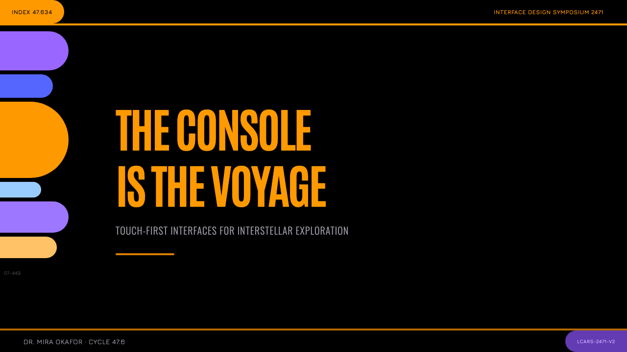
For presentation slides, a cover page benefits from the pure black ground with a single elbow-shaped graphic anchoring the title, paired with orange or violet Okudagram-style pill shapes holding key text. Content slides should organize information into color-coded functional zones connected by curved rail dividers, keeping the black negative space generous rather than filling every area with color.在演示文稿中,封面页适合以纯黑底场搭配一个锚定标题的弯肘形图形,再配以承载关键文字的橙色或紫色Okuda式药丸形色块。内容页应将信息组织成由曲线分隔轨连接的、色彩编码的功能区域,让黑色留白保持慷慨,而非用色彩填满每一处区域。
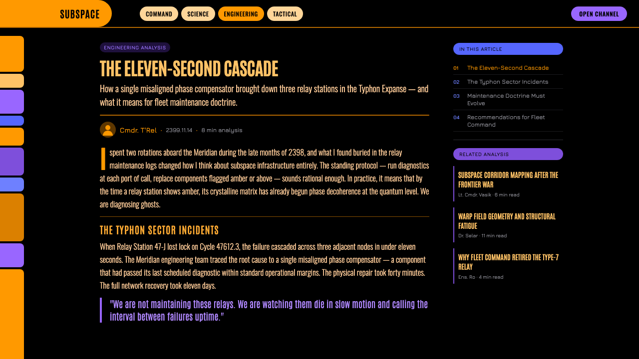
For web interfaces, the style suits products that want to signal a bold, confident, futuristic identity — gaming, entertainment, sci-fi-adjacent brands, or any dashboard where distinct functional zones benefit from strong color-coding. Navigation elements can use pill-shaped buttons directly, and section dividers can adopt the elbow curve rather than a straight horizontal rule, particularly where a sidebar meets a header.在网页界面中,这种风格适合想要传达大胆、自信、未来感身份的产品——游戏、娱乐、科幻相关品牌,或任何受益于强烈色彩编码来区分不同功能区域的仪表板。导航元素可以直接使用药丸形按钮,段落分隔可以采用弯肘曲线,而非笔直的水平分割线,尤其是在侧栏与顶部横条交汇之处。
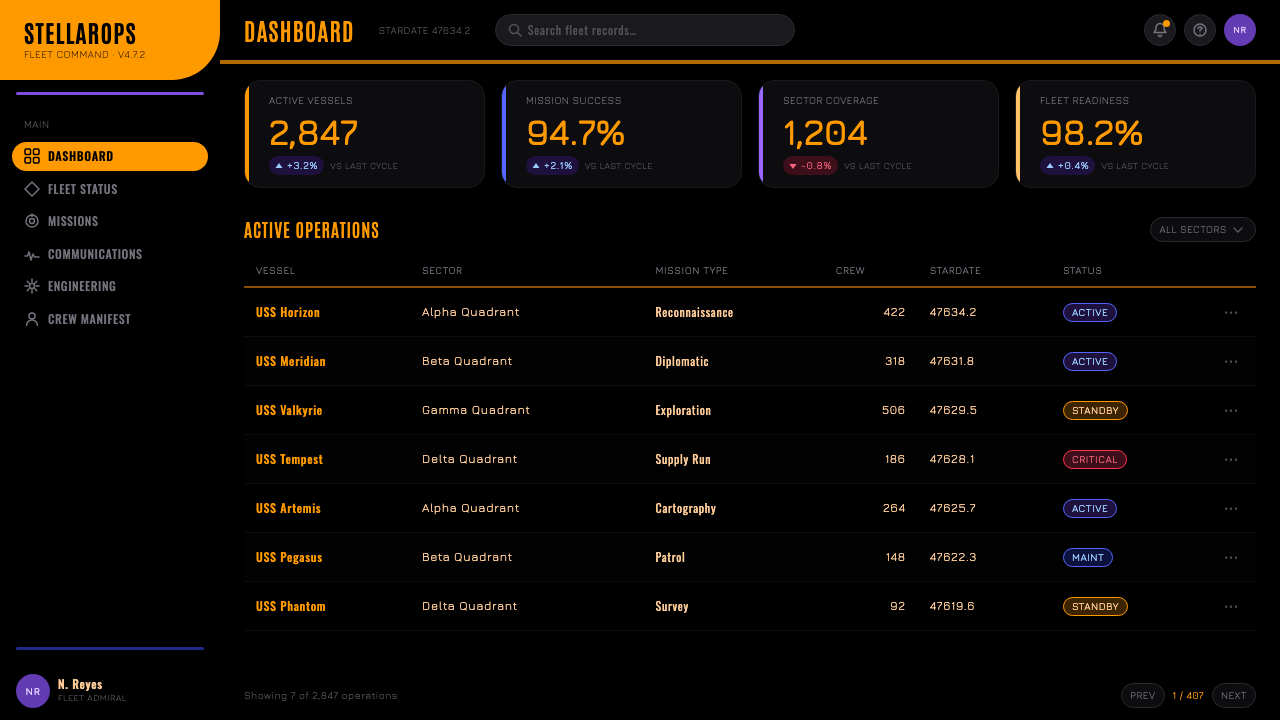
For editorial and marketing work, the style suits features on television and film production design, retro-futurism, or science fiction history. Pull quotes and section breaks can use a small elbow or pill-shaped graphic device, and photography or illustration should favor high-contrast, backlit compositions over naturally lit scenes, which dilute the console-glow effect the style depends on.在编辑与营销内容中,这种风格适合关于电视与电影制作设计、复古未来主义或科幻历史的专题报道。引语与段落分隔可以使用小型的弯肘或药丸形图形装置,摄影或插画应偏好高对比、背光式的构图,而非自然采光的场景——后者会稀释这种风格所依赖的控制台发光效果。
A common mistake is adding gradients, bevels, or drop shadows to the color blocks in an attempt to modernize the style — this directly contradicts LCARS's resolutely flat identity and produces a generic sci-fi-UI look rather than the specific, historically grounded LCARS language. Another mistake is treating the numeric tags as decorative filler rather than a deliberately dense, technical-feeling texture that should stay legible even if not functionally meaningful.一个常见的错误,是试图通过给色块添加渐变、斜面或投影来「现代化」这种风格——这直接违背了LCARS彻底扁平的身份,会产生一种泛泛的科幻界面观感,而非这种具体的、有历史根据的LCARS语言。另一个常见的错误,是把数字标签当作装饰性的填充物,而非一种刻意营造出的密集、技术感肌理,即便它不承载实际功能意义,也应保持清晰可读。
See the Star Trek LCARS design system查看 Star Trek LCARS 完整设计系统
Star Trek LCARS — FAQStar Trek LCARS · 常见问题
Was LCARS ever a functional real-world computer interface?LCARS曾经是一套真正可运行的现实世界计算机界面吗?
No — LCARS was designed entirely for television production, created by scenic art supervisor Michael Okuda to appear on screen displays within the fictional Star Trek universe. It was never intended to function as real operating software during its original production, though its influence has since inspired fan-made recreations and functional software projects that emulate its look decades after its 1987 debut.不是——LCARS完全是为电视制作而设计的,由布景美术总监Michael Okuda创作,出现在虚构星际迷航宇宙内的屏幕显示上。它在最初的制作中从未打算作为真正运行的操作软件,尽管它的影响力后来激发了粉丝自制的复刻作品与模仿其外观的功能性软件项目,这已是它1987年首播数十年之后的事了。
Why is the style so strictly flat with no gradients or shadows?为什么这种风格如此严格地保持扁平、没有渐变或投影?
Part of the reason is historical — 1980s television graphics production had real technical constraints on rendering depth and lighting effects. But flatness also became a deliberate identity choice as the style was refined across decades: the confident, geometric flatness reads as a distinctly non-naturalistic, alien computer aesthetic, deliberately avoiding any resemblance to real-world touchscreen conventions of any era.部分原因是历史性的——1980年代的电视图形制作,在渲染深度与光效方面确实存在真实的技术局限。但随着这种风格在数十年间不断打磨,扁平也逐渐成为一种刻意的身份选择:这种自信、几何化的扁平感,读起来是一种鲜明的、非自然主义的异域计算机美学,刻意避免与任何时代真实存在的触控惯例产生相似之处。
What is the significance of the "elbow" shape specifically?「弯肘」这个形状具体有什么意义?
The elbow — a header bar curving down into a sidebar through one continuous radius — is the single most recognizable structural signature of the LCARS language, distinguishing it from any generic flat-color interface. It functions as both a practical layout solution, connecting horizontal and vertical panel regions smoothly, and a visual signature immediately identifiable to anyone familiar with the style, even in a single isolated fragment of a composition.弯肘——一条顶部横条通过一段连续的弧形半径向下弯折接入侧栏——是LCARS语言中最具辨识度的单一结构性签名,把它与任何泛泛的扁平色彩界面区分开来。它既是一种实用的版面解决方案,能平滑地连接水平与垂直的面板区域,也是一种视觉签名,即便只是构图中孤立的一小段片段,也能被任何熟悉这种风格的人立刻辨认出来。
Can this style work for interfaces unrelated to science fiction?这种风格能用在与科幻无关的界面上吗?
Yes — the underlying design logic (strong color-coded functional zones, generous negative space, pill-shaped interactive elements, and confident flat geometry) is a genuinely useful information-architecture pattern independent of its fictional origin. Applied thoughtfully, it can organize dashboards, control panels, or data-dense interfaces for any product, provided the black ground and flat color discipline are preserved rather than diluted into a generic dark-mode theme.可以——其底层的设计逻辑(强烈的色彩编码功能区域、慷慨的留白、药丸形的交互元素,以及自信的扁平几何)是一种真正有用的信息架构模式,独立于它的虚构起源而存在。经过深思熟虑的应用,它可以为任何产品的仪表板、控制面板或数据密集型界面提供组织方式,前提是黑色底场与扁平色彩的纪律得以保留,而非被稀释成一种泛泛的深色模式主题。
Related design styles相关设计风格
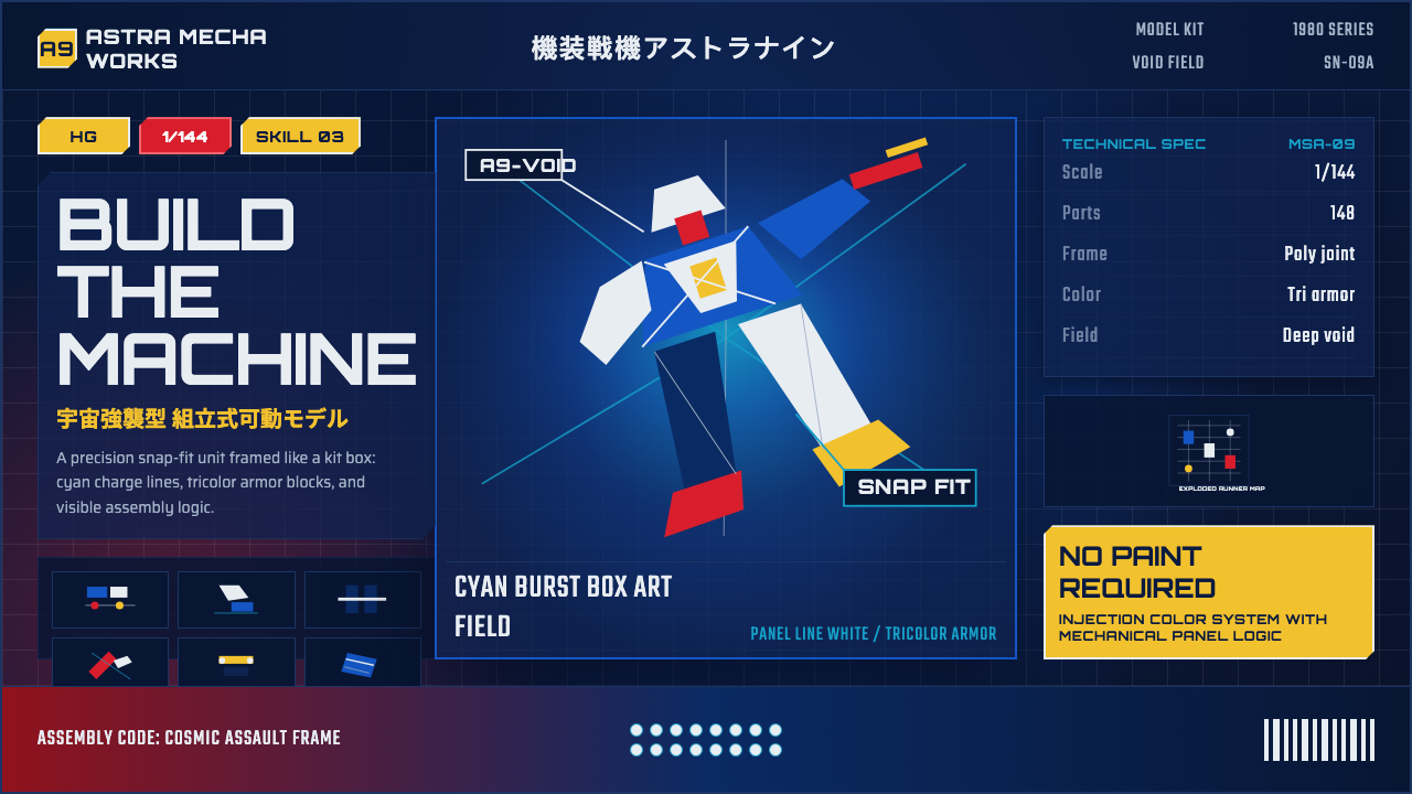 Gunpla Model BoxBuild-sheet drama. Cosmic navy, cyan burst, tricolor armor, and spec-panel gr…拼装说明般的戏剧感:宇宙蓝、青蓝爆光、三色装甲与参数网格。
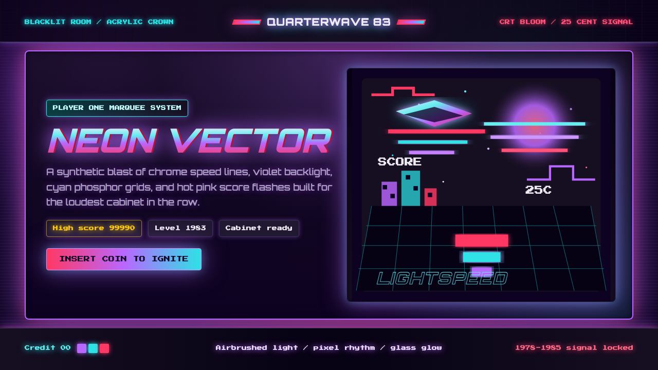 Arcade Cabinet MarqueeToo loud to ignore. Black-indigo glass, violet glow, cyan grids, hot-pink arc…刺眼才对。黑靛玻璃、霓虹紫光、电青网格与品红像素字。
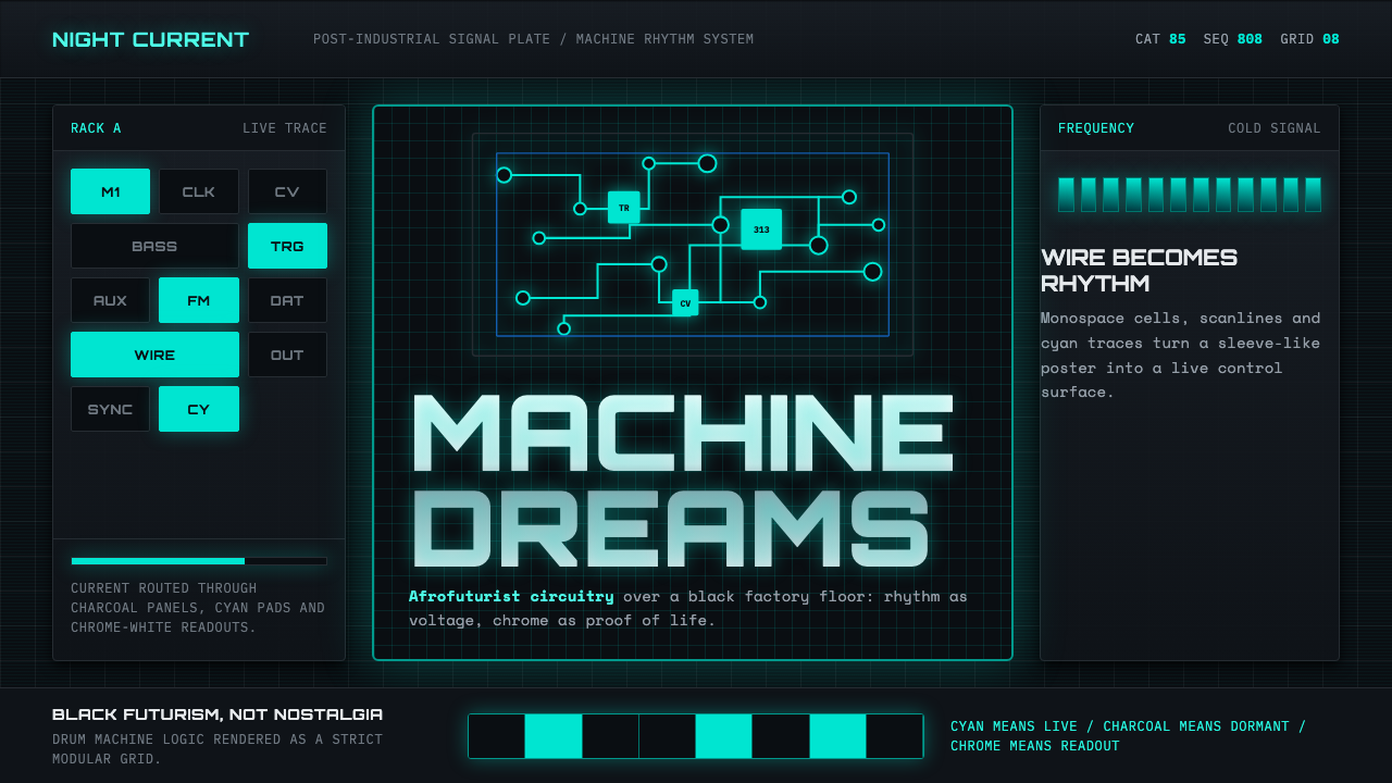 Detroit TechnoCold machines dream. Electric cyan circuits and chrome display type lock to a…冷机器在做梦。电青线路与铬感字形锁进黑色网格。
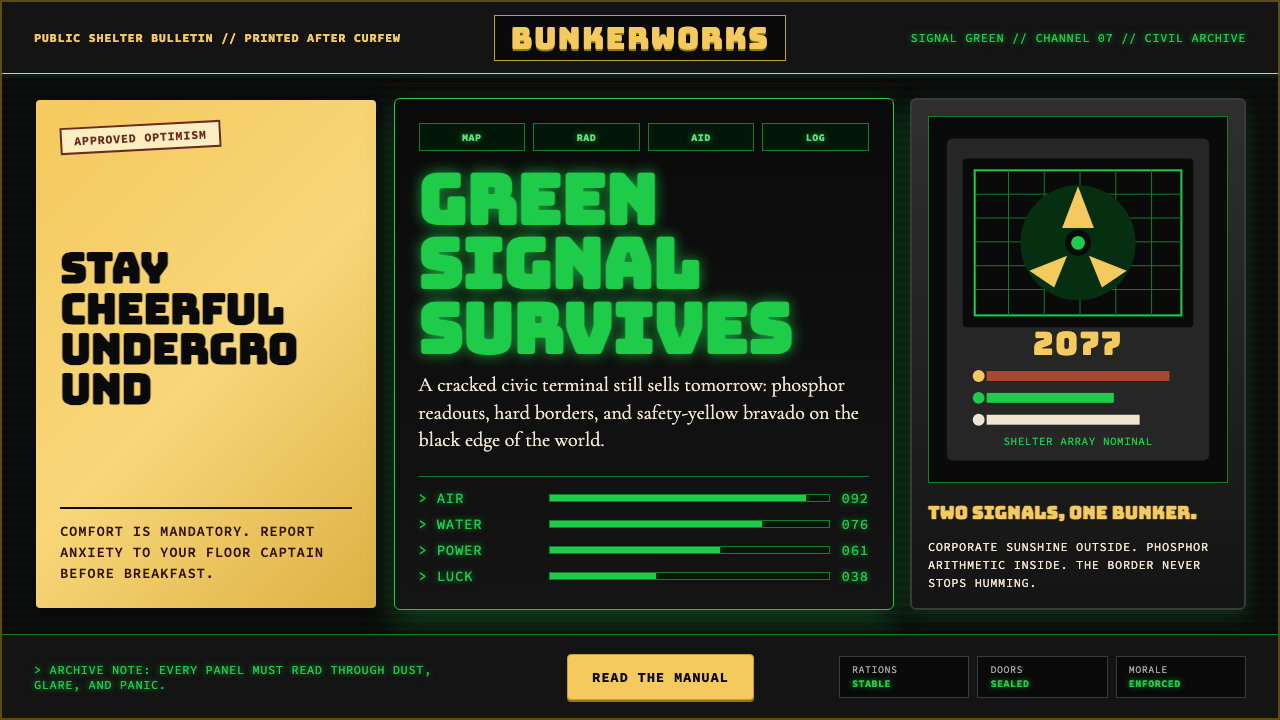 Fallout Vault-Tec Pip-BoyIrradiated optimism. Vault yellow and CRT green lock into a bordered bunker g…辐照乐观主义:避难所黄与CRT绿嵌入硬边地堡网格。
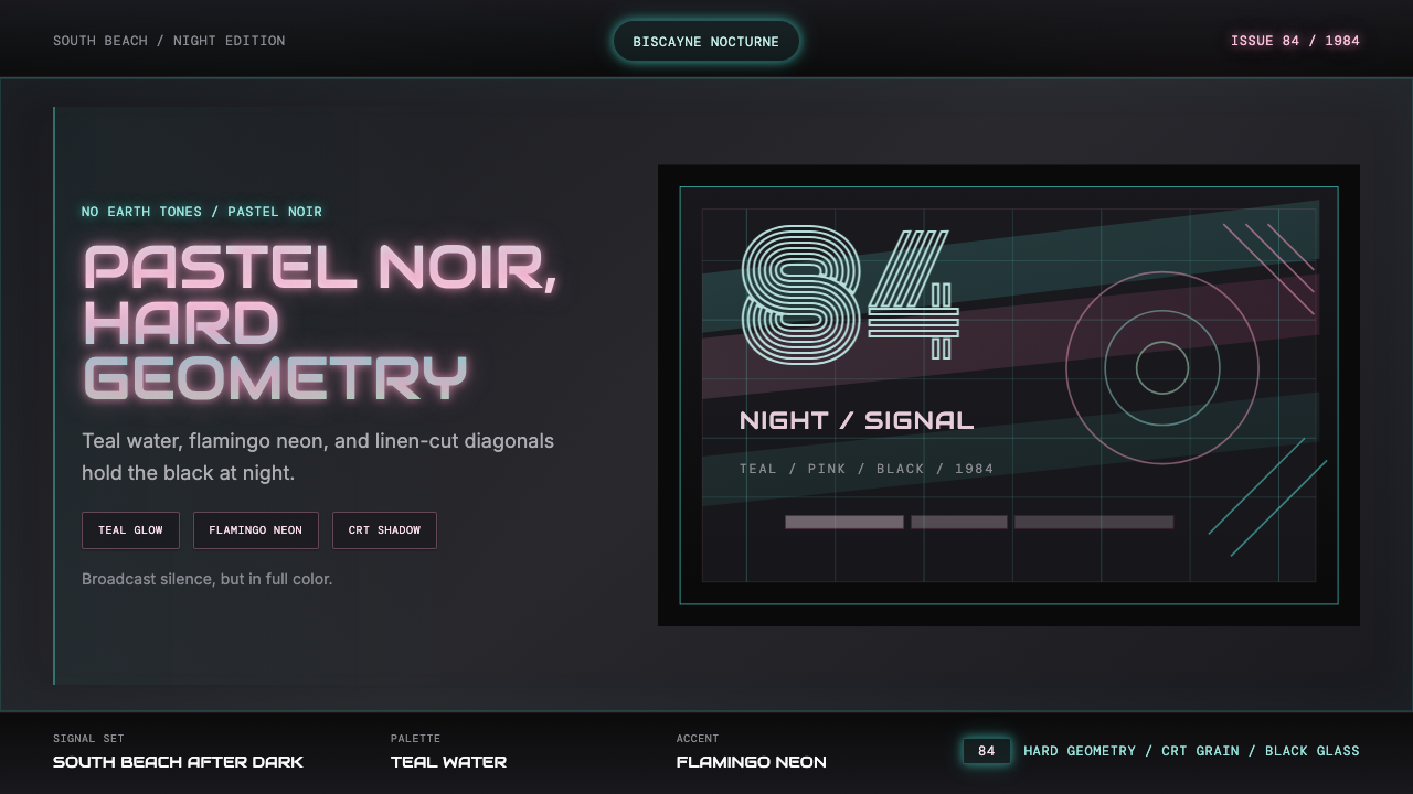 Miami Vice Pastel Teal (1984)Pastel noir, not nostalgia. Teal glow and flamingo pink slice black with geom…不是怀旧,是粉青霓虹。青光与火烈鸟粉切开黑底几何。
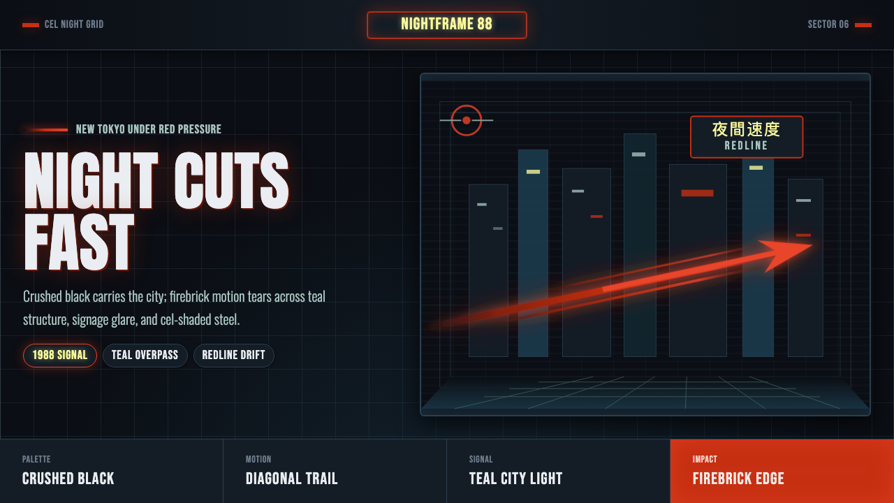 Akira Neo-TokyoNight moves fast. Firebrick trails cut crushed black, teal grids, and condens…黑夜疾驰。砖红光轨切开墨黑、青蓝网格与压缩招牌。