What is Modern Arabic Type Specimen?什么是 Modern Arabic Type Specimen?
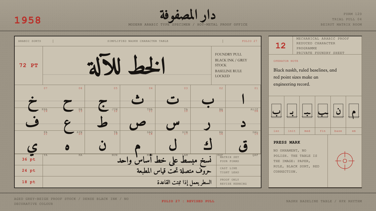
In the late 1950s, the hot-metal typesetting machine finally learned to write Arabic — and the working proof sheets it produced became a design language of their own.1950年代末,热金属排字机终于学会了书写阿拉伯文——而它印出的工作校样,本身也变成了一种设计语言。
Modern Arabic Type Specimen in briefModern Arabic Type Specimen 速览
Modern Arabic Type Specimen is a design system built around the working proof sheet, not the finished advertisement or book page. It recreates the internal documents that type foundries produced while mechanising Arabic script for the Linotype and Monotype composing machines: dense tables of naskh letterforms, size-and-weight specimen rows, and baseline rules struck in black ink onto warm, aged grey-beige proof paper.《现代阿拉伯文字体样本》这套设计系统,围绕的是真正的工作校样,而非成品广告或书页版式。它复原了字体铸造厂在为 Linotype 与 Monotype 排字机器械化阿拉伯文字时所产出的内部文件:密集的纳斯赫体(naskh)字形表、按字号与字重排列的样本行,以及以黑墨打印在温暖做旧灰米色校样纸上的基线标尺。
The palette is close to monochrome by design. Black carries the letterforms and the ruled grid; the aged proof stock supplies the only warmth in the system; and a single accent — red — is reserved for folio numbers and point-size labels, the small annotations a compositor would pencil or stamp onto a proof before it went back to the foundry for correction. Nothing is glossy, nothing is decorative, and no illustration competes with the type.色板刻意接近单色。黑色承载字形与直尺网格;做旧校样纸提供系统中唯一的暖意;而唯一的强调色——红色——只留给页码与字号标签,这是排字工人在校样送回铸造厂修正之前,用铅笔或图章标注的小注记。没有任何光泽,没有任何装饰,也没有任何插图与字体本身争夺注意力。
Because the system is drawn from an engineering document rather than a marketing one, it reads as technical and matter-of-fact. Letterforms are arranged the way a type specimen actually organises them — by size, by style, by isolated versus joined position — rather than the way a poster designer would compose them for effect. That discipline is the entire point: the system communicates precision and reverence for the naskh letterform through structure, not ornament.由于这套系统取材于一份工程文件而非营销材料,它读起来技术而务实。字形的排列方式,遵循的是真实字体样本的组织逻辑——按字号、按字样、按独立还是连写位置区分——而非海报设计师为视觉效果而做的构图。这种自律正是整套体系的核心:它用结构而非装饰,传达出对纳斯赫体字形的精确与敬意。
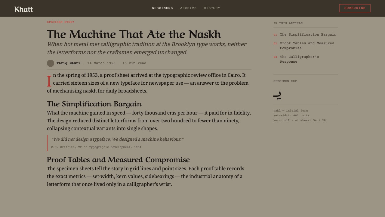
See the Modern Arabic Type Specimen design system查看 Modern Arabic Type Specimen 完整设计系统
Where does Modern Arabic Type Specimen come from?Modern Arabic Type Specimen 从何而来?
For most of the twentieth century, Arabic resisted mechanical typesetting in a way Latin script never had to. Arabic is cursive by nature — most letters change shape depending on whether they stand alone or join to a neighbor on either side — and a fully faithful rendering can require many contextual forms per letter, plus ligatures. Hot-metal composing machines like the Linotype and Monotype, which cast individual pieces of type from a limited matrix set, were built around Latin's fixed, largely non-joining letterforms. Adapting them to Arabic meant either radically simplifying the script's joining behavior or building matrix cases far larger and more complex than anything the machines had handled before.整个二十世纪的大半时间里,阿拉伯文字对机械排字的抗拒,是拉丁字母从未经历过的。阿拉伯文天生具有连写特性——大多数字母会依据它是独立出现,还是与左右相邻字母连接,而改变形态——若要完全忠实地呈现,每个字母可能需要多种语境形态,外加连字。像 Linotype 与 Monotype 这类热金属排字机,是从有限的字模集里铸出一个个活字,其机械结构本就是围绕拉丁字母固定、且大多不连写的形态设计的。要让它们适应阿拉伯文,要么必须大幅简化文字的连写行为,要么就得建造比机器以往处理过的任何字模盒都更庞大、更复杂的系统。
The breakthrough came in the mid-1950s. Linotype developed a Simplified Arabic design — commercially released as Yakout — that reduced each letter to a smaller, standardized set of forms compatible with the machine's mechanical constraints, trading some of the calligraphic nuance of hand-set naskh for the speed and economy of mechanical composition. Monotype pursued a parallel but distinct path with its Series 589 Traditional Arabic, developed around 1956, which attempted to preserve more of naskh's traditional joining logic within the constraints of the Monotype caster. By April 1957, Linotype's 12D Simplified Arabic matrix was in active development, part of a broader industry push to bring Arabic-language newspapers, books, and commercial printing into the mechanized composition era that Latin-script publishing had enjoyed for decades.突破发生在1950年代中期。Linotype 开发出一套简化阿拉伯文设计——以“Yakout”之名商业发行——将每个字母简化为更小、更标准化的一组形态,以适配机器的机械限制,用手工排版纳斯赫体的部分书法韵味,换取机械排版的速度与经济性。Monotype 则以其约1956年开发的589系列传统阿拉伯文,走上了一条平行但不同的道路,试图在 Monotype 铸排机的限制内,尽可能保留纳斯赫体传统的连写逻辑。到1957年4月,Linotype 的12D简化阿拉伯文字模已在积极开发中,这是整个行业更大规模推动的一部分——要把阿拉伯语报纸、书籍与商业印刷,带入拉丁文字出版界已经享受了数十年的机械化排版时代。
This was not a purely technical exercise; it was also a cultural negotiation. Naskh had been the dominant hand for centuries — the everyday reading script of the Islamic world, distinct from the more ornamental thuluh or the angular kufic used in monumental inscription. Mechanizing it meant deciding, letter by letter, which calligraphic features were essential to legibility and identity and which could be sacrificed for the sake of a functioning matrix case. Type engineers, foundry draftsmen, and language specialists worked through these tradeoffs on paper long before a single line of type was cast — and the proof sheets that recorded their decisions are the direct visual source for this design system.这不只是一次纯技术性的实践,也是一场文化协商。纳斯赫体几个世纪以来一直是主流手写体——伊斯兰世界日常阅读所用的字体,有别于更具装饰性的苏鲁斯体(thuluh)或用于纪念性铭刻的棱角分明的库法体(kufic)。将其机械化,意味着逐字逐字地判断:哪些书法特征对可读性与身份认同至关重要,哪些可以为了让字模盒真正可用而被牺牲。字体工程师、铸造厂制图员与语言专家,在一根活字铸出之前,早已在纸面上反复权衡这些取舍——而记录下他们决策的那些校样,正是本设计系统最直接的视觉源头。
The result of this decade of engineering was, by the end of the 1950s, a pan-Arab printing industry finally able to typeset Arabic-language newspapers and books mechanically at speed, at a moment when literacy and print circulation across the Middle East were both expanding rapidly. The proof sheet — dense, gridded, annotated in red — was the everyday working artifact of that transition, produced in foundries and print shops but rarely seen outside them. It is a document of infrastructure, not of celebration, and its aesthetic authority comes from exactly that unglamorous origin.到1950年代末,这十年的工程努力最终成果,是一个泛阿拉伯印刷业终于能够高速、机械化地排印阿拉伯语报纸与书籍——恰逢中东地区识字率与印刷发行量都在快速扩张的时刻。校样——密集、网格化、以红色批注——正是那次转型中日常的工作产物,诞生于铸造厂与印刷车间,却极少在其外流通。它是一份关于基础设施的文件,而非庆典的文件,而它的美学权威,恰恰来自这种毫不张扬的出身。
What defines the Modern Arabic Type Specimen look?Modern Arabic Type Specimen 的视觉特征是什么?
Color色彩
The palette is close to monochrome: black ink for letterforms and rules, a warm aged grey-beige for the ground, and red used exclusively for folio numbers and point-size annotations. There is no secondary or tertiary hue; color is a working-document convention, not a decorative choice, and it is used the way a compositor would use a red pencil — sparingly, functionally, always in the margins rather than the letterforms themselves.色板近乎单色:黑墨承载字形与标尺线,温暖做旧的灰米色作底,红色专用于页码与字号批注。没有第二或第三种色相;色彩是工作文件的惯例,而非装饰性选择,其用法如同排字工人手中的红铅笔——克制、功能化,且始终出现在页边而非字形本身。
Typography字体排印
Type is the entire subject of the system, not a supporting element within it. Naskh letterforms appear in gridded tables organized by size and style, showing the same letter in its isolated, initial, medial, and final joining positions side by side — exactly how a real type specimen catalogs a typeface for a foundry's clients. The presentation is exhaustive and comparative rather than expressive.字体本身就是整套系统的主题,而非其中的辅助元素。纳斯赫体字形以按字号与字样组织的网格化表格呈现,把同一个字母的独立、词首、词中、词尾几种连写形态并排展示——这正是真实字体样本为铸造厂客户编目字体的方式。整体呈现是详尽而比较性的,而非表现性的。
Grid and Layout网格与版式
Everything sits on a strict ruled grid: baseline rules, column dividers, and boxed specimen cells. The grid is not aesthetic scaffolding but a literal production requirement — proof sheets had to show every character at every size in a way a foundry technician could check against a master reference. Alignment is exact and repetitive rather than varied.所有内容都置于严格的直尺网格之上:基线标尺、栏位分隔线,以及方框化的样本格。这套网格并非美学上的脚手架,而是实实在在的生产需求——校样必须以铸造厂技师能对照母本核对的方式,展示每个字符在每个字号下的样貌。对齐是精确且重复的,而非富于变化的。
Surface材质表面
The ground is aged proof paper — never cream, never pure white — with a warm, slightly uneven tone that reads as decades of handling and storage rather than a deliberate vintage effect. This surface quality is load-bearing: it is what separates the system from a clean, contemporary type specimen and locates it firmly in the hot-metal era.底面是做旧的校样纸——绝非奶油色,也绝非纯白——带有温暖而略不均匀的色调,读起来像是数十年经手与存放的痕迹,而非刻意做出的复古效果。这种材质质感是承重的:正是它,把这套系统与一份干净的当代字体样本区分开来,并将其牢牢锚定在热金属排版时代。
Annotation批注
Red numerals and marks are the system's only functional signal color, appearing as folio numbers, point-size labels, and correction marks in the margins. They read as a compositor's or proofreader's hand rather than a designed accent — small, precise, and always subordinate to the black letterforms they annotate.红色数字与标记是这套系统唯一的功能性信号色,以页码、字号标签与页边校对痕迹的形式出现。它们读起来像是排字工人或校对员的手笔,而非设计出来的强调色——小巧、精准,且始终从属于它们所批注的黑色字形。
Restraint克制
There is no illustration, no ornamental border, and no decorative flourish anywhere in the system. Every mark on the page exists to document a letterform or its measurement. This austerity is not a stylistic choice layered onto the content — it is the content, inherited directly from the working documents the system reproduces.系统中没有任何插图、装饰边框或花饰。页面上的每一个标记,其存在都是为了记录一个字形或它的度量数据。这种克制并非叠加在内容之上的风格选择——它本身就是内容,直接继承自这套系统所复刻的工作文件。
Reverence for the Letterform对字形的敬重
Despite its dryness, the system carries an unmistakable respect for naskh as a script — every table exists to preserve and verify its correct mechanical rendering. The tone is neither romanticized nor nostalgic; it is the tone of an engineer who takes the craft seriously enough to document it exhaustively.尽管整体气质干燥,这套系统依然带着一种毋庸置疑的、对纳斯赫体这门文字艺术的尊重——每一张表格存在的意义,都是为了保存并核验它被正确机械呈现。其基调既非浪漫化,也非怀旧式的;而是一位工程师认真到愿意穷尽记录这门手艺时才会有的态度。
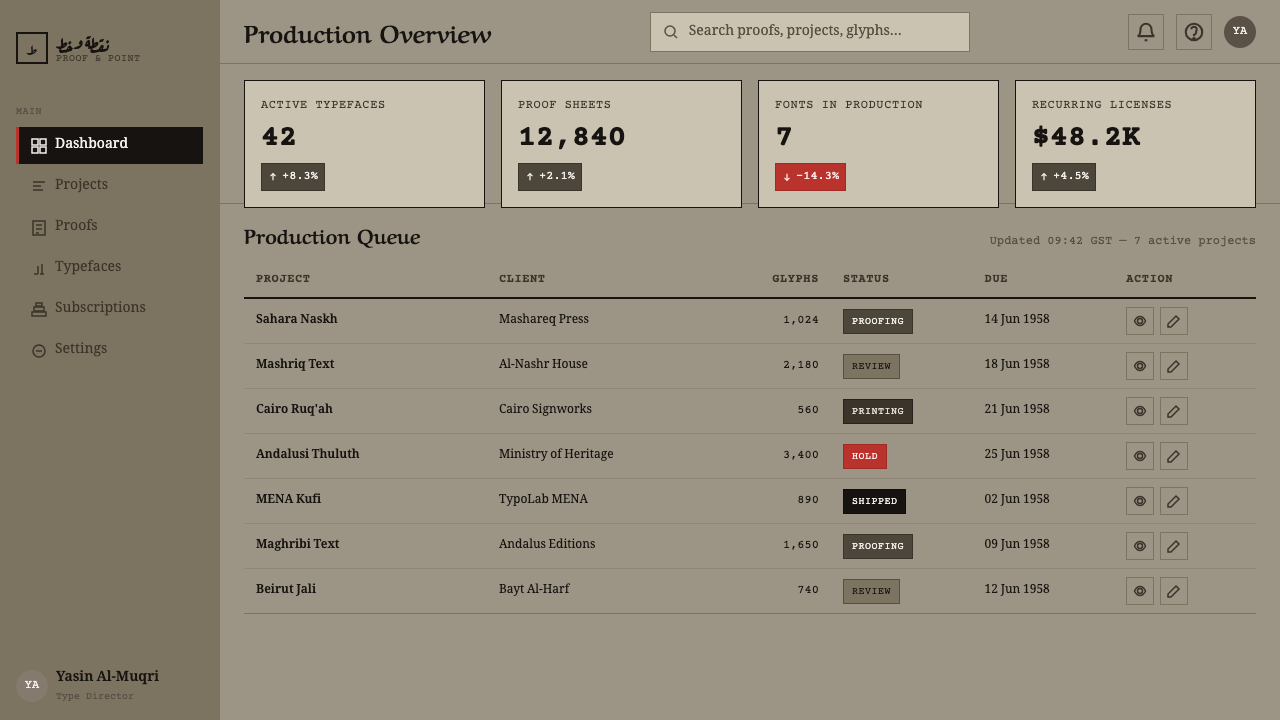
See the Modern Arabic Type Specimen design system查看 Modern Arabic Type Specimen 完整设计系统
Who shaped Modern Arabic Type Specimen?谁塑造了 Modern Arabic Type Specimen?
The engineers behind Linotype's Simplified Arabic design, commercially released as Yakout, reduced naskh's contextual letterforms to a set compatible with the machine's mechanical matrix limits. Their work — including the 12D matrix in active development by April 1957 — prioritized speed and reliability of mechanical composition, and its proof sheets are a primary visual source for this design system.Linotype 简化阿拉伯文设计(商业名称 Yakout)背后的工程师,将纳斯赫体的语境字形简化为一套与机器机械字模限制相容的形态。他们的工作——包括到1957年4月已在积极开发中的12D字模——优先考虑机械排版的速度与可靠性,其校样正是本设计系统最主要的视觉来源之一。
Working in parallel to Linotype, Monotype's engineers developed Series 589 Traditional Arabic around 1956, pursuing a design that preserved more of naskh's traditional joining behavior within the constraints of the Monotype caster. Their proof tables demonstrate a different set of engineering tradeoffs from Linotype's Simplified Arabic, offering a more calligraphically faithful — if mechanically more demanding — mechanized naskh.与 Linotype 并行,Monotype 的工程师在约1956年开发了589系列传统阿拉伯文,力求在 Monotype 铸排机的限制内,尽可能保留纳斯赫体传统的连写行为。他们的校样表展示了与 Linotype 简化阿拉伯文不同的一套工程取舍,提供了一种在书法上更为忠实——尽管机械实现难度更高——的机械化纳斯赫体。
The anonymous compositors and proofreaders who annotated these specimen sheets with red folio numbers and correction marks are the direct source of the system's signal-color convention. Their working marginalia — precise, functional, never decorative — established the visual grammar this design language reproduces.为这些样本页批注红色页码与校对痕迹的匿名排字工与校对员,是本系统信号色惯例最直接的源头。他们的工作页边注记——精准、功能化、从不装饰——确立了这套设计语言所复刻的视觉语法。
How do you use Modern Arabic Type Specimen today?今天怎么用 Modern Arabic Type Specimen?
This system rewards restraint and rewards it heavily — it is one of the least forgiving styles in the library for anyone tempted to over-decorate. Applying it correctly means treating every surface as a working document rather than a finished showpiece.这套系统对克制的回报极高——对任何忍不住想要过度装饰的人来说,它是整个库中最不宽容的风格之一。正确应用它,意味着把每一个界面都当作工作文件,而非成品展示品来对待。
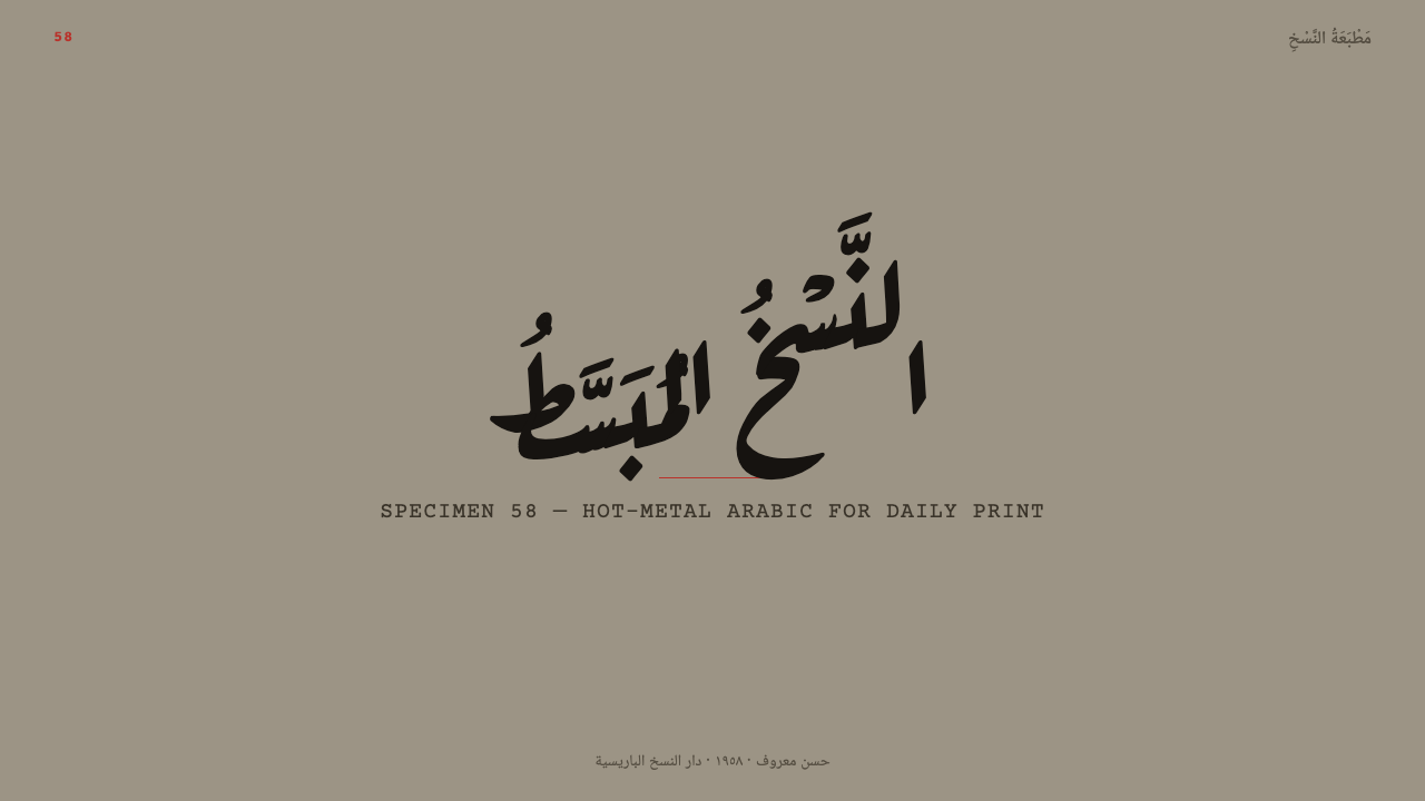
For presentation slides, the style suits technical, editorial, or archival content especially well. A cover slide can use a single large naskh letterform or ligature set against the aged grey-beige ground, with a red folio-style numeral in a corner as the only accent. Content slides should be organized as gridded tables — comparison rows, specification lists, size-and-variant breakdowns — echoing the structure of the original specimen sheets rather than a conventional bulleted layout.在演示文稿中,这种风格尤其适合技术性、编辑性或档案性的内容。封面页可以用一个巨大的纳斯赫体字形或连字,置于做旧灰米底色之上,角落留一个红色页码式数字作为唯一强调。内容页应组织为网格化表格——对比行、规格清单、字号与字样的拆解——呼应原始样本页的结构,而非常规的项目符号版式。
For web interfaces, the system is well suited to documentation sites, type-foundry product pages, and technical reference tools where density and precision are virtues rather than flaws. Backgrounds should stay in the aged proof-paper tone rather than shifting to pure white; body copy stays black; and red should be reserved for the same functions it serves historically — page or section numbering, small status labels, never for primary buttons or large blocks of color.对于网页界面,这套系统很适合文档站点、字体铸造厂产品页,以及密度与精确是优点而非缺陷的技术参考工具。背景应保持做旧校样纸色调,而不转向纯白;正文保持黑色;红色应保留给它在历史上承担的同一类功能——页码或章节编号、小型状态标签,绝不用于主要按钮或大面积色块。
For editorial and marketing work, the style is most credible when it leans into its origin as a technical artifact rather than pretending to be a lifestyle aesthetic. A magazine spread or product page introducing Arabic typography, printing history, or craft heritage can use the gridded specimen-table format directly as a design device, letting the content itself — letterforms, measurements, annotations — carry the visual interest.对于编辑与营销内容,当这种风格拥抱其作为技术物件的出身,而非假装成一种生活方式美学时,最具说服力。一篇介绍阿拉伯文字体排印、印刷历史或工艺传承的杂志跨页或产品页面,可以直接把网格化的样本表格式当作设计手法,让内容本身——字形、度量数据、批注——承载全部视觉趣味。
A common mistake when applying this system is introducing a second accent color, a gradient, or a decorative border to make the layout feel warmer or more contemporary. Any addition beyond black ink, aged ground, and red annotation breaks the logic of a working proof sheet and turns a technical document into a pastiche. The system's authority comes precisely from its refusal to decorate.应用这套系统时最常见的错误,是引入第二种强调色、渐变,或装饰性边框,试图让版面显得更温暖或更当代。任何超出黑墨、做旧底色与红色批注之外的添加,都会破坏一份工作校样的内在逻辑,把一份技术文件变成一件仿制品。这套系统的权威,恰恰来自它对装饰的拒绝。
See the Modern Arabic Type Specimen design system查看 Modern Arabic Type Specimen 完整设计系统
Modern Arabic Type Specimen — FAQModern Arabic Type Specimen · 常见问题
Why does this style avoid warm cream or white backgrounds?为什么这种风格要避开暖奶油色或白色背景?
Because the source material is not a clean type specimen but a working proof sheet that had been handled, stored, and annotated for years in a print shop. The aged grey-beige tone is a specific historical texture, not a generic vintage filter, and swapping it for cream or white severs the connection to the hot-metal proofing process the system is built to evoke.因为这套系统的源材料并非一份干净的字体样本,而是一份在印刷车间里经手、存放并批注了多年的工作校样。做旧的灰米色调是一种具体的历史质感,而非通用的复古滤镜,若换成奶油色或白色,就切断了它与热金属校样流程之间的联系——而这正是整套系统想要唤起的核心。
Can this system use any color besides black and red?这套系统能否使用黑色和红色以外的颜色?
Not without breaking its internal logic. The system's authority rests on being close to monochrome: black for letterforms and structure, aged grey-beige for the ground, red exclusively for folio numbers and point-size annotations. Introducing a third hue turns a technical document into a decorated one, undermining the dry, engineering tone that defines the style.这样做会破坏系统的内在逻辑。这套系统的权威建立在近乎单色之上:黑色承载字形与结构,做旧灰米色作底,红色专用于页码与字号批注。引入第三种色相,会把一份技术文件变成一份被装饰过的文件,损害定义这一风格的干燥、工程化基调。
Why is the type organized in tables rather than a flowing layout?为什么字体是以表格而非流动版式组织的?
Because a real type specimen sheet exists to let a foundry technician or client check every letterform at every size and joining position against a reference — it is a comparison tool, not a reading experience. The gridded table format is inherited directly from that function, and it is what gives the system its distinctive, almost scientific rhythm.因为一份真正的字体样本页,存在的目的是让铸造厂技师或客户能够对照参考,逐一核对每个字形在每种字号与连写位置下的样貌——它是一种比对工具,而非阅读体验。网格化表格正是直接继承自这一功能,也正是它赋予了这套系统那种独特、近乎科学的节奏感。
Does this style suit a warm, friendly consumer brand?这种风格适合温暖、亲和的消费品牌吗?
Not naturally. Its dryness and near-monochrome palette communicate precision, craft, and technical authority — qualities well suited to type foundries, printing archives, design documentation, and heritage or educational content. A brand seeking warmth or playfulness would need to import those qualities from elsewhere, since this system deliberately withholds them.并不天然适合。它的干燥感与近乎单色的色板,传达的是精确、工艺与技术权威——这些特质更适合字体铸造厂、印刷档案、设计文档,以及具有传承或教育意味的内容。追求温暖或俏皮感的品牌,需要从别处引入这些特质,因为这套系统本身刻意不提供它们。
Related design styles相关设计风格
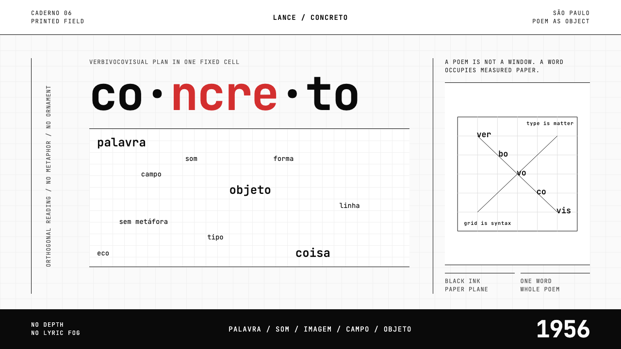 Brazilian Concrete PoetryWords become objects. Monospace cells, black-white paper, one cadmium red rup…字成为物。等宽格、黑白纸面,一处镉红断裂。
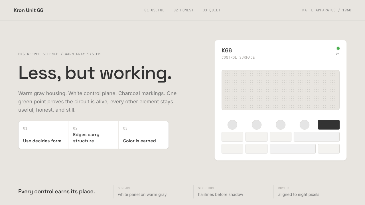 Dieter Rams / BraunQuiet by design. Warm gray, white panels, hairline grids, and one earned gree…安静即设计:暖灰、白面板、细网格,只留一枚绿色指示点。
 IBM Punchcard 029 (1928)Constraint becomes authority. Manila stock, hairline grid, industrial blue.约束即权威。米黄色卡纸、发丝网格与工业蓝。
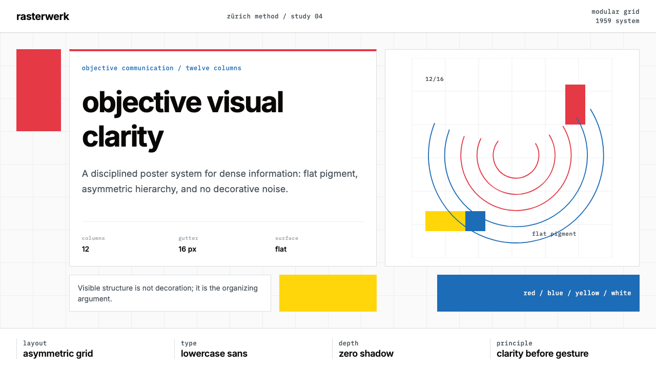 Müller-Brockmann SwissClarity is the system. Inter grids, red-blue blocks, and concentric arcs make…清晰即系统:Inter网格、红蓝色块与同心弧显露结构。
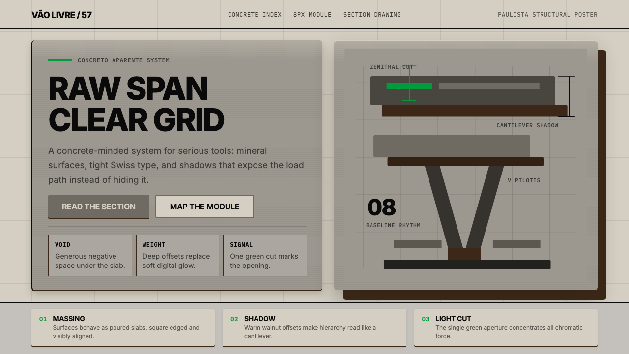 Paulista BrutalismStructural honesty, made heavy. Mineral grays, Inter grids, and walnut cantil…结构诚实而沉重:矿物灰、Inter网格与胡桃色悬挑阴影。
 Sol LeWitt ConceptualInstruction becomes art. Mono certificates face wavering graphite grids in fo…指令即艺术:等宽证书对照颤动石墨网格与四色规则。