What is Fluorescent Antifreeze Green?什么是 Fluorescent Antifreeze Green?
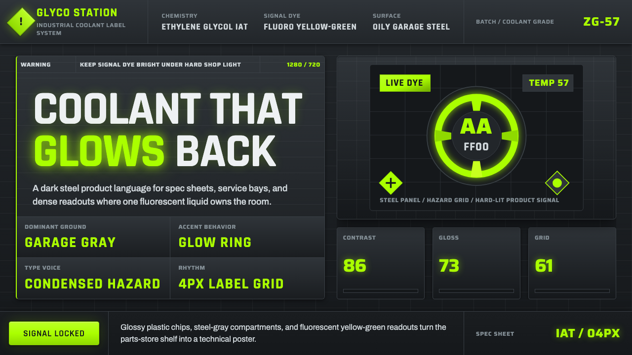
A jug of engine coolant glows an unmistakable fluorescent yellow-green under garage light — this style turns that hazard-bright liquid into an interface built from steel and warning labels.一壶发动机冷却液在车库灯光下泛出无可错认的荧光黄绿色——这种风格把这种危险般明亮的液体,变成了一套由钢铁与警示标签构成的界面。
Fluorescent Antifreeze Green in briefFluorescent Antifreeze Green 速览
Fluorescent Antifreeze Green is a design system built around the specific dyed-bright appearance of conventional ethylene-glycol engine coolant — the glowing chartreuse liquid recognizable through the translucent plastic of a jug on any auto parts store shelf. The system bottles that exact scene: a dark, oily garage environment of concrete and steel gray, with the coolant's fluorescent color glowing against it under hard, direct light.荧光防冻绿是一套围绕传统乙二醇发动机冷却液那种特定染色明亮外观构建的设计系统——那种在任何汽配店货架上、透过半透明塑料壶就能一眼认出的发光嫩黄绿色液体。这套系统把那个确切的场景装了瓶:一间油腻昏暗的车库环境,混凝土与钢铁灰构成底色,冷却液的荧光色在硬朗直射的光线下对着这片底色发光。
The visual grammar is industrial and automotive rather than digital-native — glossy plastic surfaces, condensed hazard-warning sans-serif type, and a label grid borrowed directly from automotive fluid packaging define the look. Buttons behave like glossy label chips pressed onto a surface; cards behave like dark steel panels carrying high-contrast green readouts.其视觉语法是工业化与汽车化的,而非数字原生的——光亮塑料表面、危险警示风格的窄体无衬线字体,以及直接借鉴自汽车流体包装的标签网格,共同定义了这种观感。按钮的表现如同贴附于表面的光亮标签贴片;卡片的表现如同承载高对比度绿色读数的深色钢制面板。
Green in this system never softens, warms, or desaturates — it stays exactly as bright and slightly unnatural as dyed coolant itself, because that specific unnaturalness is the entire point. This is not a nature green or an eco-friendly green; it is a chemical, manufactured green whose brightness exists purely so a technician can spot a leak or a low reservoir at a glance.在这套系统中,绿色从不柔化、暖化或去饱和——它始终保持着与染色冷却液本身一样明亮、一样略带不自然的色泽,因为正是这种特定的不自然感才是全部要义所在。这不是自然的绿色,也不是环保意义上的绿色;这是一种化学的、人工制造的绿色,其亮度的存在,纯粹是为了让技师能够一眼发现漏液或液位偏低。
See the Fluorescent Antifreeze Green design system查看 Fluorescent Antifreeze Green 完整设计系统
Where does Fluorescent Antifreeze Green come from?Fluorescent Antifreeze Green 从何而来?
Ethylene-glycol engine coolant — often called antifreeze — has been a staple of automotive maintenance since the mid-twentieth century, protecting an engine's cooling system from freezing in cold weather and overheating in hot weather by circulating alongside water in the radiator. Conventional coolant formulated with Inorganic Additive Technology, commonly abbreviated IAT, became especially widespread in the postwar mass-market automotive boom as car ownership expanded rapidly across North America and beyond.乙二醇发动机冷却液——常被称为防冻液——自二十世纪中叶以来一直是汽车维护的标配,通过在散热器中与水一同循环,保护发动机冷却系统在寒冷天气中不结冰、在炎热天气中不过热。以无机添加剂技术(常缩写为 IAT)配制的传统冷却液,在战后大众市场汽车业蓬勃发展、北美及其他地区私家车拥有量迅速扩张的浪潮中,变得尤为普及。
The fluorescent yellow-green dye is not a functional necessity of the chemistry itself — ethylene glycol is naturally colorless — but was added deliberately by manufacturers for two practical reasons. First, the bright dye allows a mechanic or car owner to visually confirm coolant level in a translucent plastic reservoir at a glance, without needing to open a cap or use a dipstick. Second, and just as important, the distinctive color helps identify a coolant leak on a garage floor or driveway, distinguishing it immediately from motor oil, transmission fluid, or water.荧光黄绿色染料并非这一化学配方本身的功能必需品——乙二醇本身是无色的——而是制造商出于两个实际原因刻意添加的。第一,明亮的染料让机修工或车主无需打开盖子或使用油尺,仅凭一眼就能确认半透明塑料储液罐中的液位。第二个原因同样重要:这种独特的颜色有助于在车库地面或车道上识别冷却液泄漏,能立即将其与机油、变速箱油或水区分开来。
Brands like Prestone became closely associated with this specific shade through decades of retail packaging and marketing in the automotive aftermarket — the industry serving car owners and independent repair shops rather than original vehicle manufacturers. The coolant's visual identity became inseparable from a broader visual culture of the garage and service bay: glossy plastic containers, condensed sans-serif hazard type warning of toxicity (ethylene glycol is poisonous if ingested), and grid-organized product labels designed for quick scanning under the fluorescent or bare-bulb lighting typical of auto shops.普利司通(Prestone)等品牌,通过在汽车后市场——即服务于车主与独立维修店、而非原厂车辆制造商的产业——数十年的零售包装与营销,与这种特定色调紧密关联在了一起。冷却液的视觉身份,与更广泛的车库与维修工位视觉文化密不可分:光亮的塑料容器、警示乙二醇有毒(若误食)的窄体无衬线危险字体,以及为在汽修店常见的荧光灯或裸灯泡照明下快速扫读而设计的网格化产品标签。
Over subsequent decades, coolant formulations diversified — Organic Acid Technology and Hybrid Organic Acid Technology variants introduced other dye colors to help distinguish incompatible coolant chemistries from one another — but the original fluorescent yellow-green of conventional IAT coolant remains the most culturally recognizable, having appeared in countless garage scenes, product photography, and automotive advertising as visual shorthand for 'engine coolant' itself, regardless of the specific chemistry inside the jug.在此后的数十年间,冷却液配方逐渐多样化——有机酸技术(OAT)与混合有机酸技术(HOAT)配方引入了其他染料颜色,以帮助区分彼此不兼容的冷却液化学成分——但传统 IAT 冷却液最初的荧光黄绿色,仍然是文化上辨识度最高的一种,无论壶中盛装的是哪种具体化学成分,它都作为“发动机冷却液”本身的视觉简称,出现在无数车库场景、产品摄影与汽车广告之中。
What defines the Fluorescent Antifreeze Green look?Fluorescent Antifreeze Green 的视觉特征是什么?
Fluorescent Yellow-Green荧光黄绿色
The core accent color reads as dyed, chemical, and glowing rather than natural or muted — a bright chartreuse-adjacent green that appears to emit light rather than merely reflect it. This color never desaturates or warms; its unnatural brightness is precisely what signals 'coolant' rather than any organic or eco-toned green.核心强调色读起来是染色的、化学的、发光的,而非自然或低调的——一种接近嫩黄绿的明亮绿色,看起来像是在发光而非仅仅反光。这种颜色从不去饱和或暖化;其不自然的明亮度,正是标志着“冷却液”而非任何有机或环保色调绿色的关键所在。
Steel-Gray Garage Ground钢灰车库底色
The base surface reads as dark concrete and steel — an oily, dim, utilitarian garage environment rather than a clean studio backdrop. This dark, textured ground is what allows the fluorescent green to pop with maximum contrast, mimicking exactly how the coolant glows in real service-bay lighting.基底表面读起来像深色的混凝土与钢铁——一个油腻、昏暗、功能主义的车库环境,而非干净的摄影棚背景。正是这层深色、有质感的底色,让荧光绿以最大对比度跃然而出,精确模拟了冷却液在真实维修工位灯光下发光的样子。
Condensed Hazard-Warning Type窄体危险警示字体
Type draws on the narrow, all-caps, high-legibility condensed sans-serif conventions of automotive hazard labels — designed to fit dense safety information into a small physical label area while remaining scannable at arm's length. Letterforms feel utilitarian and industrial rather than editorial or friendly.字体借鉴了汽车危险标签中窄体、全大写、高可读性的无衬线惯例——设计初衷是在很小的实体标签面积上容纳密集的安全信息,同时在手臂距离外仍能被快速扫读。字形给人的感觉是功能主义、工业化的,而非编辑感或友好感的。
Automotive Label Grid汽车标签网格
Information is organized into the tight, rectangular grid structure of a fluid container's product label — a bordered block for the product name, a separate bordered block for specification data, a separate block for warning text. This gridded density mirrors how real automotive labels pack regulatory and safety information into limited space.信息被组织成流体容器产品标签那种紧凑的矩形网格结构——一个带框的名称区块,一个独立带框的规格数据区块,一个独立的警示文字区块。这种网格化密度映照着真实汽车标签如何将监管与安全信息压缩进有限空间之内。
Glossy Plastic Surfaces光亮塑料表面
Buttons and interactive elements carry a glossy, slightly reflective sheen reminiscent of the translucent plastic jug the coolant itself is sold in — a hard, manufactured surface quality rather than a soft matte or paper-like finish. This gloss reinforces the industrial-product origin of the entire palette.按钮与交互元素带有一层光亮、略带反光的光泽,令人联想到冷却液本身所盛装的半透明塑料壶——一种坚硬、工业制造的表面质感,而非柔和的哑光或纸质般的质地。这种光泽强化了整套色板源自工业产品的出身。
Dark Steel Panels深色钢制面板
Cards and content containers read as dark, slightly reflective steel panels rather than paper-white cards — echoing the metal surfaces of a real garage bay. High-contrast green readouts sit against this dark steel exactly as a coolant-level gauge would against a dark engine bay.卡片与内容容器读起来像深色、略带反光的钢制面板,而非纸白色卡片——呼应着真实维修工位的金属表面。高对比度的绿色读数就置于这层深色钢面之上,正如冷却液液位表在深色发动机舱内的样子一般。
High-Contrast Green Readouts高对比度绿色读数
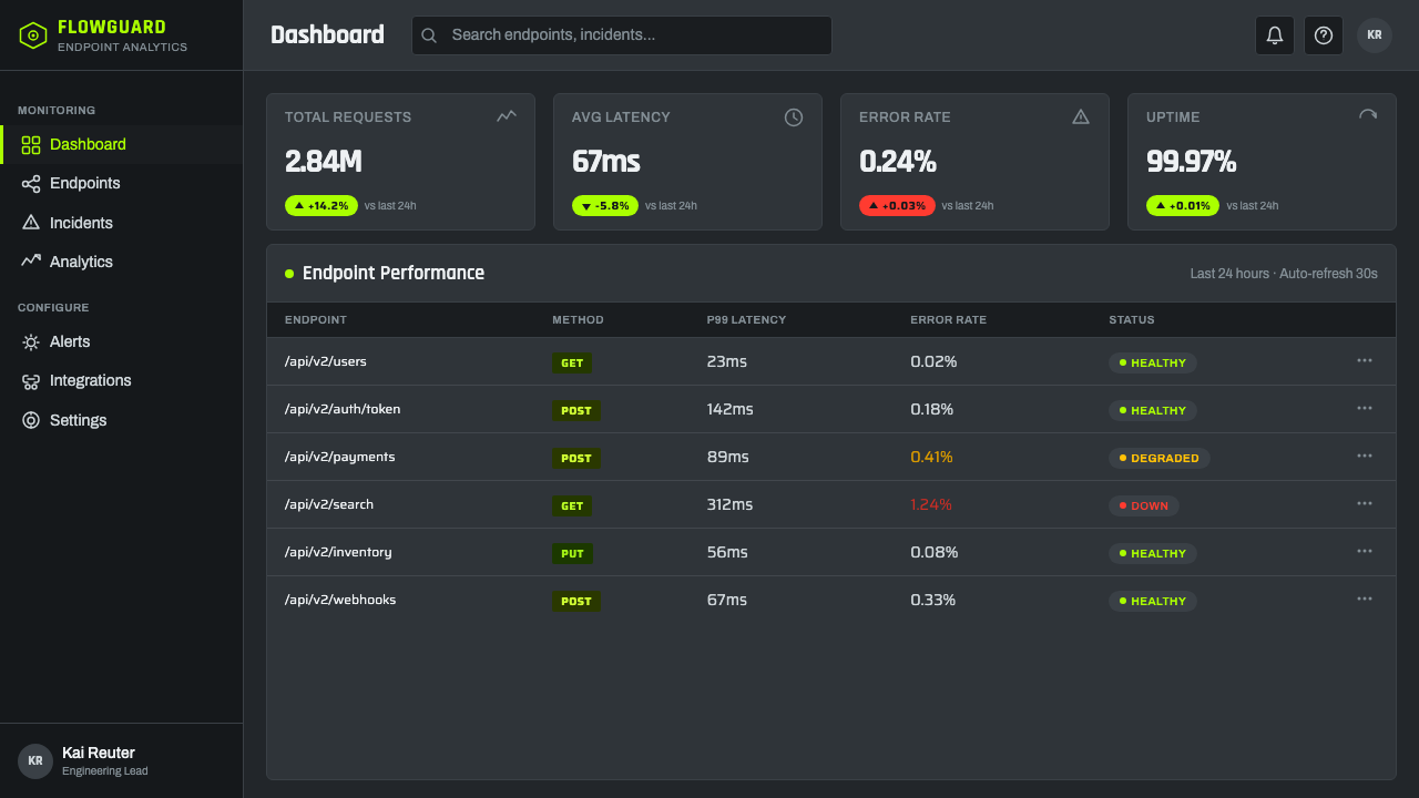
Numeric data, status indicators, and key metrics are rendered in the fluorescent green against the dark steel ground, mimicking a backlit gauge or warning indicator — this is the one place in the system where the green is meant to be read urgently and immediately, not admired decoratively.数字数据、状态指示与关键指标以荧光绿呈现在深色钢面底色之上,模仿着一个背光仪表或警示指示灯——这是系统中唯一一处绿色需要被紧迫而即时地读取,而非作为装饰被欣赏的地方。
See the Fluorescent Antifreeze Green design system查看 Fluorescent Antifreeze Green 完整设计系统
Who shaped Fluorescent Antifreeze Green?谁塑造了 Fluorescent Antifreeze Green?
Prestone became one of the most recognized brand names in automotive coolant across decades of retail packaging and marketing, closely associating its product line with the specific fluorescent yellow-green shade that this design system distills.普利司通在数十年的零售包装与营销中,成为汽车冷却液领域最具辨识度的品牌名称之一,其产品线与本设计系统所提炼的这种特定荧光黄绿色调紧密关联在了一起。
The uncredited designers behind automotive hazard and product labeling standards established the condensed sans-serif, grid-organized visual conventions that this design system borrows directly — a functional visual language built for regulatory compliance and quick scannability rather than aesthetic expression.那些未被署名的汽车危险与产品标签标准设计者,确立了这套设计系统直接借鉴的窄体无衬线、网格化视觉惯例——一种为满足监管合规与快速扫读而生的功能性视觉语言,而非美学表达。
The broader category of postwar automotive aftermarket chemical brands, serving independent repair shops and car owners rather than vehicle manufacturers directly, collectively established the visual culture of glossy fluid packaging that this style draws on.战后汽车后市场化学品品牌这一更广泛的类别,服务于独立维修店与车主而非直接面向车辆制造商,共同确立了这种风格所借鉴的那种光亮流体包装视觉文化。
How do you use Fluorescent Antifreeze Green today?今天怎么用 Fluorescent Antifreeze Green?
This style is best suited to products that want to feel industrial, technical, and unapologetically utilitarian — it carries an inherent edge that reads as automotive or mechanical rather than clean tech, which makes it distinctive for products willing to lean into a rougher, garage-floor aesthetic.这种风格最适合那些希望传达工业感、技术感与毫不掩饰的功能主义气质的产品——它天然带有一种读起来偏汽车化或机械化、而非干净科技感的锋利感,这让它对那些愿意拥抱更粗粝、车库地面般美学的产品而言颇具辨识度。
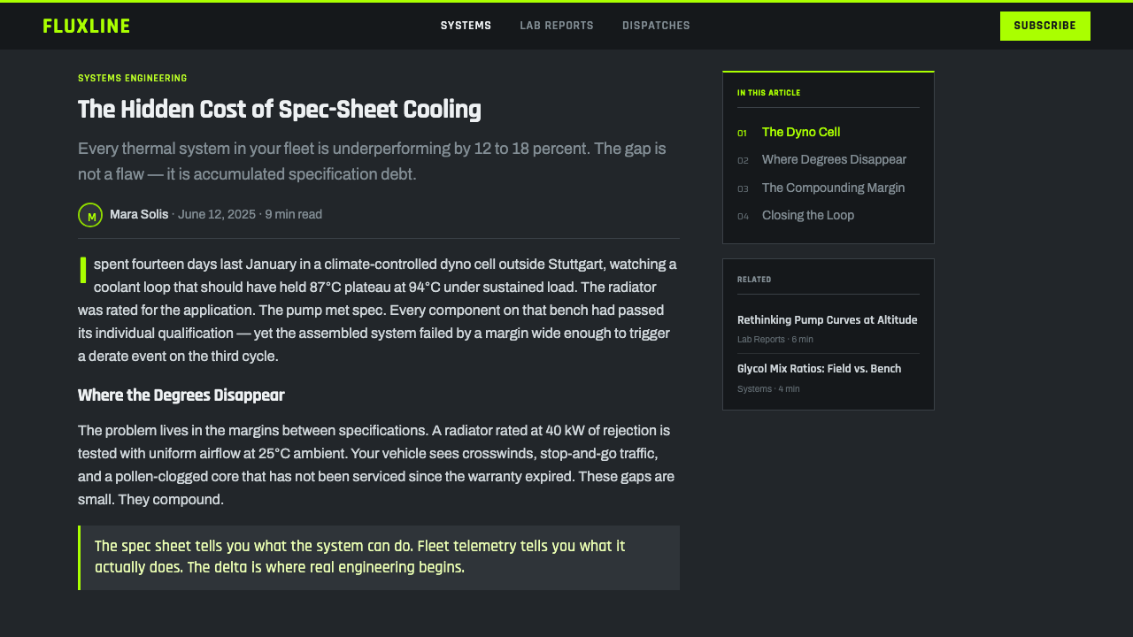
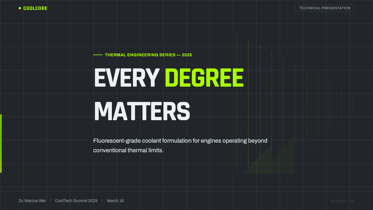
For presentation slides, the dark steel ground and fluorescent green accent make a striking cover treatment: a bordered label-style title block glowing green against a dark, textured background. Content slides should organize data into the tight label-grid structure — bordered blocks of information rather than open, airy layouts — with the fluorescent green reserved for the single most important readout or statistic per slide.在演示文稿中,深色钢面底色与荧光绿强调色能造就一个引人注目的封面处理:一个带边框的标签式标题区块,在深色、有质感的背景上发出绿光。内容页应将数据组织成紧凑的标签网格结构——带边框的信息区块,而非开阔通透的版面——将荧光绿保留给每页最重要的单一读数或数据。
For web interfaces, the system suits automotive and mechanical products, industrial monitoring dashboards, gaming or hardware brands wanting an edgy technical feel, and any platform that wants to signal 'built by people who work with their hands' rather than polished corporate software. Status indicators and alert states are a natural fit for the fluorescent green, since that color already carries the cultural association of 'pay attention to this.'对于网页界面,这套系统适合汽车与机械类产品、工业监控仪表板、追求硬核技术感的游戏或硬件品牌,以及任何希望传达“由动手实干的人打造”而非光鲜企业软件气质的平台。状态指示与警报状态天然适合使用荧光绿,因为这种颜色本身已经承载着“请注意此处”的文化联想。
For editorial and marketing content, the style suits automotive brand storytelling, garage or workshop culture content, and any narrative built around mechanical craft or hands-on expertise. Warning-style condensed type works well for section headers that want to feel blunt and direct rather than polished.对于编辑与营销内容,这种风格适合汽车品牌叙事、车库或工坊文化内容,以及任何围绕机械工艺或动手实践专长构建的叙事。警示风格的窄体字非常适合用于希望显得直白坦率、而非光鲜精致的章节标题。
A common mistake is softening the fluorescent green into a more muted, natural-feeling tone — doing so erases the specific chemical, manufactured brightness that makes the style recognizable. Another mistake is using a clean white or light background instead of the dark, oily steel-and-concrete ground; without that darkness, the green loses the garage-lighting contrast that gives it its glow.一个常见的错误,是把荧光绿柔化成更低调、更自然感的色调——这样做会抹去让这种风格得以辨识的、那种特定的化学人工制造亮度。另一个错误,是使用干净的白色或浅色背景,而非深色油腻的钢铁与混凝土底色;没有那份暗色,绿色就会失去赋予其发光感的车库照明对比。
See the Fluorescent Antifreeze Green design system查看 Fluorescent Antifreeze Green 完整设计系统
Fluorescent Antifreeze Green — FAQFluorescent Antifreeze Green · 常见问题
Why does the green have to be so specifically fluorescent rather than just any bright green?为什么这种绿色必须如此特定地荧光化,而不能是随便一种明亮的绿色?
The specific chemical brightness — appearing almost to glow rather than simply reflecting light — is what ties the style directly to dyed automotive coolant rather than to a generic bright-green brand palette. A more natural or muted bright green would lose the exact 'hazard liquid under garage light' association that gives this system its identity.这种特定的化学般亮度——几乎像是在发光,而非仅仅反射光线——正是将这种风格直接与染色汽车冷却液联系在一起、而非泛泛的明亮绿色品牌色板的关键。一种更自然或更低调的明亮绿色,会失去那种“车库灯光下的危险液体”确切联想,而这正是这套系统身份的来源。
Does the dark ground always need to look like concrete and steel specifically?深色底色是否一定要具体呈现出混凝土与钢铁的样子?
The texture should at least suggest an industrial, utilitarian surface rather than a clean studio or paper backdrop — the exact material can vary, but it needs to feel oily, worked, and functional. A pristine, glossy black background would read as generic 'dark mode' rather than specifically evoking a garage or service bay.这种质感至少应当暗示出一种工业化、功能主义的表面,而非干净的摄影棚或纸质背景——具体材质可以有所变化,但需要传达出油腻、经过使用、功能性的质感。一个纯净光滑的黑色背景,读起来只是泛泛的“深色模式”,而无法特别唤起车库或维修工位的联想。
How much of the interface should carry the label-grid treatment?界面中应有多大比例采用标签网格处理?
Structural and data-heavy areas — specification panels, status readouts, key metrics — benefit most from the bordered label-grid treatment. Long-form body text or conversational content can relax into a more open layout; applying the tight grid everywhere would make the interface feel cluttered rather than deliberately industrial.结构性与数据密集的区域——规格面板、状态读数、关键指标——最适合采用带边框的标签网格处理。长篇正文或对话式内容则可以放松为更开阔的版面;如果处处都套用紧凑网格,界面会显得杂乱,而非刻意的工业感。
Does this style suit a premium or luxury brand?这种风格适合高端或奢华品牌吗?
Not typically. The aesthetic is rooted in mass-market automotive aftermarket products and garage culture, which reads as accessible, utilitarian, and blue-collar rather than refined or exclusive. It suits brands that want to signal hands-on technical competence over polish and prestige.通常不适合。这种美学根植于大众市场汽车后市场产品与车库文化,读起来是平易近人、功能主义、蓝领气质的,而非精致或专属的。它适合那些希望传达动手实干的技术能力、而非光鲜与尊贵感的品牌。
Related design styles相关设计风格
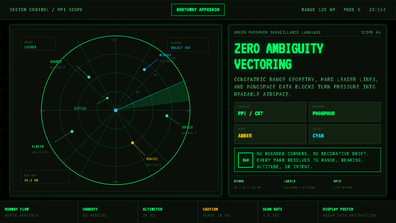 Air Traffic Control RadarOperational gravity. Phosphor green rings, sweep wedges, and monospace blips…军工级冷静:磷光绿同心环、扫描扇面与等宽光点建立零歧义。
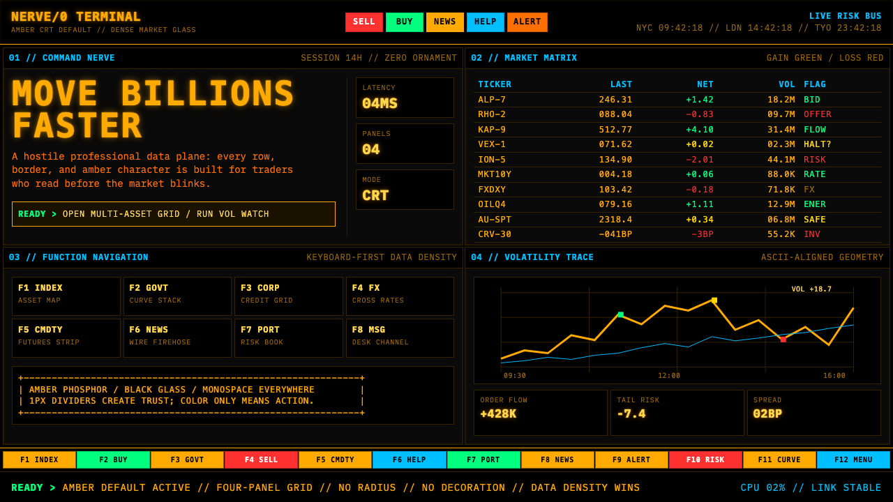 Bloomberg Terminal (Amber CRT)Hostile data authority. Amber mono grids and four hard panels make black glas…强硬的数据权威。琥珀等宽字与四格硬边框,让黑玻璃像市场神经。
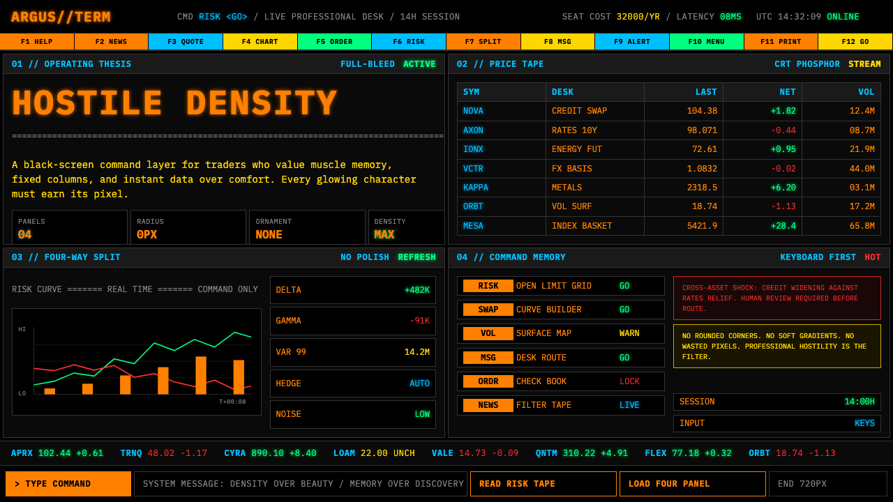 Bloomberg Terminal (CRT Green)Hostile density wins. Orange CRT mono, black grids, and four-panel data walls.敌意密度取胜:橙色CRT等宽字、黑底四分屏数据墙。
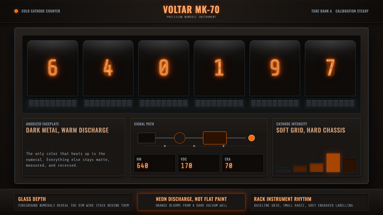 Nixie Tube DisplayHeat inside the machine. Neon-orange digits glow over black metal gridwork.机器里的热光:霓虹橙数字浮在黑色金属栅格上。
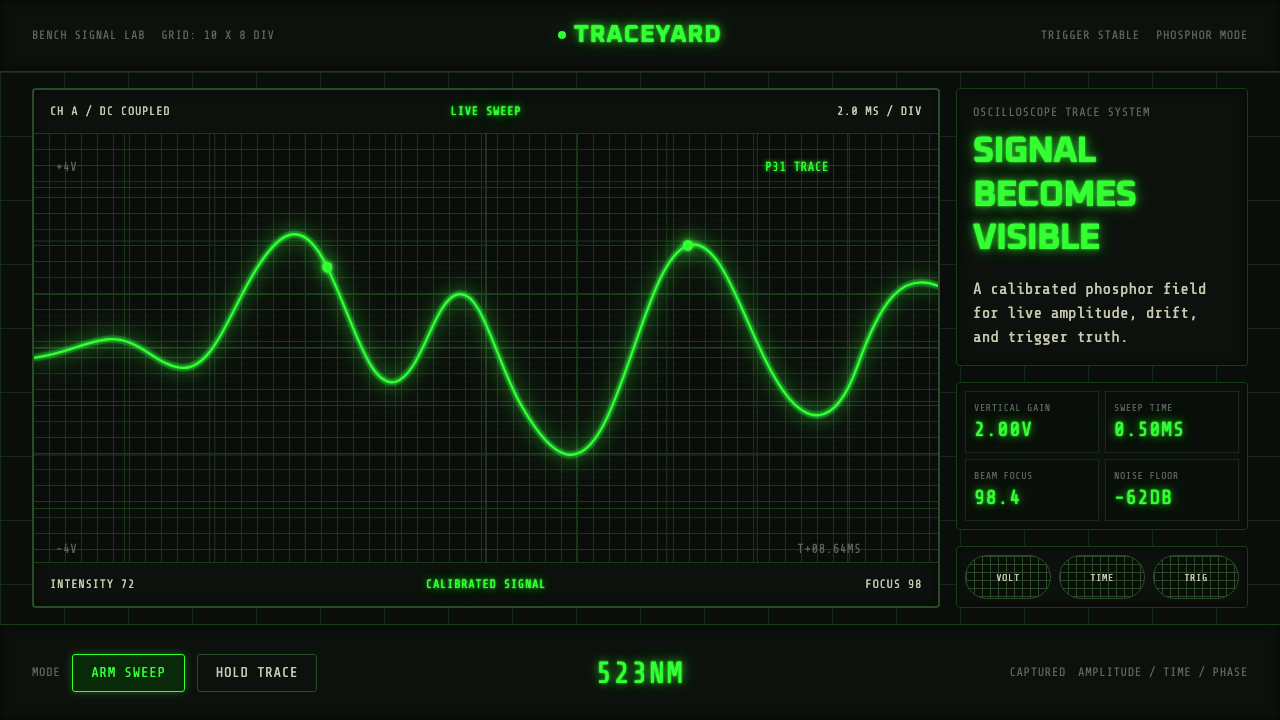 Oscilloscope TraceMeasurement glows. P31 green waveforms burn through a black graticule.测量在发光。P31绿波形穿过黑色刻度栅。
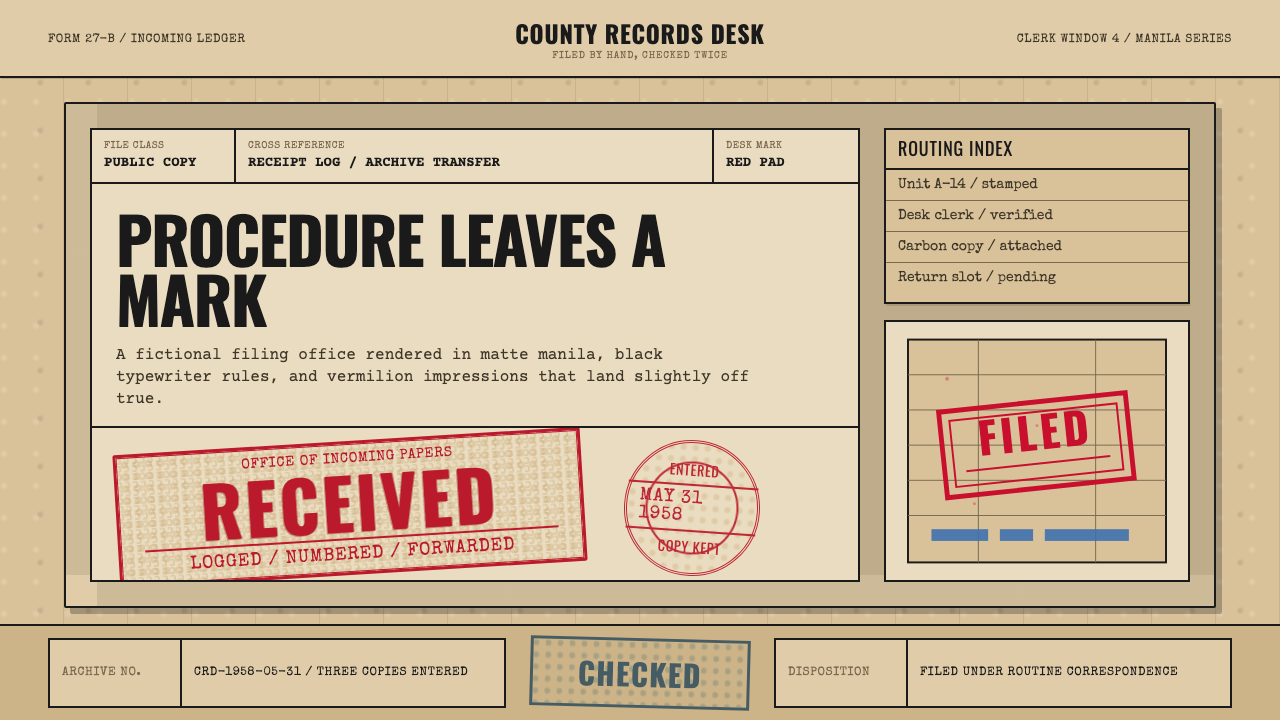 Office Rubber StampsProcedure made visible. Vermilion Oswald stamps strike a manila logbook grid.程序被看见:朱红Oswald印戳砸在马尼拉账册网格上。