What is An-Nahar Beirut Press (1933)?什么是 An-Nahar Beirut Press (1933)?
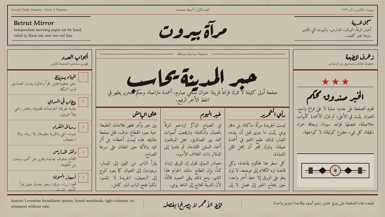
An-Nahar built its authority out of ink, grain, and a single red rule — a newspaper page so dense with columns that trust felt like a texture.《家园报》用油墨、纸纹与一道红线建立权威——版面密得像栏目本身,信任感变成了一种触感。
An-Nahar Beirut Press (1933) in briefAn-Nahar Beirut Press (1933) 速览
An-Nahar Beirut Press is the visual language of the pioneering Lebanese daily An-Nahar, distilled into a reusable design system: an austere black masthead set in naskh-style Arabic lettering, dense right-to-left Linotype columns, coarse and slightly aged grey-beige newsprint underneath, and a single accent color — a rule-line red — used only to divide sections and mark headline ornaments.《家园报》贝鲁特版式是黎巴嫩先驱日报 An-Nahar 视觉语言的提炼:肃穆的黑色纳斯赫体报头、密集的自右向左莱诺铸排栏目、底层略显陈旧的粗糙灰米色新闻纸,以及唯一的点缀色——用于分栏与标题装饰的分隔线红。
The system is defined by density rather than air. Where a modern editorial layout leans on white space to signal calm, this one leans on packed columns, visible print grain, and boxed borders to signal seriousness. Nothing floats; everything is ruled off, boxed, and set close. The effect reads as institutional and unhurried — a paper that has been telling people what happened for a very long time and sees no reason to perform lightness.这套系统以密度而非留白定义气质。当代编辑排版常靠大量留白传达从容,这套系统却靠密集的栏目、可见的印刷纹理与框线边界传达严肃。没有任何元素是漂浮的——一切都被划线、装框、紧密排布。效果是机构感的、不慌不忙的——像一份长年累月讲述时事、无需靠轻盈感自我表演的报纸。
Color is almost entirely suppressed. The page is built from near-black ink on aged paper, with red reserved exclusively for structural marks: a rule beneath the masthead, a divider between stories, a small woodcut-style flourish above a headline. Because red never appears as decoration and always appears at a structural joint, it reads as a signal rather than a flourish — the one moment where the page allows itself emphasis.色彩几乎被完全压抑。版面由旧纸上的近黑油墨构成,红色只保留给结构性标记:报头下方的一道线、故事之间的分隔、标题上方的小型木刻式装饰。正因为红色从不作为装饰出现、总是出现在结构节点上,它读起来更像信号而非花饰——是版面唯一允许自己强调的时刻。
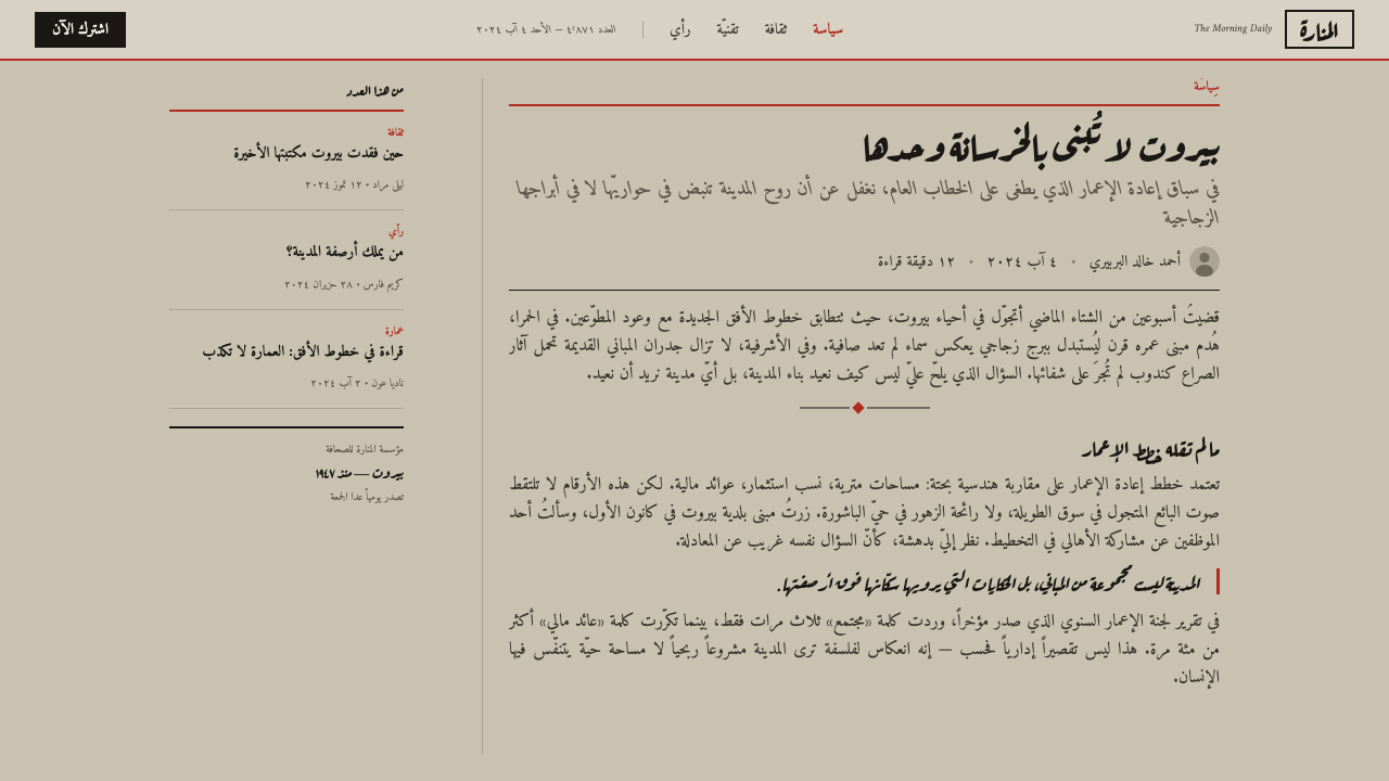
See the An-Nahar Beirut Press (1933) design system查看 An-Nahar Beirut Press (1933) 完整设计系统
Where does An-Nahar Beirut Press (1933) come from?An-Nahar Beirut Press (1933) 从何而来?
An-Nahar — Arabic for 'The Day' — was founded in Beirut on 4 August 1933 by Gebran Tueni, launching as a modest four-page paper set by hand. Lebanon at the time was under French Mandate administration, a young and contested territory still working out its own press culture between Ottoman-era print traditions and European newspaper conventions arriving through Beirut's port. Into that gap, Tueni positioned An-Nahar as a serious paper of record, not a populist sheet — a distinction the visual design was built to communicate before a reader parsed a single word.《家园报》(An-Nahar,阿拉伯语意为“白昼”)由格布兰·图埃尼于1933年8月4日在贝鲁特创办,起初只是一份手工排字的四页小报。彼时黎巴嫩处于法国托管时期,是一片年轻而充满争议的领土,正在奥斯曼时代的印刷传统与经贝鲁特港传入的欧式报业惯例之间摸索自己的新闻文化。图埃尼把《家园报》定位为一份严肃的记录性报纸,而非迎合大众的小报——这一区分在读者读懂任何一个字之前,就已经由视觉设计完成了传达。
The masthead itself did the heaviest symbolic lifting. Rendered in a bold naskh — the cursive Arabic script style long associated with formal and religious texts, as opposed to the more angular kufic used in inscriptions — the title signaled continuity with an older, respected calligraphic tradition even as the rest of the page embraced an industrial technology: the Linotype hot-metal typesetting machine, which allowed Arabic text to be cast and set at a speed hand compositors could never match. The combination of calligraphic authority up top and mechanized density below was itself a statement about modernization without abandonment of heritage.报头本身承担了最重的象征任务。以粗重的纳斯赫体(naskh)排印——这种草书式阿拉伯字体长期与正式文书及宗教文本相关联,区别于铭刻中常用的更为方正的库法体(kufic)——报头传递出与古老、受尊崇的书法传统的延续性,即便版面其余部分拥抱的是一项工业技术:莱诺铸排机热铸排字,使阿拉伯文得以以手工排字工远不能及的速度铸字排版。报头处的书法权威与版面下方的机械化密度相结合,本身就是一种关于“现代化而不弃传统”的宣言。
The physical production constraints of the era shaped the look as much as any aesthetic choice. Newsprint in 1930s Beirut was coarse, absorbent, and prone to yellowing quickly — hence the grey-beige tone that reads as 'aged' even fresh off the press. Ink was heavy and prone to spreading on that rough stock, which pushed printers toward thin, controlled rule lines rather than large color fields; a thick red block would have bled and blurred, while a hairline rule held its edge. Red itself was typically the only spot color economically available for regular runs, reserved by convention for the masthead rule and occasional headline ornament rather than spent on illustration.那个年代的物理生产条件对外观的塑造,不亚于任何美学选择。1930年代贝鲁特的新闻纸粗糙、吸墨性强,且容易很快泛黄——这正是那种即便刚下印刷机也显得“陈旧”的灰米色调的由来。油墨厚重,在这种粗纸上容易洇开,这促使印刷者倾向于使用纤细可控的分隔线,而非大面积色块;一块厚重的红色色块会洇染模糊,而一道发丝细线却能保持清晰边缘。红色本身通常是常规印次中唯一在经济上可行的专色,按惯例只保留给报头分隔线和偶尔的标题装饰,而不用于插图。
An-Nahar grew across the twentieth century into one of the Arab world's most influential and independent newspapers, particularly under Gebran Tueni's son Ghassan Tueni, and later Gebran Tueni's grandson and namesake, who was assassinated in 2005 in connection with his political journalism — a reminder that the paper's claim to seriousness was not merely typographic. The visual system this design library captures belongs specifically to the founding decades, when technology, calligraphic heritage, and material constraint together produced a look that has since become shorthand for authoritative Arabic-language print journalism.《家园报》在整个二十世纪成长为阿拉伯世界最具影响力和独立性的报纸之一,尤其是在格布兰·图埃尼之子加桑·图埃尼的主持下,此后又传至其孙、与祖父同名的格布兰·图埃尼——他在2005年因其政治新闻工作而遇刺身亡,这提醒着人们:这份报纸对严肃性的宣示,绝不仅仅停留在字体排印层面。本设计库所捕捉的这套视觉系统,正属于其创立的最初几十年——彼时技术、书法传统与材料限制共同造就了一种此后成为阿拉伯语权威印刷新闻业代名词的外观。
What defines the An-Nahar Beirut Press (1933) look?An-Nahar Beirut Press (1933) 的视觉特征是什么?
Ground and Paper底色与纸质
The base is a coarse grey-beige that reads as aged newsprint rather than clean digital white. It carries a faint mottled grain — the visual memory of cheap wood-pulp stock absorbing heavy ink unevenly. Nothing on the page is pure white or pure black; even 'black' text sits slightly softened by the paper tone beneath it, and the ground never lightens to signal a calmer or more premium section.底色是一种粗糙的灰米色,读起来像陈旧的新闻纸,而非干净的数字白。它带着淡淡的斑驳纹理——是廉价木浆纸不均匀吸墨留下的视觉记忆。页面上没有纯白也没有纯黑;即便是“黑色”文字,也因底层纸色而略显柔和,底色从不会为标示更平静或更高级的区块而变浅。
Masthead Typography报头字体
The title treatment draws on bold naskh-style Arabic lettering — cursive, flowing, and historically associated with formal and literary texts rather than casual signage. It sits boxed at the top of the composition, heavier and larger than anything beneath it, establishing a strict typographic hierarchy where the masthead's authority is never challenged by a competing headline.标题处理借鉴了粗重的纳斯赫体阿拉伯字形——草书流畅,历史上与正式文书及文学文本相关联,而非随意的招牌字体。它被框选置于构图顶端,比下方任何元素都更重、更大,确立了严格的字体层级:报头的权威地位从不会被下方标题所挑战。
Column Density栏目密度
Body copy runs in tight, narrow columns set right-to-left, packed close with minimal leading and almost no white space between blocks of text. The density itself is a design decision: a page that looks this full signals that every inch has earned its place, communicating volume of coverage and editorial seriousness rather than visual ease.正文以紧凑窄栏自右向左排列,行距极小,文本块之间几乎没有留白。这种密度本身就是一种设计决策:如此饱满的版面传达出每一寸空间都物有所值的信号,传递的是报道体量与编辑严肃性,而非视觉上的轻松。
Rule Lines分隔线
Thin black and red hairlines do all the structural work that white space would do in a modern layout. A rule beneath the masthead separates identity from content; rules between stories separate one item of news from the next; rules around boxed elements assert that this content is contained and finished. Lines are never decorative flourishes — every one marks a real boundary.纤细的黑色与红色发丝线承担了在现代版面中本应由留白完成的一切结构工作。报头下方的分隔线把身份标识与内容区分开;故事之间的分隔线把一条新闻与下一条区分开;框选元素周围的分隔线宣示这部分内容是被容纳且完整的。线条从不作为装饰性花饰出现——每一条都标记着一个真实的边界。
Red as Signal作为信号的红色
Red appears exactly once per structural context — the masthead rule, a section divider, a headline ornament — and never as a field fill or a decorative wash. Because its use is so restrained and so consistently tied to structure, red reads instantly as emphasis: the eye learns quickly that red marks something worth stopping at.红色在每个结构语境中只出现一次——报头线、分节分隔、标题装饰——从不作为色块填充或装饰性铺色。正因为它的使用如此克制、如此稳定地与结构绑定,红色能被瞬间读作强调:读者的眼睛很快就学会红色标记着值得停留之处。
Woodcut-Style Ornament木刻风格装饰
Headline flourishes borrow the coarse, slightly irregular quality of woodcut printing — small decorative marks with visibly imperfect edges rather than the crisp vector precision of a modern icon set. This imperfection is deliberate: it ties the page to a pre-digital production era and reinforces the sense of an object printed under real physical constraints, not designed on a screen.标题装饰借鉴了木刻印刷那种粗粝、略带不规则的质感——带有明显不完美边缘的小型装饰标记,而非现代图标集那种精确利落的矢量线条。这种不完美是刻意为之:它将版面与前数字时代的生产方式联系在一起,强化了这是一件在真实物理条件约束下印刷出来的物品,而非在屏幕上设计出来的东西。
Right-to-Left Structure自右向左结构
Every compositional decision — column order, masthead placement, the direction a reader's eye is meant to travel — respects Arabic's right-to-left reading direction. This is not a mirrored version of a Latin-script layout; the entire grid logic, including where hierarchy and emphasis are placed, is built starting from the right.每一个构图决策——栏目顺序、报头位置、读者视线该行进的方向——都遵循阿拉伯语自右向左的阅读方向。这不是拉丁字母版面的镜像版本;整个网格逻辑,包括层级与强调的摆放位置,都是从右侧开始构建的。
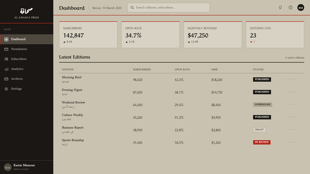
See the An-Nahar Beirut Press (1933) design system查看 An-Nahar Beirut Press (1933) 完整设计系统
Who shaped An-Nahar Beirut Press (1933)?谁塑造了 An-Nahar Beirut Press (1933)?
Gebran Tueni founded An-Nahar in 1933 and set its founding editorial tone as a serious paper of record rather than a populist sheet. The visual restraint of the original masthead and layout — authority over spectacle — traces directly back to his founding vision for what an independent Lebanese newspaper should look like and sound like.格布兰·图埃尼于1933年创办《家园报》,确立了其作为严肃记录性报纸而非迎合大众小报的创刊基调。原始报头与版面的视觉克制——权威感而非奇观感——可以直接追溯到他对一份独立黎巴嫩报纸应有面貌与声音的创立构想。
Ghassan Tueni, Gebran's son, led An-Nahar through much of the twentieth century and expanded its role as one of the most influential and independent voices in Arab journalism, reinforcing the paper's identity as a serious institution whose visual sobriety matched its editorial weight.格布兰之子加桑·图埃尼在二十世纪的大部分时间里主持《家园报》,将其发展为阿拉伯新闻界最具影响力和独立性的声音之一,强化了这份报纸作为一家严肃机构的身份——其视觉上的沉稳与编辑分量相互呼应。
The founder's grandson and namesake, Gebran Tueni, continued the family's editorial leadership into the 2000s and was assassinated in 2005 in connection with his political journalism — a stark reminder that the paper's claim to seriousness extended well beyond the printed page into real political consequence.创始人的孙辈、与祖父同名的格布兰·图埃尼,将家族的编辑领导延续到了2000年代,并于2005年因其政治新闻工作而遇刺身亡——这是一个鲜明的提醒:这份报纸对严肃性的宣示,远远超出了印刷页面,延伸至真实的政治后果之中。
The uncredited generations of Linotype operators who set Arabic text at industrial speed made the paper's characteristic column density physically possible. Their work translated calligraphic Arabic letterforms into a hot-metal typesetting system, a technical feat that shaped the visual rhythm of every column on the page.那些未被署名的一代代莱诺铸排机操作员,以工业化速度排印阿拉伯文,使这份报纸标志性的栏目密度在物理上得以实现。他们的工作把阿拉伯书法字形转译进热铸排字系统,这项技术成就塑造了页面上每一栏的视觉节奏。
How do you use An-Nahar Beirut Press (1933) today?今天怎么用 An-Nahar Beirut Press (1933)?
This style earns its keep wherever an interface needs to feel authoritative, archival, or unmistakably serious rather than friendly or light. It is not a general-purpose editorial theme — it is a specific register best deployed sparingly, for content that wants to announce itself as a record rather than a conversation.这种风格最适合用在界面需要传达权威感、档案感或不容置疑的严肃感,而非友好或轻盈气质的场景。它不是一种通用型编辑主题——而是一种特定的语域,最好谨慎地用于那些希望把自己宣示为“记录”而非“对话”的内容。
For presentation slides, this system suits a cover page that wants gravity: a boxed title treatment echoing a masthead, set against the aged-paper ground, with a single red rule beneath it. Content slides should be treated as dense columns of information rather than airy bullet points — multiple narrow text blocks divided by hairline rules, mimicking a printed page rather than a modern deck. Reserve red exclusively for section dividers or a single callout number; using it as a general accent dilutes the signal effect entirely.在演示文稿中,这套系统适合需要庄重感的封面页:一个仿报头式的框选标题处理,置于陈旧纸质底色上,下方配一道红色分隔线。内容页应被当作密集的信息栏目处理,而非轻盈的项目符号列表——多个窄文本块以发丝线分隔,模仿印刷页面而非现代幻灯片。红色应严格保留给分节分隔或单一强调数字;把它用作通用点缀色会彻底稀释其信号效果。
For web interfaces, the aesthetic is well suited to archives, editorial mastheads, subscription or paywall pages for serious journalism products, and any dashboard that wants to communicate institutional trust through density rather than whitespace. A pricing or account page rendered in this style should favor boxed panels and rule-divided sections over floating cards with soft shadows — the entire visual grammar rejects the soft, weightless conventions of contemporary SaaS design in favor of something that reads as printed and permanent.对于网页界面,这种美学非常适合档案库、编辑类报头、严肃新闻产品的订阅或付费墙页面,以及任何希望通过密度而非留白传达机构信任感的仪表板。以这种风格渲染的定价页或账户页,应偏爱框选面板与线条分隔的区块,而非带柔和阴影的漂浮卡片——整套视觉语法拒绝当代 SaaS 设计那种轻盈无重量的惯例,转而追求一种印刷般、恒久般的质感。
For editorial and marketing content, the style is most persuasive applied to long-form journalism, historical retrospectives, or any brand narrative that wants to borrow the credibility of an old, respected newspaper without literally imitating a specific masthead. A marketing page can use the dense-column layout for a manifesto or history section, reserving the red rule for the single most important claim on the page.对于编辑与营销内容,这种风格最能打动人心的应用场景是长篇新闻报道、历史回顾,或任何希望借用一份古老、受尊崇的报纸之信誉、却又不直接照搬某个具体报头的品牌叙事。营销页面可以为宣言或历史板块使用密集栏目布局,将红色分隔线保留给页面上最重要的那一条主张。
The most common mistake is treating the aged-paper ground as merely a texture to slap under a modern layout while keeping generous white space and light type weights. The system only works when density, rule lines, and restrained red are applied together — a spacious layout with a beige background reads as faux-vintage decoration rather than an authentic evocation of dense, serious 1930s print journalism.最常见的错误,是把陈旧纸质底色仅仅当作一层贴在现代版面下方的纹理,同时仍保留大量留白与轻字重。这套系统只有在密度、分隔线与克制的红色三者共同作用时才能奏效——一个背景为米色却留白宽松的版面,读起来只是仿旧装饰,而非对1930年代密集严肃印刷新闻业的真实唤起。
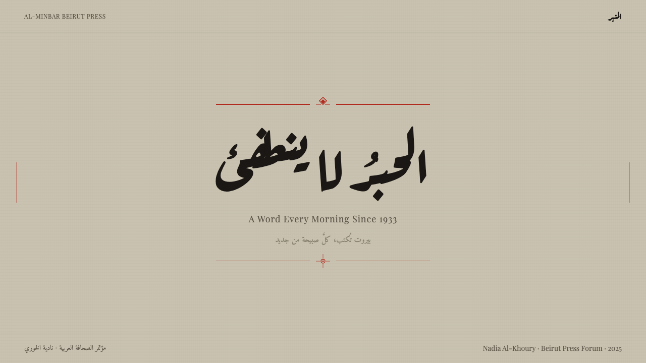
See the An-Nahar Beirut Press (1933) design system查看 An-Nahar Beirut Press (1933) 完整设计系统
An-Nahar Beirut Press (1933) — FAQAn-Nahar Beirut Press (1933) · 常见问题
Is this style specific to Arabic-language content, or can it work in Latin-script layouts?这种风格是否只适用于阿拉伯语内容,还是也能用于拉丁字母版面?
The system's deepest logic — right-to-left column order, naskh-inspired masthead lettering — is built around Arabic. It can be adapted to Latin-script content by keeping the aged-paper ground, column density, rule-line structure, and restrained red signal while switching to left-to-right reading order and a bold serif or slab masthead treatment. What must not be lost in translation is the density and the rule-line discipline; those, not the script itself, are the core of the look.这套系统最深层的逻辑——自右向左的栏目顺序、受纳斯赫体启发的报头字体——是围绕阿拉伯语构建的。它可以调整用于拉丁字母内容:保留陈旧纸质底色、栏目密度、分隔线结构与克制的红色信号,同时切换为从左至右的阅读顺序,并采用粗体衬线或粗衬线报头处理。不能在转译中丢失的,是密度与分隔线纪律;这才是这种观感的核心,而非文字本身。
Why does the palette avoid clean white entirely?为什么这套色板完全避开干净的白色?
Clean white signals a contemporary digital product, and this style's entire purpose is to evoke a specific historical material — coarse, absorbent, slightly yellowed 1930s newsprint. A pure white ground would immediately break that illusion and make the density and rule-lines look like arbitrary decoration rather than an authentic print convention. The aged tone is load-bearing, not incidental.干净的白色传递的是当代数字产品的信号,而这种风格的全部意图,正是唤起一种特定的历史材料——粗糙、吸墨、略微泛黄的1930年代新闻纸。纯白底色会立刻打破这种幻觉,让密度与分隔线看起来像是随意的装饰,而非真实的印刷惯例。这种陈旧色调是承重的,而非偶然的。
How much red is too much red in this system?在这套系统中,红色用到什么程度算过量?
Authentic usage caps red at structural marks only — a masthead rule, a section divider, a headline ornament — typically no more than two or three touches per screen. The moment red appears as a background fill, a button field, or a repeated icon color, it stops functioning as a signal and starts reading as generic brand accent, which undoes the entire point of its scarcity.真实的用法把红色严格限定在结构性标记上——报头线、分节分隔、标题装饰——每屏通常不超过两到三处。一旦红色开始作为背景填充、按钮色块或反复出现的图标颜色出现,它就不再作为信号发挥作用,而是变成了泛泛的品牌点缀色,这就抵消了它稀缺性的全部意义。
Does this style suit a friendly consumer product?这种风格适合友好型消费者产品吗?
Generally not. The style's entire vocabulary — density, restraint, an aged and slightly severe ground — communicates institutional gravity rather than warmth or approachability. It suits archives, serious journalism, research repositories, and any brand that wants to trade on the authority of an old and respected print tradition. A consumer app aiming for friendliness would be fighting its own visual language every step of the way.通常不适合。这种风格的全部词汇——密度、克制、一种陈旧而略显严肃的底色——传达的是机构式的庄重感,而非温暖或亲和力。它适合档案库、严肃新闻业、研究资料库,以及任何希望借助古老而受尊崇的印刷传统之权威感的品牌。一款追求亲和力的消费者应用,若采用这种风格,几乎每一步都会与自身的视觉语言相抵触。
Related design styles相关设计风格
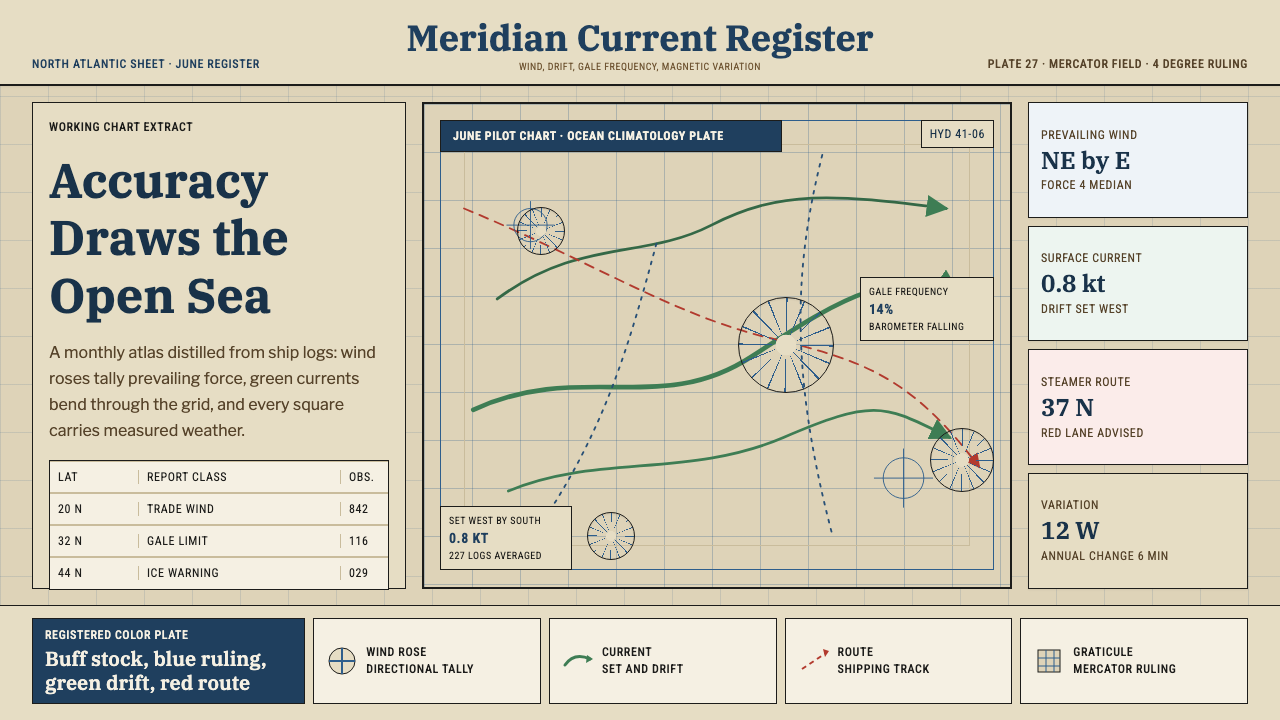 Ocean Pilot ChartAuthority by accumulation. Blue graticules and green currents crowd warm char…权威来自积累:蓝色经纬网与绿色洋流挤满暖调海图纸。
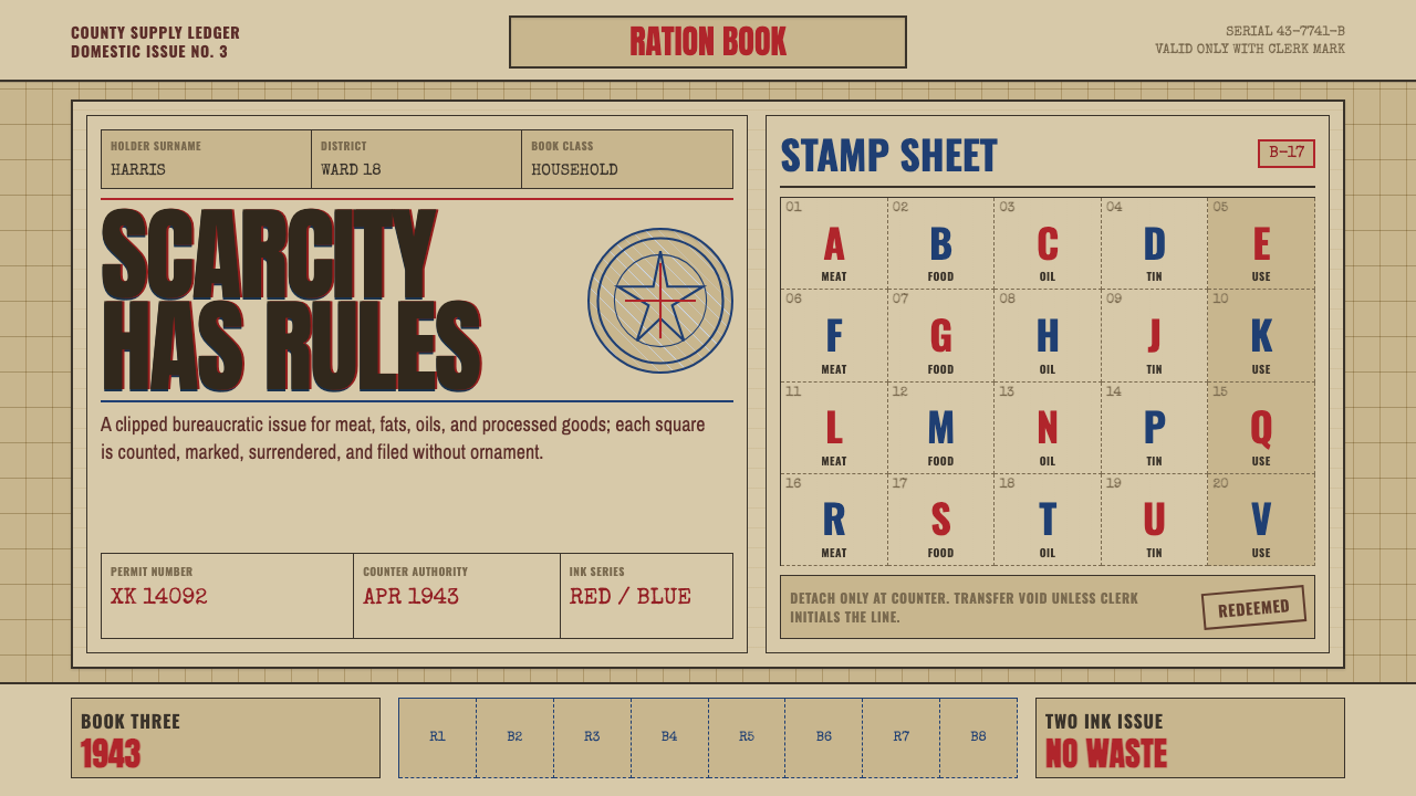 Wartime Ration CouponScarcity made visible. Buff card, red-blue overprint, and perforated grids do…稀缺被看见:浅黄卡纸、红蓝套印与齿孔格构成秩序。
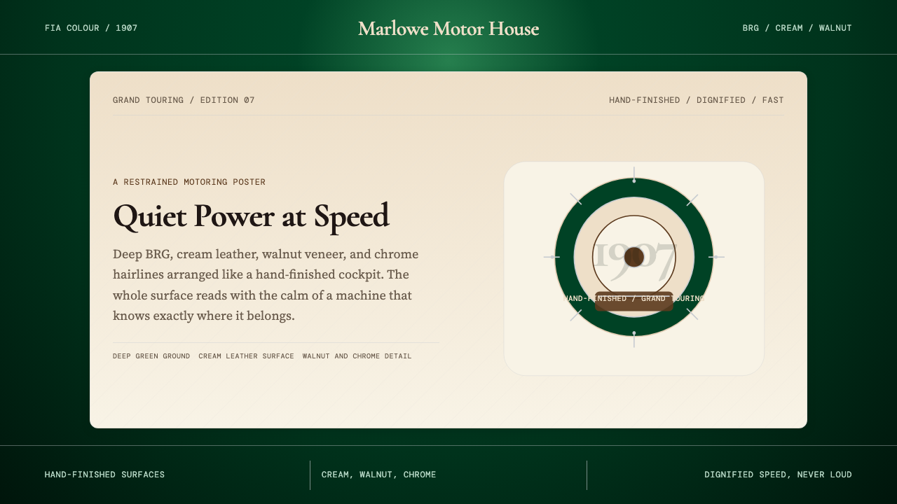 British Racing Green (Motorsport, 1907)Quiet authority at speed. Deep BRG, cream leather, walnut, and chrome hairlin…安静却有速度感。深赛车绿配奶油皮革、胡桃木和铬银细线。
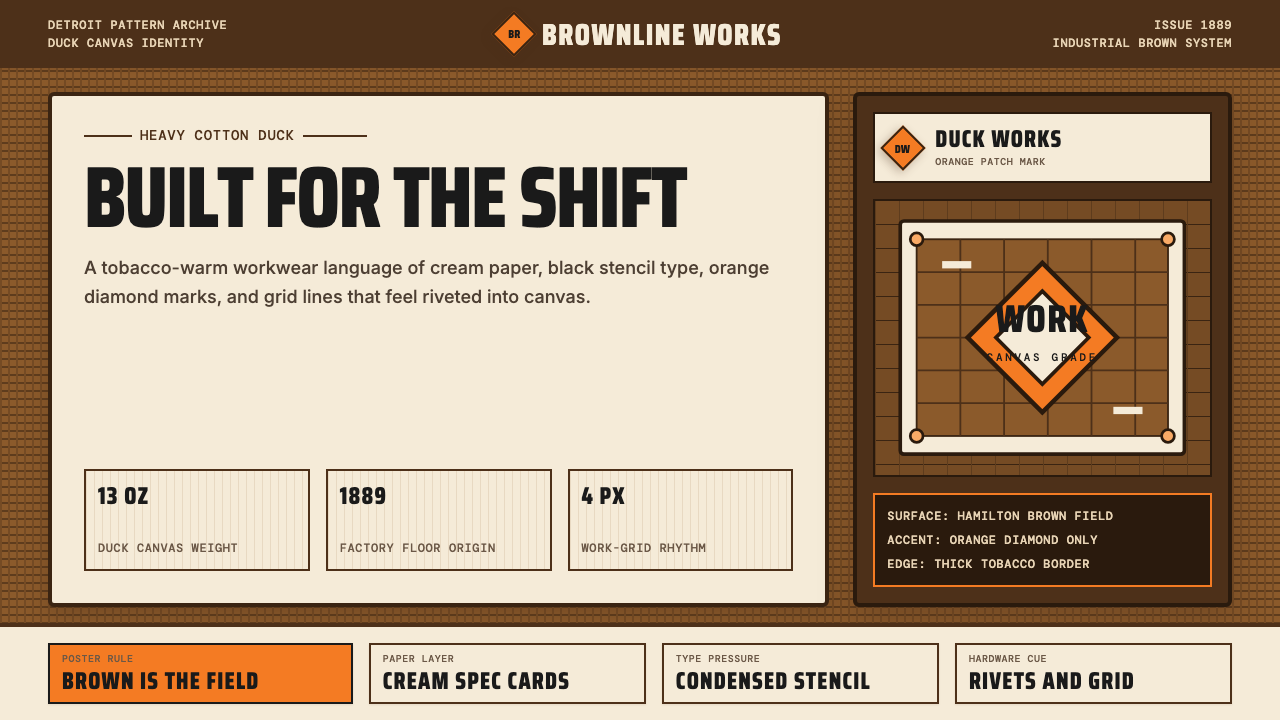 Carhartt Work Jacket Brown (1889)Built like work. Hamilton brown, orange diamond, and condensed type carry can…像工装一样坚固:汉密尔顿棕、橙色菱形与压缩字体撑起帆布重量。
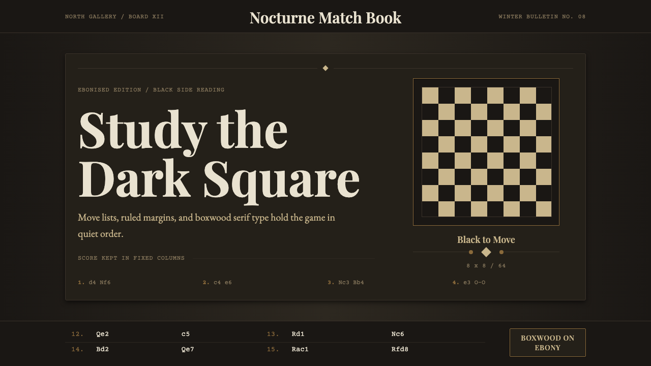 Chess TournamentQuiet intellect. Cream Playfair type, walnut rules, and notation glow on ebon…安静的智性:乌木底上乳白衬线、胡桃细线与记谱发光。
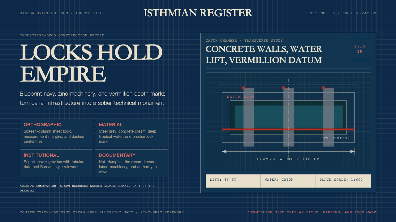 Panama Canal Deco 1914Blueprint authority. Navy grids, zinc rulework, and vermillion datum lines ma…蓝图式权威:海军蓝网格、锌灰线框与朱红基准线,冷峻精密。