What is AI Diffusion Art?什么是 AI Diffusion Art?
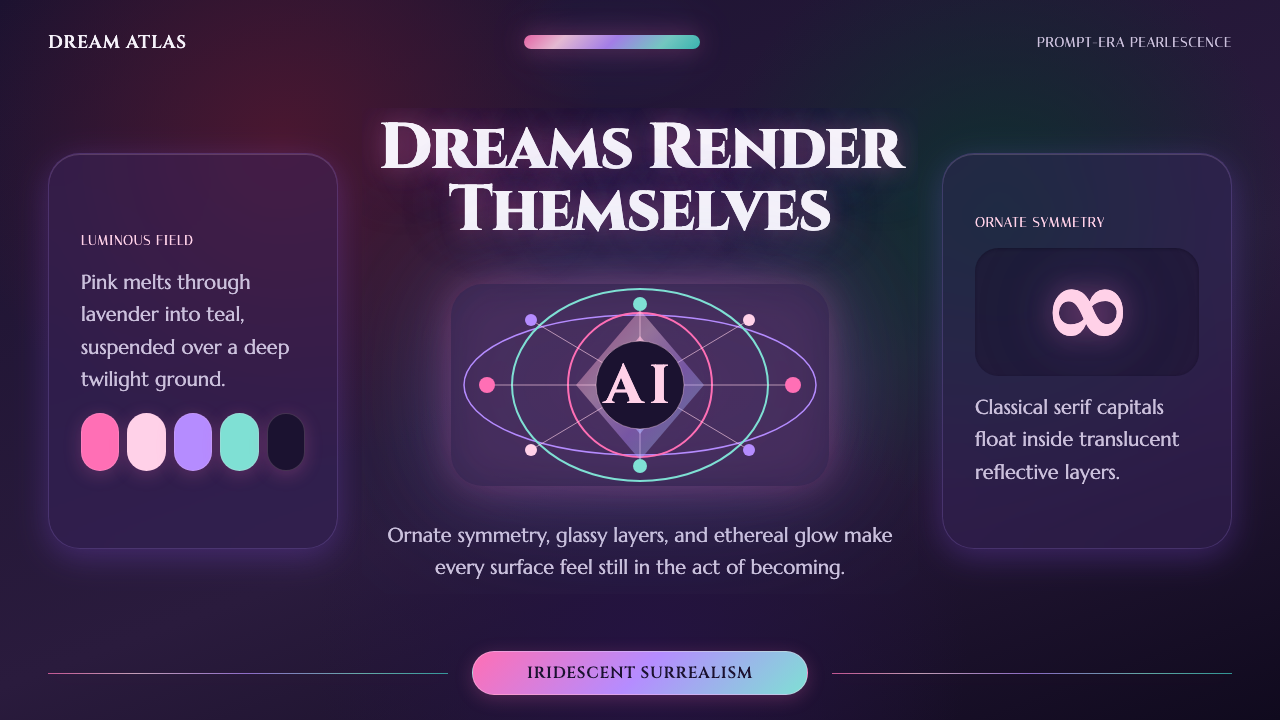
AI Diffusion Art bottles the exact moment generative image models broke into public view — melting pink-to-teal gradients, uncanny symmetry, and a luminous twilight glow.「AI 扩散艺术」封存了生成式图像模型闯入公众视野的那个精确瞬间——融化般的粉到青渐变、诡谲的对称,以及一片发光的暮色微光。
AI Diffusion Art in briefAI Diffusion Art 速览
AI Diffusion Art captures the specific look of first-generation Midjourney output that spread rapidly through social media and design communities beginning in March 2022, when public access first made diffusion-model image generation available to a mass audience. This was a visual moment unlike anything preceding it — hyper-detailed, iridescent, and unmistakably synthetic, yet rendered with a painterly, almost baroque richness no camera or traditional illustration technique had quite produced before.「AI 扩散艺术」捕捉的是第一代 Midjourney 生成图像的特定外观,这种外观自2022年3月起——即扩散模型图像生成首次向大众公开开放之时——通过社交媒体与设计社群迅速蔓延。这是一个前所未有的视觉时刻:超精细、虹彩感十足、明显具有合成质感,却又以一种绘画般、近乎巴洛克式的丰富感呈现,是此前任何相机或传统插画技法都未能产生过的效果。
The defining quality is a deep, dreamlike twilight ground overlaid with melting, pearlescent gradients that shift between pink and teal — colors that seem to glow from within rather than sit as flat surface pigment. Compositions favor uncanny, ornate symmetry: mirrored details, elaborate patterning, and a sense that every element has been generated to an almost excessive degree of intricate detail, a hallmark of the early diffusion models' tendency toward maximalist ornamentation.其最核心的特质,是一片深邃如梦的暮色底色,叠加融化般、珍珠光泽的渐变,在粉色与青色之间流转——这些色彩仿佛从内部发光,而非作为平面表面颜料存在。构图偏好诡谲的、繁复的对称感:镜像细节、精工纹样,以及一种每个元素都被生成到近乎过度精细程度的感觉——这正是早期扩散模型倾向于极繁装饰的标志性特征。
This design system translates that generative aesthetic into a structured visual language: luminous gradient fields as backgrounds, translucent reflective layers suggesting glass or liquid, and refined display serif typography that echoes the grand, symmetrical, almost classical compositions the era's prompts often produced. Interface components are imagined floating in glowing space rather than sitting within a hard, rectilinear grid.本设计系统将这种生成式美学转化为一套结构化的视觉语言:发光的渐变场域作为背景,暗示玻璃或液体的半透明反光层次,以及呼应那个时代提示词经常产生的宏大、对称、近乎古典构图的精致展示衬线字体。界面组件被想象成漂浮在发光空间之中,而非被困于硬朗、方正的网格之内。
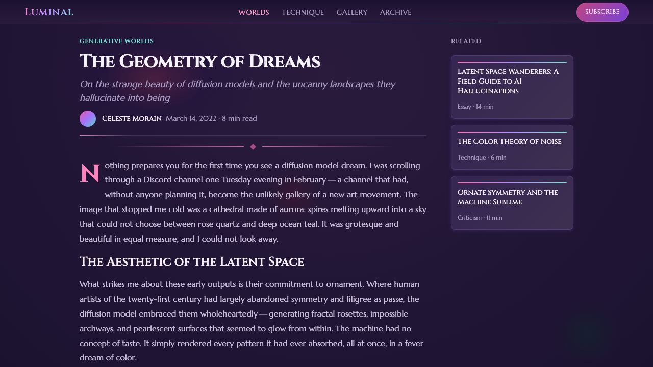
See the AI Diffusion Art design system查看 AI Diffusion Art 完整设计系统
Where does AI Diffusion Art come from?AI Diffusion Art 从何而来?
Diffusion-model image generation, the underlying technology behind this look, works by training a neural network to reverse a process of gradually adding noise to an image, allowing the trained model to generate coherent images starting from pure random noise guided by a text prompt. Midjourney, founded by David Holz, opened public access to its image-generation tool via a Discord bot in March 2022, and its early default aesthetic — before subsequent model versions shifted toward photorealism — produced exactly the pearlescent, ornate, dreamlike quality this style is named for.扩散模型图像生成,这种支撑该外观的底层技术,其工作原理是训练一个神经网络去逆转一个逐步向图像添加噪声的过程,使训练完成的模型能够从纯随机噪声出发、在文本提示词的引导下生成连贯的图像。由 David Holz 创立的 Midjourney,于2022年3月通过一个 Discord 机器人开放了其图像生成工具的公众访问权限,其早期默认美学——在后续模型版本转向照片写实之前——正产生了这种珍珠光泽、繁复、如梦般的品质,本风格正因此得名。
That specific early-2022 look was shaped as much by the model's training data and default rendering tendencies as by user intent: prompts requesting fairly ordinary subjects often returned results with elaborate symmetrical ornamentation, glowing color transitions, and a painterly surface quality reminiscent of fantasy illustration and airbrushed album art, because the model's statistical tendencies leaned toward these visually rich, maximalist outputs by default.2022年初这一特定外观的形成,既源于用户意图,也同样源于模型的训练数据与默认渲染倾向:请求相当普通主题的提示词,往往会返回带有精工对称装饰、发光色彩过渡,以及令人联想到奇幻插画与喷绘专辑封面那种绘画般表面质感的结果,因为该模型的统计倾向默认偏向这种视觉丰富、极繁主义的输出。
Competing systems emerging around the same period — Stable Diffusion, released publicly in August 2022 by Stability AI, and OpenAI's DALL·E 2 — each produced their own distinguishable visual signatures, but it was specifically Midjourney's early aesthetic that became most closely associated in public imagination with 'AI art' as a recognizable style, thanks to its viral spread across social media and design-sharing platforms during 2022.同一时期涌现的竞争系统——由 Stability AI 于2022年8月公开发布的 Stable Diffusion,以及 OpenAI 的 DALL·E 2——各自产生了可区分的视觉标志,但恰恰是 Midjourney 的早期美学,在公众想象中最紧密地与“AI 艺术”这一可辨识的风格联系在一起,这得益于它在2022年间在社交媒体与设计分享平台上的病毒式传播。
This first-generation look proved short-lived in the technology's own timeline — subsequent Midjourney versions and competing tools rapidly moved toward photorealistic, more controllable output within a year or two — which is precisely why the original 2022 aesthetic has since become a nostalgic, identifiable design reference in its own right, distinct from later, more photoreal generative-AI output.以技术自身的时间线来看,这种第一代外观其实相当短命——后续的 Midjourney 版本与竞争工具,在一两年内便迅速转向照片写实、更具可控性的输出——而这正是2022年最初这种美学后来自成一种怀旧、可辨识的设计参照的原因,有别于此后更偏照片写实的生成式 AI 输出。
What defines the AI Diffusion Art look?AI Diffusion Art 的视觉特征是什么?
Color色彩
A deep twilight ground — dark blue-violet or plum — hosts melting gradients that shift between pearlescent pink and teal, with color transitions rendered smoothly and glowingly rather than as hard-edged flat fields, mimicking the model's tendency toward soft, luminous color blending.深邃的暮色底色——深蓝紫或深梅红——承载着在珍珠光泽粉色与青色之间流转的融化渐变,色彩过渡呈现出柔和、发光的质感,而非硬边平面色块,模仿该模型倾向于柔和、发光色彩融合的特点。
Iridescent Surface虹彩表面
Surfaces carry a pearlescent, oil-slick quality — subtle shifts in hue across a single form as if light were catching a reflective, slightly translucent material, distinct from a flat single-color fill.表面带有一种珍珠光泽、油膜般的质感——同一形态之上色相发生细微变化,仿佛光线正照射在一种反光、略带半透明的材质上,有别于单一色彩的平面填色。
Ornate Symmetry繁复的对称
Compositions favor mirrored, elaborately detailed arrangements — an almost baroque density of pattern and ornament arranged symmetrically around a central axis, echoing the diffusion models' tendency toward intricate, generated detail.构图偏好镜像的、精工细作的排布——一种近乎巴洛克式的密集纹样与装饰,围绕中心轴对称排列,呼应扩散模型倾向于生成精细繁复细节的特点。
Ethereal Glow空灵光晕
A soft, diffuse luminosity surrounds key forms, as though every element emits a low ambient light rather than being lit from an external source — this glow is essential to distinguishing the style from ordinary gradient design.一层柔和、弥散的光晕环绕着关键形态,仿佛每个元素都散发着微弱的环境光,而非被外部光源照亮——这种光晕是区分本风格与普通渐变设计的关键。
Refined Display Serif精致展示衬线体
Headline typography favors an elegant, refined serif that echoes the grand, almost classical compositions the era's prompts often generated, providing a sense of considered craft against the otherwise synthetic, generated imagery.标题字体偏好优雅、精致的衬线体,呼应那个时代提示词经常生成的宏大、近乎古典的构图,在原本合成、生成的图像之上,赋予一种经过精心雕琢的匠意感。
Translucent Layering半透明层次
Components appear to float within layered, translucent glass-like or liquid-like planes rather than sitting on opaque flat panels, reinforcing the dreamlike, weightless quality central to the aesthetic.组件仿佛漂浮在层叠的、玻璃状或液态般的半透明平面之中,而非置于不透明的平面面板之上,强化了这种美学核心的梦幻、失重质感。
Uncanny Detail Density诡谲的细节密度
Surfaces carry an almost excessive amount of fine, intricate ornamental detail — a visual density that feels generated rather than hand-designed, part of what gives the style its distinctly uncanny, synthetic character.表面带有近乎过度的精细、繁复装饰细节——一种感觉像是生成而非手工设计的视觉密度,这正是赋予本风格明显诡谲、合成气质的部分原因。
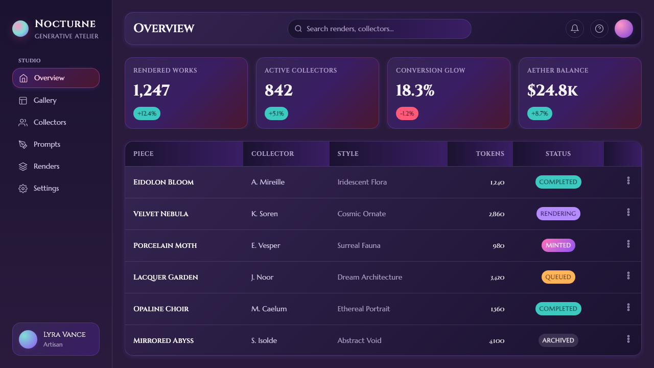
See the AI Diffusion Art design system查看 AI Diffusion Art 完整设计系统
Who shaped AI Diffusion Art?谁塑造了 AI Diffusion Art?
As founder of Midjourney, Holz led development of the tool whose public Discord release in March 2022 made this specific pearlescent, ornate generative aesthetic visible to a mass audience for the first time, defining the public's first encounter with mainstream AI image generation.作为 Midjourney 的创始人,Holz 主导开发了这一工具,其2022年3月通过 Discord 公开发布,首次让这种珍珠光泽、繁复的生成式美学被大众看见,定义了公众与主流 AI 图像生成的第一次相遇。
The early adopters experimenting with prompts on Discord in 2022 collectively discovered and popularized the visual tropes that came to define this look, sharing and iterating on prompt techniques that pushed the model toward its most ornate, glowing outputs.2022年在 Discord 上试验提示词的早期用户,共同发现并普及了定义这种外观的视觉套路,分享并迭代提示词技巧,将模型推向其最繁复、最发光的输出效果。
The team at Stability AI that developed and publicly released Stable Diffusion in August 2022 broadened access to diffusion-model image generation, contributing to the wider cultural moment even as Midjourney's specific aesthetic became the more recognizable visual signature.Stability AI 团队于2022年8月开发并公开发布 Stable Diffusion,扩大了扩散模型图像生成的可及性,为这一更广泛的文化时刻做出了贡献,尽管 Midjourney 的特定美学最终成为更具辨识度的视觉标志。
How do you use AI Diffusion Art today?今天怎么用 AI Diffusion Art?
AI Diffusion Art suits contexts wanting to feel futuristic, dreamlike, and culturally of-the-moment — evoking the specific 2022 generative-AI zeitgeist rather than a timeless or corporate mood. Applying it well means committing fully to the glow and iridescence rather than diluting the gradients into a flatter, more conventional palette.「AI 扩散艺术」适合用在希望传达未来感、梦幻感,以及紧扣2022年生成式 AI 文化时刻的场景,而非追求永恒或企业化气质的场合。用好这套风格,需要全情投入光晕与虹彩效果,而不是把渐变稀释成一种更平淡、更常规的色板。
For presentation slides, the style works well for cover slides on technology, creativity, or innovation-themed decks: a full twilight gradient field with a single glowing, ornate focal shape, and the title set in refined serif type positioned to feel like it's floating within the glow. Content slides should use the gradient treatment sparingly — as a background for key section breaks — while data and text-heavy slides shift to a plainer dark ground so density of information stays legible against the busy visual texture.在演示文稿中,这套风格适合用于科技、创意或创新主题演示文稿的封面页:一整片暮色渐变场域,配以一个发光的、繁复的焦点形状,标题以精致衬线字体呈现,位置安排得仿佛漂浮在光晕之中。内容页应节制地使用渐变处理——仅作为关键章节分隔的背景——而数据与文字密集的页面则应转为更朴素的深色底,使信息密度在繁复的视觉纹理中仍保持可读。
For web interfaces, this aesthetic suits AI and creative-tool products, digital art platforms, or brands wanting to signal cutting-edge generative technology. Hero sections benefit from the full luminous gradient treatment, while functional UI — forms, tables, settings panels — should simplify into flatter dark surfaces with occasional iridescent accents, since the dense ornamental quality does not translate well to information-heavy screens.对于网页界面,这种美学适合 AI 与创意工具类产品、数字艺术平台,或希望传达前沿生成式技术信号的品牌。首屏适合使用完整的发光渐变处理,而表单、表格、设置面板等功能性界面,则应简化为更平坦的深色表面,偶尔点缀虹彩效果,因为密集的装饰质感并不适合信息量大的界面。
For editorial and marketing work — features on AI and generative technology, creative-tool launches, digital art coverage — the style provides an immediately recognizable, era-specific mood: full-bleed gradient sections, ornate symmetrical key visuals, and refined serif pull quotes that echo the aesthetic's classical undertone.对于编辑与营销内容——AI 与生成式技术专题、创意工具发布、数字艺术报道——这套风格能立刻传达出一种可辨识的、带时代特征的氛围:满版渐变板块、繁复对称的主视觉,以及呼应该美学古典底蕴的精致衬线引言。
A common mistake is treating this as a generic 'pastel gradient' style and losing the ornate symmetry and glow that make it specifically read as AI-generated rather than simply colorful. A second common error is overusing the aesthetic across dense, functional interfaces, where the visual richness competes with usability rather than supporting it.常见的错误,是把这套风格理解为泛泛的“柔和渐变”风格,丢失了使其明确读作 AI 生成、而非仅仅是色彩丰富的繁复对称与光晕效果。第二个常见错误,是在密集的功能性界面中过度使用这套美学,其视觉丰富性会与可用性相冲突,而非予以支持。
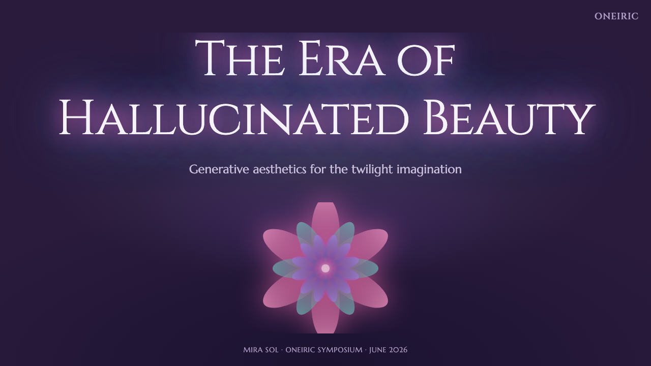
See the AI Diffusion Art design system查看 AI Diffusion Art 完整设计系统
AI Diffusion Art — FAQAI Diffusion Art · 常见问题
Why does this look feel dated to 2022 specifically?为什么这种外观特别让人联想到2022年?
Because it reflects the specific default rendering tendencies of Midjourney's earliest publicly available model version, before subsequent versions shifted toward photorealism and greater user control. Within a year or two, the tool's output changed substantially, making this ornate, pearlescent look a time-stamped visual signature rather than the current state of AI image generation.因为它反映的是 Midjourney 最早公开可用模型版本的特定默认渲染倾向,此后的版本才转向照片写实与更强的用户可控性。仅在一两年之内,该工具的输出便发生了显著变化,使这种繁复、珍珠光泽的外观,成为一个带有时间戳的视觉标志,而非当前 AI 图像生成的现状。
How is this different from generic 'holographic' or 'iridescent' gradient trends?这套风格与泛泛的“全息”或“虹彩”渐变潮流有何不同?
Generic holographic design trends typically use flat, evenly distributed rainbow gradients across simple geometric shapes. This style instead pairs the iridescent gradient specifically with ornate, symmetrical, almost baroque compositional density and a dreamlike twilight ground — the combination of glow, symmetry, and intricate detail is what ties it to the specific AI-generation moment rather than a generic decorative trend.泛泛的全息设计潮流,通常在简单几何形状上使用平面、均匀分布的彩虹渐变。这套风格则将虹彩渐变,与繁复、对称、近乎巴洛克式的构图密度,以及一片如梦的暮色底色specific地结合在一起——正是光晕、对称与繁复细节的组合,将其与那个特定的 AI 生成时刻相连,而非泛泛的装饰潮流。
Can this style be used without referencing AI or technology themes directly?不直接指涉 AI 或科技主题,也能使用这套风格吗?
Yes. The underlying visual qualities — glowing gradients, ornate symmetry, refined serif type — can suit dreamlike, fantastical, or luxury-adjacent branding more broadly, though the style carries a strong cultural association with generative AI that will likely register with audiences familiar with its origin.可以。其底层的视觉特质——发光渐变、繁复对称、精致衬线字体——可以更广泛地适用于梦幻感、奇幻感或近奢侈品调性的品牌视觉,尽管这套风格带有与生成式 AI 强烈的文化关联,对熟悉其源头的受众而言,这层联想很可能仍会显现。
What kind of imagery undermines this style's authenticity?什么样的图像素材会削弱这套风格的真实感?
Sharp, photorealistic photography with natural lighting works against the dreamlike, synthetic mood this style depends on. Imagery or illustration should carry the same soft, glowing, slightly uncanny quality as the rest of the composition to feel consistent with the aesthetic's origin.清晰、照片写实、带自然光照的摄影,与本风格所依赖的梦幻、合成氛围相悖。图像或插画素材应带有与构图其余部分一致的柔和、发光、略带诡谲的质感,才能与这种美学的源头保持一致。
Does this style suit a serious, enterprise-facing product?这套风格适合用在严肃的、面向企业的产品上吗?
It is a difficult fit for traditional enterprise contexts, where clarity and restraint are usually prioritized over dreamlike ornamentation. It works far better for creative tools, consumer-facing AI products, or marketing content wanting to feel imaginative, cutting-edge, and culturally connected to the generative-AI moment.对于传统企业场景而言,很难匹配,因为这类场景通常更看重清晰与克制,而非梦幻般的装饰性。它更适合用在创意工具、面向消费者的 AI 产品,或希望传达想象力、前沿感、并与生成式 AI 文化时刻产生关联的营销内容上。
Related design styles相关设计风格
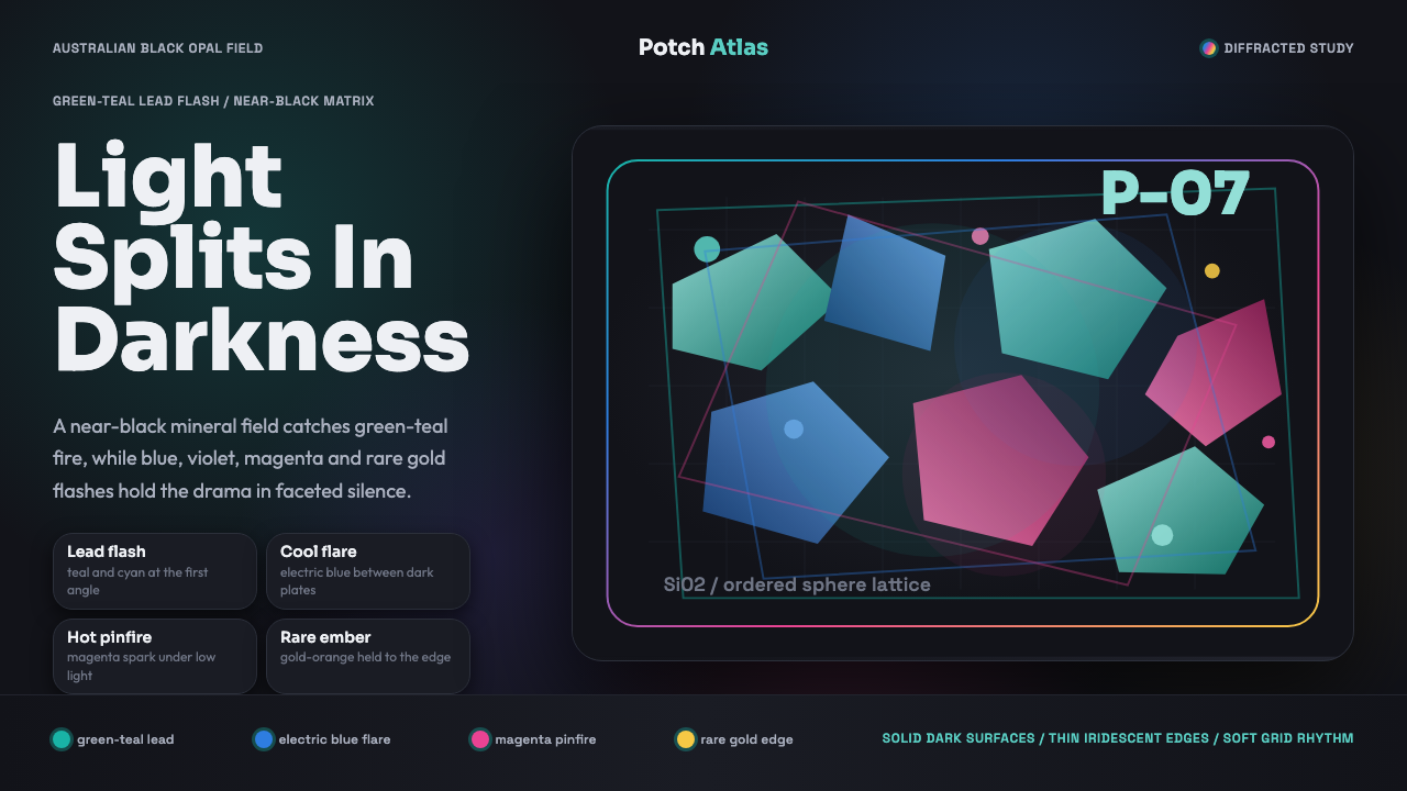 Opal Play-of-ColorDarkness makes color precise. Teal-led flashes fracture across a near-black f…黑暗让幻彩更精准:绿松主导的光斑切入近黑棱面网格。
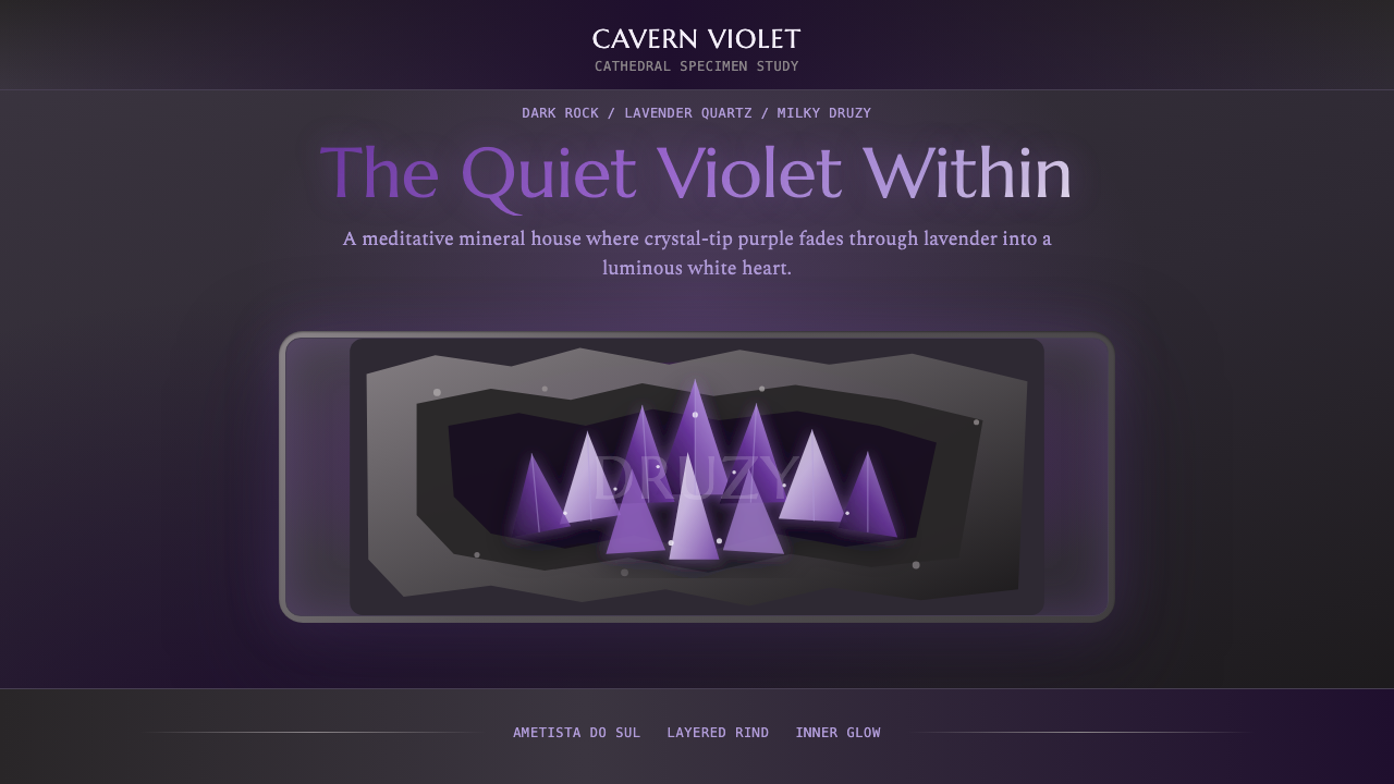 Amethyst GeodeMeditative gem luxury. Amethyst gradients glow in dark stone, framed by rough…冥想式宝石奢华。紫晶渐变在暗石中发光,粗矿壳框住光心。
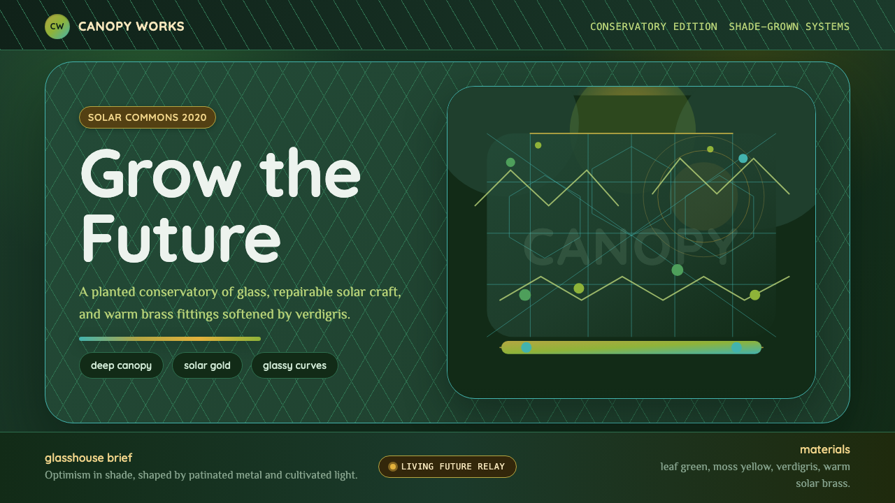 Solarpunk GreenhouseA grown future, not a sterile one. Deep canopy green, solar gold, and glassy…未来是可种植的:深冠绿、太阳金与玻璃曲线。
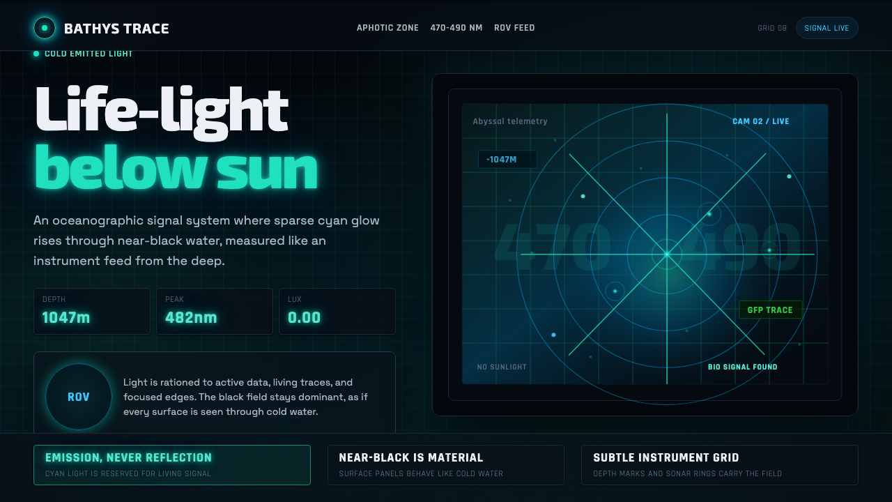 Abyssal BioluminescenceDark carries the signal. Electric cyan pins and Exo 2 readouts surface from a…黑暗承载信号。电青光点与 Exo 2 读数从声呐网格浮现。
 Africanfuturism VibraniumCeremony goes electric. Violet glow and gold inlay thread a volcanic textile…仪式感通电:紫光与金线织入火山黑几何网格。
 Annihilation (The Shimmer)Beautifully wrong. Dusk black carries pink, teal, and lilac refraction throug…美丽而失常:暮黑底上,粉、青与丁香紫在玻璃膜中折射。