What is Egyptian Political Poster?什么是 Egyptian Political Poster?
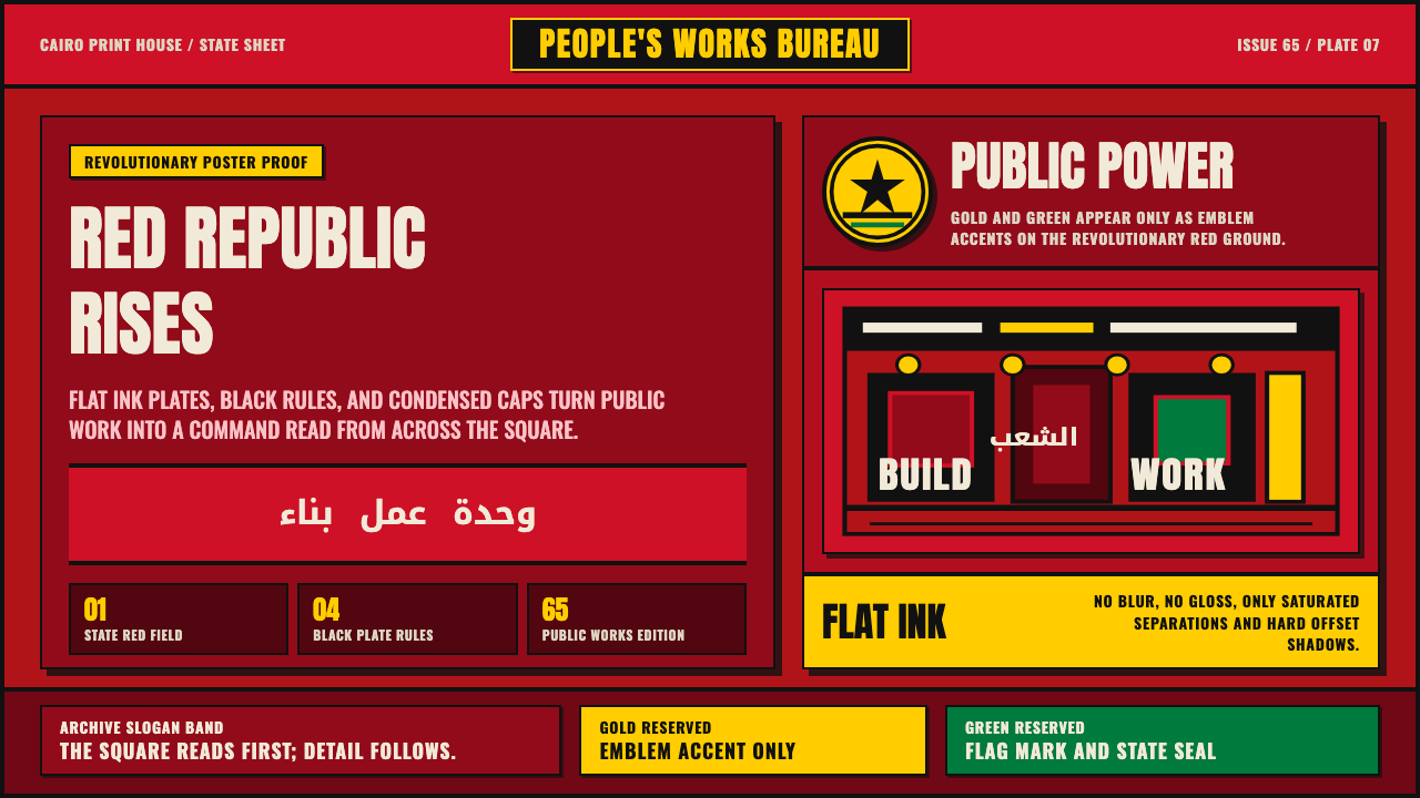
Egyptian Political Poster is the graphic voice of Nasser-era Cairo — revolutionary red, monumental script, and a state that wanted every wall to shout at once.埃及政治海报是纳赛尔时代开罗的图形之声——革命红、巨幅字体,以及一个想让每一面墙同时高声宣告的国家。
Egyptian Political Poster in briefEgyptian Political Poster 速览
Egyptian Political Poster is a design system built from the visual vocabulary of Nasser-era Cairo state propaganda: revolutionary red and black, the gold Eagle of Saladin, and monumental Kufic-inflected slogans printed on matte litho poster stock. State print houses of the period produced an enormous volume of posters celebrating heroic workers, industrial dams, and national flags, all rendered in flat, high-contrast color separations dictated as much by the limits of mass litho printing as by aesthetic choice.埃及政治海报是一套取材于纳赛尔时代开罗国家宣传视觉词汇的设计系统:革命红与黑、金色的萨拉丁之鹰,以及印在哑光胶印海报纸上、带库法体韵味的巨幅标语。那个时代的国家印刷厂制作了海量海报,歌颂英勇的工人、工业化的水坝与国旗,全部以扁平、高对比度的分色印刷呈现——这既是审美选择,也很大程度上受限于当时大规模胶印技术的限制。
The defining quality of this style is intensity without subtlety — it was never meant to whisper. A saturated state-print red serves as the dominant ground color rather than an accent, bold black keylines outline every figure and letterform with maximum legibility at a distance, and condensed, heroic capital letterforms carry slogans meant to be read from across a street or a public square, not up close on a printed page.这种风格最核心的品质,是没有丝毫含蓄的强度——它从来无意低语。饱和的国家印刷红作为主导底色而非点缀色,粗黑的轮廓线以最大的远距离可读性勾勒每个人物与字形,紧凑、英雄气概的大写字形承载着旨在从街道或广场对面就能读到的标语,而非近距离阅读的印刷文字。
Gold and green are held in tight reserve, appearing only on the emblem of the eagle and the flag — precisely because scarcity is what gives them their symbolic weight. A design language built entirely around volume and urgency, Egyptian Political Poster communicates state confidence, collective purpose, and unmistakable authority through sheer graphic force.金色与绿色被严格地保留,只出现在鹰与旗帜的徽记上——正因为稀缺,它们才承载着象征分量。这是一套完全围绕体量与紧迫感构建的设计语言,埃及政治海报通过纯粹的图形力量,传达国家自信、集体使命感与不容置疑的权威。
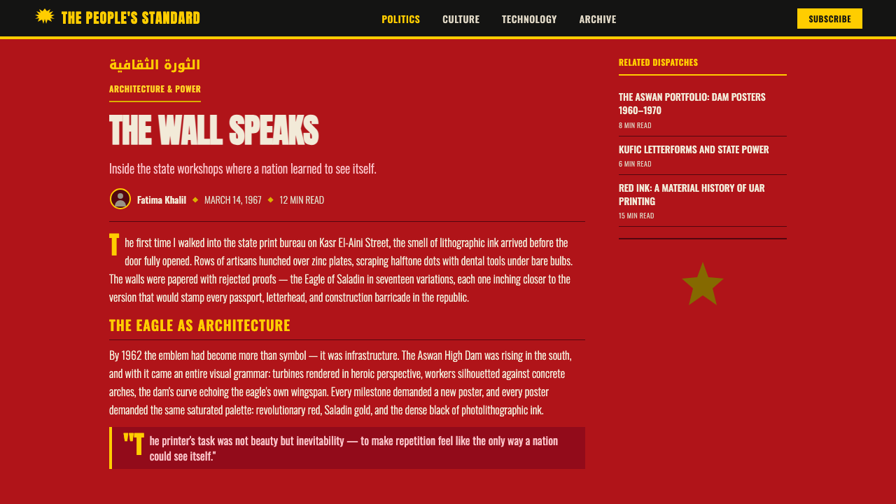
See the Egyptian Political Poster design system查看 Egyptian Political Poster 完整设计系统
Where does Egyptian Political Poster come from?Egyptian Political Poster 从何而来?
Gamal Abdel Nasser rose to power in Egypt following the 1952 Revolution that overthrew King Farouk, becoming president in 1956 and remaining the dominant figure in Egyptian and pan-Arab politics until his death in 1970. His government pursued a program of Arab socialism, nationalization of major industries — most famously the Suez Canal in 1956 — and pan-Arab nationalist ambition, briefly formalized in the United Arab Republic, a political union between Egypt and Syria that lasted from 1958 to 1972, whose distinctive two-star flag design appears frequently in the poster art of this period.贾迈勒·阿卜杜勒·纳赛尔在1952年推翻法鲁克国王的革命后崛起于埃及政坛,1956年就任总统,此后直到1970年去世,始终是埃及乃至泛阿拉伯政治舞台上的主导人物。他的政府推行阿拉伯社会主义纲领,将主要产业收归国有——最著名的是1956年将苏伊士运河国有化——并怀抱泛阿拉伯民族主义抱负,一度以「阿拉伯联合共和国」的形式短暂正式化——这是埃及与叙利亚从1958年持续到1972年的一场政治联合,其标志性的双星国旗设计频繁出现在这一时期的海报艺术中。
State-run print houses under Nasser's government produced enormous quantities of poster art in service of these political goals, celebrating the nationalization of industry, the construction of the Aswan High Dam — completed with substantial Soviet engineering and financial support and widely presented as a symbol of Egyptian modernization and independence from Western colonial influence — and the broader narrative of the heroic Egyptian worker and soldier building a new, self-determined nation.纳赛尔政府旗下的国营印刷厂,为服务于这些政治目标制作了海量海报艺术,歌颂产业国有化、阿斯旺高坝的建设(该工程在苏联工程与资金的大力支持下完工,被广泛塑造为埃及现代化与摆脱西方殖民影响、实现自决的象征),以及那个更宏大的叙事——英勇的埃及工人与士兵,正在建设一个自主决定命运的新国家。
The visual style drew on several converging traditions. Arab socialist realism, itself influenced by Soviet socialist realist art through Cold War-era political and cultural exchange, supplied the heroic, muscular figuration of workers and soldiers rendered in flat, monumental scale. Traditional Kufic calligraphy — an early, angular style of Arabic script historically used in Quranic manuscripts and monumental architectural inscription — was adapted into bold, modernized poster lettering, lending state slogans a visual gravity that connected contemporary political messaging to a much older tradition of authoritative public inscription.这种视觉风格汲取了几股相互交汇的传统。阿拉伯社会主义现实主义,本身受到冷战时代政治与文化交流中苏联社会主义现实主义艺术的影响,提供了以扁平、纪念碑式尺度呈现的、肌肉发达的工人与士兵英雄形象。传统的库法体书法——一种历史上用于古兰经手抄本与纪念性建筑铭文的早期棱角状阿拉伯字体——被改造成大胆、现代化的海报字体,赋予国家标语一种视觉庄重感,将当代政治宣传与更古老的权威性公共铭文传统联系起来。
The gold Eagle of Saladin, adopted as Egypt's national emblem after the 1952 revolution and named for the medieval sultan Saladin, appears throughout this poster tradition as the fixed visual marker of state authority, typically rendered in careful gold-and-black detail against the otherwise flat red-and-black color scheme — its ornamental precision deliberately set apart from the simplified, mass-produced figuration surrounding it. Individual poster artists working within Egyptian state print houses of this era, producing work under the pressures of state commission and rapid mass production, developed the flat, high-contrast, keyline-heavy technique that defined the look, balancing propagandistic urgency with the practical realities of litho printing on a national scale.1952年革命后被采纳为埃及国徽的金色萨拉丁之鹰(以中世纪苏丹萨拉丁命名),作为国家权威固定的视觉标记,贯穿整个这一海报传统,通常以精细的金黑细节呈现,与周围扁平的红黑配色方案形成刻意的区隔——它的装饰性精细度被有意从周围简化、批量生产的形象中区分出来。这一时代埃及国营印刷厂中的个体海报艺术家,在国家委托与快速大批量生产的压力下创作,发展出了这种扁平、高对比、重轮廓线的技法,在宣传的紧迫感与全国规模胶印生产的现实条件之间取得了平衡。
What defines the Egyptian Political Poster look?Egyptian Political Poster 的视觉特征是什么?
State-Print Red Ground国家印刷红底色
The base is a saturated, dominant red — never paper-white or beige — functioning as the primary ground of the composition rather than an accent. This red should feel like the actual color of the poster stock itself, present from edge to edge, rather than a tinted background layered over a neutral base.底色是一种饱和、占主导地位的红色——绝非纸白或米色——作为构图的主要底面,而非点缀色。这种红色应给人一种「就是海报纸本身的颜色」的感觉,从边到边一以贯之,而非叠加在中性底面之上的一层染色图层。
Bold Black Keylines粗黑轮廓线
Every figure, letterform, and emblem is outlined with a heavy, uniform black keyline, ensuring maximum legibility even from a distance. This keyline treatment should never taper or vary in weight — its consistency is part of what gives the style its mass-produced, monumental character.每个人物、字形与徽记都以厚重、均匀的黑色轮廓线勾勒,确保即使在远距离也能保持最大的可读性。这种轮廓线处理绝不应有粗细变化或渐细——它的一致性正是这种风格批量生产、纪念碑式特质的一部分。
Kufic-Inflected Type库法体韵味字体
Slogans and headline text draw on the angular, geometric quality of Kufic calligraphy, translated into bold, modernized letterforms rather than delicate calligraphic script. This typography should feel monumental and inscriptional, carrying the weight of a public proclamation rather than casual text.标语与标题文字应汲取库法体书法棱角分明、几何化的品质,转化为大胆、现代化的字形,而非精致的书法手写体。这种字体应显得纪念碑式、如铭文般庄重,承载公开宣告的分量,而非随意的文字。
Gold Eagle Emblem金色雄鹰徽记
The gold Eagle of Saladin appears as a fixed, precisely rendered emblem, its careful gold-and-black detail deliberately set apart from the flatter, simplified figuration used elsewhere in the composition. It functions as a marker of official state authority and should never be simplified into the same flat treatment as other elements.金色萨拉丁之鹰以固定、精细呈现的徽记形式出现,其精心的金黑细节被刻意从构图中其他更扁平、简化的形象中区分开来。它承担着标示国家官方权威的功能,绝不应被简化成与其他元素相同的扁平处理方式。
Flat Color Separation扁平分色
Figures and background elements are rendered in flat, high-contrast color fields with no gradients or soft shading, reflecting the practical limitations of mass litho printing as much as a deliberate graphic choice. Every color area should have a hard, clean edge rather than a soft transition.人物与背景元素以扁平、高对比度的色块呈现,没有渐变或柔和的明暗过渡,这既反映了大规模胶印生产的现实限制,也是一种刻意的图形选择。每个色块区域都应有坚硬、干净的边缘,而非柔和的过渡。
Heroic Monumental Scale英雄气概的纪念碑尺度
Figures — workers, soldiers, industrial structures — are rendered at a large, dominant scale within the composition, filling most of the available space rather than sitting within generous negative space. This scale reflects the propagandistic intent to project confidence and collective strength.人物——工人、士兵、工业建筑——在构图中以宏大、占主导地位的尺度呈现,填满大部分可用空间,而非置于宽裕的留白之中。这种尺度反映了传达自信与集体力量的宣传意图。
Restrained Gold-and-Green Accents克制的金绿点缀
Beyond the eagle and flag emblems, gold and green appear rarely and only in small, deliberate doses. Their scarcity relative to the dominant red-and-black scheme is what gives them symbolic weight — spreading them broadly across a composition would dilute their meaning entirely.除了鹰与旗帜徽记之外,金色与绿色极少出现,且只以小而刻意的分量点缀。相对于主导的红黑配色,它们的稀缺性正是其象征分量的来源——若在构图中大面积铺开,会彻底稀释它们的含义。

See the Egyptian Political Poster design system查看 Egyptian Political Poster 完整设计系统
Who shaped Egyptian Political Poster?谁塑造了 Egyptian Political Poster?
President of Egypt from 1956 until his death in 1970, Nasser led the post-revolutionary government whose Arab socialist and pan-Arab nationalist program supplied the political content driving this poster tradition — nationalization of industry, the Aswan High Dam, and the United Arab Republic union with Syria all became recurring poster subjects celebrating state achievement.纳赛尔自1956年起担任埃及总统直至1970年去世,他领导的后革命政府所推行的阿拉伯社会主义与泛阿拉伯民族主义纲领,为这一海报传统提供了驱动力的政治内容——产业国有化、阿斯旺高坝,以及与叙利亚的阿拉伯联合共和国联盟,都成为反复出现、歌颂国家成就的海报题材。
A poster artist working within Egyptian state print houses during the Nasser era, Radwan's work exemplifies the flat, keyline-heavy, monumental technique that defined the period's propaganda poster tradition, balancing heroic figuration with the practical constraints of mass litho production.阿卜杜勒哈利姆·拉德万是纳赛尔时代埃及国营印刷厂旗下的一位海报艺术家,他的作品体现了那个时期宣传海报传统所定义的扁平、重轮廓线、纪念碑式的技法,在英勇形象与大规模胶印生产的现实限制之间取得了平衡。
The network of state-run printing operations that produced the bulk of Nasser-era political poster art, working at national scale to disseminate a consistent visual language of revolutionary achievement across cities and public spaces throughout Egypt.这一系列国营印刷机构网络,制作了纳赛尔时代绝大部分的政治海报艺术,以全国规模运作,将一套统一的革命成就视觉语言传播到埃及各城市与公共空间之中。
How do you use Egyptian Political Poster today?今天怎么用 Egyptian Political Poster?
On presentation slide covers, the style delivers unmistakable urgency and confidence: a saturated red field, a large monumental figure or symbol outlined in heavy black, and a bold Kufic-inflected title reading as a public proclamation rather than a subtitle. Content slides should keep the red ground dominant throughout, using flat black keylines to organize hierarchy rather than color variation, with gold reserved strictly for the single most important emblem or highlighted figure on a slide.在演示文稿封面上,这种风格能传达毫不含糊的紧迫感与自信:一片饱和的红色场域,一个以粗黑轮廓勾勒的宏大人物或符号,一个大胆、带库法体韵味的标题,读起来像一份公开宣告而非副标题。内容页应始终让红色底面占主导,用扁平的黑色轮廓线而非色彩变化来组织层级,金色应严格保留给一页中最重要的单一徽记或亮点人物。
For web interfaces, this style suits products wanting to project collective purpose, national or cultural identity, or bold civic confidence — cultural institutions, historical archives, or campaigns built around large-scale collective achievement. Dashboards are a poor fit for the style's full intensity, but a restrained version — flat color blocks, heavy keylines for structure, a single gold accent for the most important status — can translate the visual logic without the full propagandistic volume.对于网页界面,这种风格适合想要传达集体使命感、民族或文化认同,或大胆公民自信的产品——文化机构、历史档案,或围绕大规模集体成就构建的campaign。仪表板不太适合这种风格的完整强度,但一个克制的版本——扁平色块、重轮廓线用于结构、单一金色点缀用于最重要的状态——可以在不带完整宣传张力的情况下转译其视觉逻辑。
In pricing pages, the state-print red can serve as a striking background for a single recommended tier, with the gold-emblem treatment reserved for the tier's key call-to-action button, echoing how gold is reserved for the eagle and flag alone in the original tradition.在定价页面中,国家印刷红可以作为单一推荐等级的醒目背景,金色徽记处理则保留给该等级的关键行动号召按钮,呼应原始传统中金色仅保留给鹰与旗帜的做法。
For editorial and marketing content about history, cultural heritage, collective movements, or bold national identity, full-bleed hero sections built from the saturated red ground with monumental keylined figures and Kufic-inflected headline type can carry real graphic force, provided the historical and political weight of the reference material is handled with appropriate care and context.对于关于历史、文化传承、集体运动或大胆民族认同的编辑与营销内容,通栏主视觉区块以饱和红色底面、纪念碑式的重轮廓人物与库法体韵味标题构建,能承载真正的图形力量,前提是要以恰当的谨慎与语境来处理参照素材背后的历史与政治分量。
The most common mistake is softening the red into a pastel or muted tone, which destroys the state-print intensity that defines the style — the red must remain fully saturated and dominant. A second frequent error is spreading gold and green liberally across a composition rather than reserving them for a single emblem, which erodes the scarcity that gives these accent colors their symbolic authority.最常见的错误,是把红色柔化为一种柔粉或沉闷的色调,这会摧毁定义这种风格的国家印刷强度——红色必须保持完全饱和且主导。第二个常见错误,是把金色与绿色随意大面积铺开,而非保留给单一徽记,这会侵蚀这些点缀色象征权威所依赖的那种稀缺性。
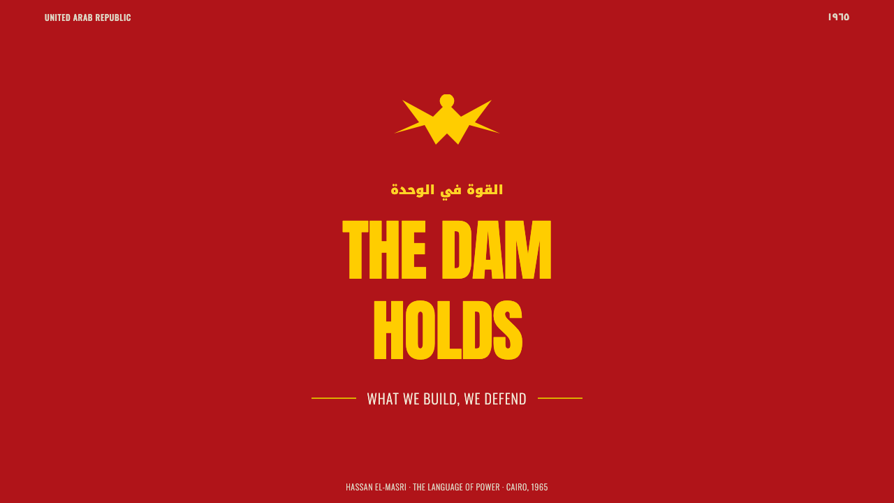
See the Egyptian Political Poster design system查看 Egyptian Political Poster 完整设计系统
Egyptian Political Poster — FAQEgyptian Political Poster · 常见问题
Why is red used as the dominant ground color rather than as an accent?为什么红色被用作主导底色,而非点缀色?
In the original state-print tradition, red was the actual color of the poster stock itself, a practical and symbolic choice tied to the revolutionary red long associated with socialist and nationalist political movements. Treating it as the ground rather than an accent preserves this historical relationship and gives the style its characteristic intensity — a red accent on a neutral background would read as decorative rather than as a genuine propaganda poster.在原始的国营印刷传统中,红色本身就是海报纸的实际颜色,是一种既实用又具象征意义的选择,与长期以来同社会主义和民族主义政治运动相关联的革命红一脉相承。把它当作底色而非点缀色来处理,保留了这层历史关系,也赋予这种风格标志性的强度——如果红色只是中性背景上的一处点缀,读起来就会像是装饰,而非真正的宣传海报。
Is Kufic-inflected type the same as traditional handwritten Arabic calligraphy?库法体韵味字体和传统手写阿拉伯书法是一回事吗?
No. Kufic is specifically an early, angular, geometric style of Arabic script historically used for monumental inscription and Quranic manuscripts, distinct from the more flowing, cursive calligraphic styles like Naskh or Thuluth. The poster tradition adapts Kufic's angular, blocky quality into bold modern letterforms suited to mass printing and distance legibility, rather than reproducing delicate handwritten calligraphy.不是。库法体特指一种早期、棱角分明、几何化的阿拉伯字体,历史上用于纪念性铭文与古兰经手抄本,不同于纳斯赫体或苏鲁斯体等更为流畅、连笔的书法风格。这一海报传统把库法体棱角分明、方正的品质,改造成了适合大规模印刷与远距离可读性的大胆现代字形,而非复制精致的手写书法。
How much of a composition should gold or green occupy?构图中金色或绿色应该占多大比例?
Very little — these colors should appear only on the eagle emblem, the flag, or a single equivalent marker of official authority, never spread across body text, backgrounds, or general decorative elements. Their symbolic weight in the original tradition depends entirely on this scarcity relative to the dominant red-and-black scheme.非常少——这些颜色应只出现在鹰徽、旗帜,或一个类似的官方权威标记上,绝不应铺满正文文字、背景或一般性装饰元素。在原始传统中,它们的象征分量完全取决于相对于主导红黑配色的这种稀缺性。
Is it appropriate to use this style for unrelated commercial branding?把这种风格用于无关的商业品牌是否合适?
The style carries genuine historical and political weight tied to a specific state propaganda tradition, so applying it thoughtlessly to unrelated commercial products can read as either confused or insensitive. It is best suited to contexts that engage seriously with history, cultural heritage, or collective identity, ideally with some acknowledgment of the source material's actual political context, rather than being used purely as a decorative 'bold red poster' aesthetic stripped of its meaning.这种风格承载着与特定国家宣传传统紧密相连的真实历史与政治分量,因此不加思考地将其用于无关的商业产品,可能显得混乱甚至失当。它最适合那些认真对待历史、文化传承或集体认同的语境,理想情况下应对源材料真实的政治背景有所承认,而非被剥离含义、纯粹当作一种「大胆红色海报」的装饰美学来使用。
Why do the figures use such heavy, uniform black outlines instead of varied line weight?为什么人物使用如此厚重、均匀的黑色轮廓,而不是变化的线宽?
The uniform heavy keyline is partly a practical legacy of mass litho printing, which favored simple, high-contrast separations that reproduced reliably at scale, and partly a deliberate graphic choice to maximize legibility at a distance — these posters were meant to be read from across a street or public square, where fine variation in line weight would simply disappear.均匀厚重的轮廓线,一方面是大规模胶印生产的实际遗留——这种技术偏好简单、高对比度的分色,能够大规模可靠地复制;另一方面也是一种刻意的图形选择,以最大化远距离可读性——这些海报本就旨在从街道或广场对面被阅读,而线宽的细微变化在那样的距离下根本无法辨识。
Related design styles相关设计风格
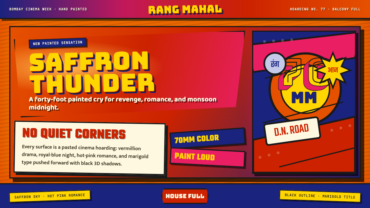 Bollywood Poster Art (1970s)Subtlety is unaffordable. Saffron fields, Bungee shadows, diagonal hoarding d…节制太便宜:藏红花底、Bungee黑影与斜向招贴制造十米戏剧。
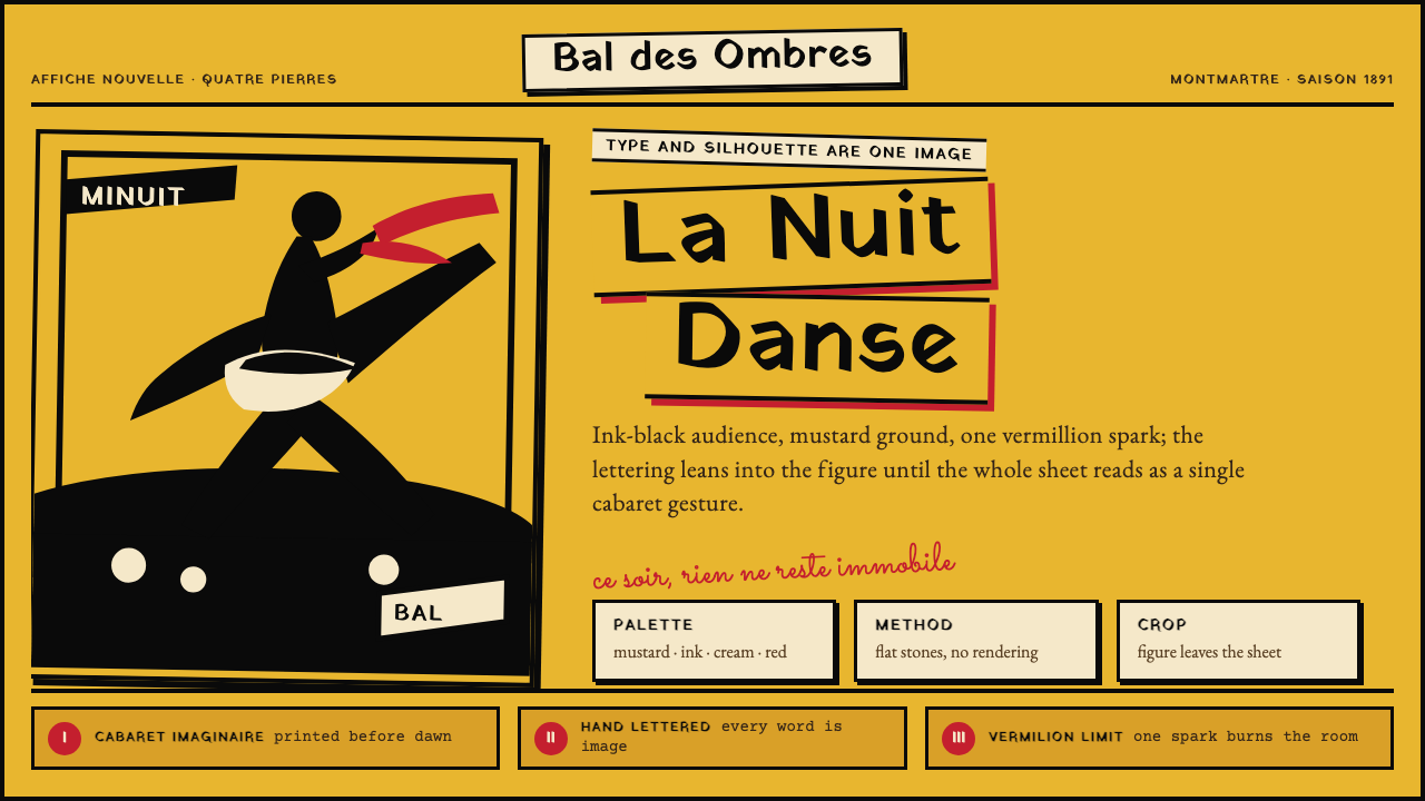 Toulouse-Lautrec Belle ÉpoqueNight becomes gesture. Mustard ground, black silhouette, hand lettering, one…夜色化作手势:芥末底、墨黑剪影、手绘字与一抹朱红。
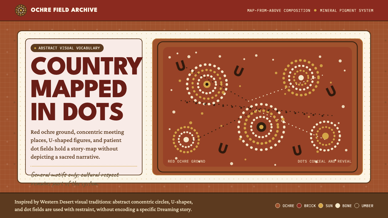 Aboriginal Dot PaintingAncient story-map energy. Red ochre, bone dots, concentric circles, and U-mar…古老故事地图感:红赭底、骨白点、同心圆与 U 形构成大地。
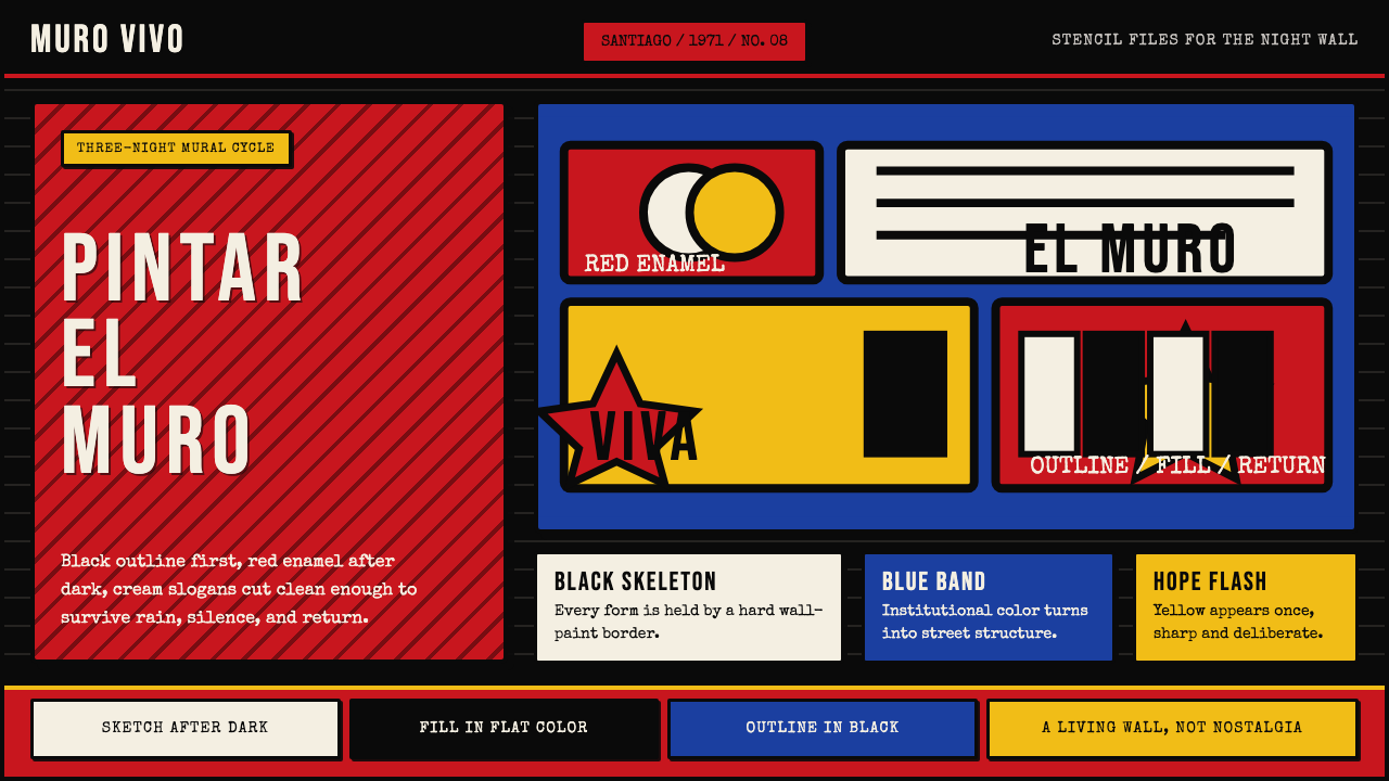 Chilean BRP Ramona Parra 1971Resistance stays alive. Blood red panels, black outlines, and stencil type re…抵抗仍在呼吸:血红墙面、粗黑轮廓与模板字重建街墙。
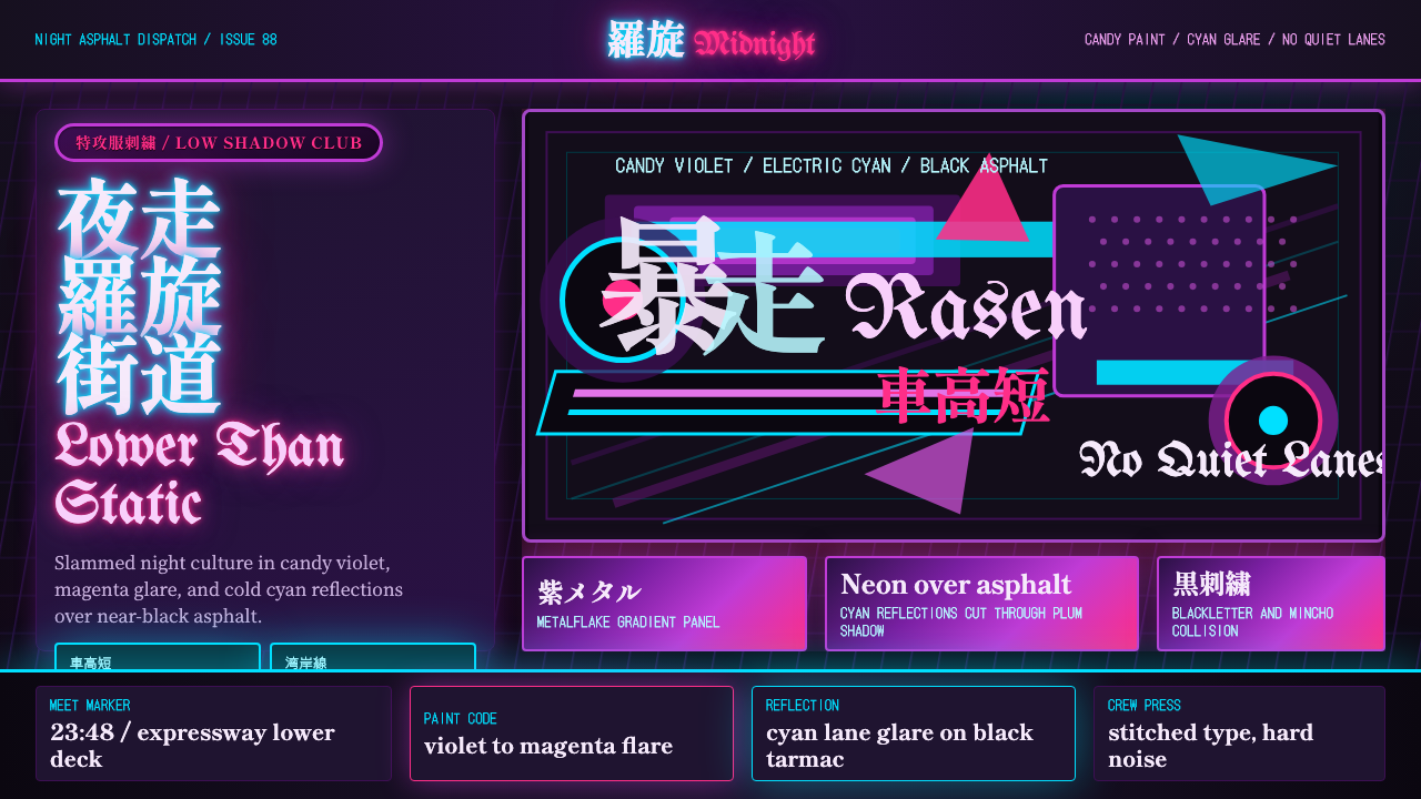 JDM BosozokuNight culture shouts. Candy violet, cyan neon, and stacked Mincho-blackletter…夜色里吼叫:糖果紫与电光青,明朝体和黑体叠满柏油。
 Levantine Keffiyeh Black & WhitePolitical textile, not ornament. Cotton type and fishnet lattice cut through…政治纺织,不是装饰。棉白字体与渔网格纹切入黑底。